


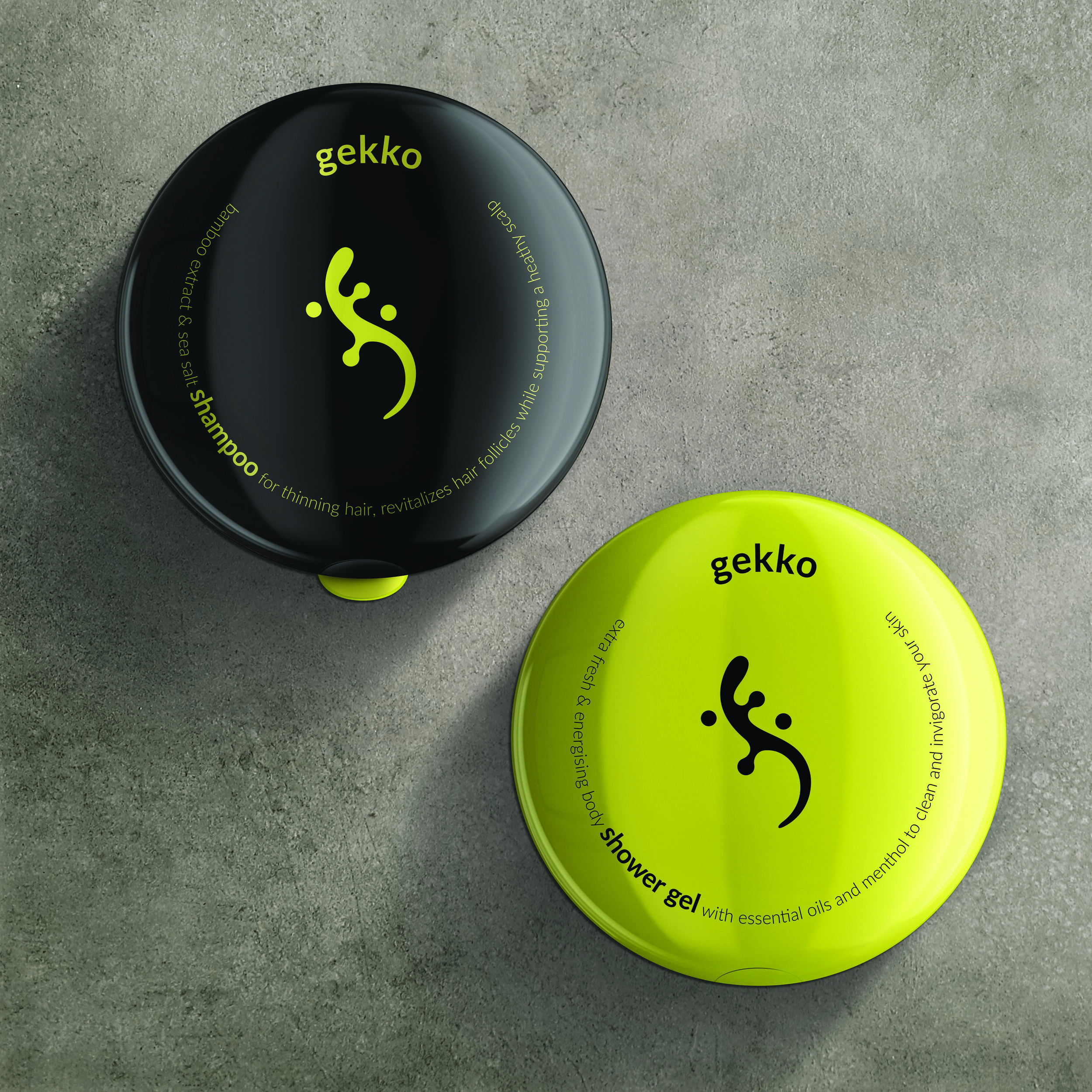
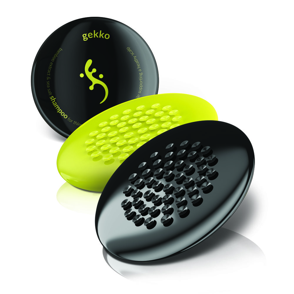
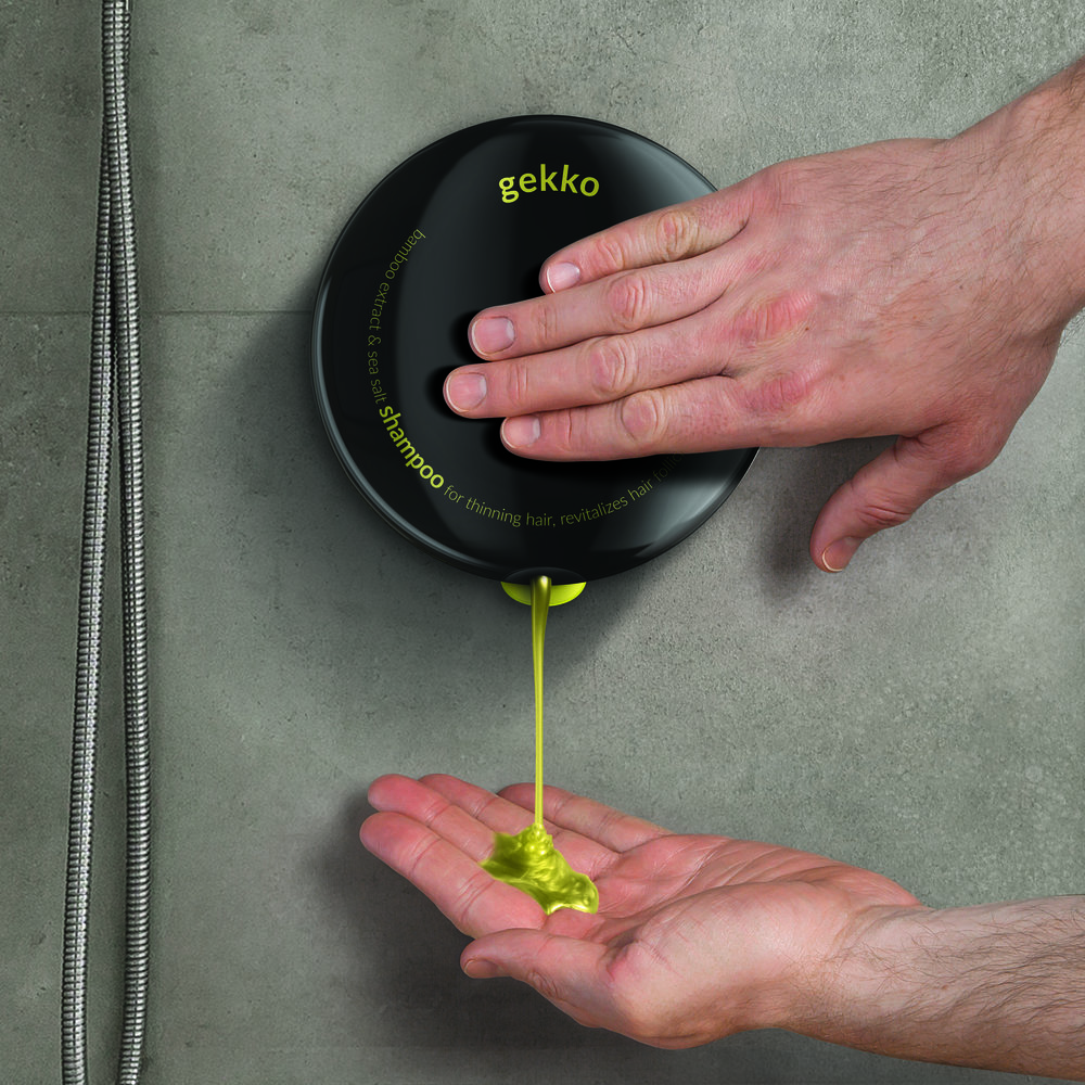
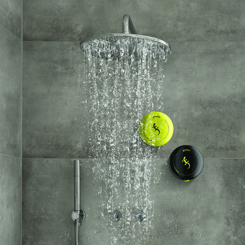
“Minimalistic design puts the functionality of the product in the foreground. In order to quickly identify basic categories of products, two contrastive colours of packaging have been used – one for shampoos and the other for shower gels. After all, most men buy just the basic variants.Men have been struggling to maintain a place for their cosmetics in showers. “Premium” spots in shower caddies are reserved for their wives and girlfriends. Men are left with the shower floor to put down their shampoos and shower gels. Gekko is a personal care brand concept that will help men to alleviate this problem. The key feature is a system of attaching packaging to shower surfaces which keeps the product out of shower caddies.The system of suction cups integrated with packaging is inspired by the physiognomy of geckos. It allows you to place your shampoo or gel quickly and intuitively in the most convenient part of the shower. Stable fastening and a flexible front of the package facilitate dosing.”
CREDIT
- Agency/Creative: Opus B Brand Design
- Article Title: Opus B Brand Design – Gekko (Concept)
- Project Type: Packaging
- Format: Bottle
- Substrate: Plastic


