


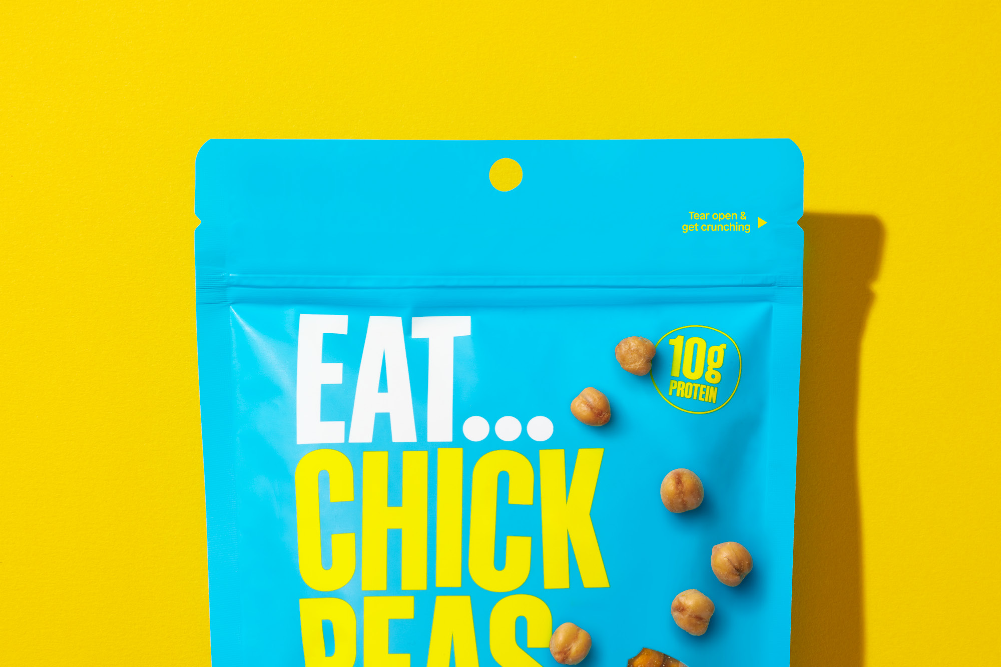
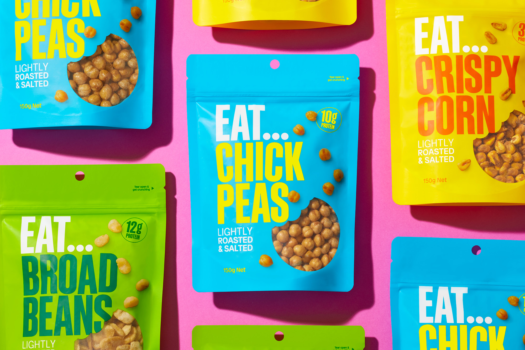
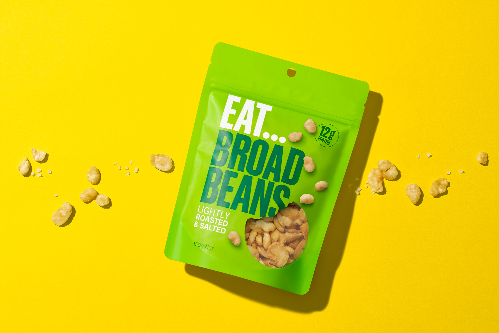
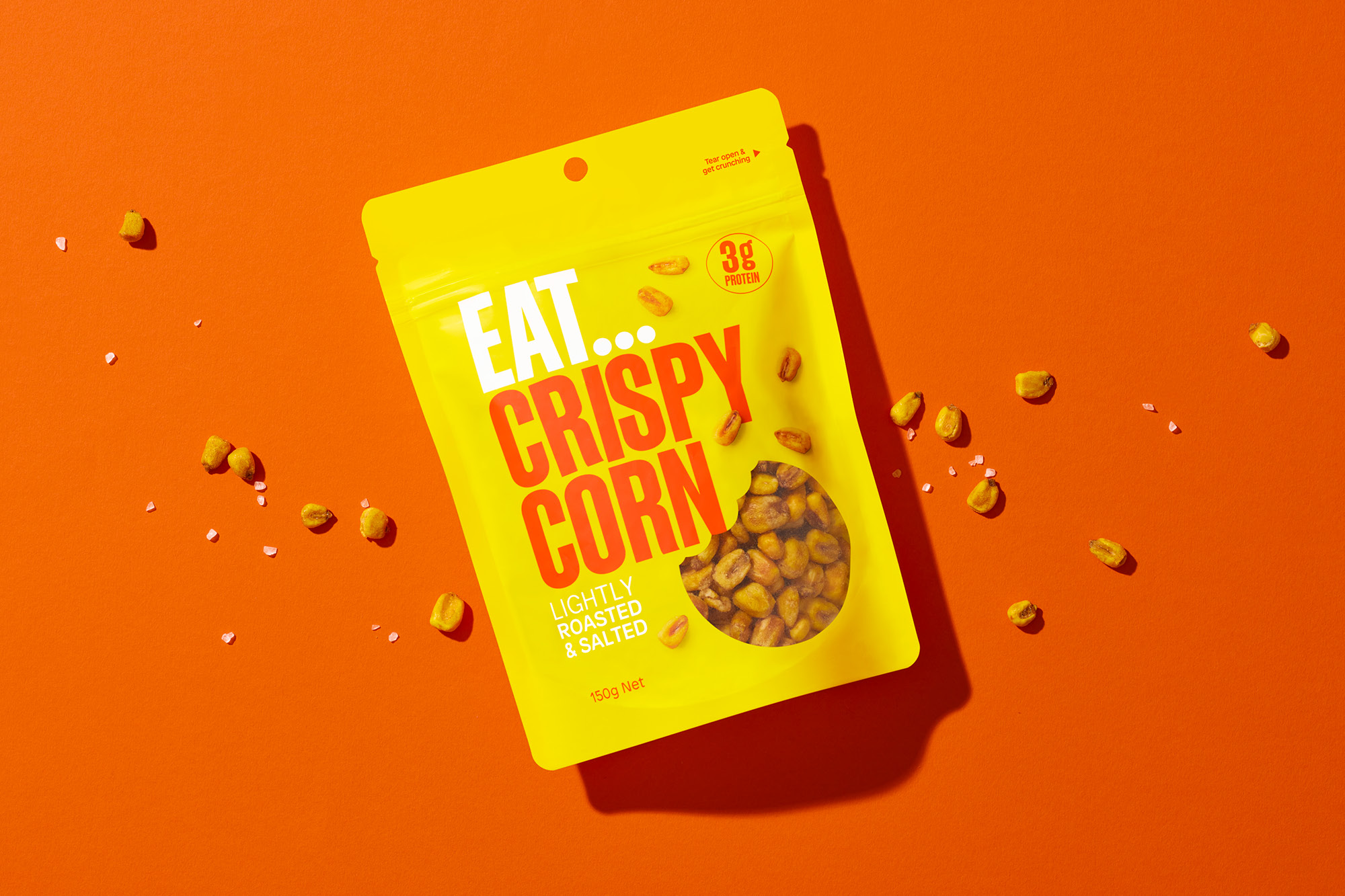
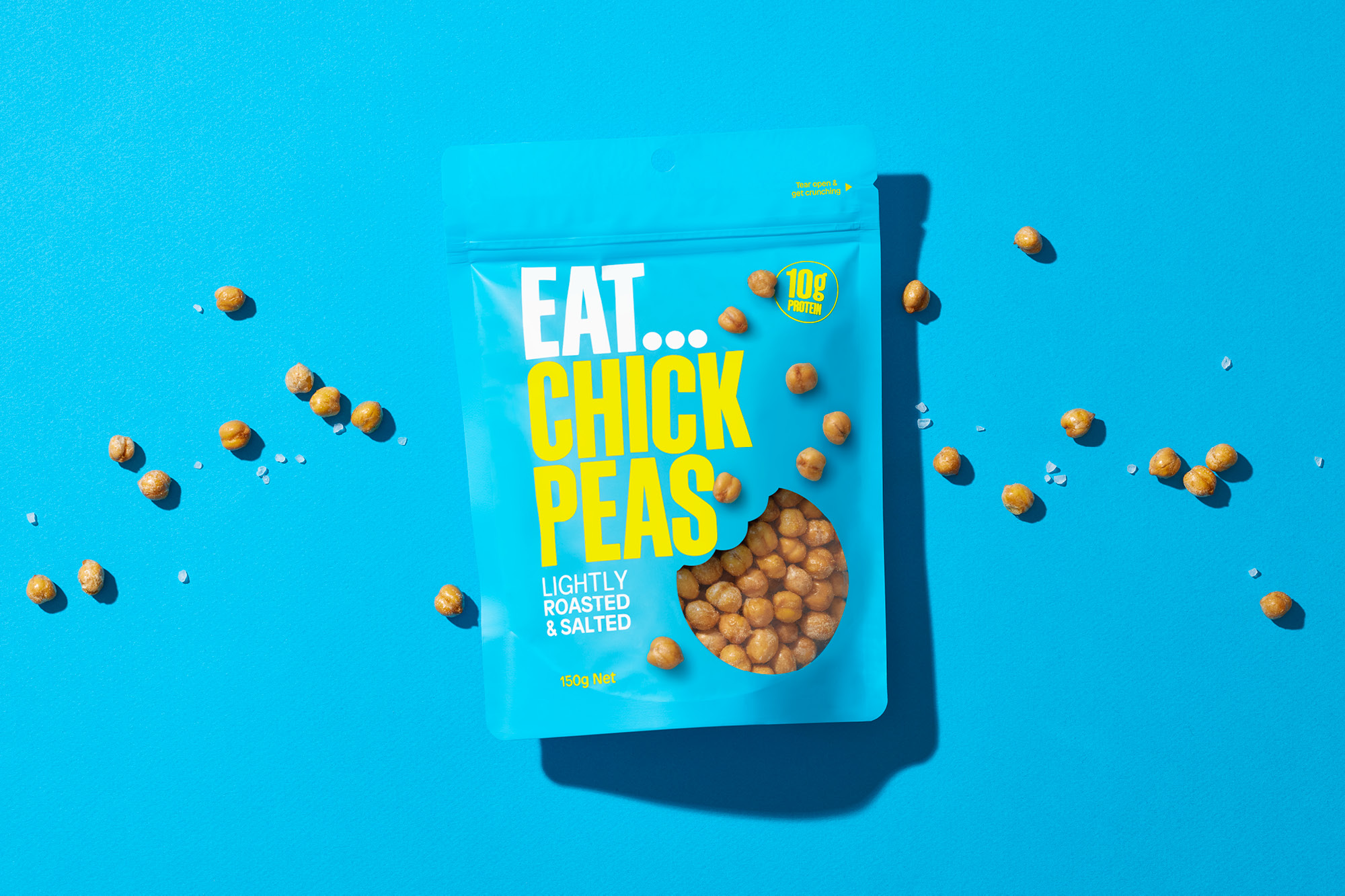
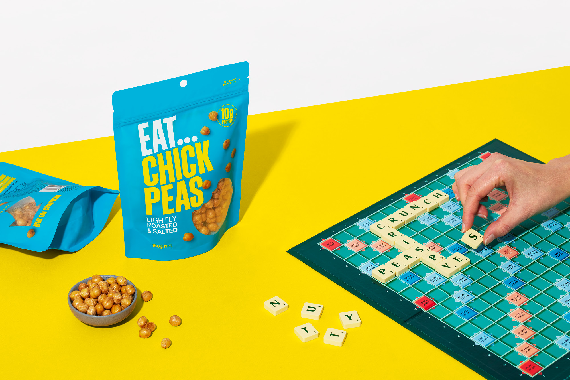
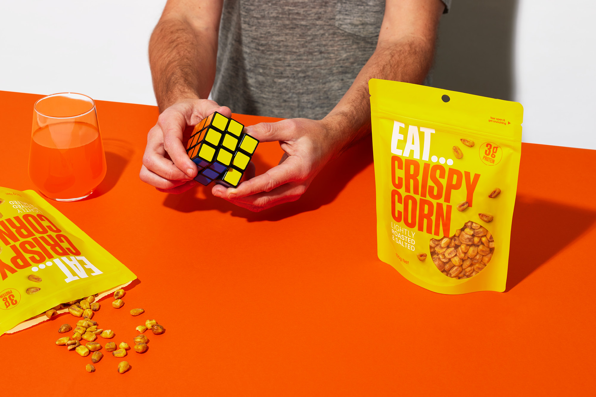
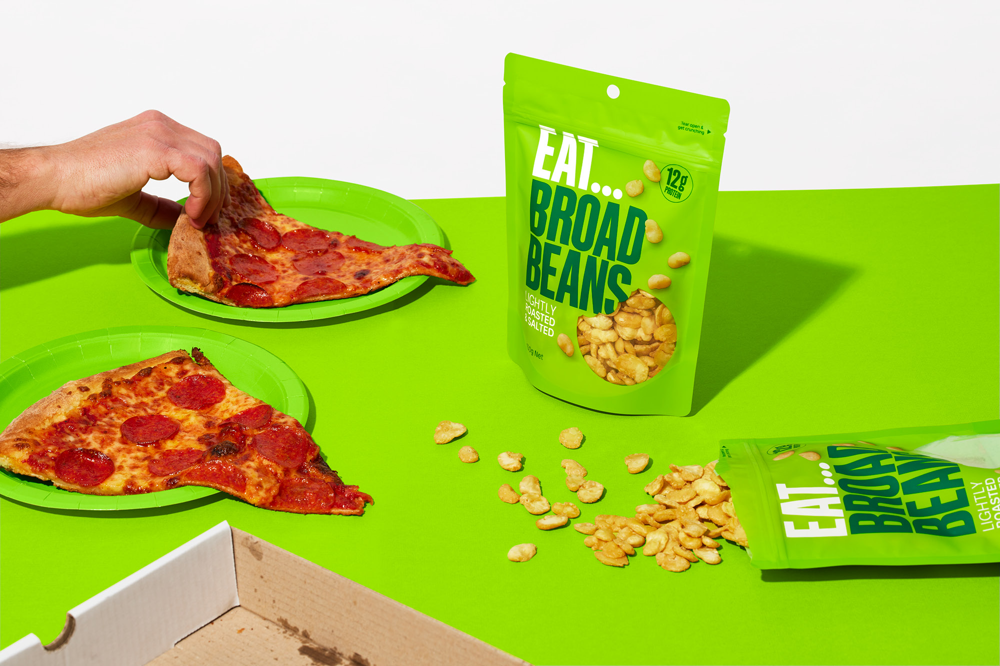
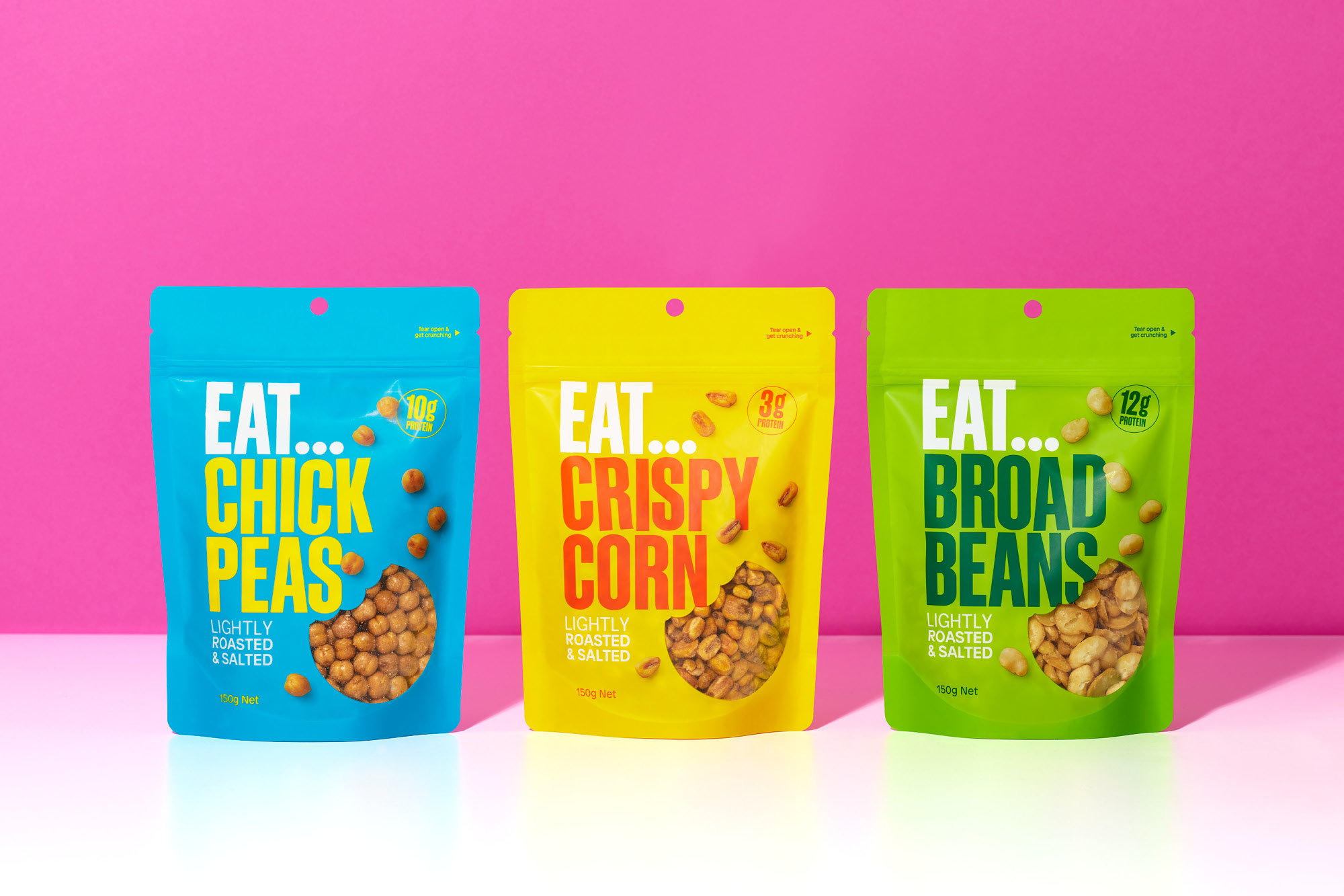
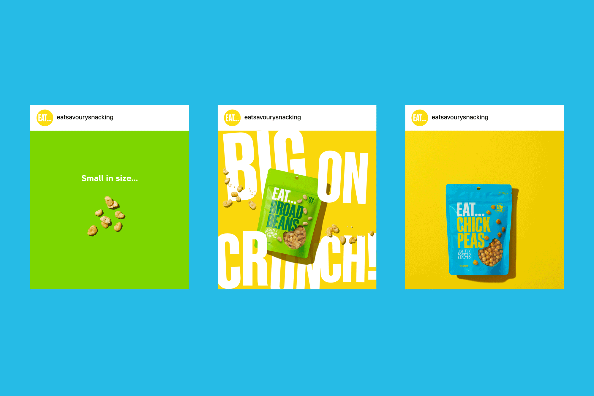
No one should feel guilty about snacking, far from it. The team at EAT… are on a mission to prove that there are delicious options beyond the usual suspects of flavoured savoury snacks. Chickpeas, broad beans and corn kernels wouldn’t be top of the list when thinking about snacking. But when these small protein-packed delights are carefully seasoned and toasted, you end up with a delicious and satisfying snack that is big on crunch!
That eternal question inspired the naming – what shall I snack on? Whether it is downtime at work, chilling out at home, getting a bit ‘hangry’ when out-and-about, there is always that pause as your brain races through options. We captured this moment with the simple premise of Eat, then adding the ellipsis – the grammatical representation of the pause. Similarly, this moment is the same anticipation when texting, and the animated ellipsis appear bouncing on the phone screen in the chat bubble as the other person is texting back.
The product offering is aimed primarily at savvy millennials and Gen X’ers with an appetite for new food experiences and healthy ways of snacking in a straight-up, no-nonsense manner. They don’t want any prologue or preamble, just get straight to the point! We took our design inspiration from this insight at the oversized crunch of the toasted ingredients – these were definitely small in size, but with an oversized savoury crunch. An unapologetically bright, vivacious colour palette with big, bold typography combines for an bright personality that practically shouts on retail shelves.
CREDIT
- Agency/Creative: Onfire Design
- Article Title: Onfire Design Creates a Bold and No-Nonsense Packaging Range for Eat
- Organisation/Entity: Agency
- Project Type: Packaging
- Project Status: Published
- Agency/Creative Country: New Zealand
- Agency/Creative City: Auckland
- Market Region: Oceania
- Project Deliverables: Brand Design, Brand Naming, Brand Tone of Voice, Branding, Creative Direction, Design, Graphic Design, Packaging Design
- Format: Pouch
- Substrate: Plastic
- Industry: Food/Beverage
- Keywords: WBDS Agency Design Awards 2021/22
-
Credits:
Creative Direction: Matt Grantham
Design: Michael Nicholls
Design: Matt Grantham


