


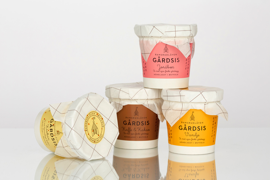
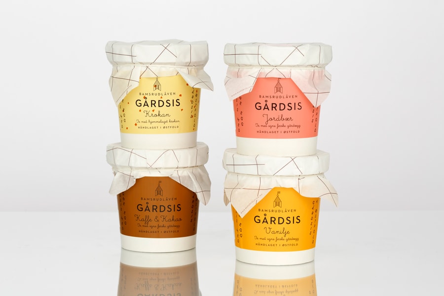
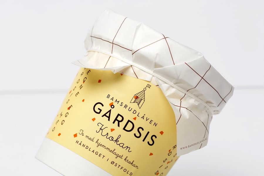
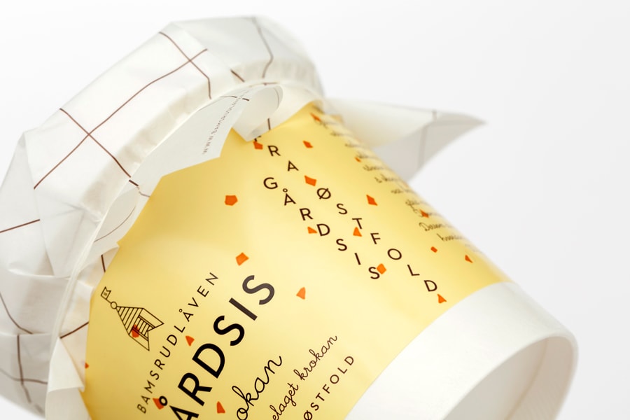
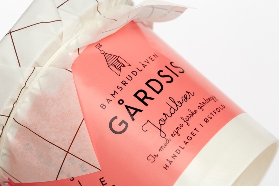
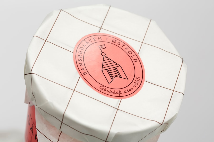
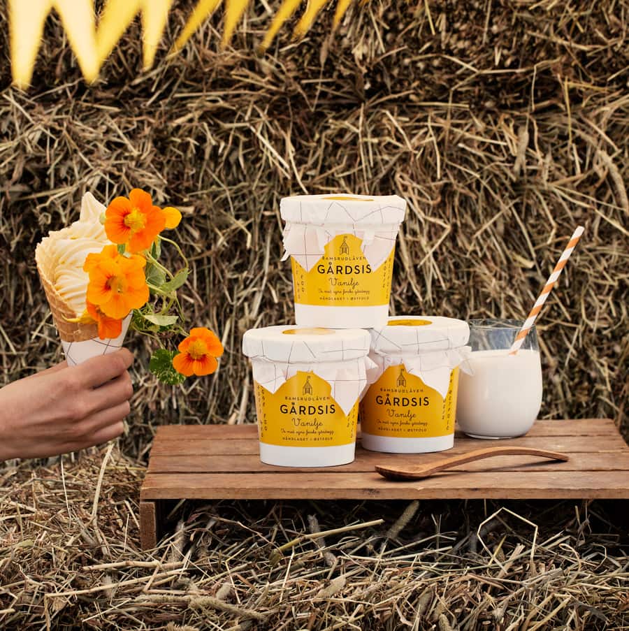
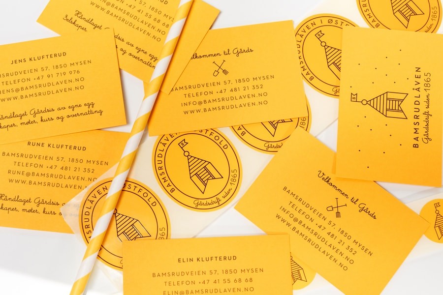
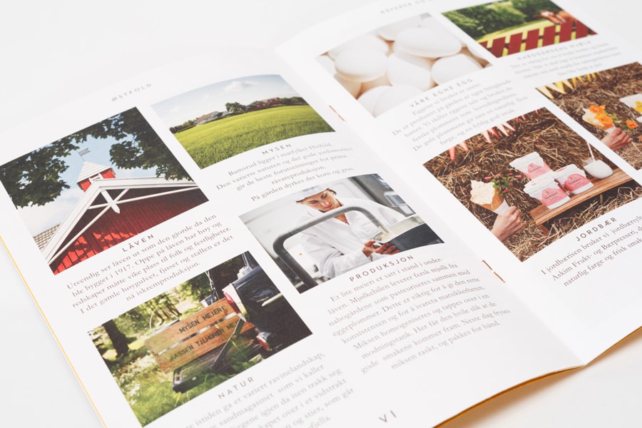
“Young farmers grown up on an egg farm east of Oslo in Norway decided to start an ice cream adventure. With eggs from their own hens, milk from the neighbour farm and local ingredients. With the ambition of creating a real, local and homemade ice cream, the charming story of the family is full of heritage, spontaneity and playfulness. They have been in the egg business since 1865. The logo is inspired by a detail from the farm, the bell tower, used during festivity and celebrationreflects the lavish nature of the ice cream.”
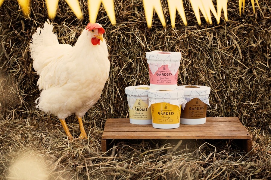
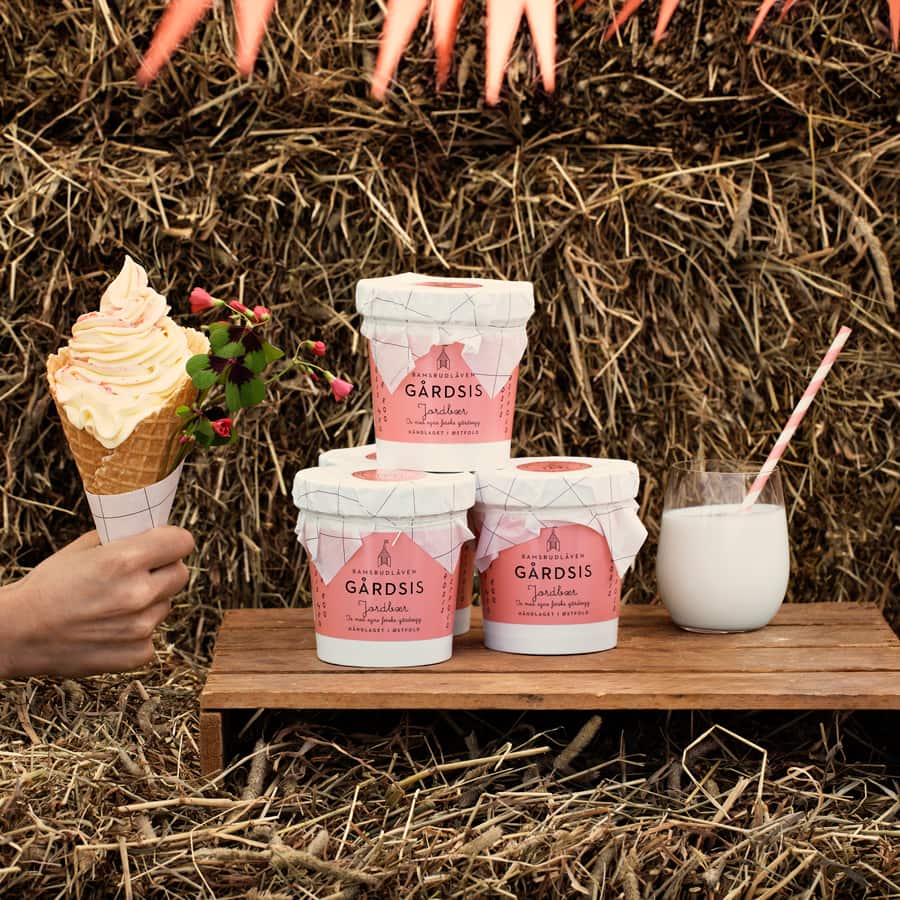
“The packaging uses a colour code to differentiate the taste allowing flexibility and efficiency to introduce more flavours, a label solution was selected because of the “small scale” production size and complemented with a hand applied paper seal. Bamsrudlåven Gårdsis won 1st price Dieline awards 2014 in Boston and Gold Pentaward 2014 in Tokyo. Photo: On location by Sigve Aspelund (TINAGENT), studio pictures by AJBstudio”
CREDIT
- Agency/Creative: Olssøn Barbieri
- Article Title: Olssøn Barbieri – Bamsrudlåven Gårdsis
- Project Type: Packaging
- Format: Pot
- Substrate: Plastic


