


Well-loved water brand Font Vella didn’t want to miss out on launching a Premium range, to appeal to consumers that were looking for something out of the ordinary and to keep up with evolving market trends. The brand turned to Morillas to design and position a striking range
that would delight existing customers and attract new ones with a product that reflects life’s most exceptional and exquisite moments. The challenge lay in creating a new bottle that would lift the brand’s positioning, through a truly disruptive design, which would stand out from other bottles in the category. To go beyond gaining presence within the range, and excel by speaking directly to consumers that are keen to break away from their everyday brand. Just as innovation was an indispensable requisite in this project, it was also vital to remain consistent and coherent with the brand essence.
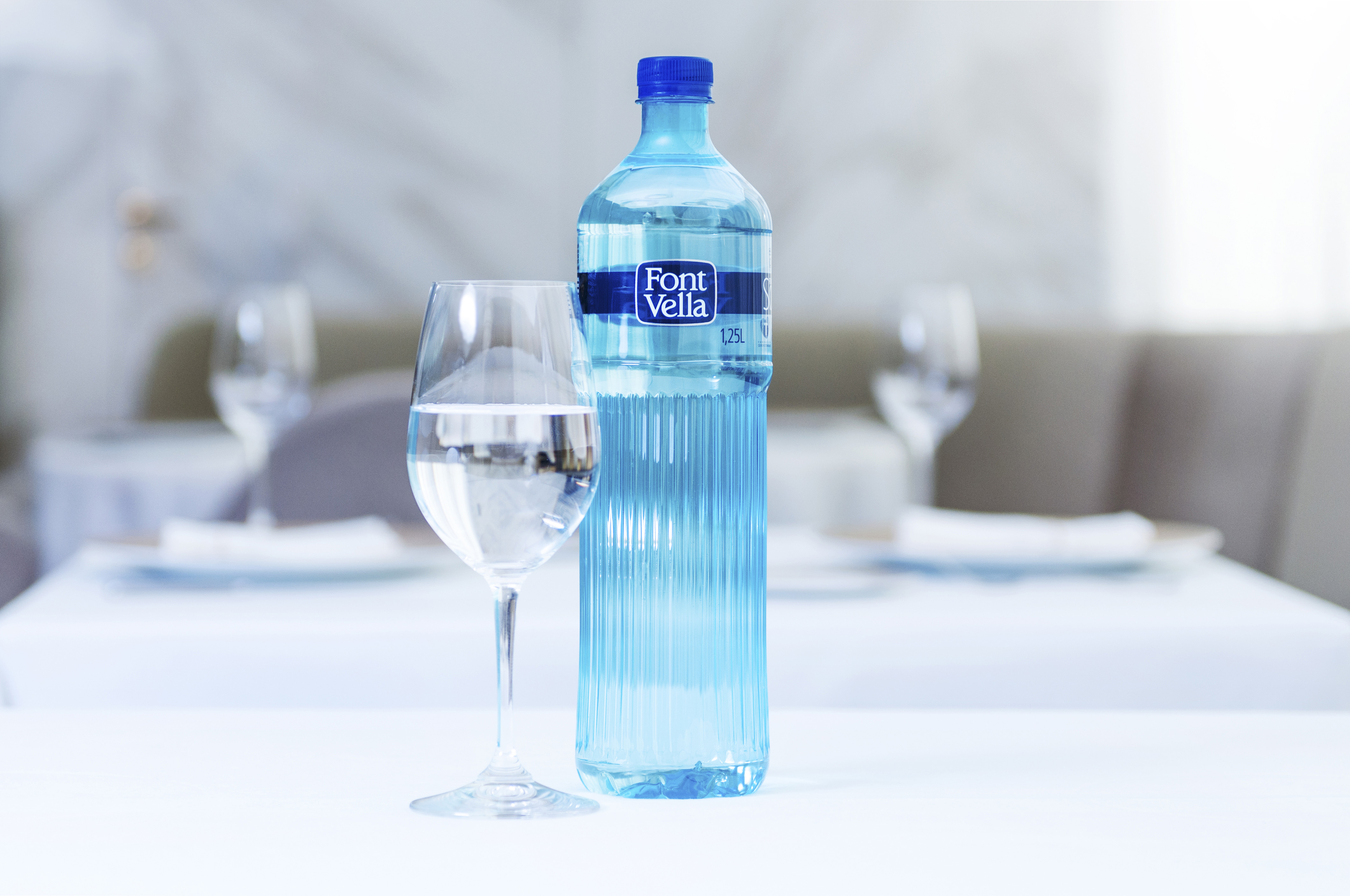
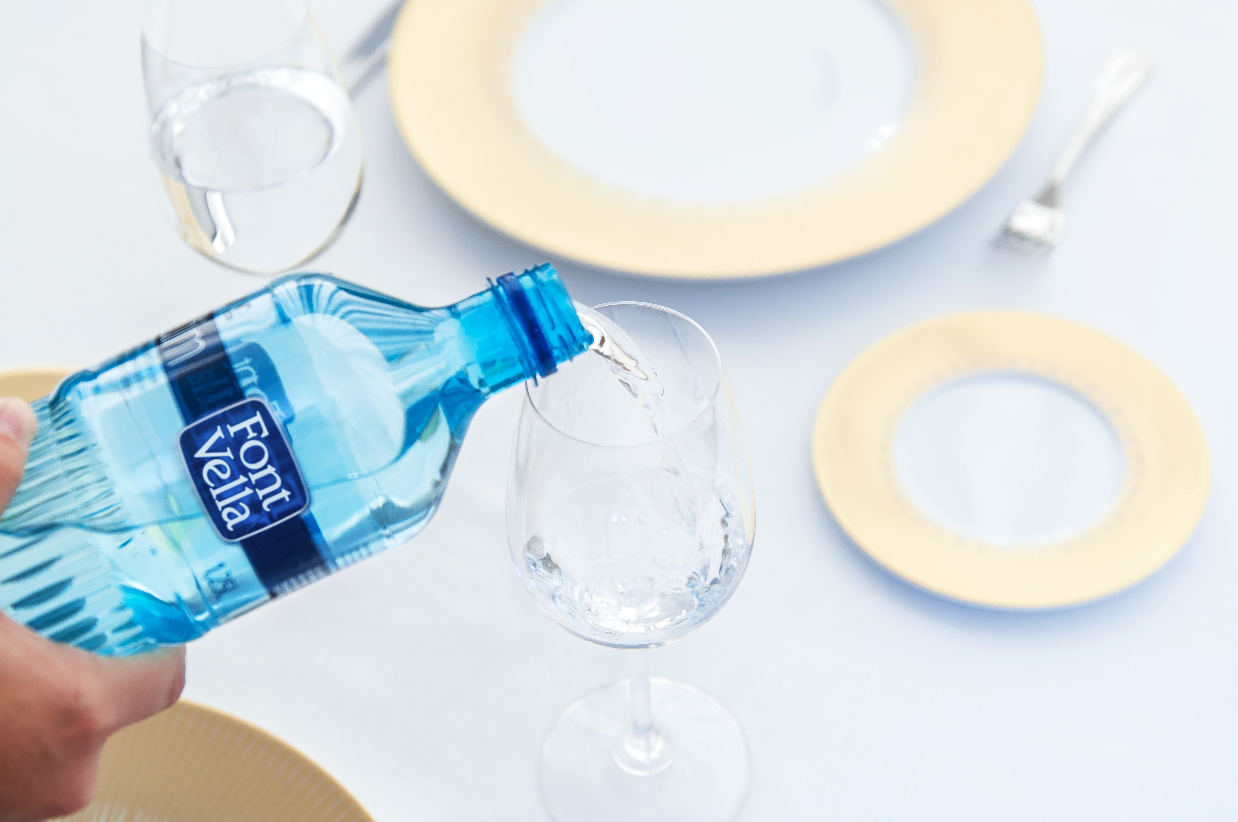
The solution was to return to Font Vella’s roots, to reveal the brand’s heritage, appealing to the purity of the natural springs from which the water comes. The new bottle had to be embedded in the brand’s history and reflect the Mediterranean personality and pureness that has always been in its soul. The design needed to capture the light and natural qualities of water and to evoke the deep Font Vella tradition.
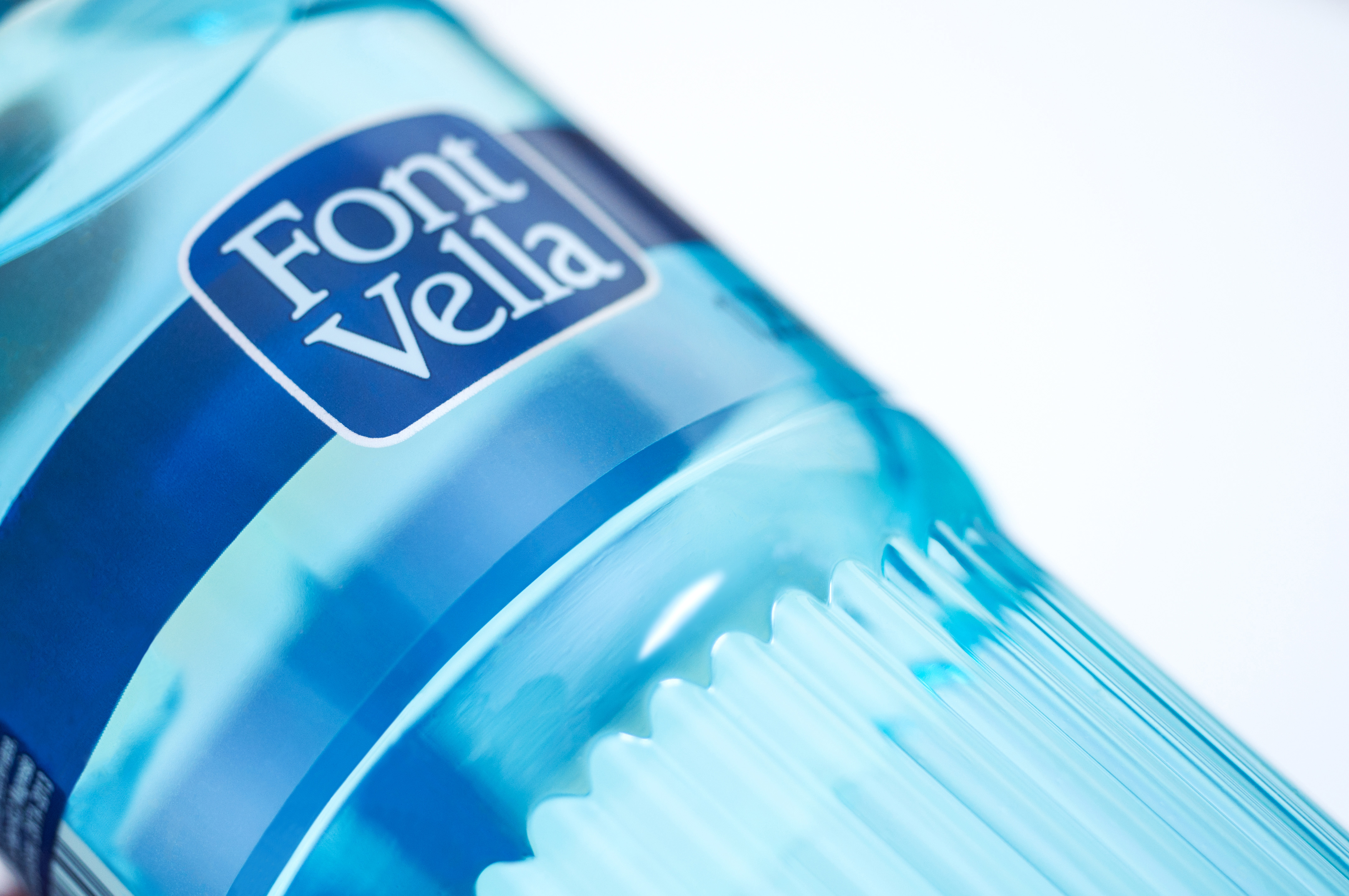
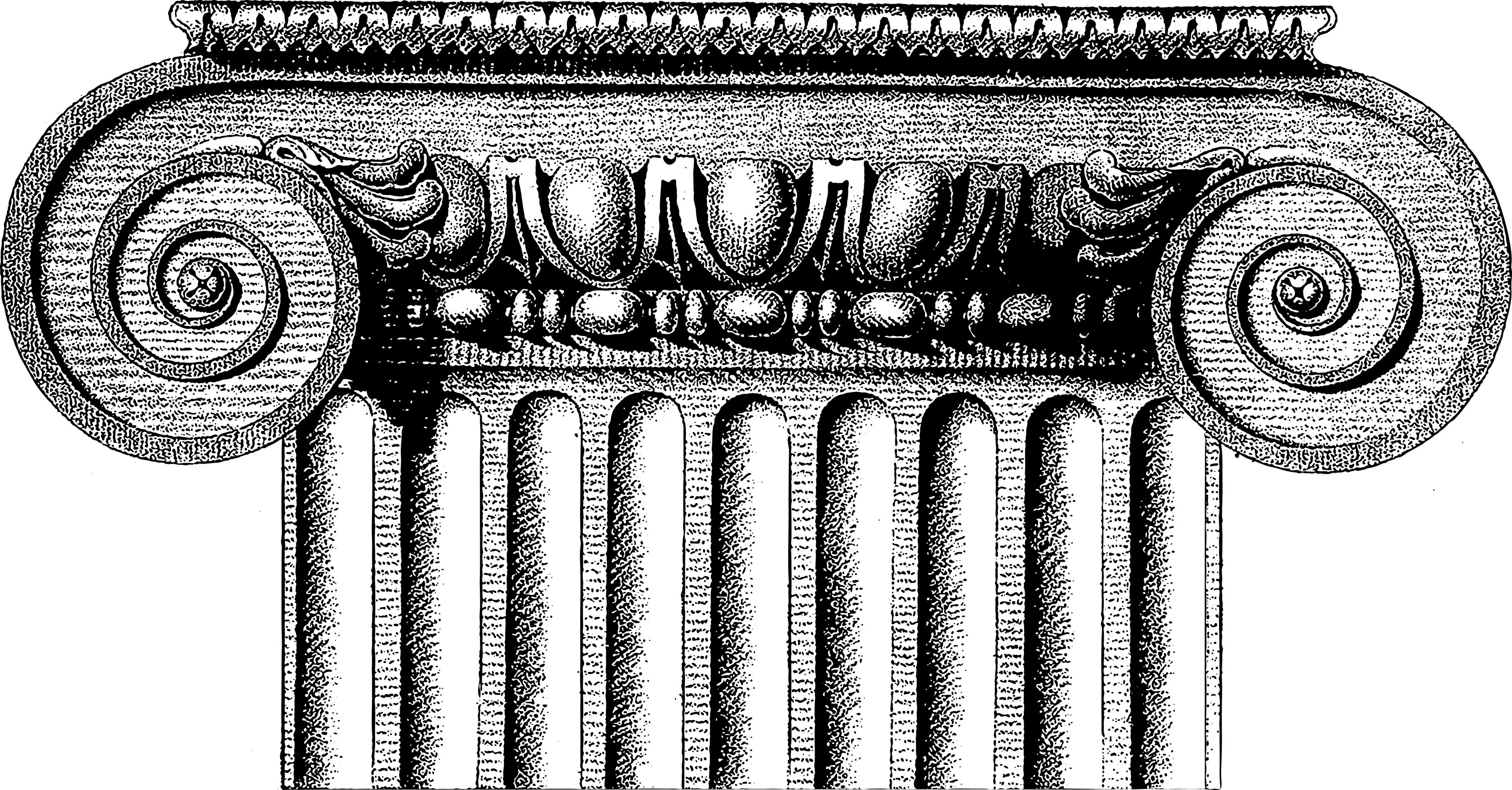
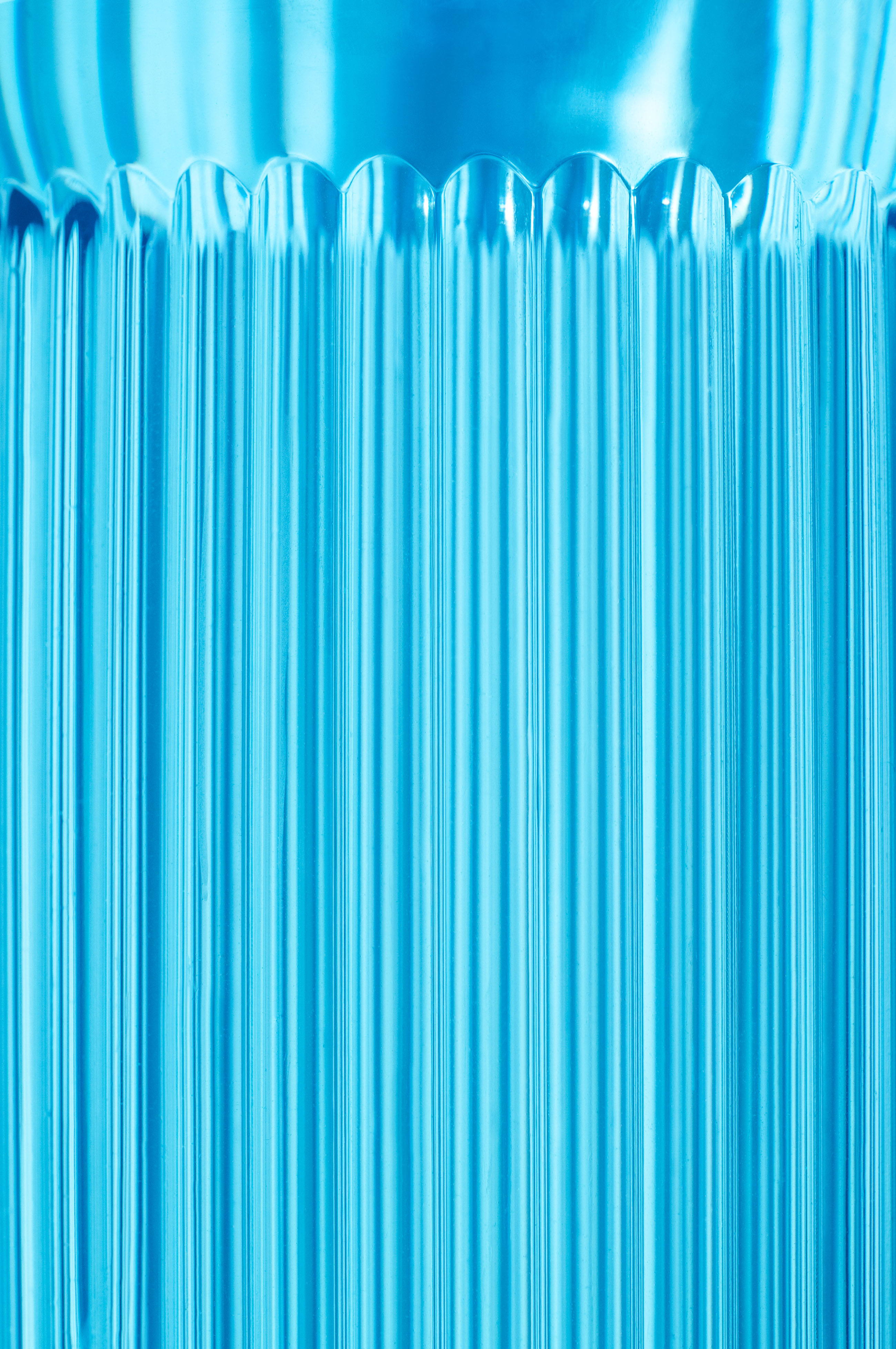
The challenge also lay in moving away from standards commonly used by the brand in recent years, in which the bottles depict the feminine figure. Taking a more conceptual path, we opted for a more minimalist and refined shape, with straight lines and softly rounded edges. Nature served as a source of inspiration to illustrate the purity of water. From this base, a bottle was designed that is striking for its unique texture, which conjures the movement of water cascading from a waterfall. The perception of the bottle was elevated through the reinterpretation of the classic elements, with a shape based on a greek column. A further distinctive element of this project is its original use of colour: a blue tone inspired by the clean water of the springs and spas that permits us to lift the bottle and the brand, placing it among the Premium options and making it stand out from its competitors.
The result is an authentic icon with utterly unique brand elements that are trickling into other Font Vella products and connecting them to its most Premium product.
CREDIT
- Agency/Creative: Morillas Branding Agency
- Article Title: Nothing Less than Font Vella Brand Water Designed by Morillas Branding Agency
- Organisation/Entity: Agency, Published Commercial Design
- Project Type: Packaging
- Agency/Creative Country: Spain
- Market Region: Global
- Project Deliverables: Brand Creation, Graphic Design, Industrial Design, Packaging Design, Photography, Research
- Format: Bottle, Flow-Pack, Sleeve
- Substrate: Plastic


