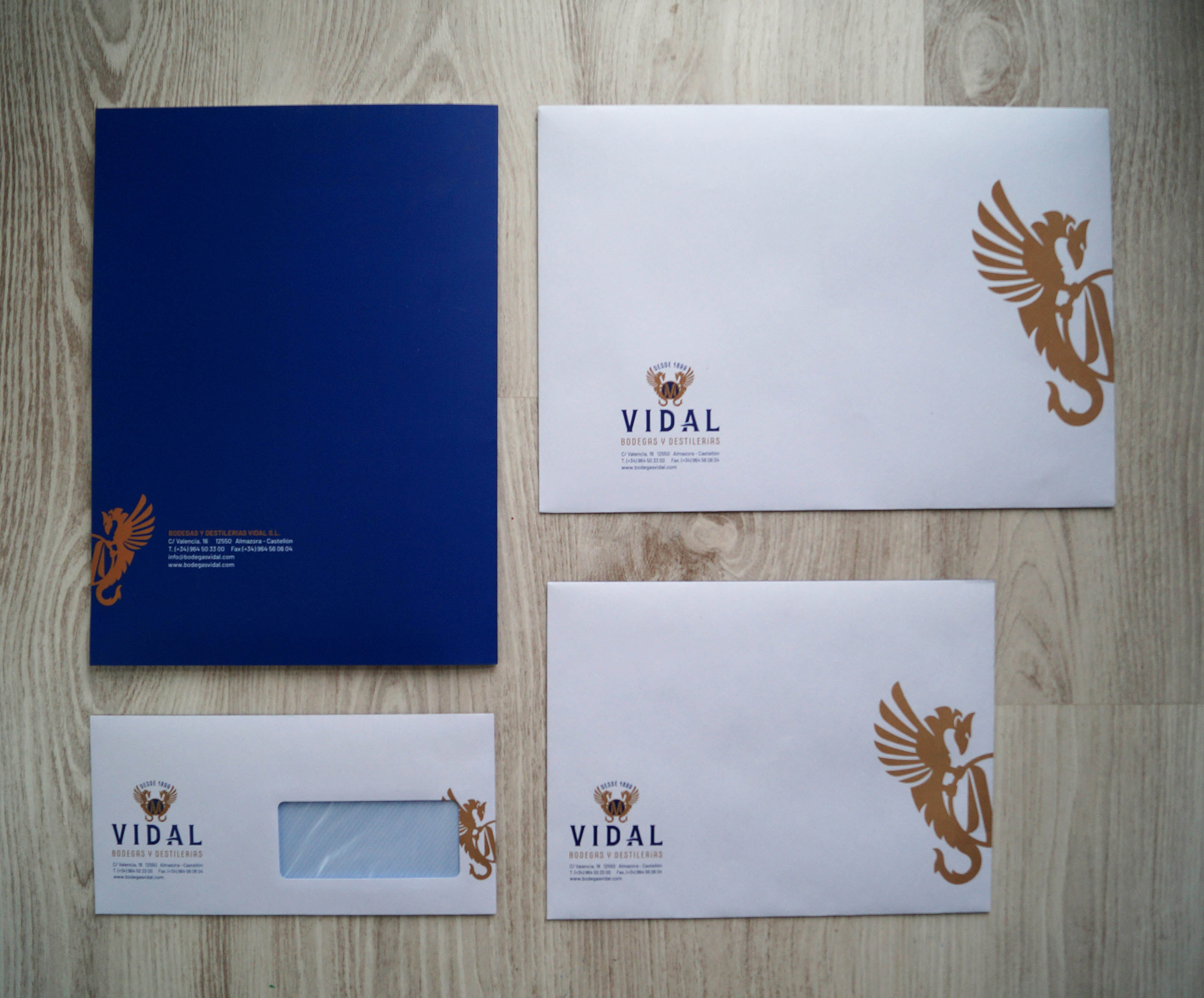
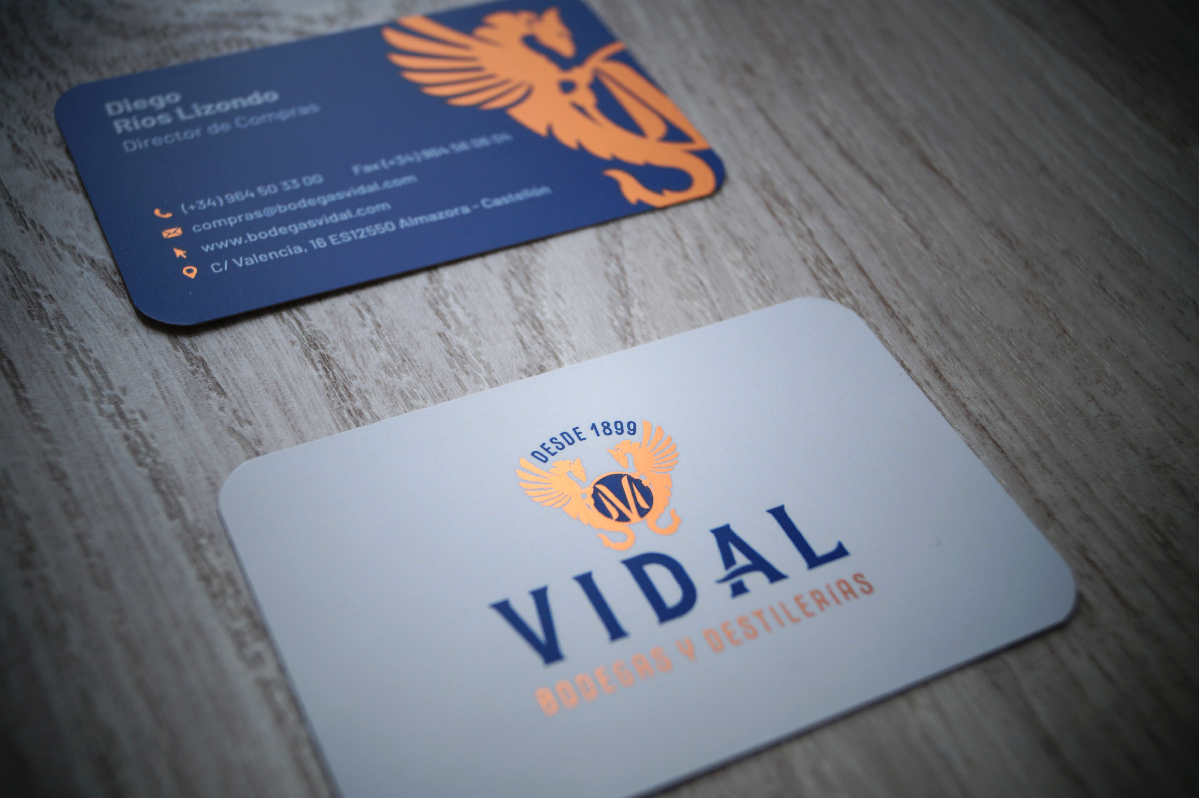
Vidal is a family business focused on the wine and spirits sector since several generations and located in Castellón (Spanish Mediterranean coast).
For a long time the brand had a neglected and not consolidated brand graphic image. For instance they had two different versions of the same logo being used at the same time, and no brand colors or types defined.
Basing on the historical files, and after a deep study of the several applications of the image, I chose and kept the most essential elements of the indentity to build new shapes.
Some of the main points of this work:
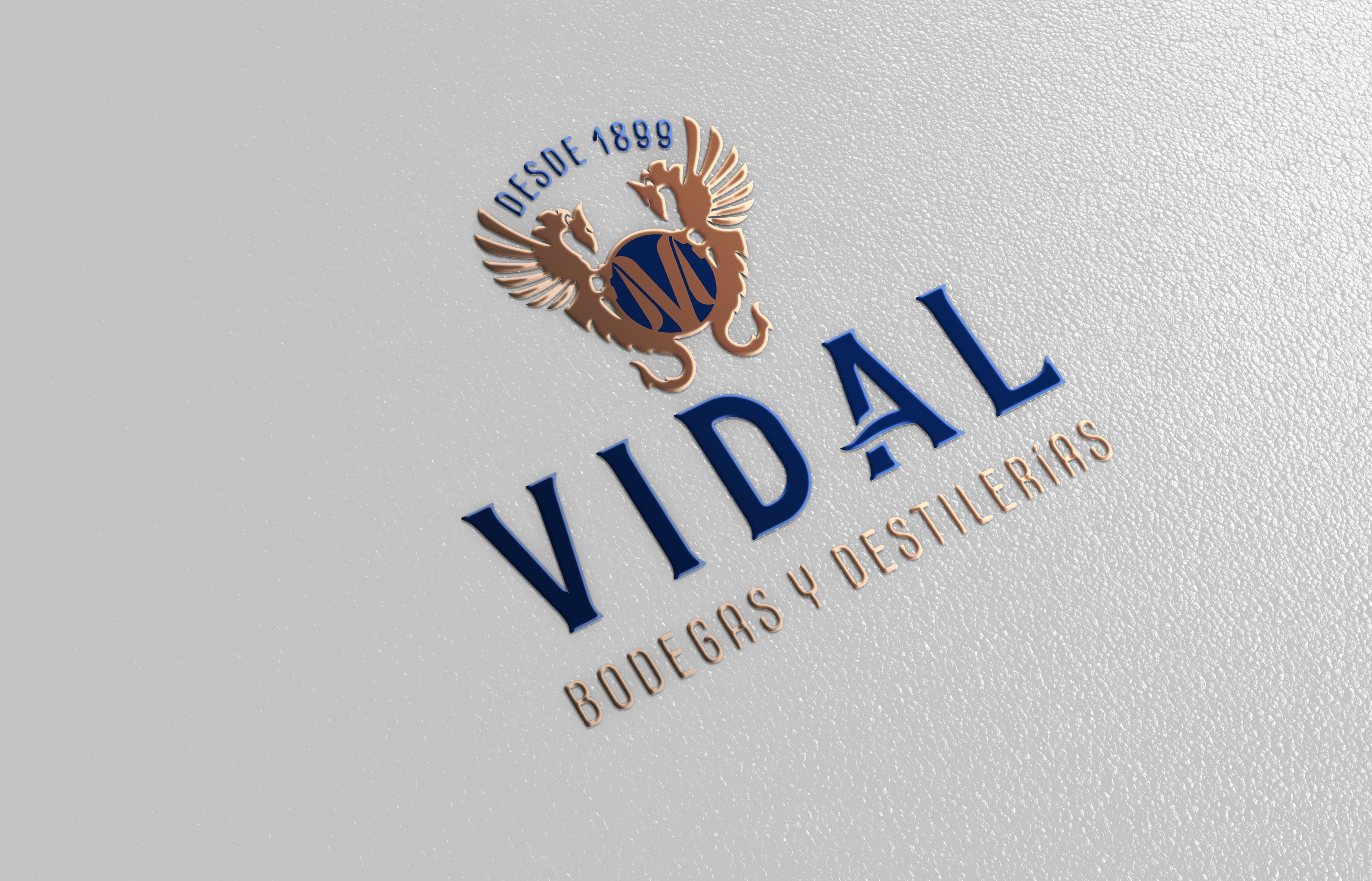
· To keep and improve the image of the dragons: Heraldic elements that in Spain have some evocation of Mediterranean locations (because of the helmet of Jaume I the Conqueror). And abroad may evoke Spanish heraldic symbols and some values as: conquest, strength, resolution, nobility, tradition, generational business…
· To keep the year of foundation: This is a family business passing their values from generation to generation. It denotes confidence and knowledge.
· Logo: I used a bold classic looking type that inspires certain discipline and tradition. It has been customized, making the shape of “D” more rounded, and giving to the “A” more dynamism to inspire liquid products. The logo is designed to be used alone without the rest of elements of the brand, in order to be adapted into several product labels.
· Keeping the relation with a certain business sector: The surname Vidal appears in other different business with no relation with this family. Using “Bodegas y Destilerías” (Cellars and Distilleries) in a way well integrated with the brand we avoid misunderstandings.
· Choosing corporate colors: It is not easy to find a color palette that fits the liking of the customer and at the same time haves not only the right inks but also a right stamping foil color to use it depending on the surface or work. Also the combination is a link to the soil and the sea.
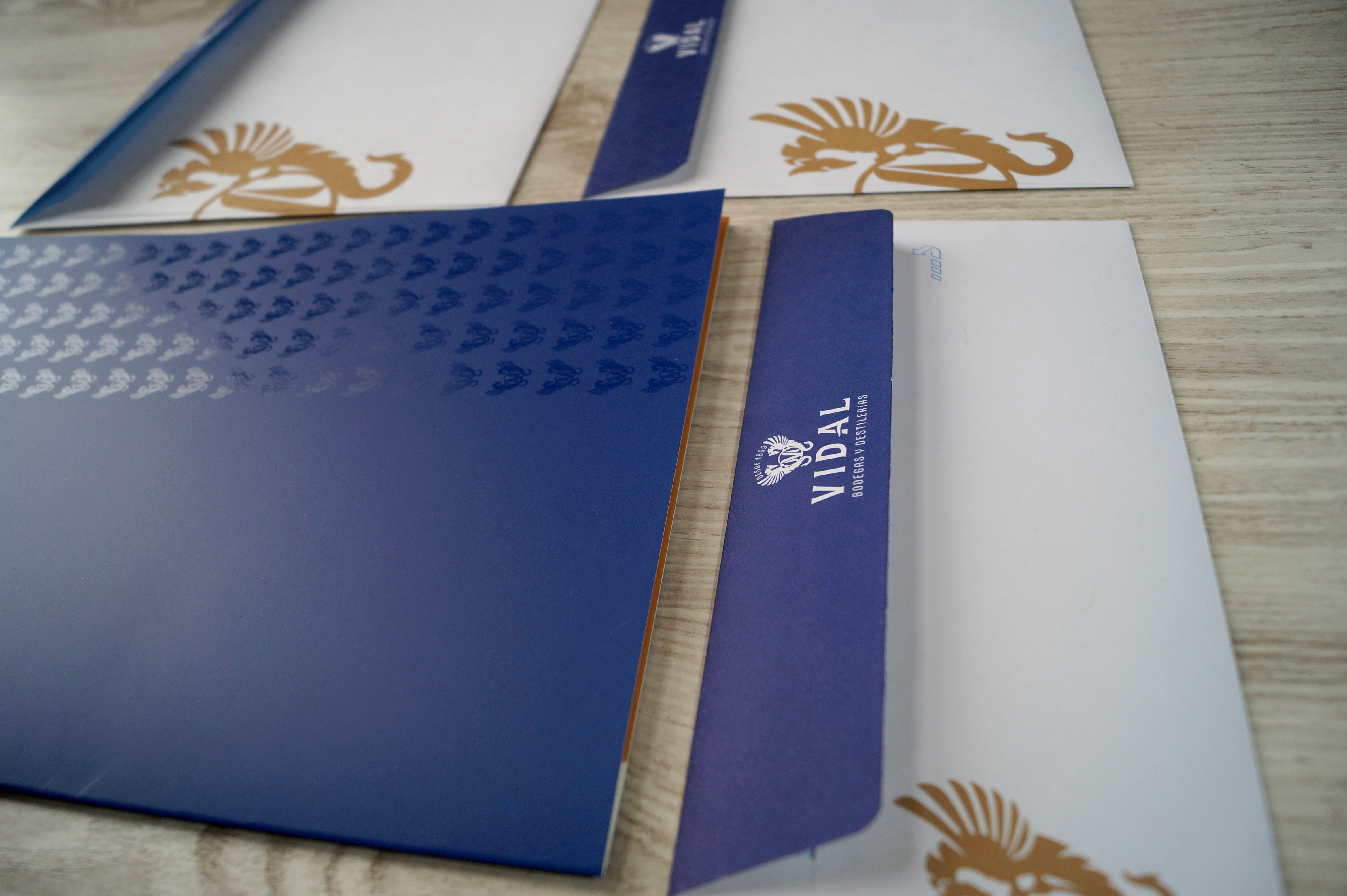
· Do the several adaptations into all kind of the company’s needs and uses, solving all the possible fitting problems.
After a long time of work trying, styling shapes, sending drafts, getting feedbacks, and most of all making a good team with the customer, we got an elegant, clean and timeless image, that it is more a significant evolution than a revolution, keeping the essence and values of the company.


CREDIT
- Agency/Creative: Magic Mirror Design
- Article Title: New Corporate Image for Bodegas y Destilerías Vidal
- Organisation/Entity: Freelance, Published Commercial Design
- Project Type: Identity
- Agency/Creative Country: Spain
- Market Region: Europe
- Project Deliverables: Brand Architecture, Brand Creation, Brand Guidelines, Brand Identity, Brand Redesign, Brand Refinement, Brand Rejuvenation, Brand World, Branding, Graphic Design, Illustration, Rebranding, Research, Structural Design
- Industry: Food/Beverage
- Keywords: brand, branding, diseñografico, imagencorporativa, logo, marca, papelería, vinosylicores, wine&spirits, corporate stationery


