


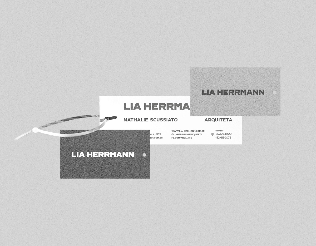
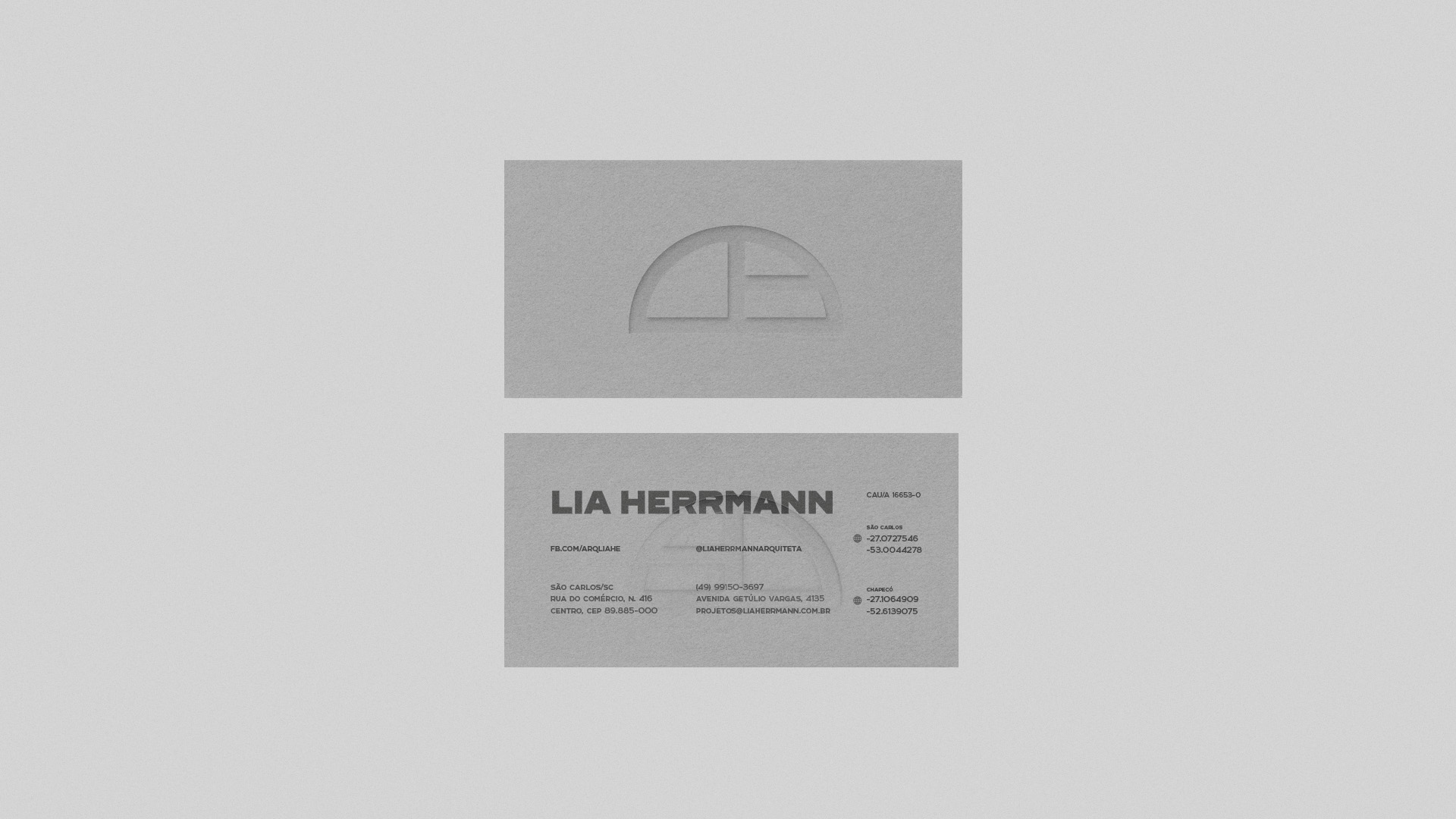
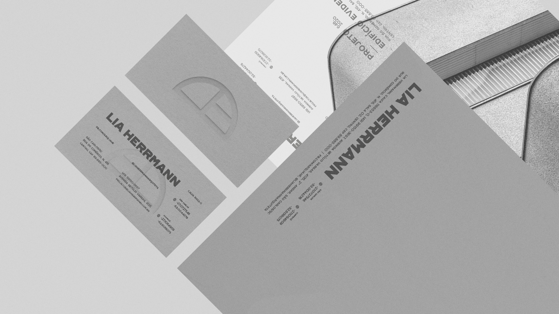
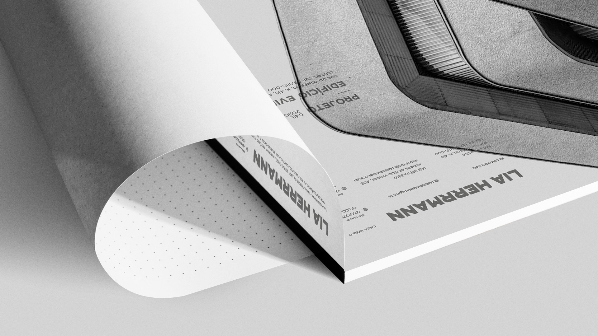
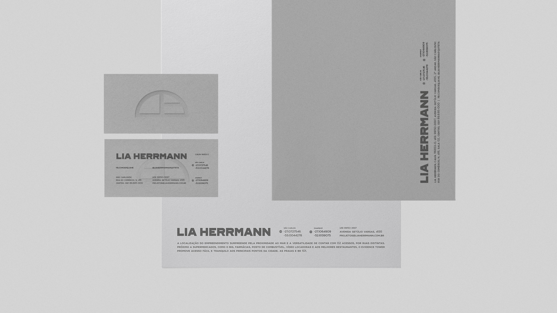
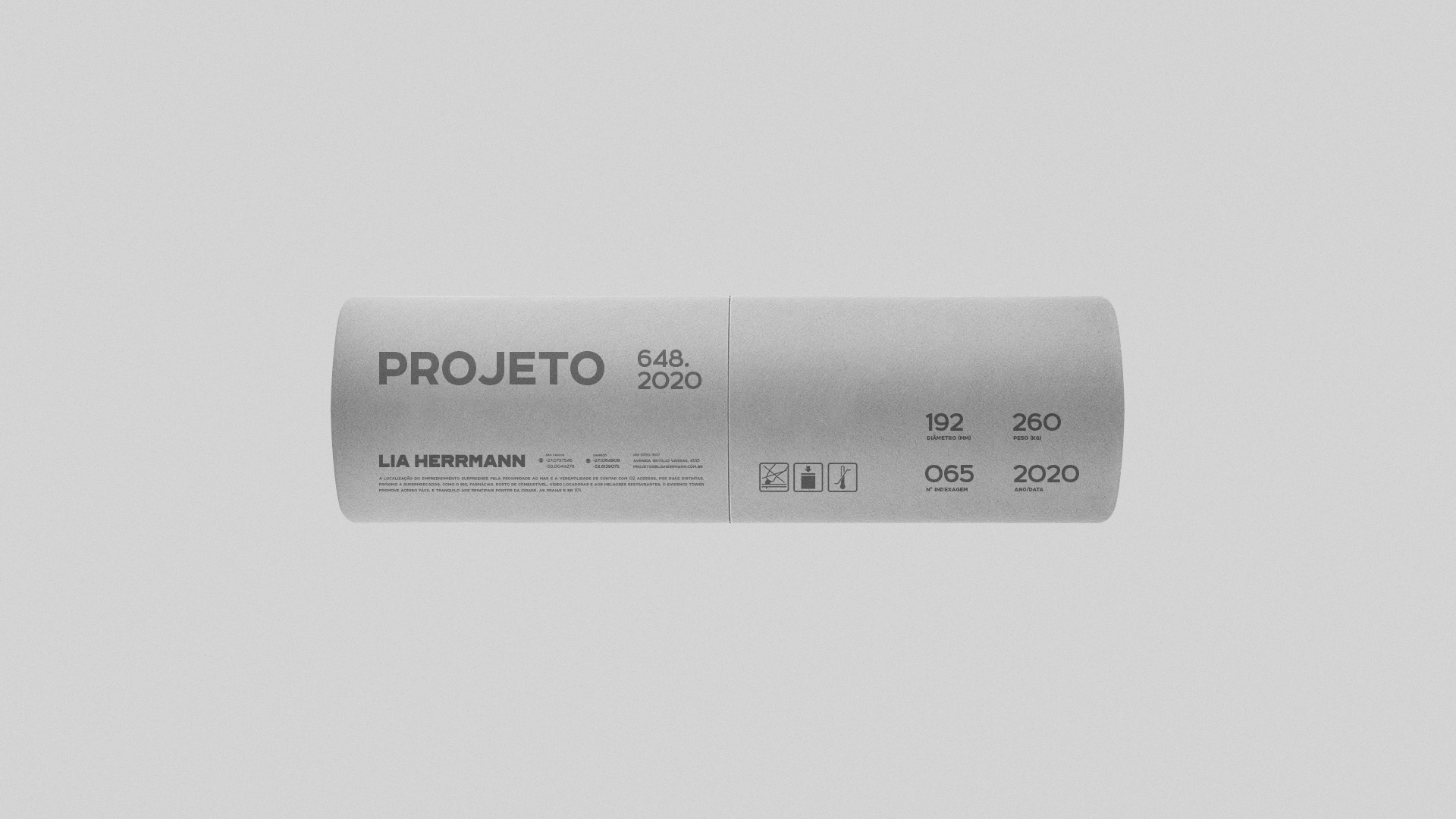
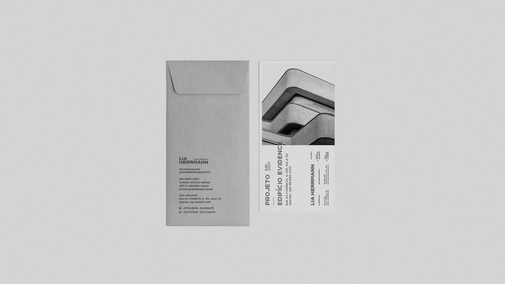
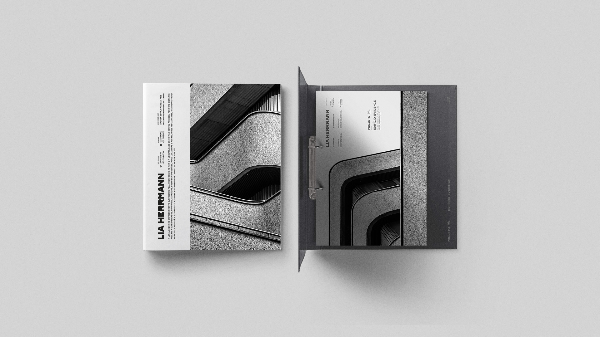
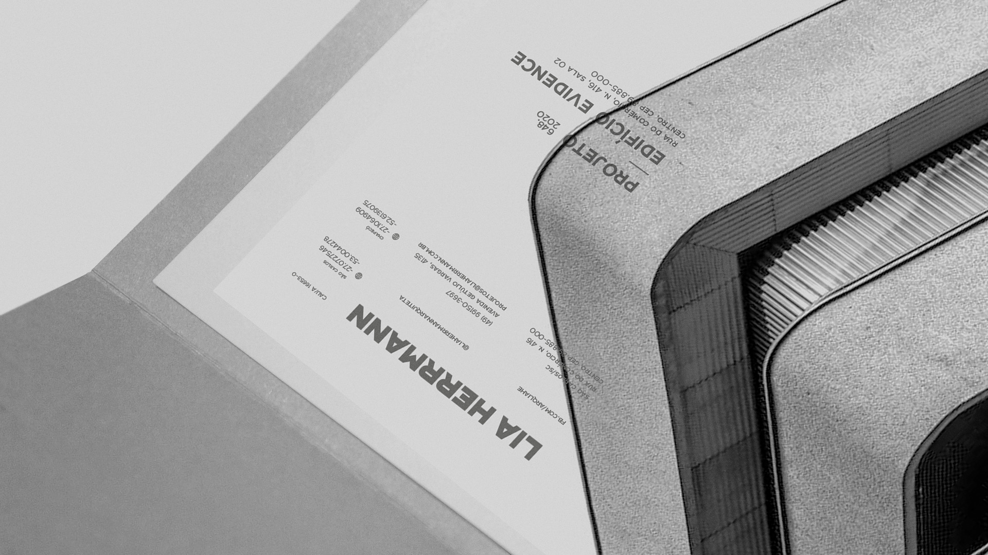
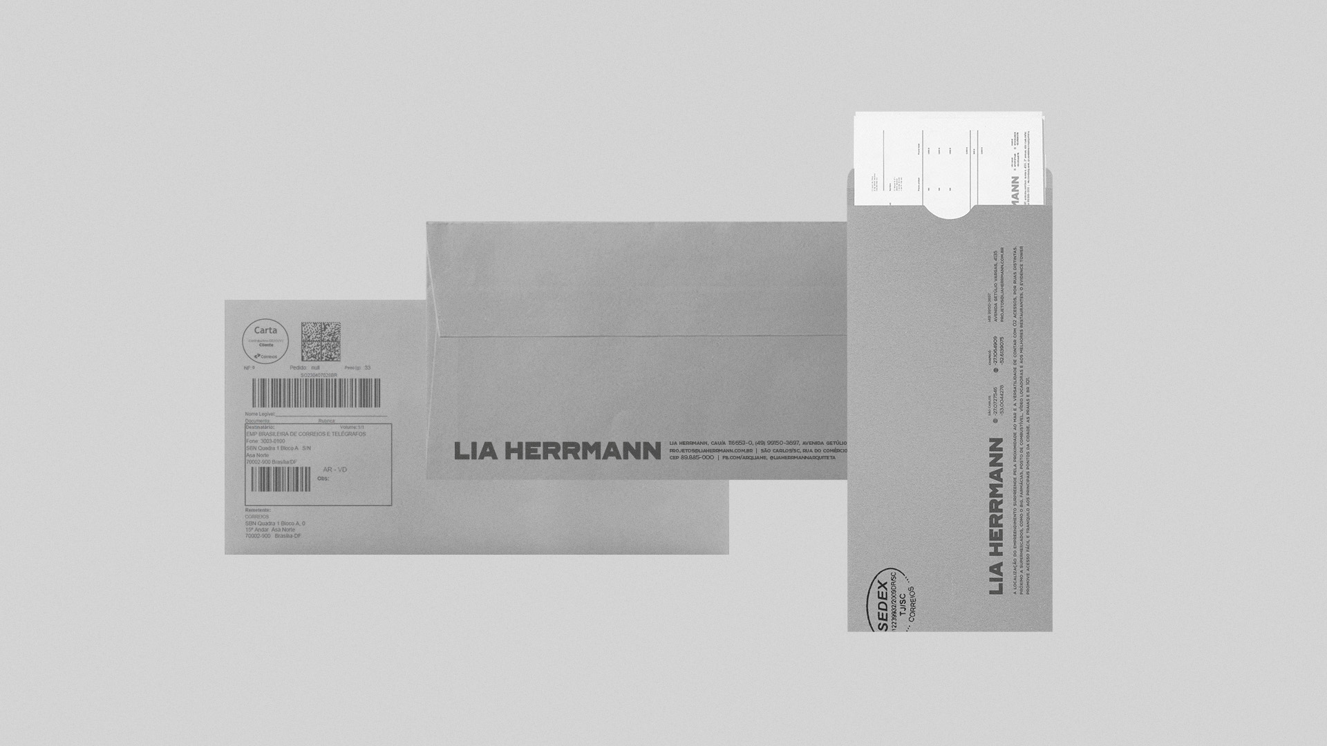
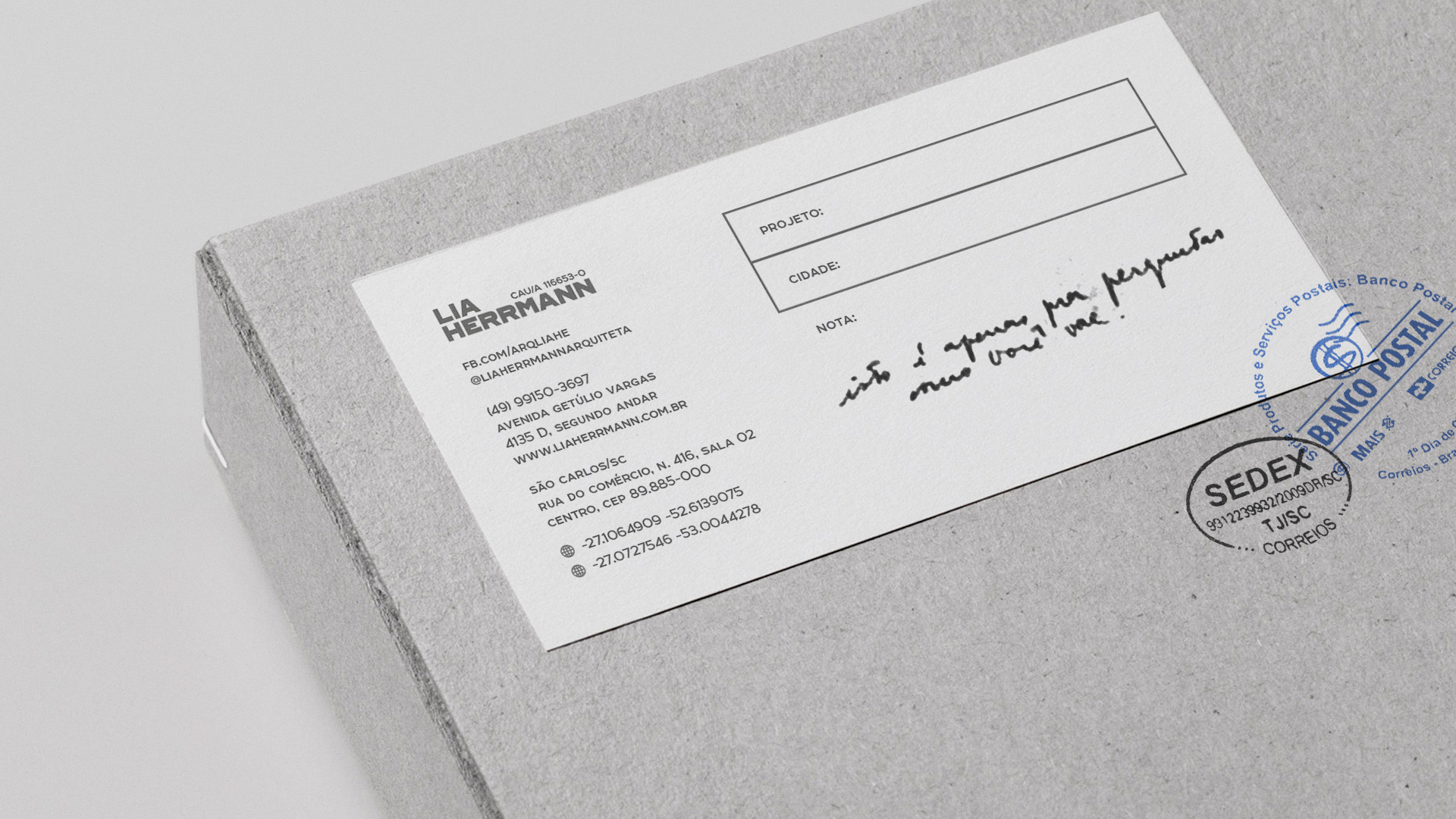
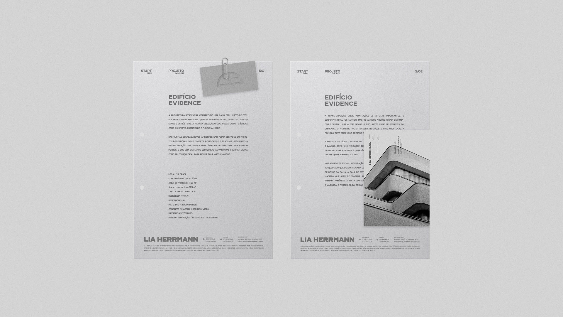
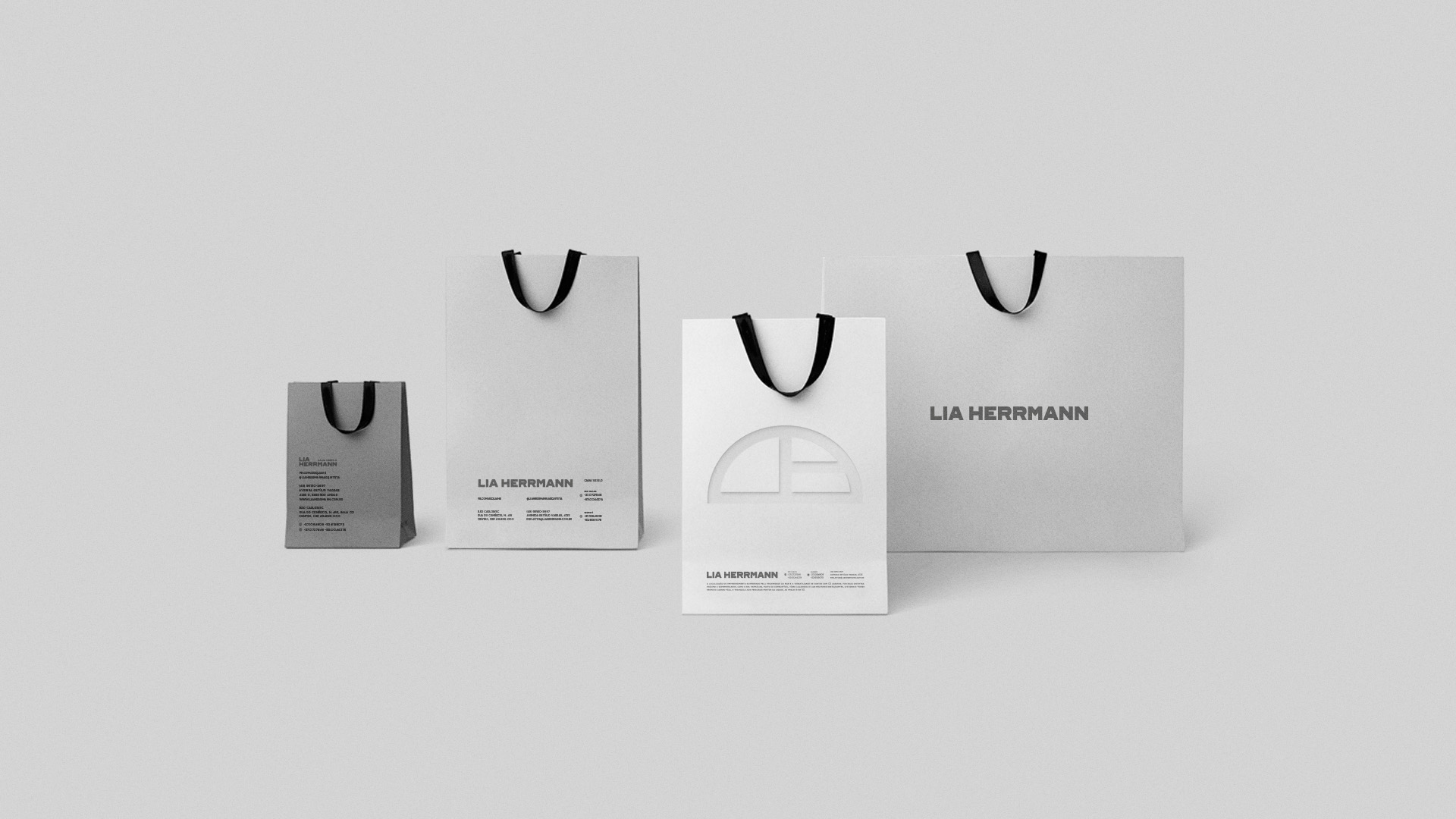
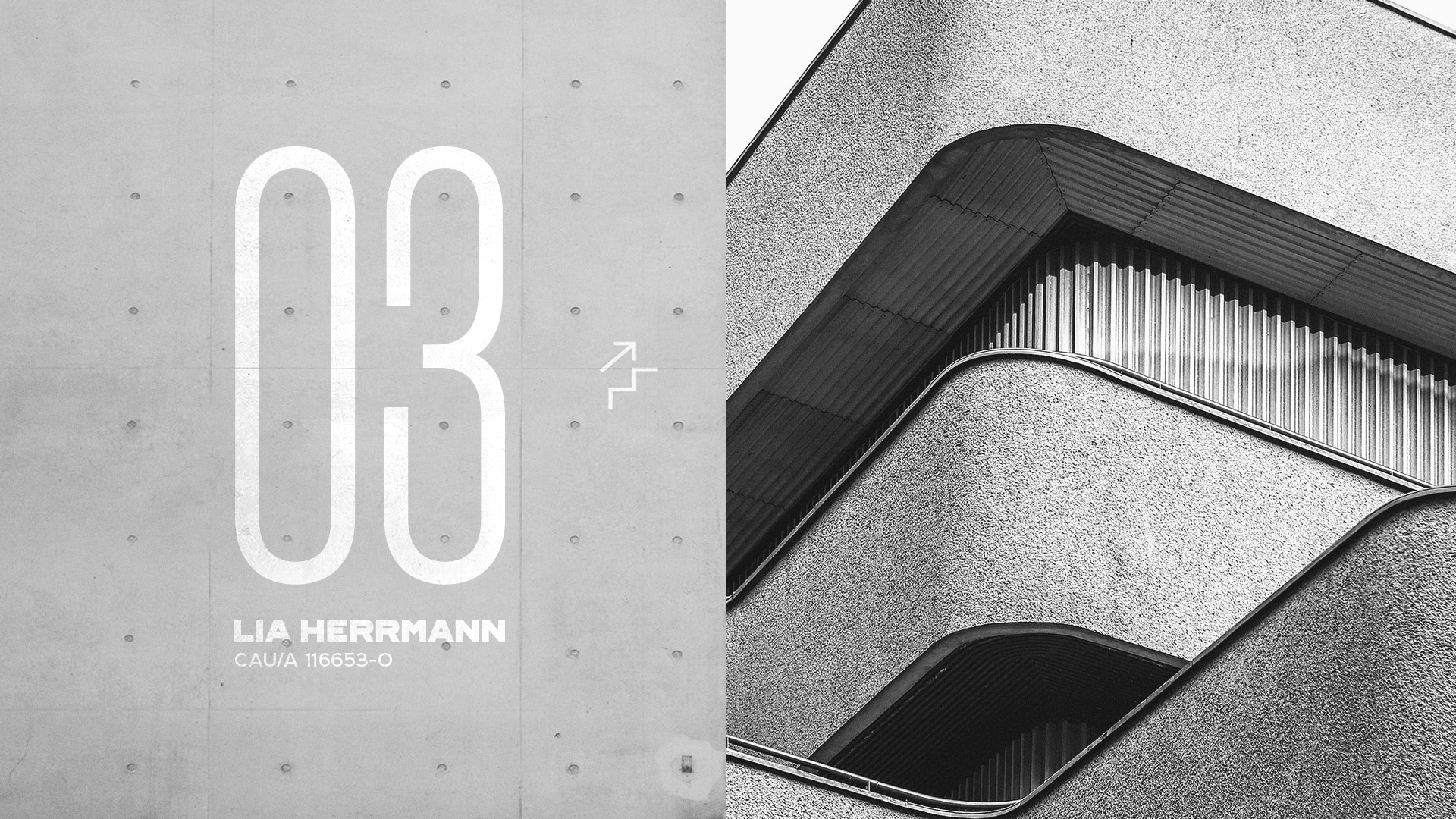
Lia Herrmann Arquitetura is an architecture office located in Chapecó/SC Brazil. For the redesign of the brand, the characteristics of the company’s DNA were analyzed: Empathic, Passionate, Bold, Warrior and Detailed. The symbol was developed to obtain a double meaning, the shape of a roof being the main one and for its lines to create the letters “LIA”. The definition of the color palette in shades of gray was made thinking of a minimalist and harmonic style, in addition to being connected to the trend used in the segment.


CREDIT
- Agency/Creative: Neo/Saga
- Article Title: New Branding Identity for Lia Herrmann by Neo/Saga
- Organisation/Entity: Agency, Published Commercial Design
- Project Type: Identity
- Agency/Creative Country: Brazil
- Market Region: South America
- Project Deliverables: Brand Creation, Brand Identity, Brand Redesign, Brand Strategy, Branding, Rebranding
- Industry: Construction
- Keywords: architecture, acrchitect, minimalism, monocolor
FEEDBACK
Relevance: Solution/idea in relation to brand, product or service
Implementation: Attention, detailing and finishing of final solution
Presentation: Text, visualisation and quality of the presentation


