


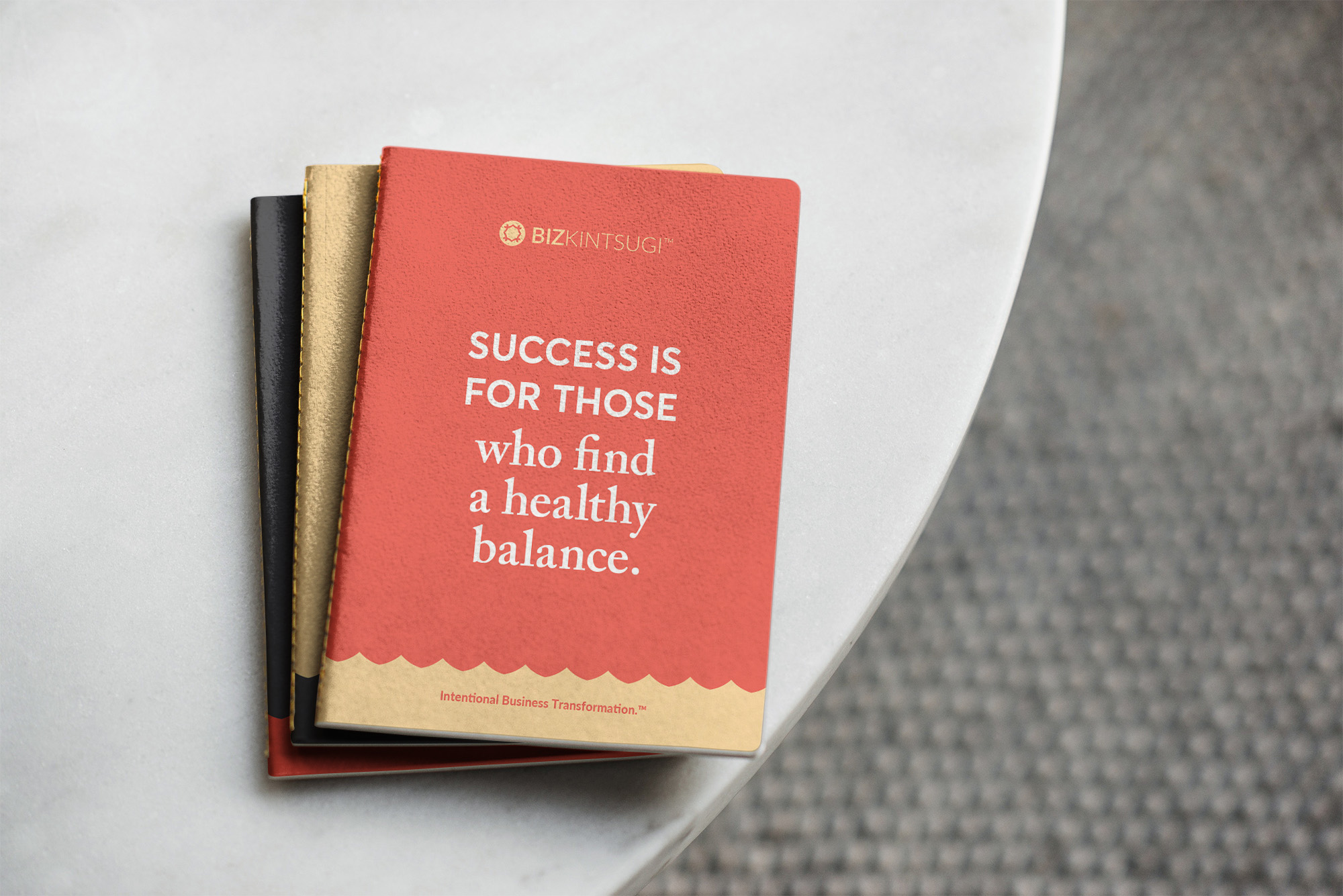
Kintsugi: “the Japanese art of repairing broken pottery with powdered gold, silver, or platinum.” This is the vision that business coach Deirdre Baker had when describing her brand. She works directly with female business owners who are overwhelmed with their business and helps them establish a better mindset and approach. Deirdre’s goal is to mend the broken structure of her clients’ company and turn it into something beautiful, efficient, and sustainable. The visual identity of her own company needed to support this mission, and she turned to Creative Chameleon Studio to help.
In the branding consultation call, it became clear that the best approach was a minimal, strong icon that married the idea of kintsugi and what Deirdre was promising her clients. After exploring a variety of different icons, one idea emerged as the clear winner for both its visual strength and layered meaning.
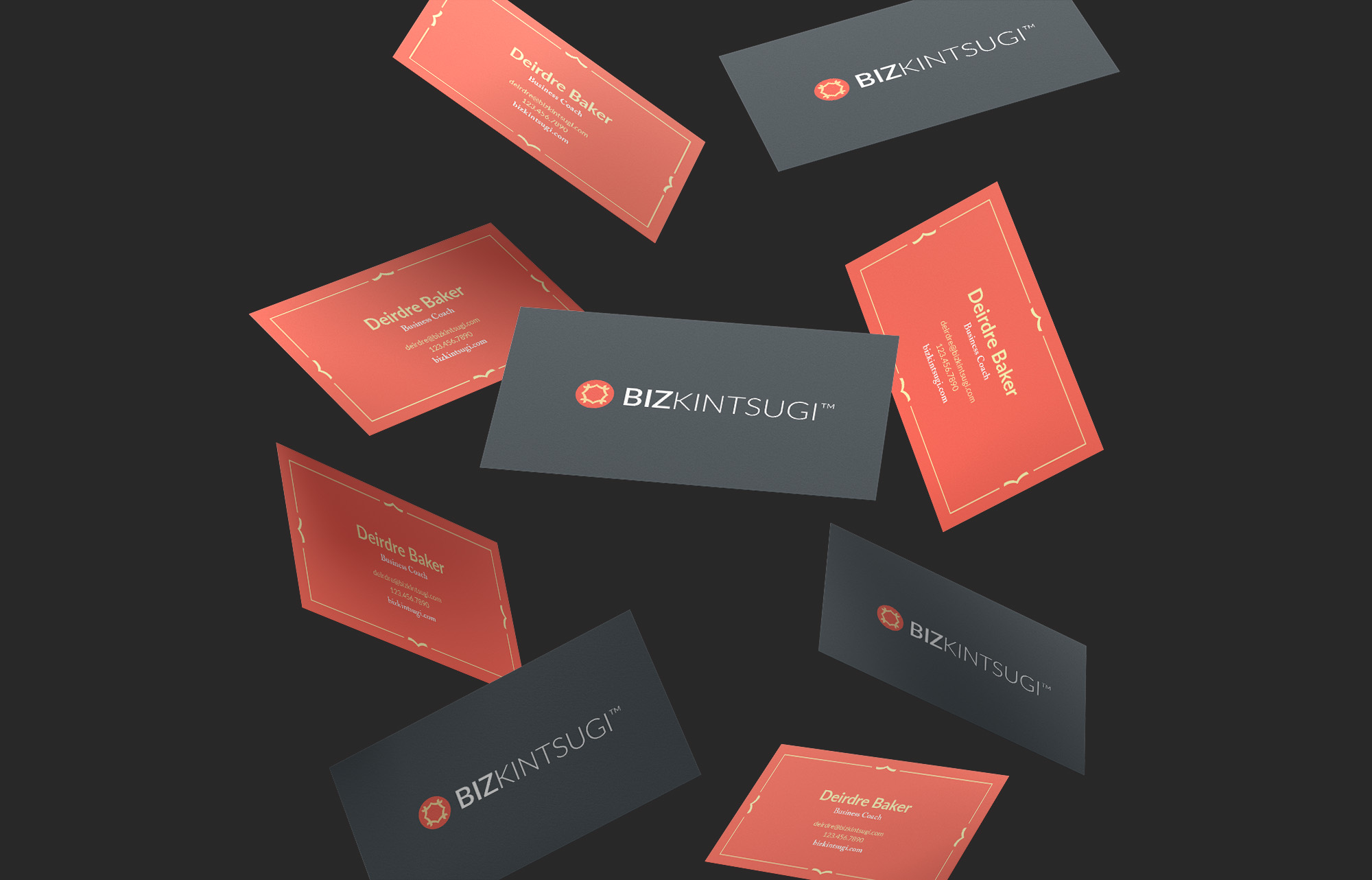
The four arrows represent a compass and the way that BizKintsugi helps clients navigate the journey of entrepreneurship. The lines come together to represents four individual pieces being joined to form a solid image, alluding to BizKintsugi helping clients build a better business, no matter their past failures or struggles. The outer circle holds the pieces together, representing the longevity of the tools clients will receive as they form practices for a sustainable balance.
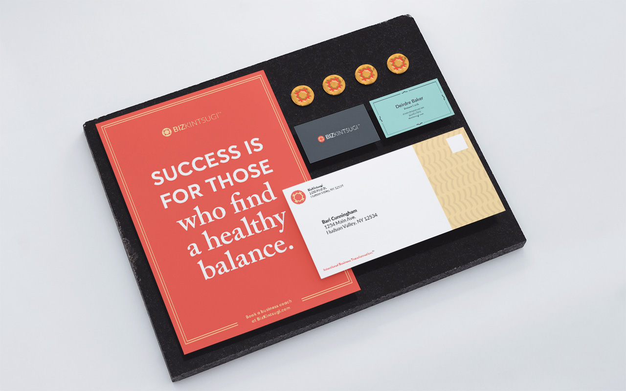
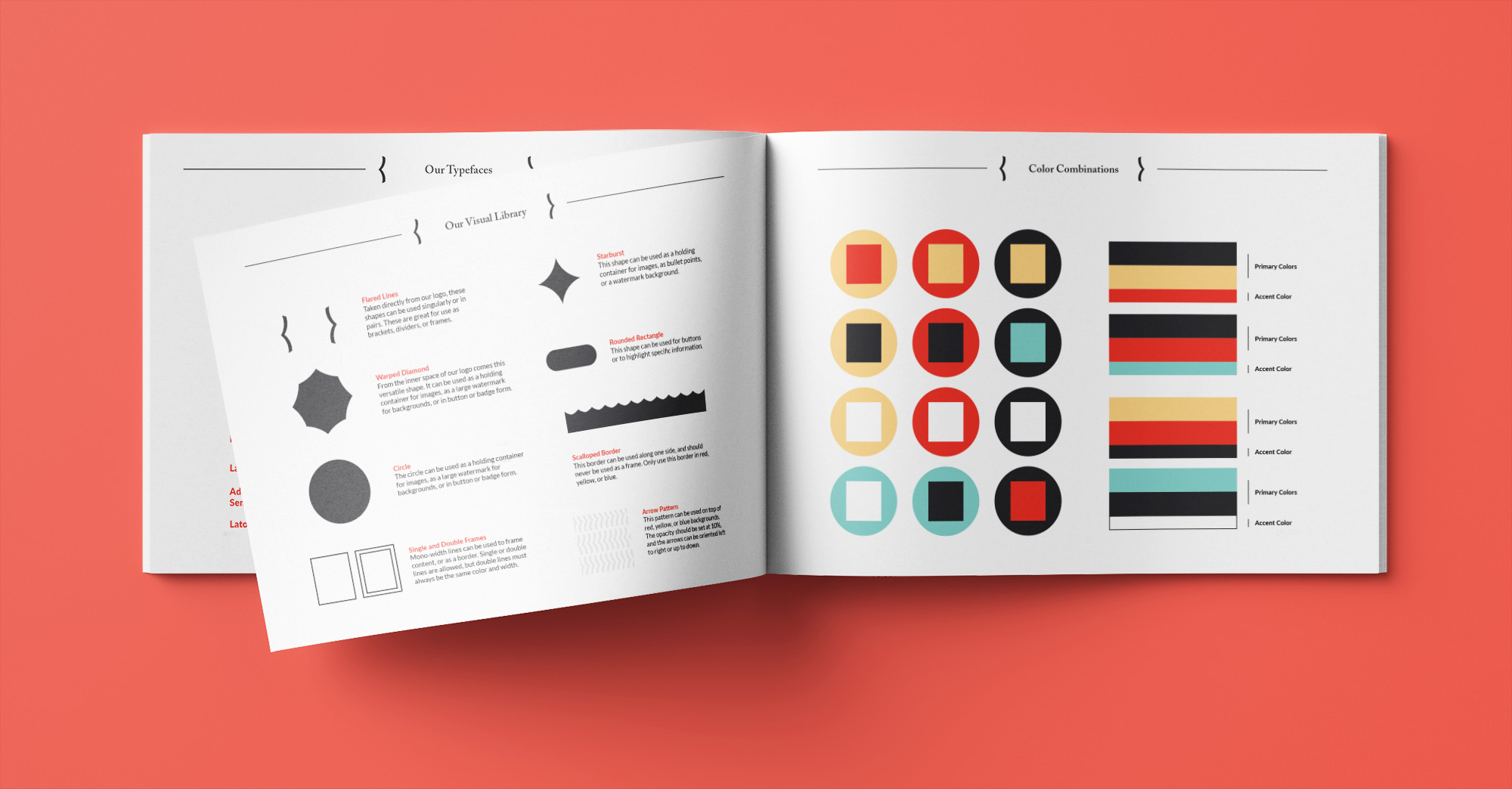
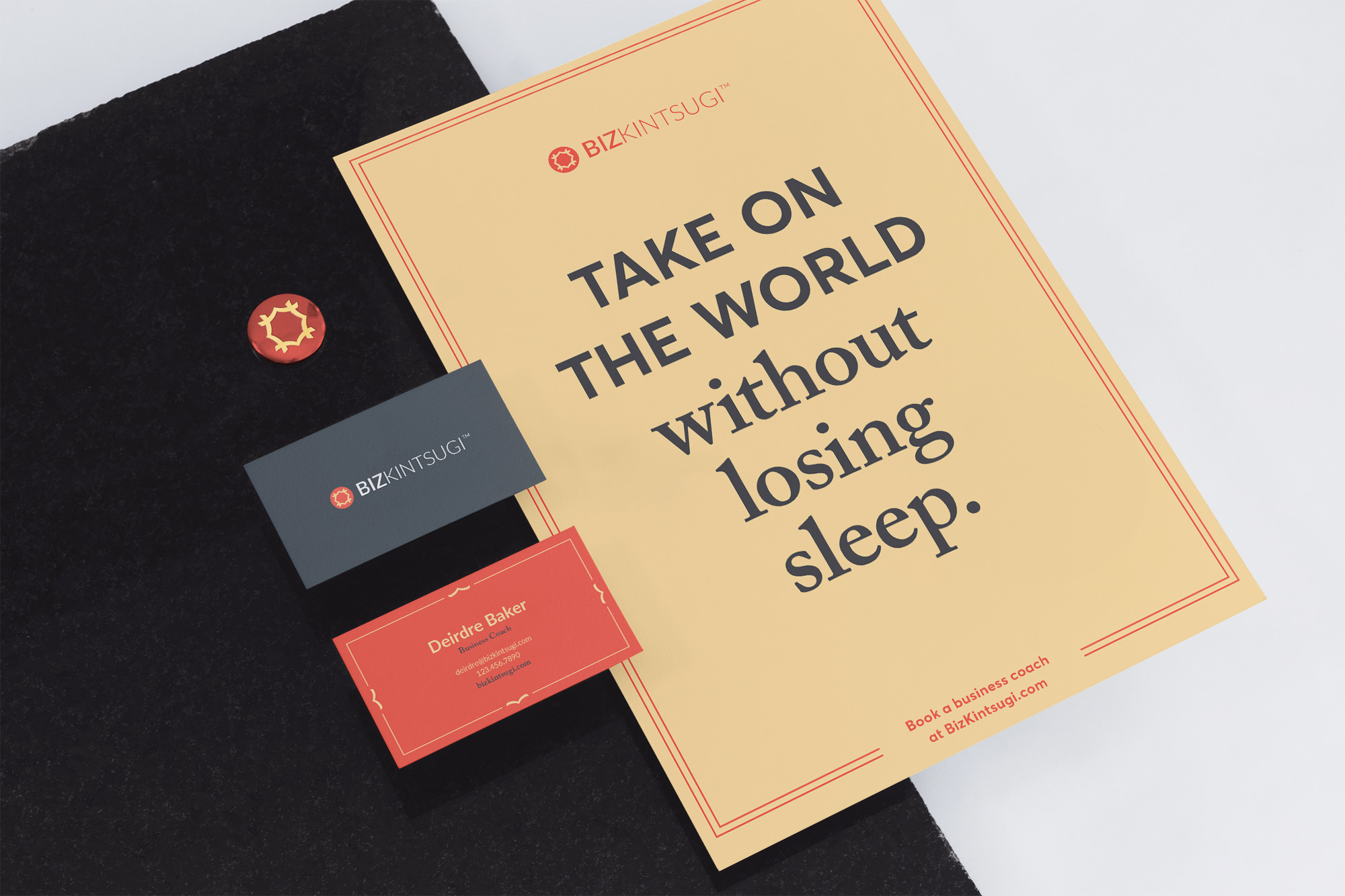
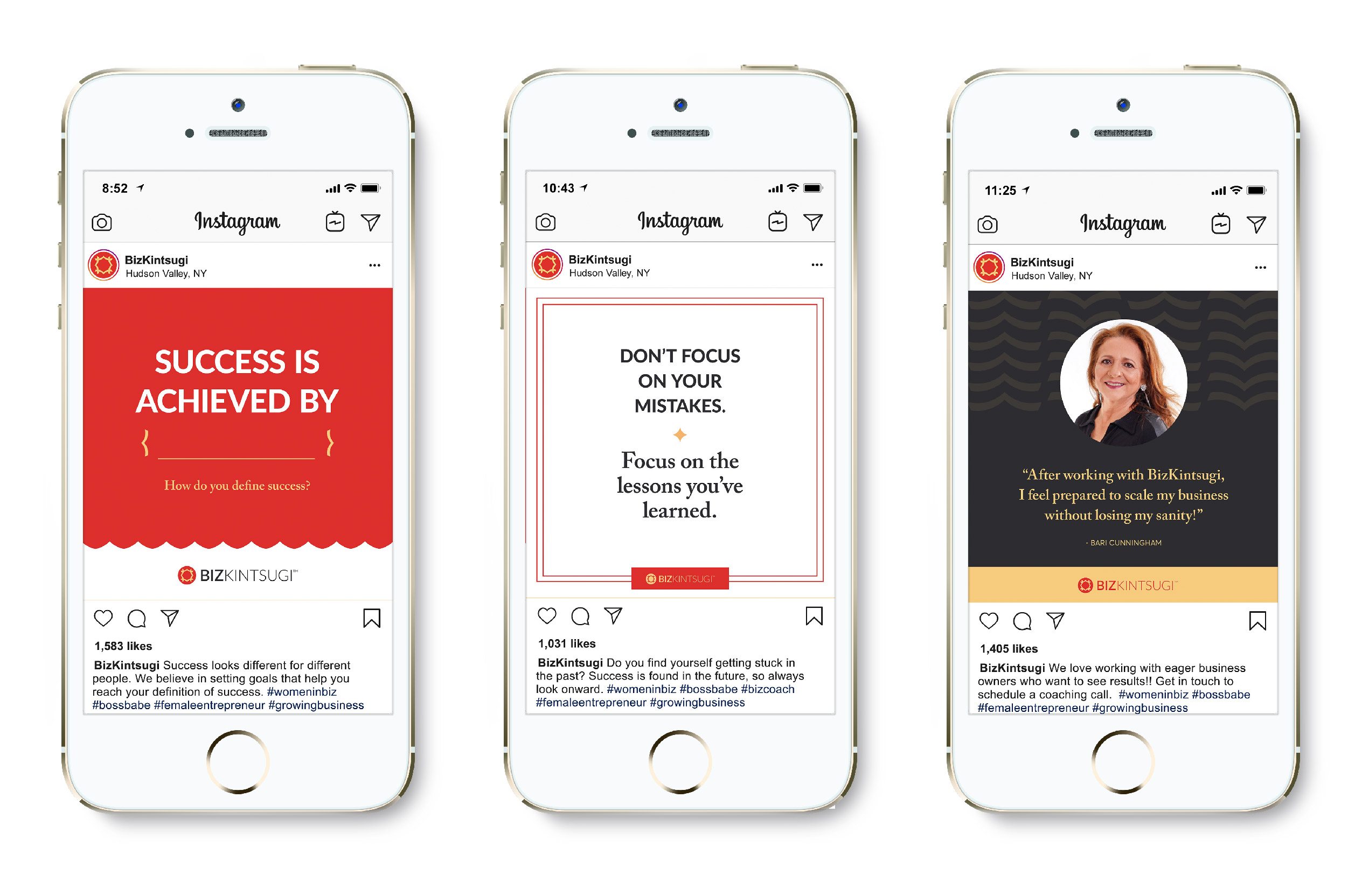
This logo was then developed into a larger identity system that was flexible enough to be utilized across various collateral, but strict enough to maintain visual consistency for brand recognition. Accompanying every visual identity project is a brand guideline that condenses the brand information from the initial discovery session, the various rules for using the logo, type, and color, and examples of how the visual language should be applied to the company. These guidelines are important in ensuring that BizKintsugi’s new identity is consistent and will continue to strengthen and support the brand for years to come.
CREDIT
- Agency/Creative: Creative Chameleon Studio
- Article Title: New Brand Identity For Women-Focused Business Coach Design by Creative Chameleon Studio
- Organisation/Entity: Freelance, Published Commercial Design
- Project Type: Identity
- Agency/Creative Country: United States
- Market Region: North America
- Project Deliverables: Brand Advertising, Brand Architecture, Brand Creation, Brand Design, Brand Guidelines, Brand Identity, Brand Strategy, Brand World, Branding, Graphic Design, Identity System, Research
- Industry: Education
- Keywords: Brand identity, logo design, coaching, consultant, identity system, female entrepreneur, brand design, graphic design, visual identity


