


ZIIJN – City of Jastrzębie-Zdrój
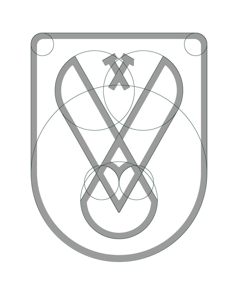
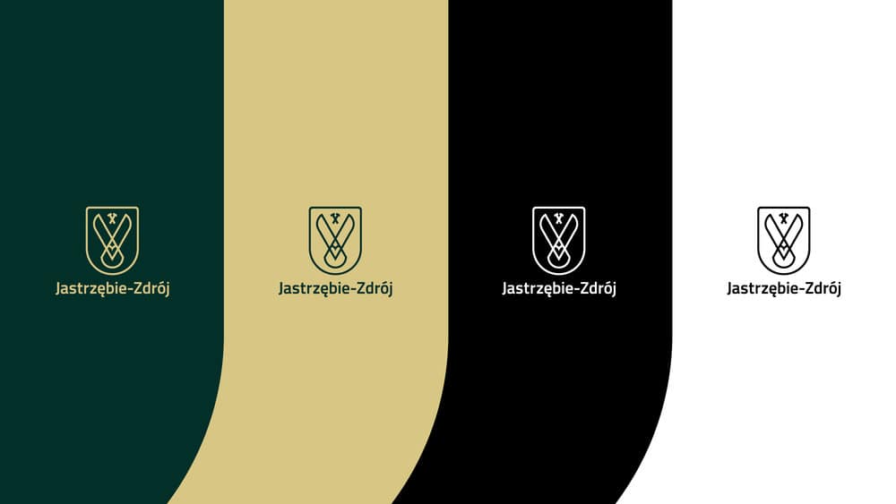
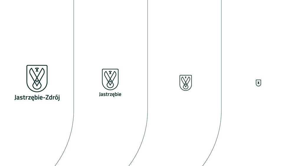
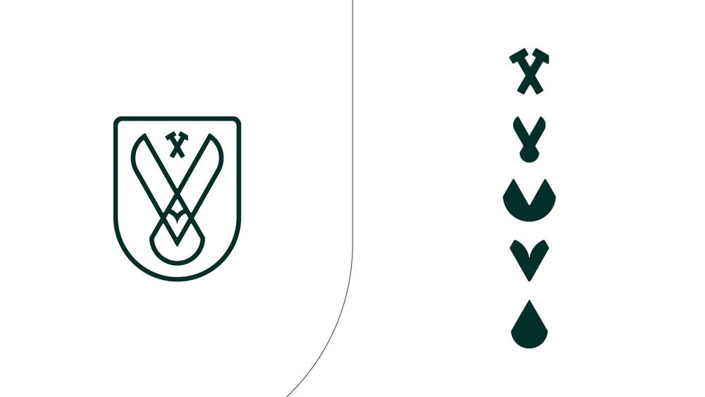
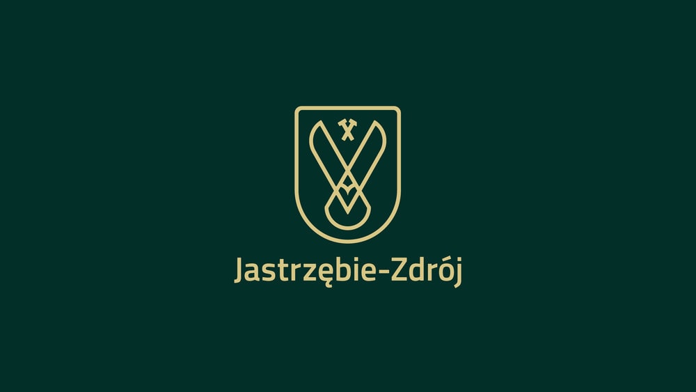
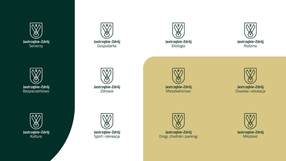
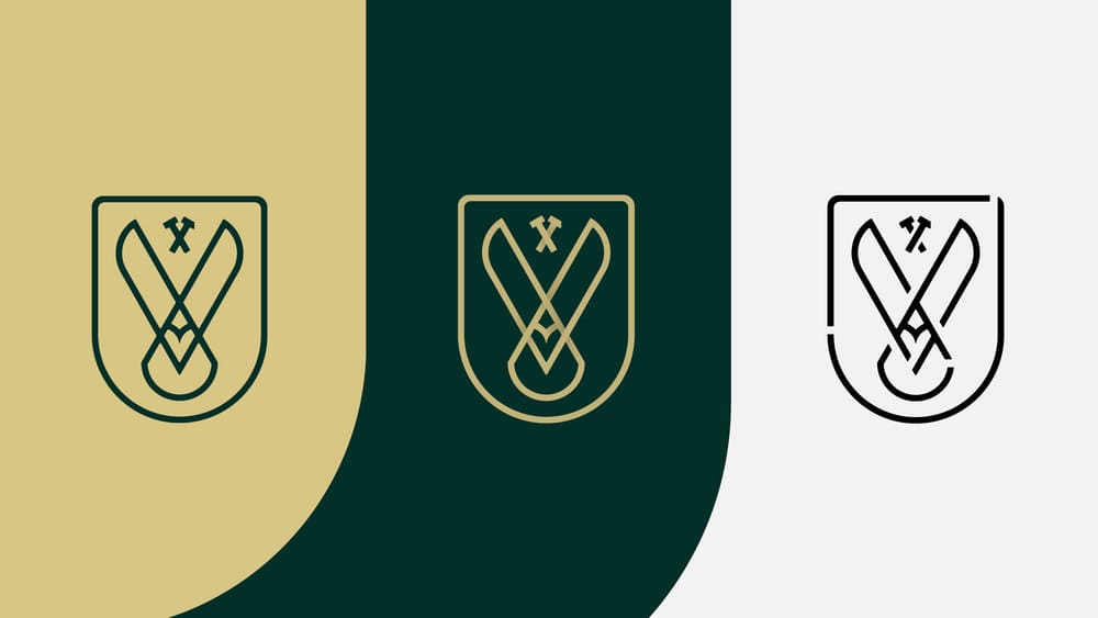
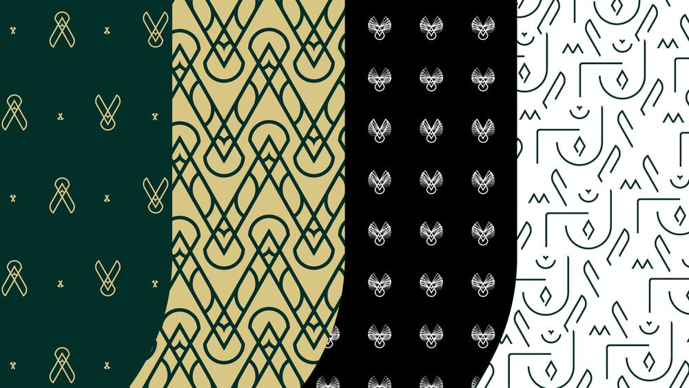
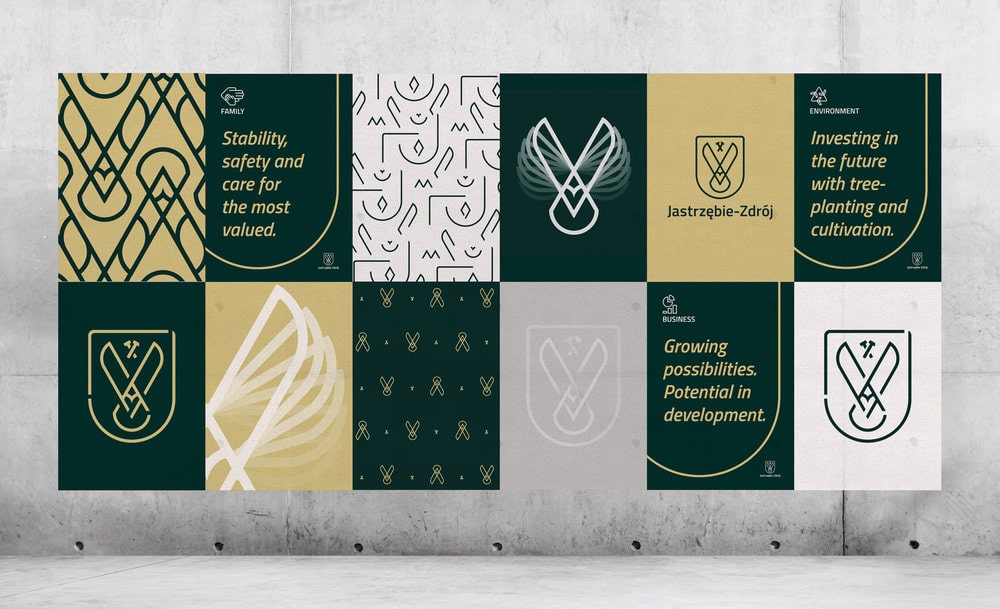
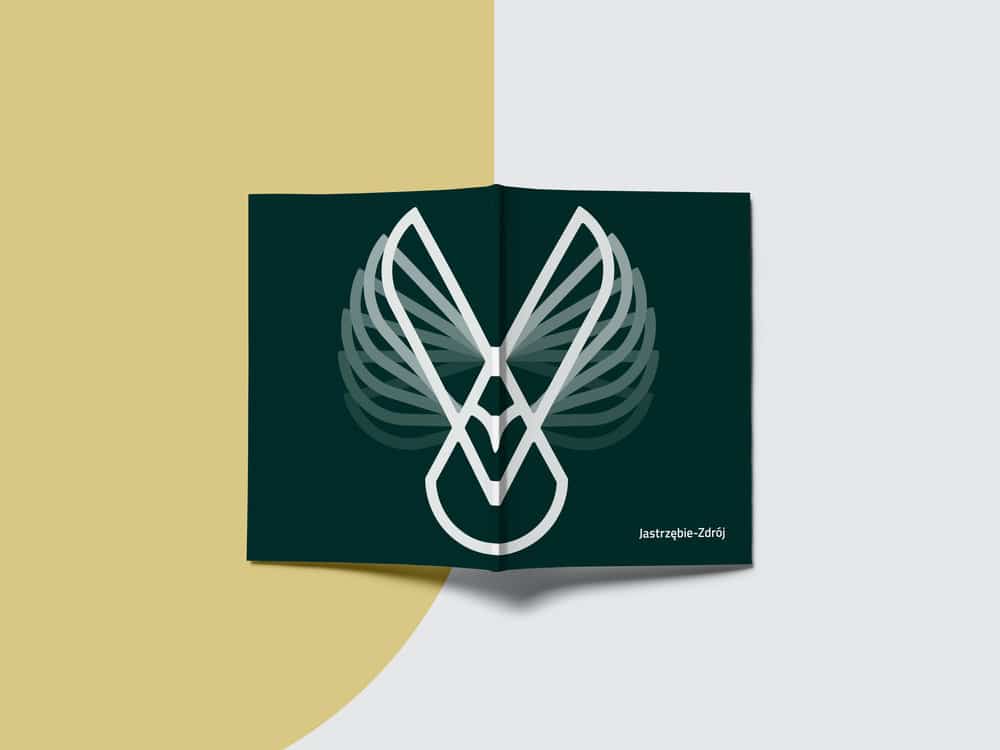
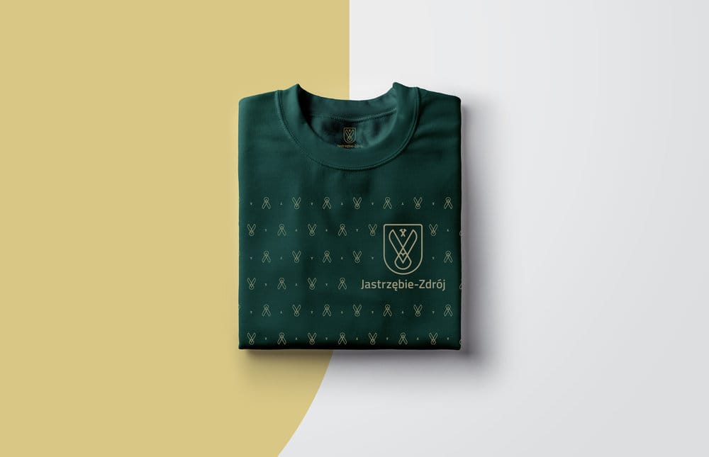
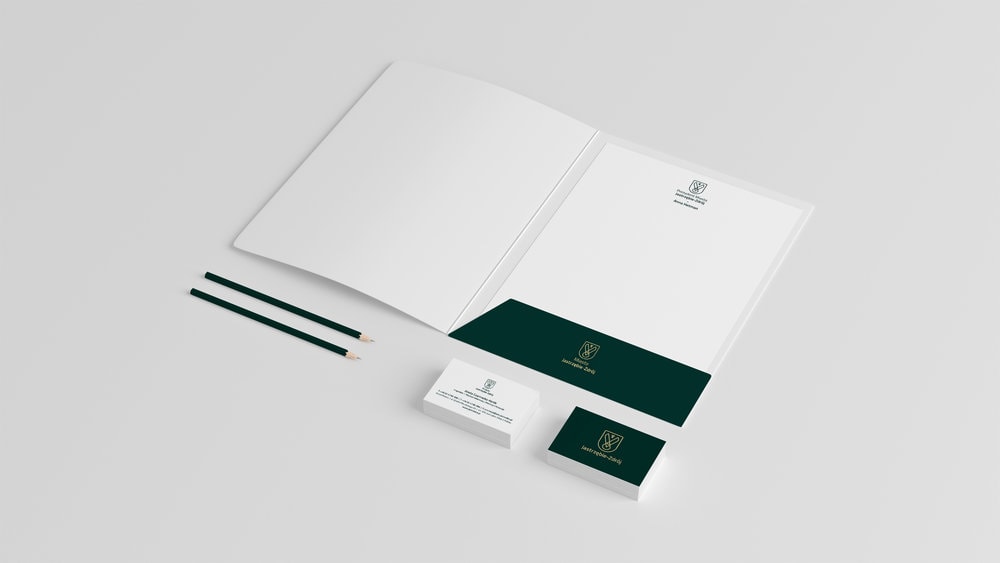
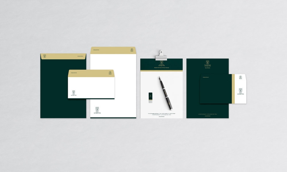
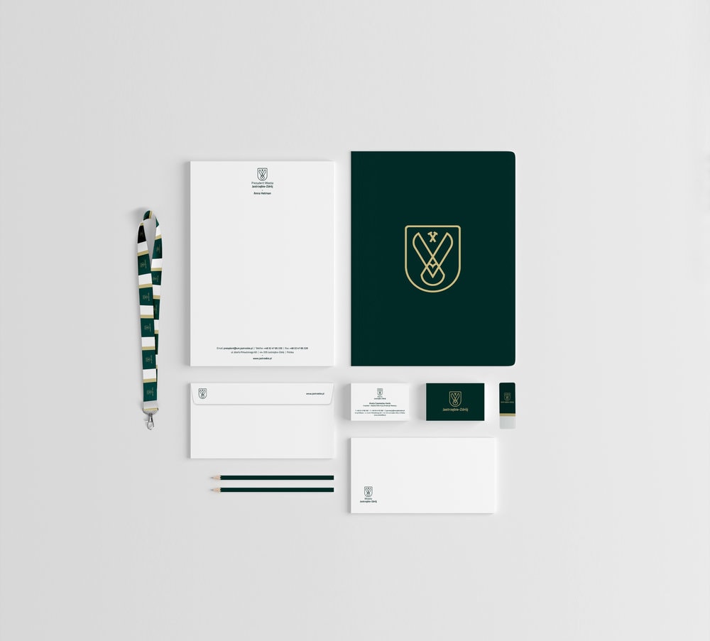
Jastrzębie-Zdrój is a municipal city in south Poland, situated close to the Czech border with around 90.000 inhabitants. Its name comes from the Polish words jastrząb (“hawk”) and zdrój (“spa” or “spring”). The area is populated since the 14th century and until the 20th century it was a spa village. It gained city rights in 1963. In the 1960s it also became a center of coal mining. Jastrzębie, which was one of the centers of the workers’ protests has played a special role in the political transformation of Poland at the end of the 1980s. The main inspiration for the entire rebrand was the rich visual heritage of the city. On one hand Jastrzębie-Zdrój, as its name also shows, once was a spa city famous from its water filled with various minerals. On the other hand it has also a long tradition in mining and heavy industry and identifies itself as a place to combine tradition with modernity. The symbol of the logo features the hawk which bird the city has its name after, the modernized version of the hammer and pick, the traditional sign of mining, a drop of water, a heart shape and two mountains.The new identity of Jastrzębie is dynamic. It changes its content and elements when is scaled down to serve the best legibility of the logo and still remain recognizable to carry the brand message on all platforms in all sizes possible.The new identity uses two main colours, Pine and Gold and two secondary colours Coal and White. The Pine colour stands for nature, the Gold symbolizes a new, prosperous era of our times. The Coal usage is rooted in mining traditions and the White refers to the spa city times and fresh spring water.While experimenting with the logo elements, we have discovered that if the outline shape of the shield is placed upon a rectangle, it creates a „J” letter. Taking the fact that the city’s name starts with this same letter, we put further emphasis on bringing our discovery into practice and use it as an element that serves well the purpose of brand recognition. The overlapping areas of a square or rectangle and the shield shape create three sections: two large fields that can be used for colour or image fill and a J-shaped line that can be highlighted and used as a dividing element between the large fields.By using the elements of the logo, there can be created a large number of applications for various purposes, such as apparel decoration, seamless patterns, packaging design, visual support, tapes, scaffolding covers, etc. To emphasize the dynamic features of the logo, there is a possibility to use the movement of the hawk either as a pattern, or a layered artwork. The hawk movement stages can also be animated or drawn on the corners of larger amount of pages.
CREDIT
- Agency/Creative: ZIIJN
- Article Title: Jastrzębie-Zdrój Rebranding
- Organisation/Entity: Agency, Published Commercial Design
- Project Type: Packaging
- Agency/Creative Country: Poland
- Market Region: Europe
- Industry: Hospitality


