


“We need a packaging and the visual identity which will exempify the top quality of our product.
The target consumer: Consumers in Greece and abroad with high demands in quality and product design.
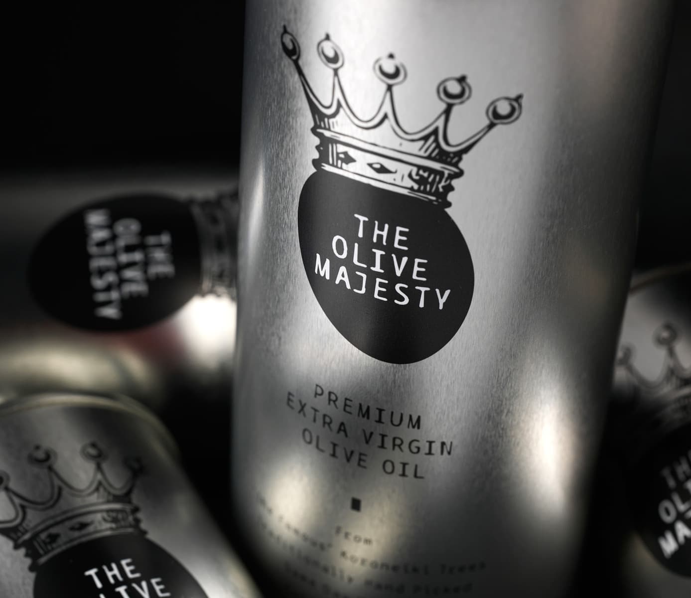
The design: The top quality characteristic of this product and our client’s wish to place it accordingly in the market guided our design approach. One of the company names (Magesty) triggered our inspiration towards the development of its visual identity. In the highly competitive context of olive oil brands “The Olive Majesty” name we suggested, is a way to differentiate the product dynamically and personify it in the most direct, absolute way.”
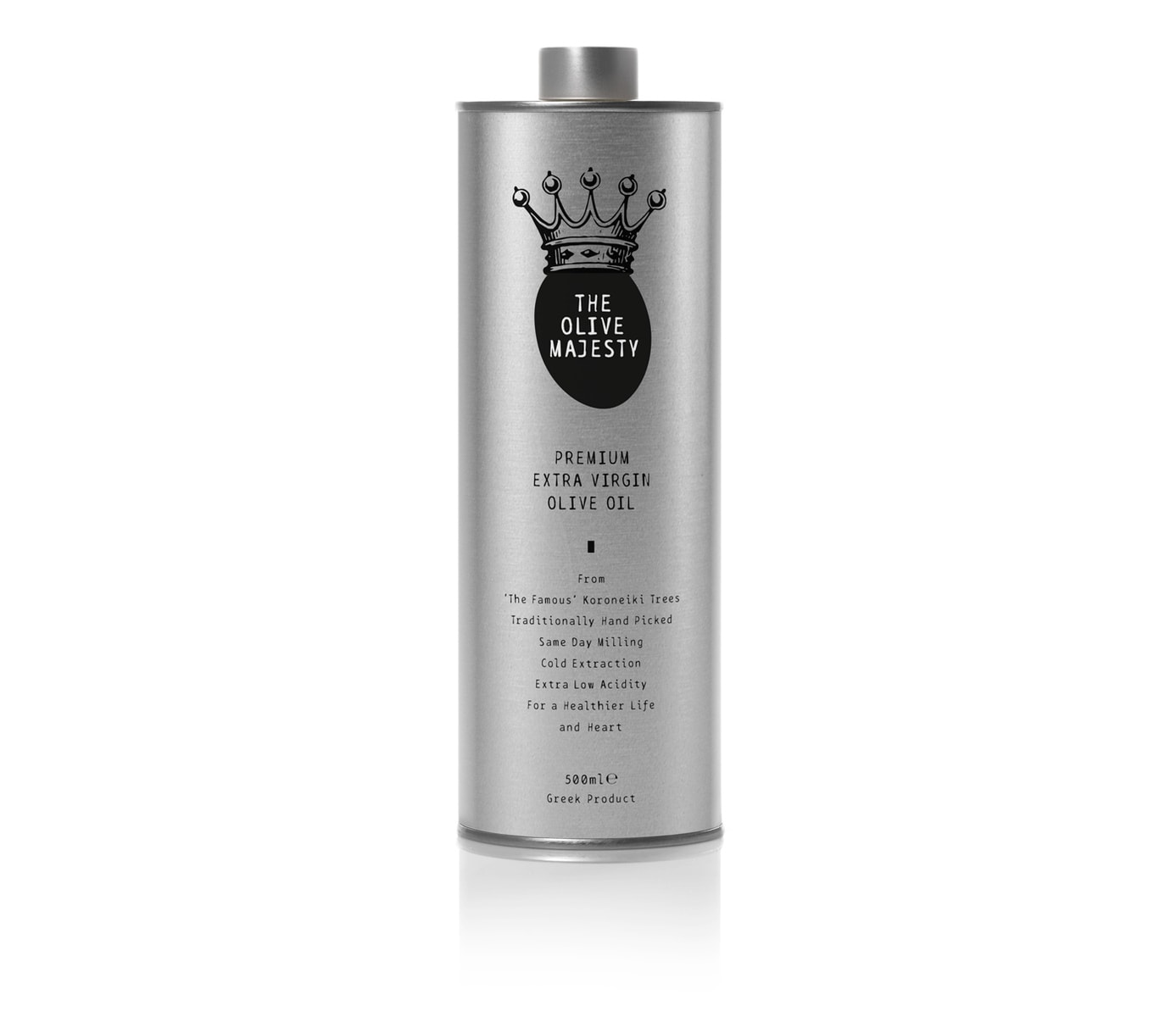
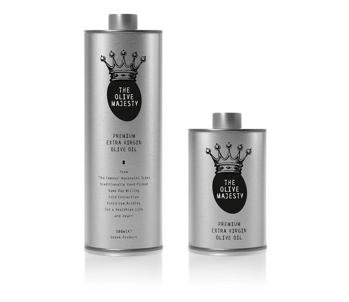
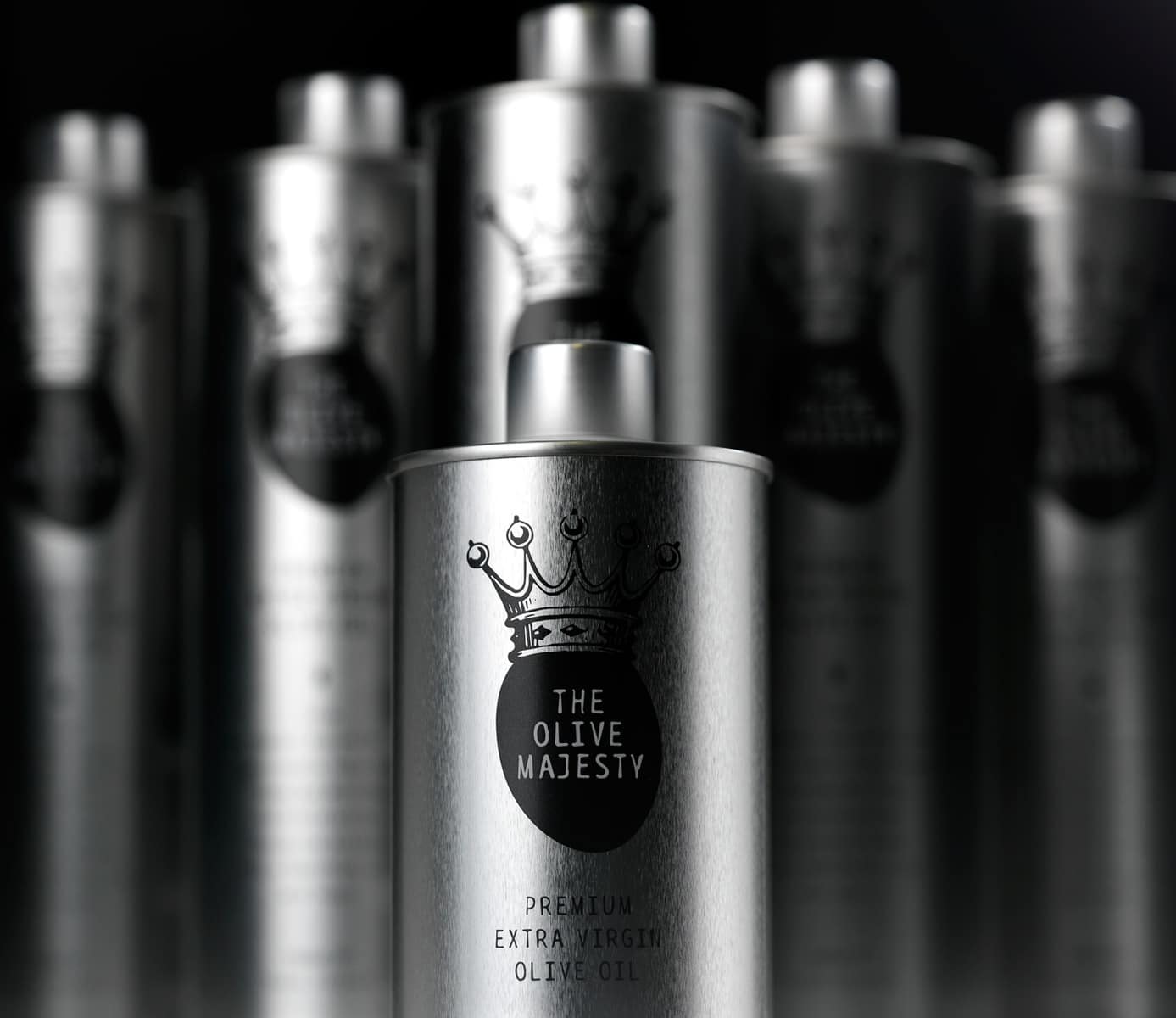
“The logo was designed as an olive fruit in the place of a crowned face. This humorous approach in outlining traditional hierarchy as royalty has been balanced by the choice of a contemporary, industrial looking, metal container. Kingship is a result of hard work in this case where producers strive for high quality standards. All communication material, including website, follow the same design strategy of accessible prestige.”
CREDIT
- Agency/Creative: mousegraphics
- Article Title: mousegraphics – The Olive Majesty
- Project Type: Packaging


