


“The briefing: “We need a packaging idea for our apple and orange juices. We want to base it on the product name, 17.5″
The target consumer: Mostly young and middle ages, of both sexes.
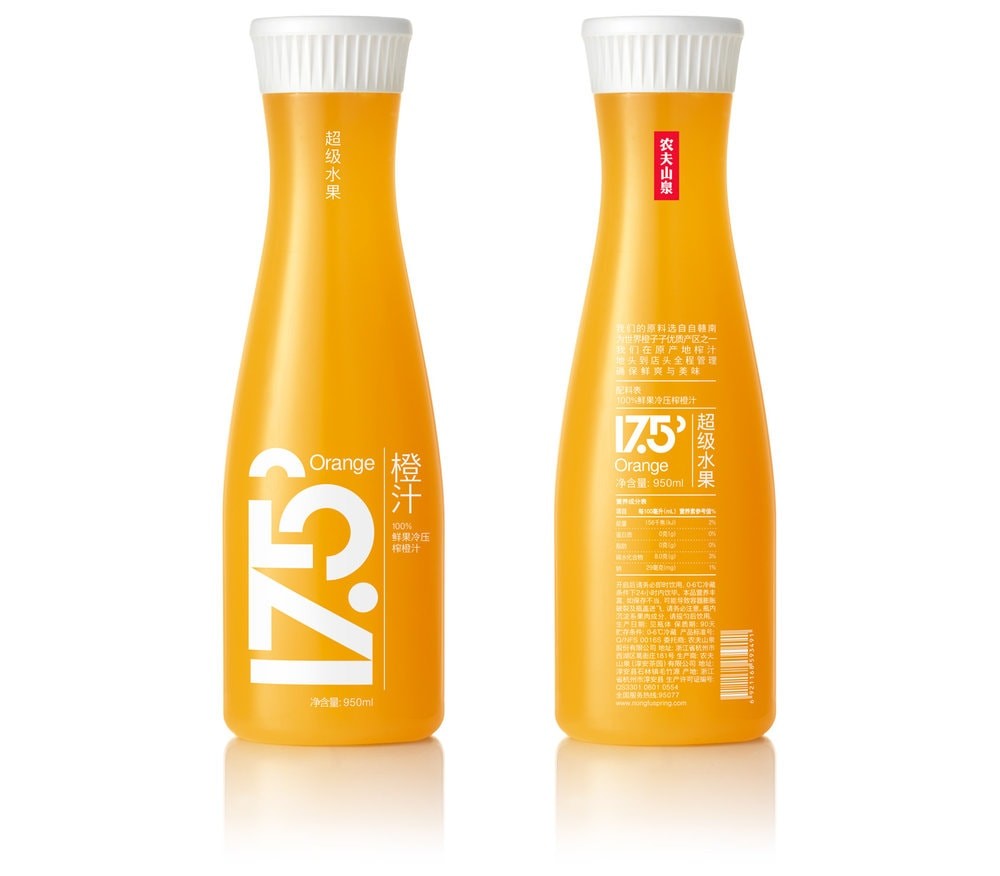
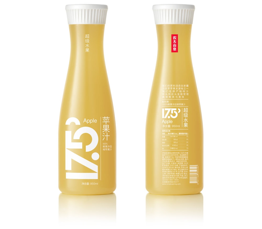
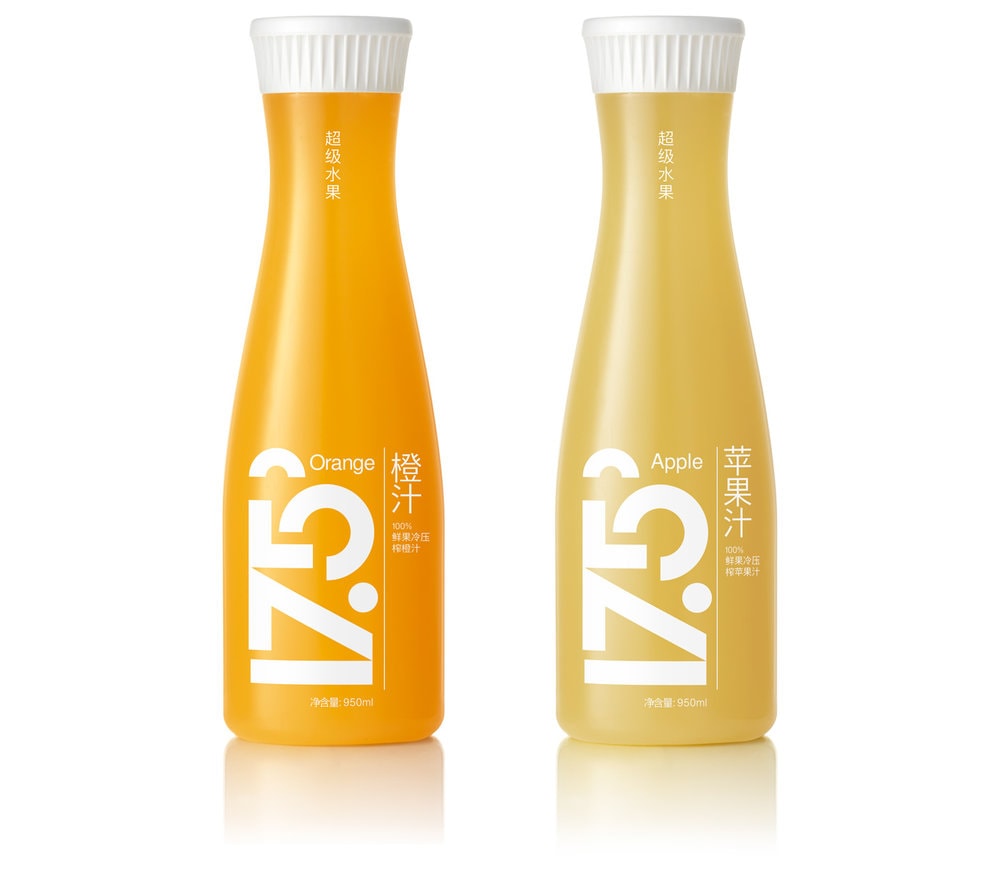
The design: 17.5 is used to describe the ideal RSS (Ratio of Sweet and Sour) in our client’s orange and apple juices. We used a simple, bold, equal – width typography in order to better imprint and aesthetically ‘stabilize’ in the mind of the viewer the product name 17.5 as chosen by the company. The ideal balance conveyed by the RSS ratio pronounced with this number is extended to the balance of letters and the overall form. The semi circle at its end ‘visualizes’ the 0.5 part of this numeric index. If the name 17.5 is triggering consumers’ curiosity through abstraction and toward easy recollection, the design attempts to reinforce the process with the body and weight of a dominating logo. Clear pet material is used for the container so that the natural juice color serves as the backdrop of the product name.”
CREDIT
- Agency/Creative: mousegraphics / Dimitris Papazoglou
- Article Title: Mousegraphics – Nongfu
- Project Type: Packaging
- Format: Bottle
- Substrate: Plastic


