


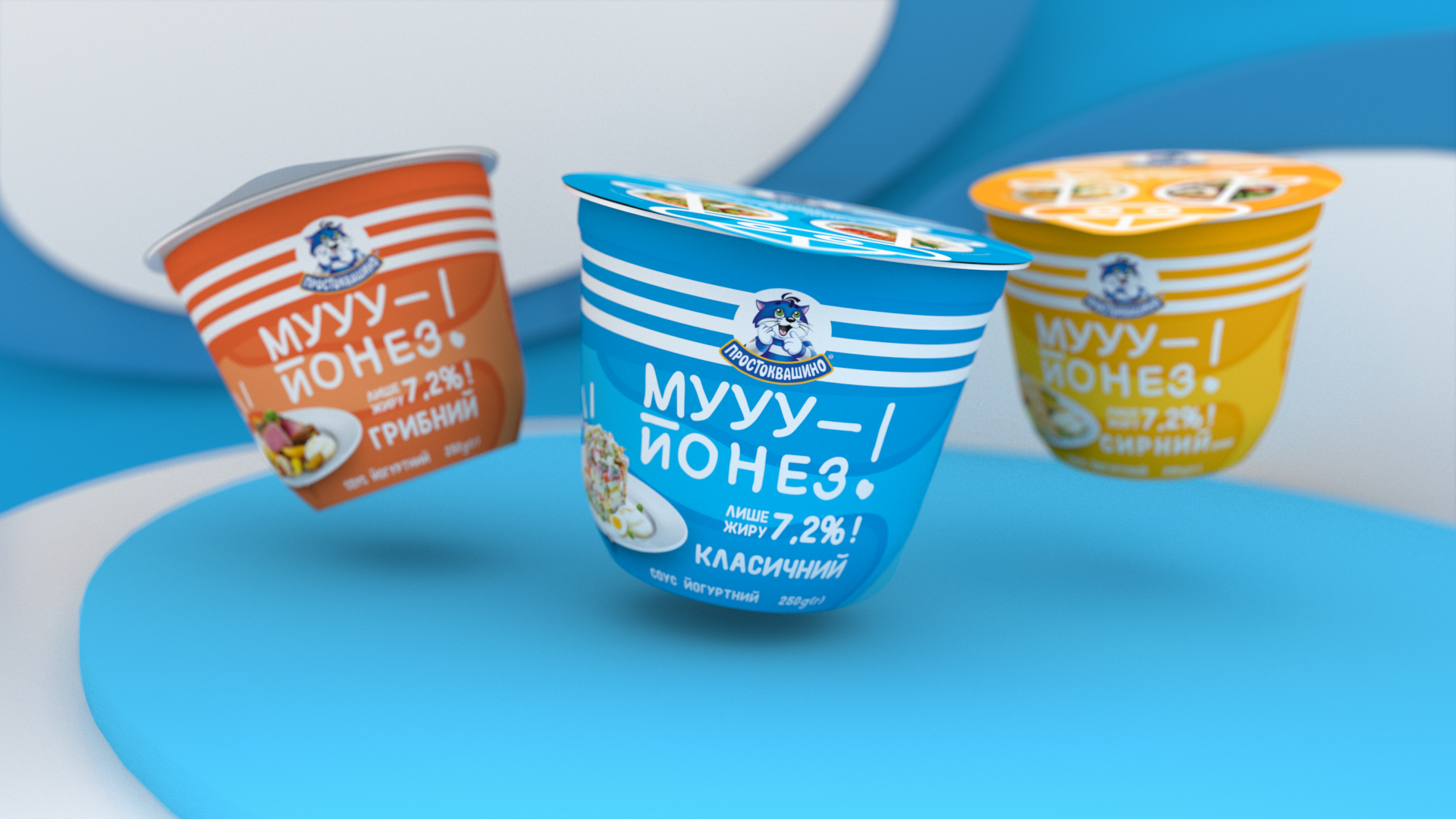
Moo-yonnaise looks like mayonnaise, tastes like mayonnaise and sounds like mayonnaise, but it’s not. It is a yogurt based sauce that has only 7% fat in contrast to 70% in a typical mayonnaise. Thus, our main goal in design was to convey Moo-yonaise’s yogurt nature and lightness.
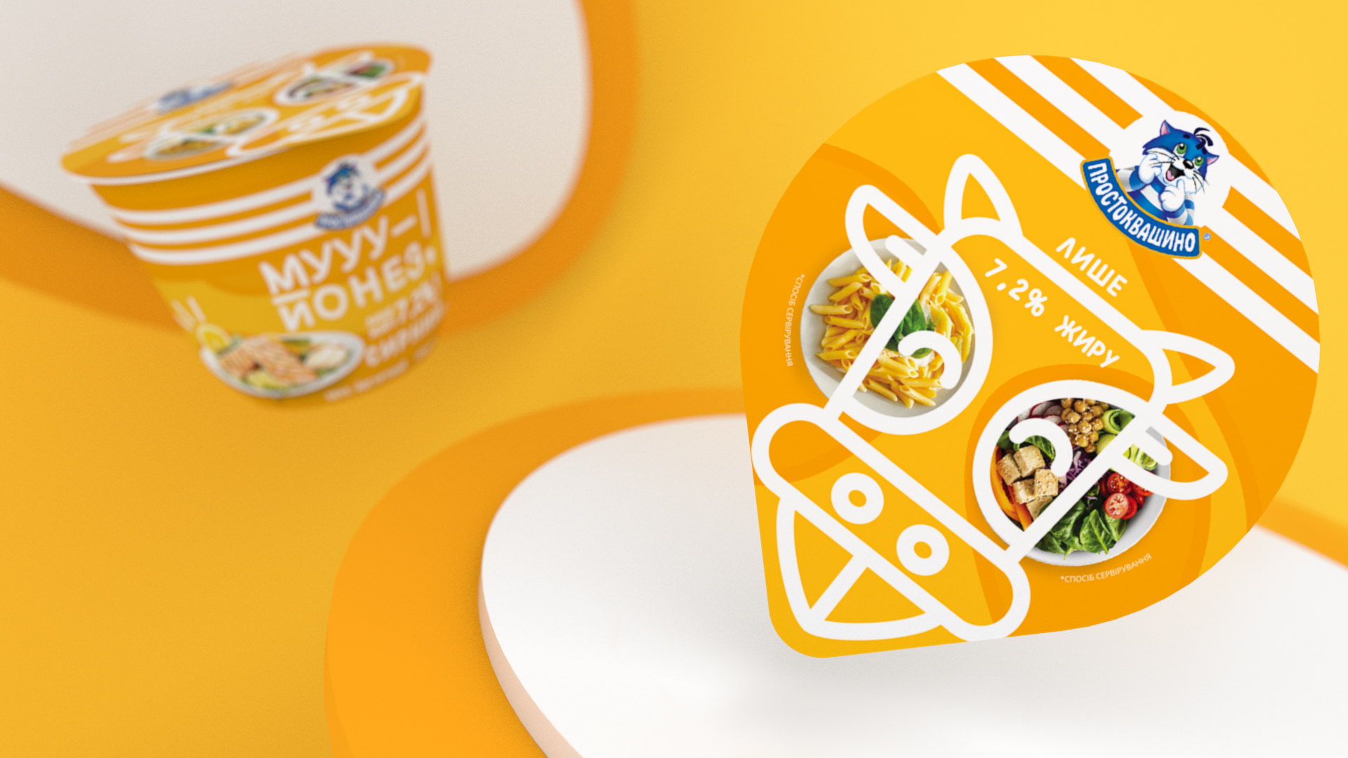
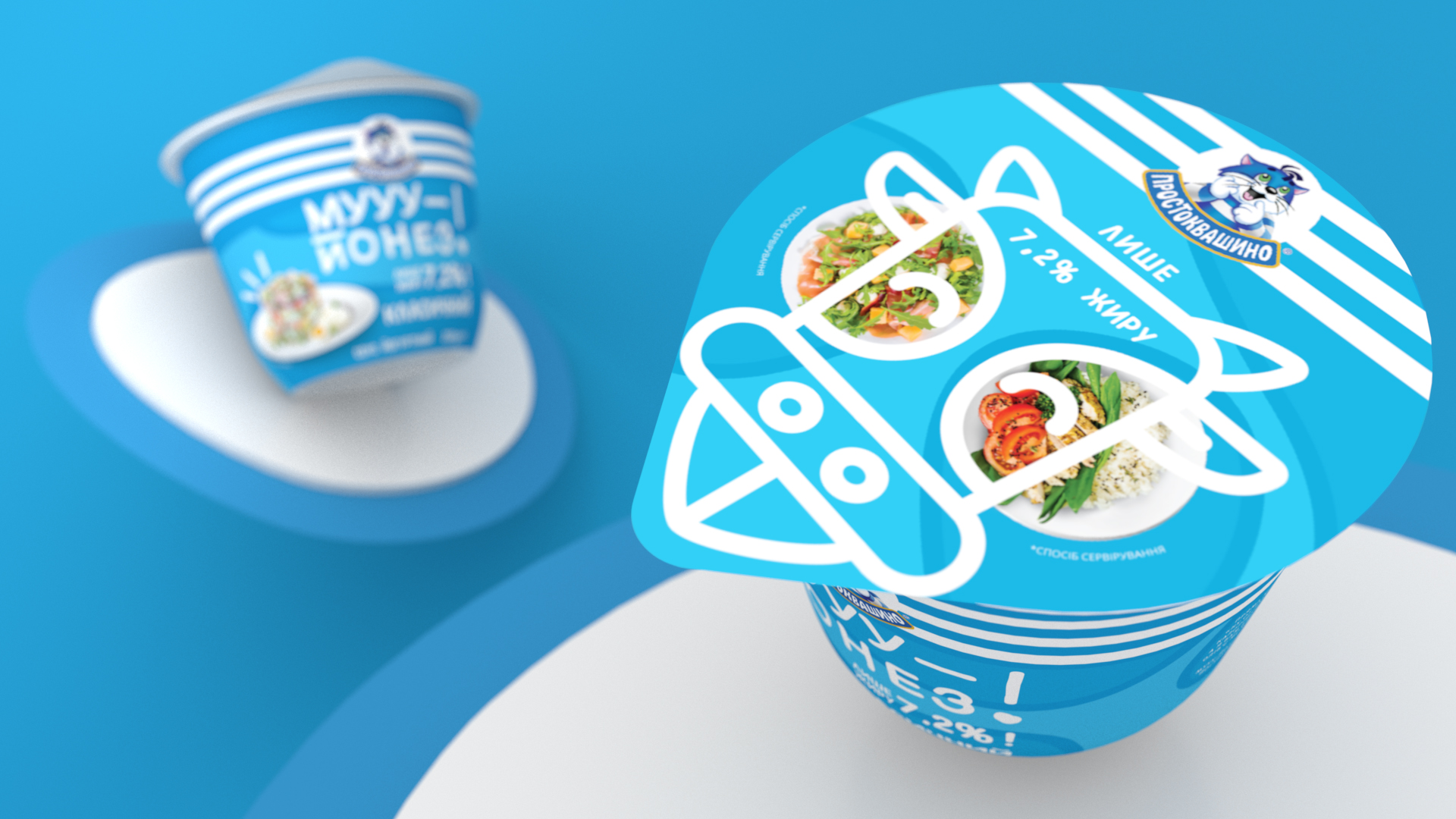
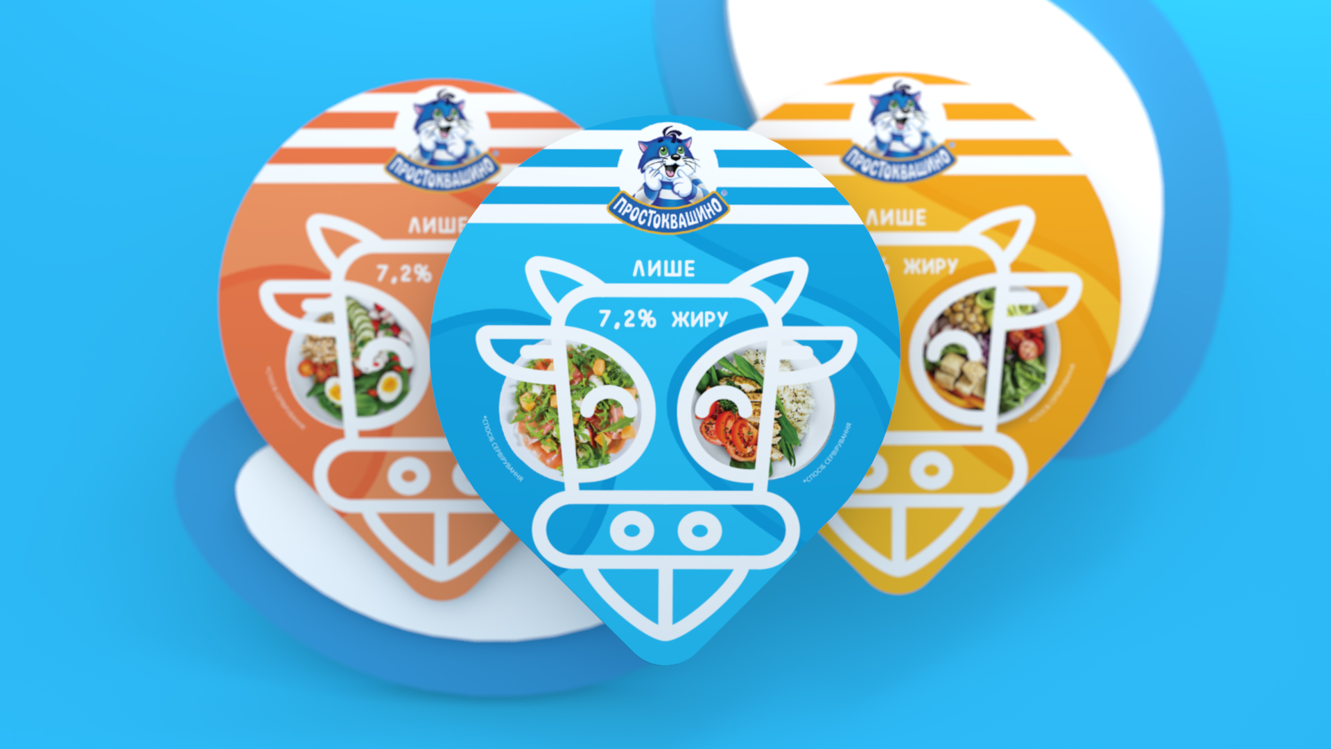
Yes, we used cow as a symbol to show that it’s a yogurt in the first place. But don’t jump to conclusions — our label still stands out from other dairy products with it’s non-typical for the category bright colors.
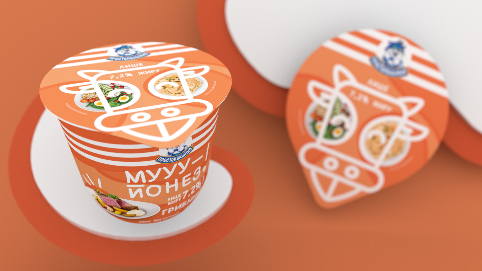
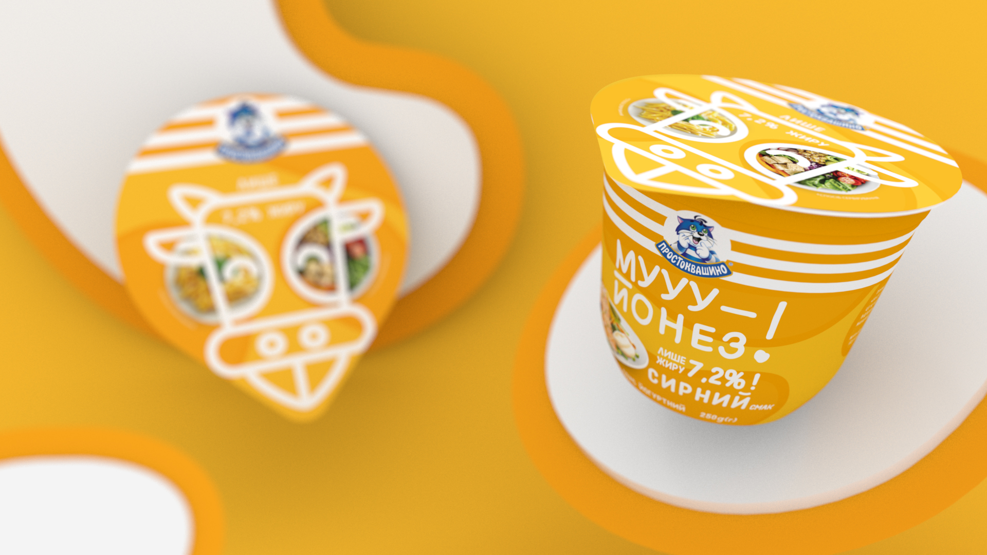
To express the lightness and naturalness of the product, we painted label background with airy clouds that look like a “cow print”.
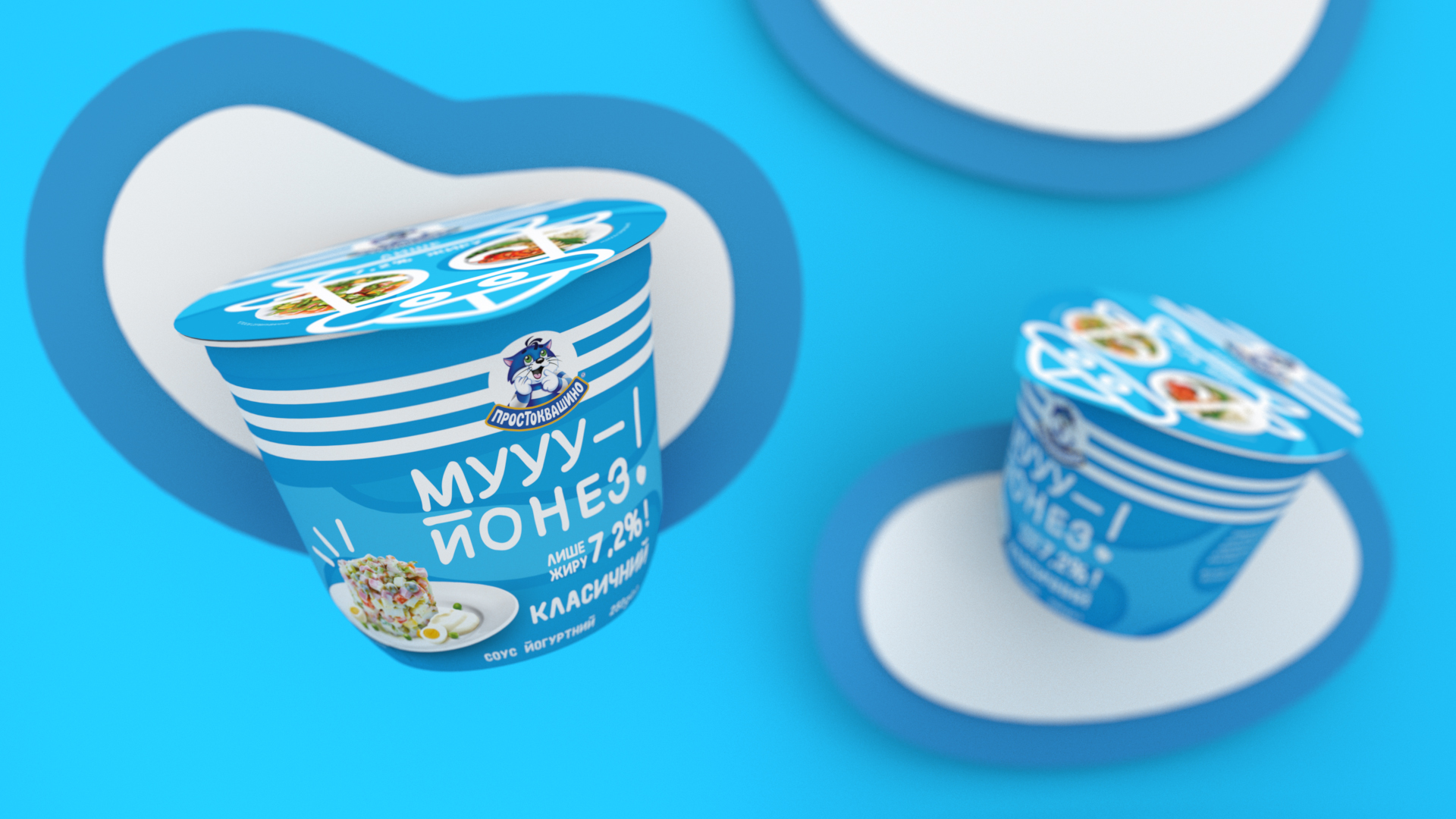
The sauce name is quite joky. It inspired us to highlight it visually, so we chose a playful font and drew a tongue-showing cow on the foil.
Also our team really fell in love with the Moo-yonnaise cow. So we went further and made a funny Instagram mask with it.


CREDIT
- Agency/Creative: R Agency
- Article Title: Moo-yonnaise: Only Pleasure, No Guilty
- Organisation/Entity: Agency, Published Commercial Design
- Project Type: Packaging
- Agency/Creative Country: Ukraine
- Market Region: Europe
- Project Deliverables: Graphic Design, Illustration, Packaging Design, Research
- Format: Sleeve
- Substrate: Plastic


