


Mesoestetic Pharma Group is a pharmaceutical laboratory specialized in the field of dermatology and aesthetic medicine founded in 1984 that has become a world reference in antiaging therapies and depigmenting treatments.
A part of their quest to redefine beauty through science, a new brand positioning, identity, portfolio architecture, packaging and visual language was created. With the aim of providing scientific rigor to the cosmetic industry.
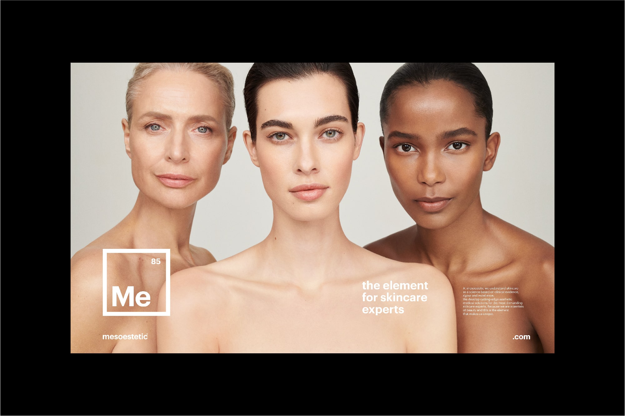
For doctor, aesthetics professionals and final consumers, mesoestetic pretends to provide solutions that act on the cause and not only on the skin visible effects. So, we created a brand strategy that elevated beauty to science, making mesoestetic, the scientist of beauty.
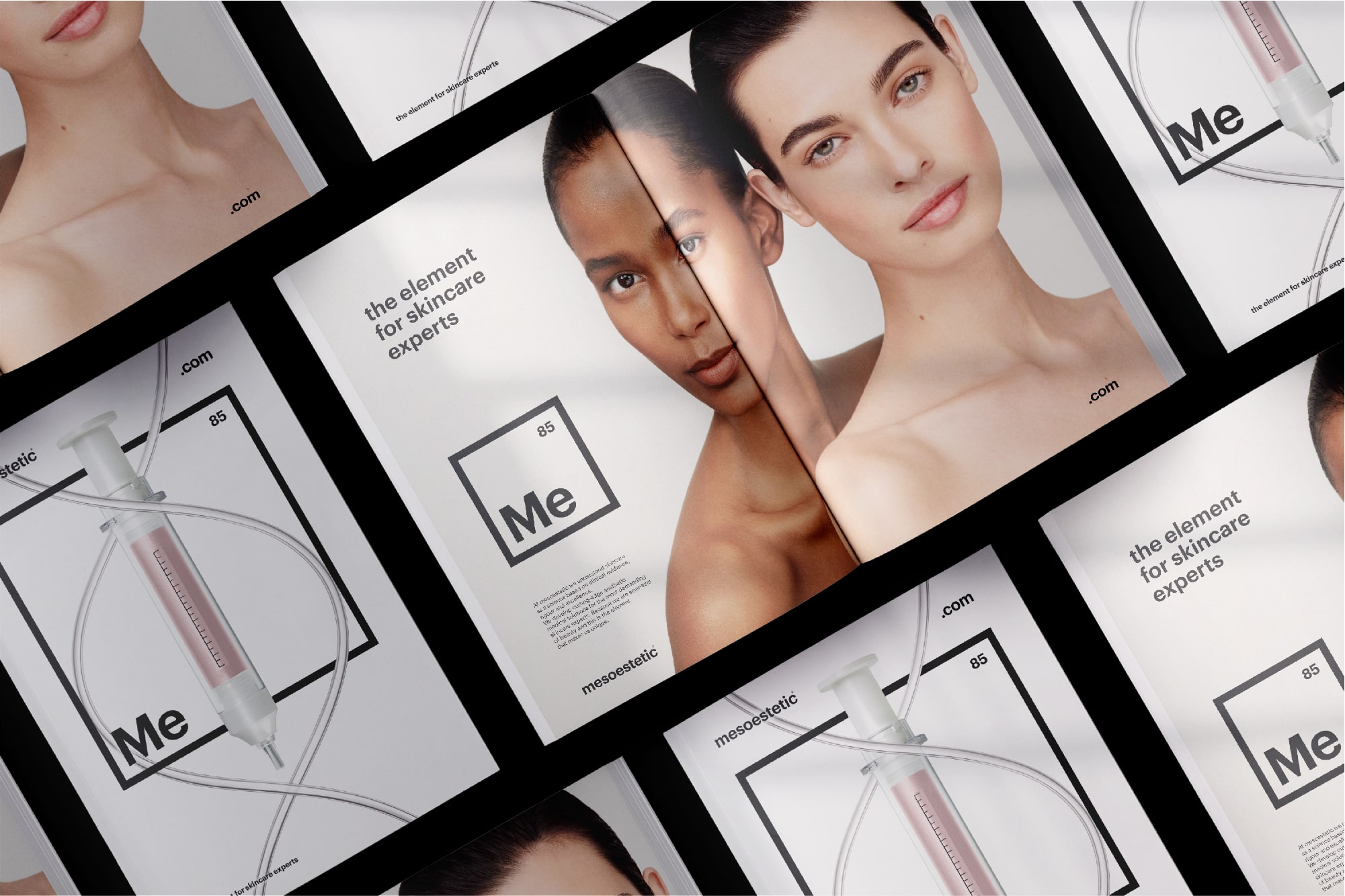
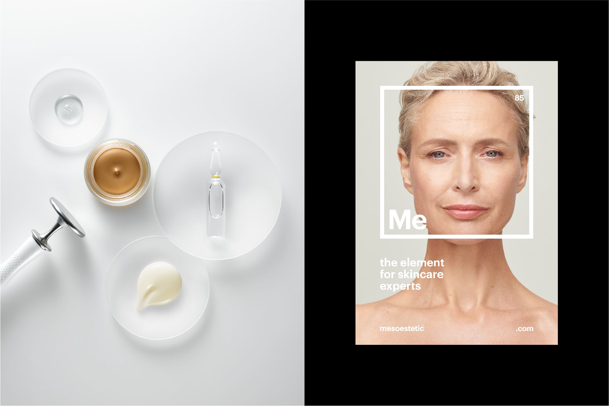
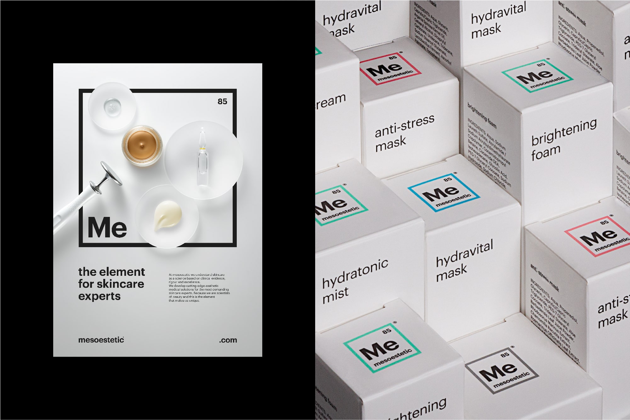
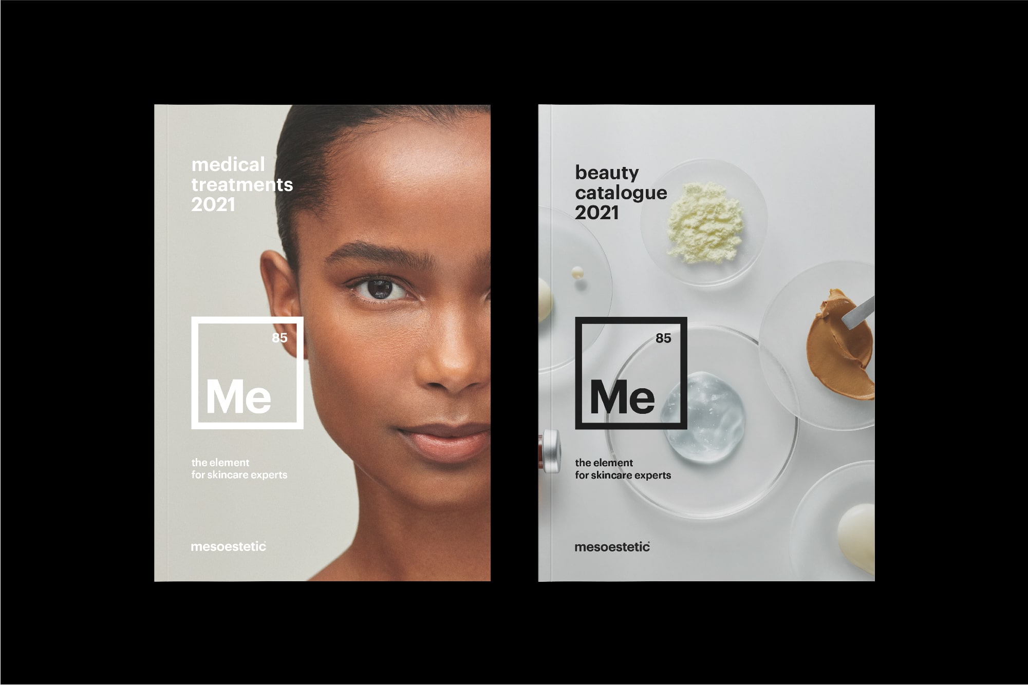
With “the element for skincare experts” as the claim, our aim was to explain how the brand uses science to create professional solutions.
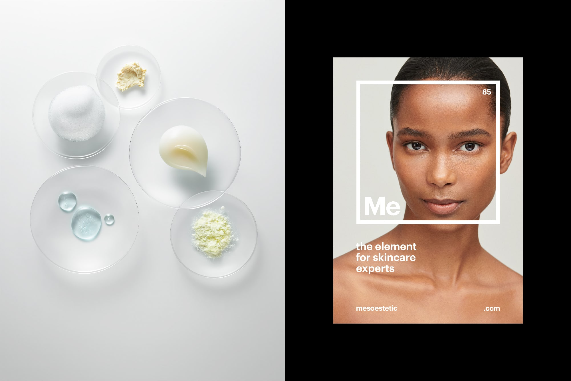
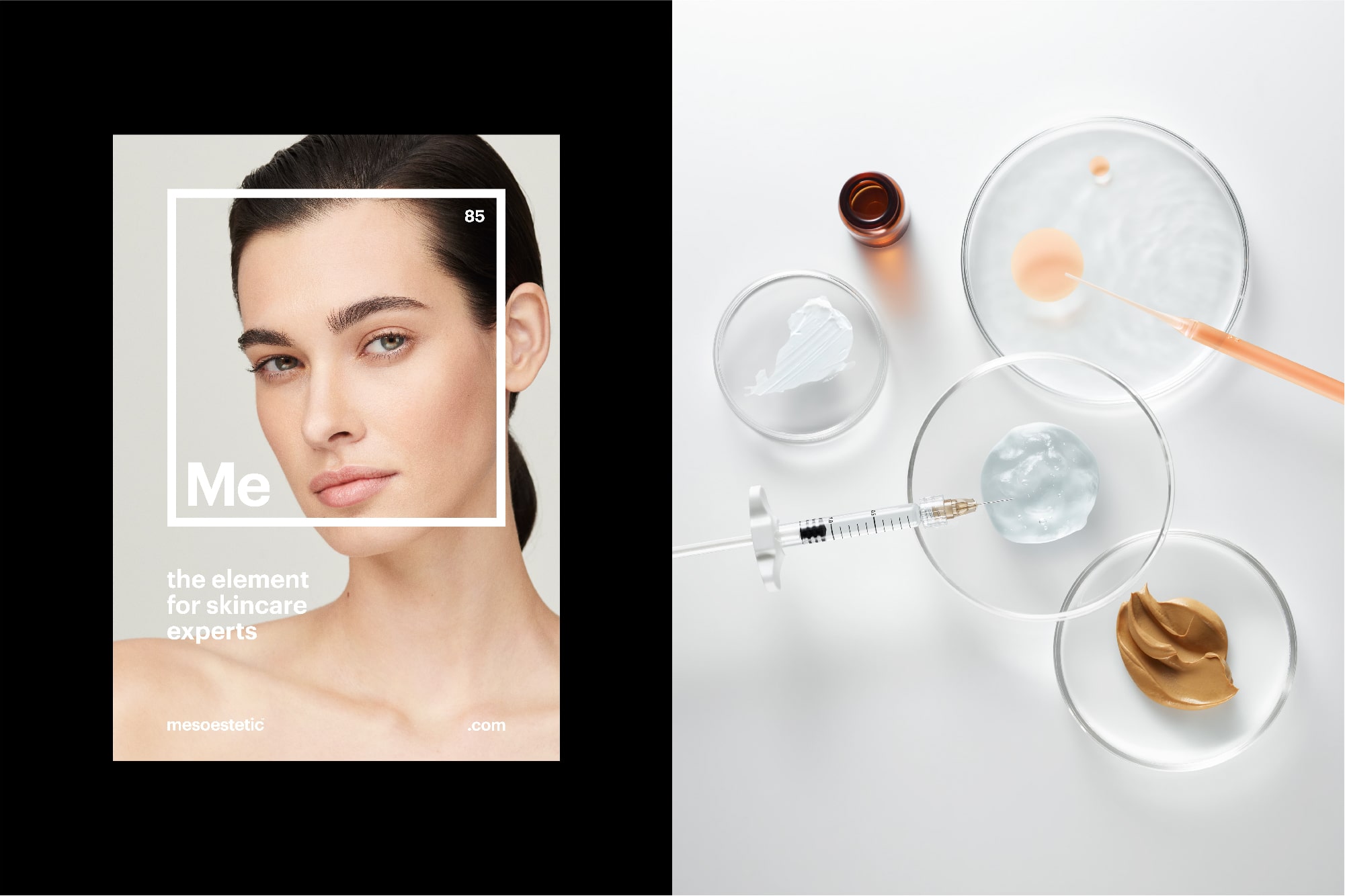
In order to shed light on science while connecting with final users, we shaped a sophisticated, scientific and human personality. An element that is reflected in its visual identity too, leading to a visual treatment where natural comes together with quality. Hence, we elevate the brand while communicating quality and naturalness without forgetting scientific rigor.
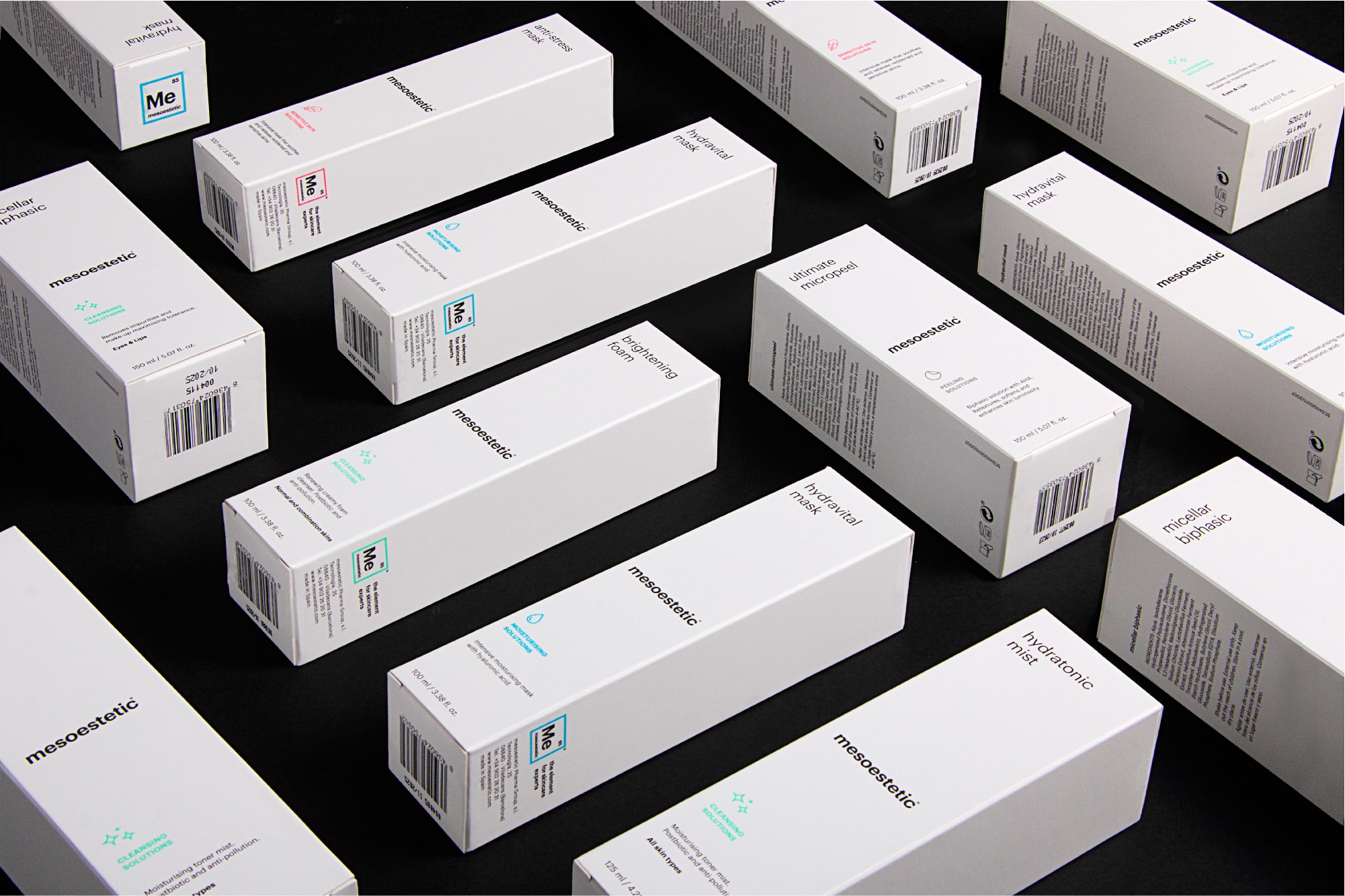
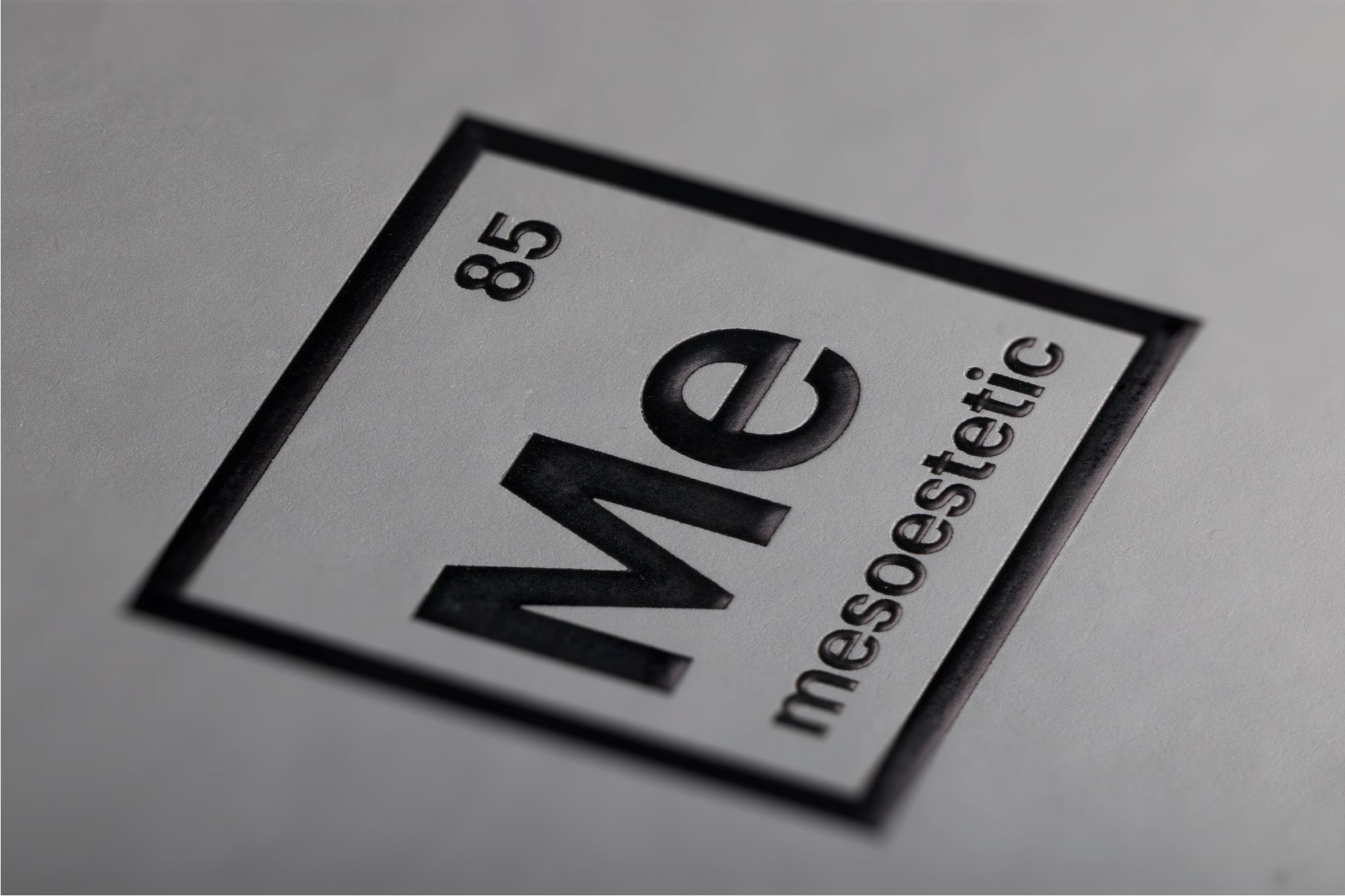
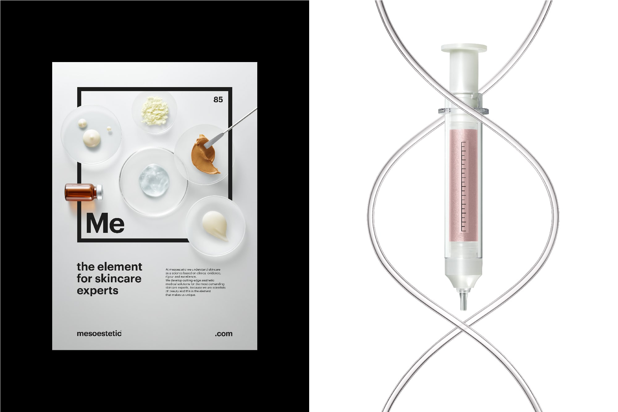
Every powerful strategy needs an exceptional visual identity behind it. And so, to bring mesoestetic’s concept to life we elevated the brand to science, introducing it on the periodic table by making the brand the element of beauty. The element, therefore, becomes the center of our visual language proposal. By using the scientific codes of the elements’ visual representation, mesoestetic is embodied as the supreme element of beauty, representing the solid grounds of a more than 35-year-old company.
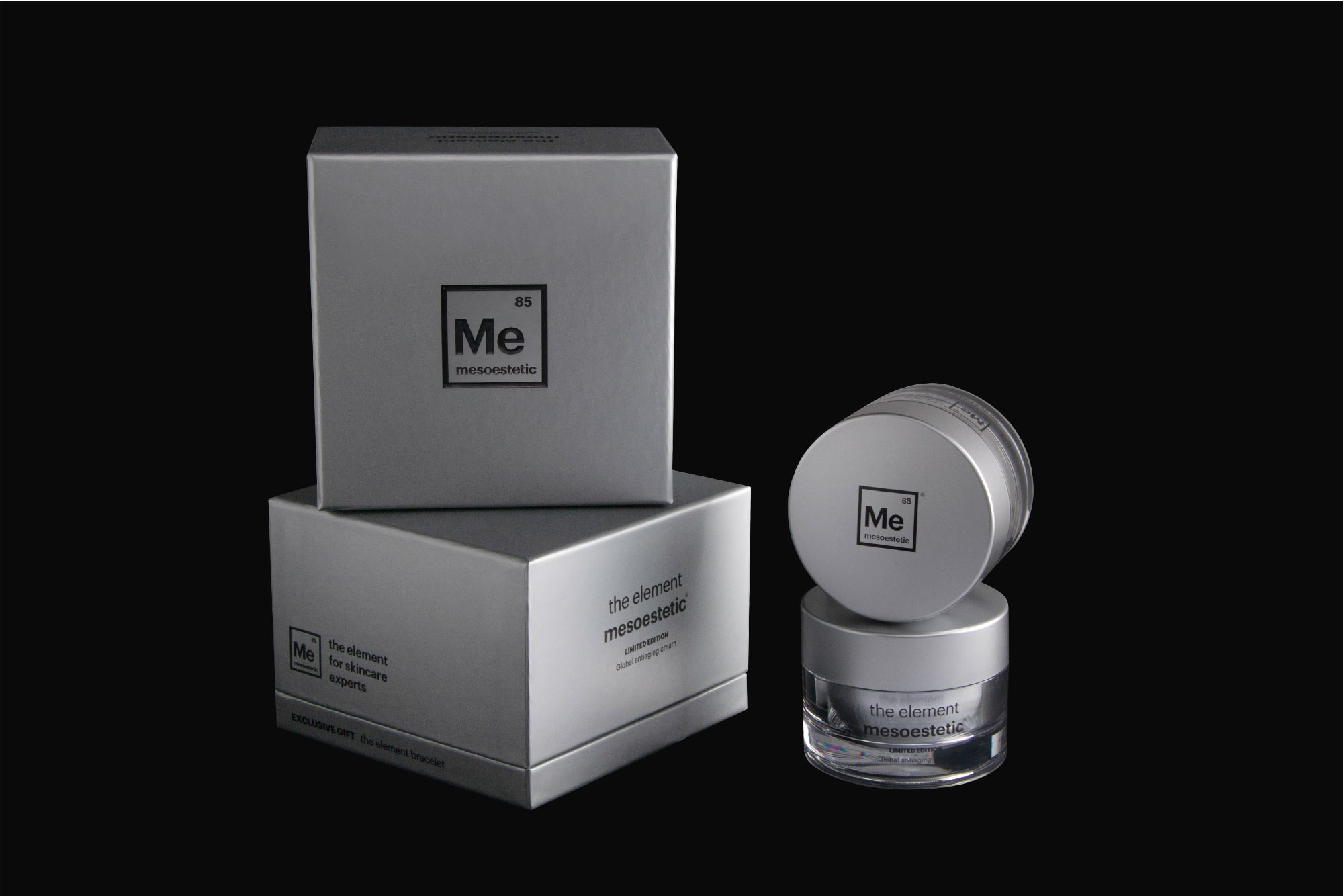
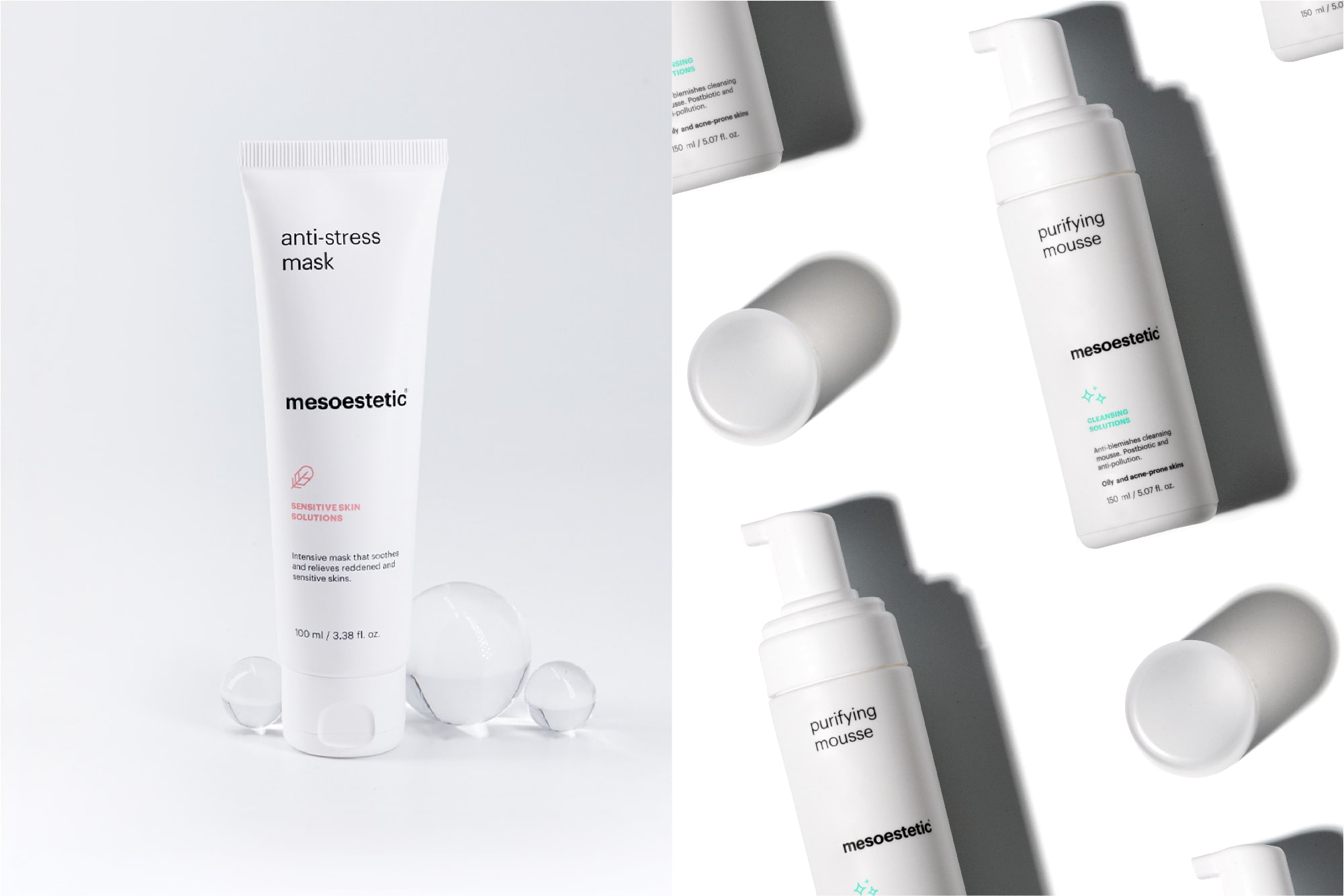
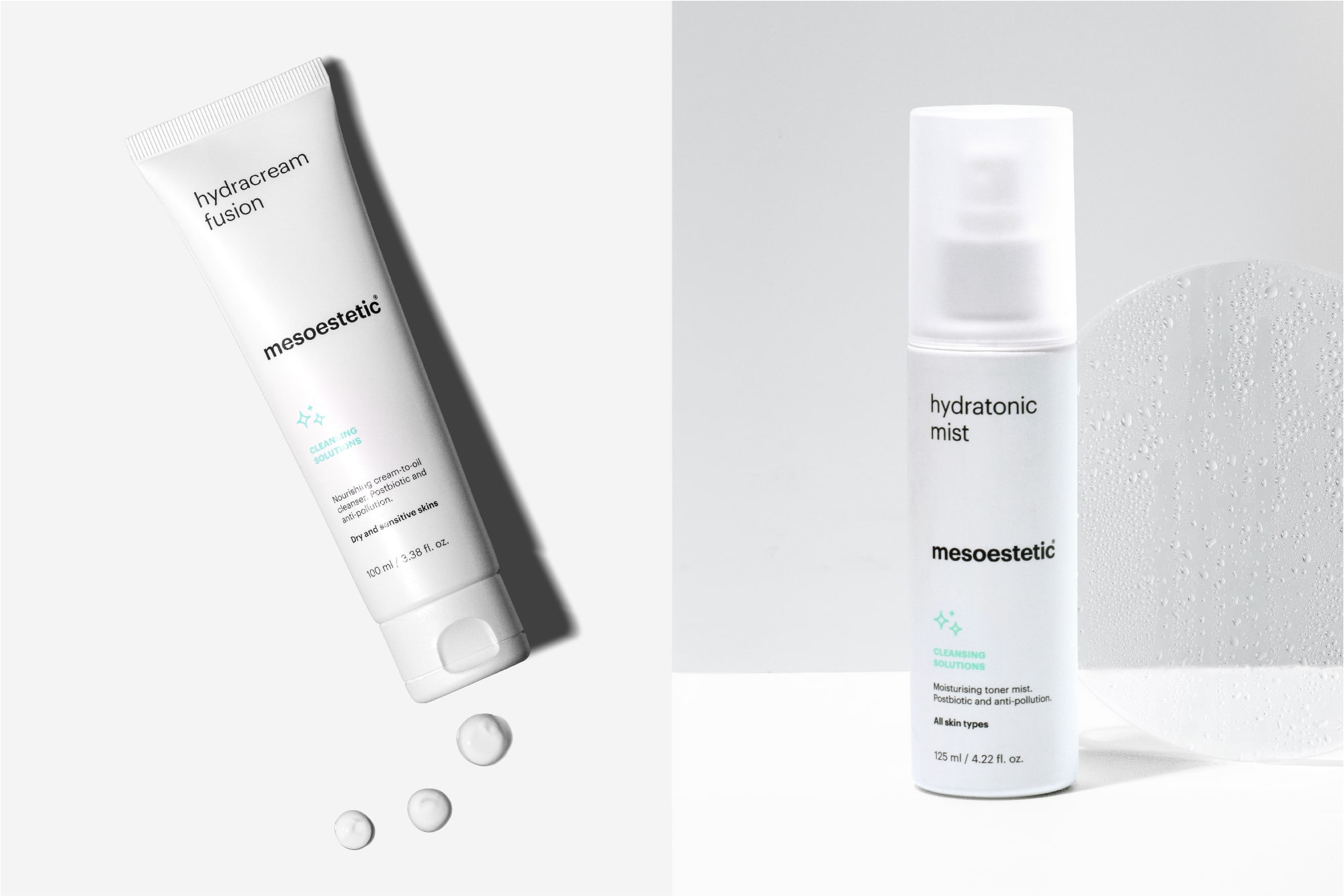
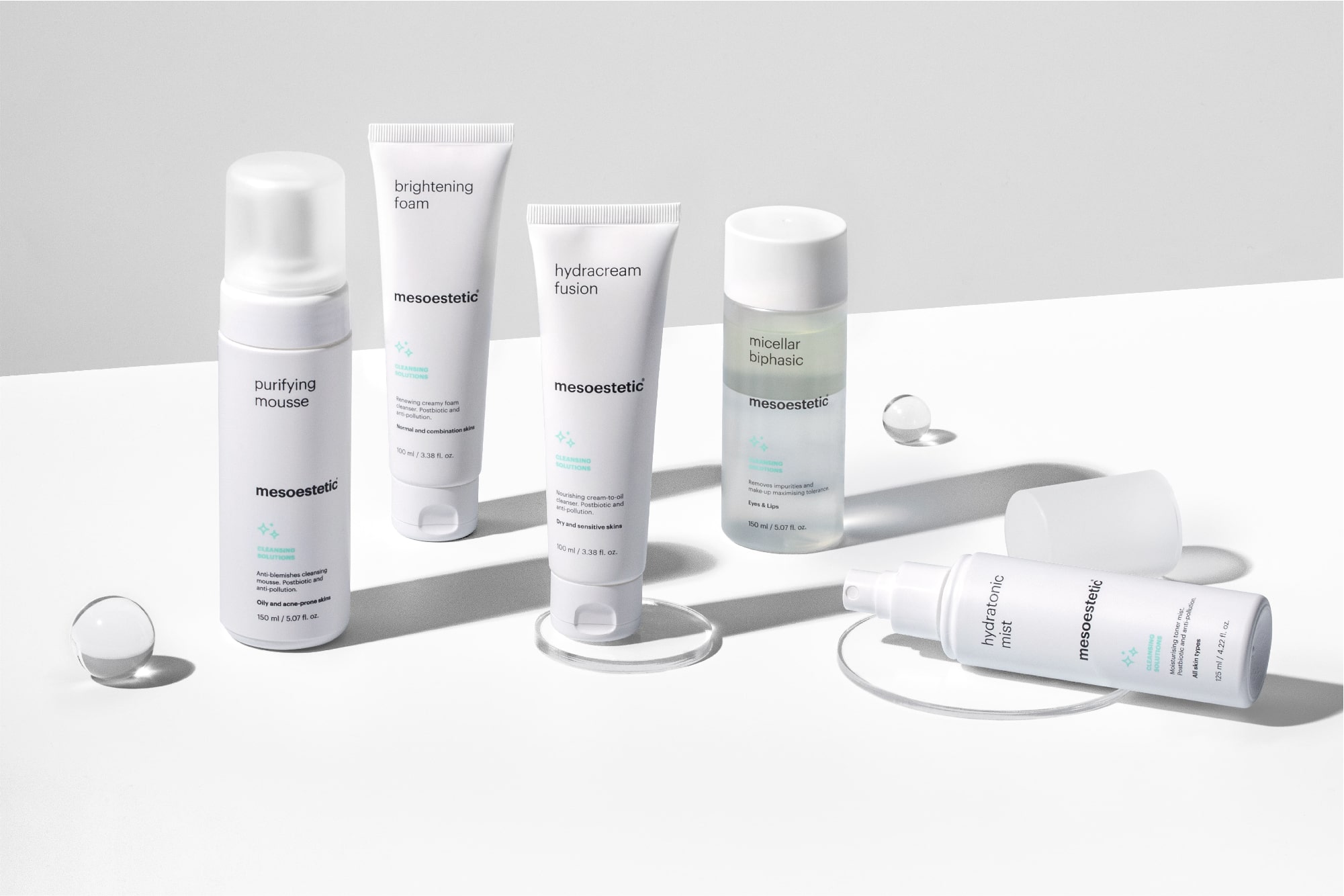
Once we had defined the brand positioning and visual identity, we started hands-on with the portfolio reimagining. To do so, we structured it in three families, ranging from the medical range to the esthetics and domestic use. To better navigate through the ranges, a set of symbols was developed, each of them highlighting the type of solutions for the skin. The first pack to shed light on the new brand consisted in a special edition cream. In it, we wanted to convey the minimalism yet sophistication of the new brand, while making the brand concept, the product hero.
We also defined the communication principles and the visual brand universe, working with our partner Alejandro Sonoro, who captured the beauty of Mesoestetic women, by adding his personal interpretation of how beauty can also deploy science and still life photographer, Marçal Vaquer who helped us represent the merging of medical processes and cosmetic science.

CREDIT
- Agency/Creative: Morillas Branding
- Article Title: Mesoestetic – The Element for Skincare Experts
- Organisation/Entity: Agency, Published Commercial Design
- Project Type: Identity
- Agency/Creative Country: Spain
- Market Region: Europe
- Project Deliverables: Brand Architecture, Brand Identity, Brand Redesign, Brand Strategy, Branding, Graphic Design, Identity System, Packaging Design, Photography, Product Architecture, Research, Tone of Voice
- Industry: Health Care
- Keywords: Beauty, Skincare, Brand Architecture, Element, Packaging


