


maÿk is the creative mind behind Leapfrog Remedies and their launch product, Leapfrog Immune – a powerful immune support supplement that contains the natural anti-viral active lactoferrin, plus zinc and vitamin C. A co-creation between an immunologist, pharmacist, nutritionist, lifestyle journalist Stephanie Drax and the founder of Planet Organic, Renée Elliott, Leapfrog Immune is backed by strong science and is the first supplement of its kind in the UK.
Lactoferrin and You: Lactoferrin is a little-known nutraceutical, despite its extraordinary benefits. You’re no stranger to lactoferrin – it’s working inside you right now as an important part of your innate immune system. Your body naturally produces lactoferrin every day – it’s in your eyes, nose and mouth – ready to neutralise or suppress germs as they attempt to enter the body.
When we’re stressed, tired, run down, not eating properly, or simply ageing, our innate lactoferrin may be depleted faster than it is restored leaving us vulnerable. This is when Leapfrog springs into action.
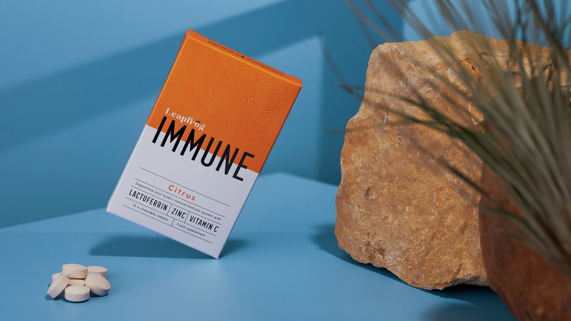
Formulated as a chewable tablet, Leapfrog Immuneis predominantly absorbed through the mouth to get to work more quickly. No water needed, no pills to swallow.
Natures Remedy: Lactoferrin is a key component of mother’s milk and is created by nature to offer a newborn optimal immunity. Our lactoferrin comes from milk produced by French cows that live on an all-natural diet on family farms within 80km of St Pol sur Ternoise in France. The lactoferrin is separated from fresh milk and then gently microfiltered, purified and dried to preserve the structure, activity and purity. The idea of this protein intertwining science and nature lead to the trademarking of Nature’s Remedy.
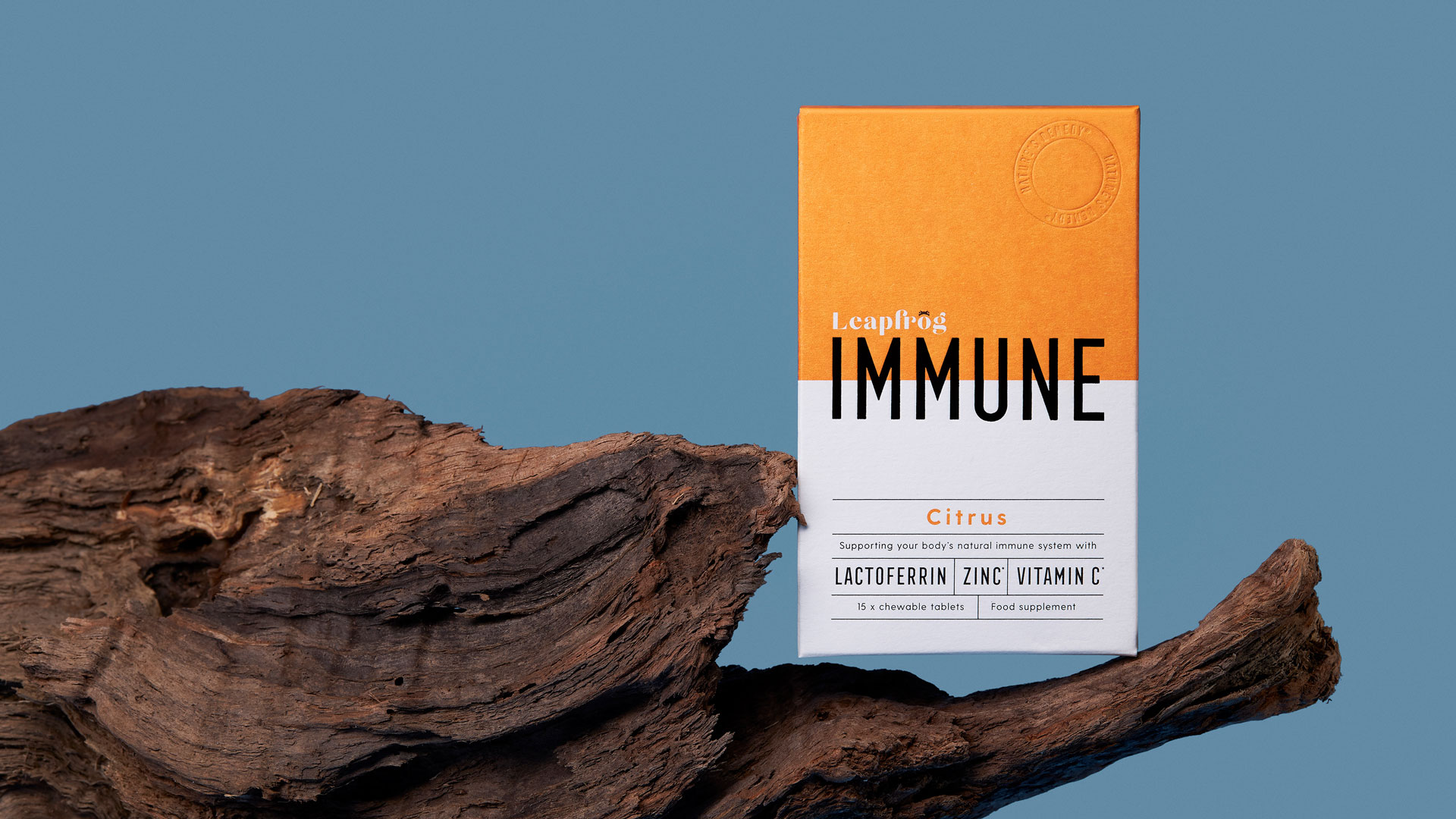
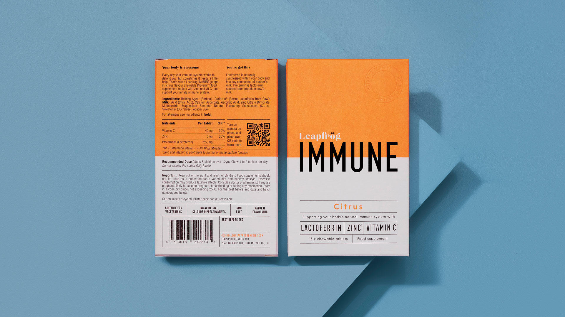
Leapfrong Immune is a UK Pioneer: Leapfrog Immune is the first chewable supplement in the UK with lactoferrin, zinc and vitamin C. The design of Leapfrog Immune needed to be both distinct and vivid enough to engage curiosity in a crowded marketplace. The bold title – Immune – needed to educate and enlighten from a distance.
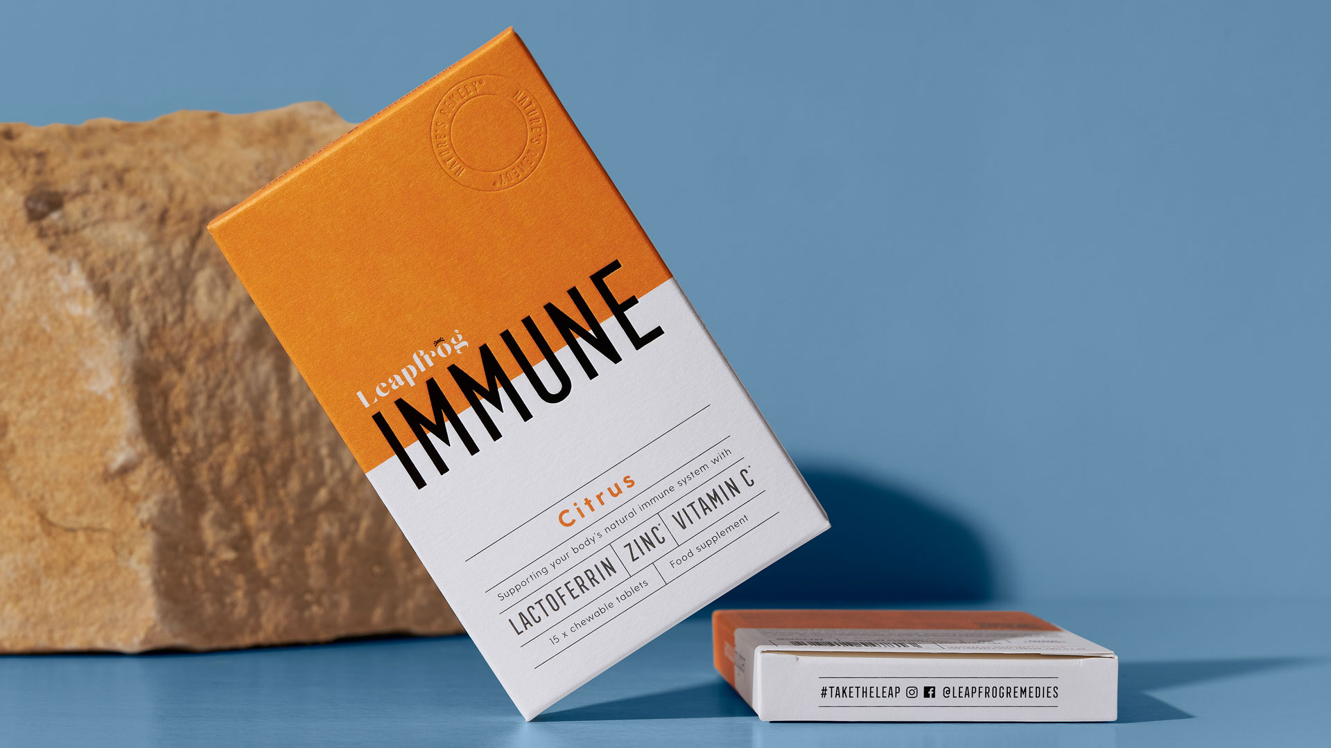
The Leapfrog Journey: Over the course of 12 months, the formulation of Leapfrog Immune evolved from a liquid to a gummy to a chewable tablet, and with each pivot came fresh packaging concepts: from amber glass bottles, to PET tubs and biodegradable pouches. The scientific evidence dictated the necessity for a chewable – the action of the lactoferrin begins in the rich vein network of the mouth, bypassing the gastric juices that capsules and swallow-with-water tablets fall prey to. The chewable tablet radius was small – 14mm – and the tablets required protection from humidity and water. A blister pack was the obvious choice to preserve and protect the chewable tablets. After research into biodegradable blisters, the evidence could not conclusively state that the tablets would remain stable on shelf. Once the blister sheet of 15 tablets was decided on, the carton needed to be created.
The Brief: Leapfrog Immune has a relatively high price point in the supplement sector and therefore the product needed to have a premium look and feel. The brief was to have the product sit comfortably on a shelf in a woman’s bathroom surrounded by her premium beauty products. Conversely, this was not to be a supplement that would be relegated to the back of a kitchen cupboard. The carton needed to have tactile appeal – that the quality of the product could easily be sensed from the paper at the first touch. Budgets were tight but simple boxboard was not going to cut it: several paper finished, weights and brands were appraised including Curious Matter from Arjowiggins, Snow White by Keaykolour and Colorplan’s 250gsm Bright White. Ultimately, the simplicity yet stunning quality of Colorplan won the job.
On-the-Go Format: Unlike many other supplements that require water, Leapfrog chewable tablets are perfect for on-the-go (particularly useful for anti-viral protection when travelling). The idea was to keep the carton pocket-sized, so that it could easily fit into a handbag or back pocket.
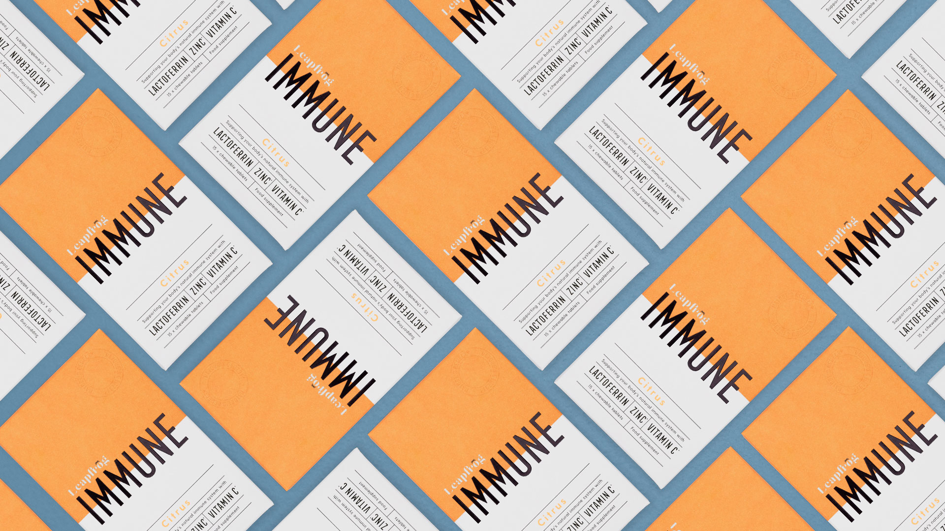
Colour and Design: The strong, bright orange not only offered shelf presence but also corresponded well to the delicious citrus flavour of the tablets (and built into this was the notion that future products in the range would have other flavours and associated colours). The 50/50 orange/white colour split was a playful riff on traditional pill supplements, but on the box of convenient chewable tablets. The front of pack was intended to be bold, clean and uncluttered, allowing the word Immune to capture attention. The matte finish with glossed Immune added to the eye-catching drama and also gave an impression to the touch. The side of the pack – a clean ‘Leapfrog Remedies’ – allowed the pack to be recognisable from every angle and easily found on a shelf. Nature’s Remedy is a trademark of the company and this was highlighted by the contours of a blind deboss – emphasising the trademark without overshadowing the product title “Immune”. The back of pack was never to be an afterthought: space on the small carton was limited, and so a QR code offered a link to further information and education on lactoferrin and Leapfrog.
Inspired by a French heritage apothecary brands, Leapfrog Immune balances this with a modern bold colour palette in order to stand out on shelf. The pocket-sized carton is perfect for Leapfrog’s on-the-go chewable tablets. maÿk choose GF Smith Colorplan (FSC certified) matt paper with a gloss embossed Immune and a blind deboss roundel stamp in order to place this supplement comfortably in the premium category.
CREDIT
- Agency/Creative: maÿk
- Article Title: Maÿk Helps Leapfrog Remedies Launch the UK’s First Lactoferrin Brand
- Organisation/Entity: Agency, Published Commercial Design
- Project Type: Packaging
- Agency/Creative Country: United Kingdom
- Market Region: Multiple Regions
- Project Deliverables: Brand Architecture, Brand Creation, Brand Design, Brand Identity, Brand Strategy, Branding, Graphic Design, Packaging Design, Photography, Product Architecture, Product Naming
- Format: Blister-Pack, Box
- Substrate: Pulp Board, Pulp Paper


