


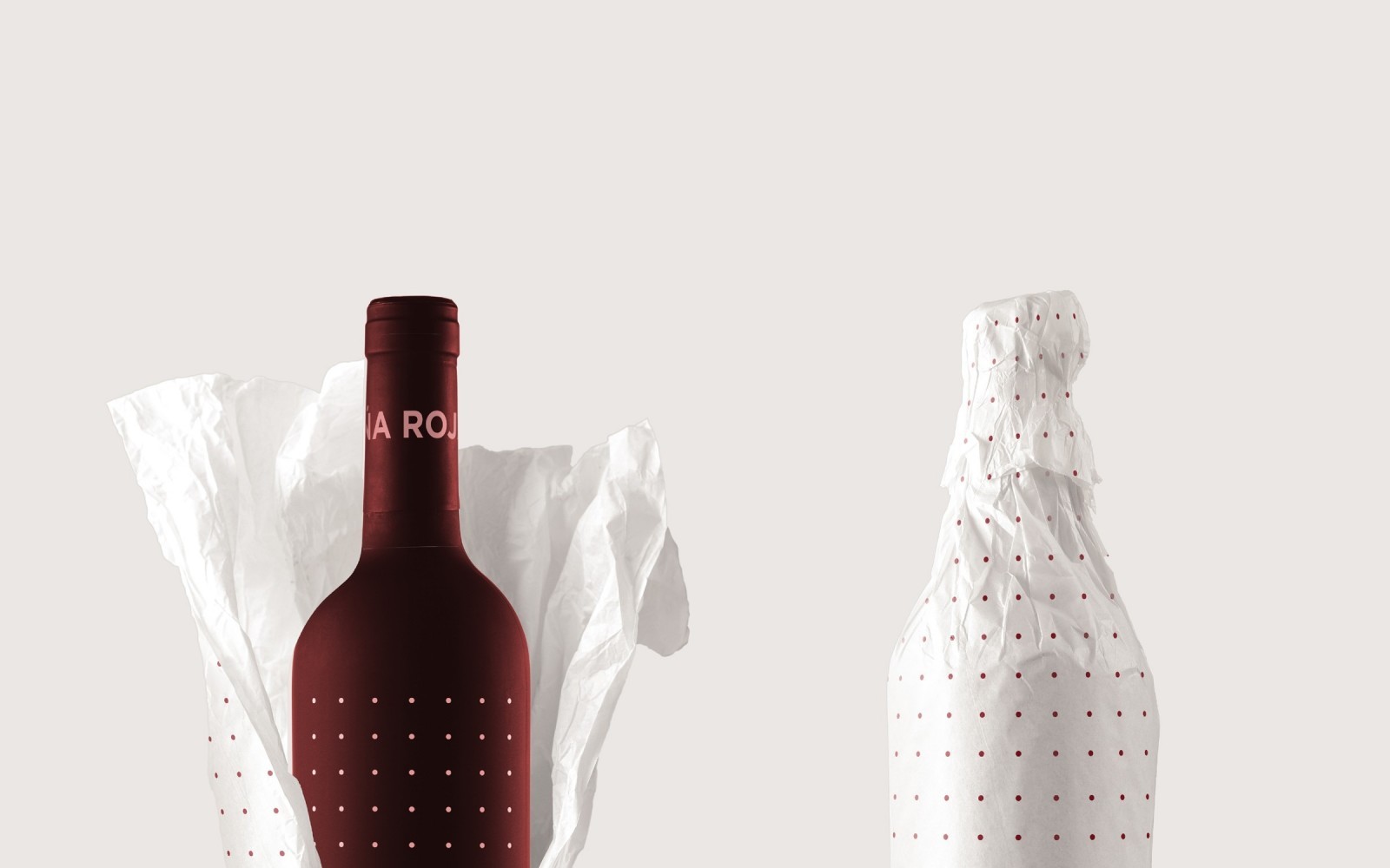

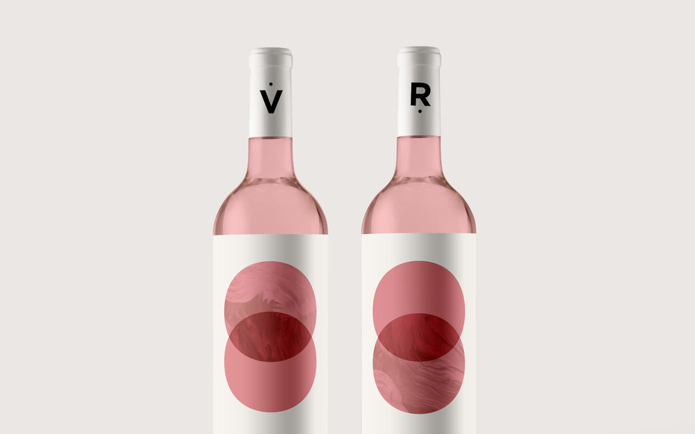
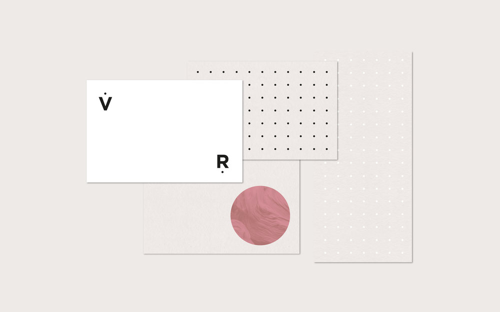
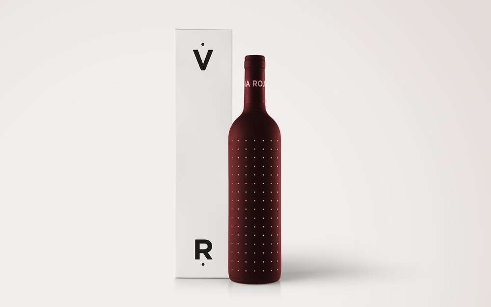
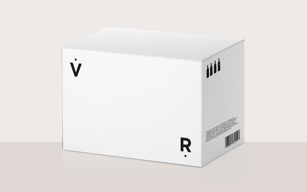
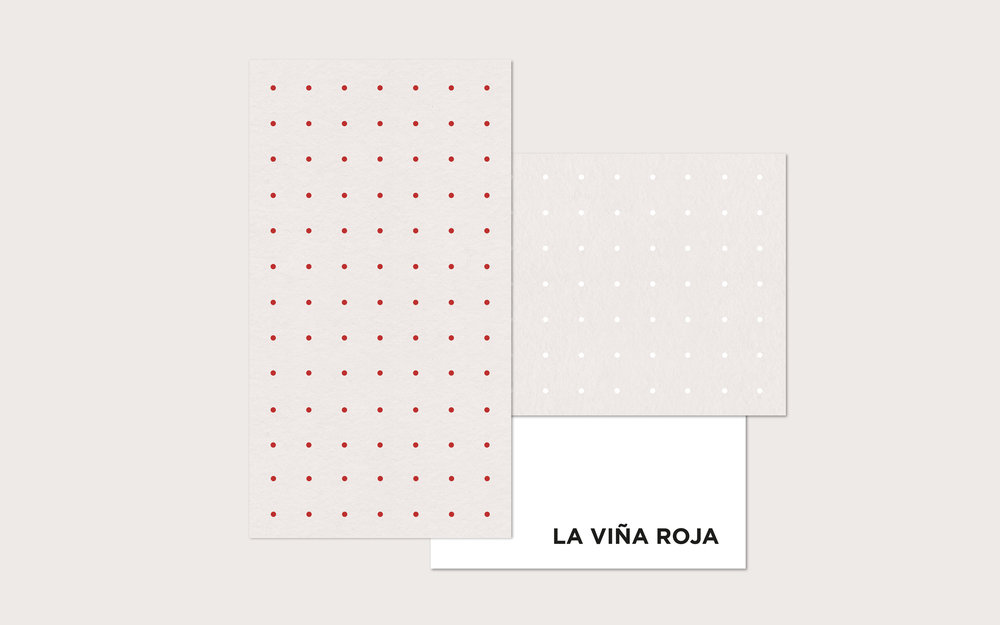
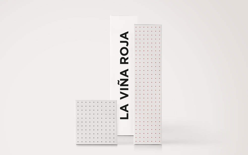
” La Viña Roja (Red Vineyard) branding & packing:The design is minimalist and conceptual. The shape of the circle represents the simplification of the grape’s shape. And the “v” is the greatest simplification of the wine glass. The pattern of circles represents in a metaphorical way, both the planting in rows, and the grapes that contain the wine bottles. The visual identity features modern typography within a simplified design by using a minimal colour palette.”
CREDIT
- Agency/Creative: María Hdez
- Article Title: María Hdez – La Viña Roja (concept)
- Project Type: Packaging
- Format: Bottle, Box
- Substrate: Glass, Pulp Carton
FEEDBACK
Relevance: Solution/idea in relation to brand, product or service
Implementation: Attention, detailing and finishing of final solution
Presentation: Text, visualisation and quality of the presentation


