


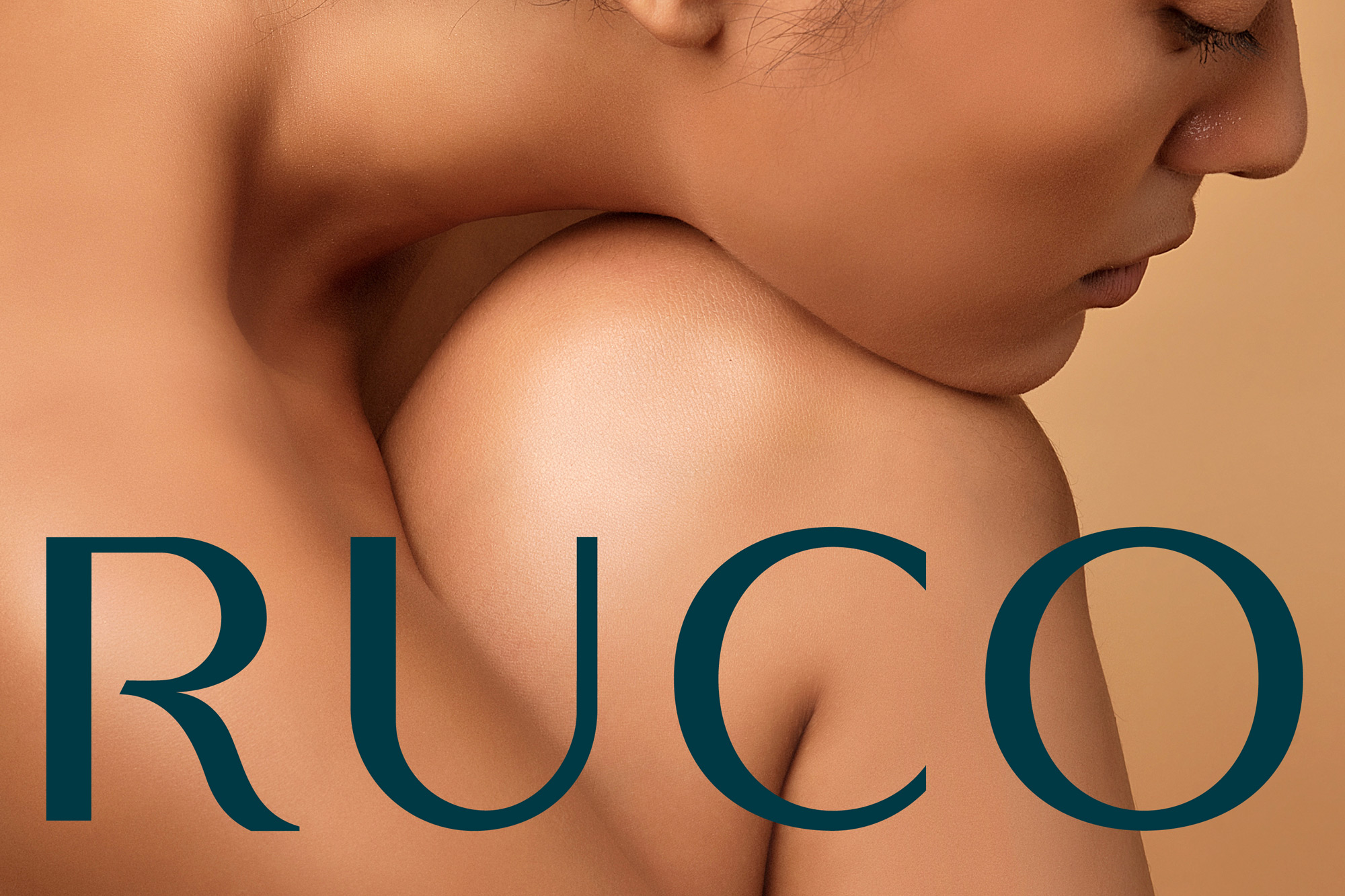
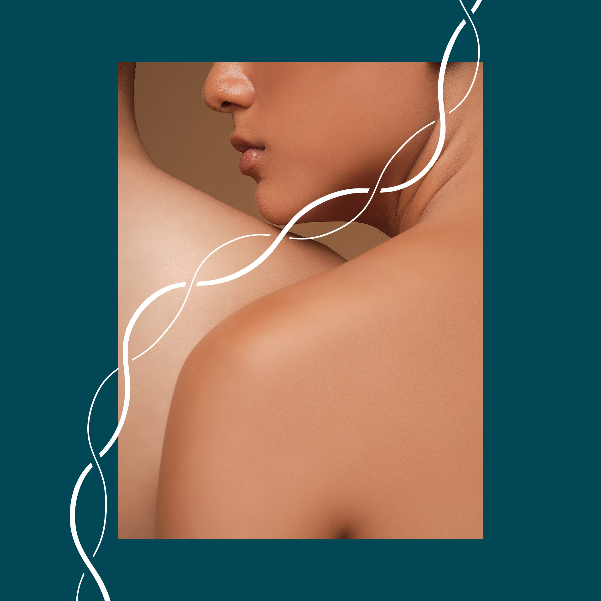
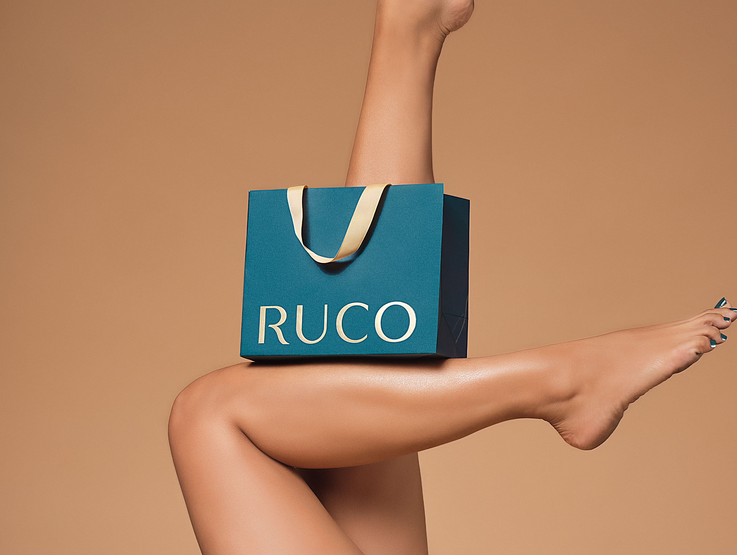
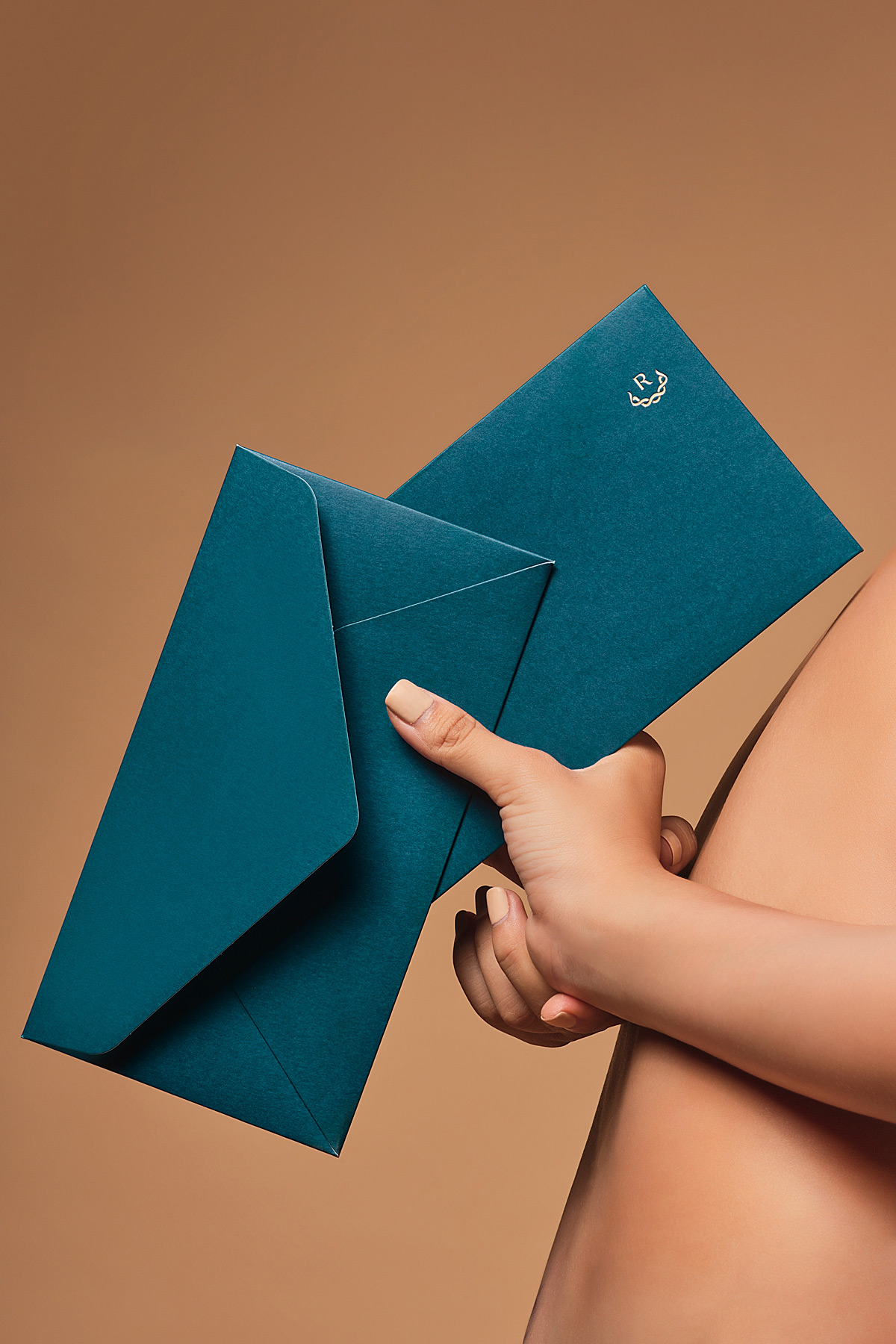
Engaging women’s body curves and lines, Ruco is well known as a certified international beauty clinic that applies non-surgical innovative technology for facial and body rejuvenation. Their rebranding needs a complete system speaking in one voice representing customers’ flawlessness and feminity.
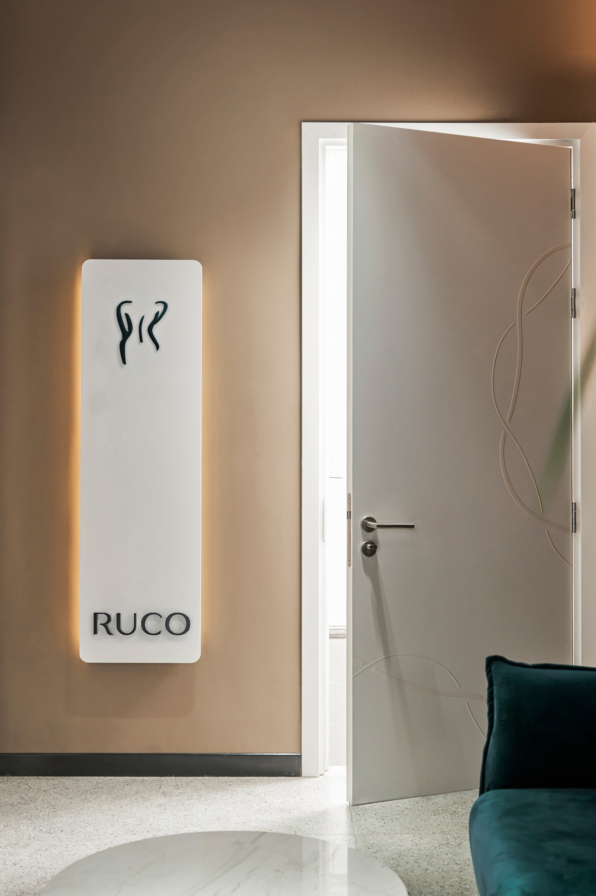
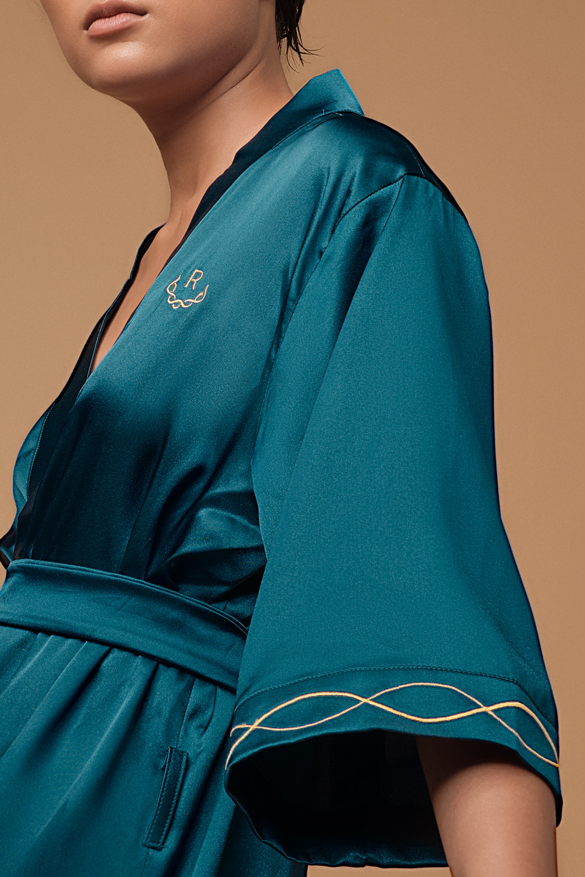
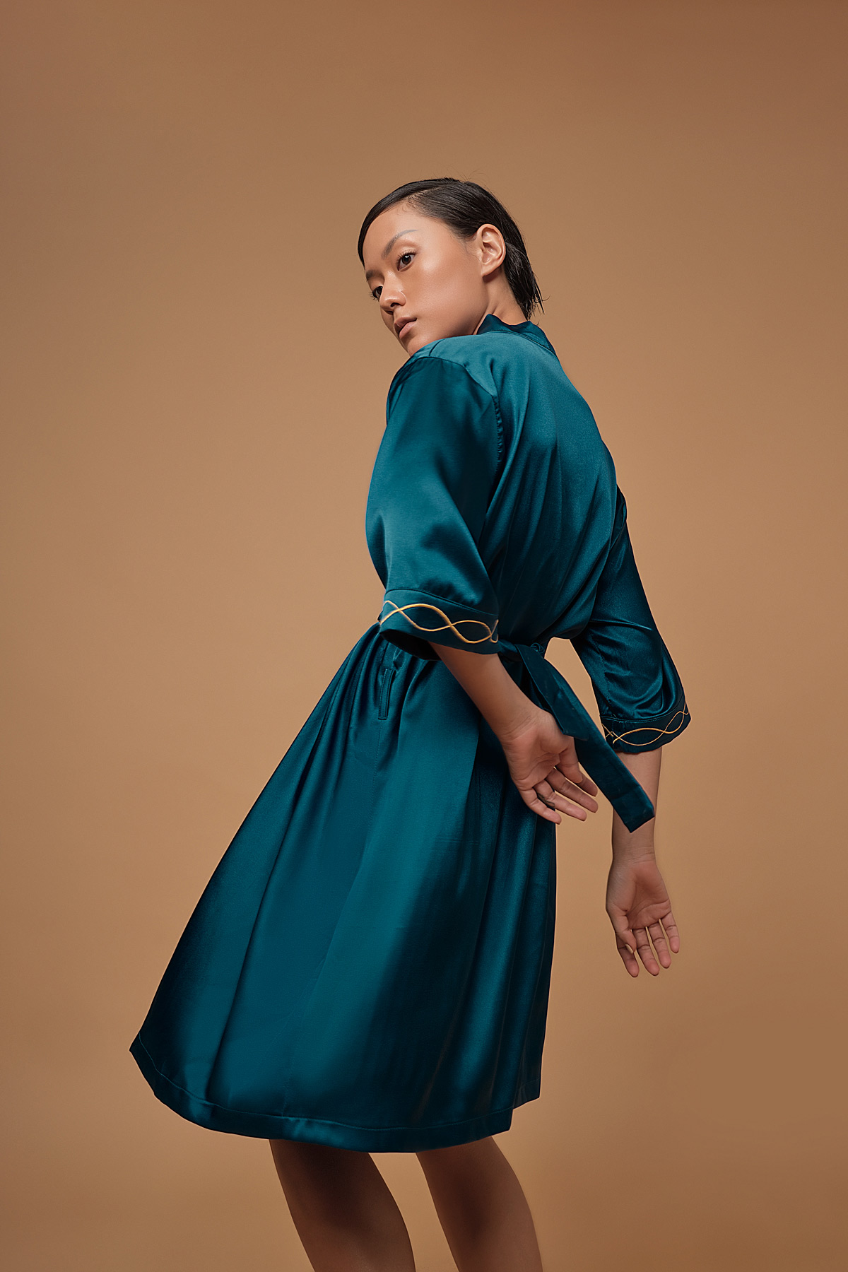
Honoring the delicate body curves and skin rejuvenating technology, we create “The Femina” – the key element of the brand. With 2 graceful curvy lines harmonizing in an infinite loop, the new symbol can be easily recognized and refers to the exquisite feminine details.
Traits from The Femina are used to create additional elements, including sets of braids that seamlessly run throughout layouts and applications to create a more dimensional system. We separate them into 4 different types, represent 4 qualities that Ruco’s service provides, as well as characteristics found in their customers: Circle: completion, perfection Twisted: Outstanding, flexibility Straight: Sustainability, everlastingness Curvy: softness, femininity.
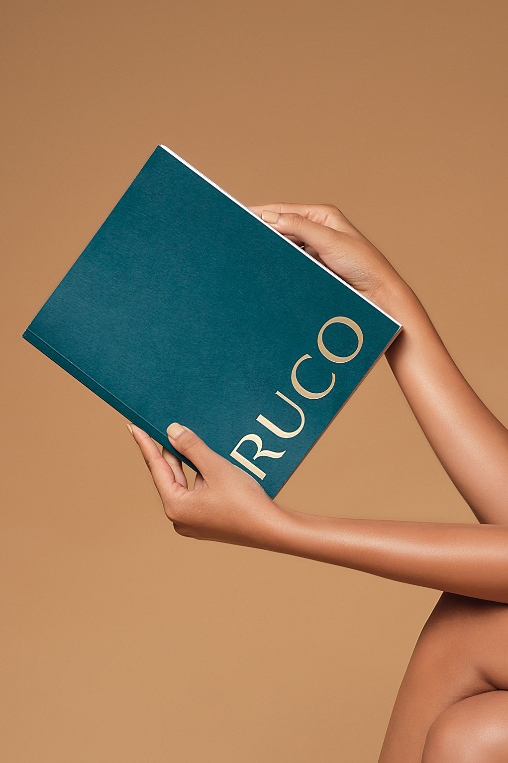
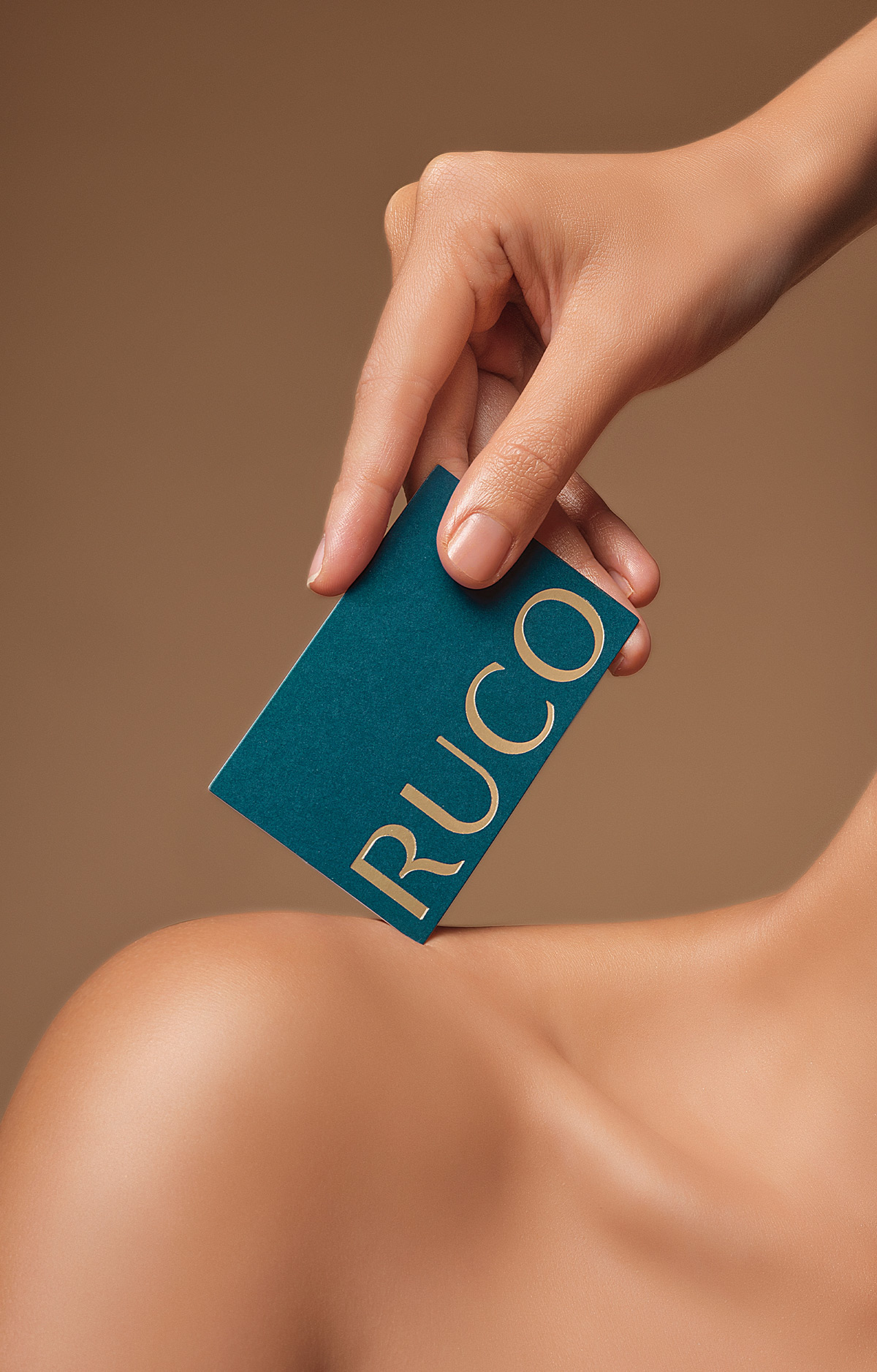
Typographical form from the logotype addressed on Ruco’s iconography system, sculpturing the beauty essence literally ready for applications.
Along with the Femina motifs & simple typographic expression, the brand delivered a sense of informational immediacy, dividing content in the arrangement, orientation and typesetting of Helvetica Neue.
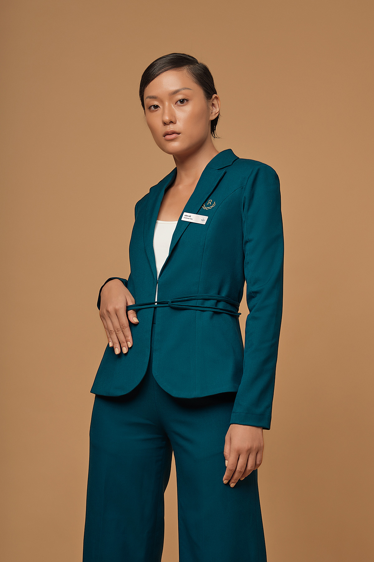
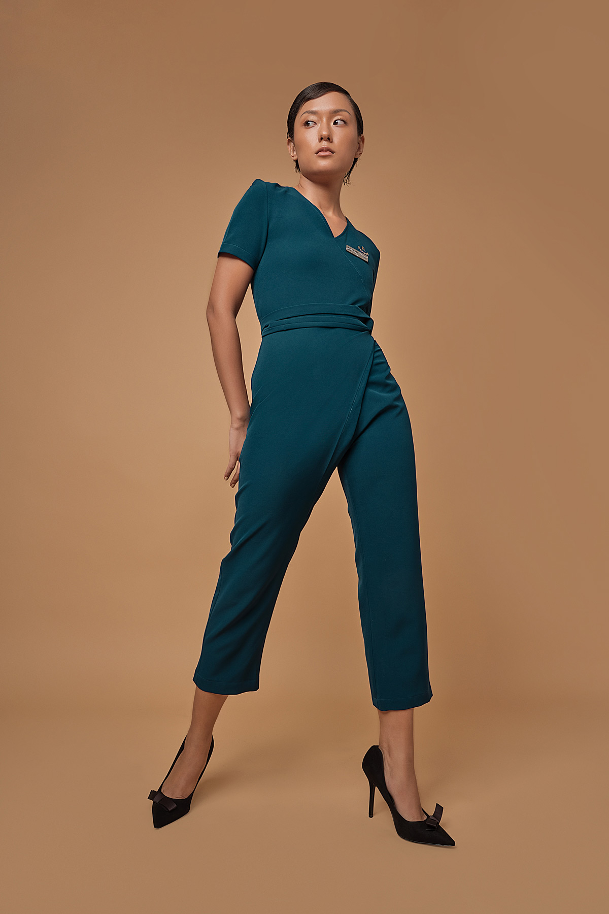
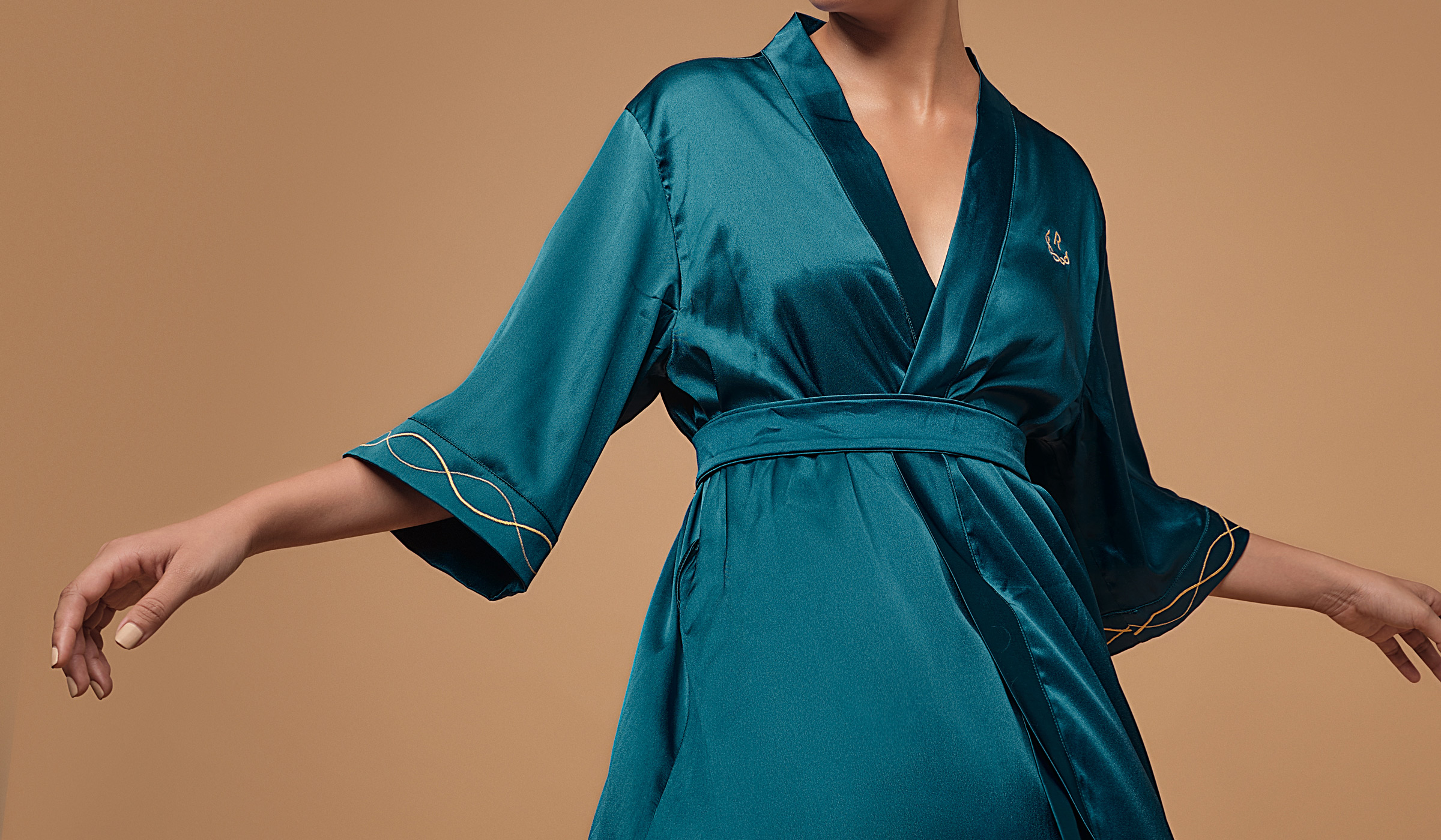
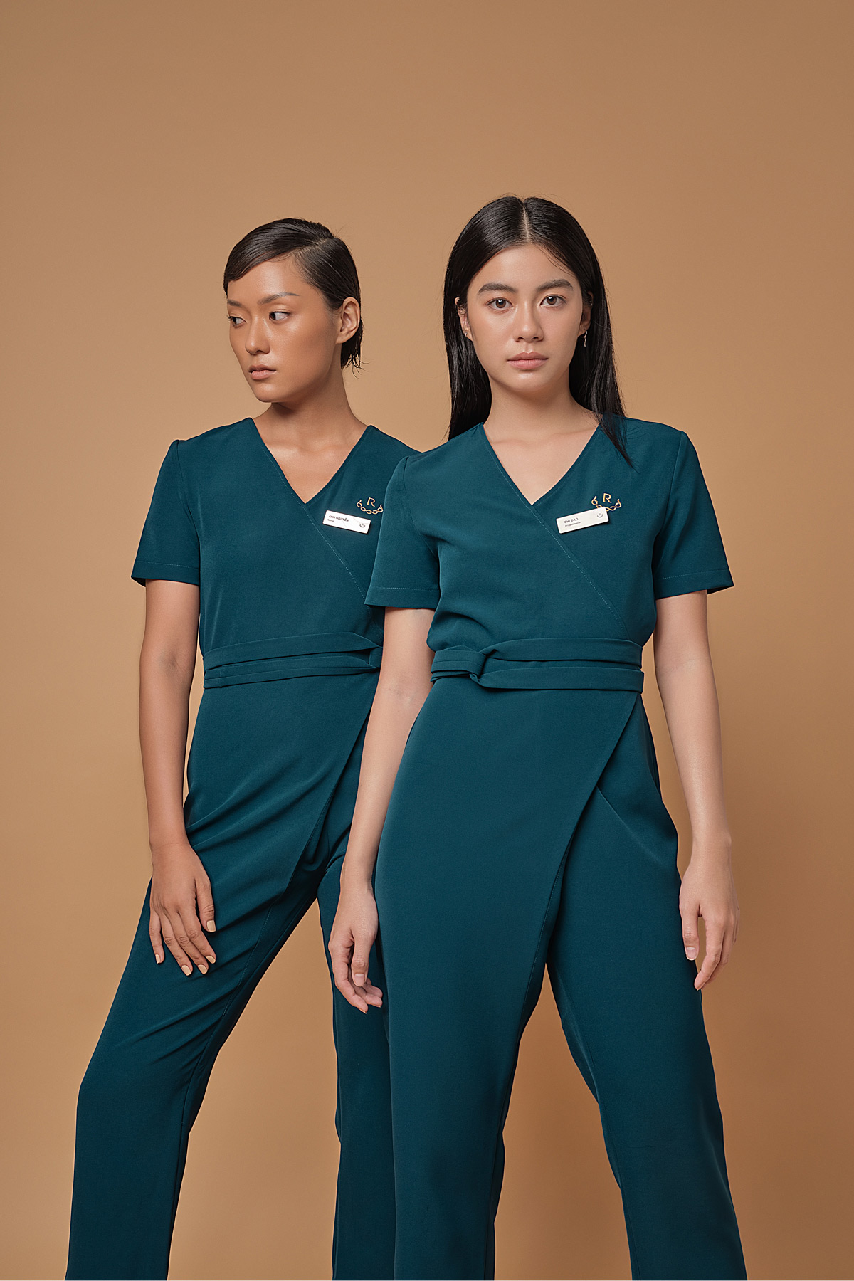
All of the uniforms are perfectly designed to achieve that professional voguish look for the staff, every piece is custom-fitted to enhance each staff’s body form. Subtle elements that refers to the brand are also input, like the twisted belt of the consultant’s pantsuit or the front fold on the beauty technician’s bodysuit.
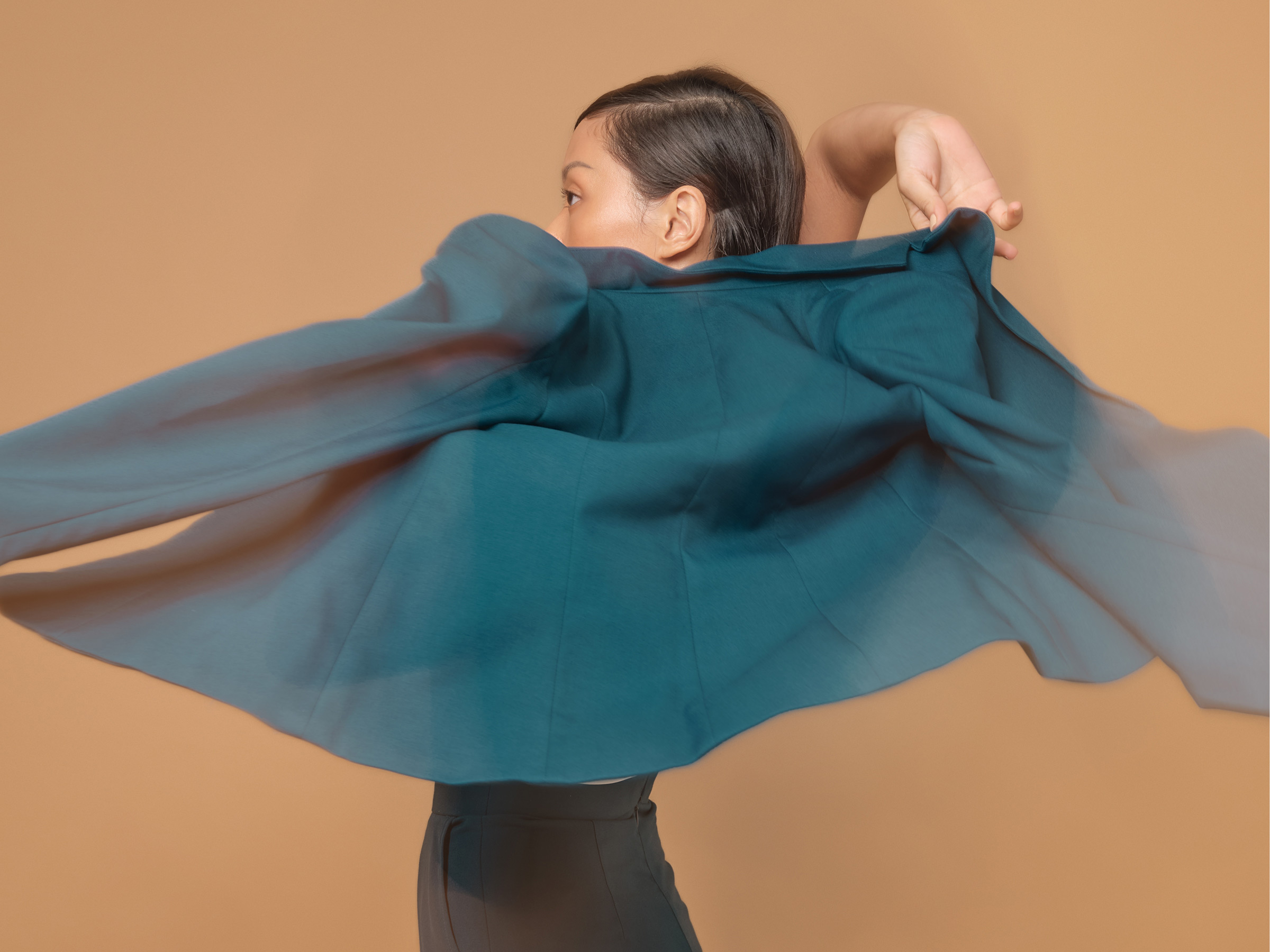
This rebranding work created a dynamic visual system based on something so minimal and essential. The solution is keeping away from chaotics usual Vietnamese spa design motif with many fonts and imagery but having communication troubles. This is not just a visually exciting and appropriate identity but one that provides ample opportunity for the symphony to be as expressive, adventurous, and evocative in its communication as it is in the music and experiences it creates.
CREDIT
- Agency/Creative: M — N Associates
- Article Title: M — N Associates Redesigned Feminine Ruco Clinic
- Organisation/Entity: Agency, Published Commercial Design
- Project Type: Identity
- Agency/Creative Country: Vietnam
- Market Region: Asia
- Project Deliverables: Brand Advertising, Brand Creation, Brand Design, Brand Experience, Brand Guidelines, Brand Identity, Brand Naming, Brand Redesign, Brand Refinement, Brand Rejuvenation, Brand Strategy, Brand World, Branding, Graphic Design, Identity System, Photography, Rebranding, Research, Retail Brand Design, Structural Design, Tone of Voice
- Industry: Health Care
- Keywords: BEAUTY, BODY, BRANDING, CLINIC, COSMETIC, PLASTIC SURGERY, SPA, DERMATOLOGY, SKINCARE, VISUAL IDENTITY


