


The Luxembourg Dental Institute is a dentistry institute based in Luxembourg, where the main focus is the education and training of professionals in the sector.
The main challenge was to create an identity with institutional style framed in a chromatic set that could easily be associated with the medicine and health sector.
The key words for the creation of this identity were oral health, training, research and teaching. At Luxembourg Dental Institute, it is believed that sharing knowledge is the main path to wisdom, and this is the main value that the brand intends to pass on.
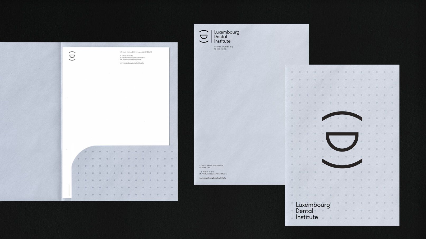
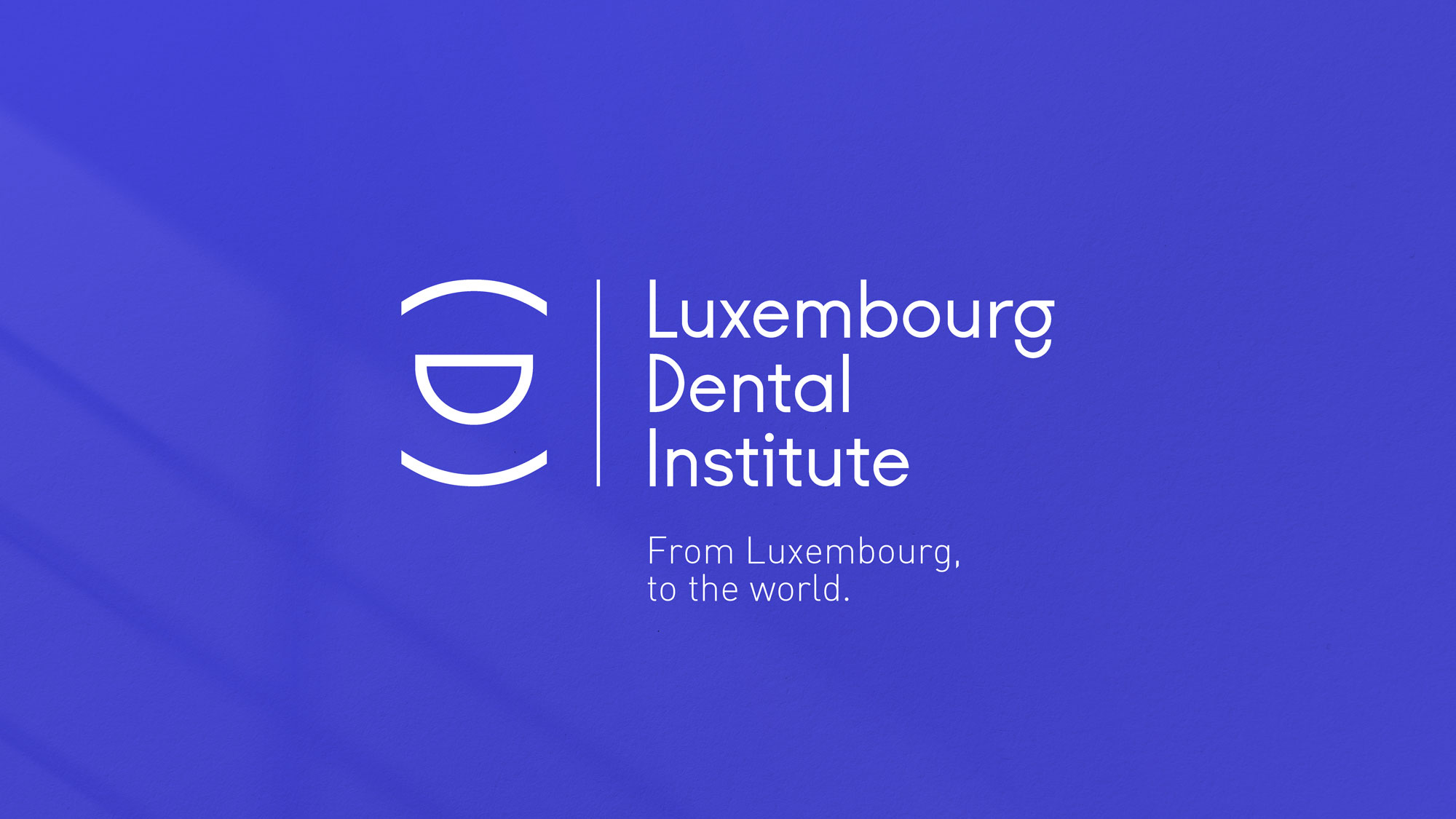
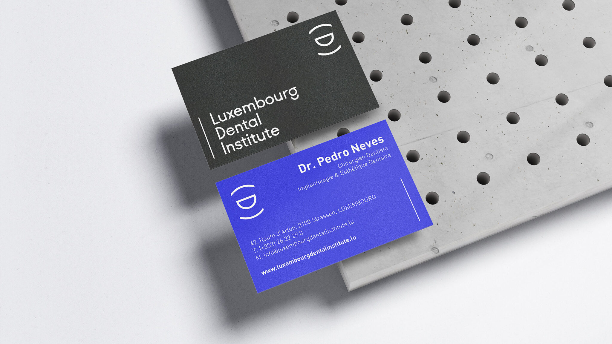
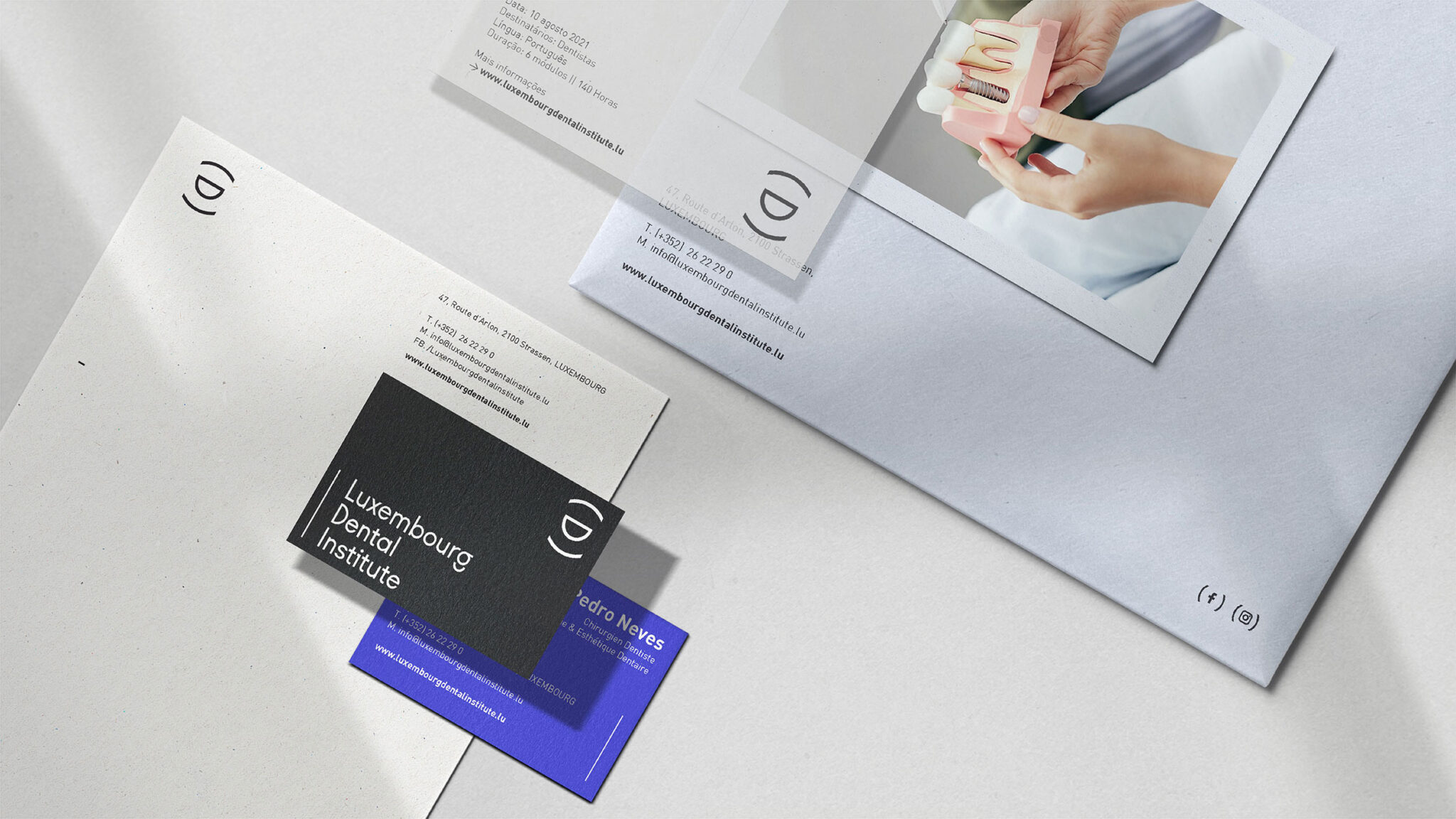
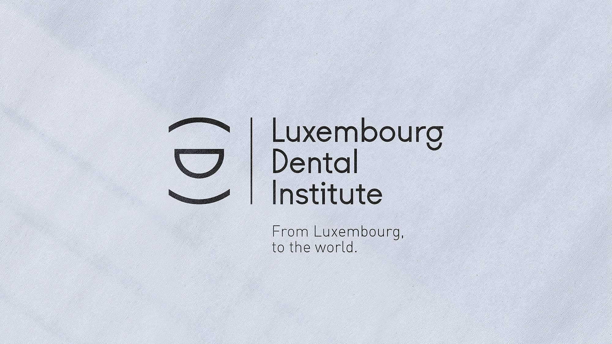
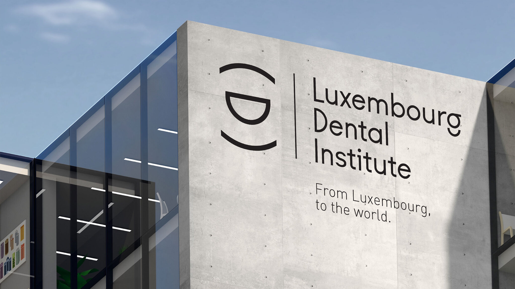
The concept of the logo started from the acronym of the name itself (LDI). The mouth starts as a representation of oral health and, in turn, the parentheses that lead us to an idea of more information, knowledge and wisdom.
The chromatic choice is essentially linked to the context of medicine and health.Light blue is a colour that conveys harmony and comfort, fostering and inspiring a learning environment. The dark blue tone reflects confidence and innovation.
Black is a color linked to professionalism, while white is associated with the purity and sophistication of the sector.
This color palette thus reinforces the brand’s association with the educational and medical sector.
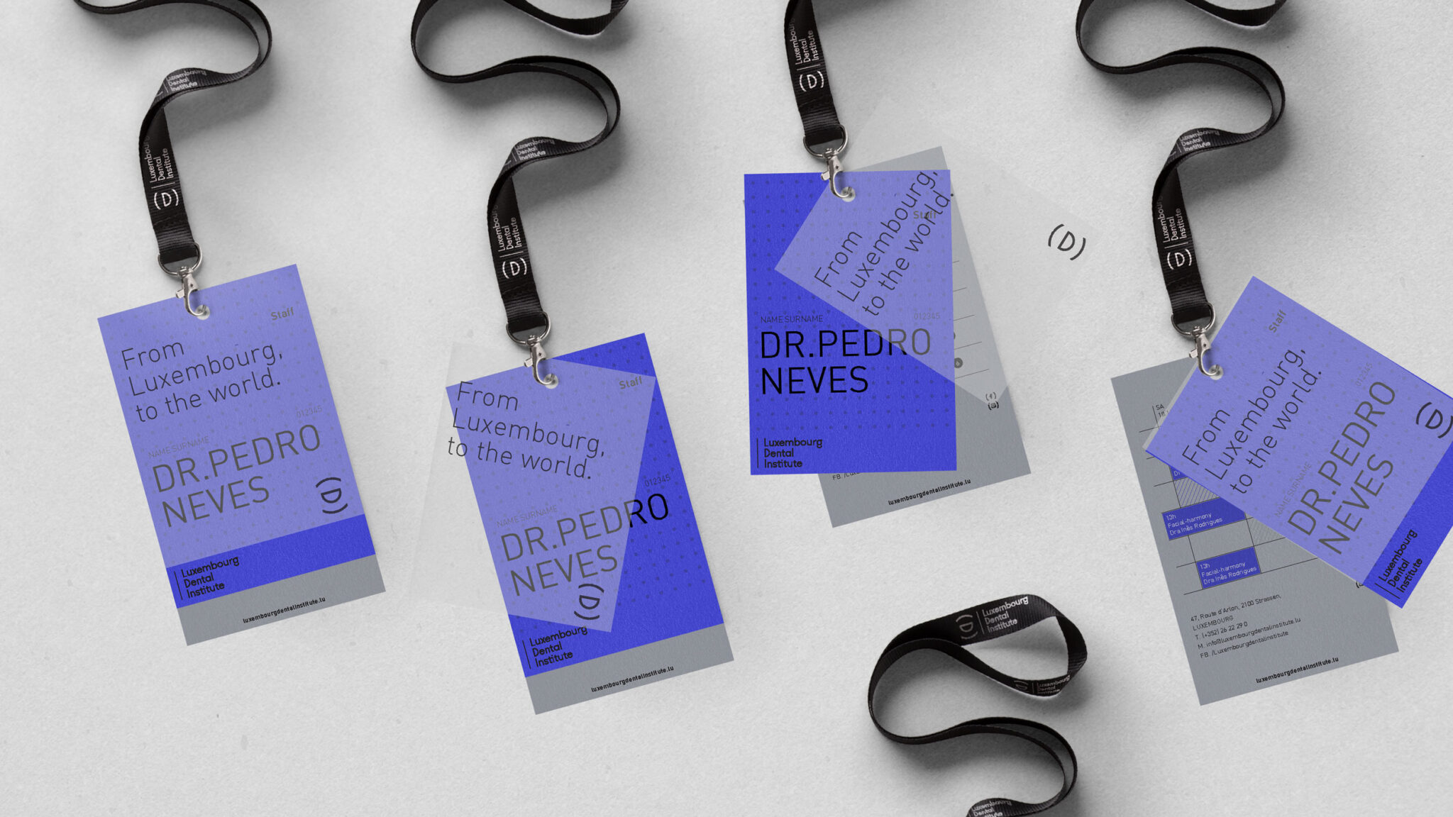
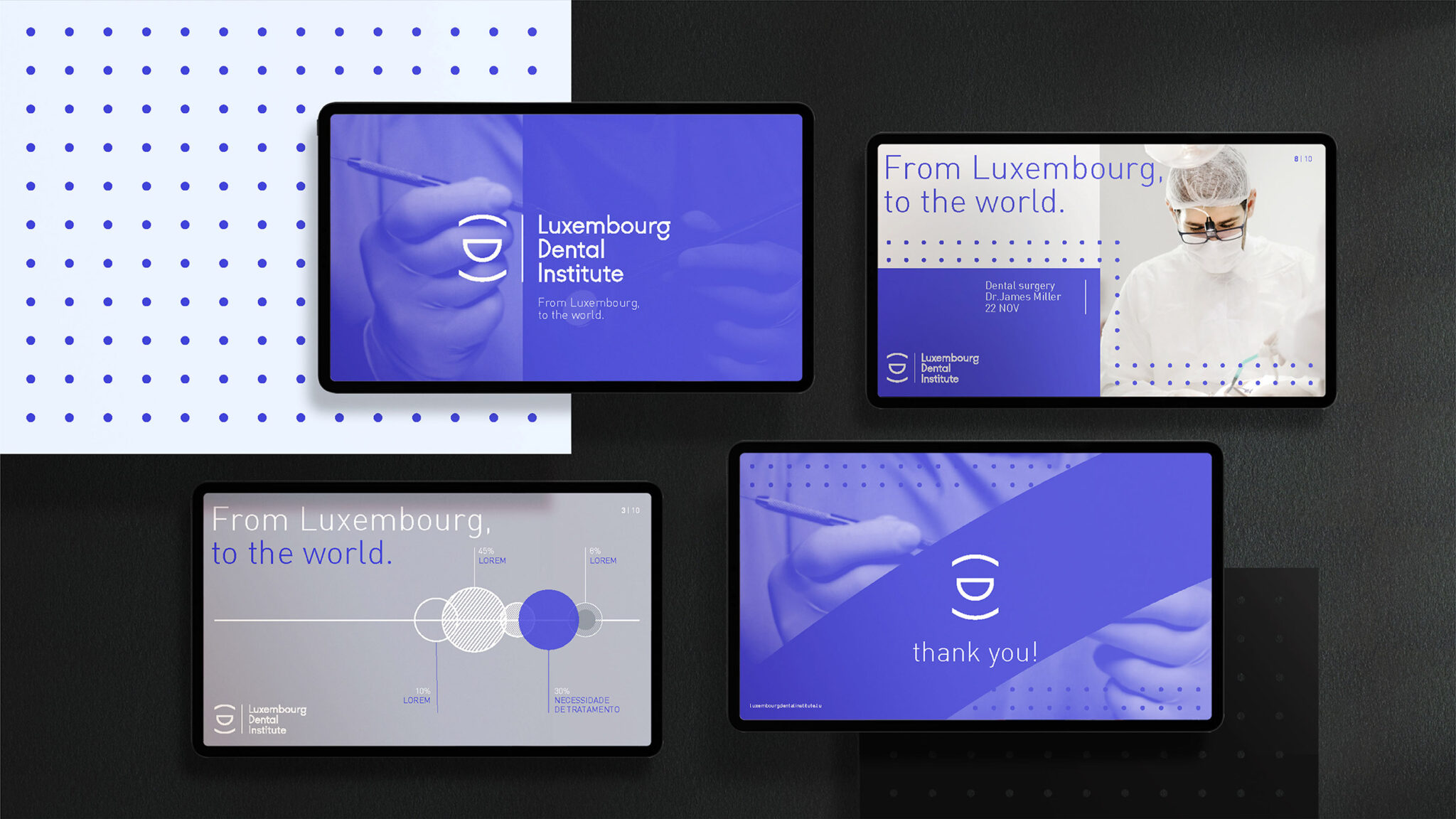
Although the brand is headquartered in Luxembourg, it is intended that all knowledge is transmitted to any professional in the area, either in person or online, anywhere in the world, through events, lectures and video conferences.


CREDIT
- Agency/Creative: d'front
- Article Title: Luxembourg Dental Institute Branding
- Organisation/Entity: Agency
- Project Type: Identity
- Project Status: Published
- Agency/Creative Country: Portugal
- Agency/Creative City: Cascais
- Market Region: Europe
- Project Deliverables: Brand Design, Brand Identity
- Industry: Health Care
- Keywords: Dental Institute, Oral Care, New brand, Branding
-
Credits:
Art Director: Sebastião Seguro
Designer: Bernardo Braga


