


Today we are going to tell you, from the beginning to end, what a bad day is like.
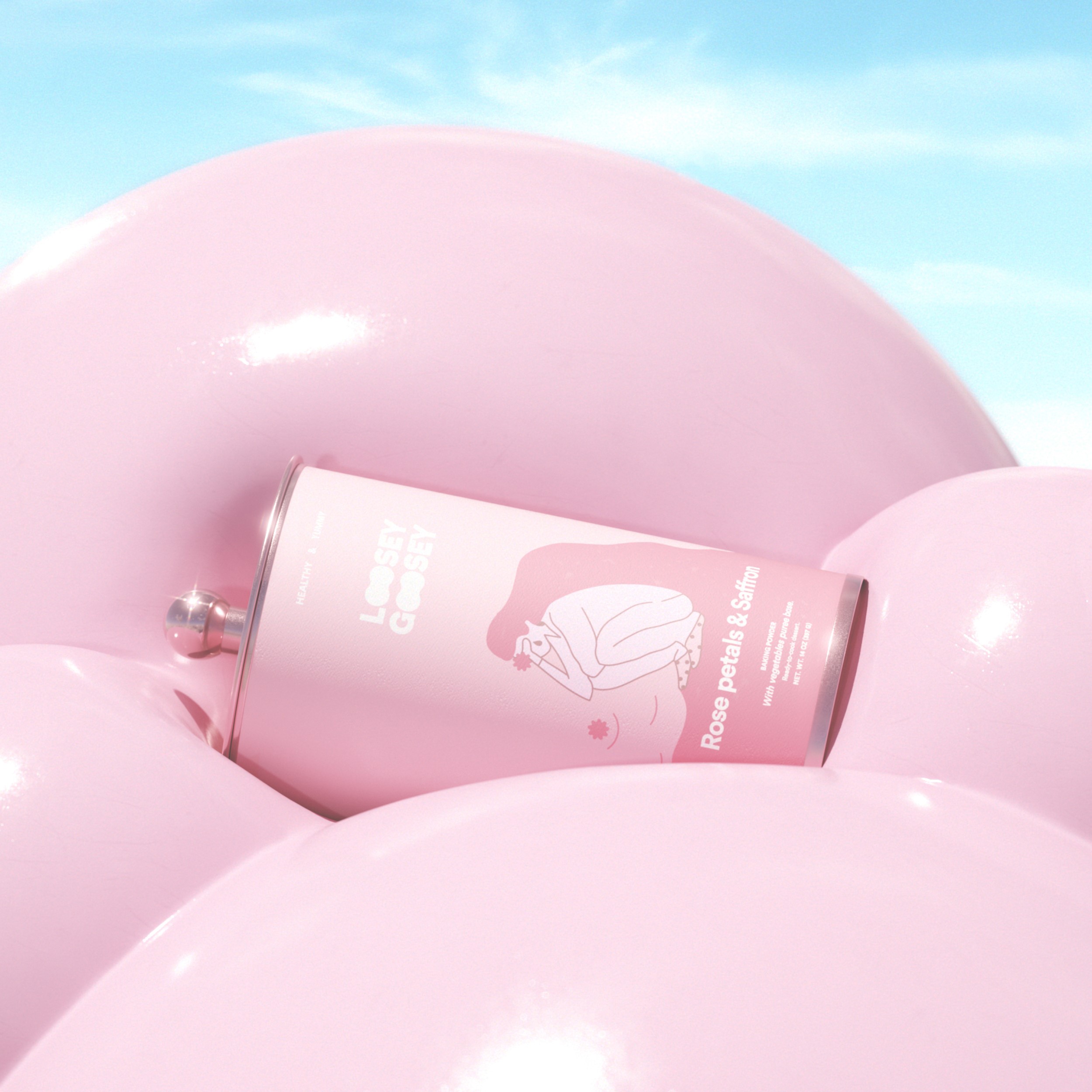
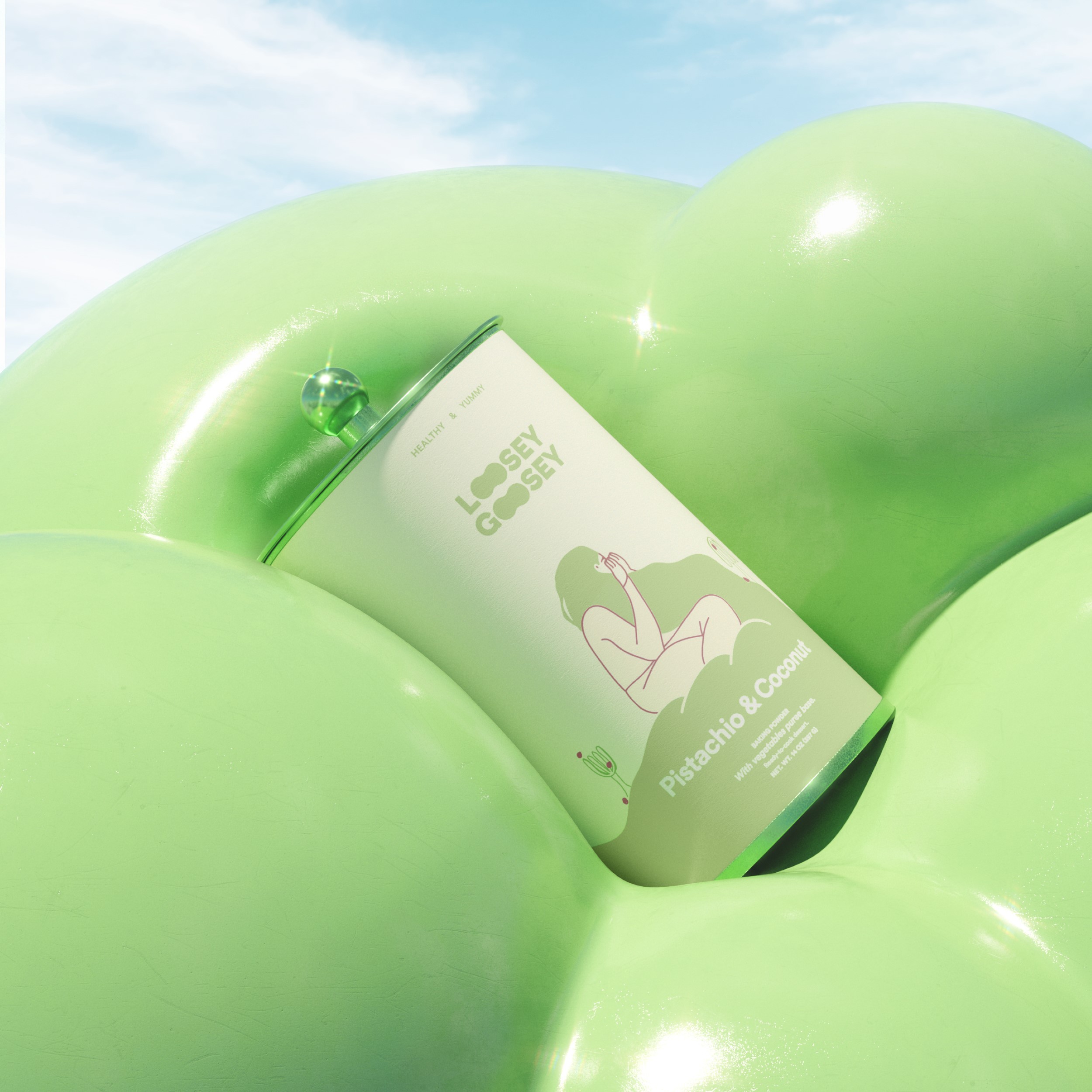
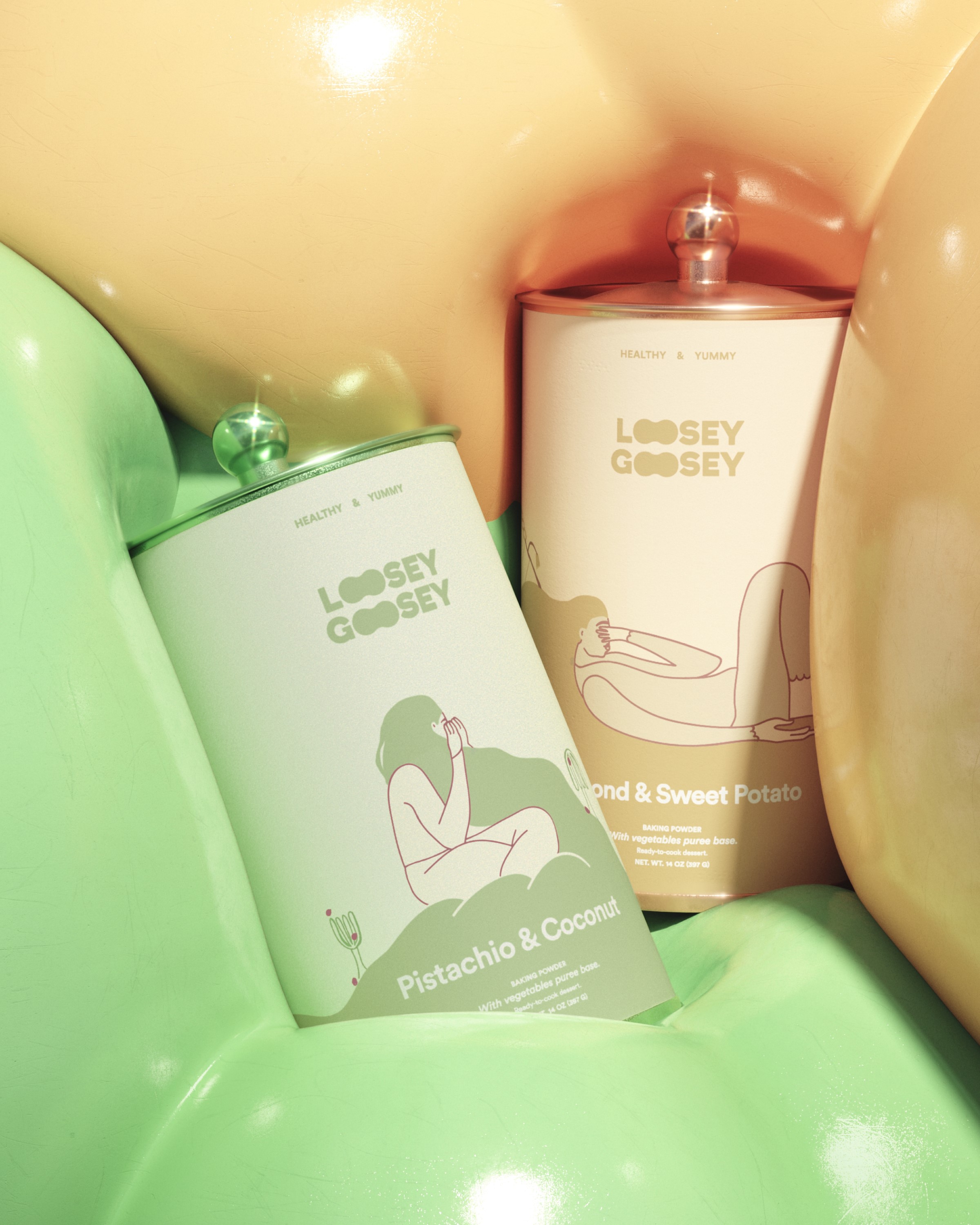
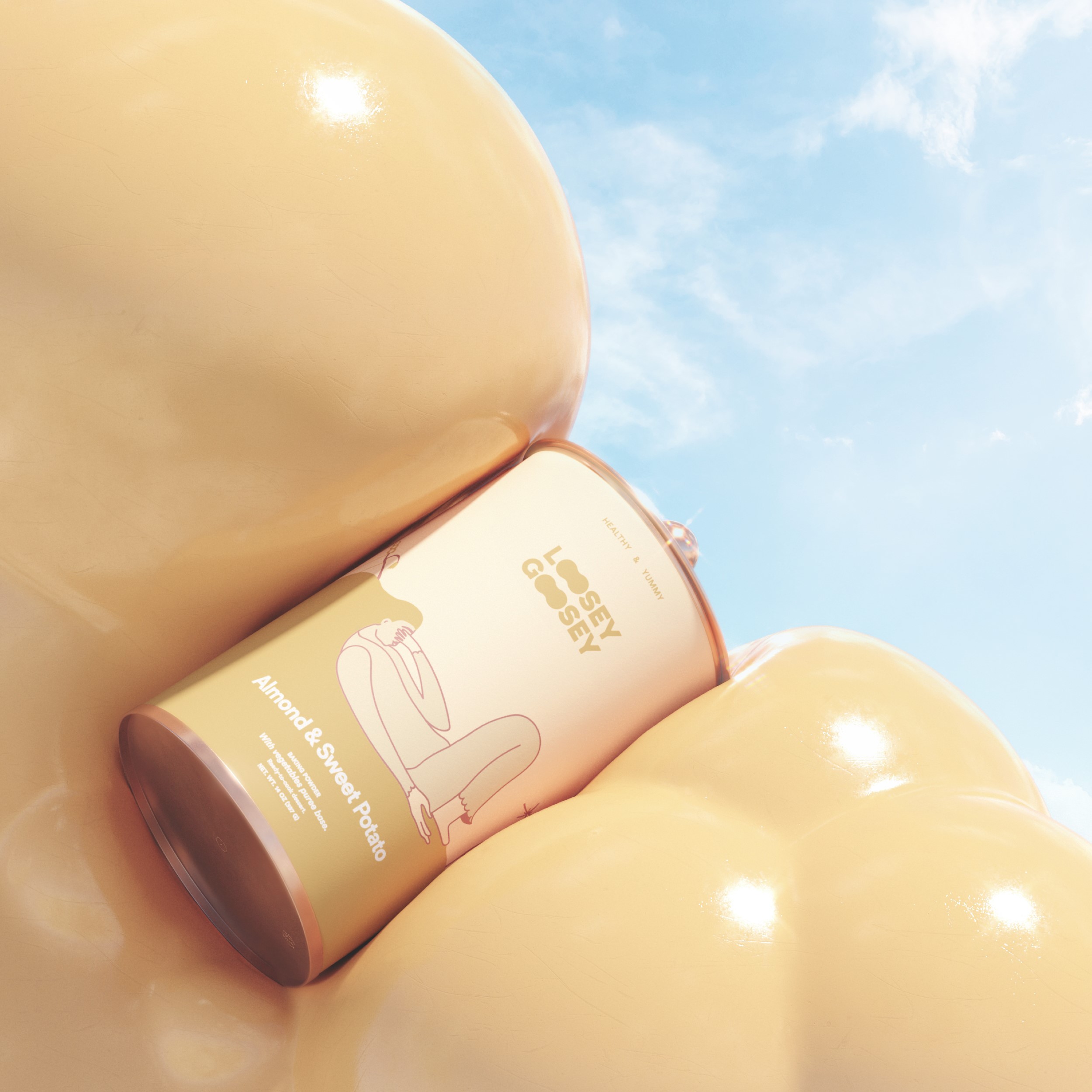
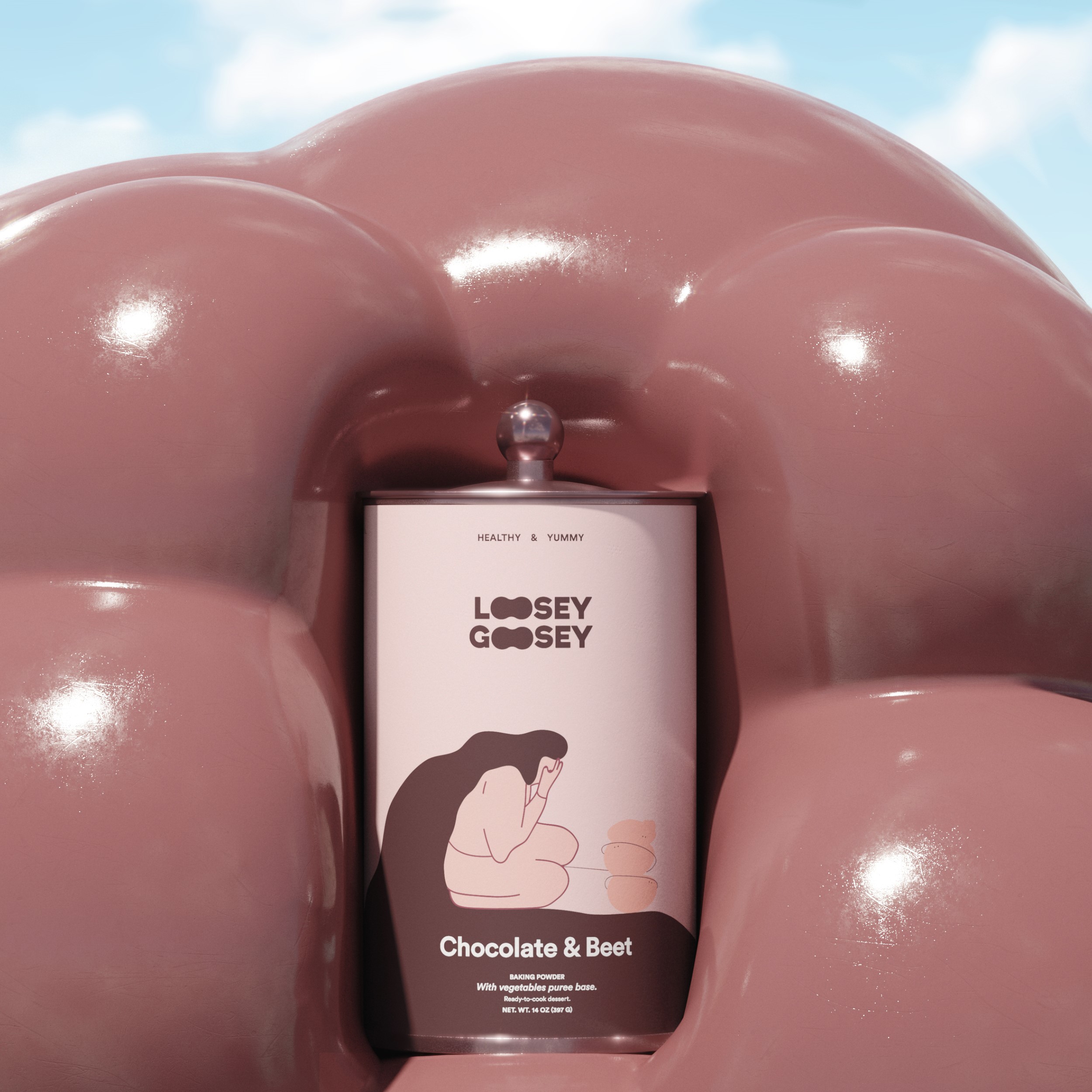
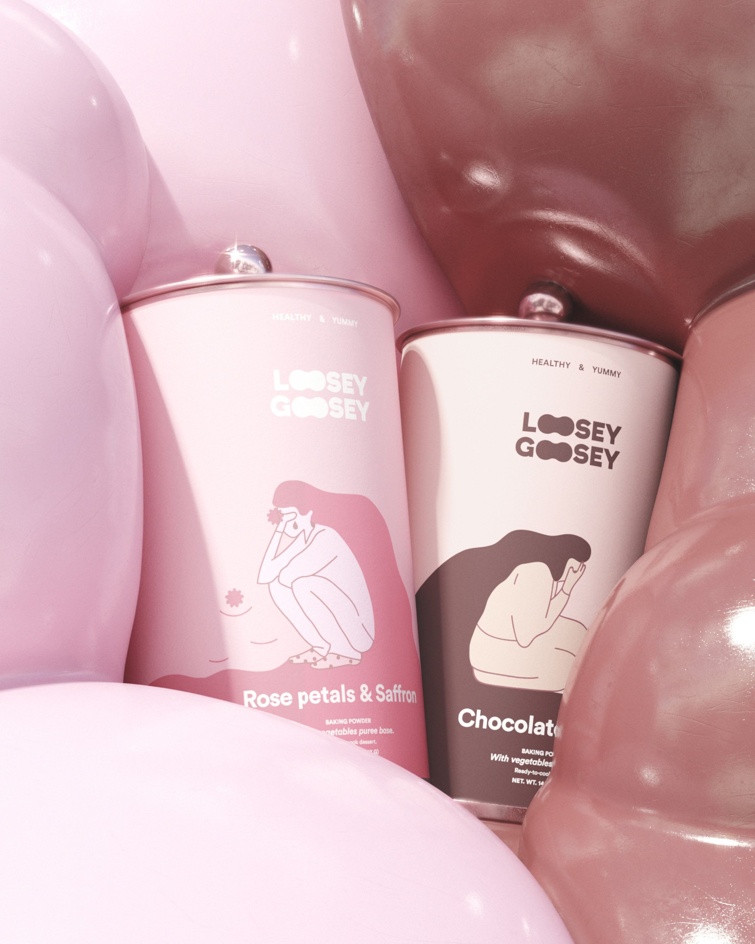
Bad days are those where everything feels more nostalgic. When you don’t crave your favourite breakfast and when your lower back hurts from so much stress. Those days where you just want time to pass faster so you can get home to be all Loosey-Goosey and pamper yourself as only you know: eating something you love, something delicious, light, and fluffy. Not only eating it but also being able to prepare it easily and simply, just like magic.
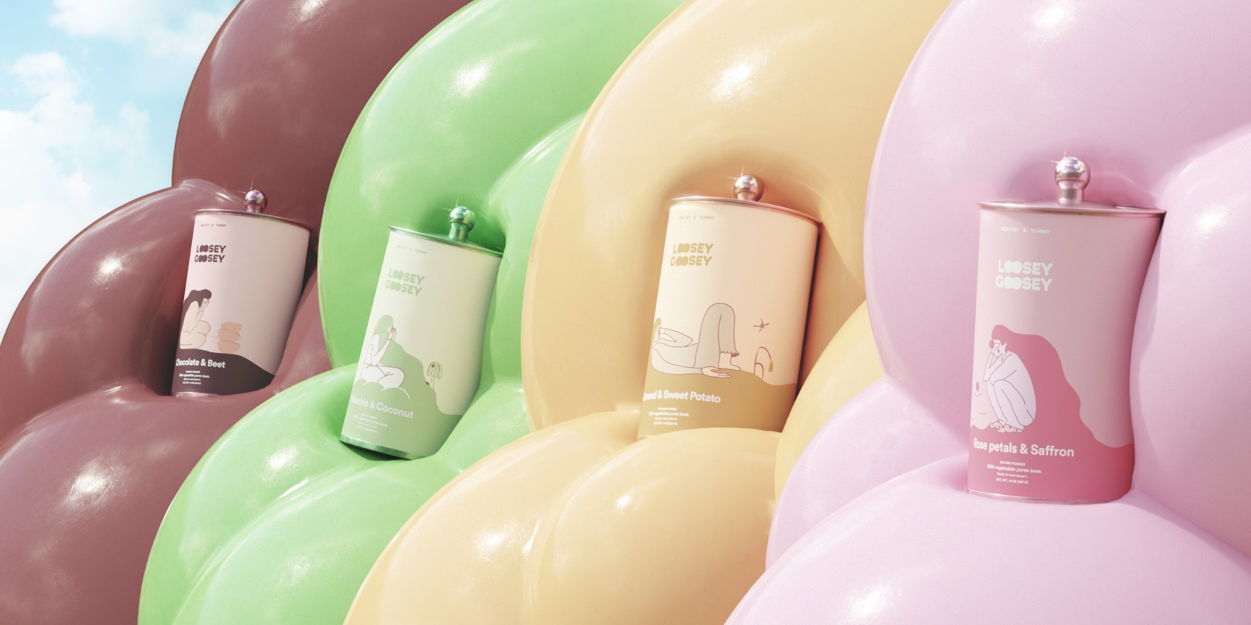
These are the baking powders that magically ended a bad day.
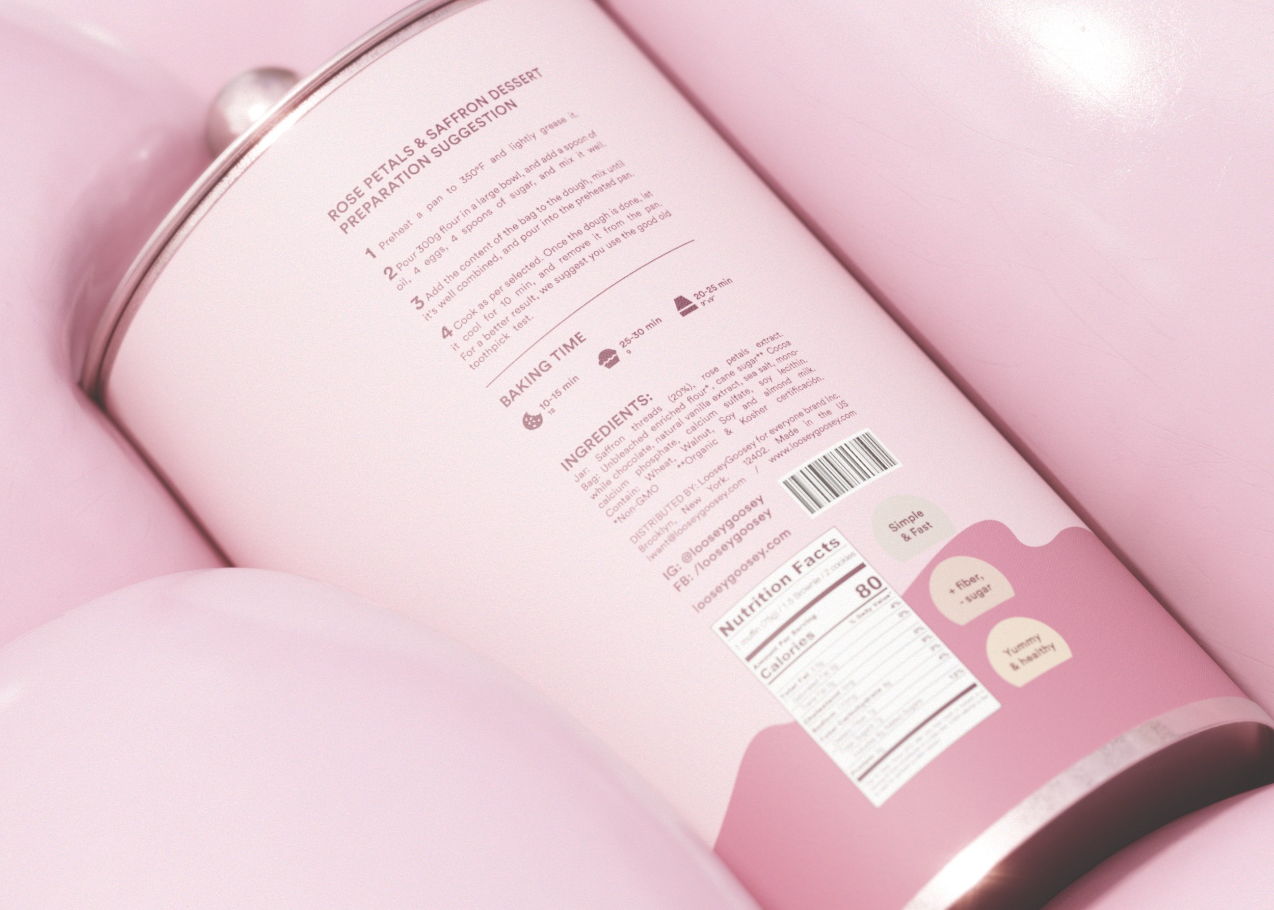
Packaging and Visual Identity: Like most stories, baking powder brands tell tales from beginning to end; but ultimately you have to read to all info to get the whole idea. This inspired us to create a structure where illustrations on the packaging deliver that story through separated sections, like little crumbles that generate a whole entity. We used that as a metaphor for learning step by step, like a recipe. The illustrations are always split conceptually into two elements, the first is about emotions, and the second is about senses; those define different stories and different ingredients.
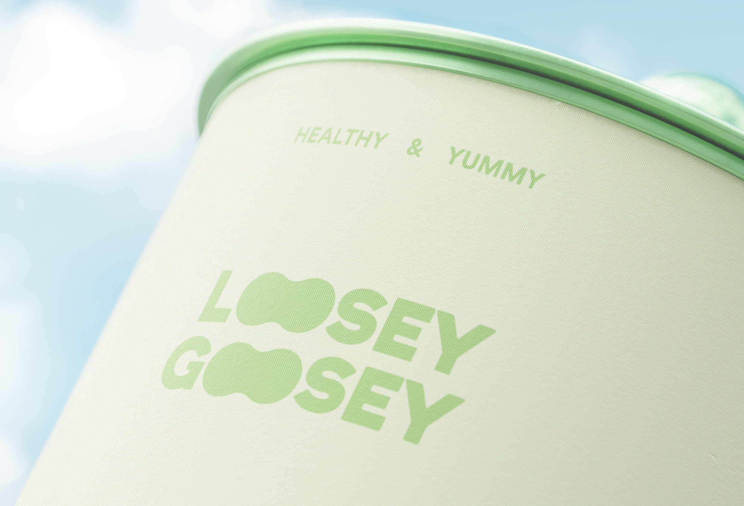
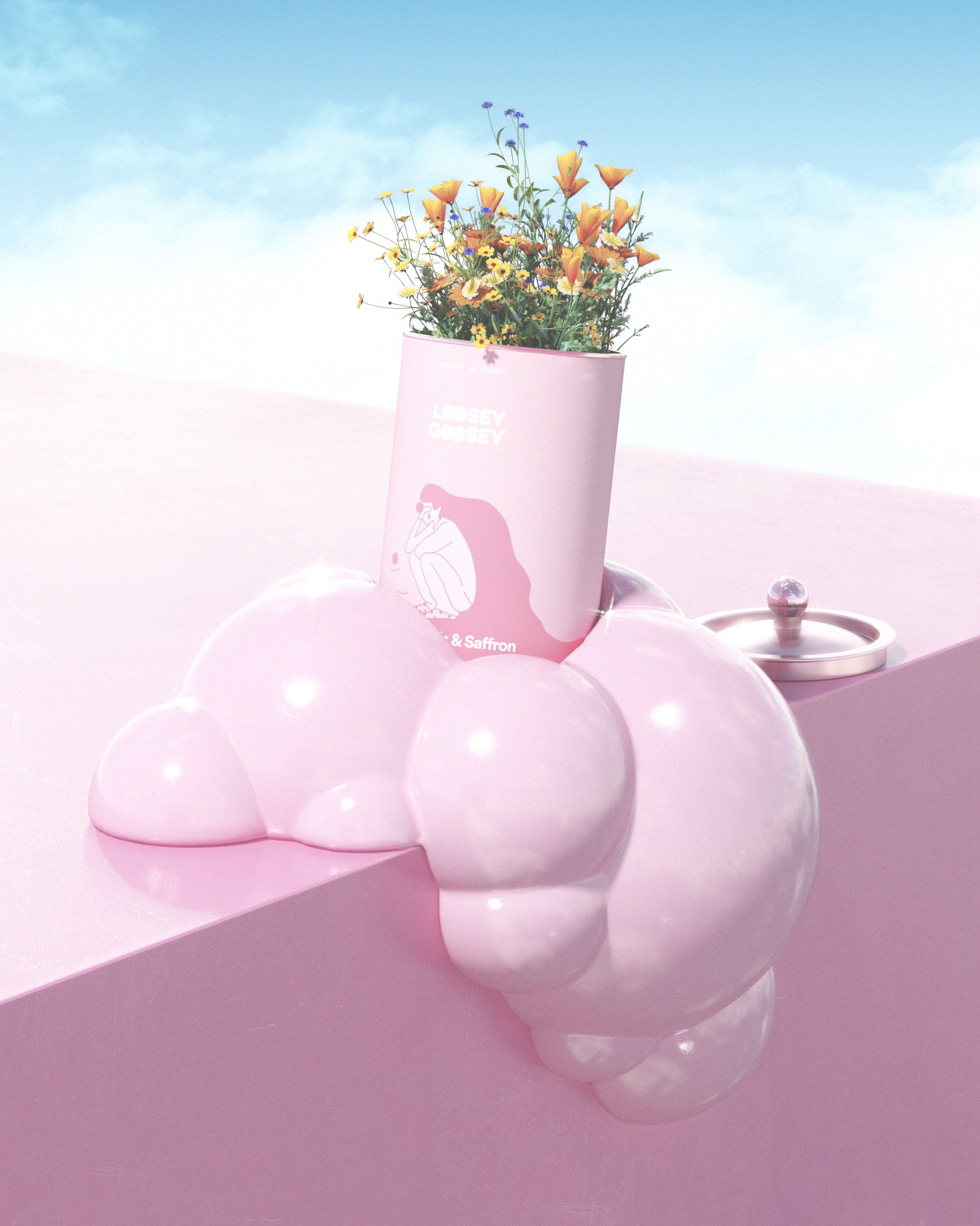
Eco: Loosey-Goosey is made thinking in people but also the environment. Both aluminium packaging and paper labels are 100% recycled and recyclable. But the ecological value does not end in the materials used, Loosey-Goosey’s packaging has been designed to be as beautiful as possible, to be reused at home, as a decoration, or as storage, to become the new cookies aluminium boxes where our grandmothers used to save their sewing material.
CREDIT
- Agency/Creative: Enrike Puerto and Adrià Tañà
- Article Title: Loosey-Goosey Baking Power Visual Identity and Packaging Design by Enrike Puerto and Adrià Tañà
- Organisation/Entity: Freelance
- Project Type: Packaging
- Project Status: Published
- Agency/Creative Country: Mexico
- Agency/Creative City: Mexico City
- Market Region: Global
- Project Deliverables: 2D Design, 3D Art, 3D Design, 3D Modelling, Art Direction, Brand Creation, Brand Design, Brand Identity, Brand Mark, Brand Naming, Brand Tone of Voice, Brand World, Branding, CGI, Copywriting, Creative Direction, Design, Graphic Design, Icon Design, Identity System, Illustration, Label Design, Logo Design, Packaging Design, Set Design, Tone of Voice, Visualisation
- Format: Can, Jar, Pot, Tin
- Substrate: Metal
- Industry: Food/Beverage
- Keywords: Branding, Identity, Brand Identity, Brand, Logo, Graphic Design, Illustration, Packaging, Packaging Design, Render, 3D, Visual, Visualisation, Backing, Aluminium, Dough, Color, Colour, Colourful, Colorful, Food, Cap, Lid, Pot, Can, Tin,
-
Credits:
3D Render: Adrià Tañà
Art Direction, Graphic Design, Illustration: Enrike Puerto


