


Fuller’s London Pride, the award-winning flagship beer of Fuller’s Griffin Brewery, today unveils a striking new visual brand identity created by Bristol-based design studio, Outlaw.
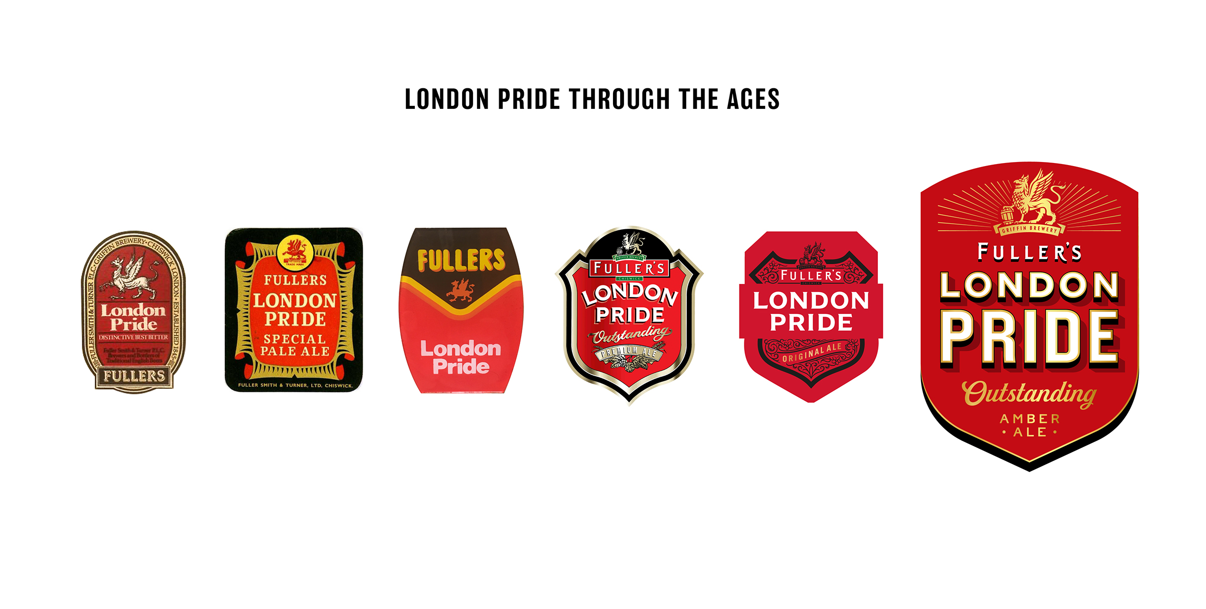
First introduced in 1959, London Pride took its name from a flower that rose from the rubble in Blitz-hit wartime London and thrived against all odds to become a symbol of hope. Brewed at the Griffin Brewery in Chiswick using all-British ingredients since then, London Pride remains an unmistakable beer. However it was often seen as old-fashioned and too traditional, with a flat identity that lacked the premium craft needed to transform the brand on a global scale.
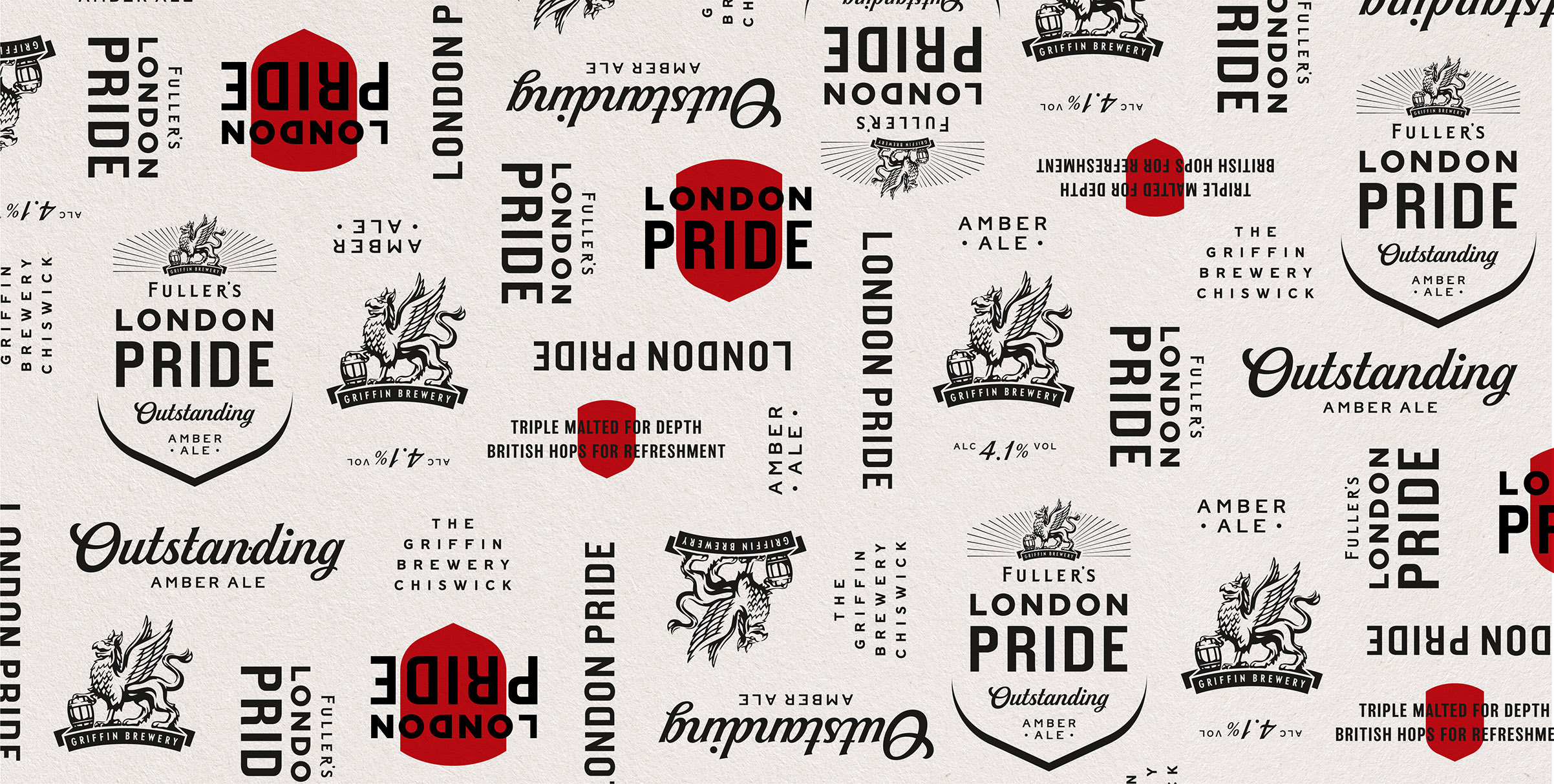
The new identity by Outlaw draws from the depths of London Pride’s rich history, reinventing the brand’s most meaningful and credible symbols and allowing them to shine once again.
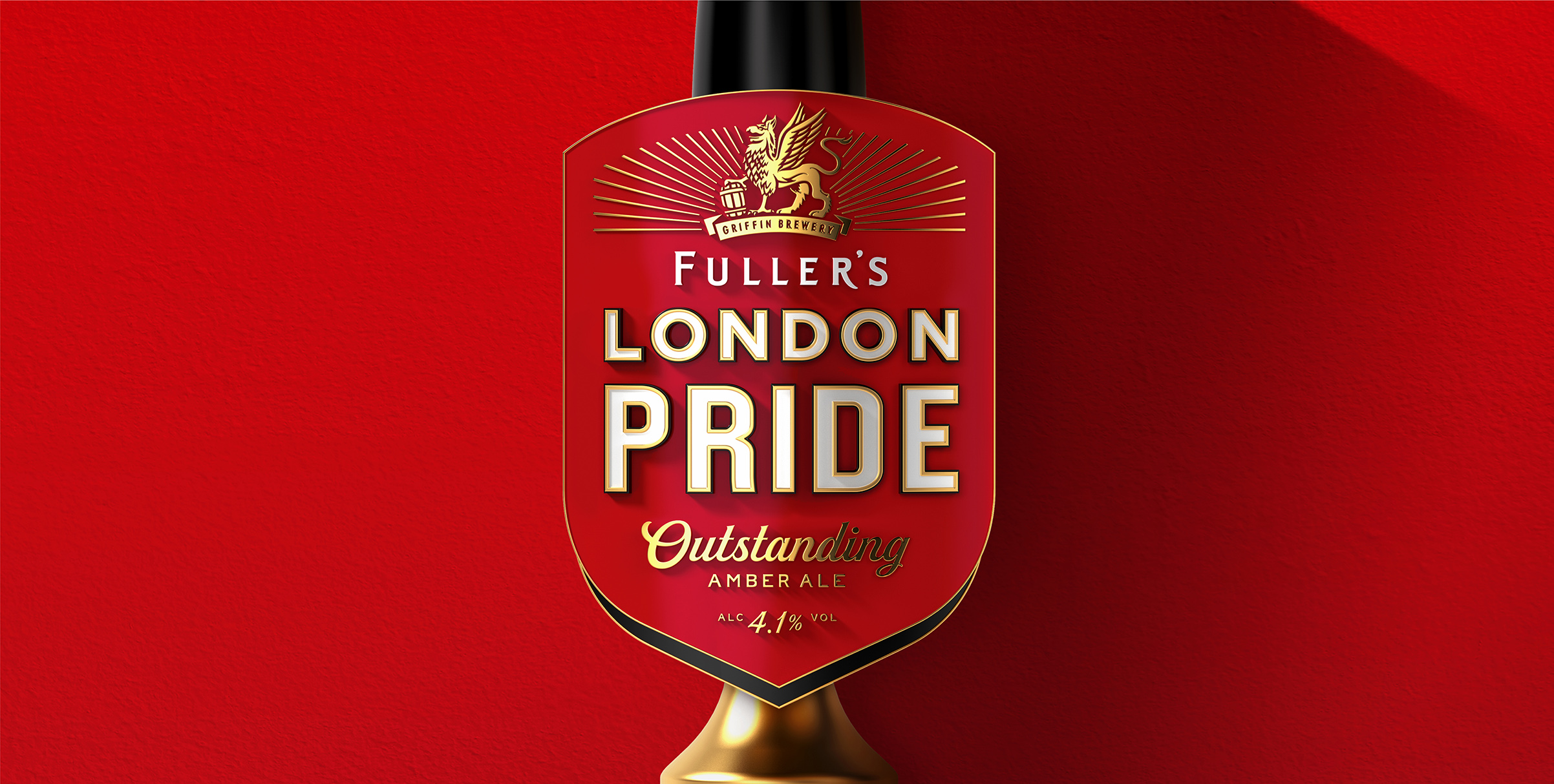
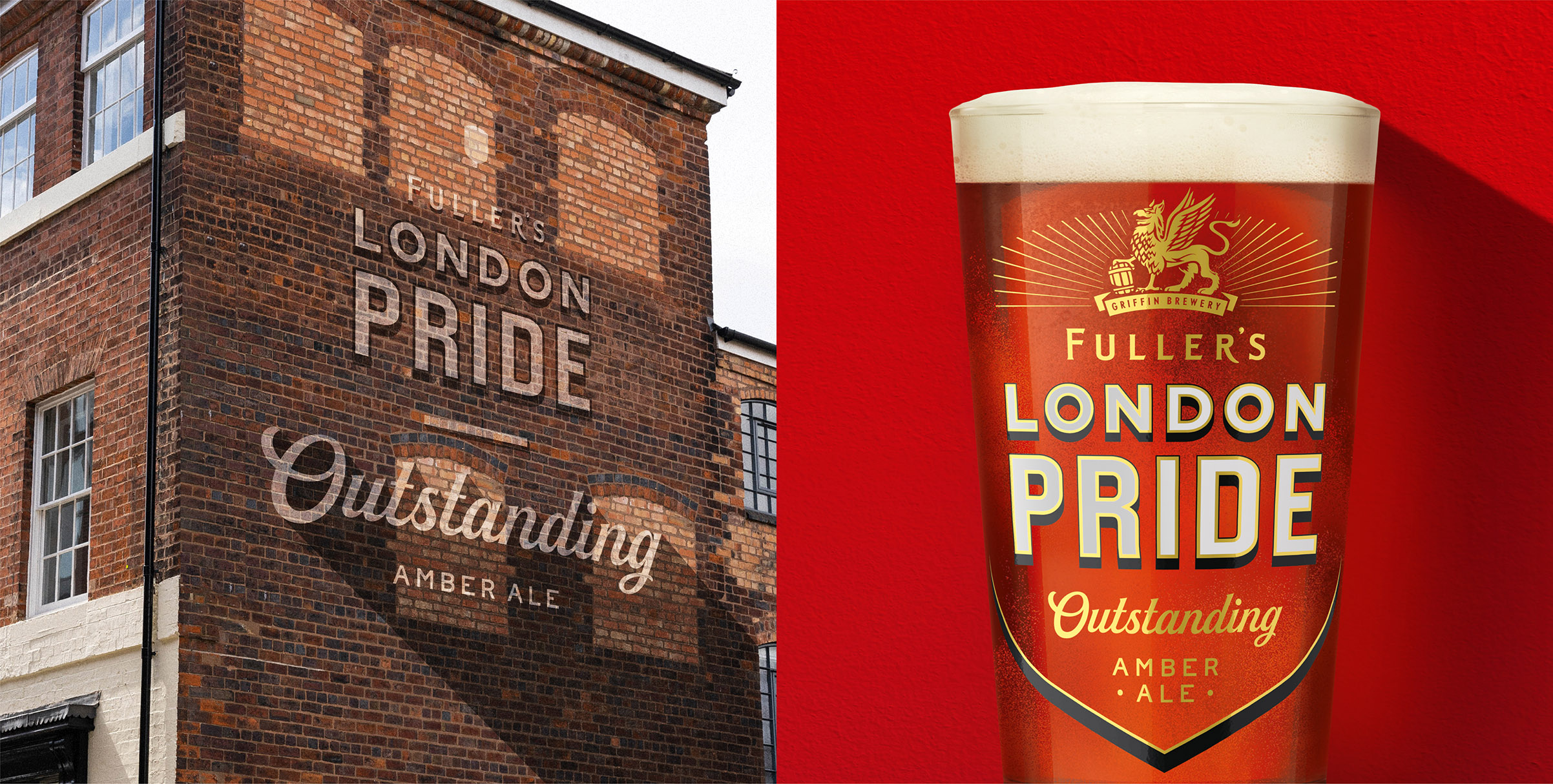
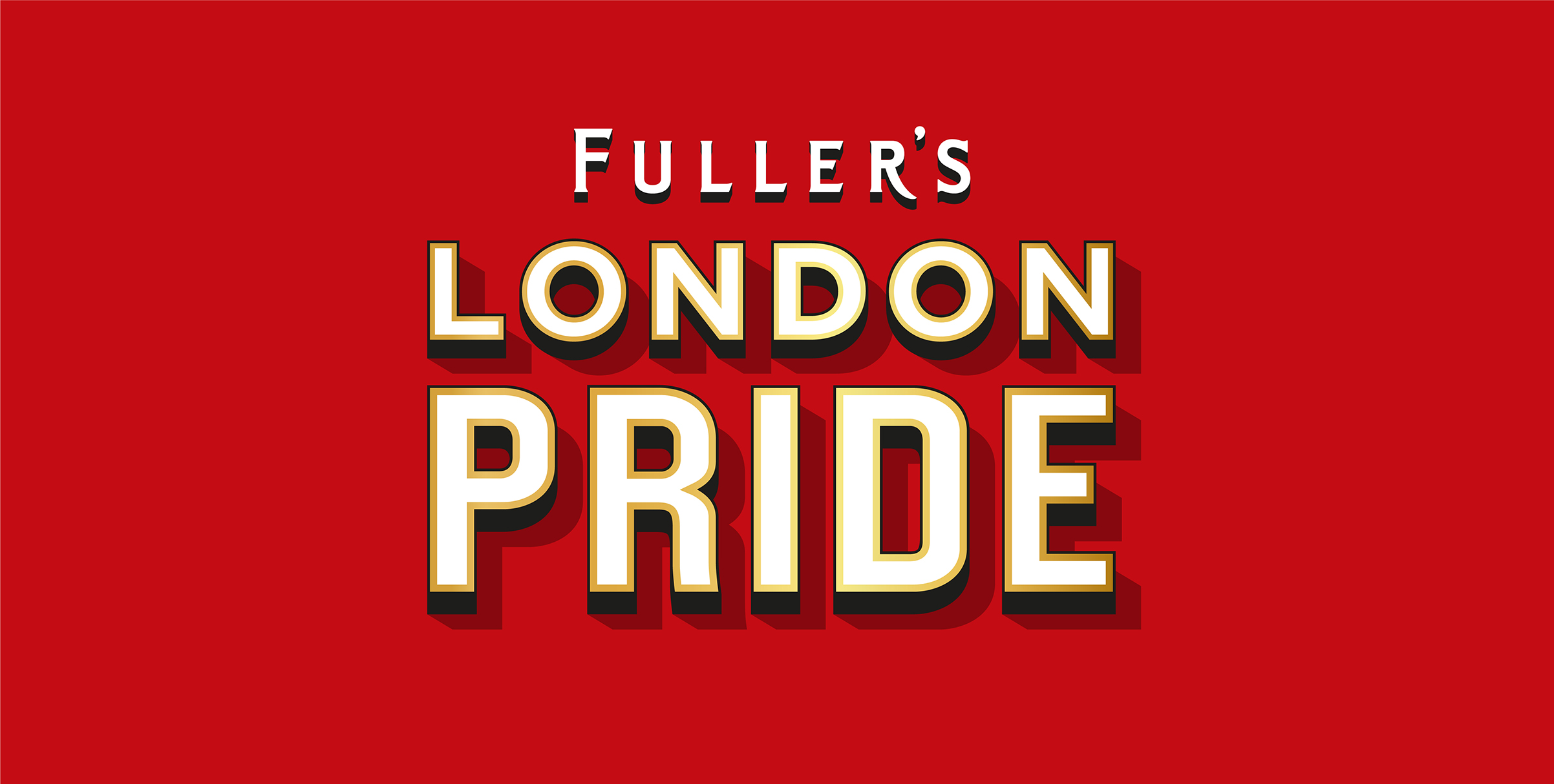
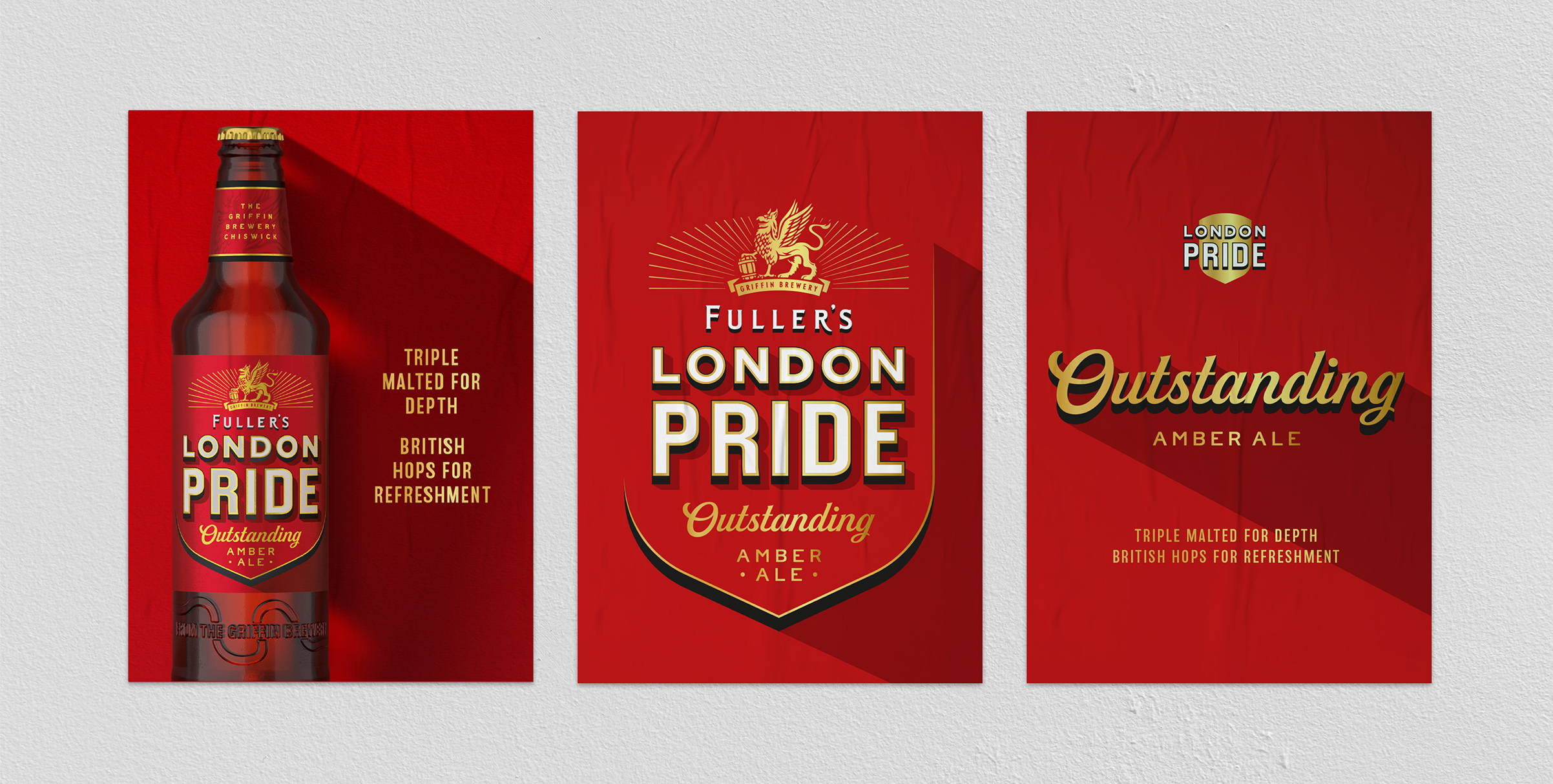
A modern shield shape retains an iconic piece of the brand’s past while avoiding cliché heraldry and is topped with the radiant Griffin, an integral part of the Fuller’s heritage. The shield also bears an ‘Outstanding Amber Ale’ message – language from the brand’s archives, brought to life in
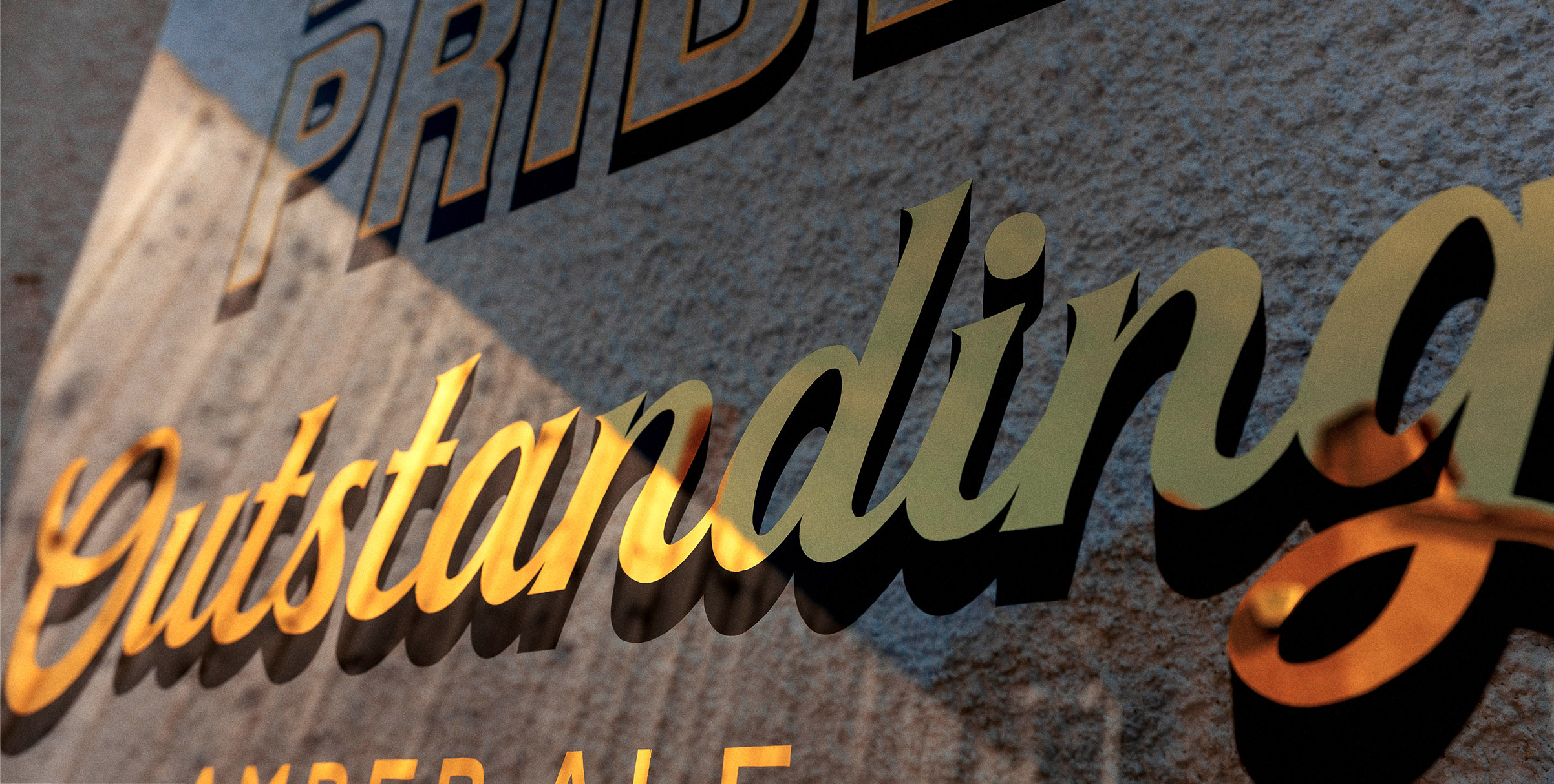
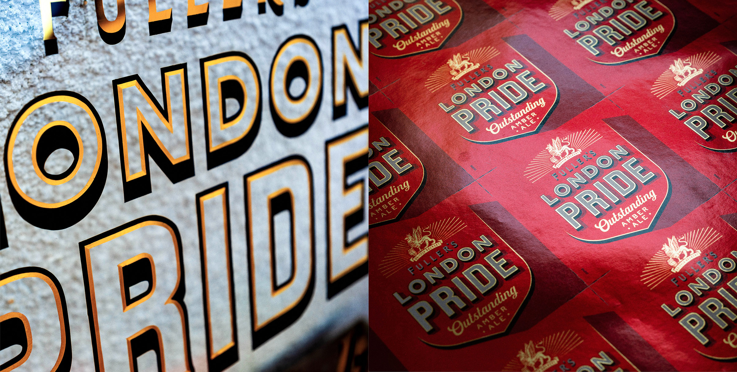
a signwriting style reminiscent of the gilded lettering seen on windows and mirrors across the Fuller’s estate of iconic London pubs.
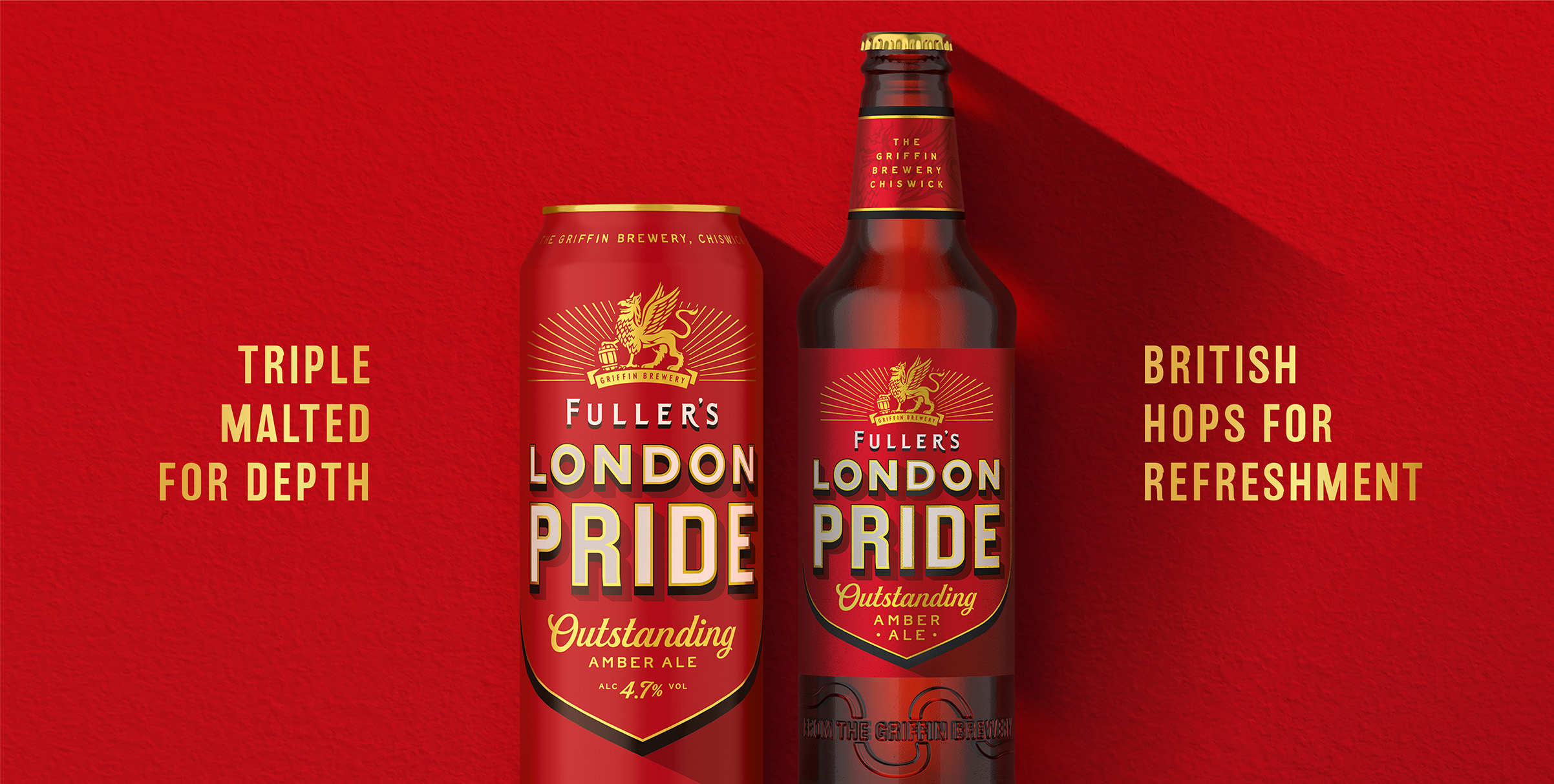
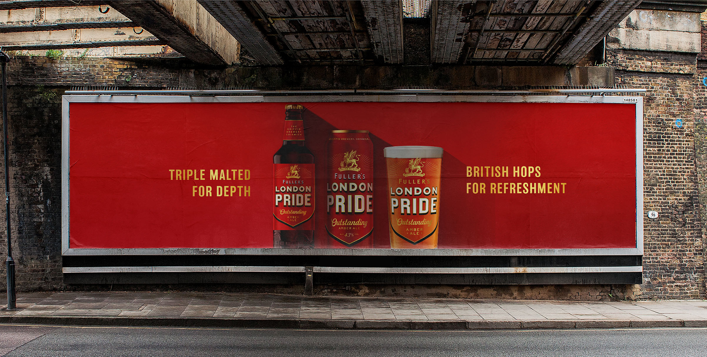
The new colour palette reflects the best of the brand’s past with pure white against black, considered touches of radiant gold and a new ‘living red’. The layered London Pride word marque mirrors the layered taste profile of the liquid, while a gold keyline and black tip add form and depth to the shield. And in a nod to the brand’s introduction in 1959, a 59-degree angled shadow completes the primary brand asset on pack and is extended out for dramatic impact in the wider brand world.
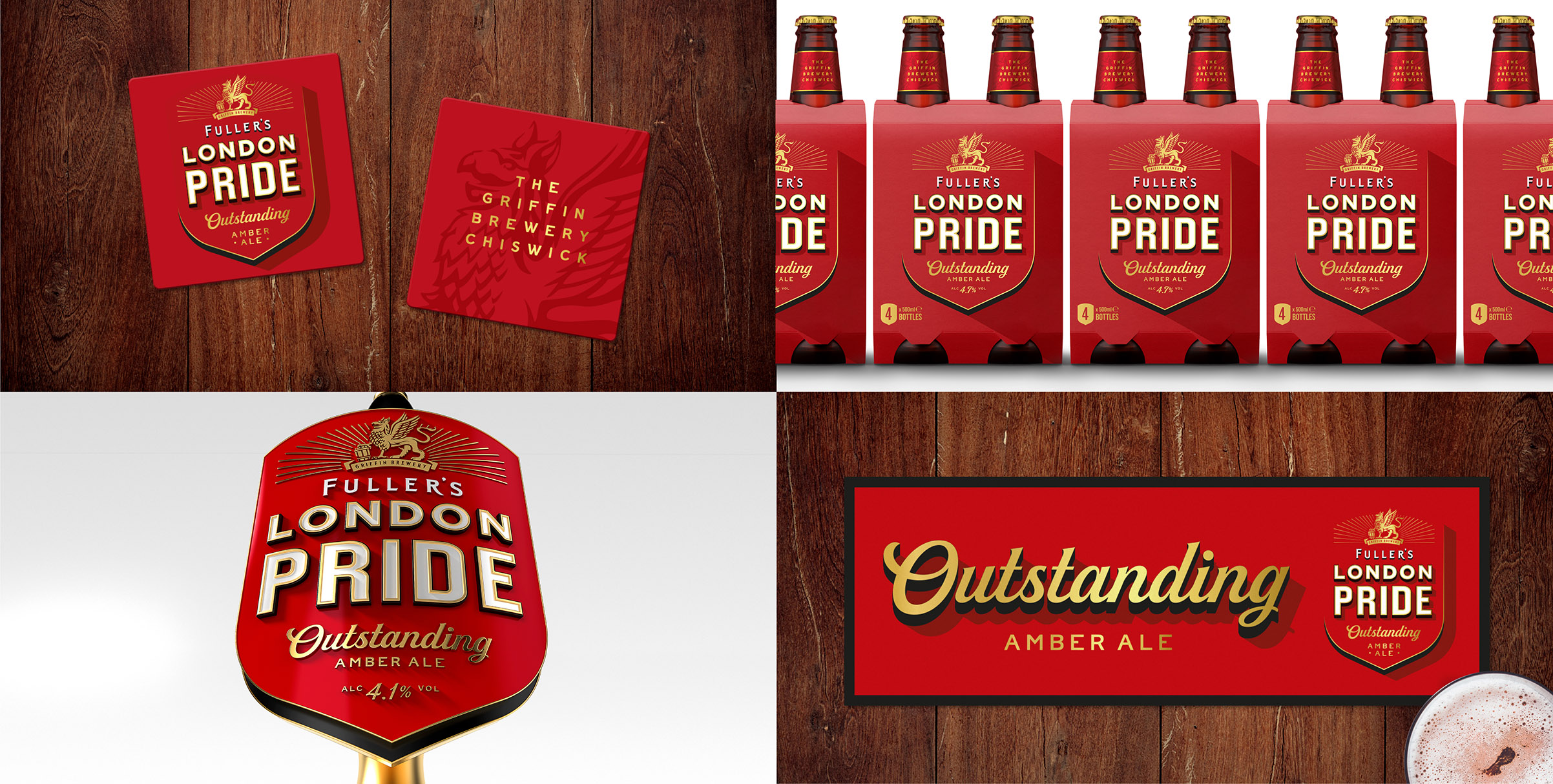
The new identity will be seen across packaging, on and off-trade point of sale, glassware, pump clips and cask handles, out of home advertising, livery and merchandise.
Outlaw said: “London Pride isn’t a brand to be played with, so from the outset we set ourselves three principles the new design had to deliver against: outstanding craftsmanship, refreshing depth and optimistic radiance. We held ourselves accountable to these principles at every step in the process, from first concept to final detail, to create something that existing drinkers will respect and new drinkers will be drawn into. It’s been a privilege to write our chapter in the history of this iconic brand.”
CREDIT
- Agency/Creative: Outlaw
- Article Title: London Pride Reveals Depth and Craft with New Identity by Outlaw
- Organisation/Entity: Agency, Published Commercial Design
- Project Type: Packaging
- Agency/Creative Country: United Kingdom
- Market Region: Global
- Project Deliverables: Brand Guidelines, Brand Identity, Brand Redesign, Brand Rejuvenation, Brand Strategy, Brand World, Branding, Graphic Design, Rebranding, Research, Retail Brand Design, Structural Design, Tone of Voice
- Format: Basket, Bottle, Box, Can
- Substrate: Glass Bottle


