Eirescapes is a landscape photography business based near the iconic North Coast in Northern Ireland. They offer unique and bespoke photographs all over the island of Ireland, including seascapes, rugged coastlines, forests and historical architecture. The business offers printed images which can be framed and mounted to the consumers tastes, giving them a piece of Ireland to be placed in their home, office or as a gift.
The brands target audience is adults aged between 25 – 60. This audience includes people from the UK, USA and across Europe who have a deep love for Ireland and its famous landscapes. An appreciation for nature is also a desirable trait in the target audience, as these people are more likely to purchase a photograph to feel a closer connection to nature.
The brand needed to reflect the professional, bespoke and organic qualities of the brand. The consumers experience was not to be limited to just the product offered (photographic prints), but needed to be continued through all areas including social media and print, from browsing for print to unpacking it after delivery. Eirescapes faces strong local competition from other landscape photographers meaning a strong and memorable brand identity was essential.
The brand strategy was to mirror the rawness of nature in the photographs in the design. Using organic and sustainable materials in print would re-enforce the connection with nature and the environment. It would also resonate with the consumer, giving them a sense and feel of what Irelands natural landscapes feel like through colour, material and typography.
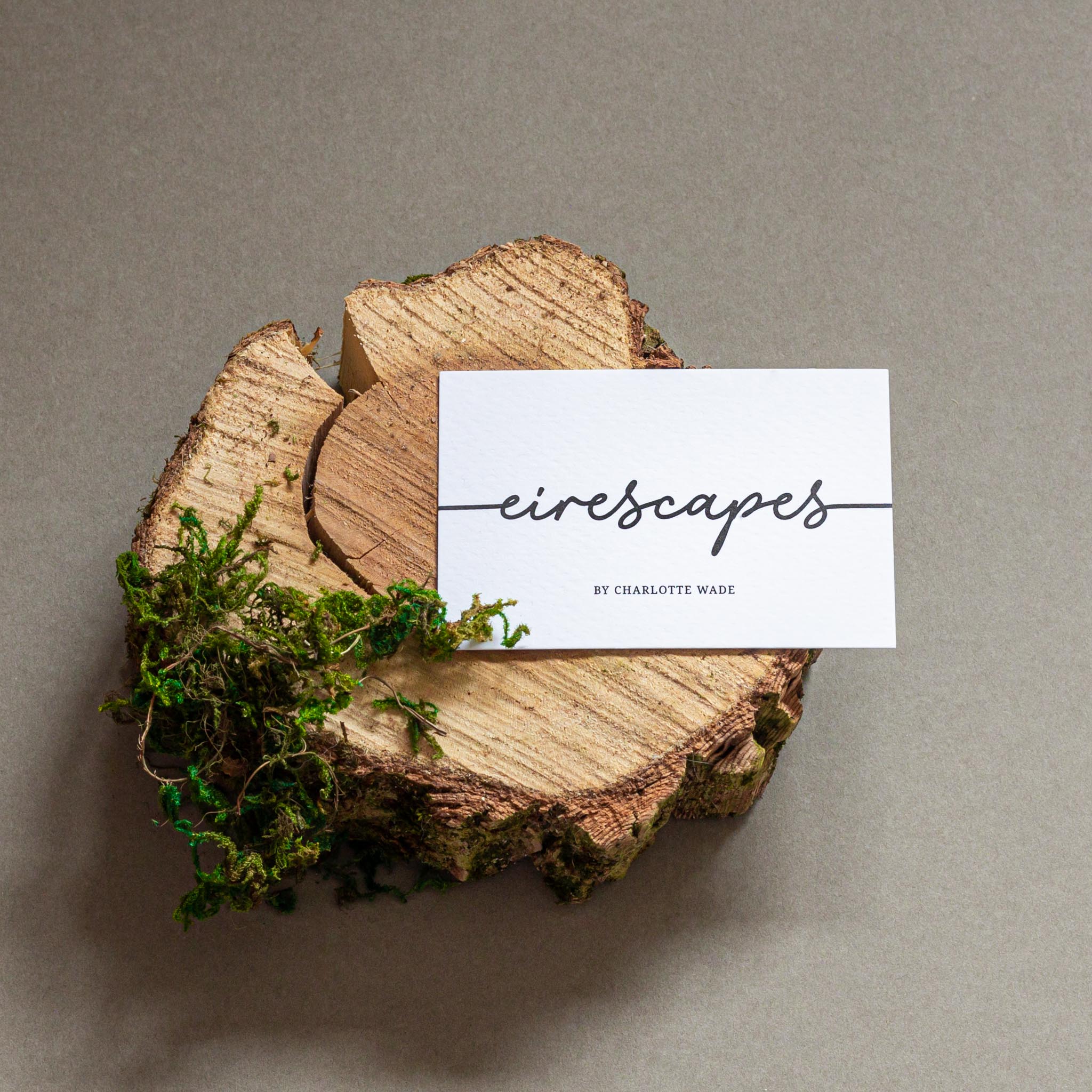
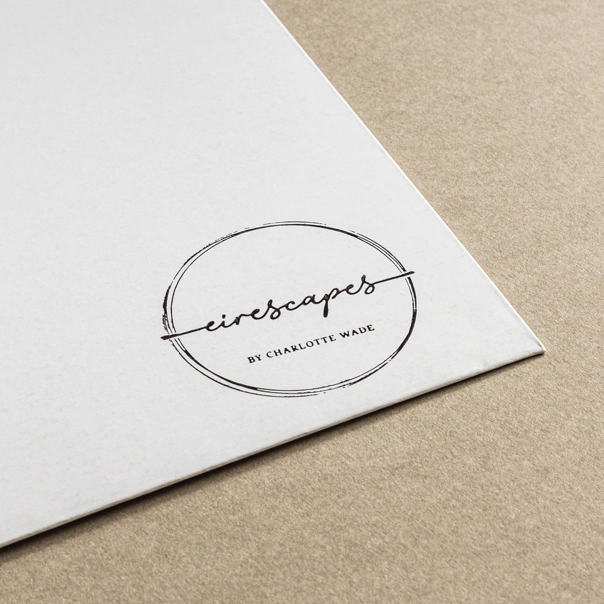
The Eirescapes logo is written in Monoline, a script typeface which mimics the photographers signature when signing the corner of a photograph. The typeface carries connotations of a handmade and bespoke product, which creates trust between the consumer and the brand. Its legible, works well in black & white and colour and can be used across all platforms including Facebook, Instagram, websites, and printed livery. This typeface is paired with Noto Serif, a typeface with a large family that works best with print.
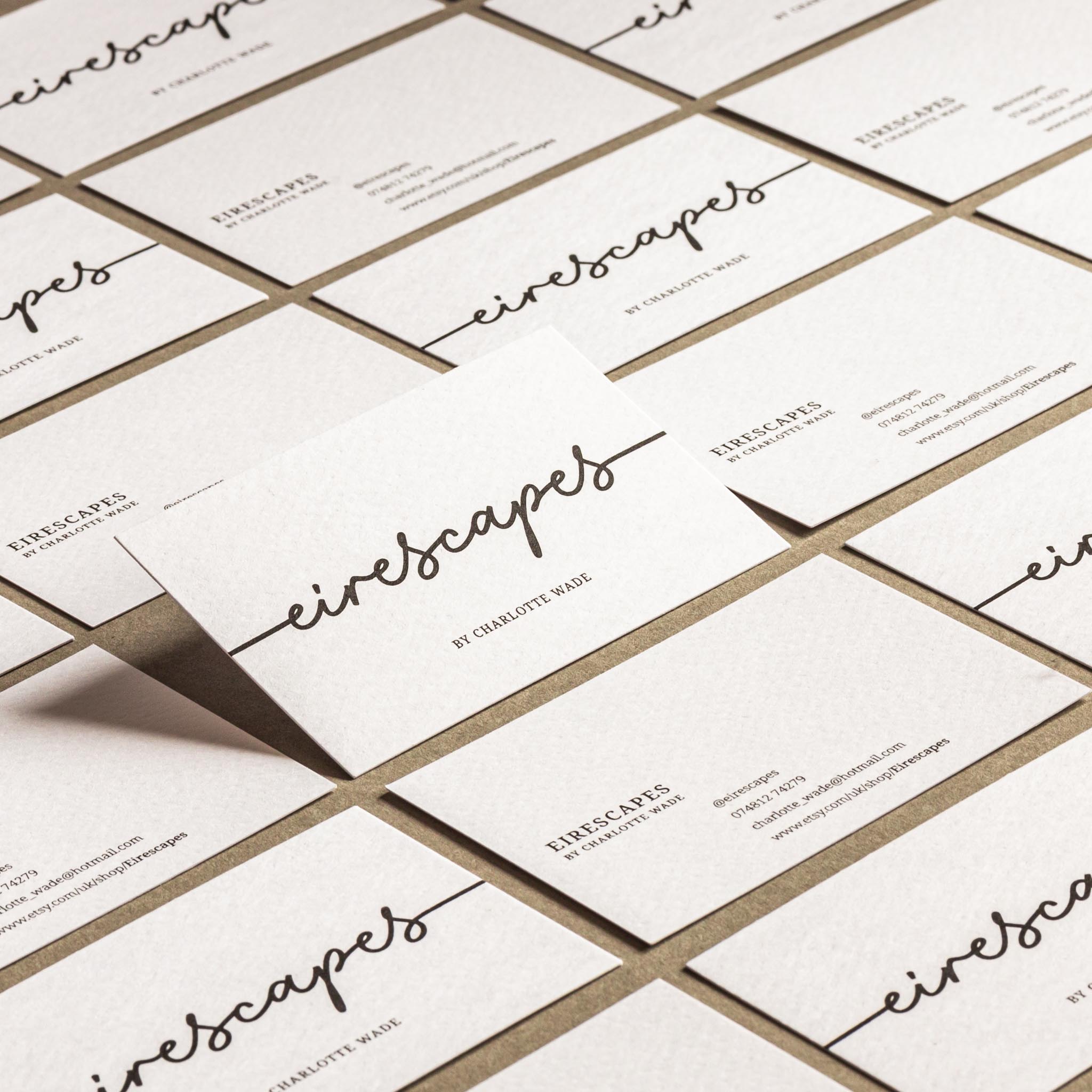
Eirescapes business cards are minimal yet impactful. The front simply has the logo in black on white textured card, while the reverse has the contact details in Noto Serif. The white textured card creates a sense of luxury and purity, the white mimics the pure white mounts the photographs are set in.
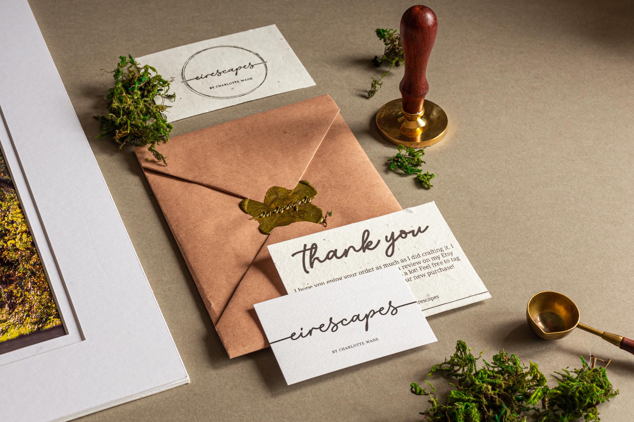
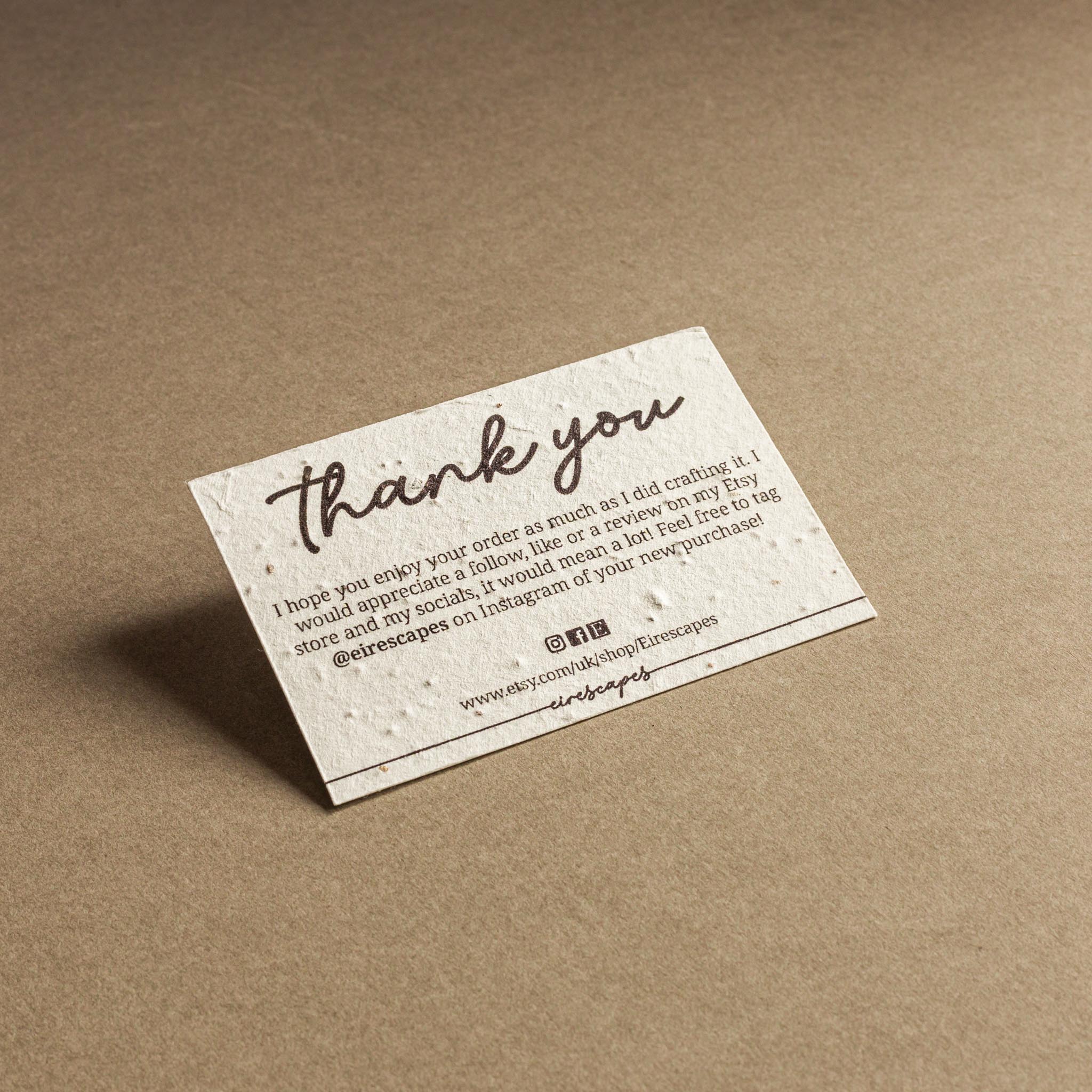
The thank you cards are printed on seeded paper, meaning they can be planted when the consumer is finished with them. This decision was a direct connection with nature and sustainability, allowing the brand to be more than just paper, it can create more life long after it’s gone.
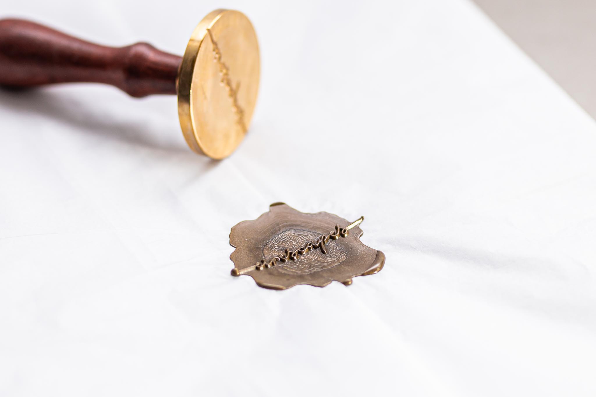
The logo has also been made into a stamp to allow the photographer to brand rigid envelopes, photo mounts, tissue paper and boxes. Again this method brings a handmade quality, the consumer can see the photographer has put a personal touch on the packaging which creates positive connotations with the Eirescapes brand.
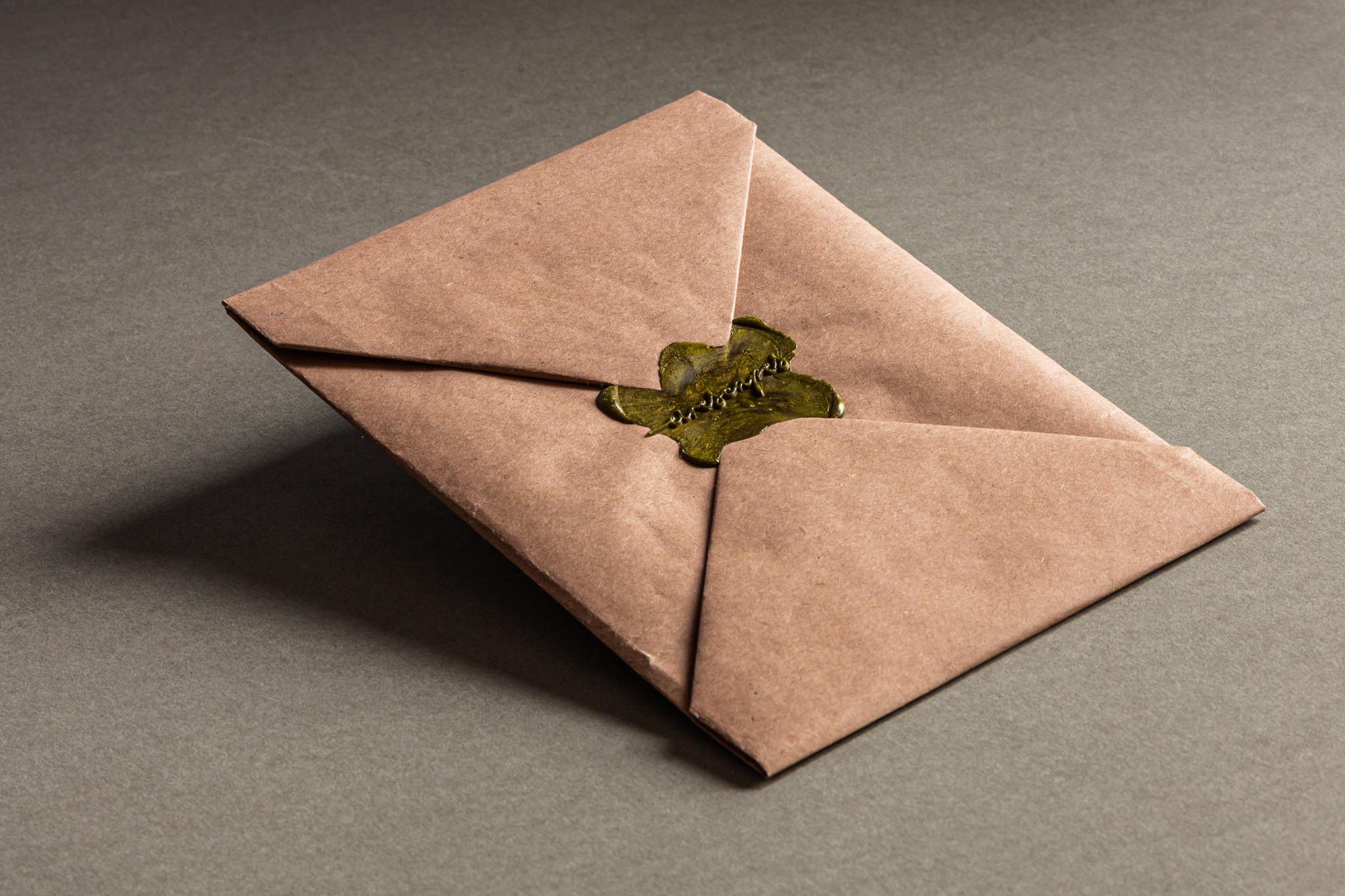
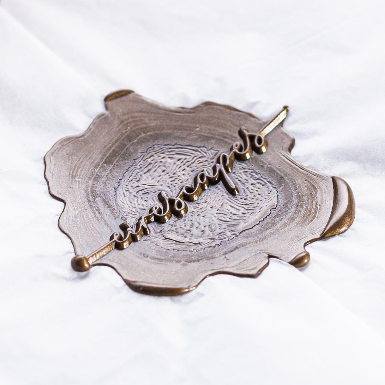
The logo is also shown in the form of a wax seal. A wax seal is usually known as a historical way to seal handwritten letters, however here it is used to seal and brand wrapped photographs. The aim of the seal is to carry the feeling of handmade and bespoke when the consumer is opening their package. Each seal is unique and can be in white or olive green wax which is consistent with he brand colours. Olive green represents nature, carrying connotations of forests, trees and moss.
Eirescapes brand identity has taken inspiration from nature in Ireland including colour, material and sense of touch. It creates a professional yet handmade feel, creating loyalty and trust between the consumer and the brand.
CREDIT
- Agency/Creative: Charlotte Wade Design
- Article Title: Landscape Photographer Creates Nature Inspired Brand Identity
- Organisation/Entity: Student, Published Self Promotional Design
- Project Type: Identity
- Agency/Creative Country: United Kingdom
- Market Region: Multiple Regions
- Project Deliverables: Brand Architecture, Brand Creation, Brand Identity, Brand Naming, Branding, Graphic Design, Photography
- Industry: Retail
- Keywords: Landscape photography, photography branding, nature inspired branding


