


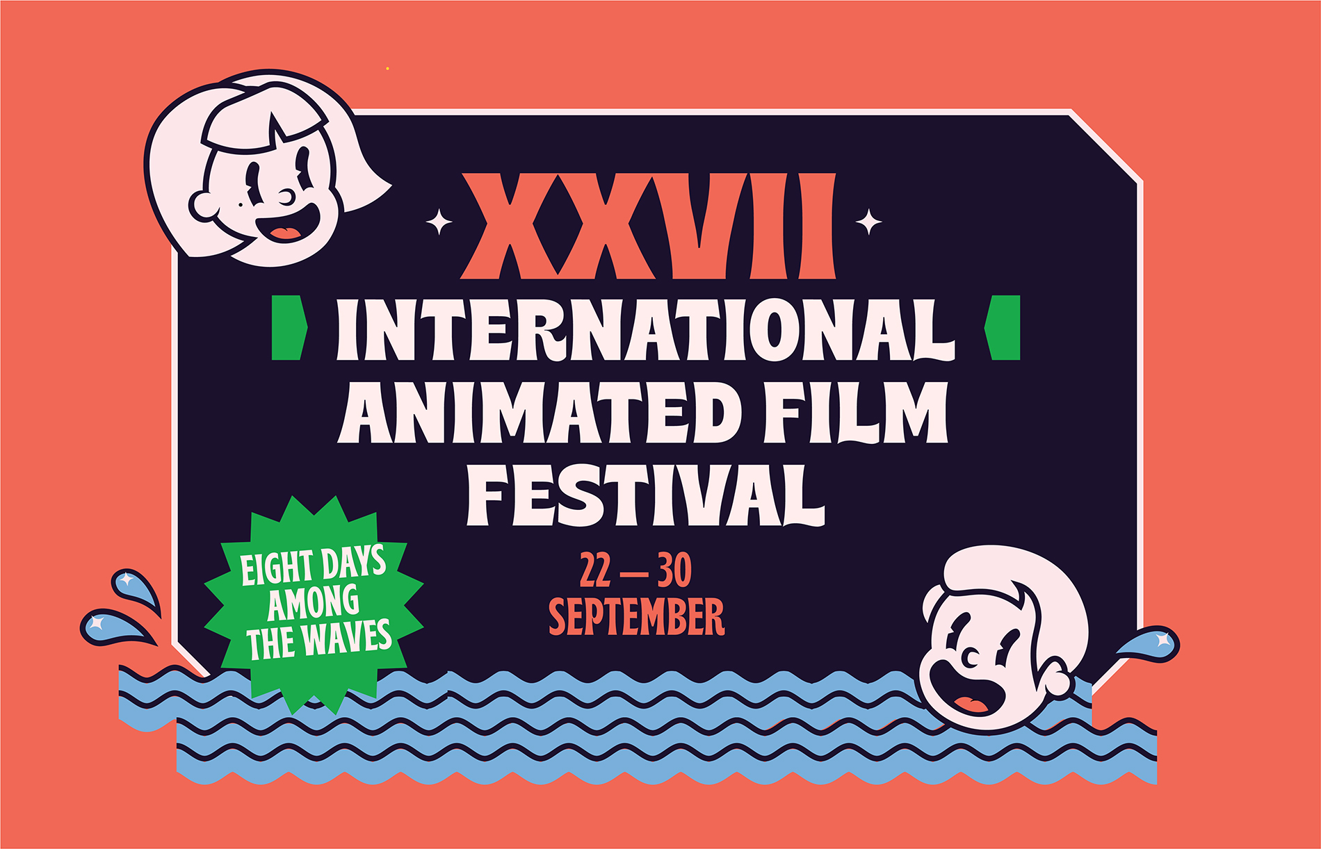
KROK — is the International Animated Film Festival. The creative bridge between Russian and Ukrainian cinema worlds. The 8-day film show, taking place on a comfortable ship. The way of life and the way of thinking. The ongoing stream of creativity, joy, and communication. KROK is also a step. A step forward in the animated film industry, driven by the splashing waves and the fresh wind.
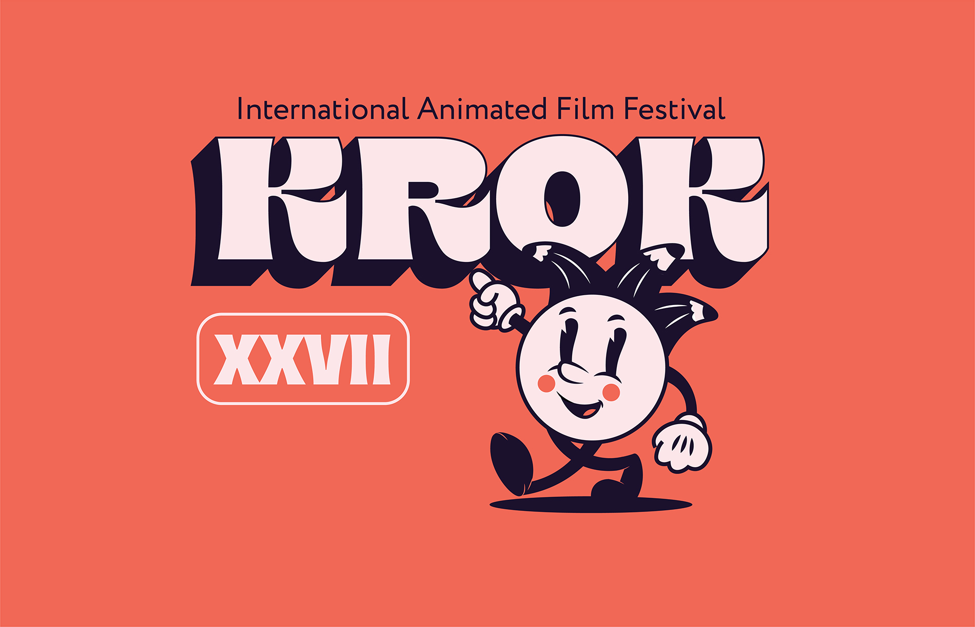
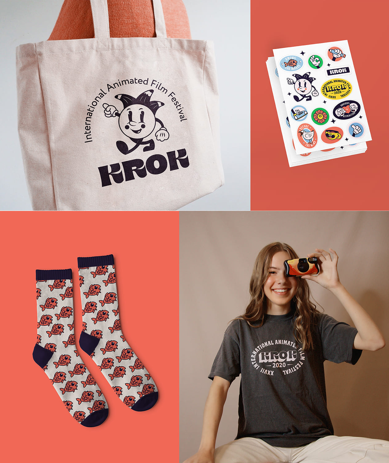
We have decided to develop and refresh the festival look to highlight that KROK marches in step with trends. To that end, we redesigned the festival mascot and created a new corporate identity that would assist to promote the event among the youth.
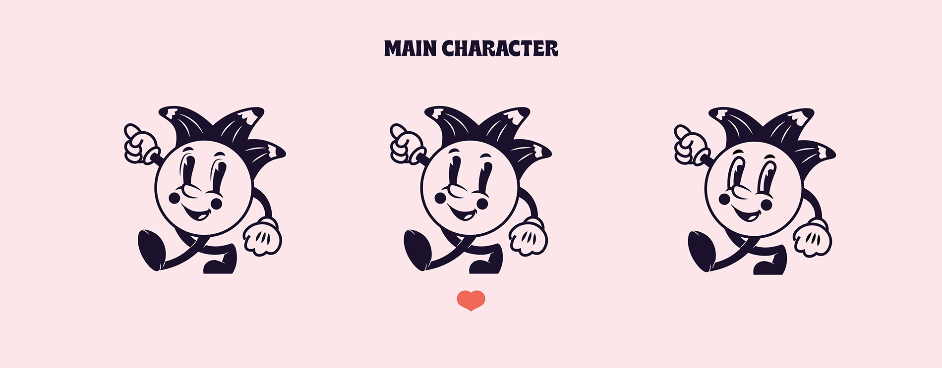
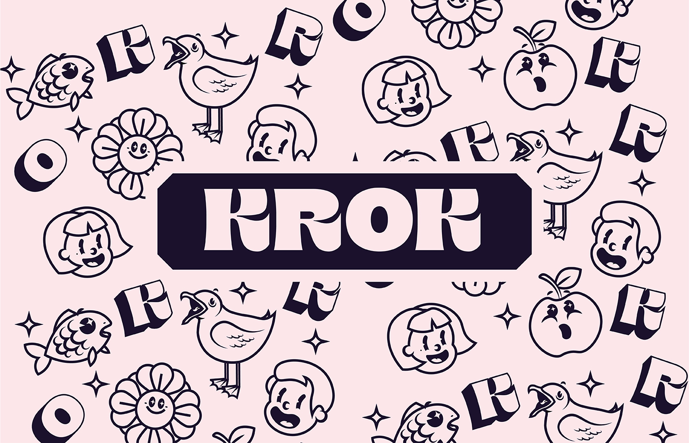
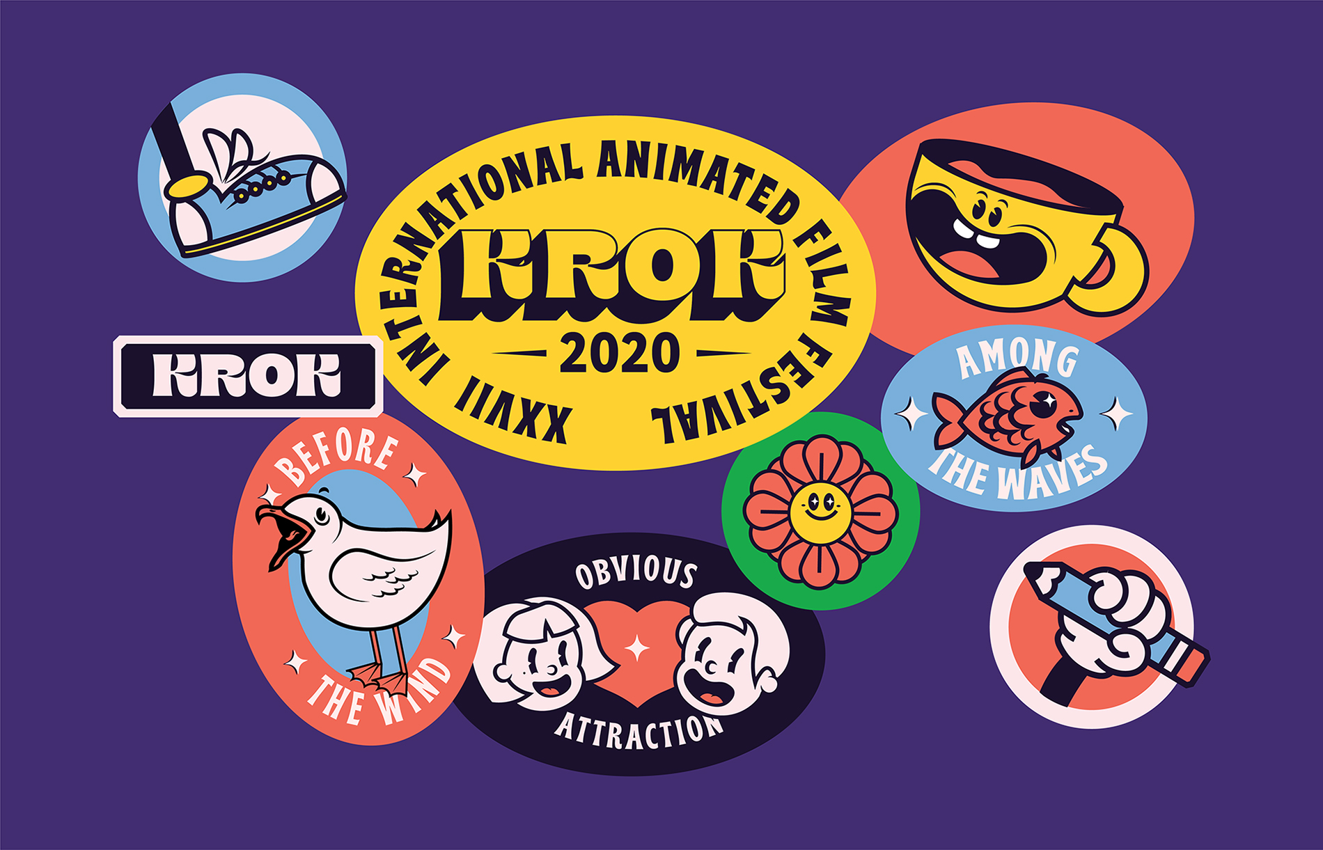
While working on the corporate identity, we were inspired by the Golden Age of American animation (the 1920—40s). Following its style, we have drawn a newer version of the mascot, as well as a few characters, which keep it company on various brand items. As a result, we have got a fully-fledged animated film plot from which you can’t tear your eyes away.
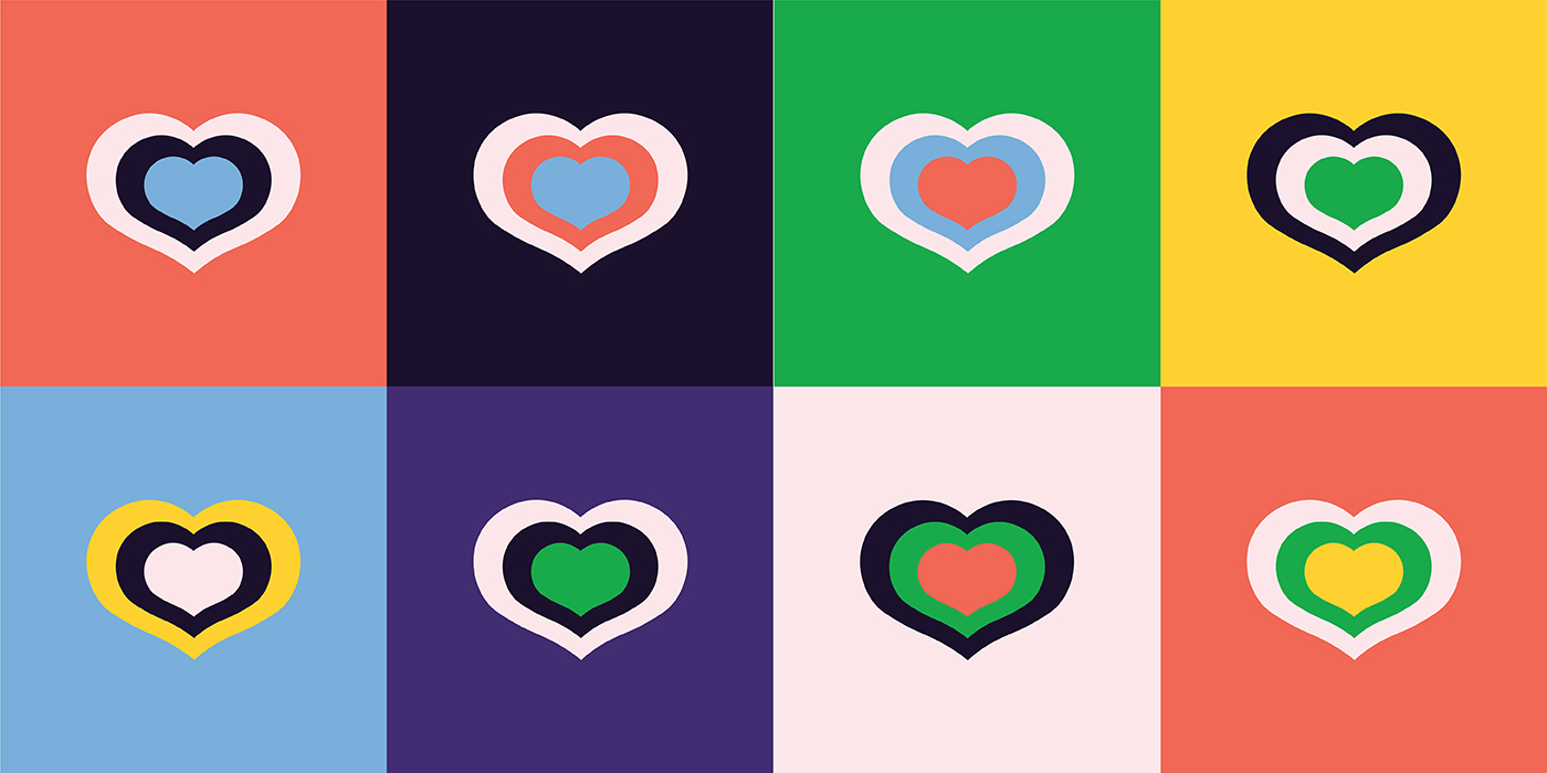
The brand colour palette consists of seven shades — three primary and four complementary ones. This kind of set enables to create a strong visual diversity, keeping it within a unified brand style.
There are several water motifs in digital and printable brand elements design: playful waves, light splashes, loud seagulls, mischievous fishes. All of them unobtrusively remind of the unique festival format.
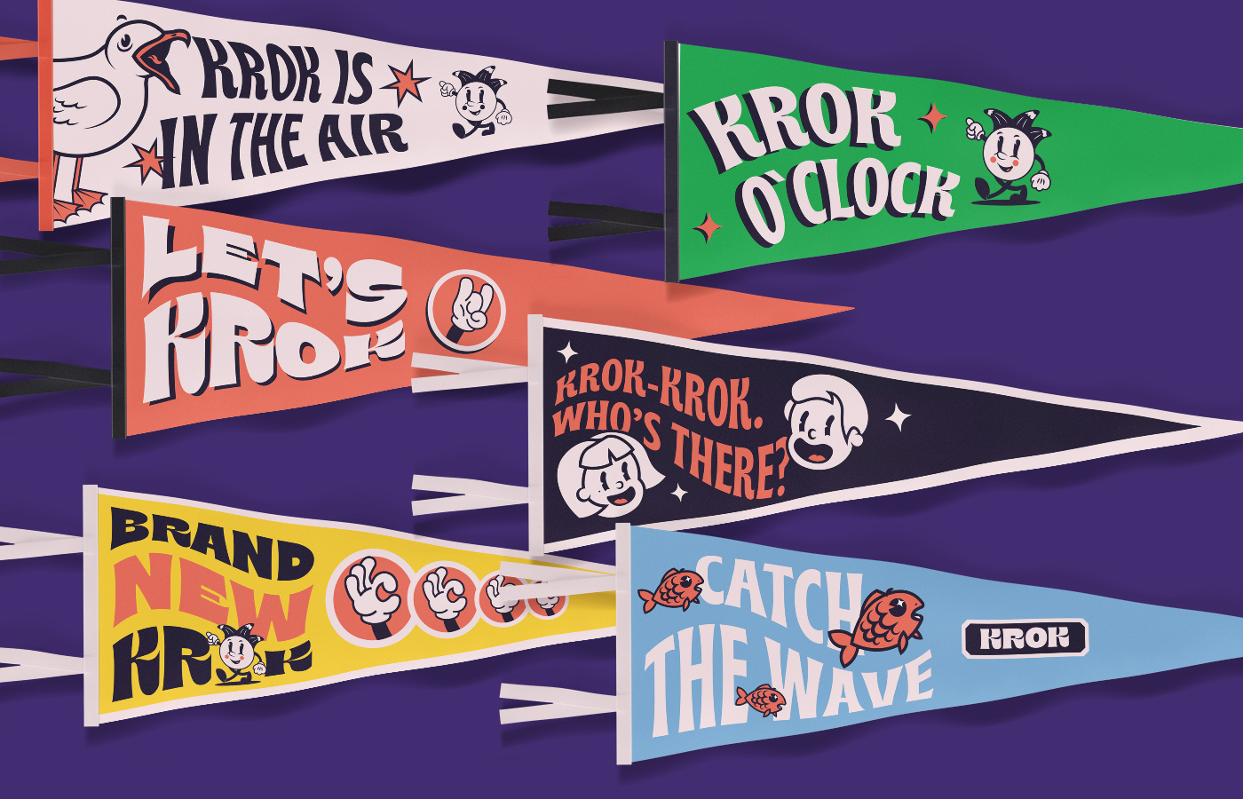
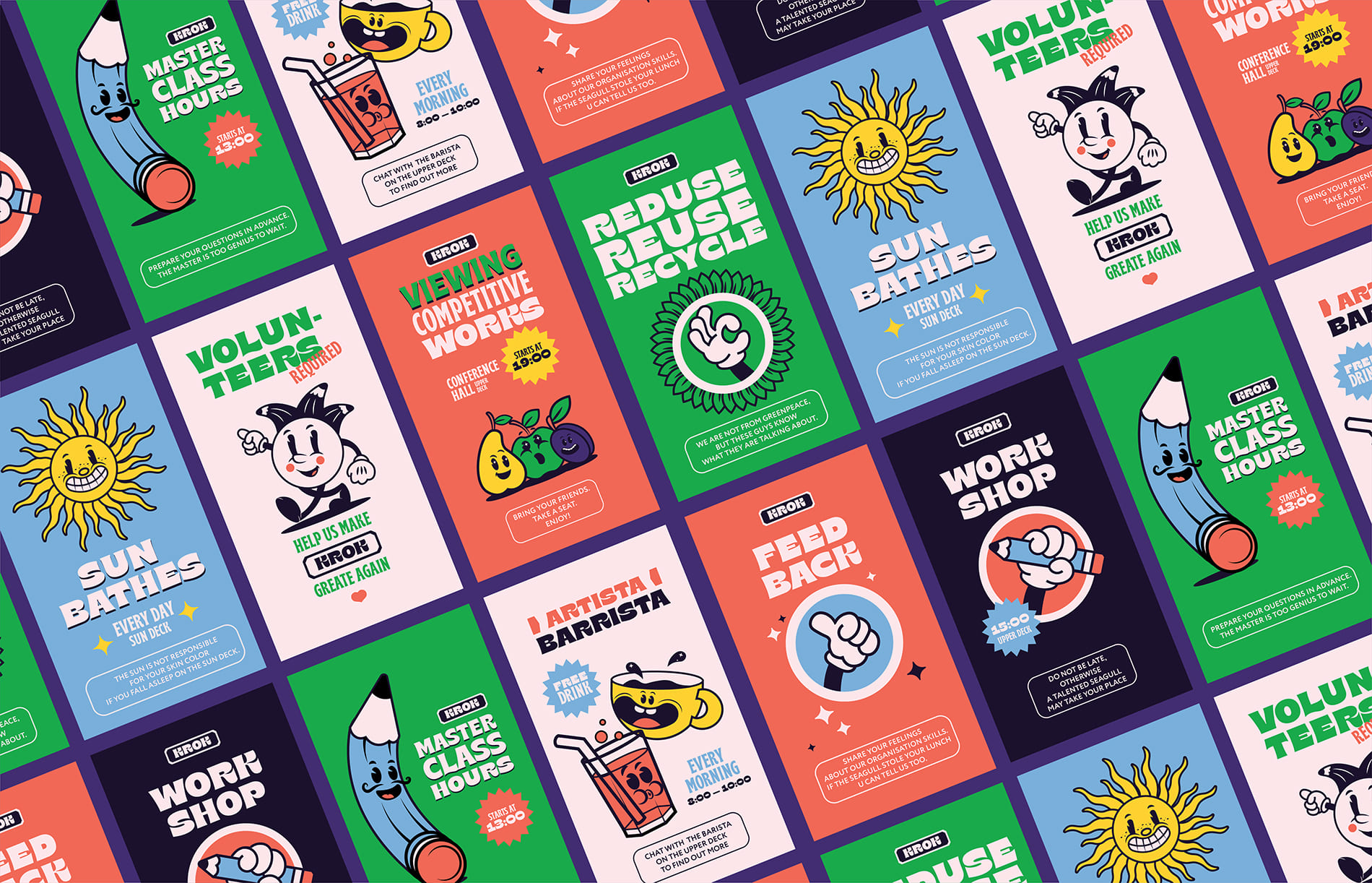
As each KROK’s participant is considered the most welcome guest, there are bright flags with facetious phrases on them. These flags meet people on the upper deck and make them feel the relaxed and friendly festival atmosphere.
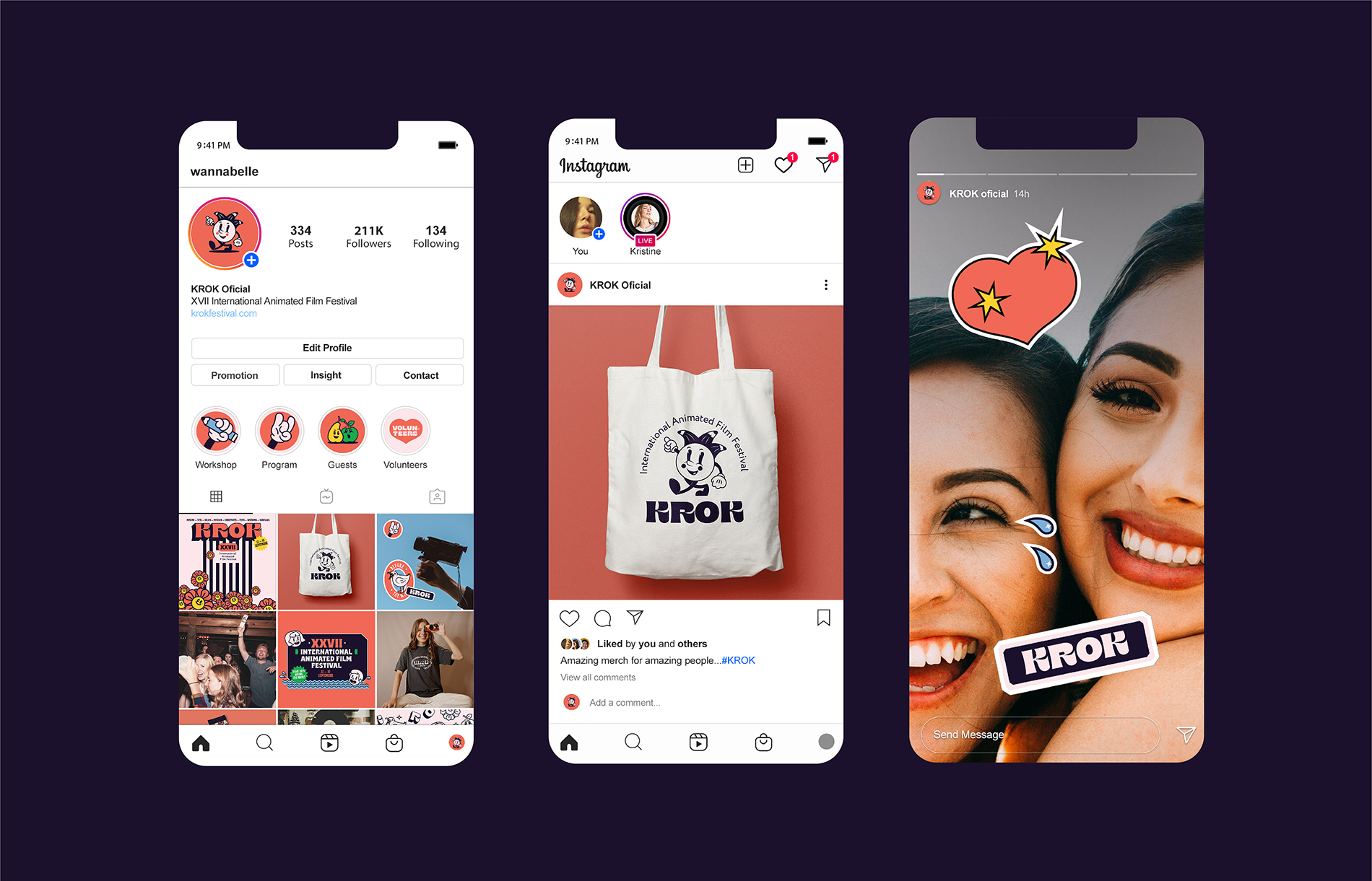
In real life, KROK speaks with guests in a voice of pure openness and sincere joy. Hence, festival social media should transmit the same feelings. Therefore, in Instagram stories and publications we show the cheerful faces of KROK’s volunteers and guests, as well as brand merch owners.
All informational materials support the general style of animation of the 20th century, reminding about the main festival events as if a close friend was talking.
The corporate site, like other brand items, is designed in a simple, minimalistic style. Owing to the bright, clear and convenient navigation, each guest can easily find information about the main festival participants, and, if desired, take a mini-trip along the waves of KROK-history.
CREDIT
- Agency/Creative: Karina Li
- Article Title: KROK Animated Film Festival Identity Designed by Karina Li
- Organisation/Entity: Freelance
- Project Type: Identity
- Project Status: Non Published
- Agency/Creative Country: Russia
- Agency/Creative City: Saint-Petersburg
- Market Region: Europe
- Project Deliverables: 2D Design, Brand Identity, Graphic Design, Illustration, Motion Graphics
- Industry: Entertainment
- Keywords: festival, animation, cartoon, mascot, idenity, motion
-
Credits:
Art-director: Karina Li
Graphic designer: Karina Li
Copywriter: Anastasia Zanko


