Hassle Free Boilers had a 20 year heritage, and great, trusted product offerings. But it wasn’t connecting with younger consumers in the same way industry competitors were. While it was a well-recognised brand within its sector, it wasn’t well-loved and consumers struggled to comprehend what the brand stood for.
This resulted in Hassle Free Boilers approaching us for more than just a rebrand. They wanted to redefine themselves and make a fundamental shift within their sector. The result is the biggest transformation in the organisation’s history resulting in a strategy, tone of voice and visual language that redefines boundaries within a stale industry.
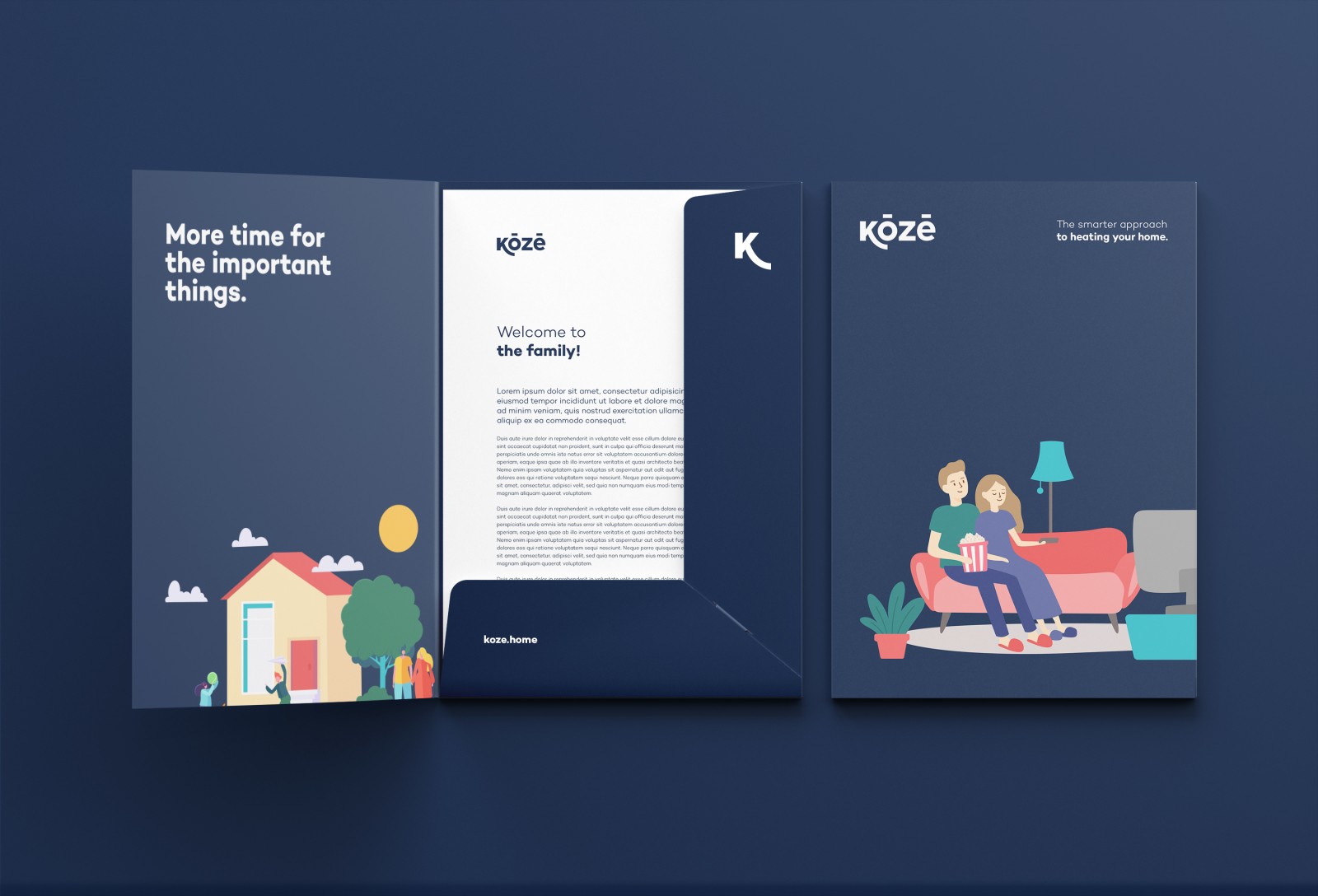
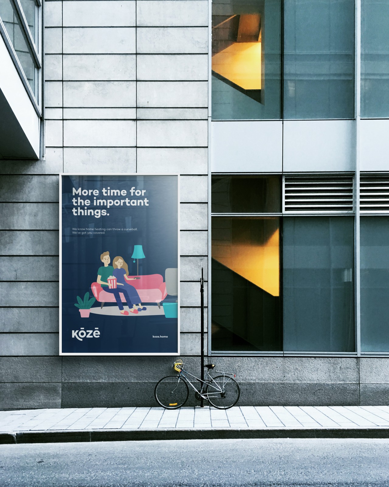
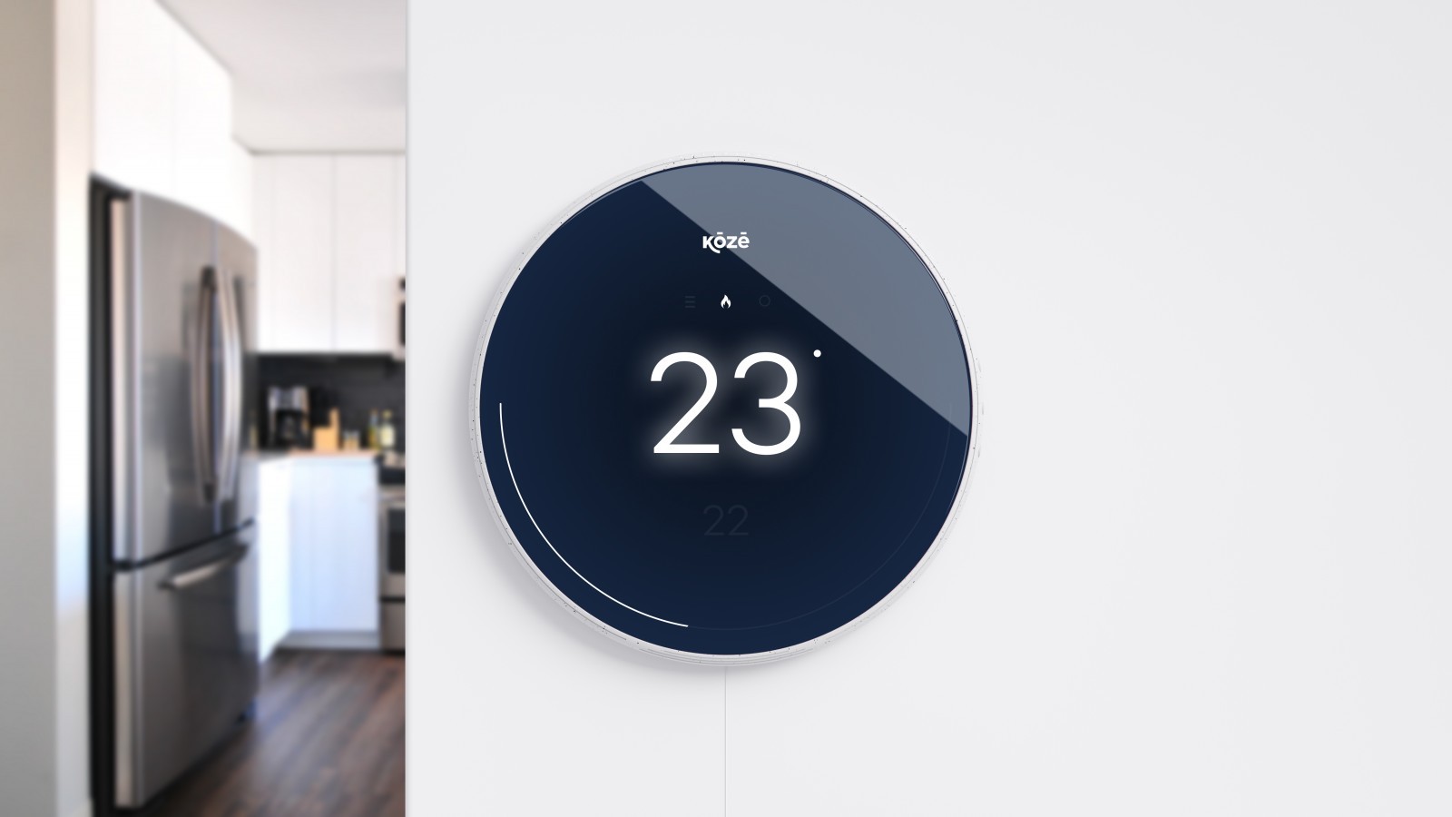
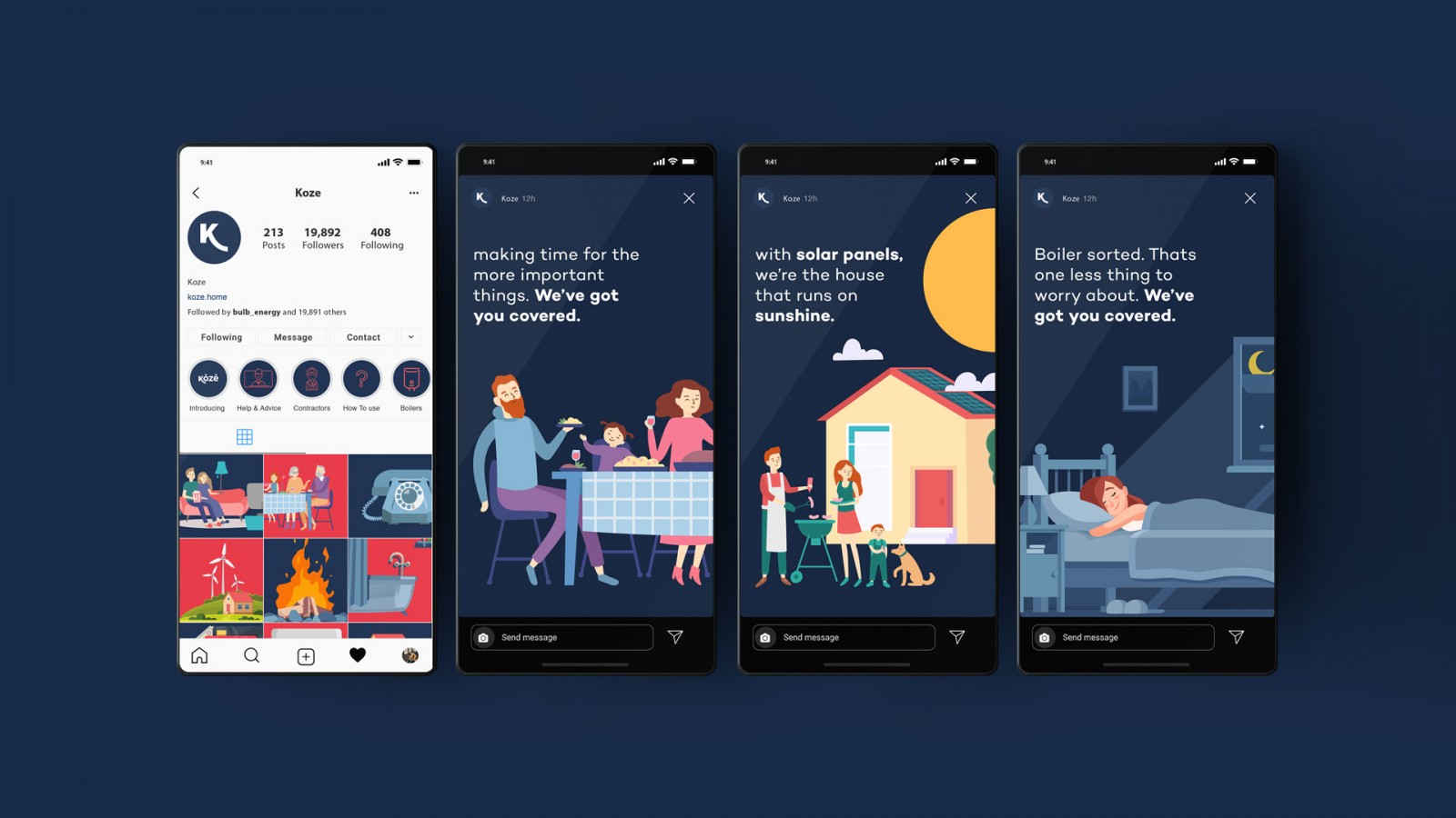
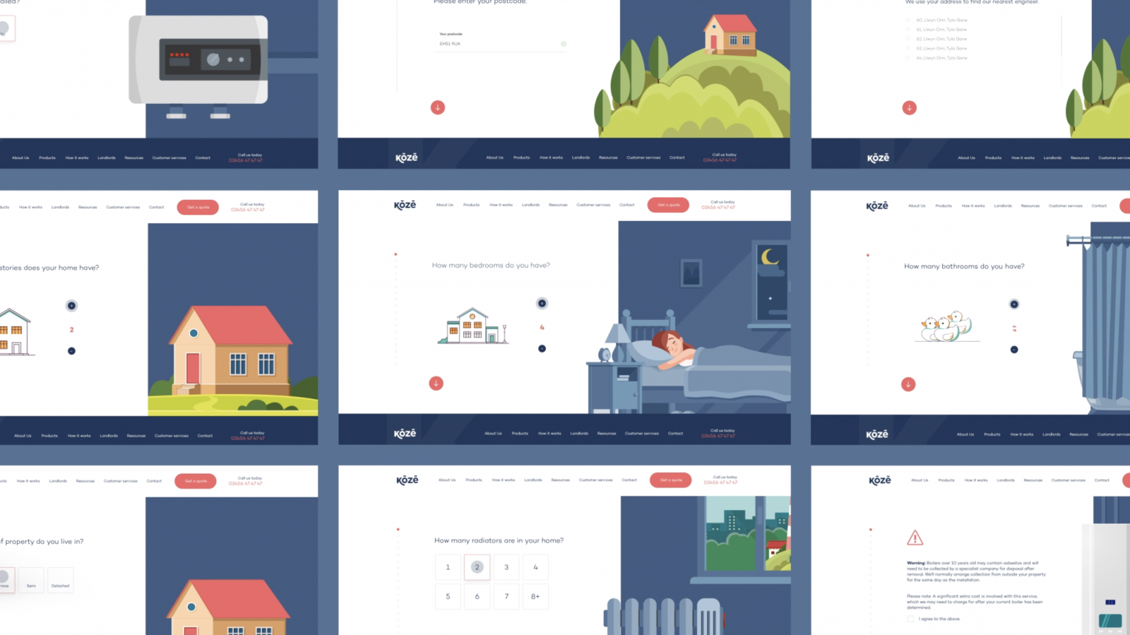
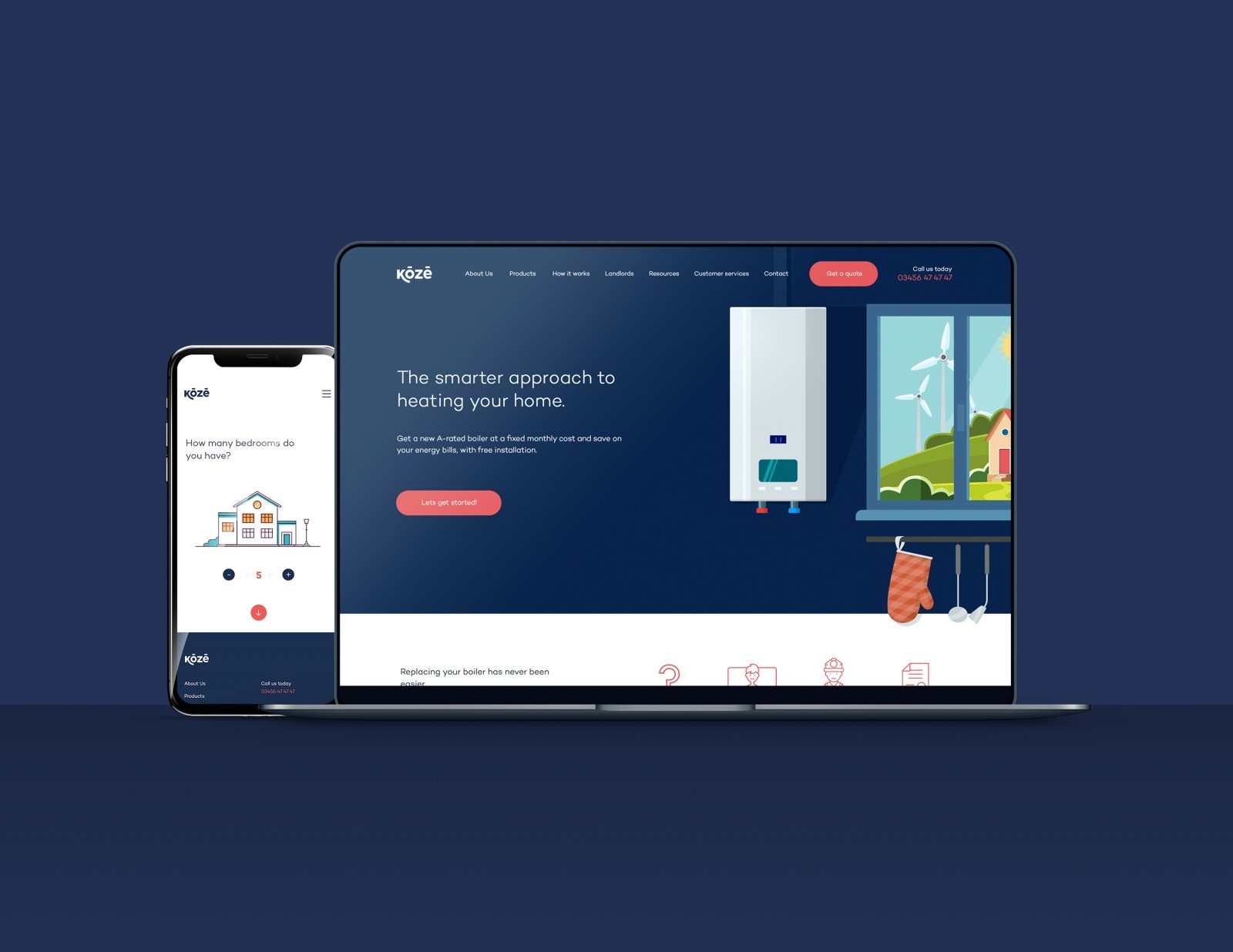
To develop and adapt to an ever changing landscape, a strong, consistent and flexible identity was needed to house a large range of products and sub-brands, to catch the eye and compete with competitors in an e-commerce setting. From traditional print campaigns to social media and connected home technologies, the brand needed to live and breathe in a consistent manner.
Our research and strategy dictated that a name change was the best possible route. Working with internal
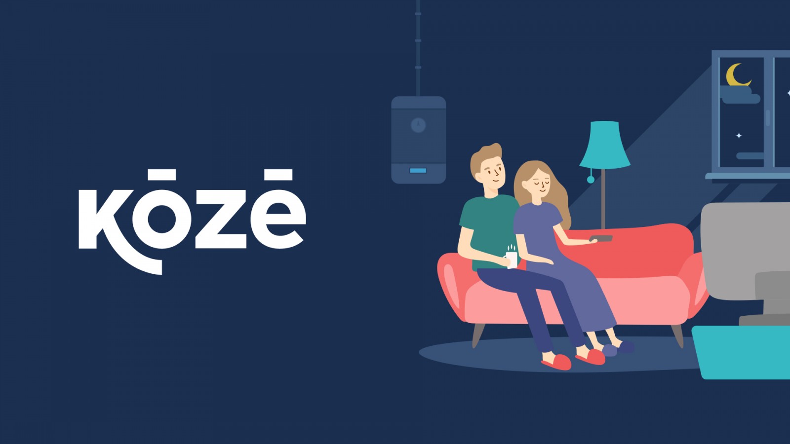
and external focus groups we arrived at Koze – emphasising the feeling of warmth at home and reflecting on the brands products, heritage and values. Collaborating over several months, we renamed and produced a brand that is unmistakably fresh, and unmistakably Koze.
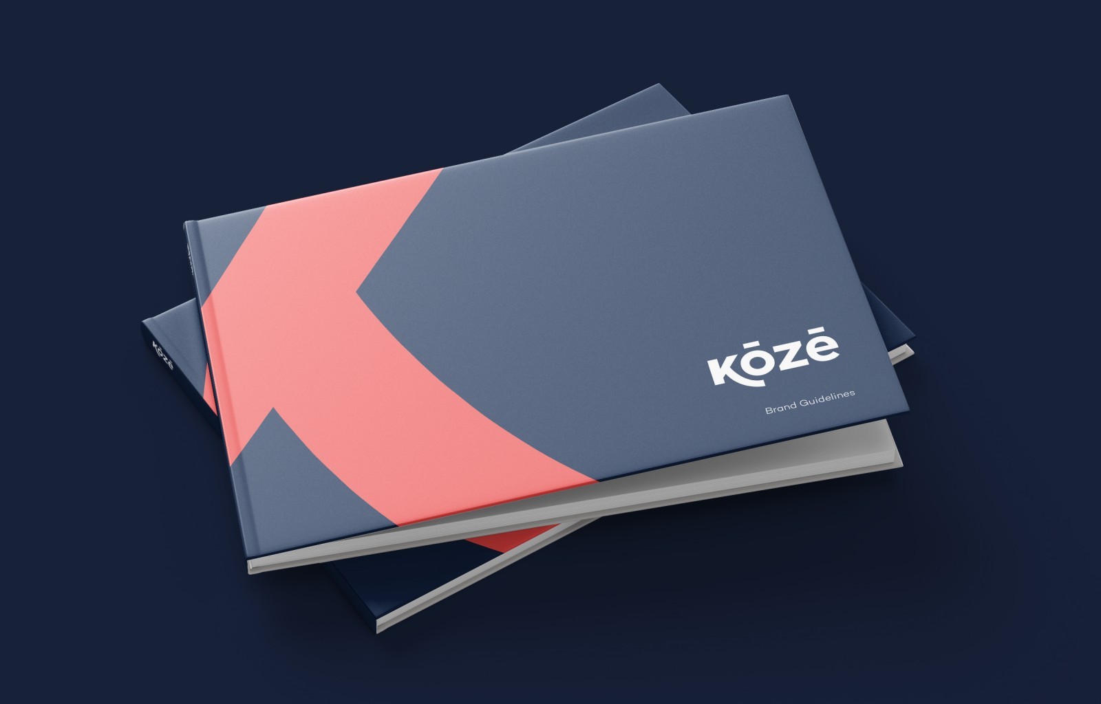
Koze celebrates the new vision, ethos and more approachable side of the brand. Drawing from the new strategy, we created a logotype based on simple, friendly shapes suited to anything from a connected home device to digital, e-commerce UI. The logotype is rooted within the organisations heritage, yet at the same time focuses on its future strategy and vision. The rebrand was an opportunity to give Koze leverage in commercial settings. It needed a strong visual identity that would associate it with high-end brands, but also the vibrancy to make it stand out and command attention in its industry. The result is a bold visual language and colour palette that is uniquely Koze. For tone of voice, we defined a simple approach – all in keeping with the new customer-first approach, with industry jargon being replaced with language that was far more approachable.
Since Koze has product offerings that can remain active with customers for several years, throughout the country, we developed a tactical blueprint of how the brand transition would take place. We considered how new products and offerings could live alongside older products, and how Koze could live alongside HFB during a transitional phase. The outcome is a brand that’s full of energy, approachable, and future-facing. A brand to lead Koze and its sector into a new era.
We have given Koze the guidelines and tools to propel the brand forward – to excite its employees and shape the future perceptions of its industry. The rebrand shows how a strong sense of purpose, backed up with an invigorating brand strategy and identity can have significant results within a short space of time.
CREDIT
- Agency/Creative: Creo Interactive
- Article Title: Koze Hassle Free Boilers Brand Redesign by Creo Interactive
- Agency/Creative Country: United Kingdom


