


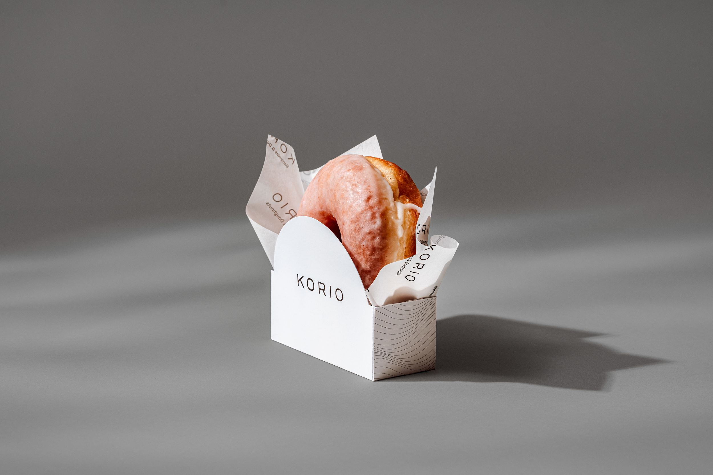
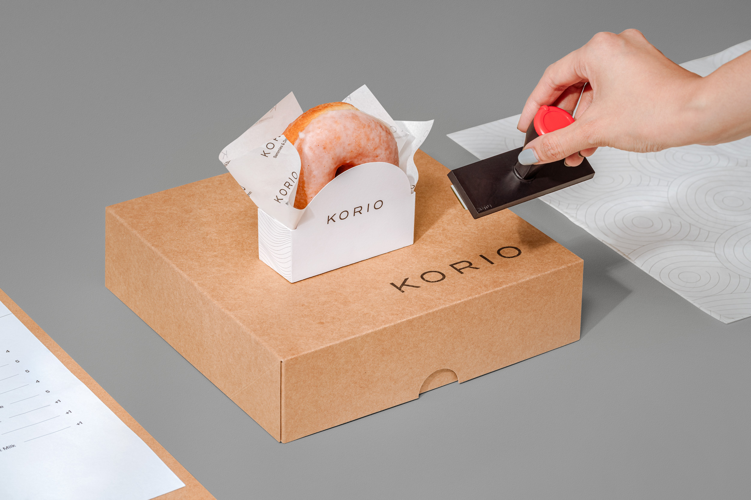
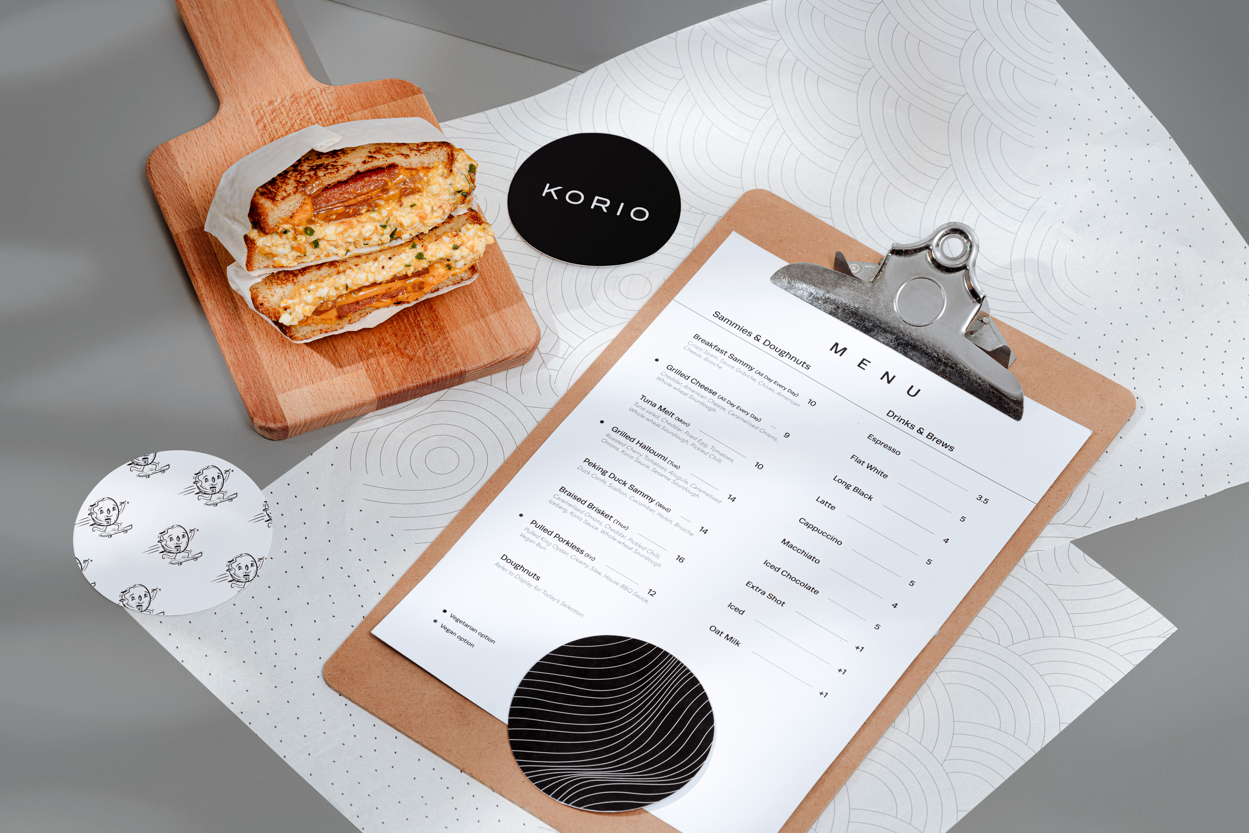
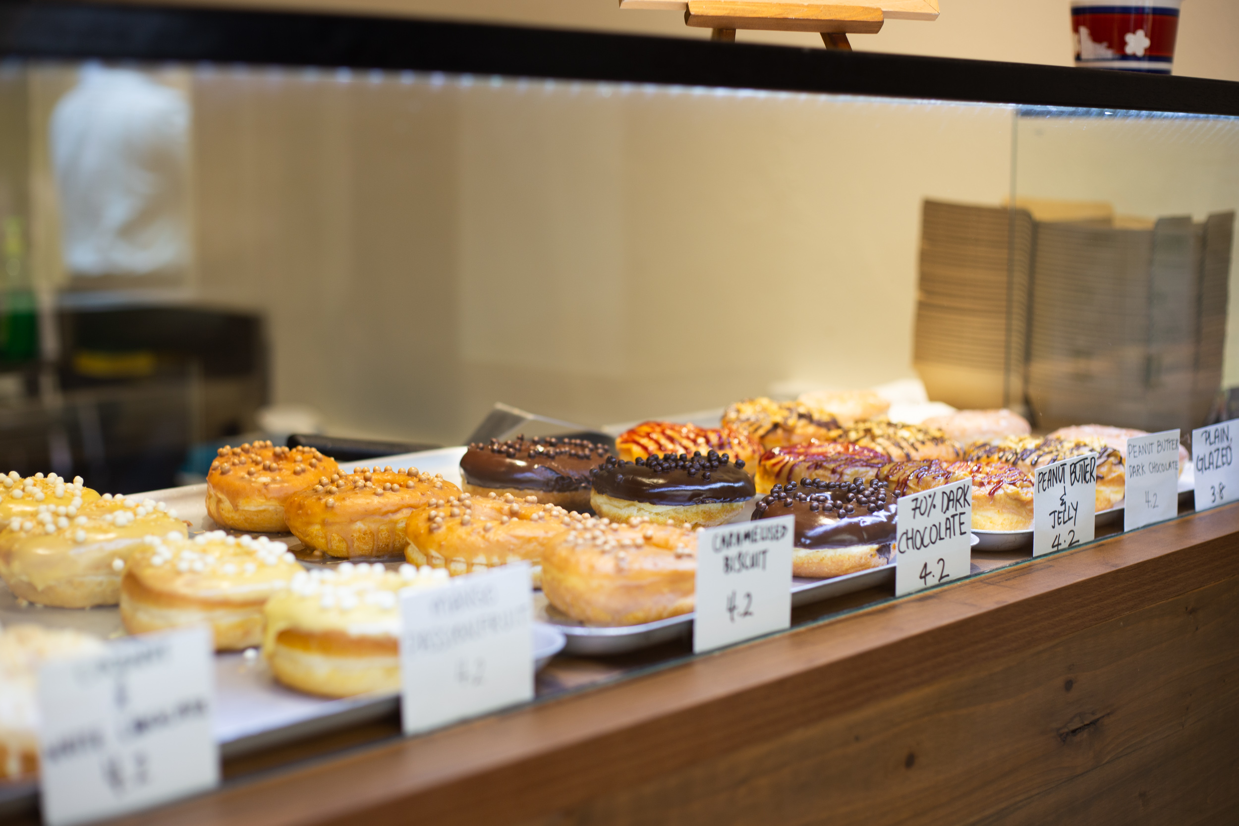
Korio is an independent artisanal sandwich and doughnut eatery located at downtown Singapore. Walking past this hole-in-the-wall eatery, one’s attention would be drawn to the trays of colourful donuts. Other than pretty donuts, you can also expect hearty grilled cheese sandwiches with sick cheese-pulls and well-seasoned meats.
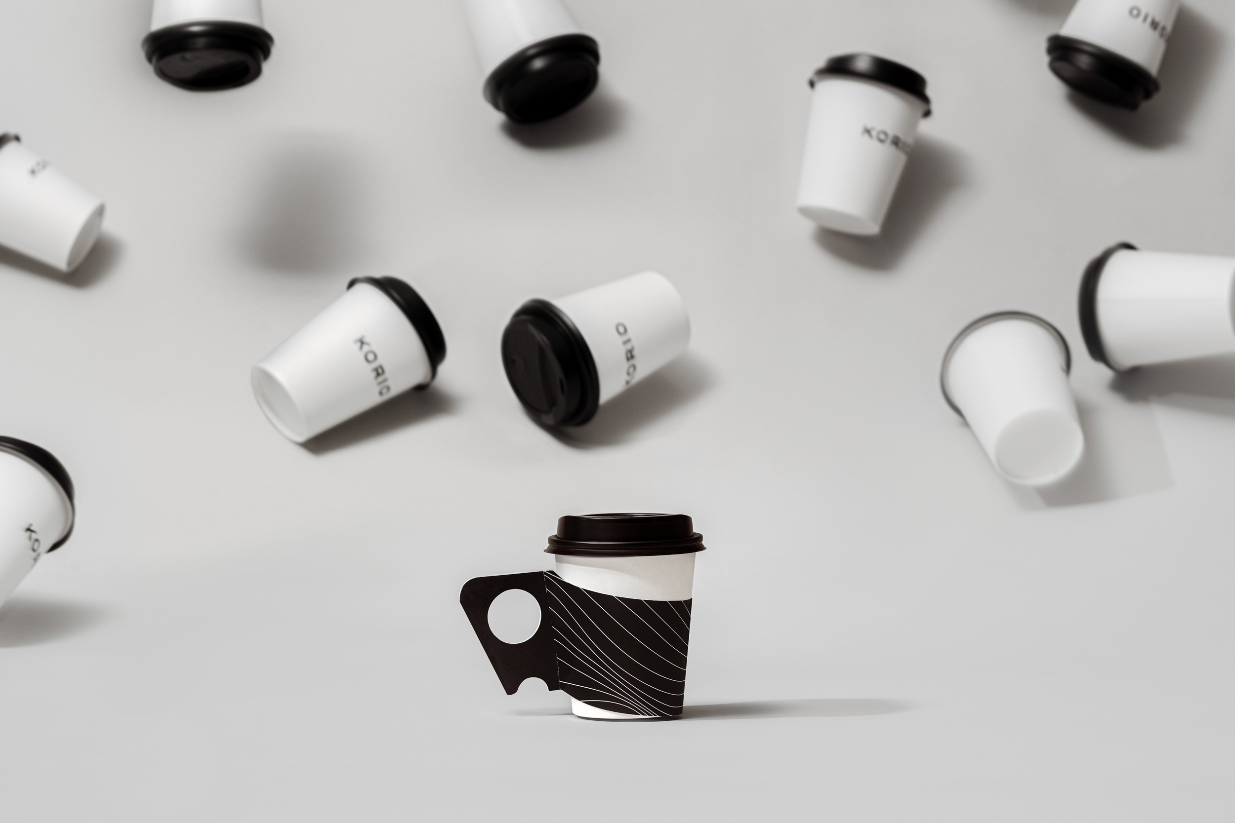
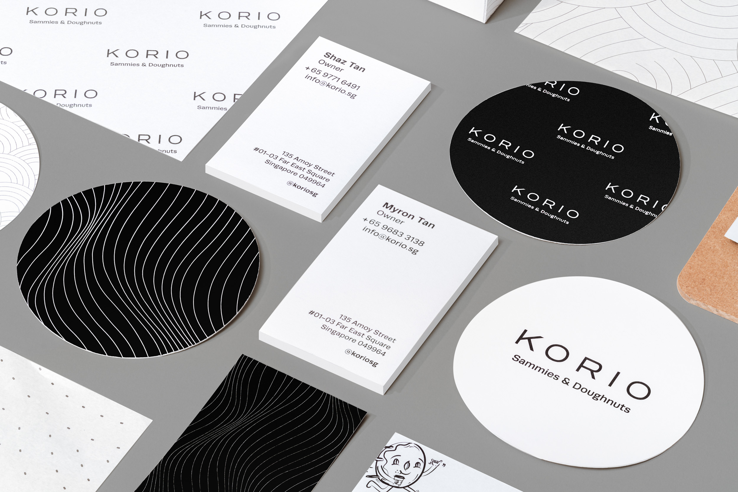
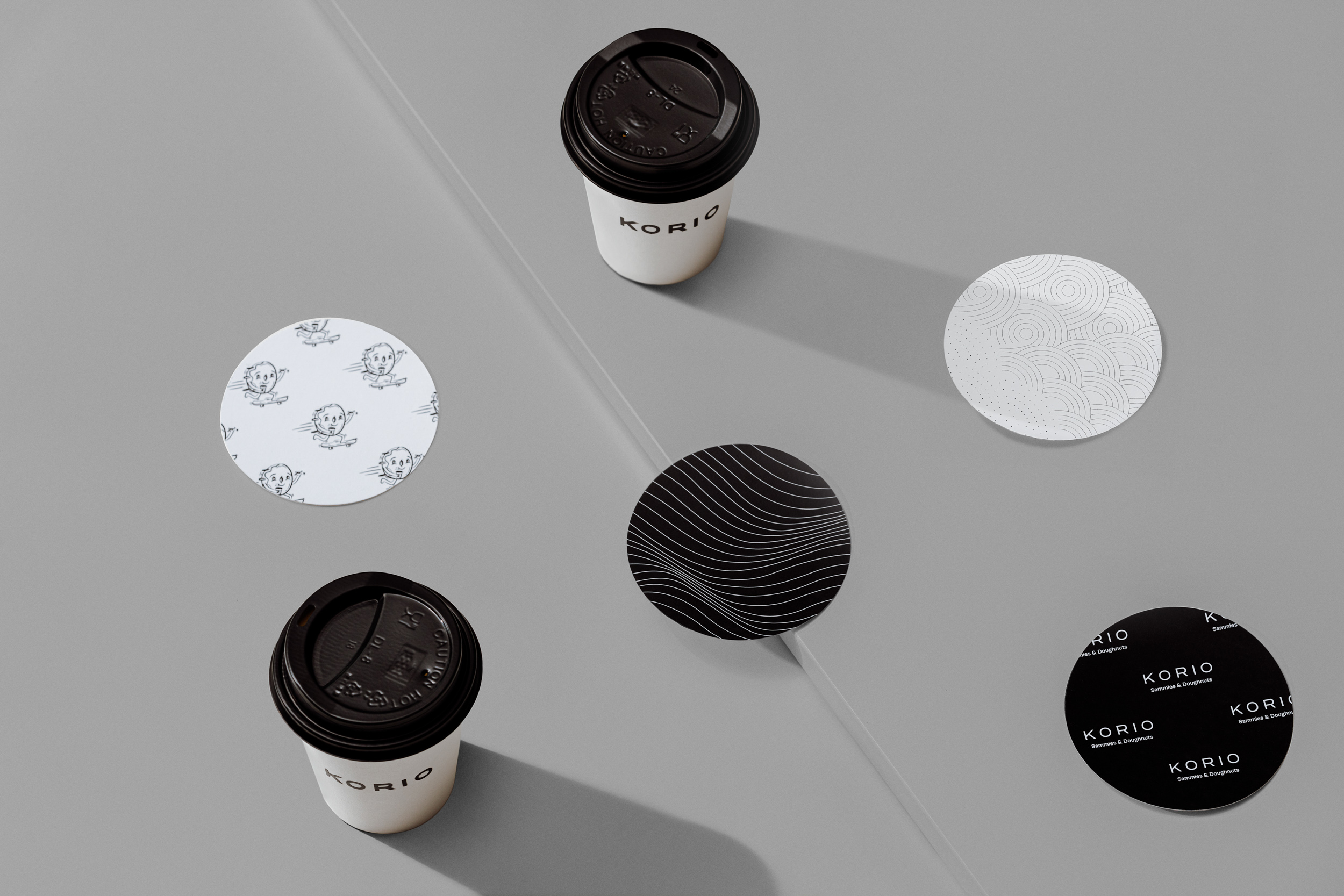
The logotype is inspired by the modernist, san-serif typefaces in downtown New York. Various supporting illustrations and minimalist secondary graphics are also created for different collaterals at the store.

CREDIT
- Agency/Creative: Fable
- Article Title: Korio Branding by Fable
- Organisation/Entity: Agency, Published Commercial Design
- Project Type: Identity
- Agency/Creative Country: Singapore
- Market Region: Asia
- Project Deliverables: Brand Identity, Brand Naming, Branding, Graphic Design, Identity System, Packaging Design, Tone of Voice
- Industry: Food/Beverage
FEEDBACK
Relevance: Solution/idea in relation to brand, product or service
Implementation: Attention, detailing and finishing of final solution
Presentation: Text, visualisation and quality of the presentation


