


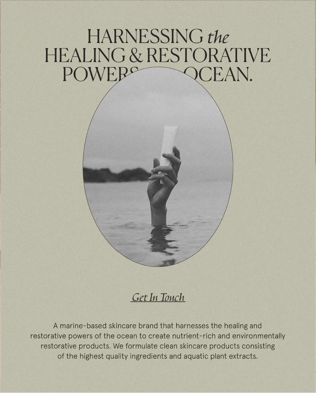
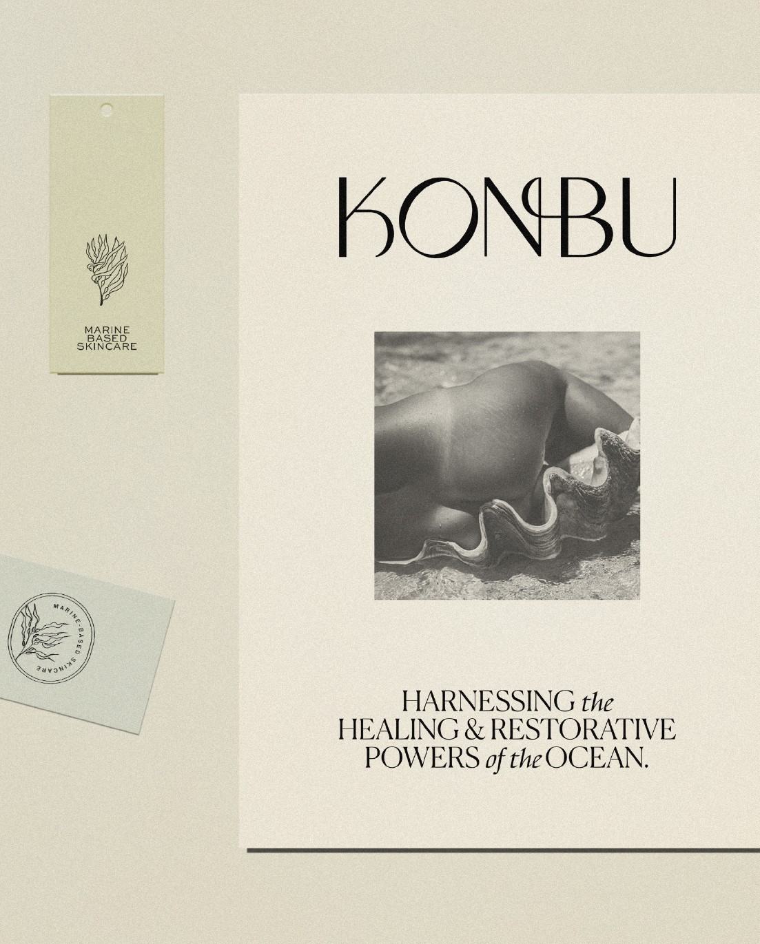
Konbu comes from the Japanese word for Kelp which is Kombu. It’s a marine-based skincare brand that harnesses the healing and restorative powers of the ocean to create nutrient-rich and environmentally restorative products. Konbu formulates clean skincare products consisting of the highest quality ingredients and aquatic plant extracts to nourish skin with minerals, vitamins, and antioxidants. Konbu promises to offer nourishing facial skincare products that truly perform while holding themselves accountable to unparalleled standards of safety in their clean formulations (no parabens, questionable chemicals etc.)
The brand’s target audience audience are women & men (27-33) who are searching for high-quality skincare products to help them improve their appearance. They care about purchasing products that are free of harmful toxins. They are willing to spend some money on qualitative skincare products to look and feel their best.
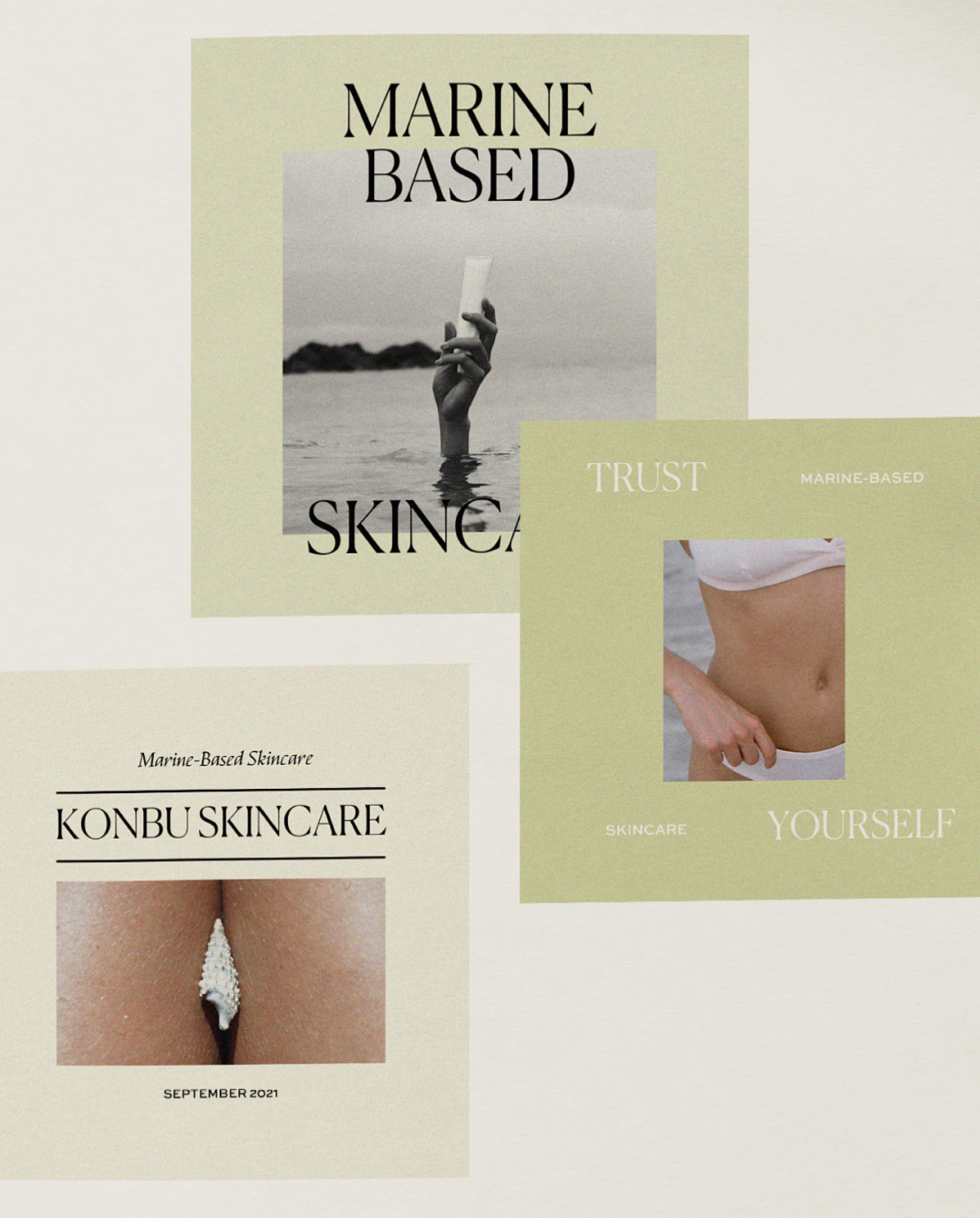
We focused on a a branding experience that makes the target audience feel rejuvenated, nourished and connected to the ocean as they search for clean and nutrient-dense skincare that doesn’t harm them or the planet and enables them to look and feel their best. – An identity that is conscious, contemporary, minimal, clean and luxurious .
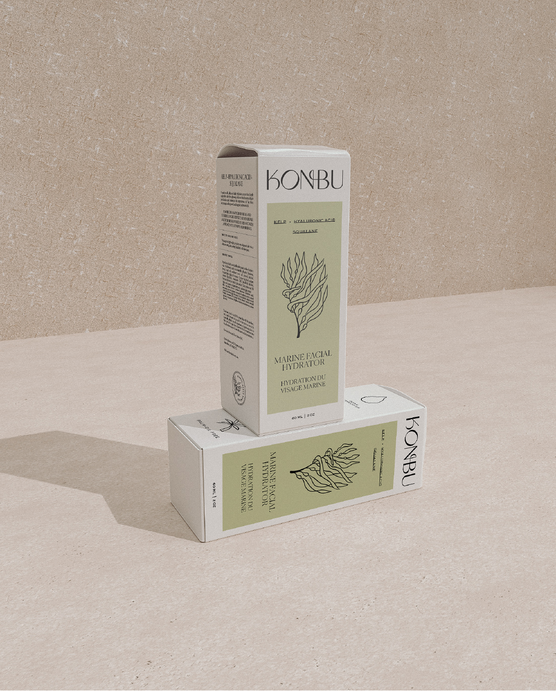
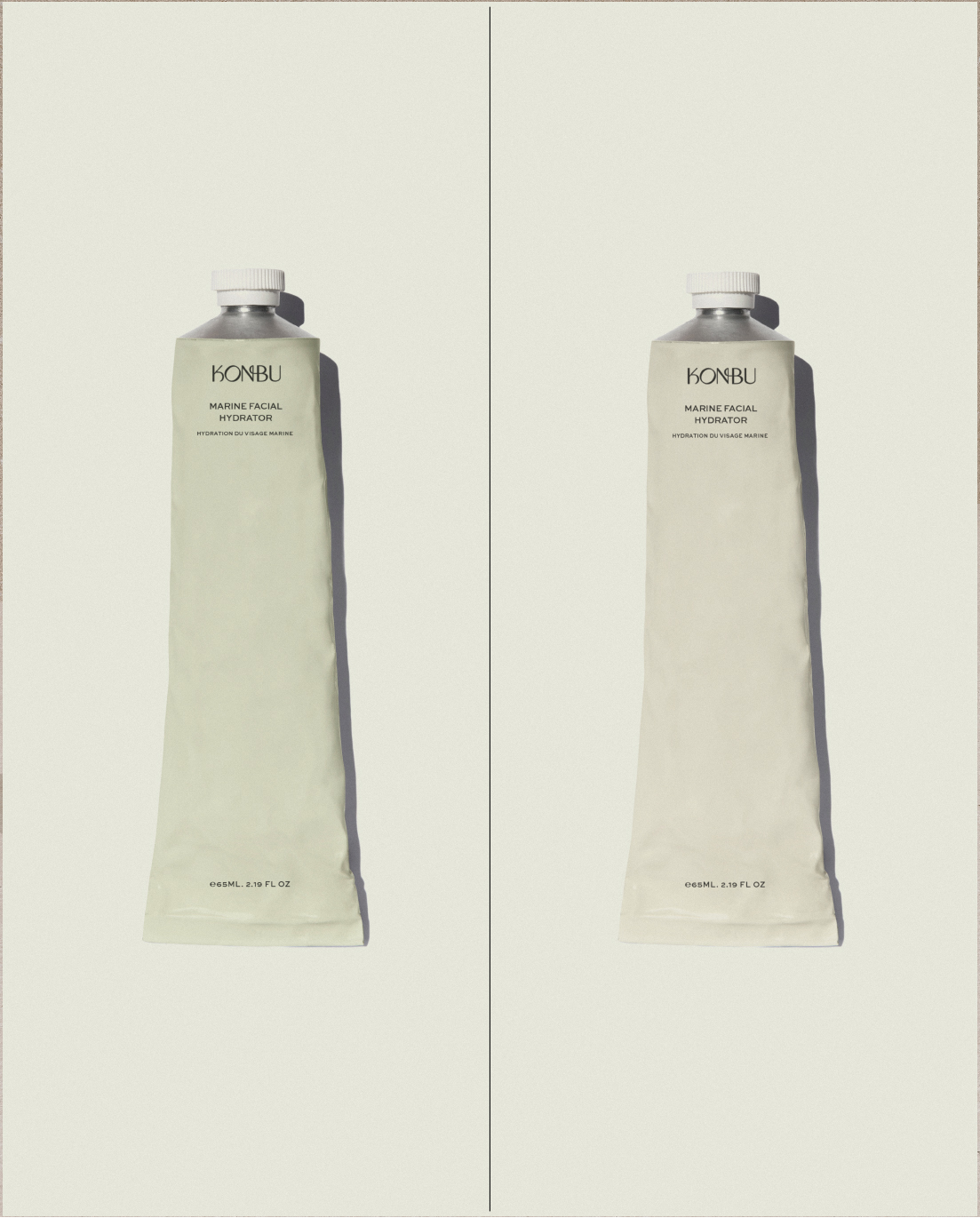
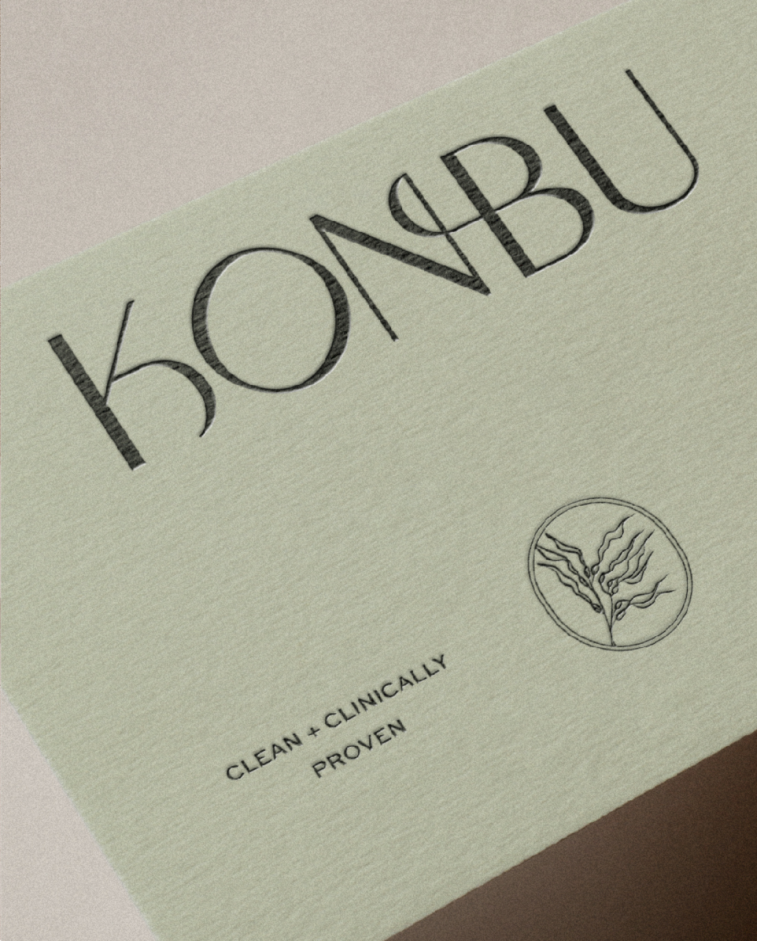
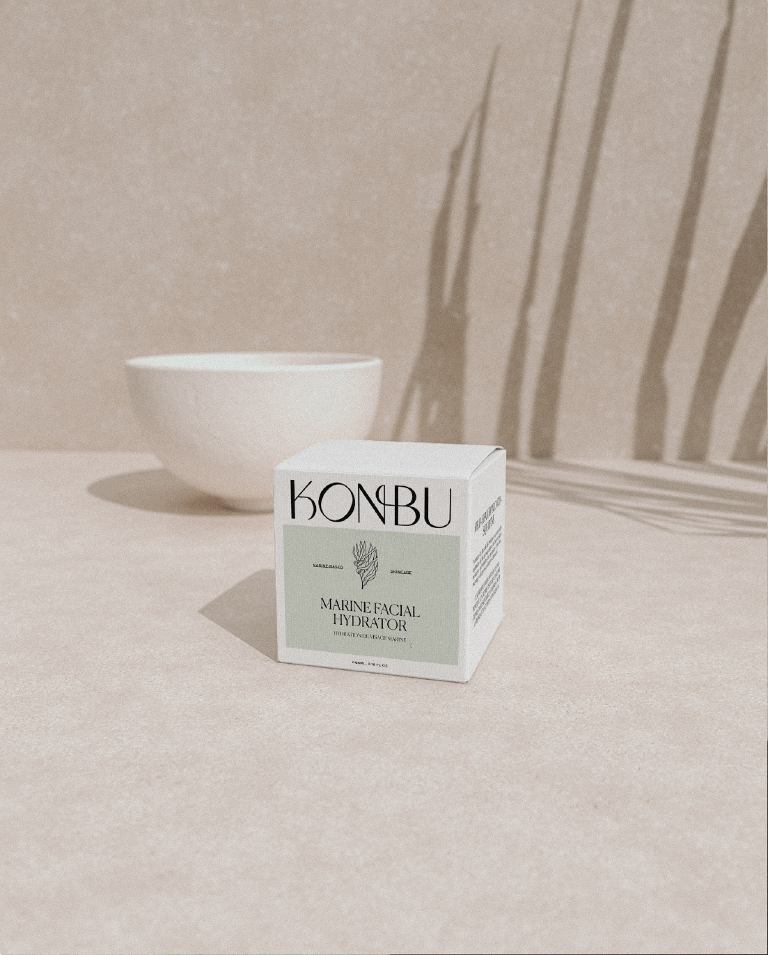
The result is a brand identity that is clean, yet luxury and most importantly, evokes feelings of cleanness and connection to the ocean. We do this by using an ocean-inspired, yet neutral and inviting color palette. For the primary colors we chose a dark green and light green to evoke feelings of earthiness, and a beautiful cream and black to evoke the feelings of luxury, while also helping to stand out. For Konbu’s logo mark, a beautiful uppercase font was chosen because of its strong character and vintage feel. We customized the typeface so that it is truly unique. In addition to the wordmark, we created a symbol that can be used to stand on its own. The line-art illustration is a hand-drawn kelp drawing to tie in those minimalist vibes.
CREDIT
- Agency/Creative: Labels Studio
- Article Title: Konbu Marine-Based Skincare Brand Identity and Packaging Design by Labels Studio
- Organisation/Entity: Freelance, Published Commercial Design
- Project Type: Identity
- Project Status: Published
- Agency/Creative Country: Netherlands
- Market Region: North America
- Project Deliverables: Brand Identity, Brand Strategy, Branding, Illustration, Packaging Design
- Keywords: Marine-based skincare, Packaging Design, Skincare Packaging, Skincare Branding, Sustainable Packaging, Natural Skincare


