


Naturence, a health functional food company, launched Kefir Lab to inform consumers of a good ingredient called Kefir, which is still unfamiliar.
Kefir is known as superfood, a traditional fermented oil in the mountainous region of long-lived village, Kavkaz, and Kefir Lab wanted to show its expertise and technology. There were many brands of scientific mood in the existing nutritional product market, but they were asked to avoid it. So we wanted to exclude the shapes and intuitive graphics of organs seen in existing lactobacillus brands. We also thought that this was a new way other than showing the product mainly on functionality.
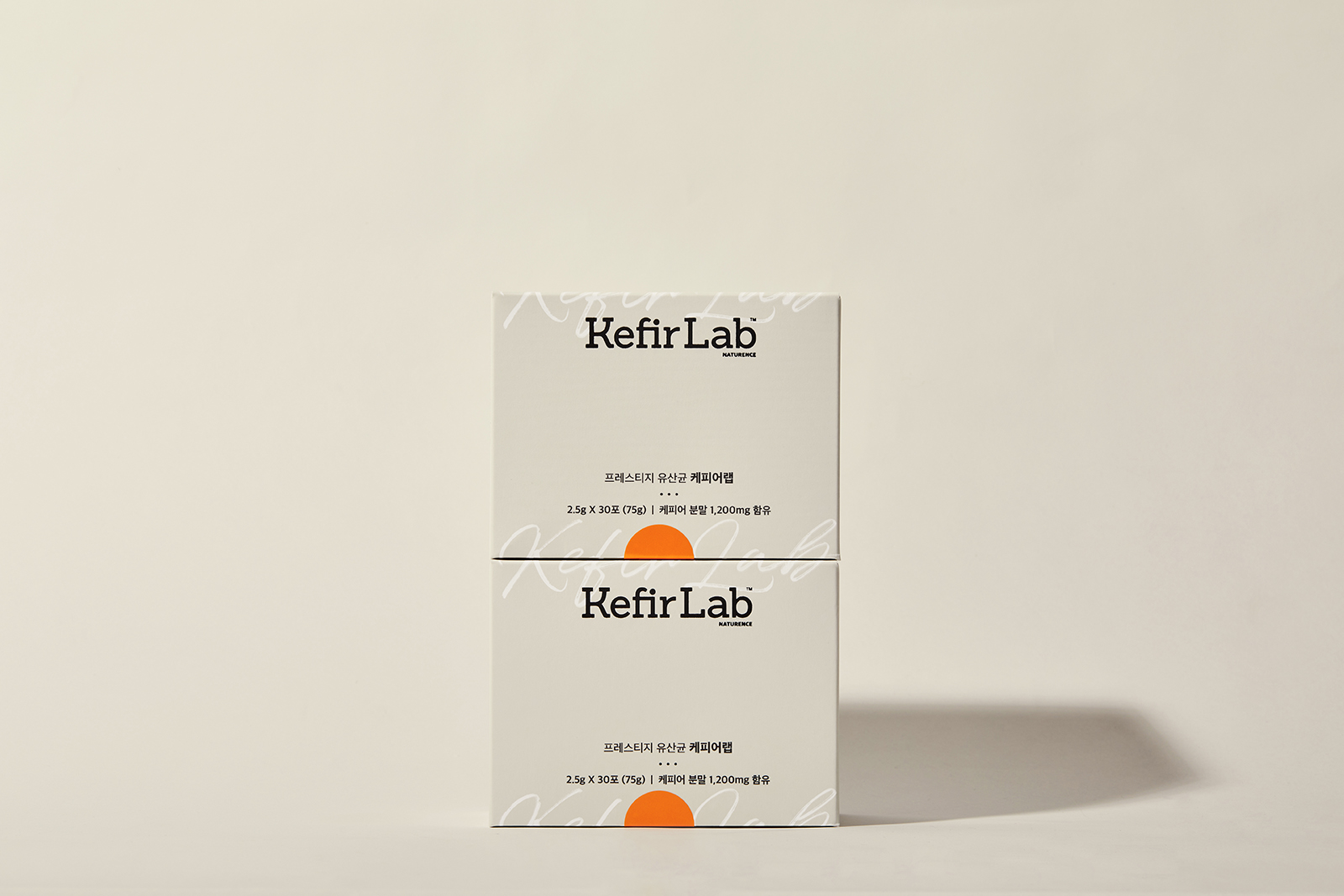
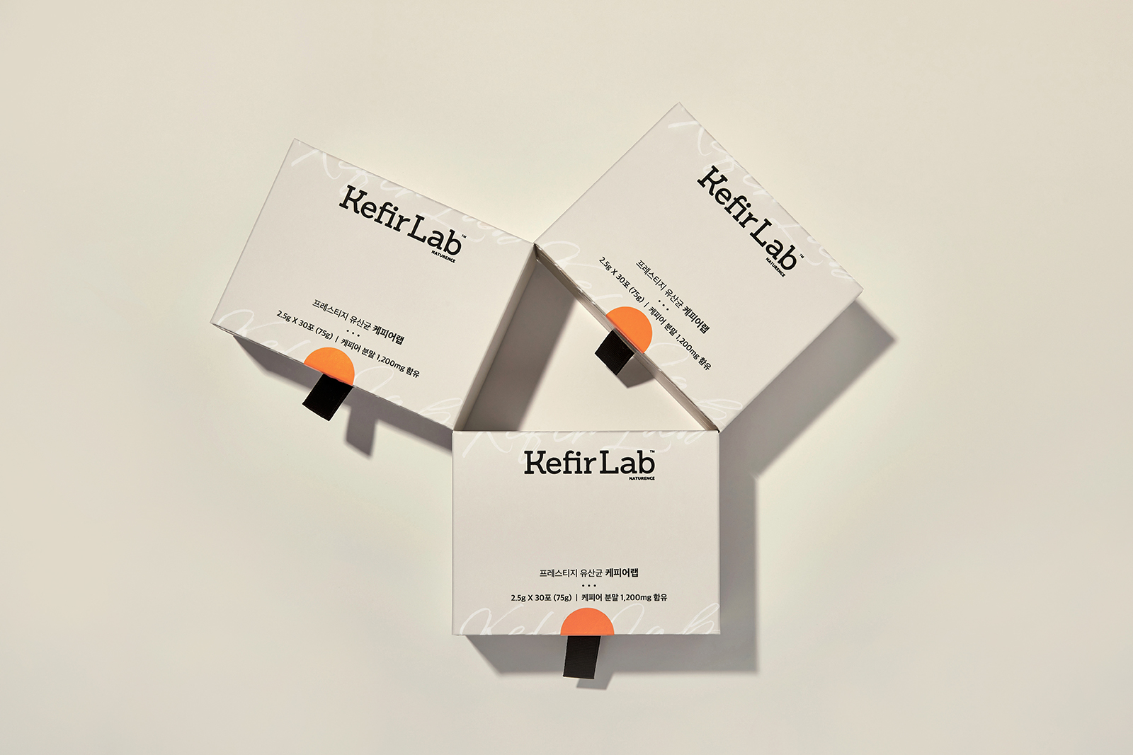
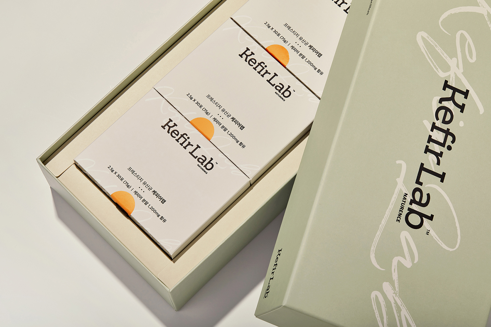
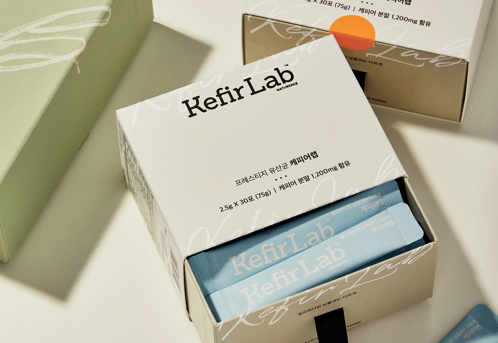
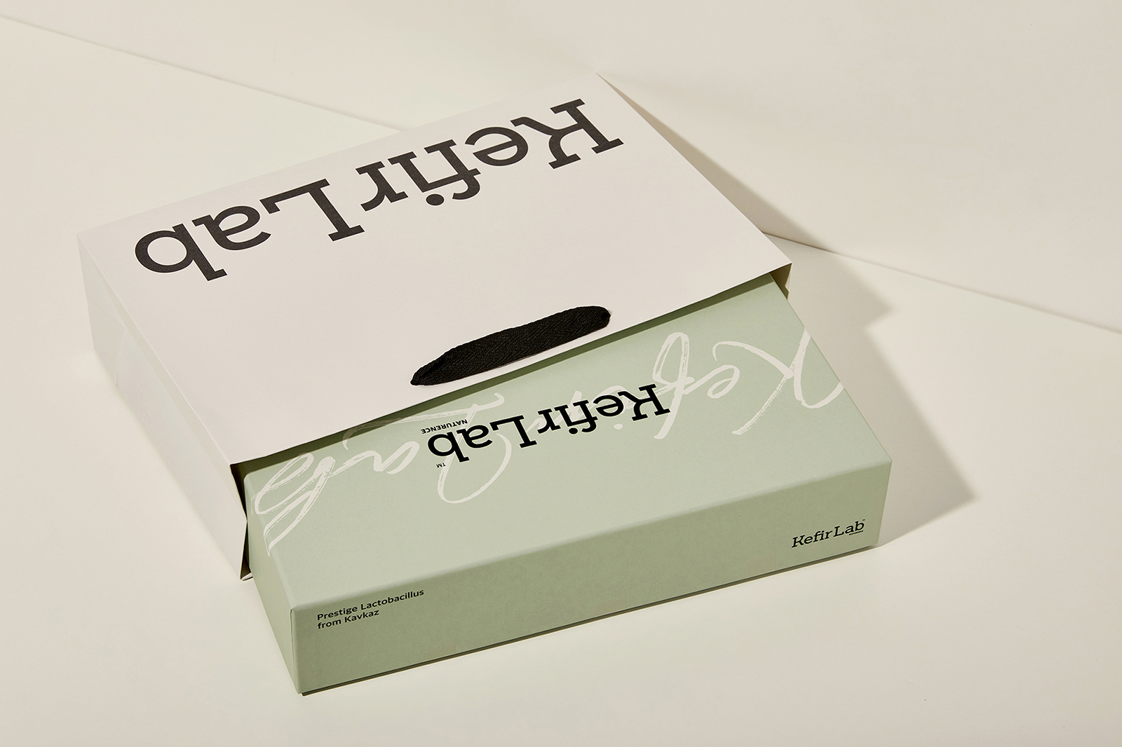
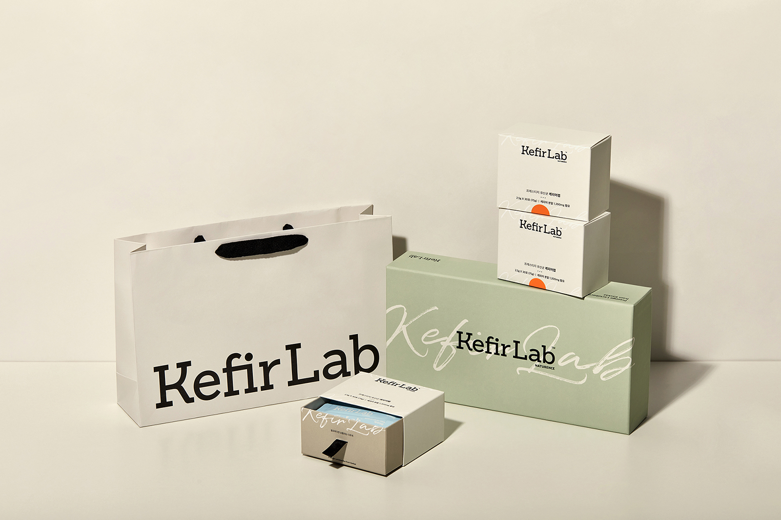
The first keyword that came to mind was Europe. Imagining a clean Europe. We tried to minimalise the feeling of the raw material from there with visual and tone manners. The place is a landscape of cows and children running around on green grass, but the brand itself expressed it in a more understated way. The decorative elements in the logo are also composed only of vertical and horizontal, and the calligraphy appears as a sub-visual.
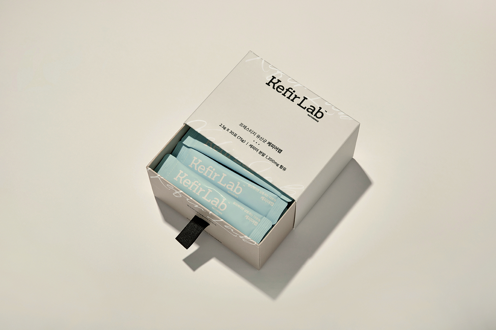
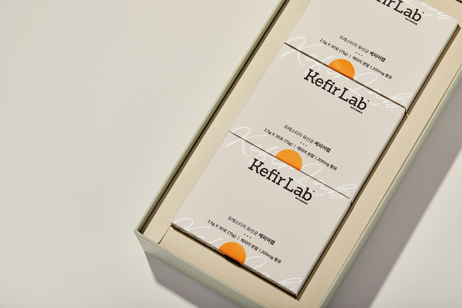
And the sticker that finishes the product becomes a small point element.
The most focused was a different interpretation of premium health products. We tried to find moderation rather than glamour. Small points are located in Packaging, and neutral colors play a role in making the brand richer. The overall composition divided into several plays a role in enriching the mood of each neutral color. It allows consumers to experience psychological satisfaction and branding while taking care of their health.
CREDIT
- Agency/Creative: Long&Short
- Article Title: Kefir Lap Branding and Packaging by Long&Short
- Organisation/Entity: Agency
- Project Type: Identity
- Project Status: Published
- Agency/Creative Country: South Korea
- Agency/Creative City: Seoul
- Market Region: Asia
- Project Deliverables: Branding, Packaging Design
- Industry: Health Care
- Keywords: Europe, Refined, Present
-
Credits:
Creative Director: Joohyung Yun
Designer: Sohyeon Kim


