


The national centre is brand new, and started without a visual identity. Development of NCFO’s design foundation; A visual identity and website with a focus on web accessibility and and simple design. The National Center for Obesity is a new national knowledge centre which aims to gather and provide an overview of existing knowledge about obesity – from research to health services.
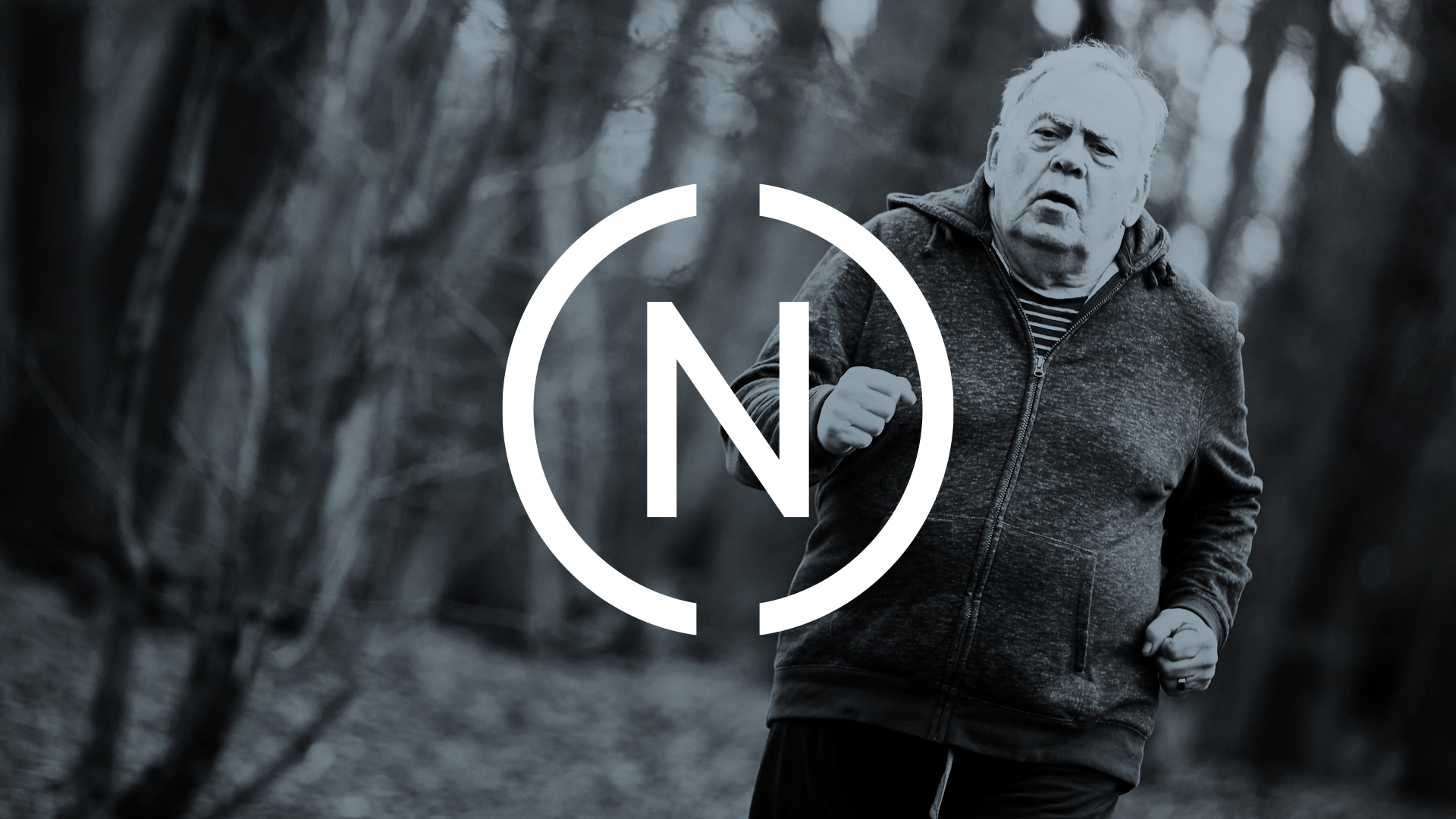
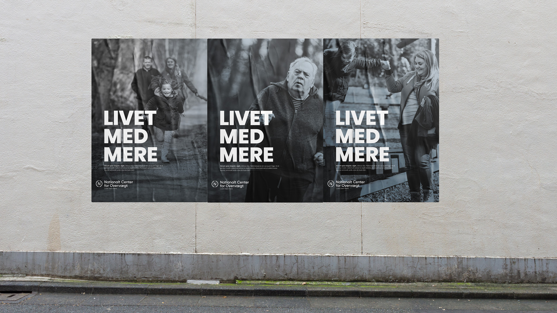
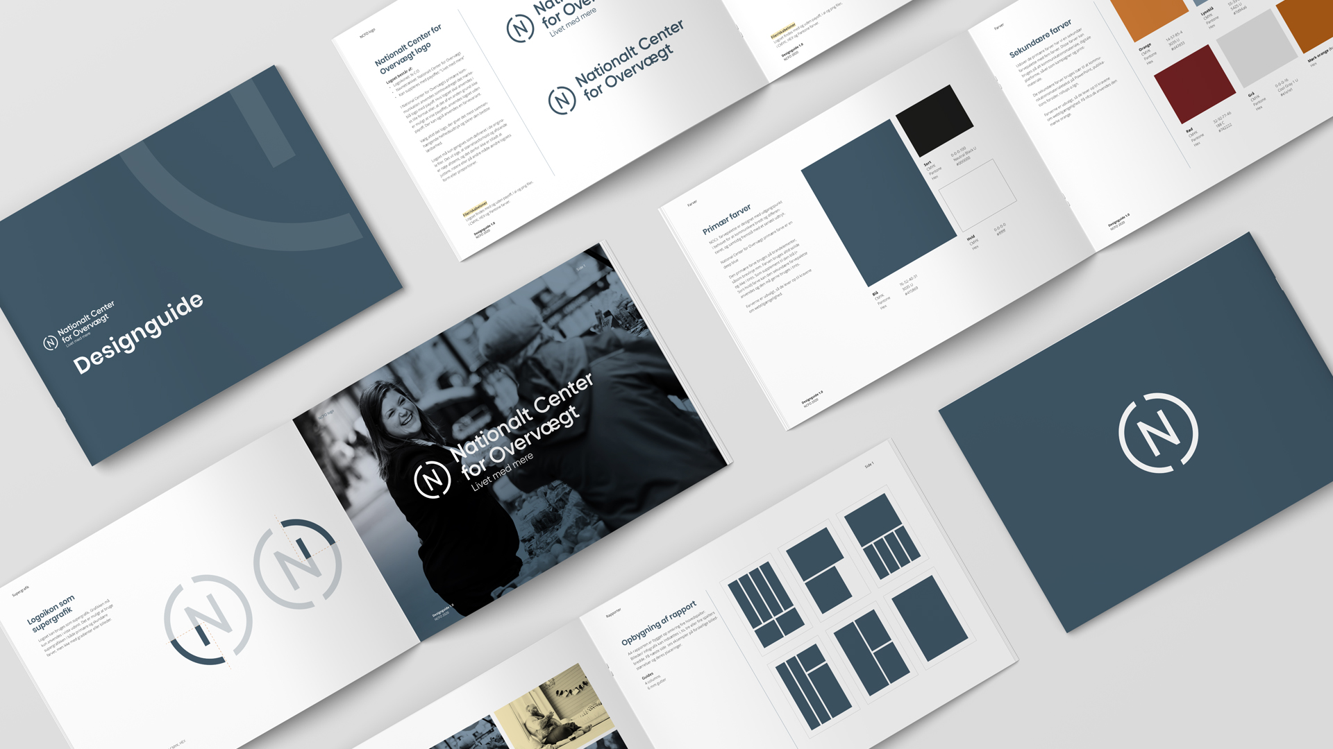
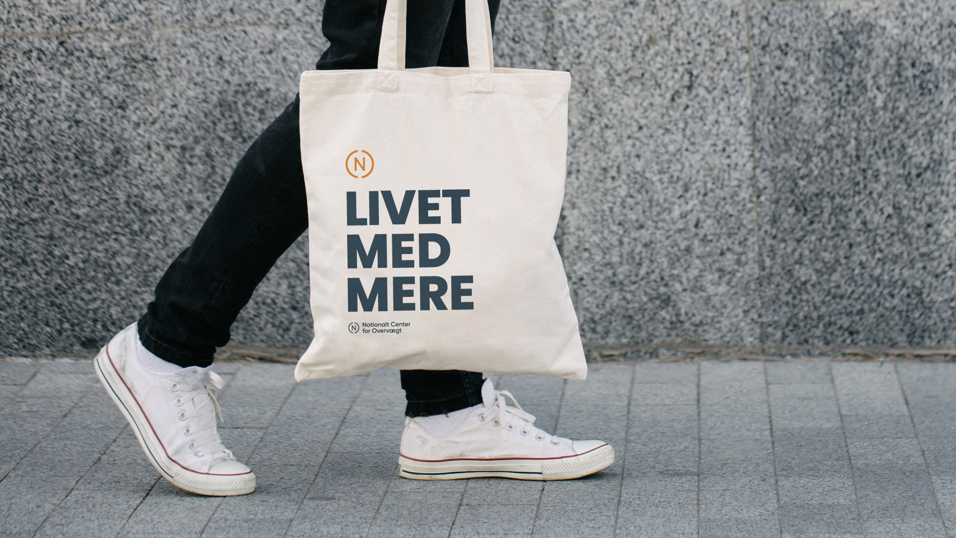
Identity: I have developed a logo that is easy to recognize. The logo is a central element of the visual identity, which must reflect it serious knowledge center. Professional, national, positive with an important mission. With a slight twist, without falling for naive symbolism. The circle is divided in two. It provides a light and vibrant expression and symbolises in part the two ways we communicate knowledge on, with the brain and the heart.
Colours: The first half of the colour palette reflects a professional, serious and credible knowledge centre, their communicate with the brain. Blue = trustworthy, reliable, stable and committed and Grey = balance, neutrality and timelessness. The second half of the ocean reflects the warmth of the NCFO; sincerity and optimism, and communicate with the heart. Orange = excitement, uplifting, warmth and energy and Yellow = optimism, joy, warmth and cheerfulness.
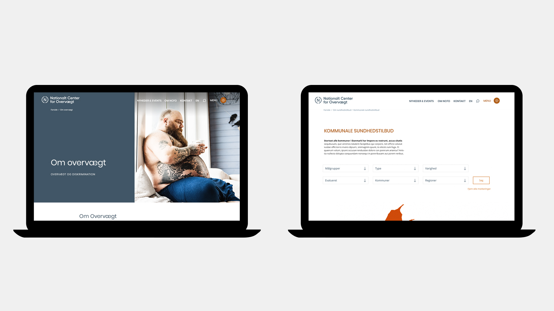
The website is designed to meet WCAG’s requirements for web accessibility. The website follows the principles, techniques and provisions of the Web Accessibility Act, which means that ncfo.dk can be used by everyone, including users with disabilities, without compromising the brand design.

CREDIT
- Agency/Creative: Janus Mikkel
- Article Title: Janus Mikkel Creates New Identity for the Danish National Center for Obesity
- Organisation/Entity: Freelance
- Project Type: Identity
- Project Status: Published
- Agency/Creative Country: Denmark
- Agency/Creative City: Odder
- Market Region: Europe
- Project Deliverables: Art Direction, Brand Identity, Logo Design, Web Design
- Industry: Health Care
- Keywords: Health Care, Obesity


