


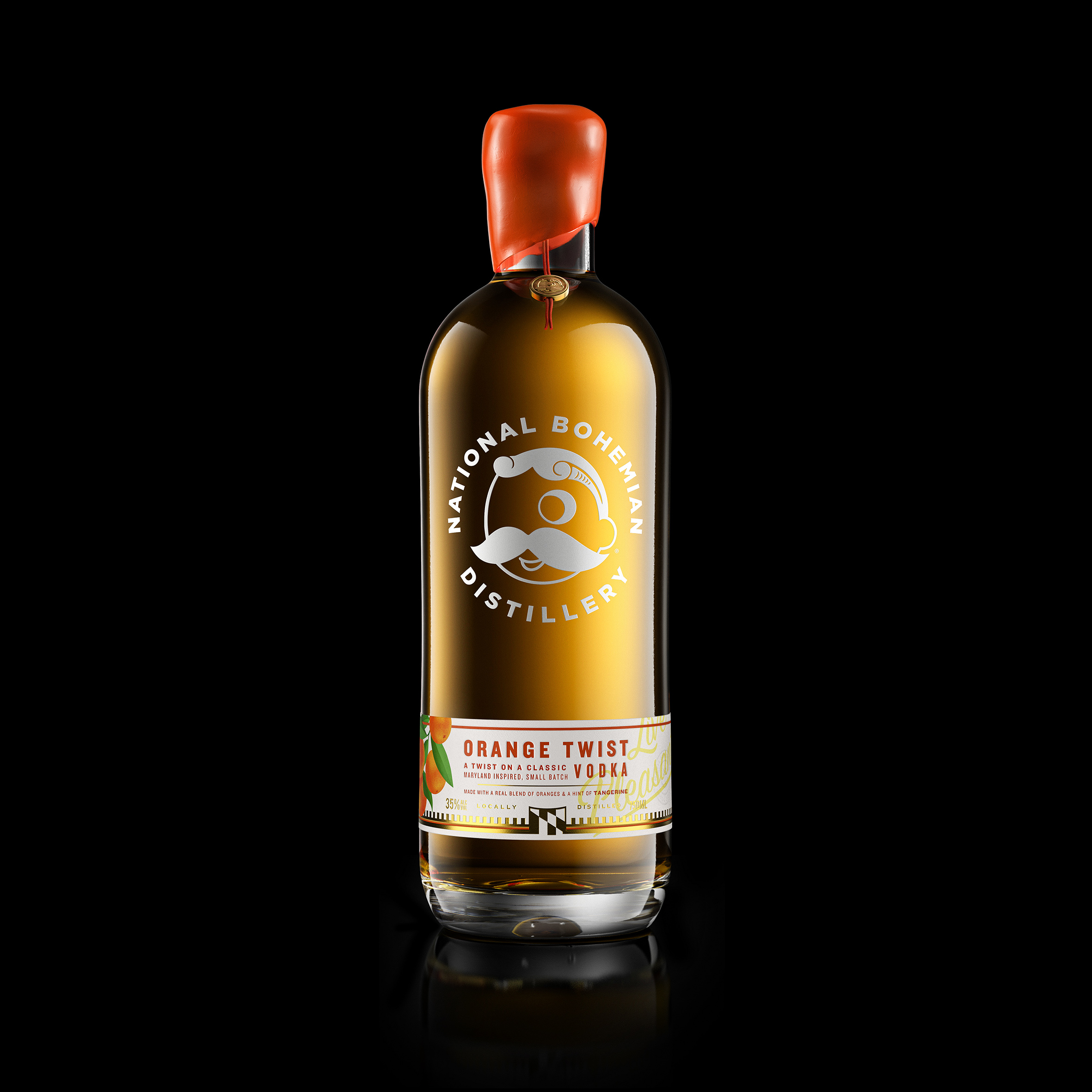
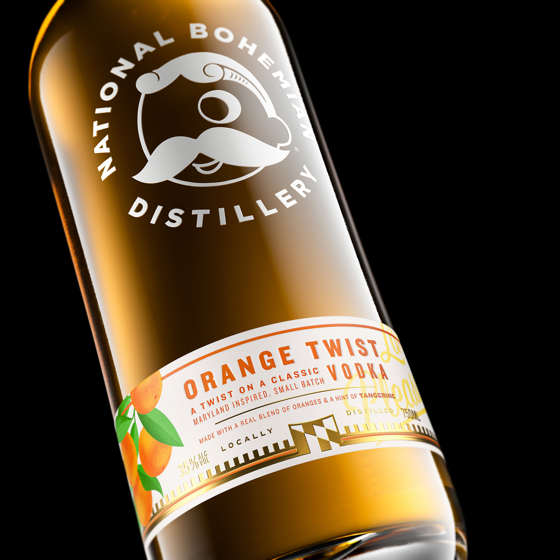
Introducing a design by Intertype Studio for ‘Natty Boh’ orange twist vodka. The brand is the local price of Baltimore, Maryland, and is currently known for its much loved brewery. The work moves the brand into a distilling space, and is inspired by the spirit of mid-century optimism; a time of positive ideals and astonishingly simple brand messaging. The bottle takes cues from the famous sign that sits atop the brewery itself, whilst the graphics are inspired by the labelling and wax seals found on fruit labels of the 1950’s. The branding invites you to ‘live pleasantly’ and enjoy a simpler kind of lifestyle, taking you back to a laid-back time when everything seemed less complex. The liquid is inspired by a famous local Baltimore favourite: the “Orange Crush” cocktail.
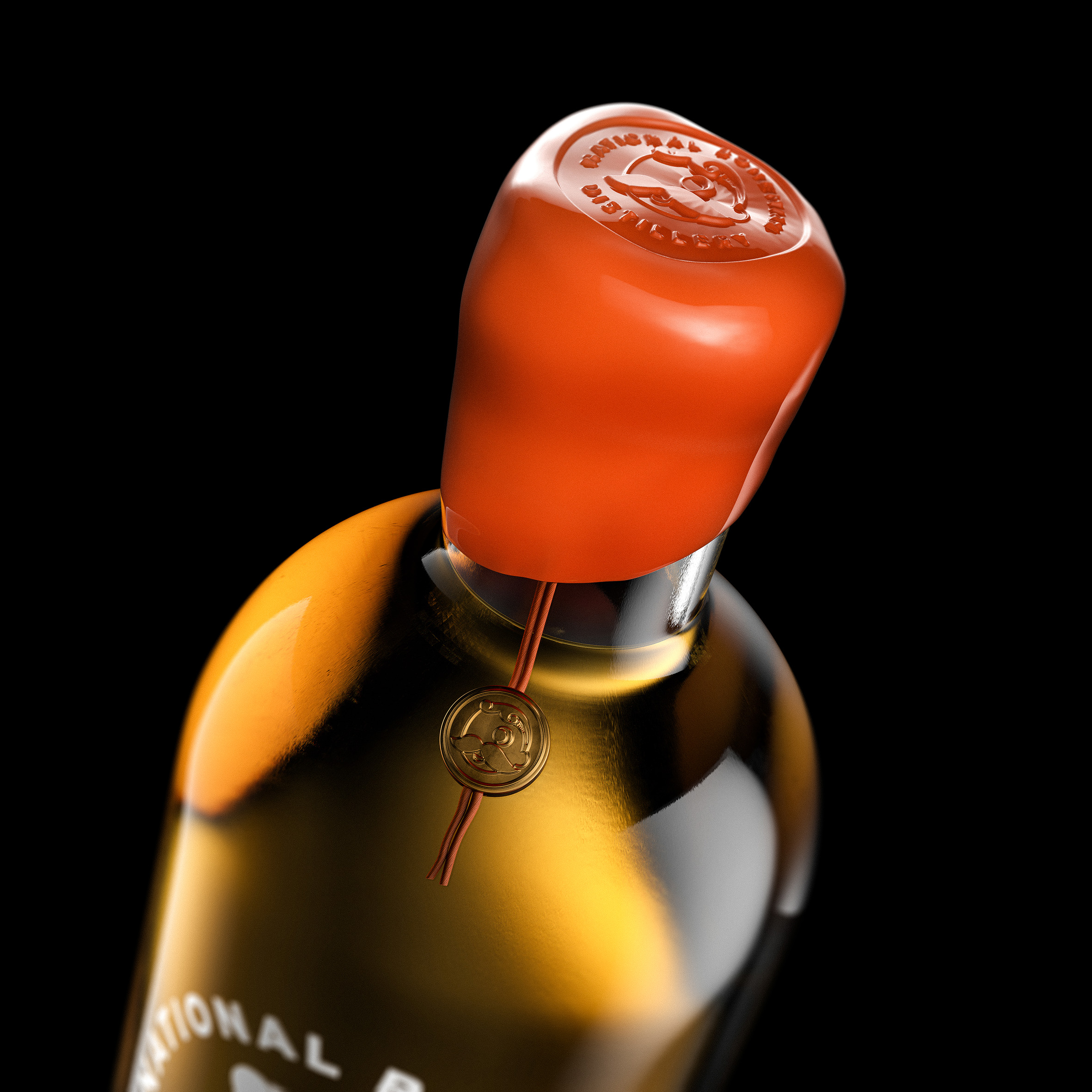
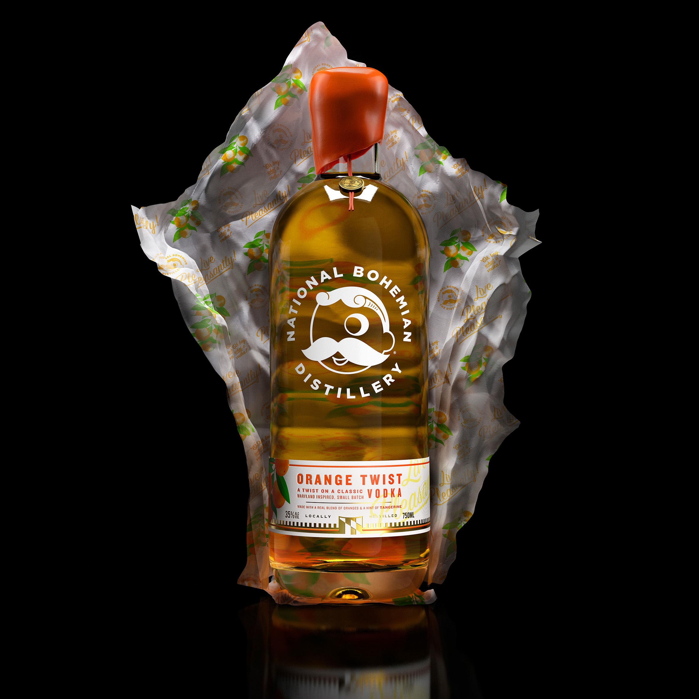
The bottle closure is dipped in orange wax and features a gold pendant detail, which was inspired by an original gold cufflink collectable, which was made for the brand in the mid-century and can still be found for sale on auction websites today. The cufflink is suitable attire for “Natty Boh” himself, the nickname of the charming character who is the mascot for the brand and has long been an icon of the city of Baltimore. The dictionary definition of “Natty”: Stylish and Tidy in very detail. It therefore follows that the design should live up to this!
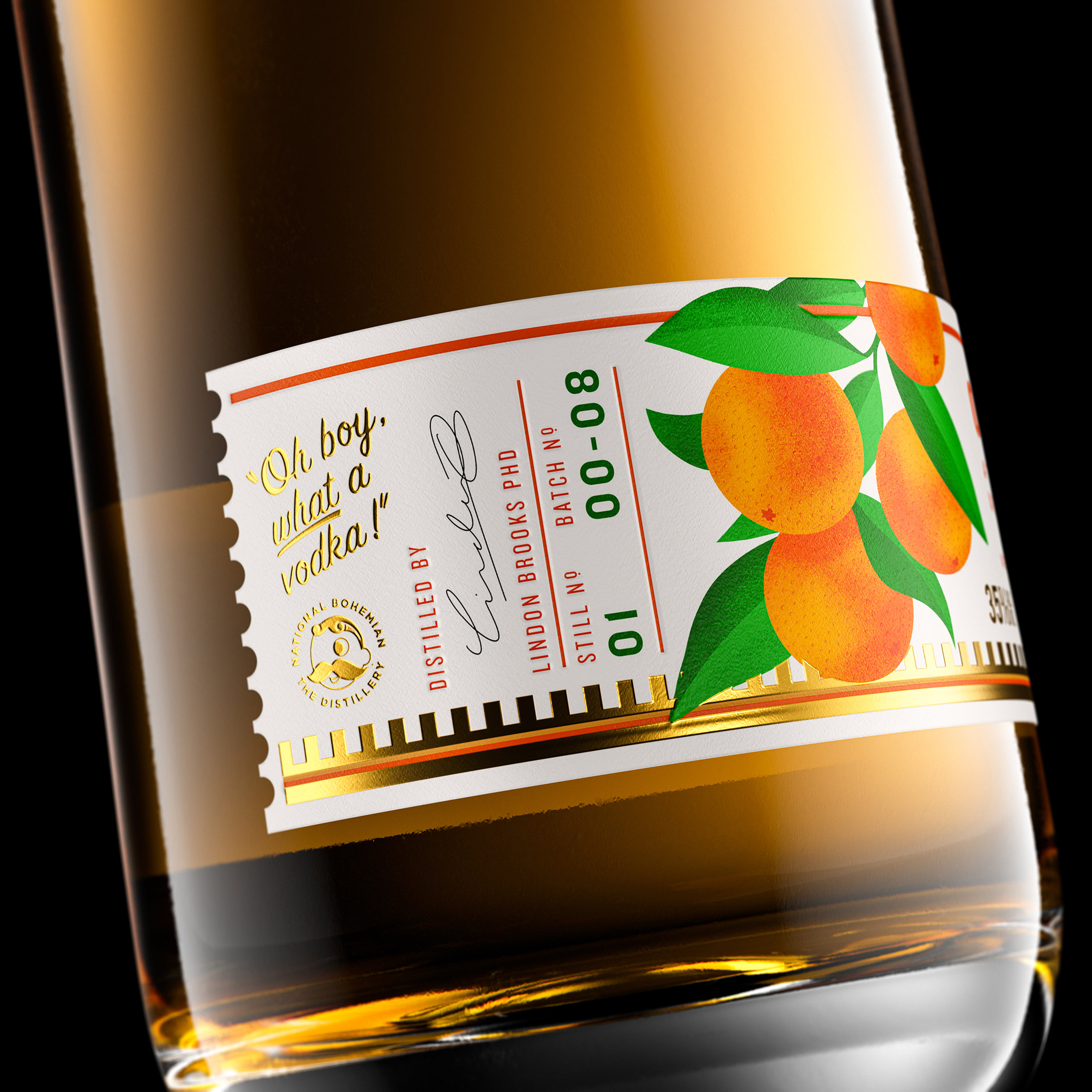
The bottle label features gold foil details, debossing and blind embossing, and an illustration of the oranges in a bold and simplistic 1950’s style. The bottle comes in a tissue paper wrap which features a repeat pattern of the brand iconography and messaging and is reminiscent of a green grocer’s orange wrap, giving the impression that you’re unwrapping a fruit when you first unveil the bottle. The almost spherical bottle shoulders exaggerate this effect, and this circle device is repeated throughout the design in an echo of the unusual proportions of the brand icon himself.
These effortless and yet beautifully crafted details elevate the brand to a premium craft space. The liquid credentials are also enhanced with batch numbering and the signature of the distiller on the side of the label. As Natty Boh himself exclaims…”Oh boy, what a vodka!”
CREDIT
- Agency/Creative: Intertype Studio
- Article Title: Intertype Studio Design Packaging for Natty Boh Orange Twist Vodka
- Organisation/Entity: Agency
- Project Type: Packaging
- Project Status: Published
- Agency/Creative Country: United Kingdom
- Agency/Creative City: London
- Market Region: North America
- Project Deliverables: Packaging Design
- Format: Bottle
- Substrate: Glass
- Industry: Food/Beverage
- Keywords: vodka mid-century modern live pleasantly spirts design innovation
-
Credits:
Creative Director: Asa Cook


