


“Dogfish Head Brewery is a craft beer company based in Milton, Delaware and founded by SamCalagione. It opened in 1995 and has since grown into one of the top 15 largest craft breweries in the country; still proudly independent to this day. Dogfish Head made a name for itself by being unconventional, “off-centered,” wildly creative and fiercely independent. But over its 21 year history, Dogfish’s amazing stories would slowly become lost in a sea of inconsistencies.”
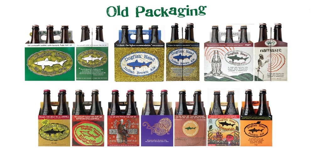
“Interact partnered with Dogfish to refresh its amazing library of beers and stories with a packaging redesign. We started by visiting our fast friends on their turf in Delaware, spending time at the Dogfish Inn, brewery, brew pub, campus and even their homes. We immersed ourselves in their incredible culture, their growing competition and discerning consumers. What we learned was clear: no brewery told a better story through its ingredients and beer than Dogfish.”
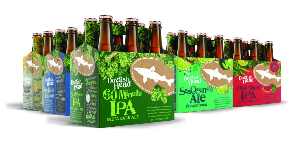

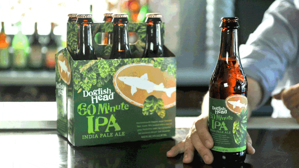
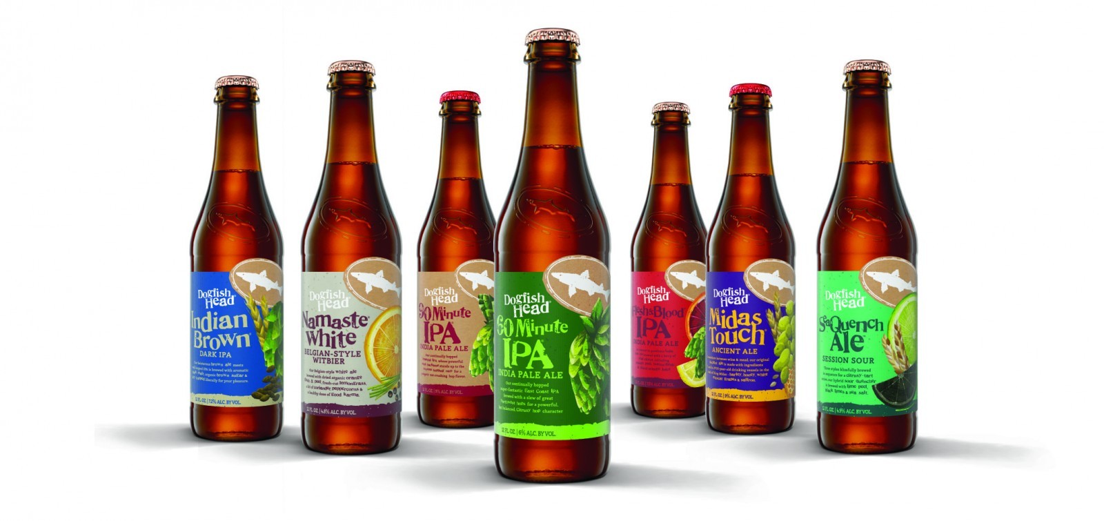
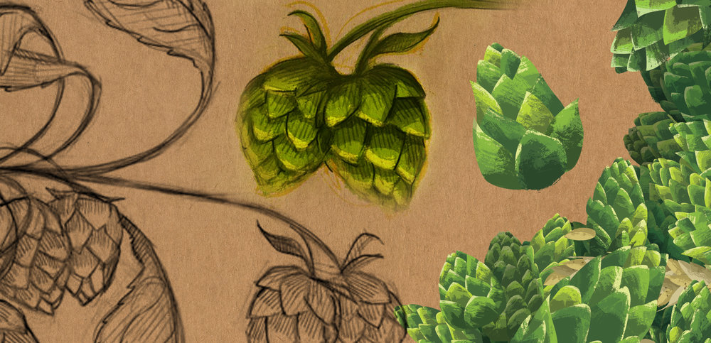
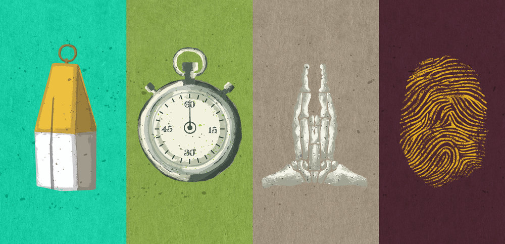
“This new packaging sets out to honor that foundationtional spirit of off-centered innovation and imagination by highlighting Dogfish’s legacy of exploring goodness through ingredients and process. Ingredients are the stars of the design, showcased in playful illustrations thatcreate realistic and authentic flavor expectations in an off-centered manner. You’re now ableto see what goes into each bottle by viewing the side panel of the carrier, which highlights thespecific ingredients and unique brewing processes involved in creating that beer. The handle area is also a unique feature, offering you a literal handful of the ingredients when proudly holding a 4 or 6 pack.”
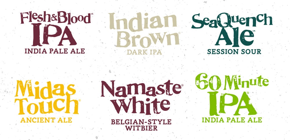
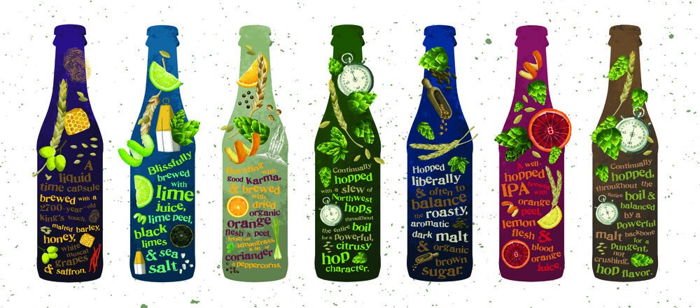
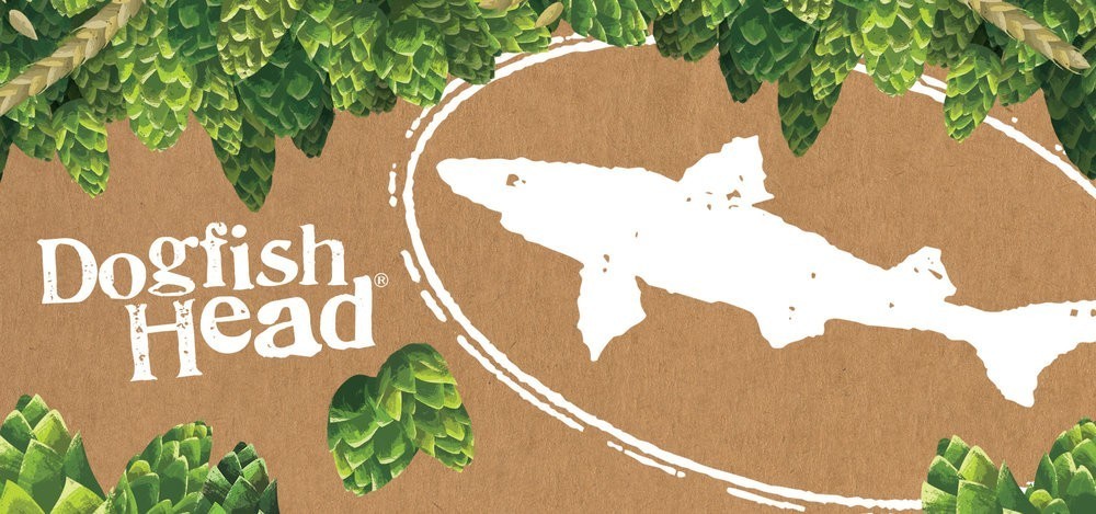
“The new design also organizes key information, such as beer style and ABV, in a way that makes it easier for people to find exactly what they’re looking for. “We wanted to create some uniformity across our portfolio without falling into the trap of being predictable and sterile,” Calagione says. The iconic Dogfish Head “shark and shield” logo and proprietary “Doggie” font are the two recognizable design elements that will carry through from the old packaging into the new style.”
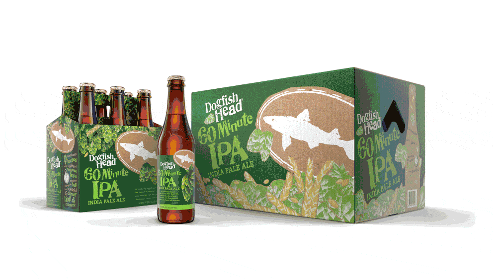
“The end result was a refined positioning that not only celebrated the ingredients, brewing andpersonality that’s made Dogfish so beloved but also shepherded people’s interest in beer in general. Our redesign culminated in 30+ designed SKUs, spanning Dogfish’s bottles, 6 & 4 packs, shippers and a soon-to-be nationwide release of 60 Minute cans…and a ton of late night beers. Cheers.”
CREDIT
- Agency/Creative: Interact Boulder
- Article Title: Interact Boulder – Dogfish Head Redesign
- Project Type: Packaging
- Format: Bottle, Box, Can, Case
- Substrate: Glass, Pulp Paper


