


“Greenhouse Juice is the idol of the cold-pressed green juice movement in Toronto if not all of Canada. From it’s quiet start in January 2014, the brand has exploded in popularity and distribution through it’s network of small company owned outlets. Hanging on to its roots, the brand knew if it were to grow outward, it would need to solve a few key challenge that were clearly going to restrict the brands success if not resolved.
1. Shelf Life
2. Package Differentiation / Competitiveness
3. Package Visibility / Shelf Presence
4. Clear communication of product and value to new audiences
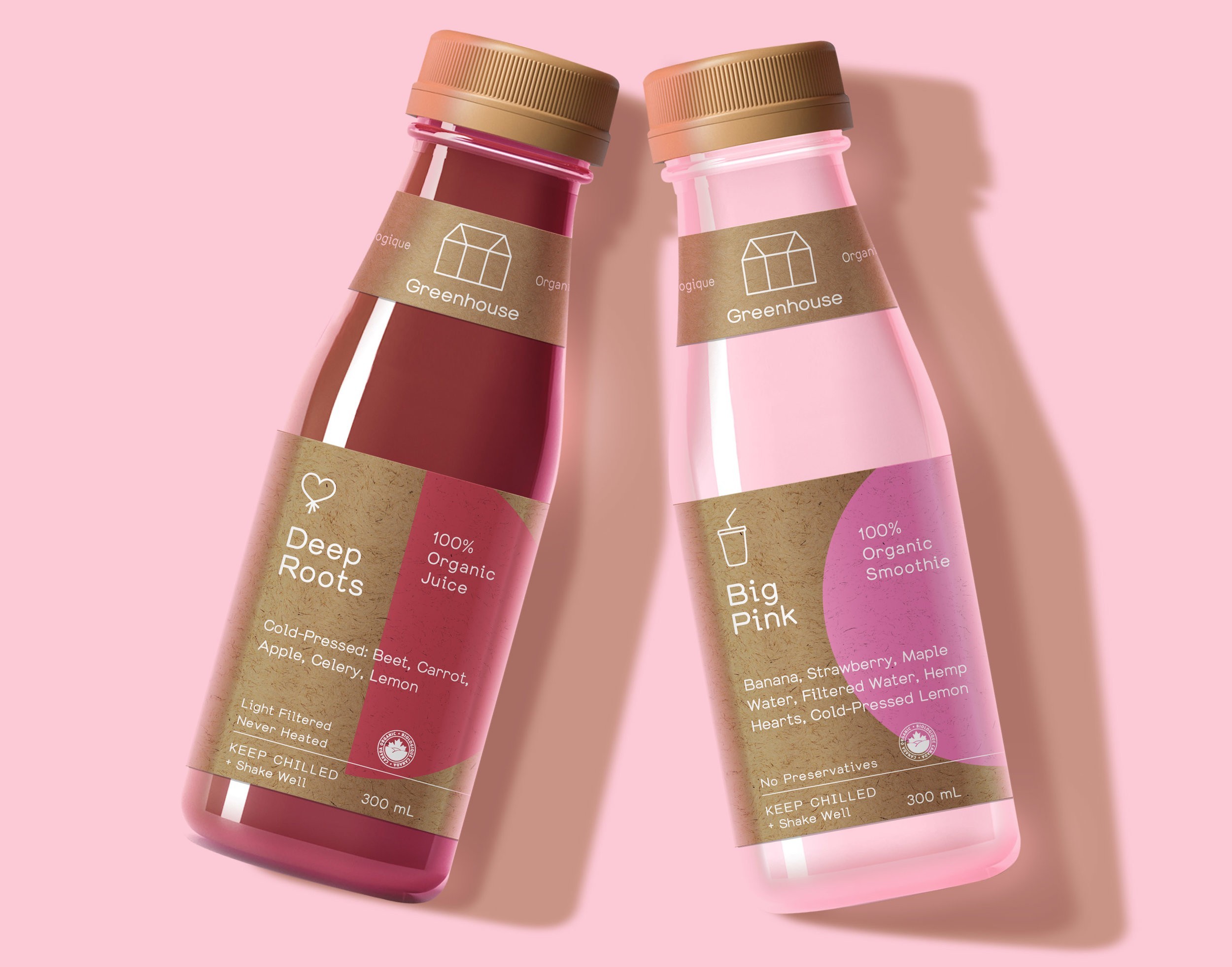
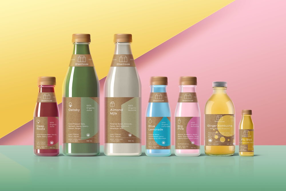
The startup package design was beautifully simple and met the needs of the original intention. Hand sell cold-pressed juice to a fast moving deeply engaged urban audience. That allowed the colour of the juice alone to be the star and the brand elements of the package to take a back seat. All sold in Greenhouse Juice stores meant that the environment could do the talking for identity and brand, further relieving the package of any tiring effort.
However in 2016 the Greenhouse team knew that expanding into environments that they didn’t control would be their only option for strengthening the brand in the face of extremely fast assembling copy-cat competition. Greenhouse 1.0 knew that they had already lost their visual uniqueness amongst this new crowd as well they feared that if they hastily expanded into grocery they faced the ultimate compromise — pasteurization for shelf life — something they were deeply apposed to.
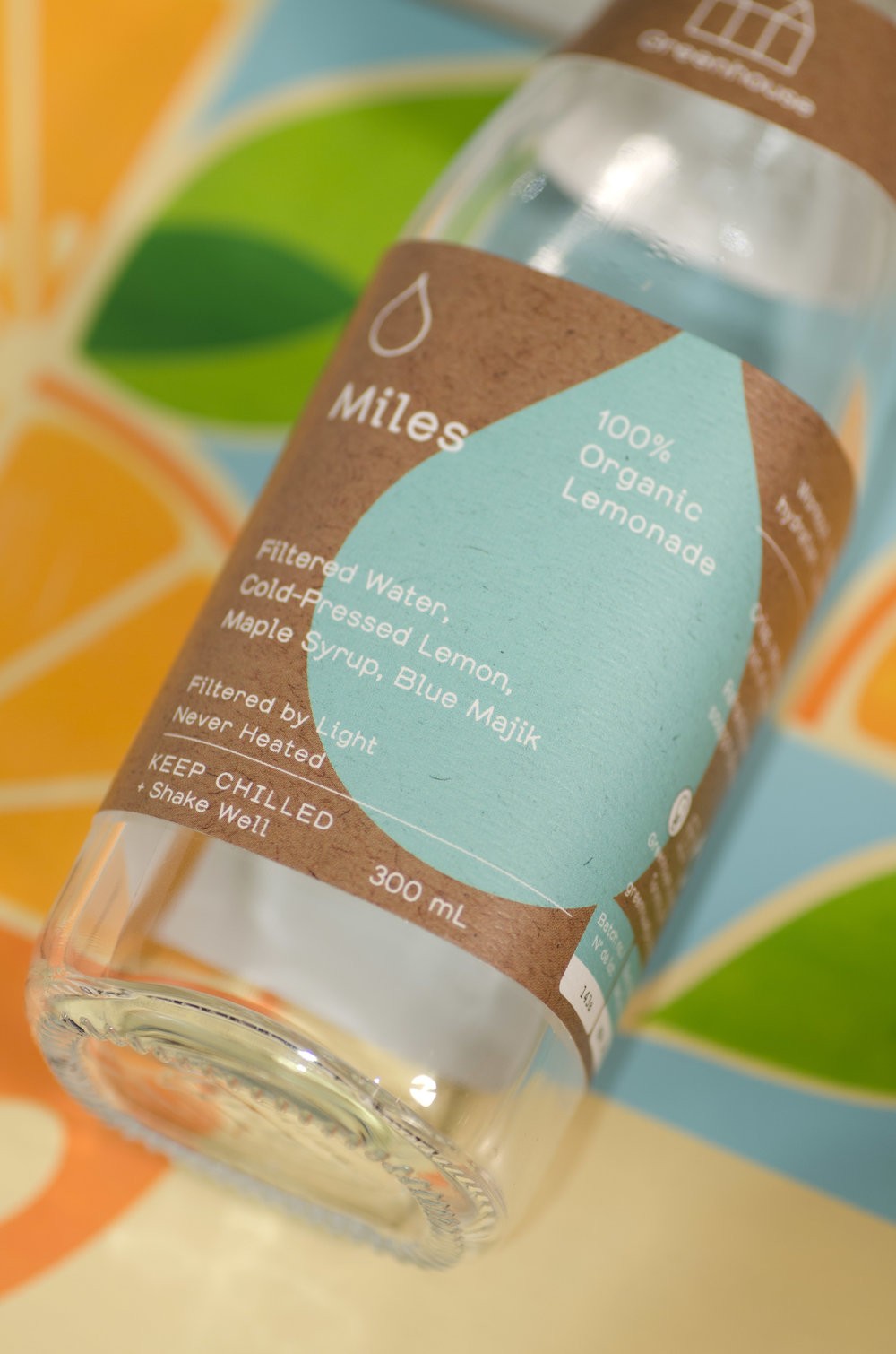
The solution was to develop a proprietary cold filtering process using light — “Light Filtering” — to extend shelf life and stability of the delicate natural juice as well as change the packaging to suit and compete in the new environments.
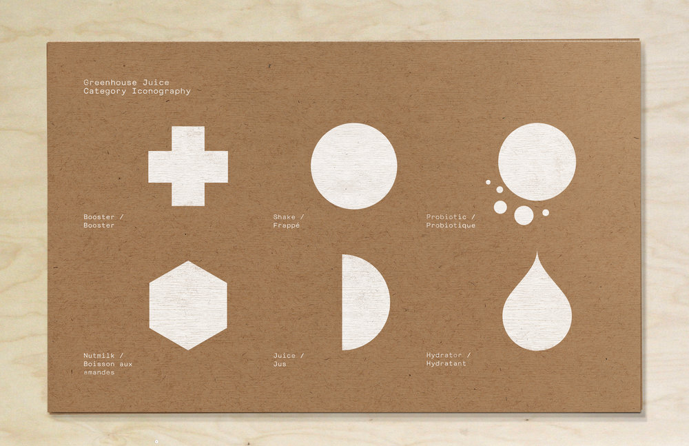
We were invited to assist the Greenhouse Juice team to focus their visual communication on package as well as create a new package system and package design that their team could manage and roll out across their full and extended product line. So in collaboration with the Green team we redesigned their packaging range so that it could better communicate in more intense retail environments outside and more distant from their own aesthetically controlled, hand sell stores and situations. Picking up on the Greenhouse design team’s desire for a craft paper, the system cleanly concentrates the most important and differentiating product merits on the facing panel. Then the system utilizes bold and colorful geometric symbols to separate product categories while tying the family’s core natural value together within a craft paper and subtle silkscreen feel.”
CREDIT
- Agency/Creative: Insite Design
- Article Title: Insite Design – Greenhouse Juice Co.
- Project Type: Packaging
- Format: Bottle
- Substrate: Glass, Pulp Paper


