


Identity Brandcom – Sai Nakrani Developers Rebrand
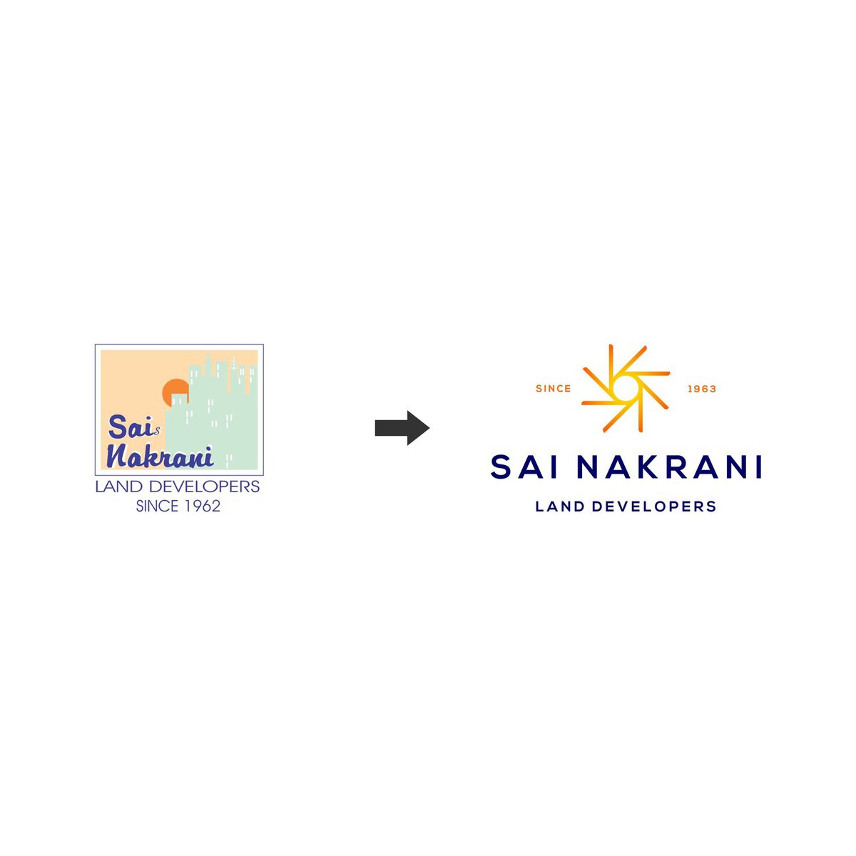
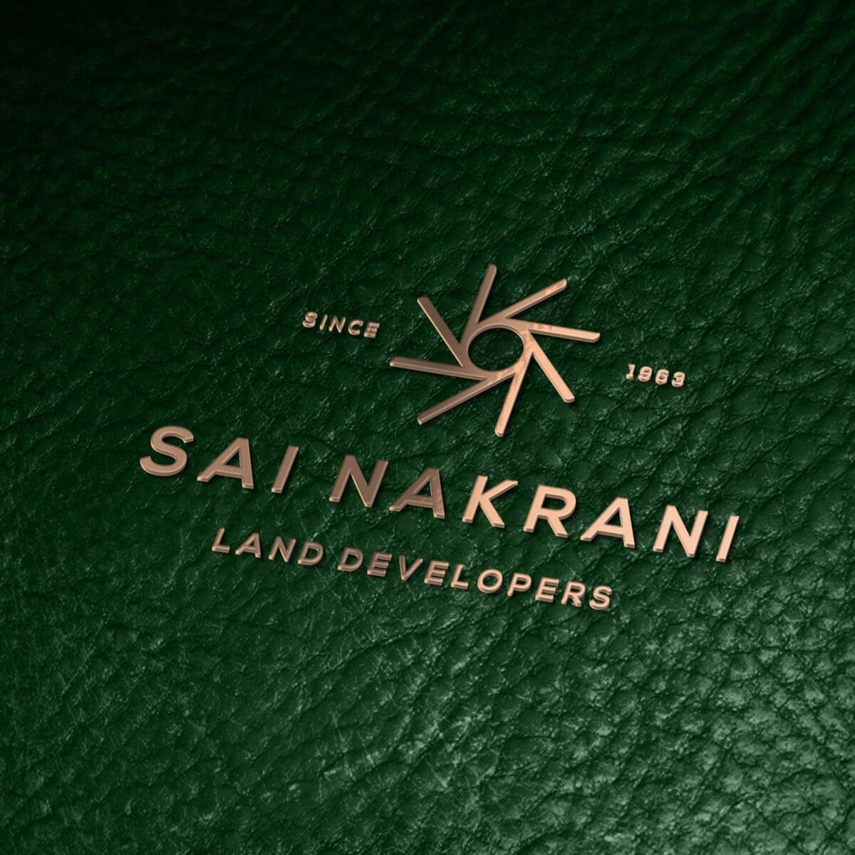
Brand identity refreshed for a real estate developer based in Mumbai.The brand icon is derived from the iconic Six Sigma adapted in a way to form a Sun. The Six Sigma signifies a professionally driven organization, it highlights key brand attributes like, quality delivery, premium service, meticulous planning and execution.The Sun resembles punctuality, selfless service (our client-first approach), Enlightened (in depth knowledge & vast experience)Strong geometric typography and custom kerning makes the brand regal and professional.


CREDIT
- Agency/Creative: Identity Brandcom
- Article Title: Identity Refreshed for a Real Estate Developer Based in Mumbai
- Project Type: Packaging
- Agency/Creative Country: India
- Market Region: Asia
- Industry: Real Estate
FEEDBACK
Relevance: Solution/idea in relation to brand, product or service
Implementation: Attention, detailing and finishing of final solution
Presentation: Text, visualisation and quality of the presentation


