


The Brief: Create a brand identity and packaging for India’s first Himalayan Whiskey. Himalayan and being a “Select Himalayan Blend” is the route to take on the packaging to connote premiumness as well as differentiate from the competition.The label and packaging should reflect the craft origin of the drink, its authenticity, as well as evoke a sense of trust among consumers.
Due to the cutthroat competition in the segment, the emphasis should be on ‘The Taste’ and that being the differentiating reason for anyone to pick this brand in retail. The brand identity and packaging should reflect the brand values and personality, also making sure it integrates with the brand story well. Thus staying true to tradition and being modern at the same time.
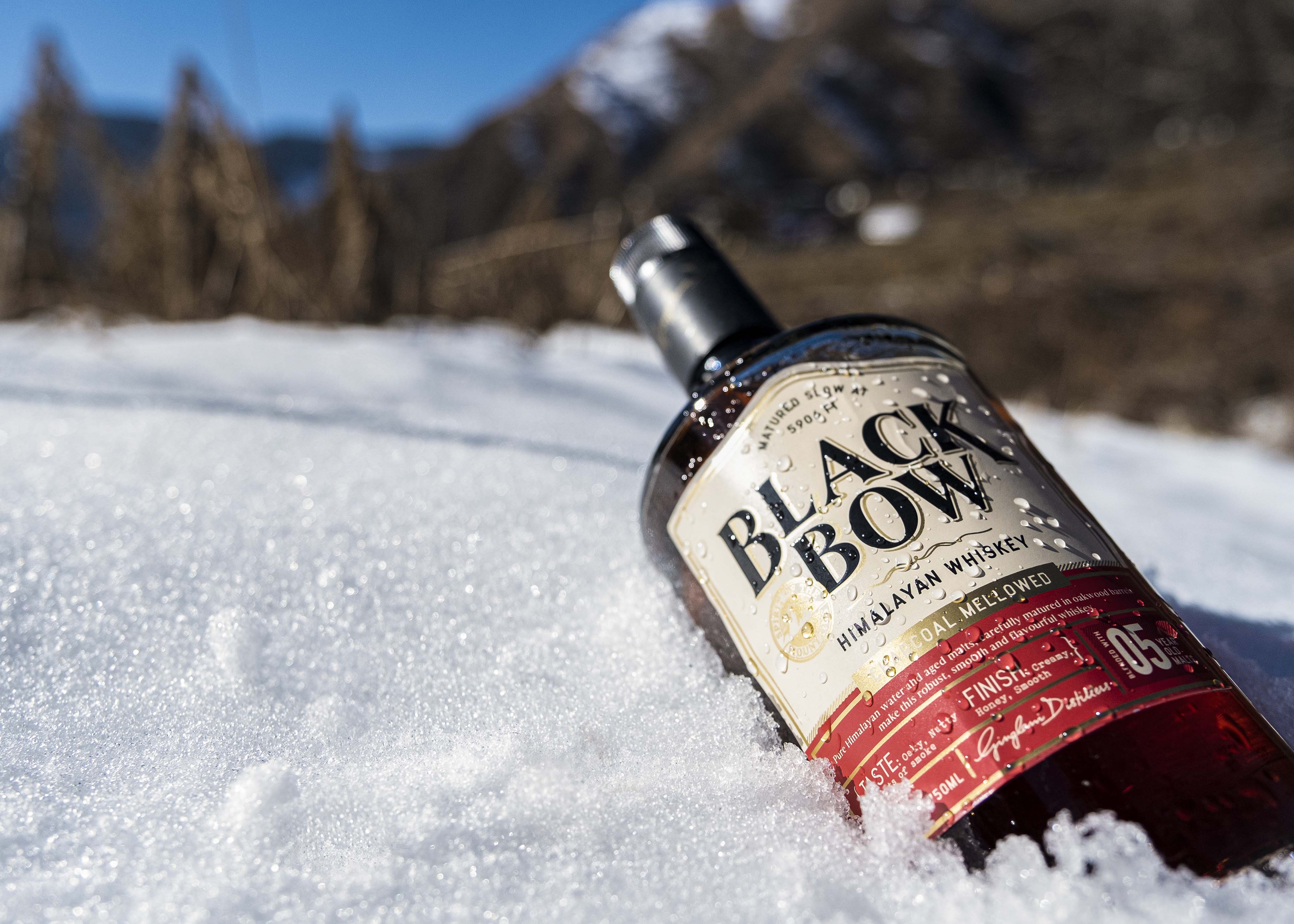
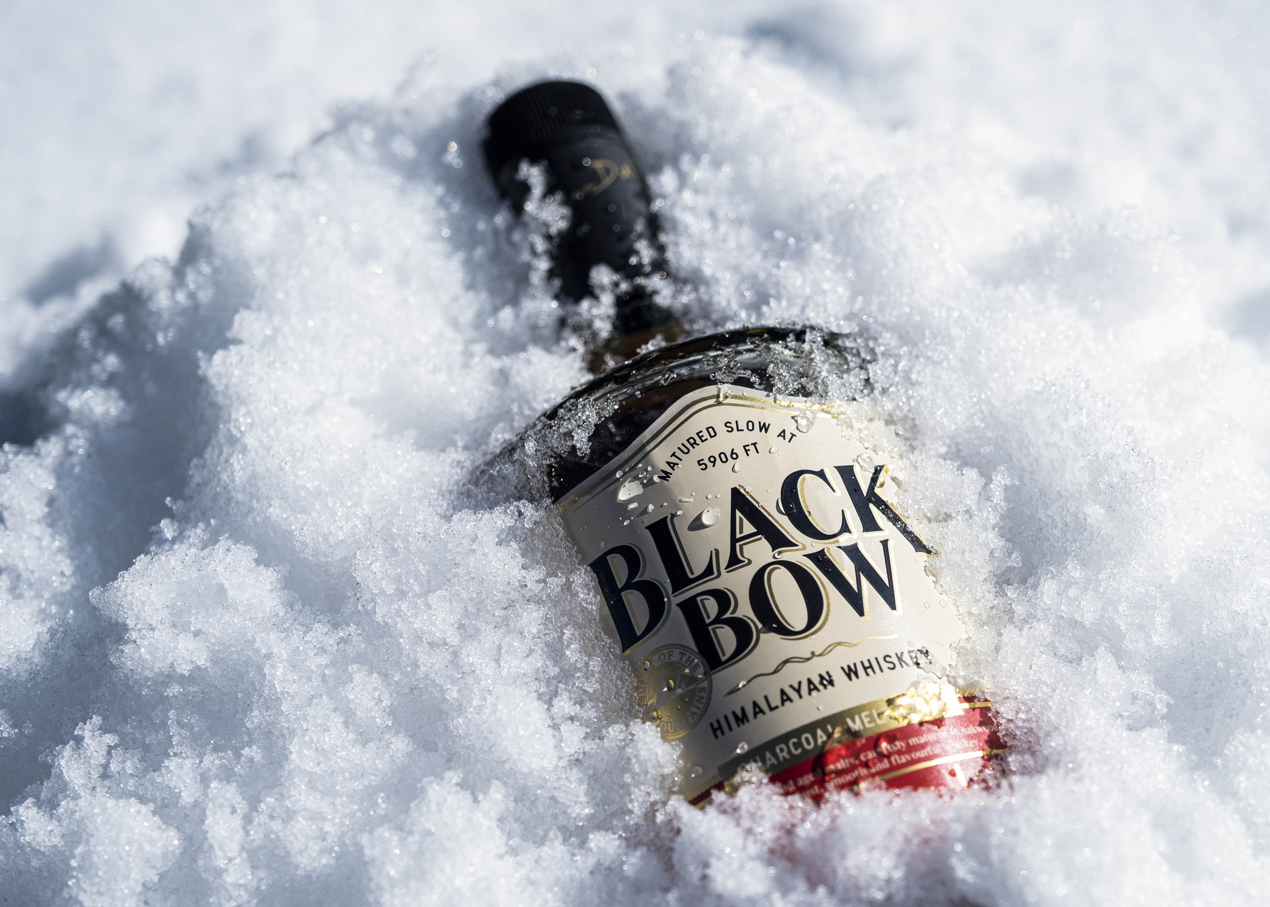
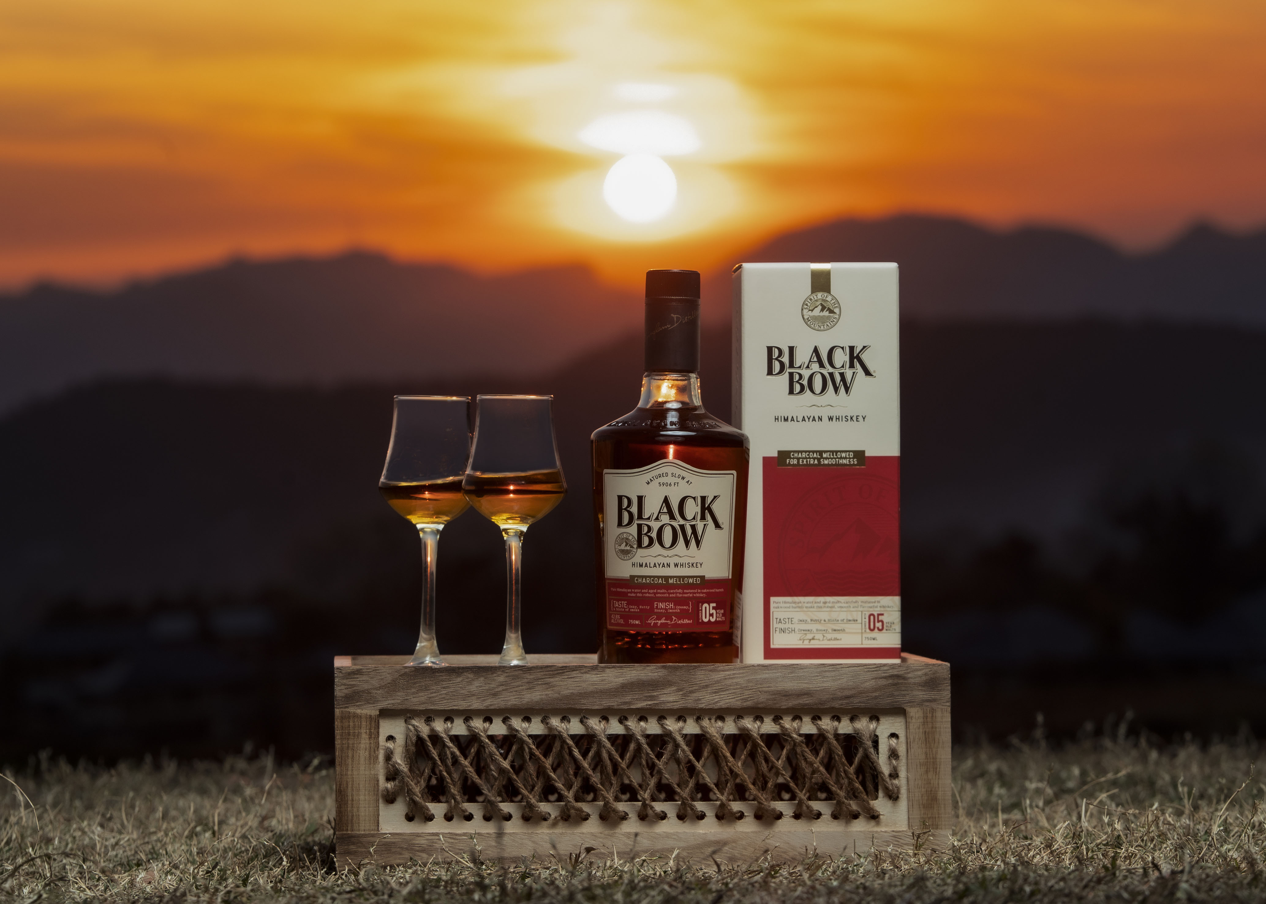
Black Bow: 5906 ft. above sea level, in the Himalayas, icy peaks give birth to the clearest waters the land has known. Down the
mountainside the water flows into the valley, bringing lush life to all that it touches. This water is holy. This water is life.
In a small town in Solan, in nature pure and untouched, our story begins. Malts are housed in charred oak barrels for a slow, gentle maturation. The barrels take on a life of their own as they expand with the summer sun and contract with the winter winds. The young malt undertakes its longest journey as it breathes and swishes, seeping into the cracks and slowly trickling back.
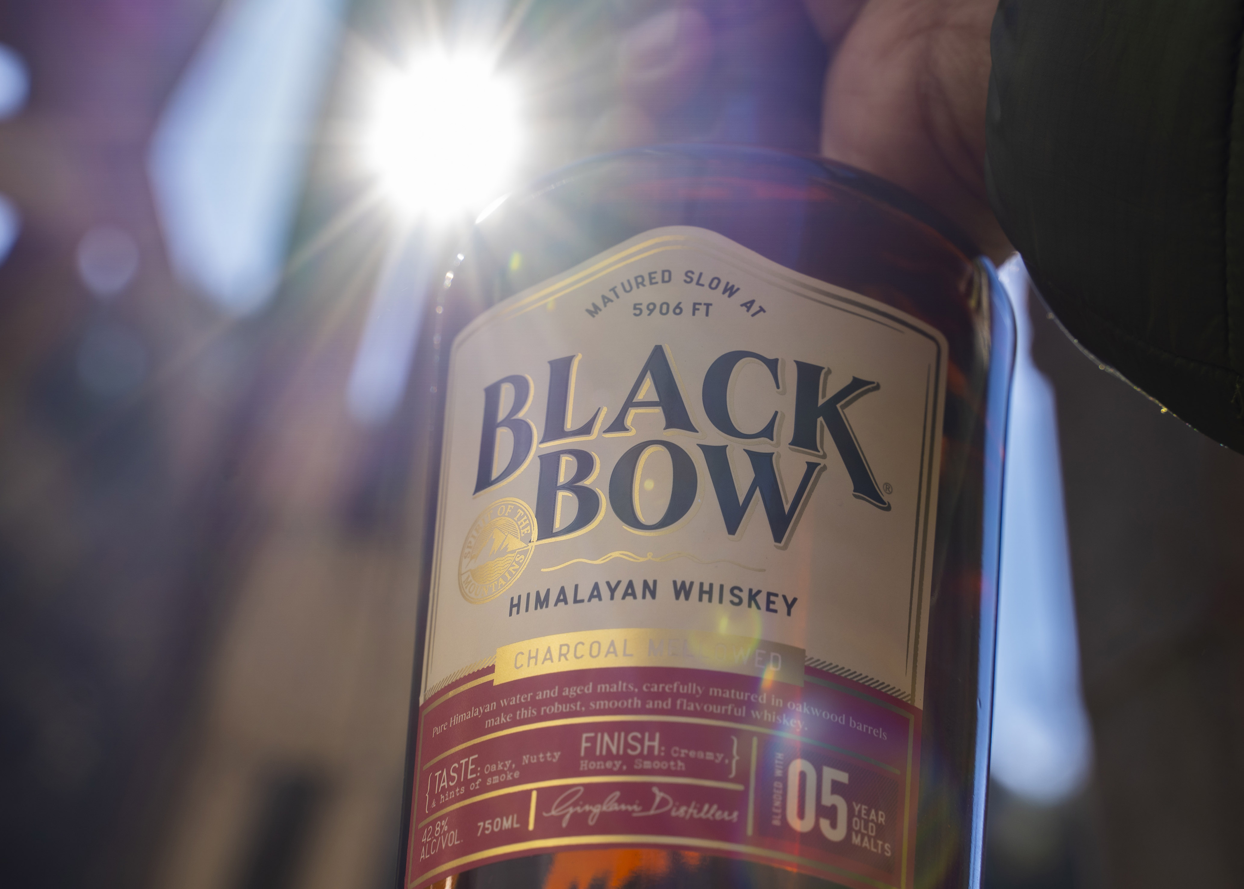
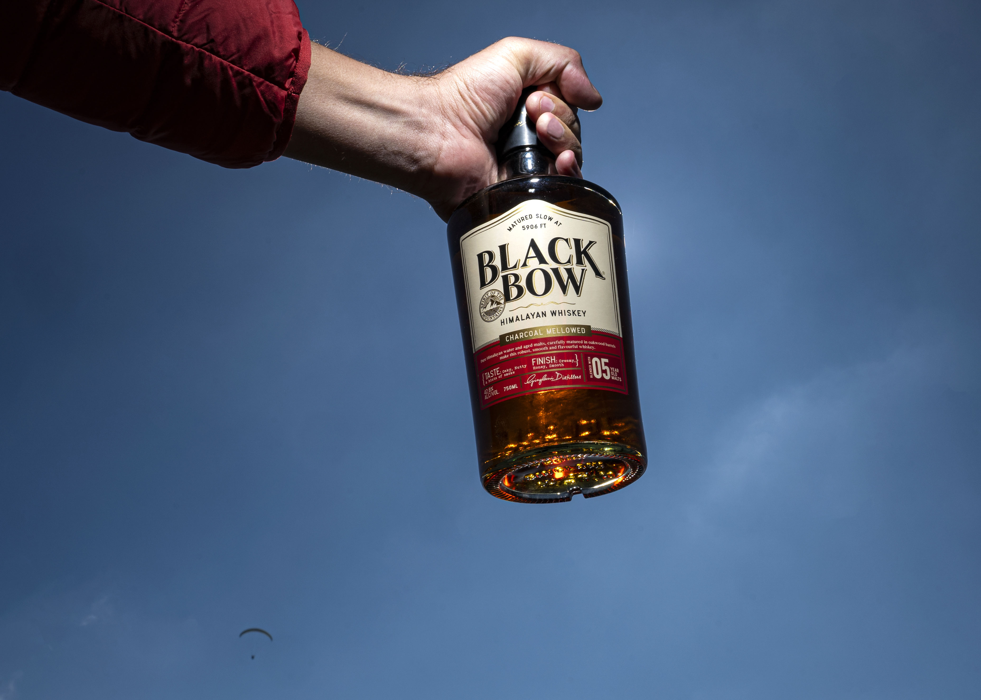
Over the years it comes of age and matures into a distinct malt with nuanced flavours. The natural, toasted oak lends the whiskey its characteristic sweet and nutty notes, building the flavour profiles of Black Bow. Our master blender then hand selects the choicest malts, blending them in an in-house perfected proportion. Nurtured by the mountains and nourished by the sun, the blend is ready for its final journey – where it is charcoal mellowed, drop by drop, to achieve the characteristic smoothness that we pride Black Bow for.
Helping us bottle this flavourful whiskey is the warm, local community led by Himachali women. The land gives and we give back and, in all humility, this is what we call the Spirit of The Mountains.
CREDIT
- Agency/Creative: Freddy and Naved Communications
- Article Title: Identity and Packaging Design for Black Bow
- Organisation/Entity: Agency
- Project Type: Packaging
- Project Status: Published
- Agency/Creative Country: India
- Agency/Creative City: Delhi
- Market Region: Asia
- Project Deliverables: Art Direction, Brand Redesign, Brand Strategy, Branding, Creative Direction, Design, Packaging Design
- Format: Bottle
- Substrate: Glass
- Industry: Food/Beverage
- Keywords: Whiskey, Himalayan, Packaging Design, Alcohol, India, Delhi, Branding
-
Credits:
Creative Director: Urvi Jaidka


