


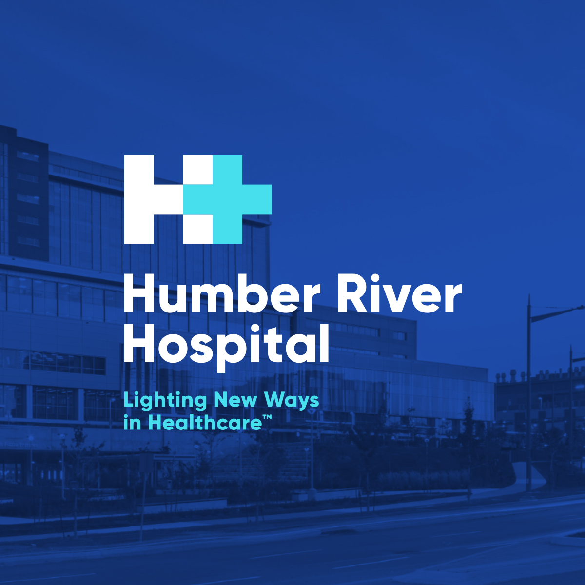
Humber River Hospital is a global leader in healthcare innovation. This was especially clear during the COVID-19 pandemic, when Humber’s facilities and staff appeared frequently in the media to discuss their cutting-edge approach. All eyes were on Humber as we prepared to launch the new tagline we had created, Lighting New Ways in Healthcare. Our challenge was to refresh the design to ensure it aligned with the new messaging while keeping key elements of the foundational brand. The new design had to be modern, clean, and progressive — a quick-read visual representation of the leading-edge hospital it would represent.
To honour a champion of Canadian healthcare, we looked to a celebrated Canadian graphic designer, Allan Fleming. Using his Canadian National Railway logo as inspiration, we wanted to create a simple-yet-powerful icon that would remain relevant for decades. The kind of logo that makes people go ‘wow, that’s so simple and smart. Why didn’t I think of that?!” Which, as every designer knows, is way easier said than done!
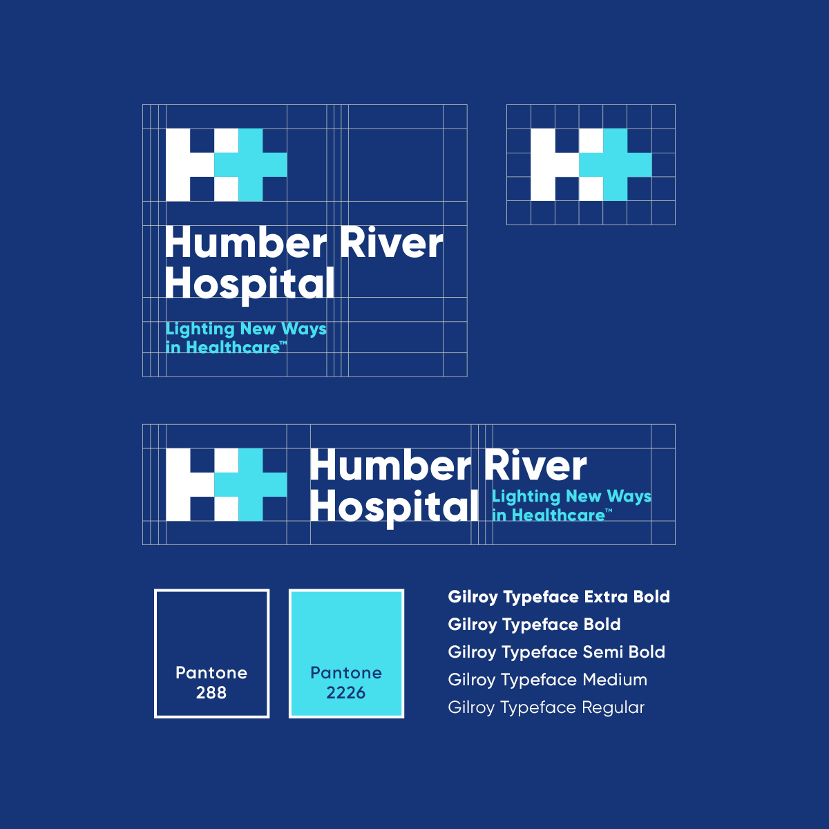
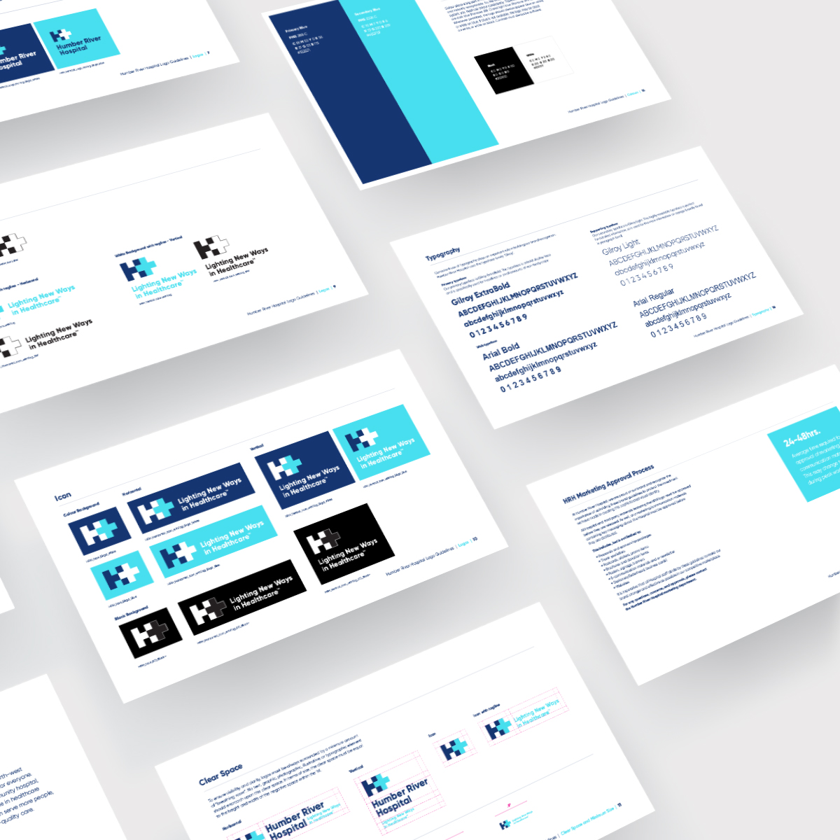
The logo had to include a blue H, as per the original. But since this is typically used to identify hospitals, it wasn’t ownable. We wanted to highlight the existing plus symbol, both a traditional first aid symbol and a representation of how Humber, with its forward-thinking staff and technology, is more than your standard hospital. Using a grid system, we aligned the plus symbol and the H with a slight overlap, to merge the H and the plus into one unified, balanced icon. We coloured the plus in a lighter blue to represent a gentle glow, symbolic of Humber ‘Lighting New Ways in Healthcare.’
We created an updated version of the old logo that was both completely new and recalled the original branding, creating a sense of continuity for Humber staff and the community. It’s unique and legible, clean and modern, and even features a little Easter Egg: there’s a hidden plus symbol in the negative space between the two H’s in Humber and hospital.
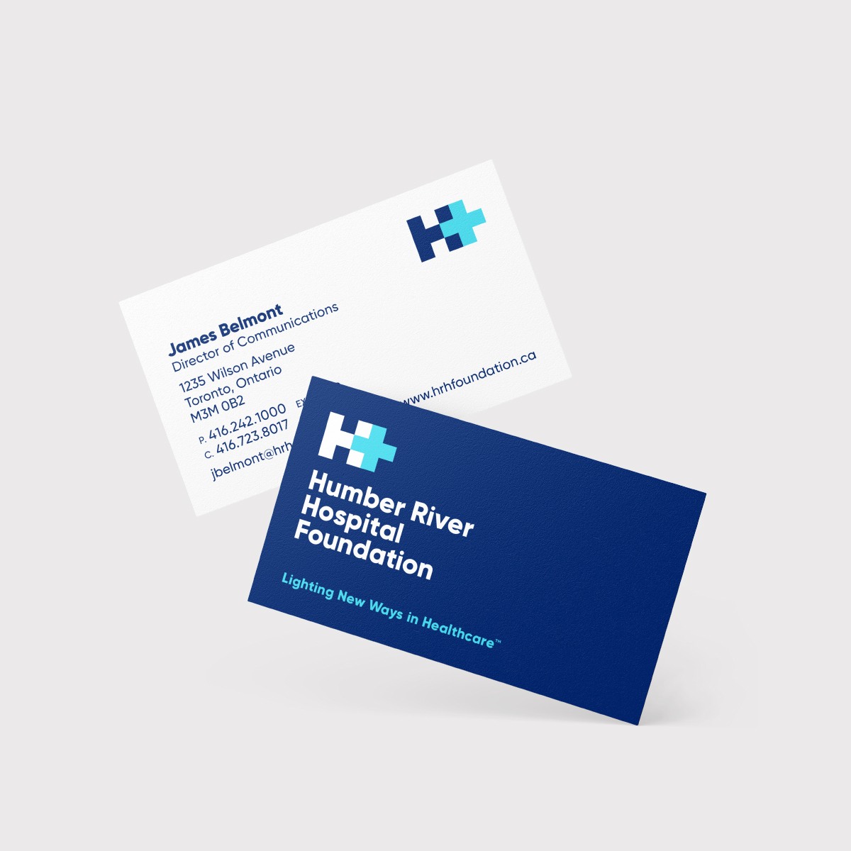
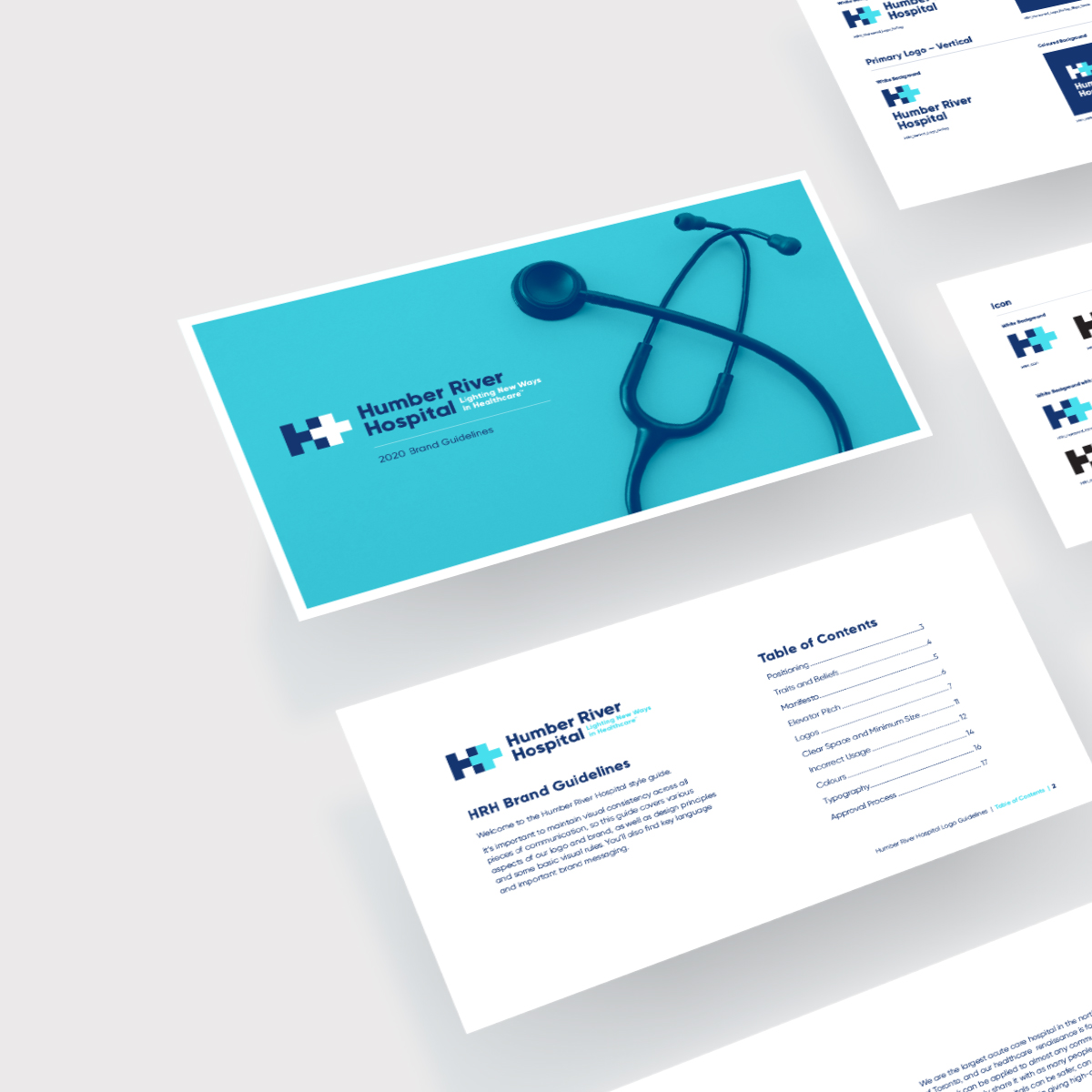
Once the icon, logo, and colours were established, we looked at the rollout of all the other assets. Our goal was to be consistent with the simple design of the logo. Humber’s 5th Anniversary was October 18th, 2020, and they were having a virtual event to celebrate the hospital’s achievements and to share ways they would continue to lead the charge in healthcare. They decided to launch the new brand at that event. We set to work redeveloping all existing assets in the new design, including stationary, business cards, in-hospital signage, fundraising materials, and websites, as well as proposing some other elements to elevate their brand from other Hospitals.
The new branding was received extremely positively by Humber staff, donors, and members of the Ontario Government. We see this as an ongoing evolution for the brand, and we will continue to innovate and push the creative to keep pace with Humber’s innovative mindset.

CREDIT
- Agency/Creative: Central Station
- Article Title: Humber River Hospital Rebrand Identity Program Designed by Central Station
- Organisation/Entity: Agency, Published Commercial Design
- Project Type: Identity
- Agency/Creative Country: Canada
- Market Region: Global
- Project Deliverables: Brand Advertising, Brand Architecture, Brand Design, Brand Experience, Brand Guidelines, Brand Identity, Brand Naming, Brand Redesign, Brand Refinement, Brand Rejuvenation, Brand Strategy, Brand World, Branding, Graphic Design, Identity System, Product Naming, Rebranding, Tone of Voice
- Industry: Health Care
- Keywords: Hospital, Healthcare, Rebrand, Logo design, Branding, Icon, iconography, Toronto, Ontario, Canada


