


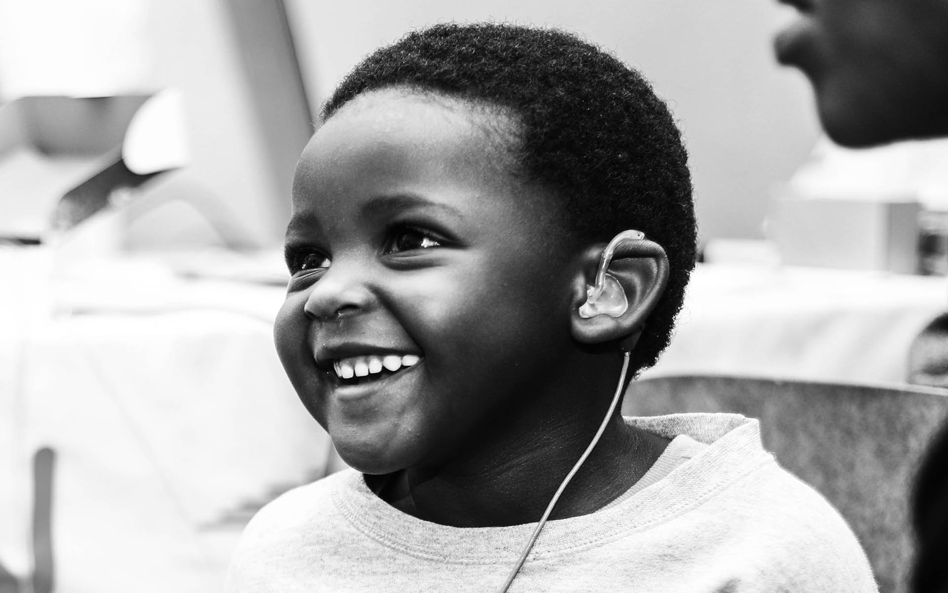
Rush has partnered with Hear to Aid, a Zimbabwe-based Foundation Trust offering hearing health care services to children and youths aged 18 and under, to create a new identity for the trust.
Although the Foundation Trust was only formalised in 2018 with an international board of trustees, the founders have been offering free help to children from low income families for the past seven years. Their activities saw 826 children and youths tested and managed for free in the Harare clinic by 2018 with clinics in the rural areas being added in 2019. Enabling more children to access the help in their own hometowns and villages.
After they founded a Harare based full-service audiology clinic in 2013. It soon became clear that many of the most vulnerable were unable to access services due to cost and distance. Initially clinic fees and hearing aid costs were waived on a case by case basis, for children aged 18 and below where hearing aids were needed but no funds were available. This was in part made possible using donated devices received from a major hearing aid manufacturer and in part at the personal cost of the clinic owners.
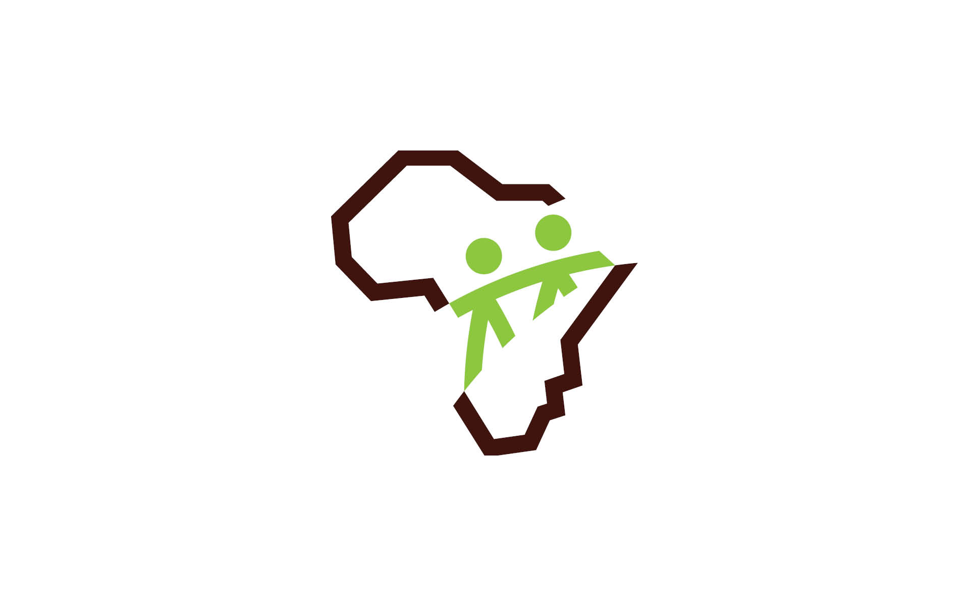
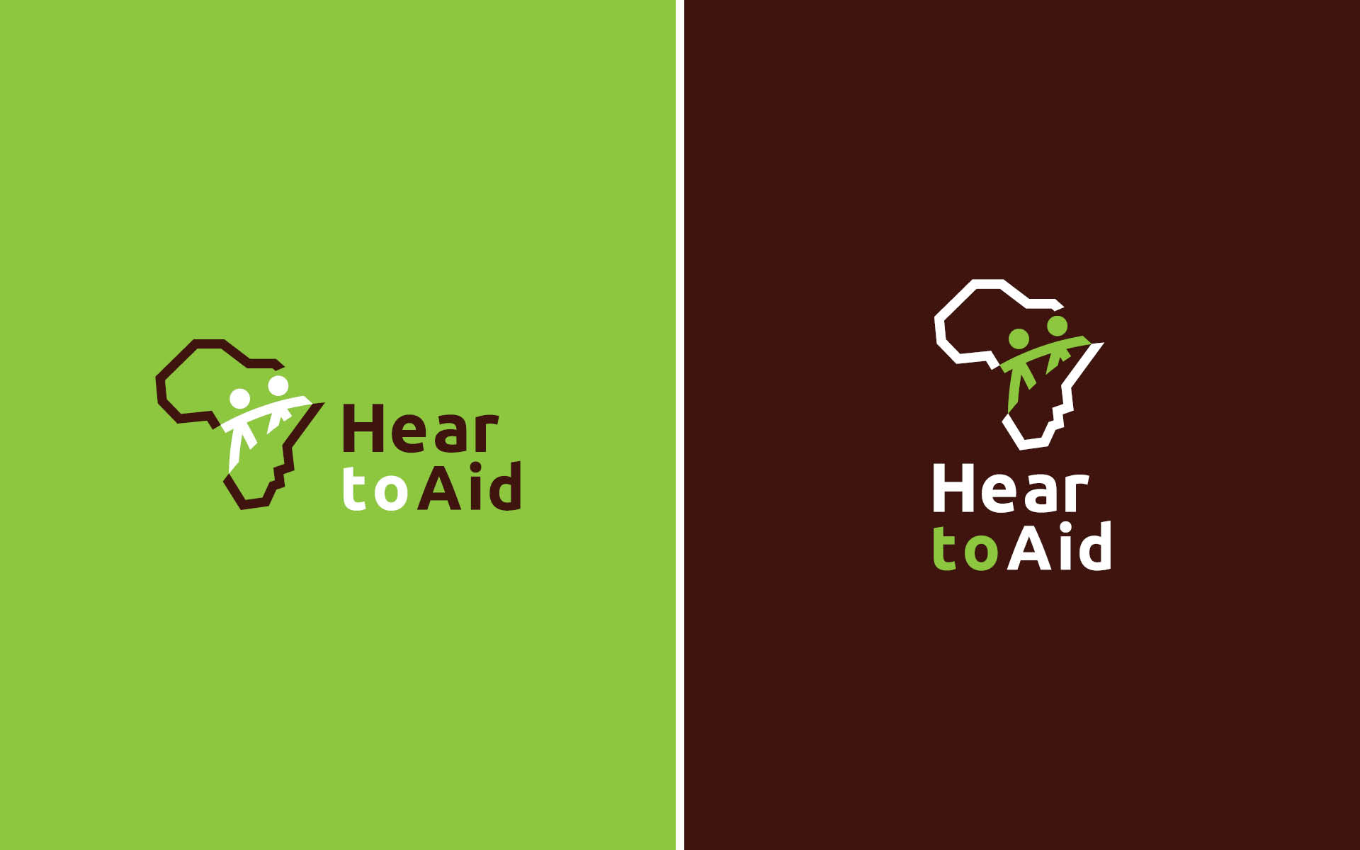
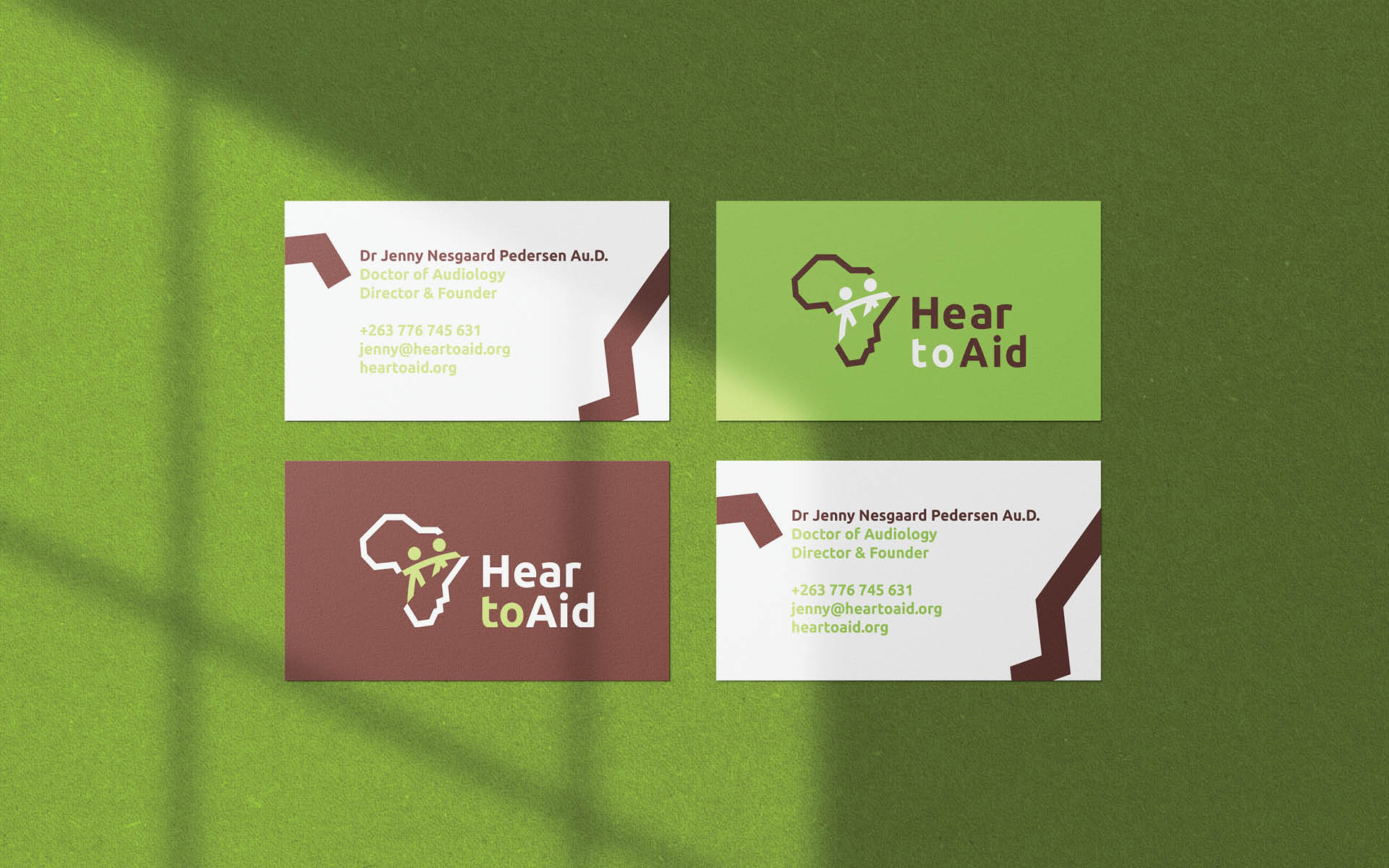
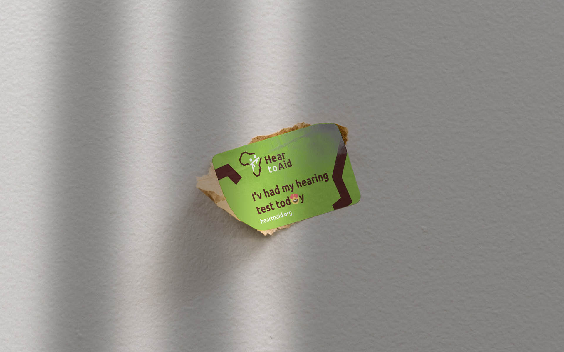
Playing on the words Hear (here) and aid (help) + Electronic device the new name Hear to Aid. Speaks directly into their purpose and mission as a Trust.
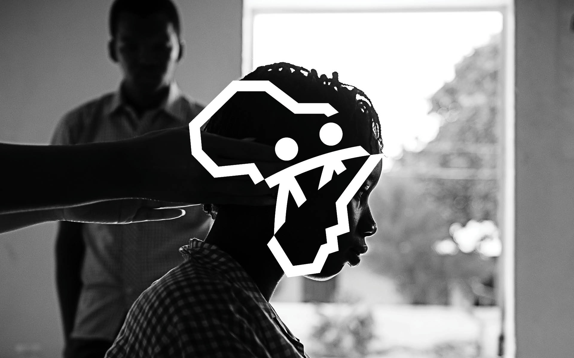
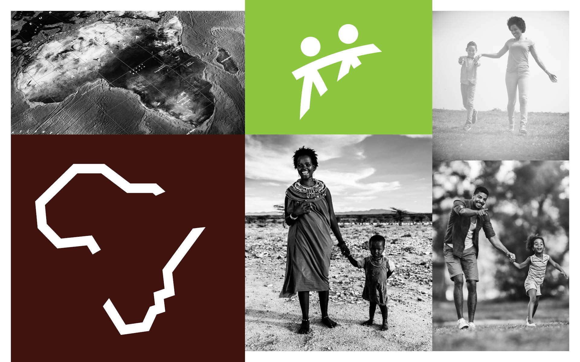
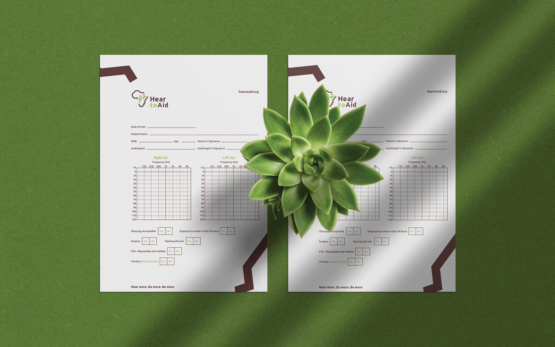
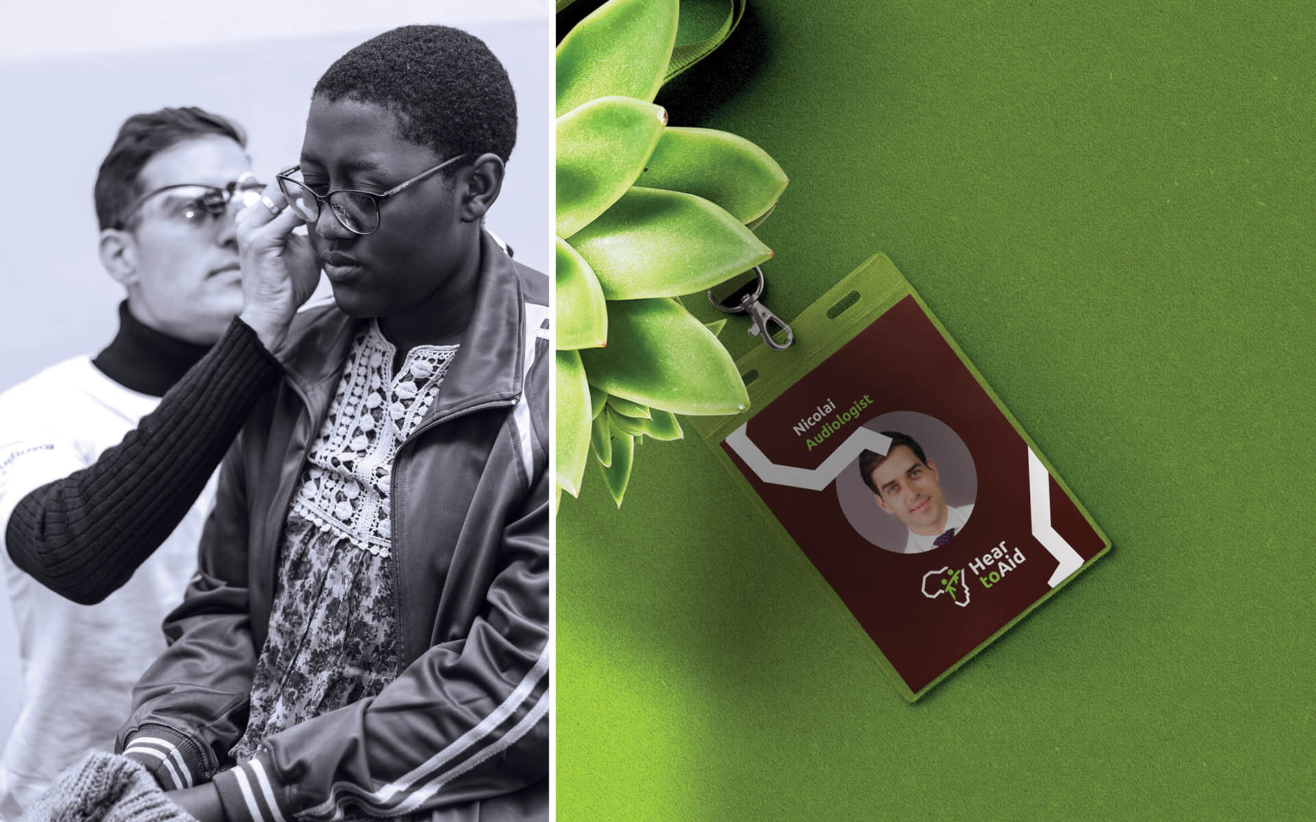
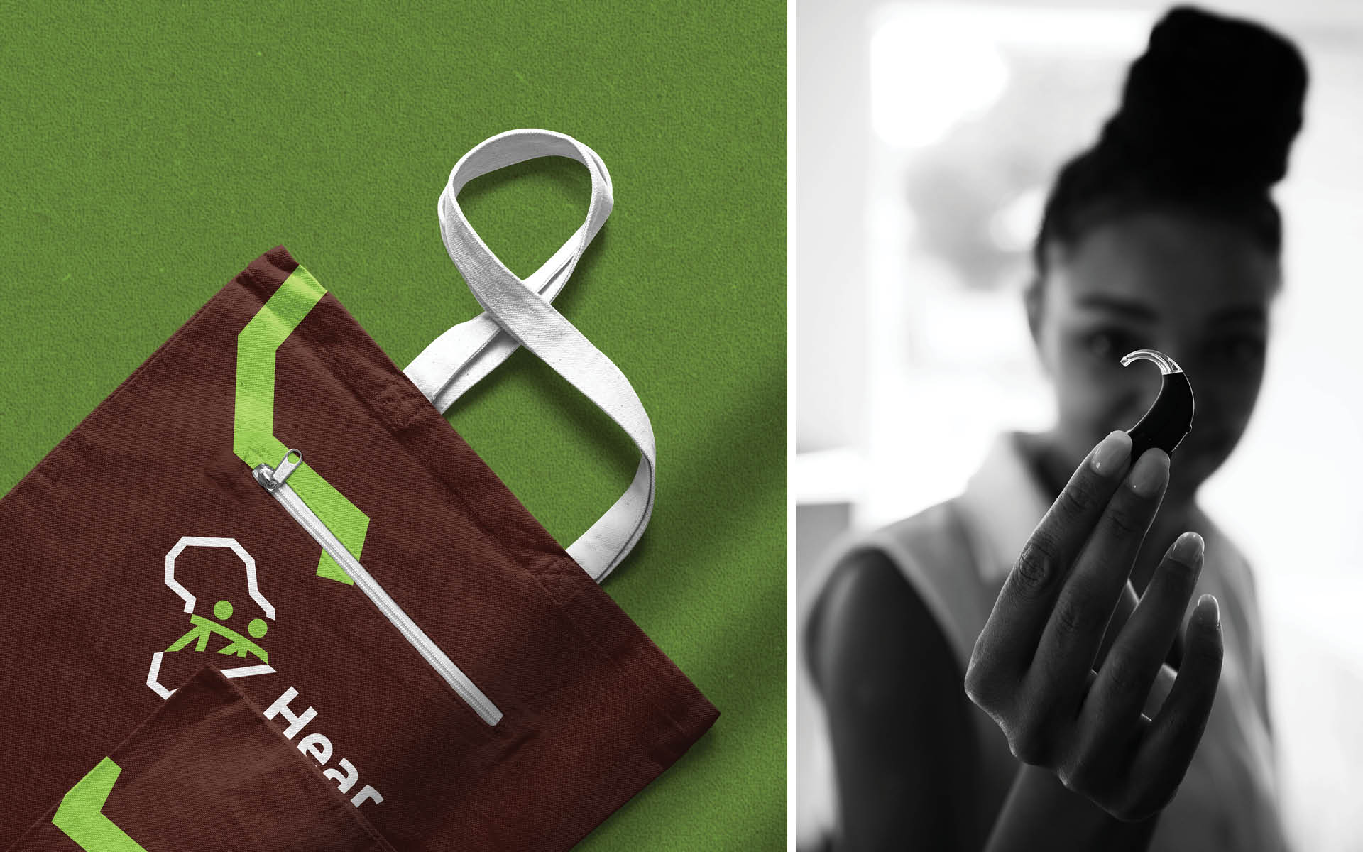
The new brand identity tells the same story. It visually depicts and demonstrates the emotional and practical support of their guardian and family like network, laid from coast to coast on a background of the geographical location covered by the charity’s activities.
The symbol is an African map and a people symbolise a child and a guardian in Africa going to get some aid. It can also be interpreted as one person aiding another or people joining hands for a common vision. Symbols that embody passion, conviction and kindness.
The typography is friendly and brown and green also expresses its roots and the important cause.
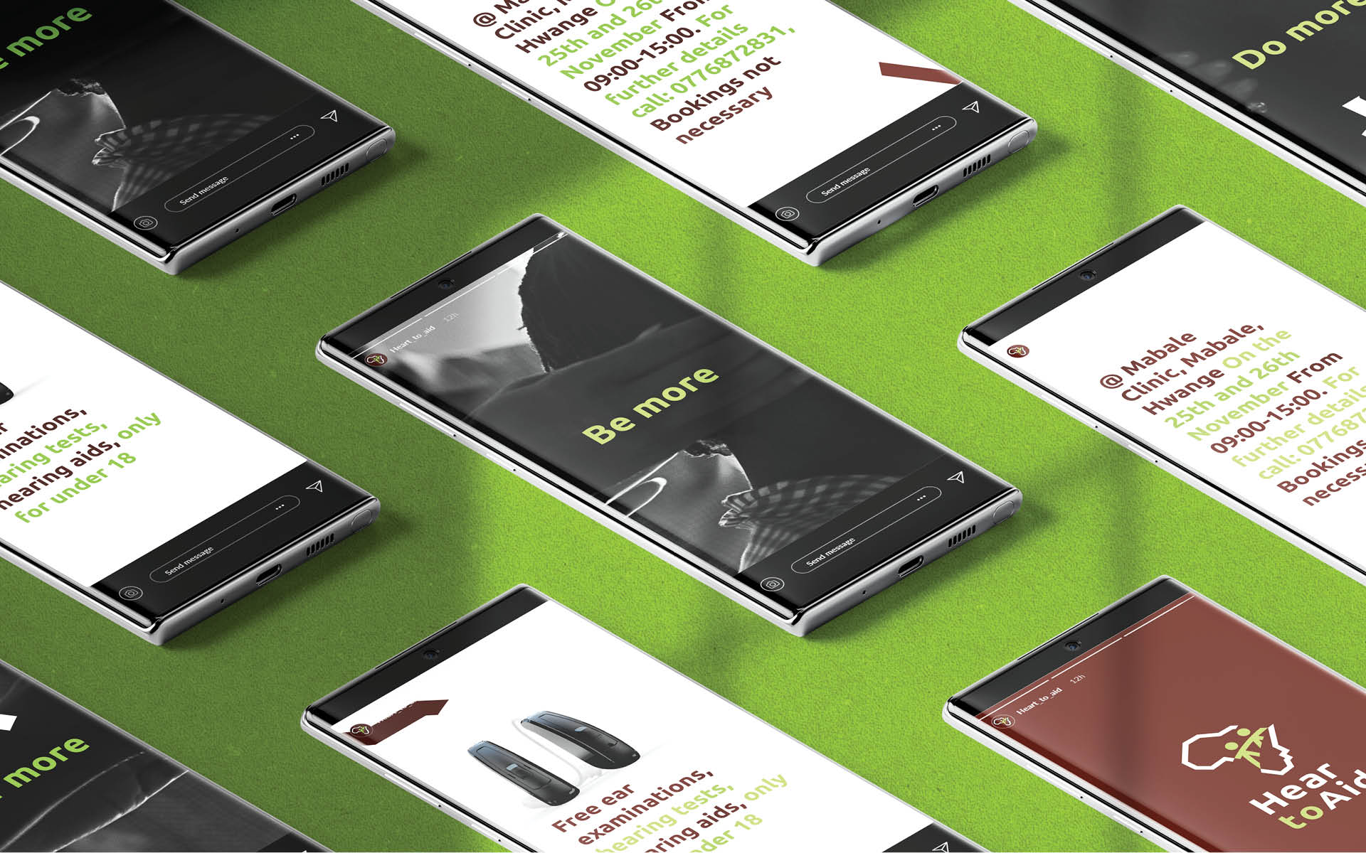
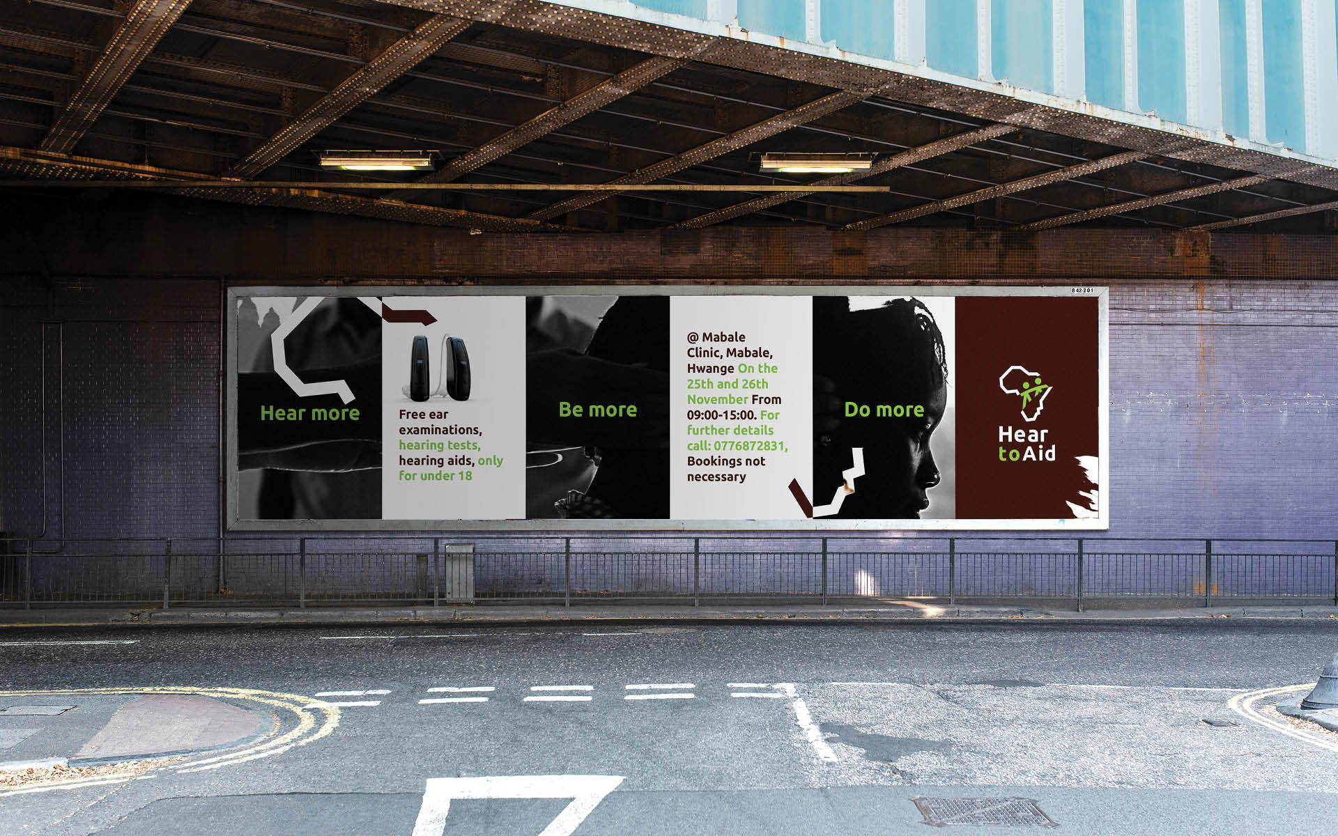
Rush also created the tone of voice, graphic language and art direction style for all its communications.
The communication was also riding on their tagline ‘Hear more. Do More. Be More’ which came from the one of their partners, the GN Store Nord Foundation. It speaks into the door of limitless opportunities made available to the impaired child by the devices provided by Hear to Aid. This message inspires hope in their hearts and the hearts of their loved ones. It is the brand promise.
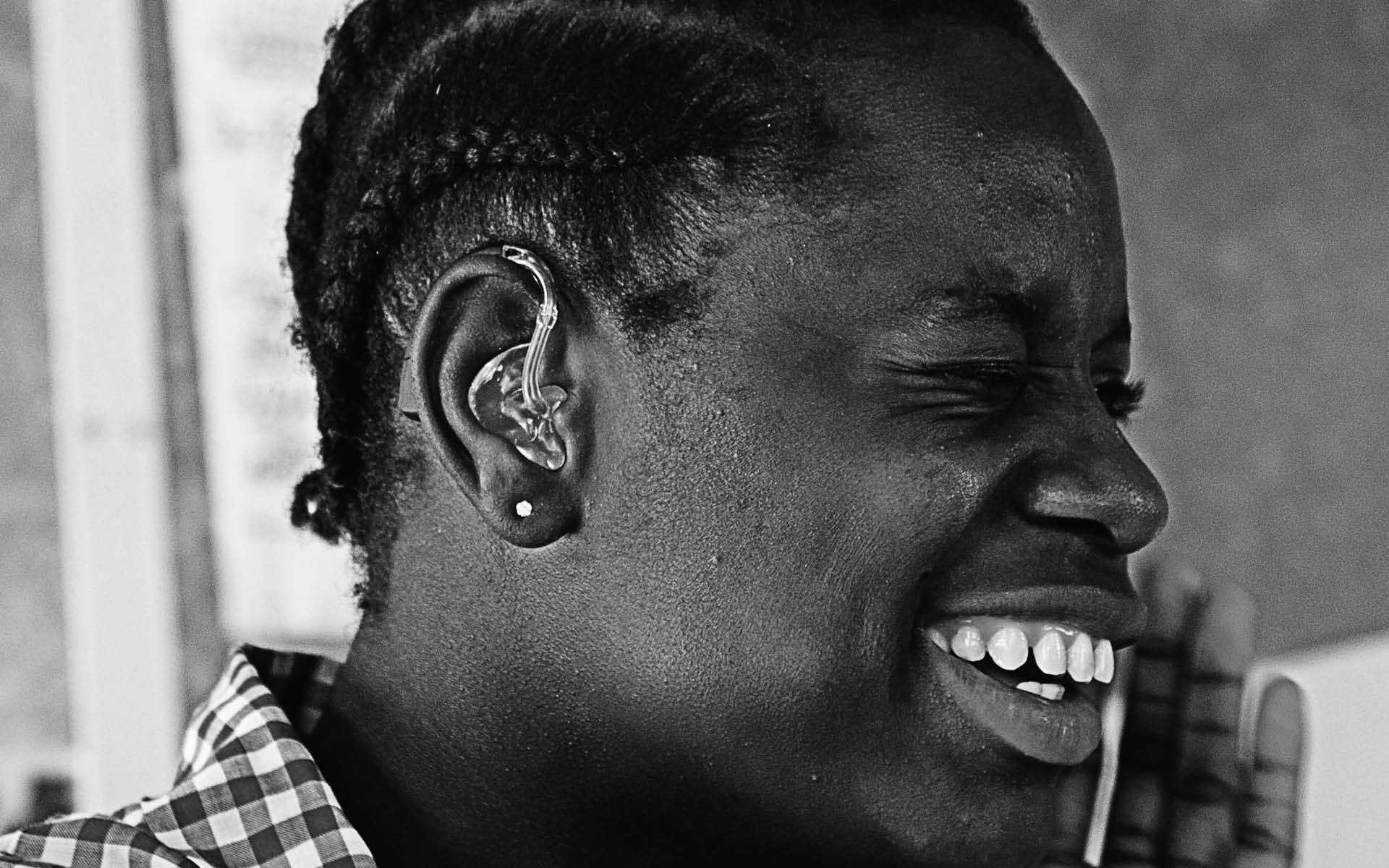
While the prognosis is positive, there is still much work to do. Together we can change the lives of hearing-impaired children in Africa, and Rush’s new branding is playing an important role in supporting Hear to Aid’s vital work in achieving this.

CREDIT
- Agency/Creative: Rush Creative Agency
- Article Title: Hear More – Do More – Be More
- Organisation/Entity: Agency, Published Commercial Design
- Project Type: Identity
- Agency/Creative Country: Zimbabwe
- Market Region: Africa
- Project Deliverables: Brand Advertising, Brand Architecture, Brand Creation, Brand Experience, Brand Identity, Brand Naming, Brand Refinement, Brand Strategy, Brand World, Branding, Graphic Design, Photography, Product Architecture, Product Naming, Rebranding, Research, Tone of Voice
- Industry: Non-Profit
- Keywords: NGO, Africa, Hearing, Zimbabwe


