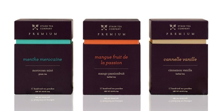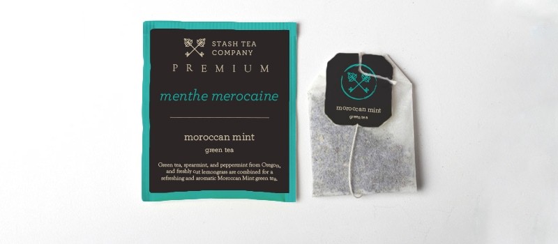
Stash is a Portland-based specialty and herbal tea company founded in 1972 that sells both bagged and loose leaf tea, with one brick and mortar store that offers tea tastings. The name “Stash” is derived from tea’s status as a once-valuable good that was frequently transported by ship, whose captain would be given a selection of the finest teas for his private reserve, or his stash.
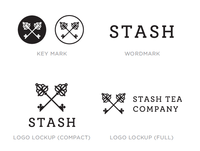
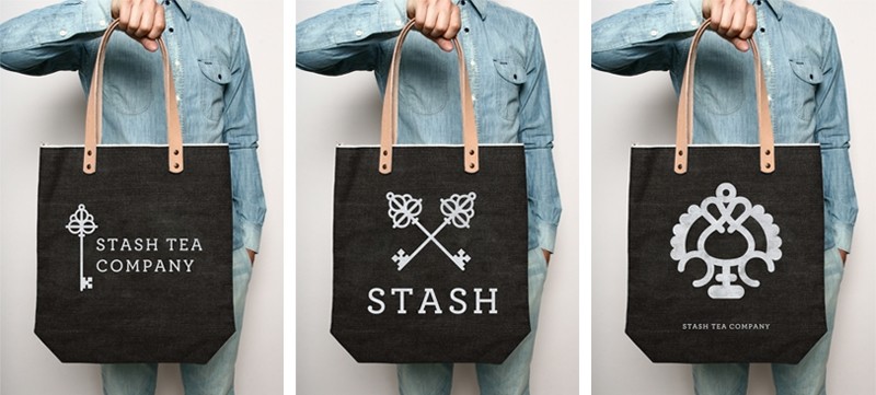
The logo is inspired by imagery originally used in the logos of trading companies of the 17th and 18th centuries and is designed with the graphic simplicity of a brand (the wood burning type you might find on a shipping crate) in mind. The keys reference the idea of something being so wonderful that it must be locked up to protect it, an allusion to the company’s namesake.
To continue with the themes of travel, worldliness, and exoticism associated with the early tea trade, the key head designs in the logo are based on Tibetan keys and leave room for supplemental graphics of key designs from other cultures.


CREDIT
- Agency/Creative: Haley Luden
- Article Title: Haley Luden – Stash Rebrand
- Project Type: Packaging
- Format: Box


