


ADOT is a Non-profit Organisation located in Nigeria. This is an organisation focused on empowering young displaced persons with education, food, shelter, skill acquisition, etc. This organisation has spanned 3 years but visibility has been a problem. Hence, they requested for a rebrand.
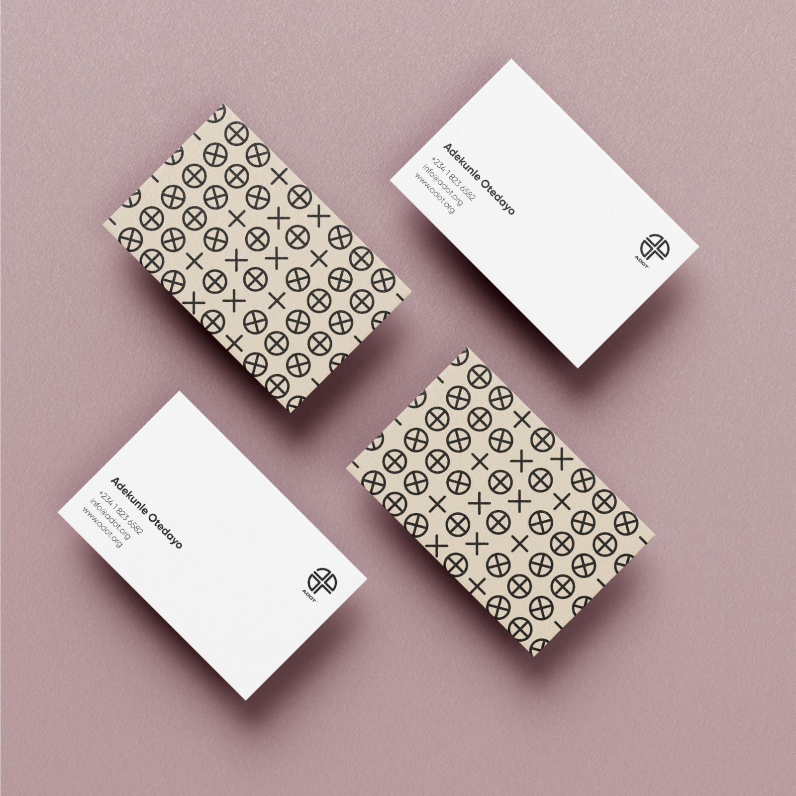
The logo design is just a simple monogram, Adot.
The colours used Gold: The colour gold is the colour of extravagance, wealth, riches, and excess, and shares several of the same attributes of the colour yellow. The color gold is a warm color that can be either bright and cheerful or somber and traditional. The colour gold is cousin to the colour yellow and the colour brown, and is also associated with illumination, love, compassion, courage, passion, and wisdom. Black: Black is a popular colour in retail. In color psychology, black’s color meaning is symbolic of mystery, power, elegance, EVIL and sophistication. In contrast, the color meaning can also evoke emotions such as sadness and anger. Many fashion retailers have used black in their logos. Black is also a popular color for text as it’s an easy color to read. Some brands choose to use black and white photos for lifestyle banner images or icons to create a certain tone or consistency on their website. But my reason for choosing black is the fact that, black describes Africans.
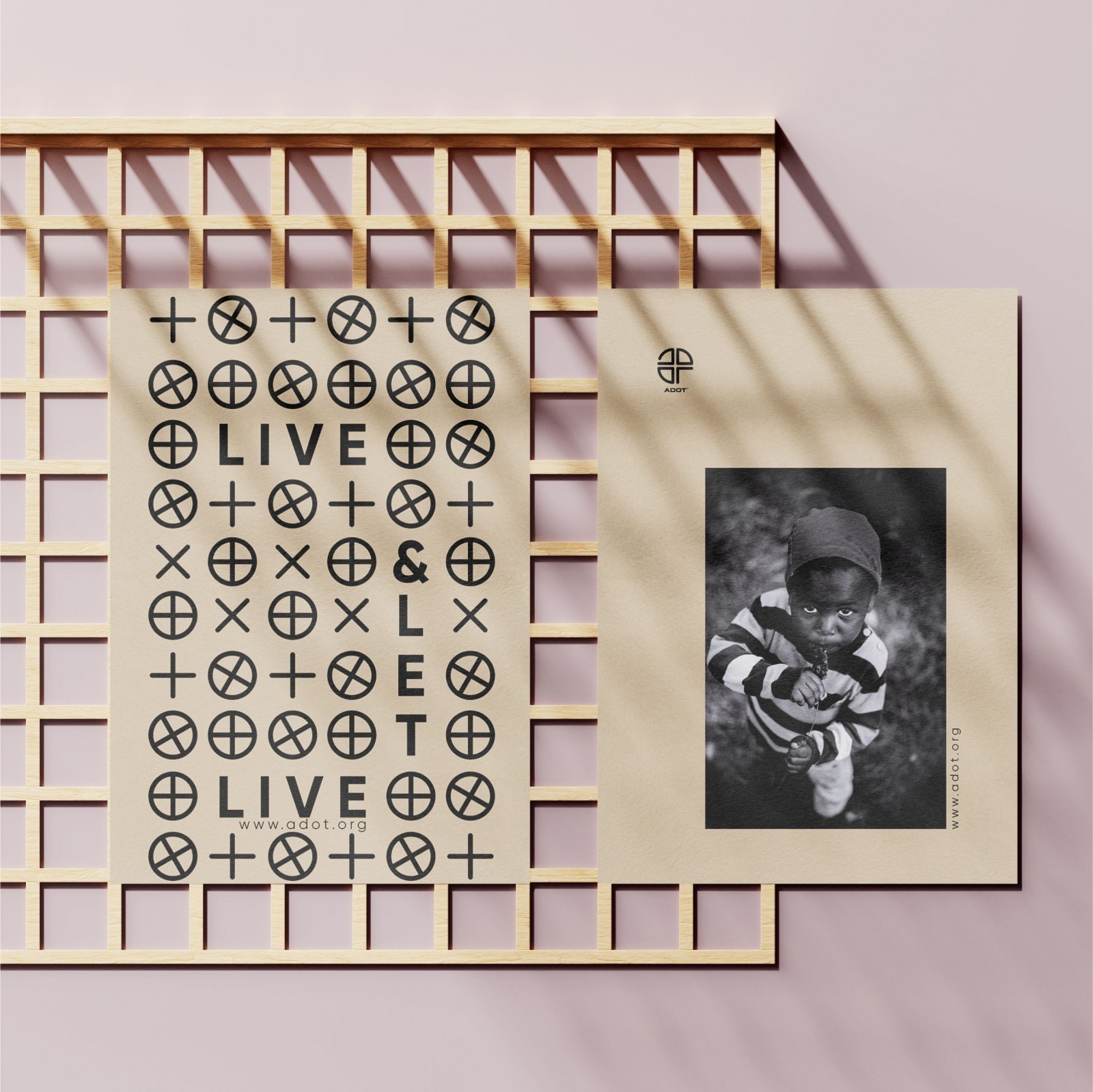
Furthermore, the colors used is to depict that, irrespective of the evil these children are surrounded with, they can still project luxury later in their lives.
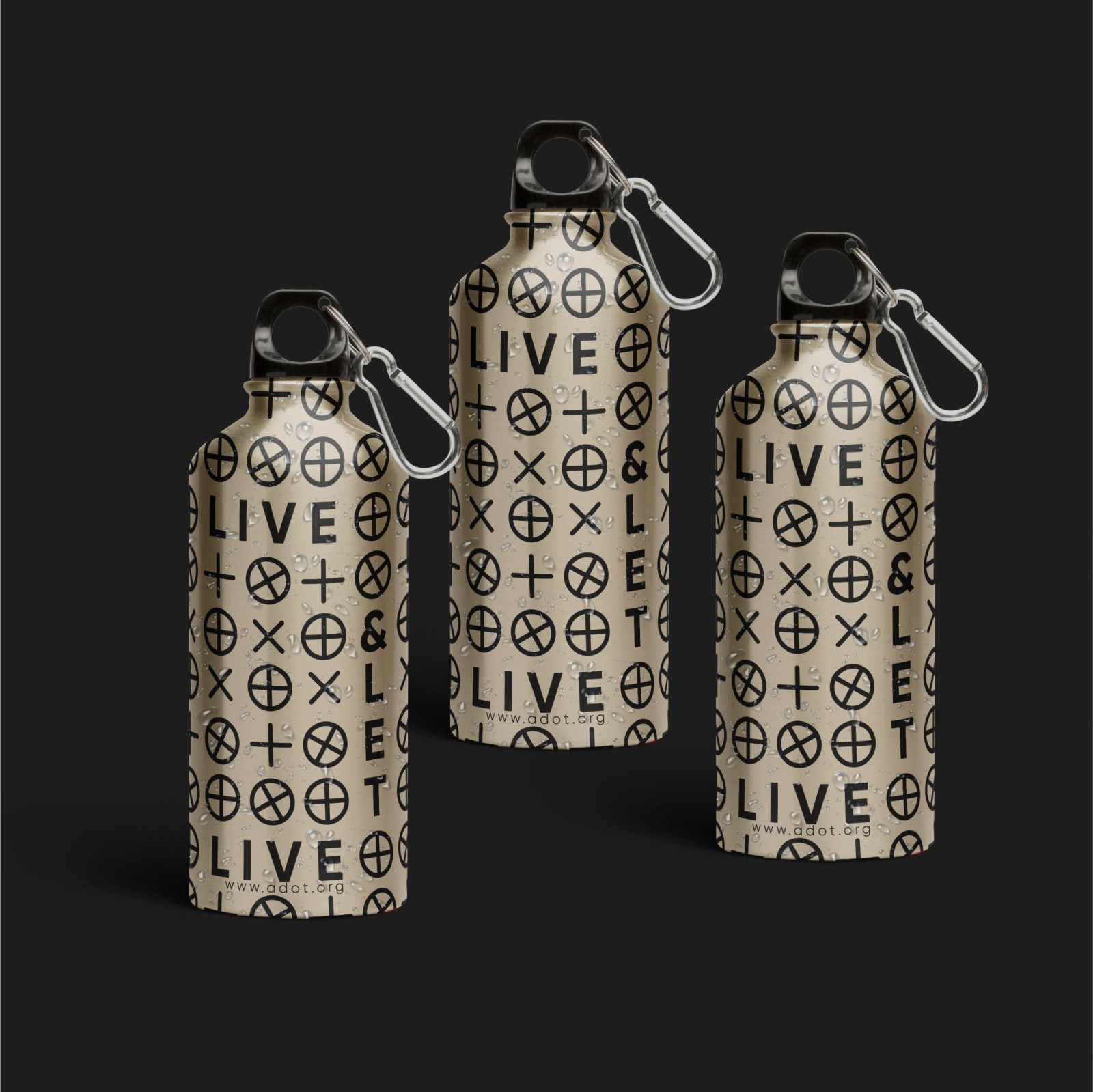
In Africa, there is enough luxury for all, but the ones with the dark minds hold everything to themselves. The only solution to this necessary evil is for these people to learn to Live & Let Live, Hence, the company’s slogan. While working on this design, the ample qualities and good designs was put into consideration. Qualities like, Simplicity, Balance, Rhythm, Contrast, Sustainability and Functionality of the Logo across all platforms, prints and on the media. Accessibility was also put into perspective when working on this brand Identity design because, as humans, we have different sensations, different feelings, different aptitudes. Taking these into consideration helps us optimise for easy access to our work for most, if not all. Because we design to help other humans achieve things meaningful to them.
CREDIT
- Agency/Creative: Hadexpete Creatives
- Article Title: Hadexpete Creatives Creates New Brand Identity for Adot
- Organisation/Entity: Agency, Published Commercial Design
- Project Type: Identity
- Agency/Creative Country: Nigeria
- Market Region: Africa
- Project Deliverables: Brand Creation, Brand Identity, Brand Naming, Branding
- Industry: Non-Profit
- Keywords: Brand, Brand Identity, Logo Design, NGO, Africa, Brand Identity Design, Children, African, Black, Gold, Art, Business Card Design, Package Design, Branded Bottle, Flyer Design, Campaign Design.


