


Tquila provide expert insight and innovative solutions to ambitious businesses looking to harness the potential of intelligent automation for game-changing value. Working closely alongside the passionate & ambitious team at Tquila, Fable&Co. set about establishing a unique brand proposition & visual identity that set the standard for one of the industries leading & fastest growing intelligent automation consultancies.
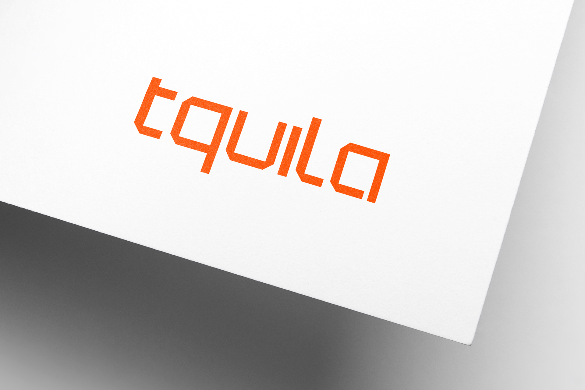
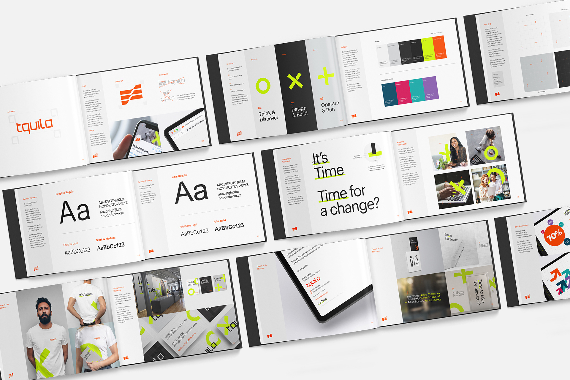
Fable&Co. created a modern, technical & robust wordmarque with angular forms that looked to capture the bespoke approach utilised for each unique client challenge. The wordmarque featured a customised bold font, communicating technology & stability through its solid & uniformed structure. Close attention was paid to the detail falling on the angular cut off corners of the letters to mirror the same structure evident within the brand icon.
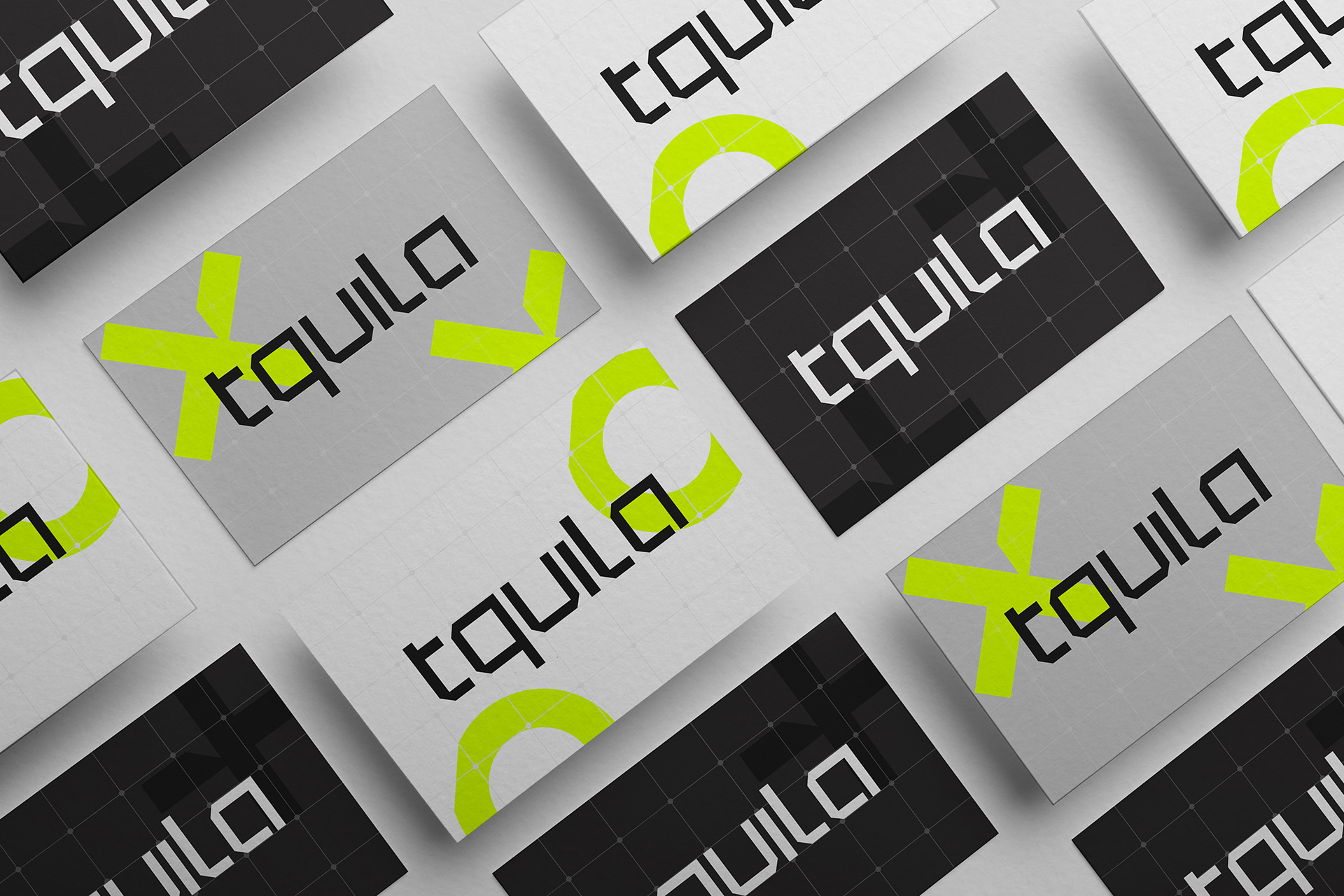
Fable&Co also crafted an accompanying brand icon that featured three angular, stepped lines, demonstrating the impact Tquila can have – helping to catapult businesses to the next level of growth. It also represents Tquila’s ability to help clients on their automation journey through their end-to-end service offerings of advisory, delivery & managed services.
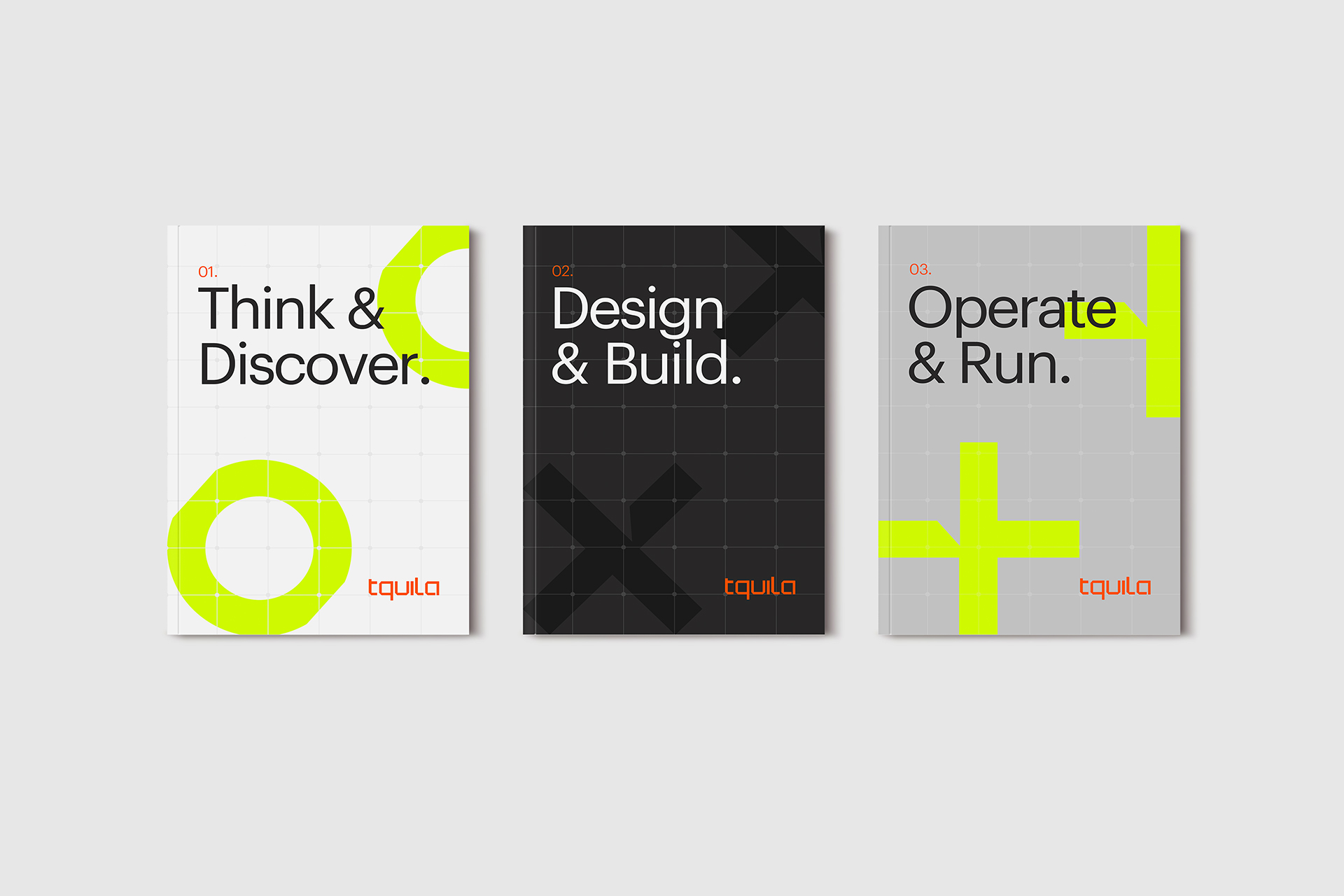
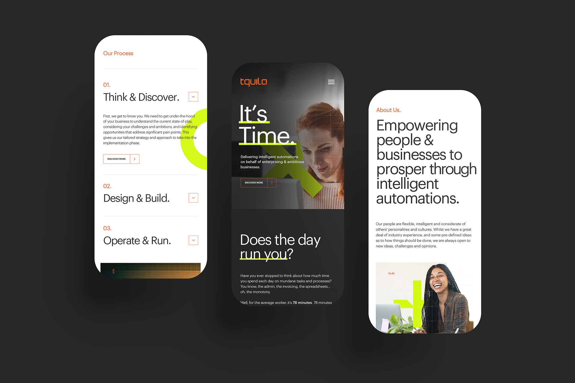
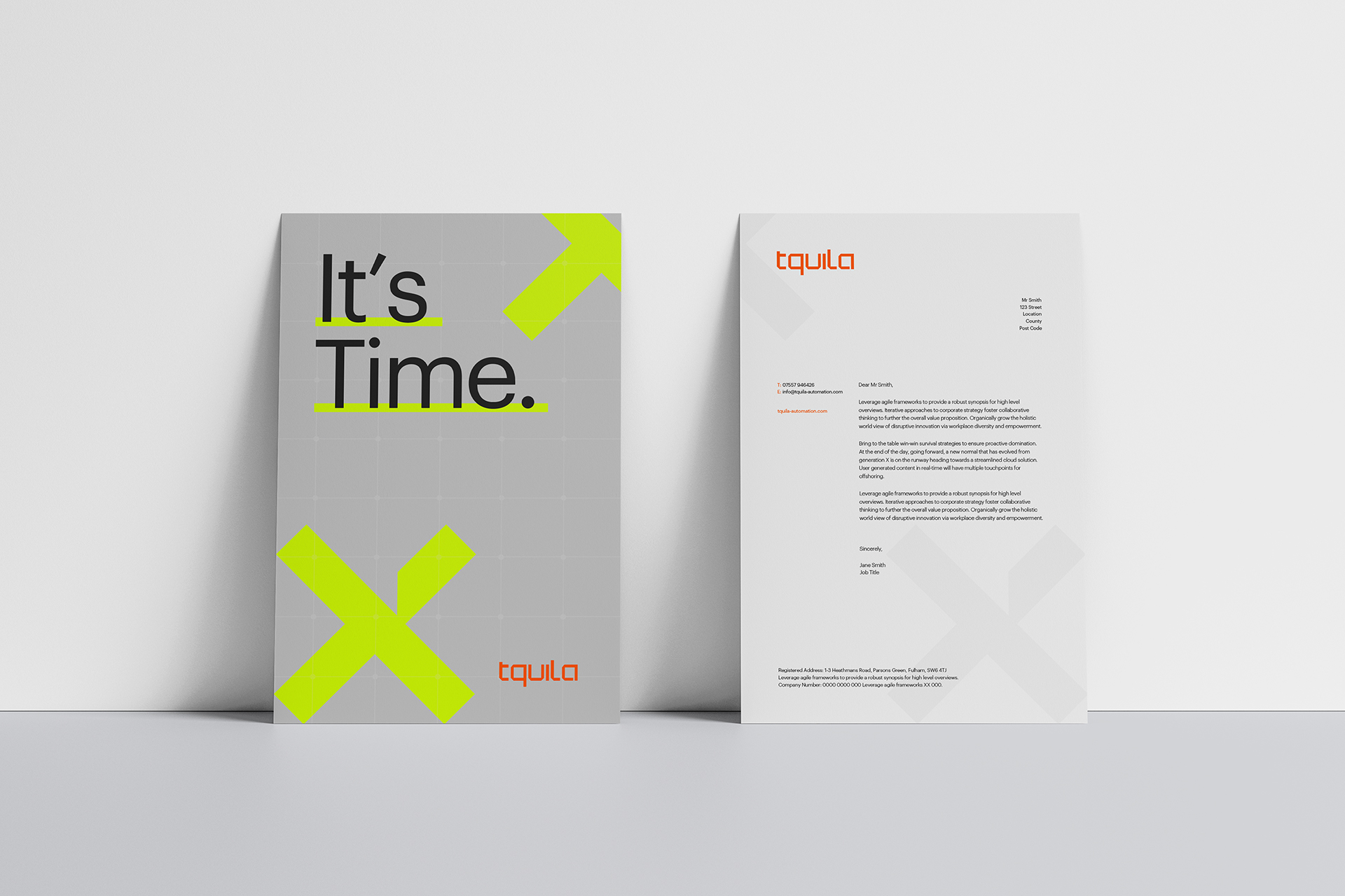
To represent the new strategy & concept of ‘It’s Time’, Fable&Co drew upon this narrative, crafting an identity that showcases efficiencies at its core. Fable&Co created three bold, custom symbols that had elements of the angular Tquila wordmarque & icon, each designed to reflect one of Tquila’s three service offerings.
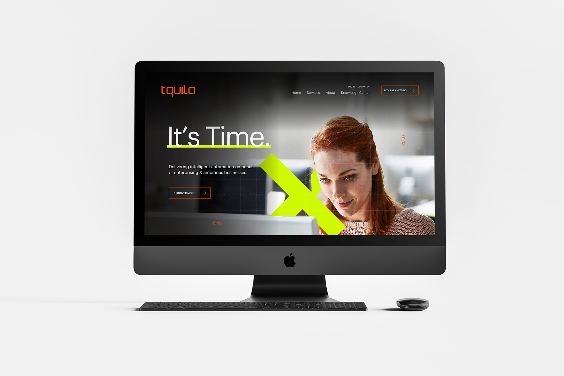
These symbols were then weaved throughout brand imagery to metaphorically highlight the areas that intelligent automation can transform business processes & support, or even free, the human workforce. The striking & impactful highlighter yellow introduced a breath of fresh air in the blue-soaked automation space, whilst representing speed, agility, efficiency & reliability.
Coupled with the greys & blacks to provide a sense of professionalism, sophistication & credibility. The vibrant orange accent was a subtle nod to the original Tquila colour & acknowledged their unique relationship with UiPath.
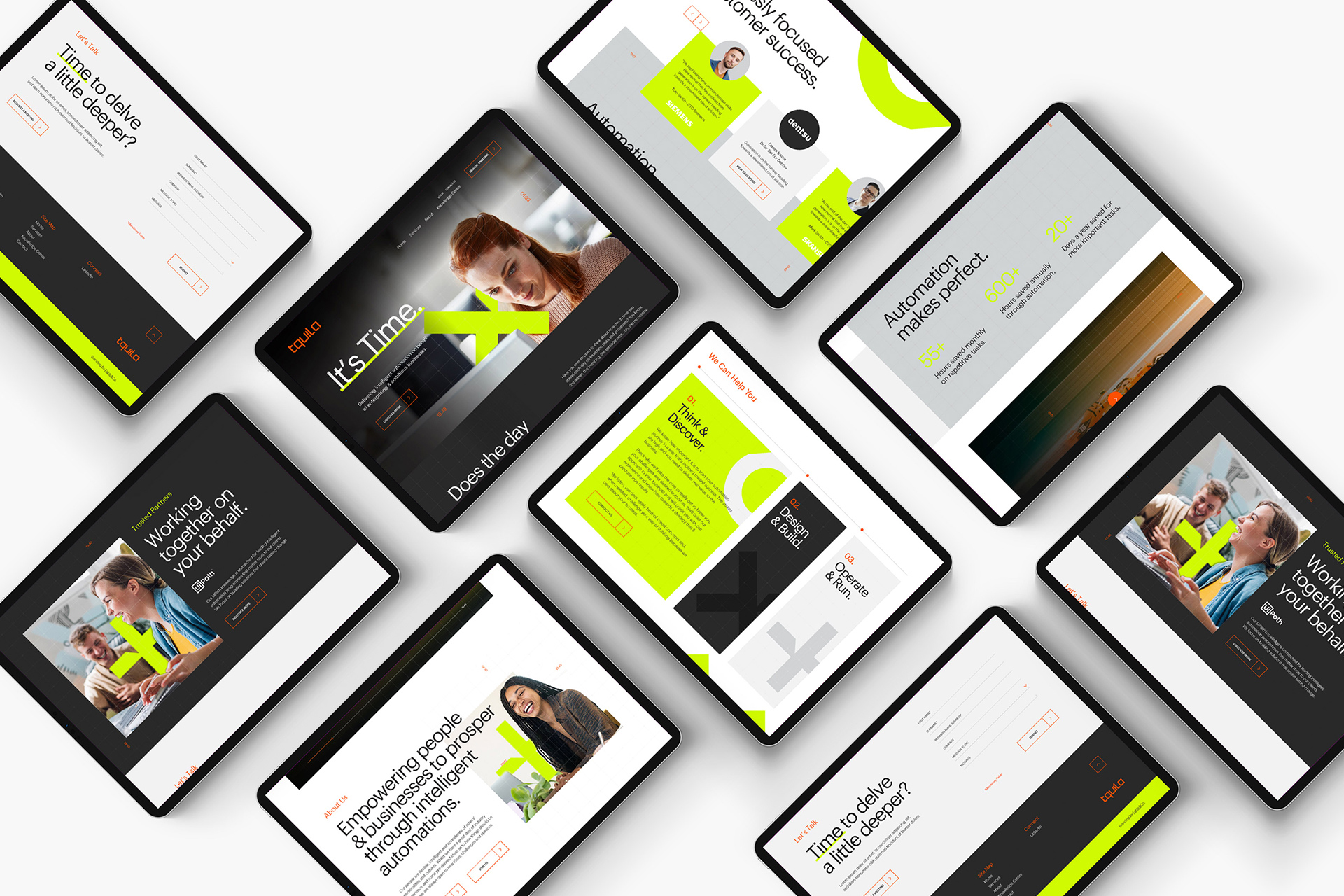
The new Tquila website would play a crucial role in generating new business leads across the globe. It was important to strike just the right balance of practical & effective, with beautiful & rewarding. The notion of ‘It’s Time’ would be evident throughout, with the use of the digital timers, world clocks & key messaging.


CREDIT
- Agency/Creative: Fable&Co.
- Article Title: Global Rebrand for Leading Tech Business Tquila Automation
- Organisation/Entity: Agency
- Project Type: Identity
- Project Status: Published
- Agency/Creative Country: United Kingdom
- Agency/Creative City: London
- Market Region: Global
- Project Deliverables: Art Direction, Brand Design, Brand Experience, Brand Guidelines, Brand Identity, Brand Redesign, Brand Strategy, Brand Tone of Voice, Brand World, Copywriting, Identity System, Logo Design
- Industry: Technology
- Keywords: brandstrategy brandpositioning branding brandidentity techbranding technologybranding brandmessaging brandingagency brandingstudio visualidentity brandguidelines corporatestationerydesign websitedesign uiux interfacedesign uidesign uxdesign logo logodesign logoicon logowordmark
-
Credits:
Creative Director: Ross Davison
Strategy Director: Jack Archer
Brand Artist: Isabella Hall
Brand Artist: Matt Jones


