


Öömrang came to CF Napa to create the logo and packaging design for their line of German-inspired wines, eaux de vie and geists (fruit brandy).
The owners of the winery are German and have a long family history of growing grapes and producing wine in the Franconia region of Bavaria. Located in Washington state, the Öömrang vineyards are at the same latitude as Bavaria, making it an ideal climate to grow German varietals of wine grapes.
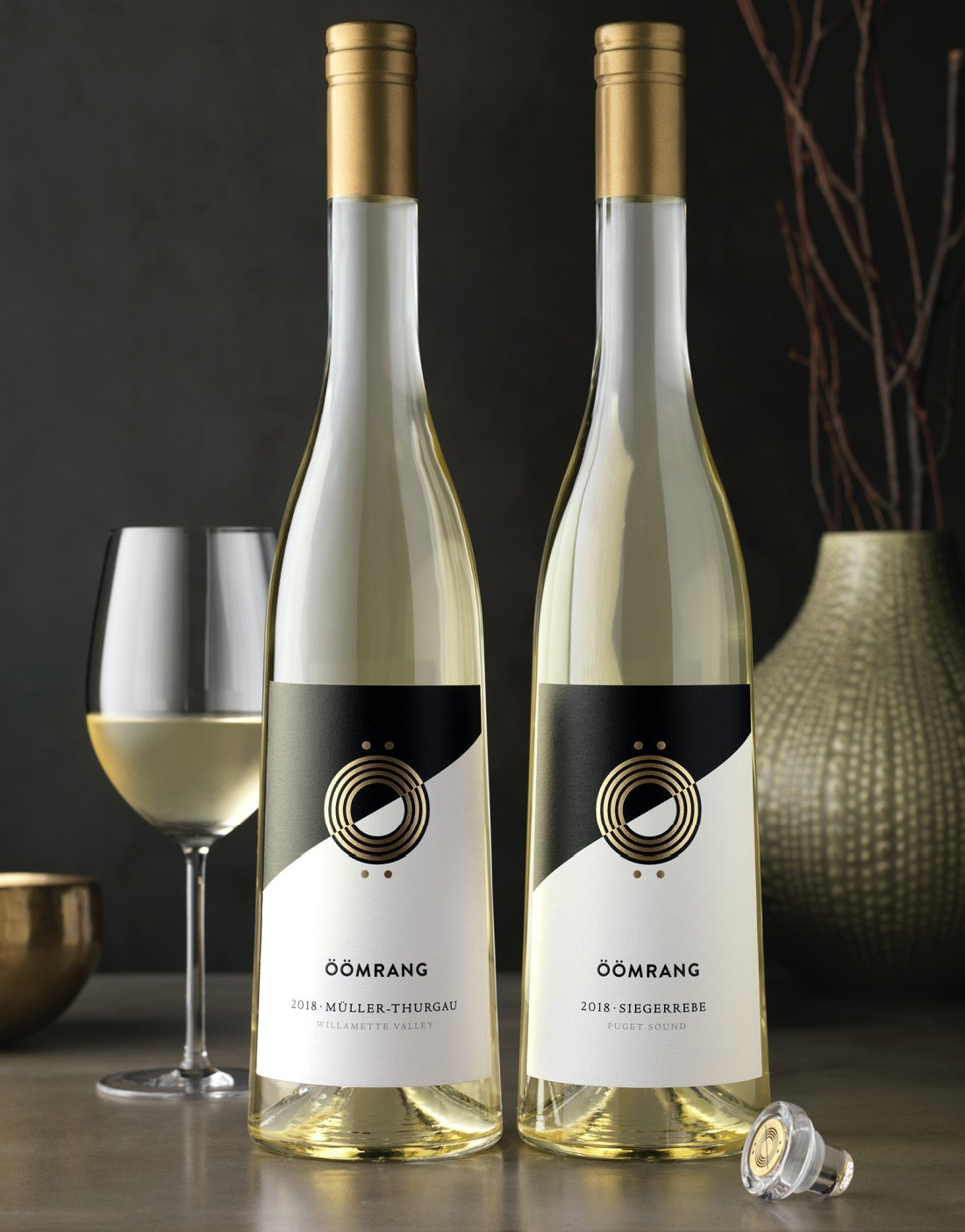
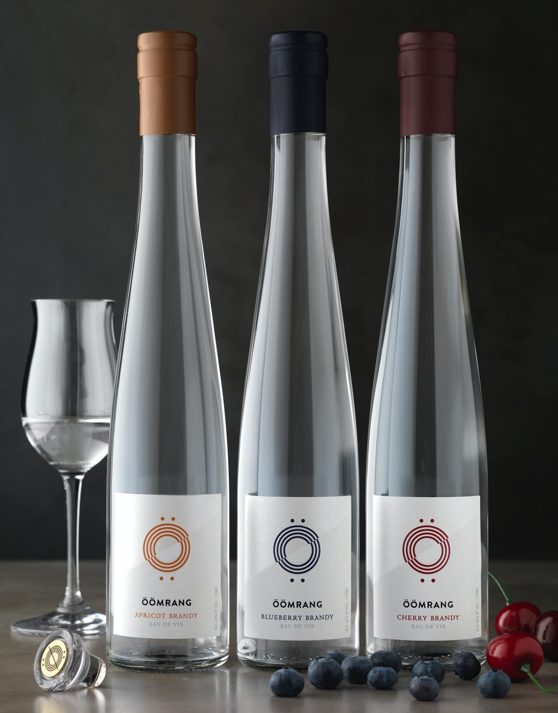
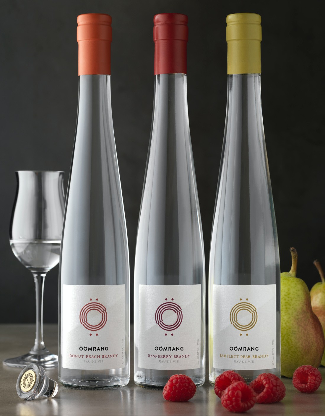
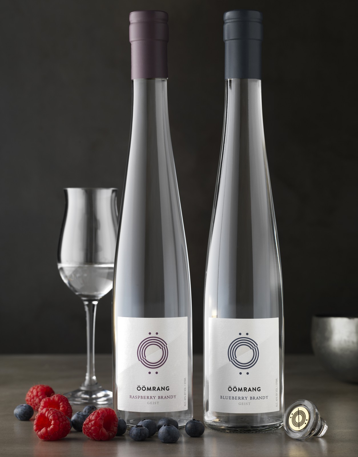
CF Napa’s solution was to create a modern, artistic, clean look reminiscent of German architecture. The Ö with the umlaut is the centerpiece of the label. The icon was created by interlocking the two Ö’s from the name Öömrang. For the white wines, the Ö icon pops in gold foil and is spliced along a diagonal, separating a black and white pattern. The extension to the eaux de vie and geists uses color in the Ö icon to differentiate between SKUs. A pearlescent foil provides a special detail on these premium spirits labels.
To top off each of the bottles, the wines and spirits utilize a glass closure adorned with a gold coin that has been debossed with the Ö icon. The capsules of the eaux de vie and geists match the colored foil on the label.
![]()
CREDIT
- Agency/Creative: CF Napa Brand Design
- Article Title: German-Inspired Wines Öömrang Packaging Design By CF Napa
- Organisation/Entity: Published Work , Packaging Design Creation
- Project Type: Packaging
- Project Status: Published
- Keywords: WBDS Creative Design Awards 2020/21


