


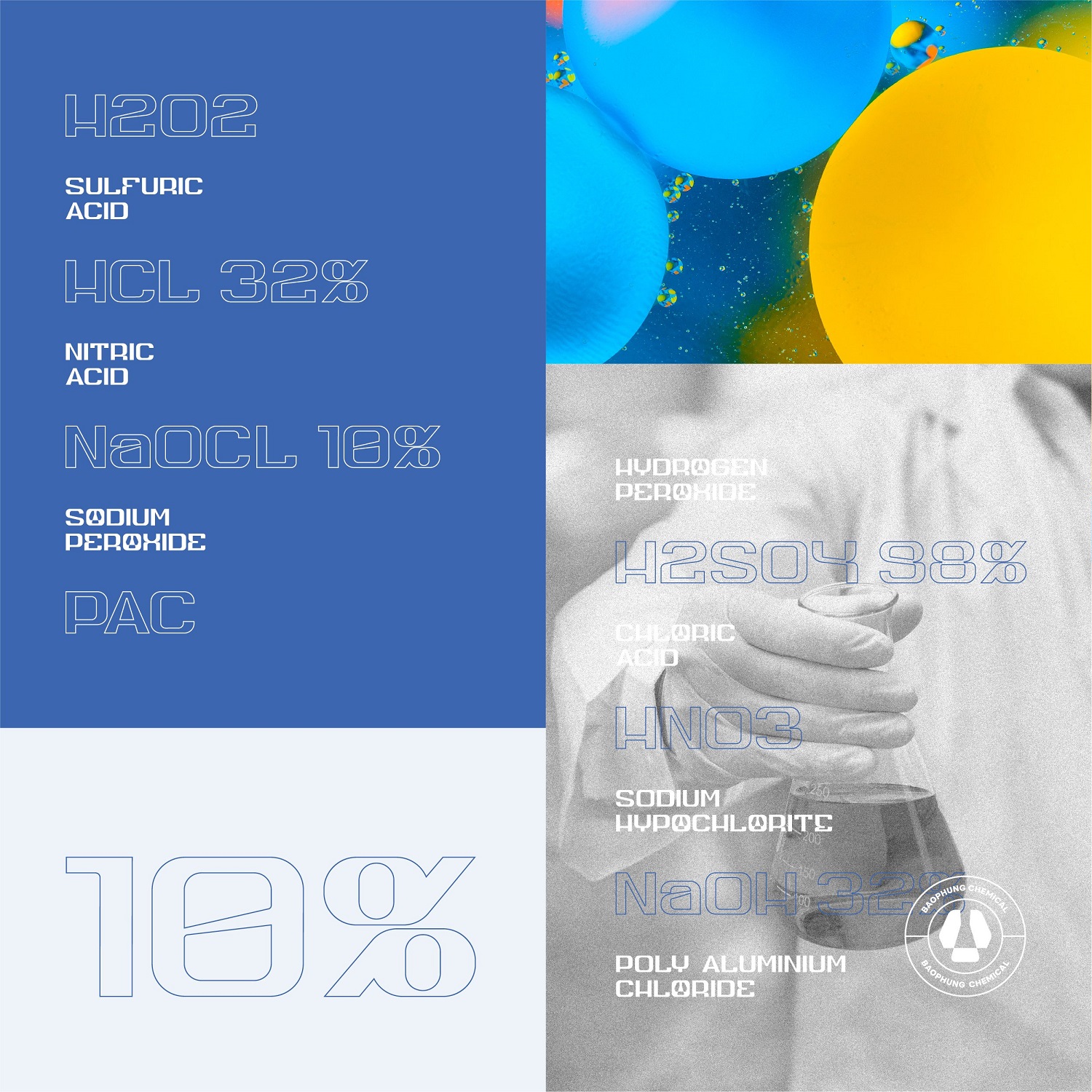
Introduction: Bao Phung is a chemical production and trading company in more than 19 years, formerly a family business dealing in chemicals. Over nearly 2 decades, Bao Phung has grown and expanded its distribution network throughout Vietnam. Task: Bao Phung wanted to renew itself, wanted to put on a modern, easy-to-remember appearance, and easy to impress customers.
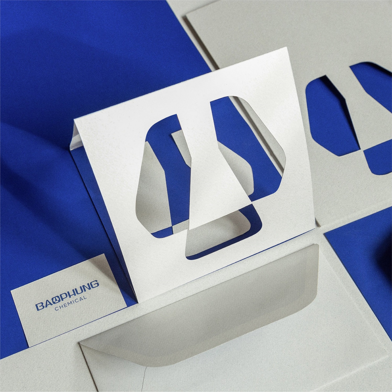
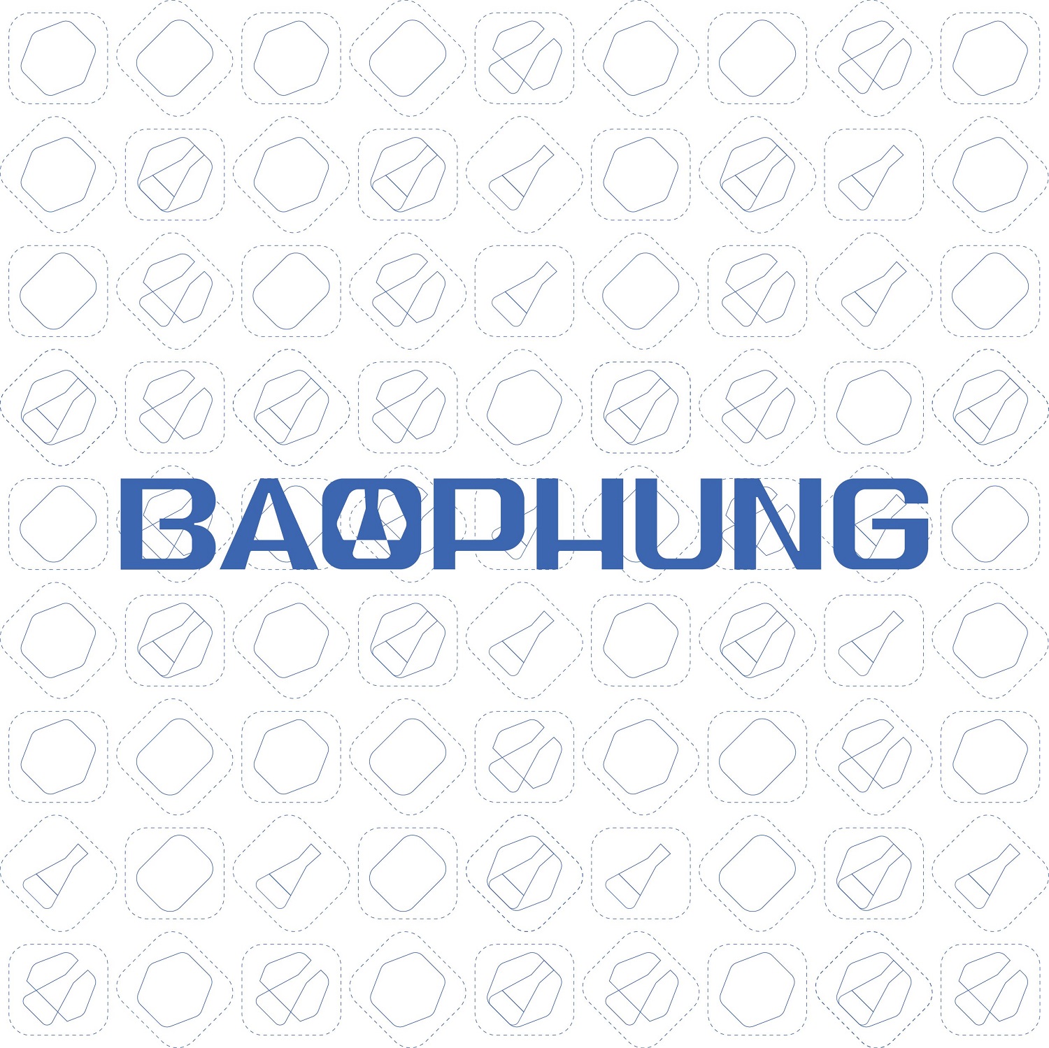
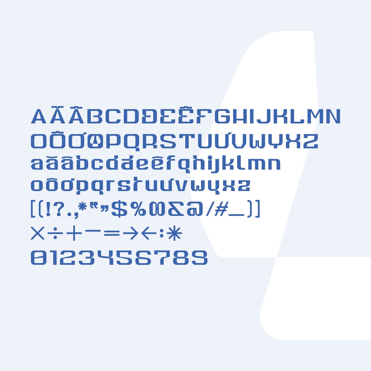
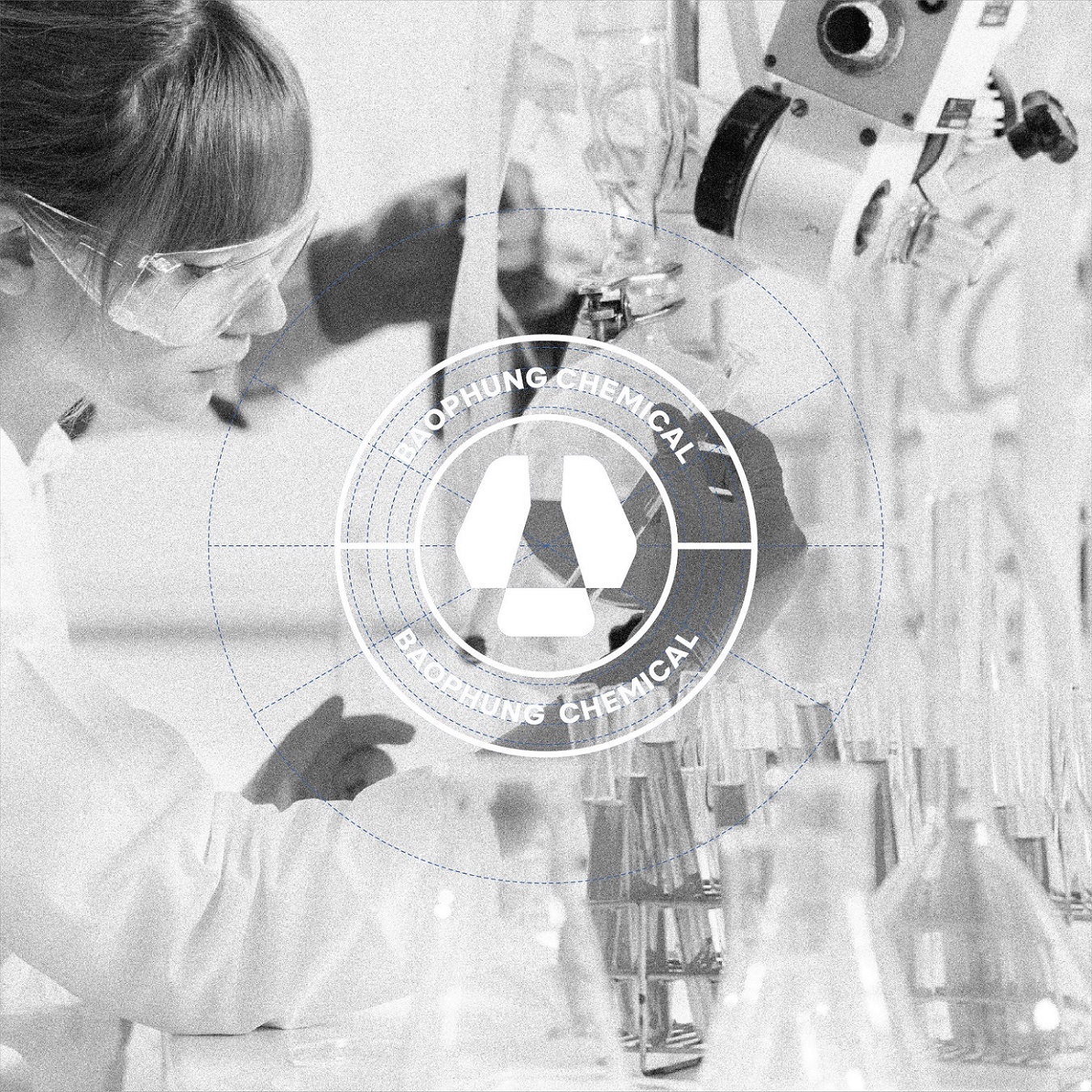
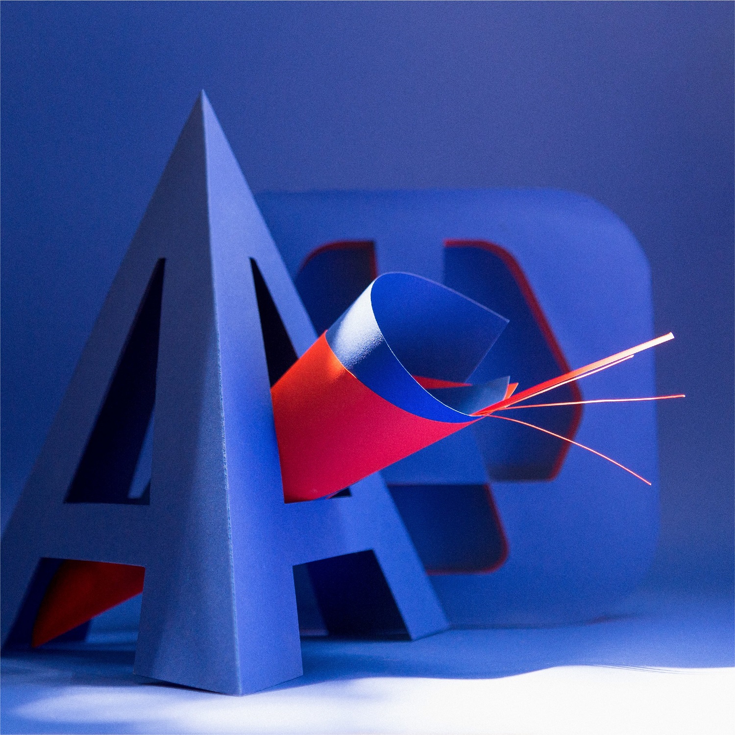
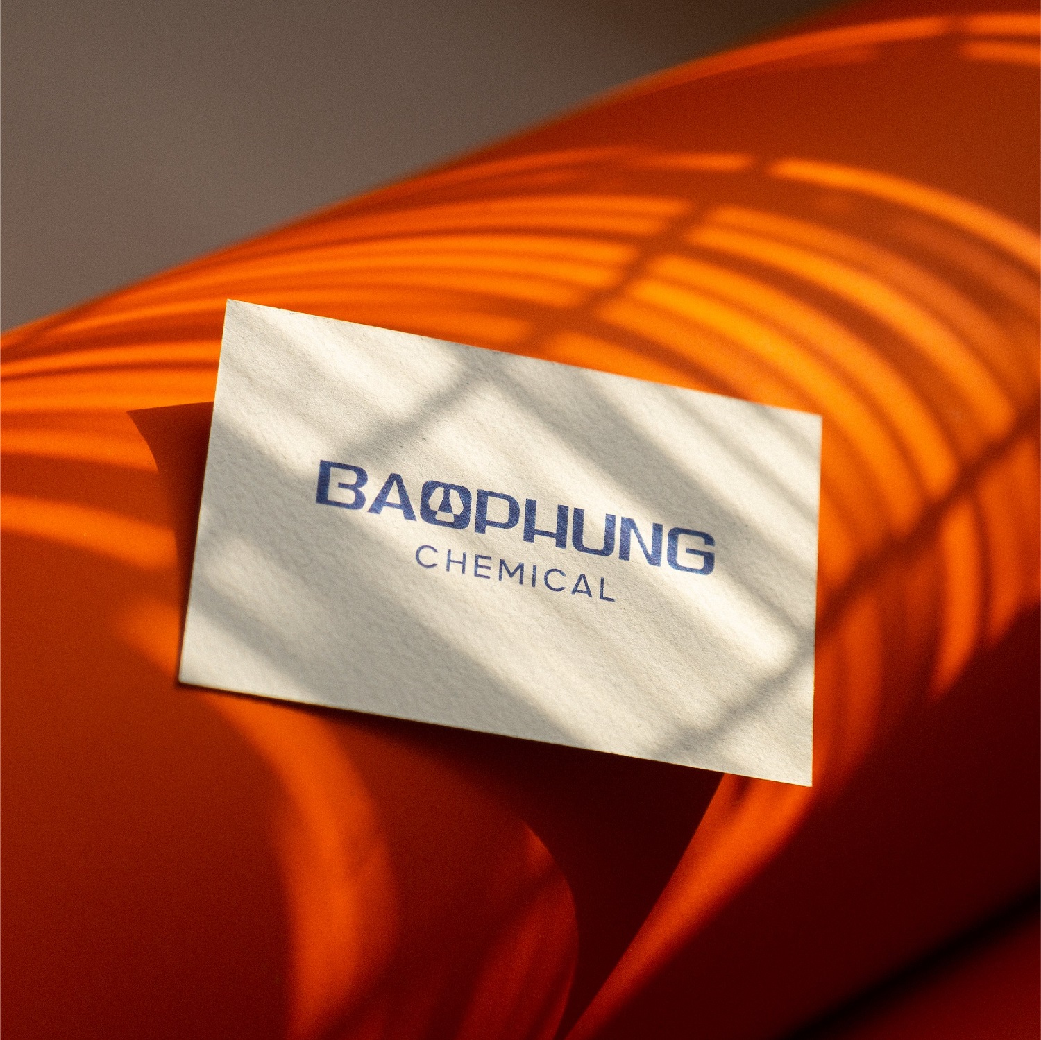
Discussion Process: It was a senior business and held its own strong viewpoint and pride. Transferring from a complex pictorial mark to a plain word mark was a whole long process to sit down and carefully consider all aspects together: business sector, core values, brand positioning, brand archetype, modern design trends, and high applicability in branding activities. As a result, Bao Phung logo was built in an innovative word mark both showing the business strengths, impressing modern appearance and focusing on effective applications. Colour and font: The blue, Bao Phung chemical primary color represents two meanings: Developing a company that heightens protecting the environment and building trust in each customer through safe and qualified products that Bao Phung Chemical supplies. The type of font that comes with this identity is a neutral one with the priority in text presentation and user-friendliness. The graphic elements are developed from the cubes that make up the identity to increase the uniformity in application designs and support Bao Phung Chemical brand identity.
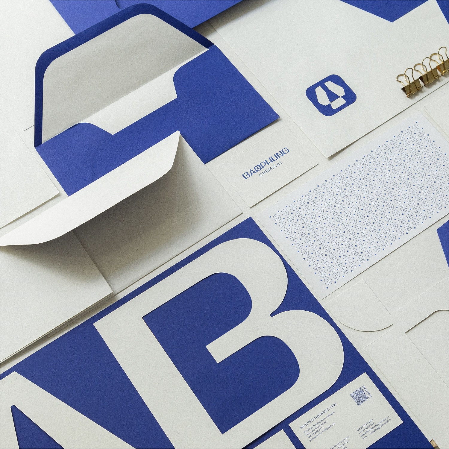
Results of Work: Bao Phung Chemical brand identity set includes: logo, guidelines, typography, stationery design. All in all, this is a project of many experiences to us. With specific and less popular products and services, listening, discussing and exploiting information from clients as well as doing research are really important to help us create and complete this project. In addition, the focus on developing Bao Phung display typeface enables to express the brand’s personality effectively. In our viewpoint, a simple design that prioritises high applicability is what we are aiming for.

CREDIT
- Agency/Creative: Fubo Creative
- Article Title: Fubo Renews the Whole Brand Identity for Bao Phung Chemical
- Organisation/Entity: Agency, Published Commercial Design
- Project Type: Identity
- Project Status: Published
- Agency/Creative Country: Vietnam
- Market Region: Asia
- Project Deliverables: Brand Guidelines, Brand Identity, Brand Redesign, Branding, Identity System, Rebranding, Research
- Keywords: branding, identity, creative, logo, typography, chemical


