


Independent design agency Sunhouse has rebranded Fry’s, the original plant-based pioneer. Delivering iconic standout on shelf and beyond, the new identity encapsulates the family’s passion to not only craft tasty plant-based foods, but also to inspire people to move to a healthier, more compassionate and sustainable lifestyle.
The Fry Family Co. is a leader in the plant-based food industry with over 40 products on supermarket shelves in 30 countries around the world. Founded on real purpose, they have been inspiring and enabling families on their plant-based journeys since 1991. Whilst the new popularity in this category has provided fresh opportunities for the family-run company, it has also brought on pressure from the growing competition.
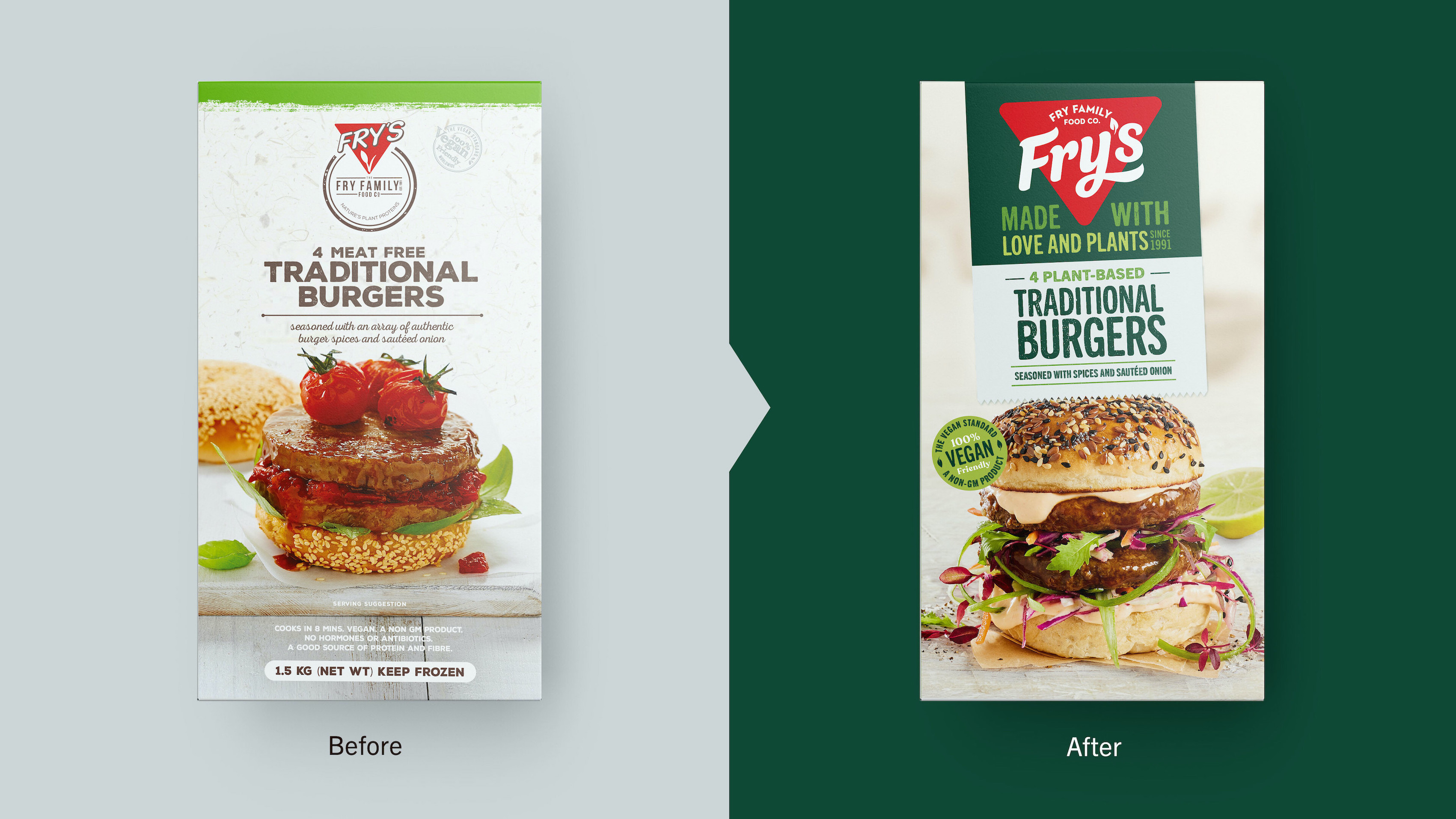
“Being an early entrant to plant-based food products, Fry’s adopted a product-centric approach and used visual elements that have now become category conventions,” comments James Giles, Creative Director at Sunhouse. “To distinguish it from the crowd, we needed to unlock what makes the brand distinctive and celebrate it with emotional and functional reassurance at every touchpoint. In order to shift focus from the product to the brand, we needed to develop ownable assets that told the Fry’s story with confidence, authenticity, expertise and love.”
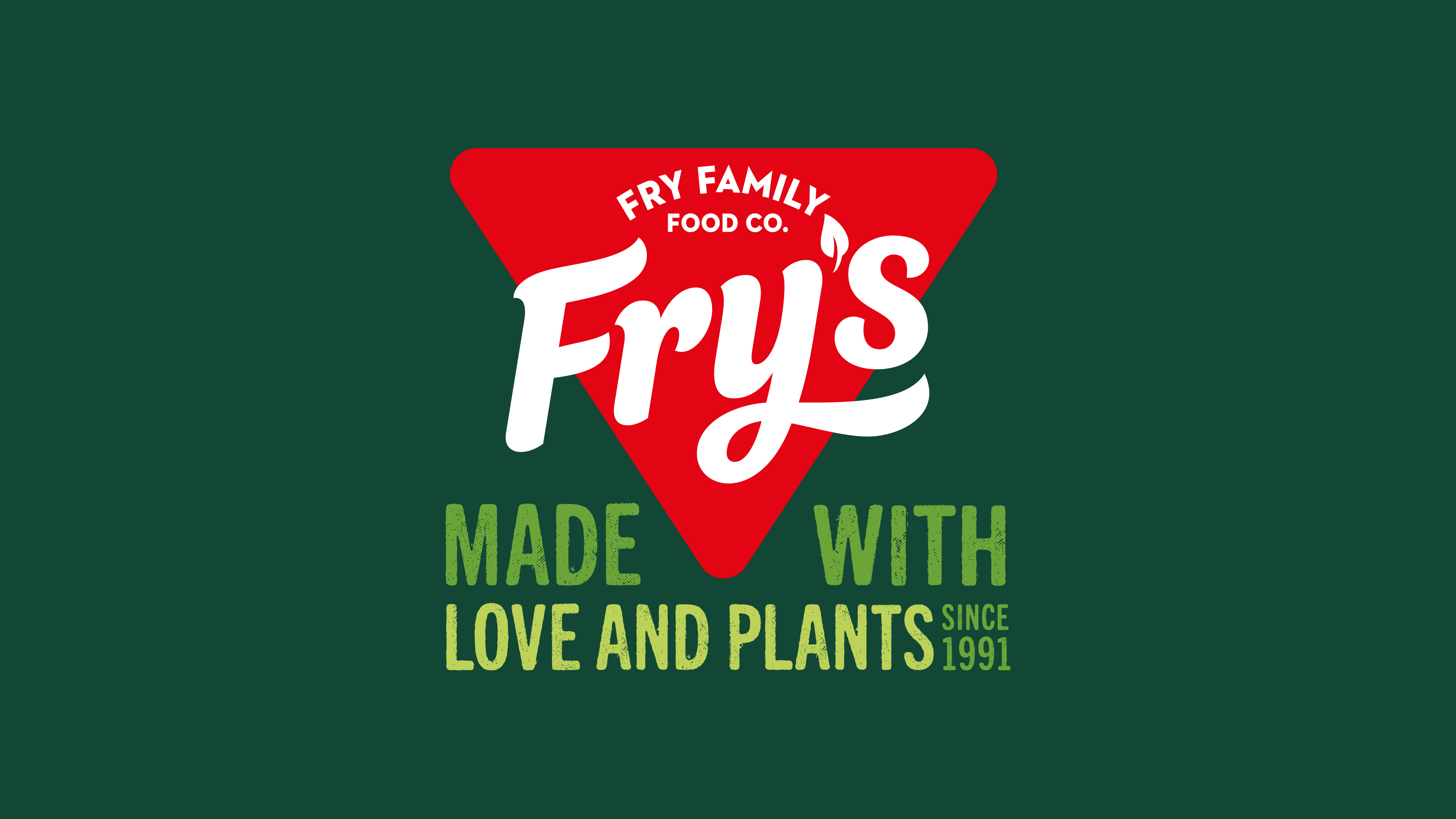
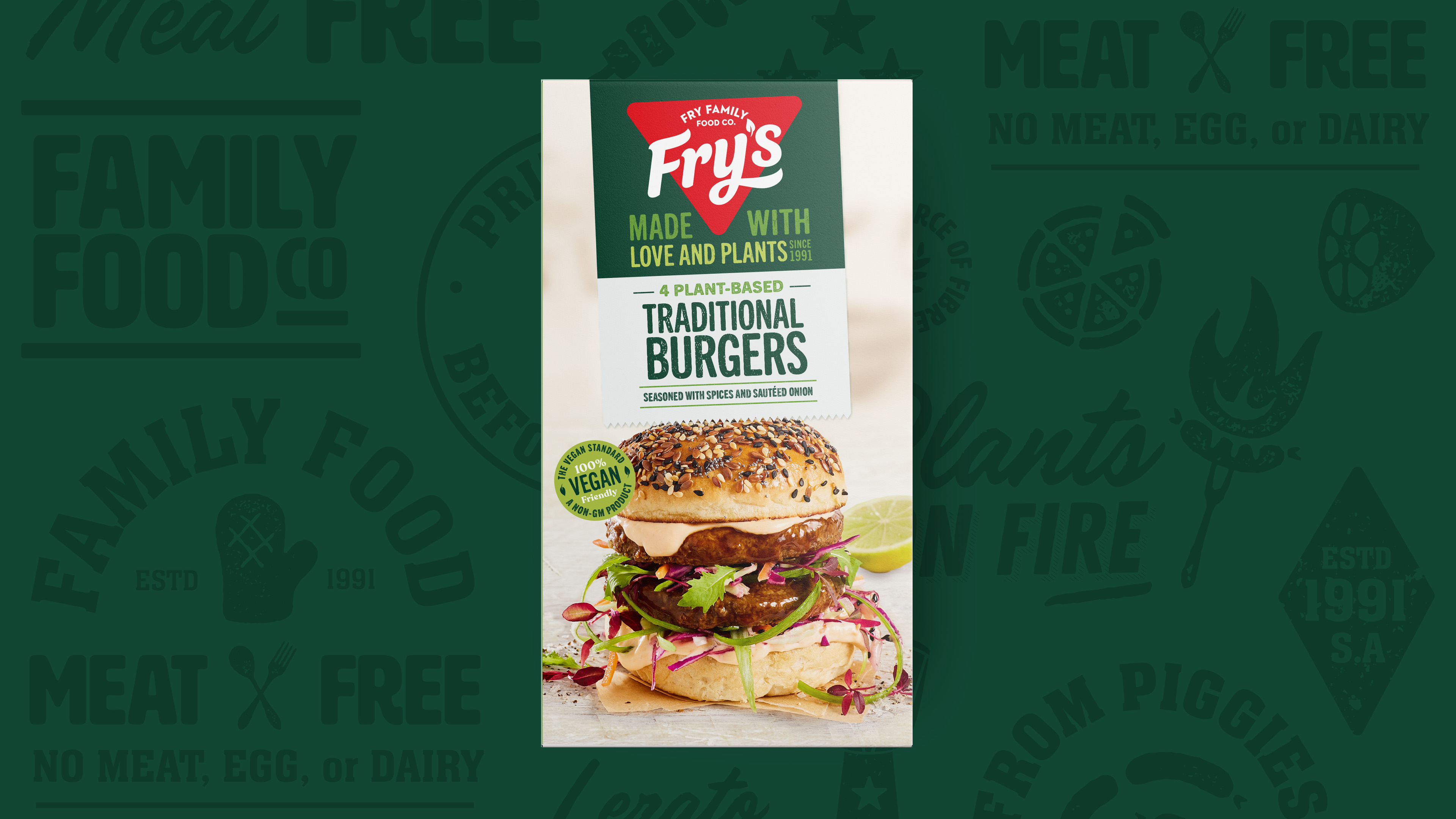
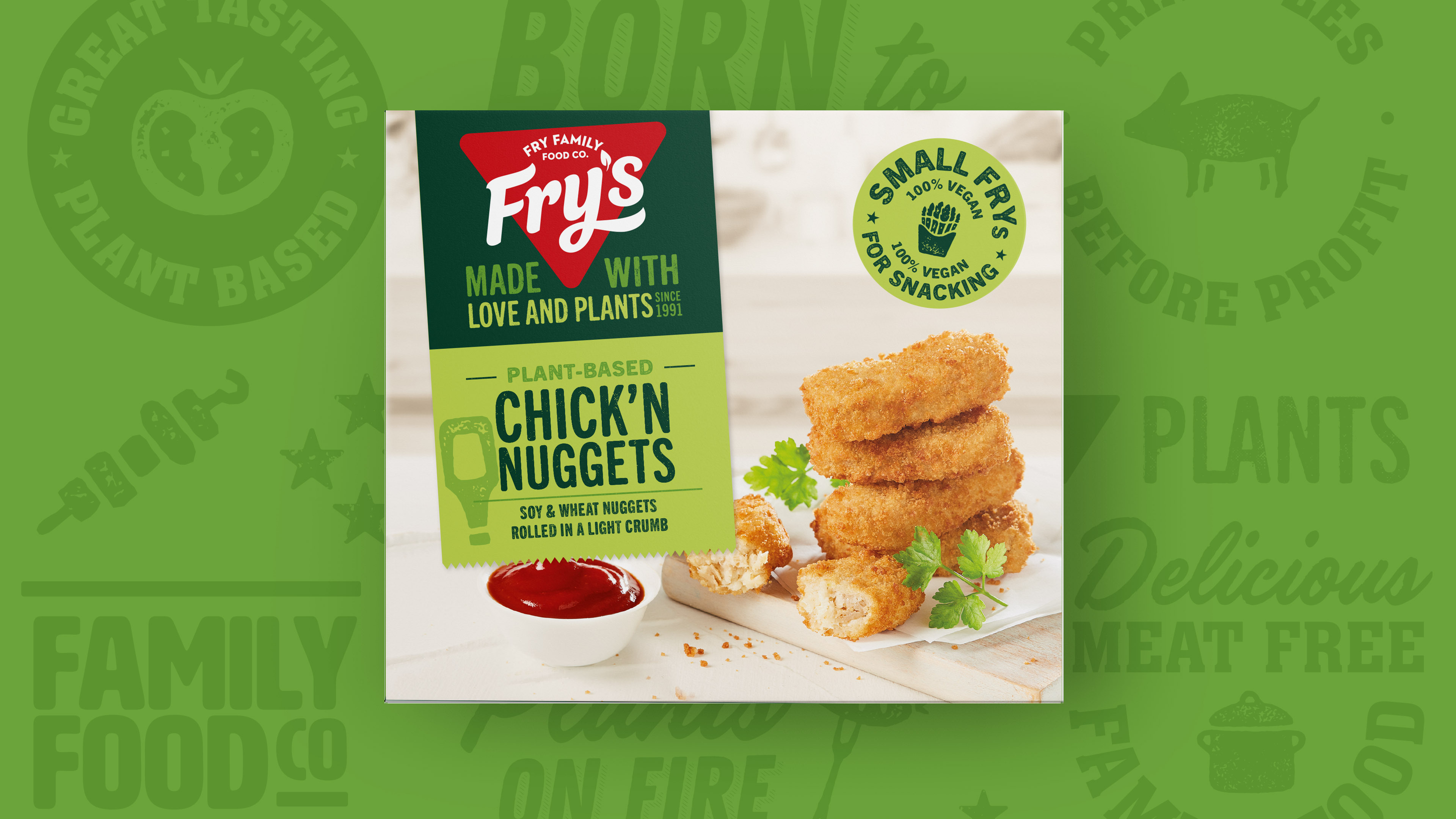
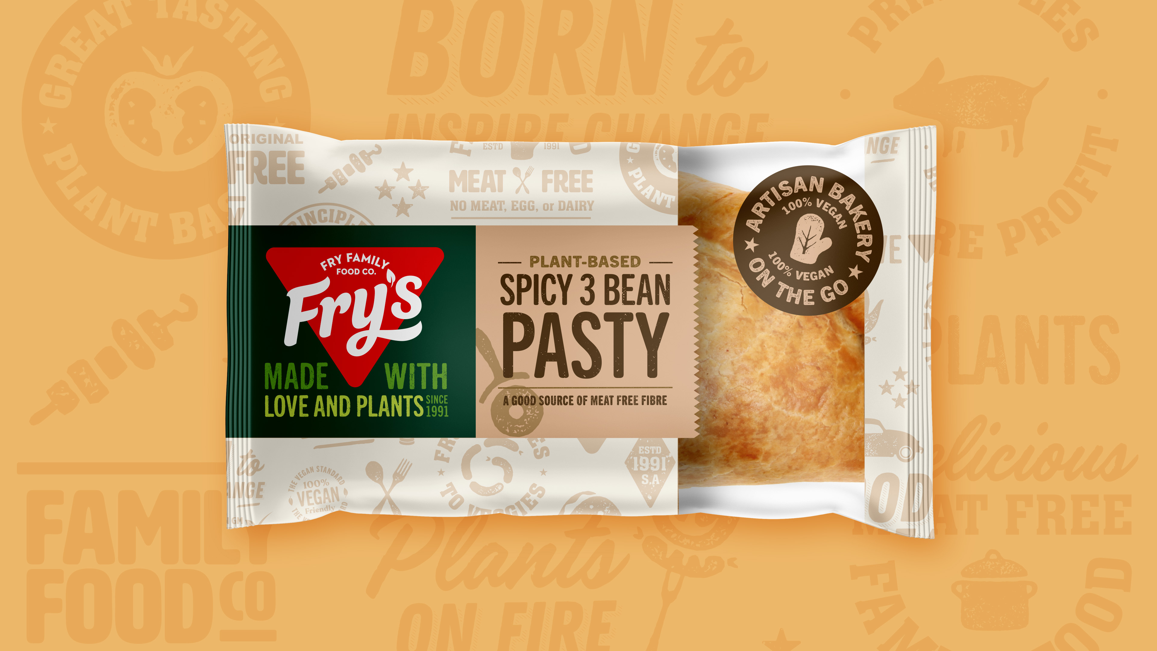
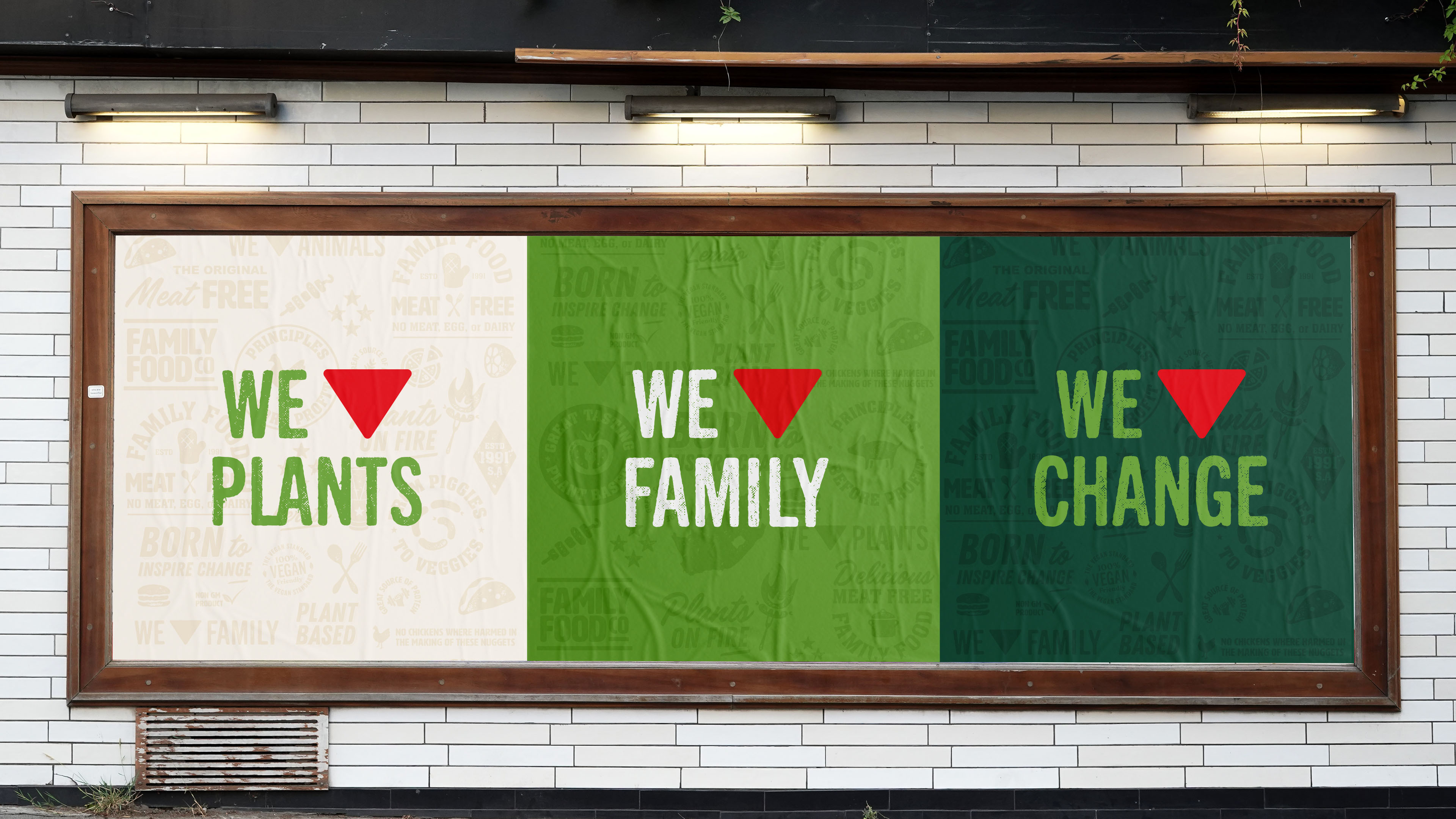
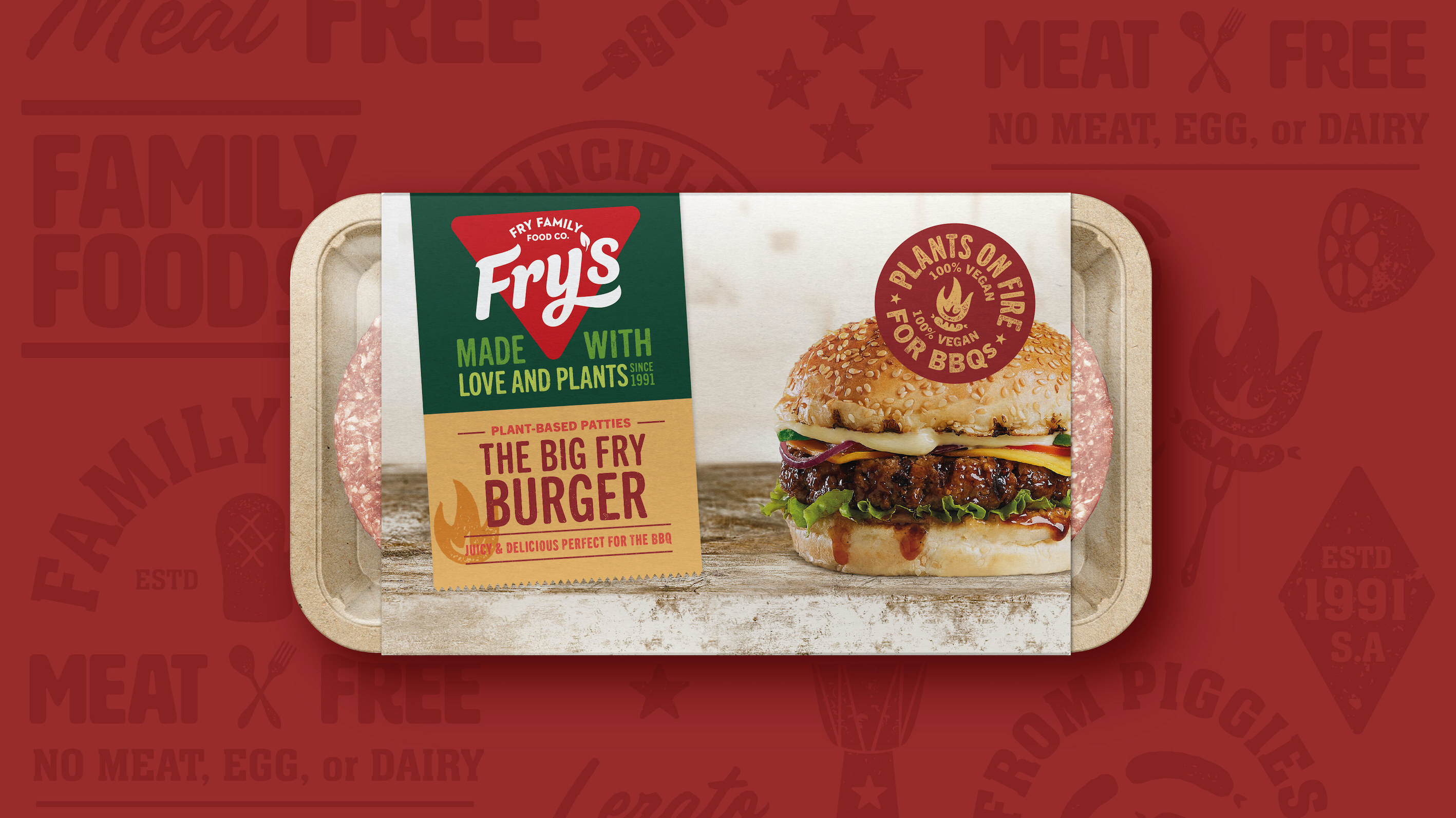
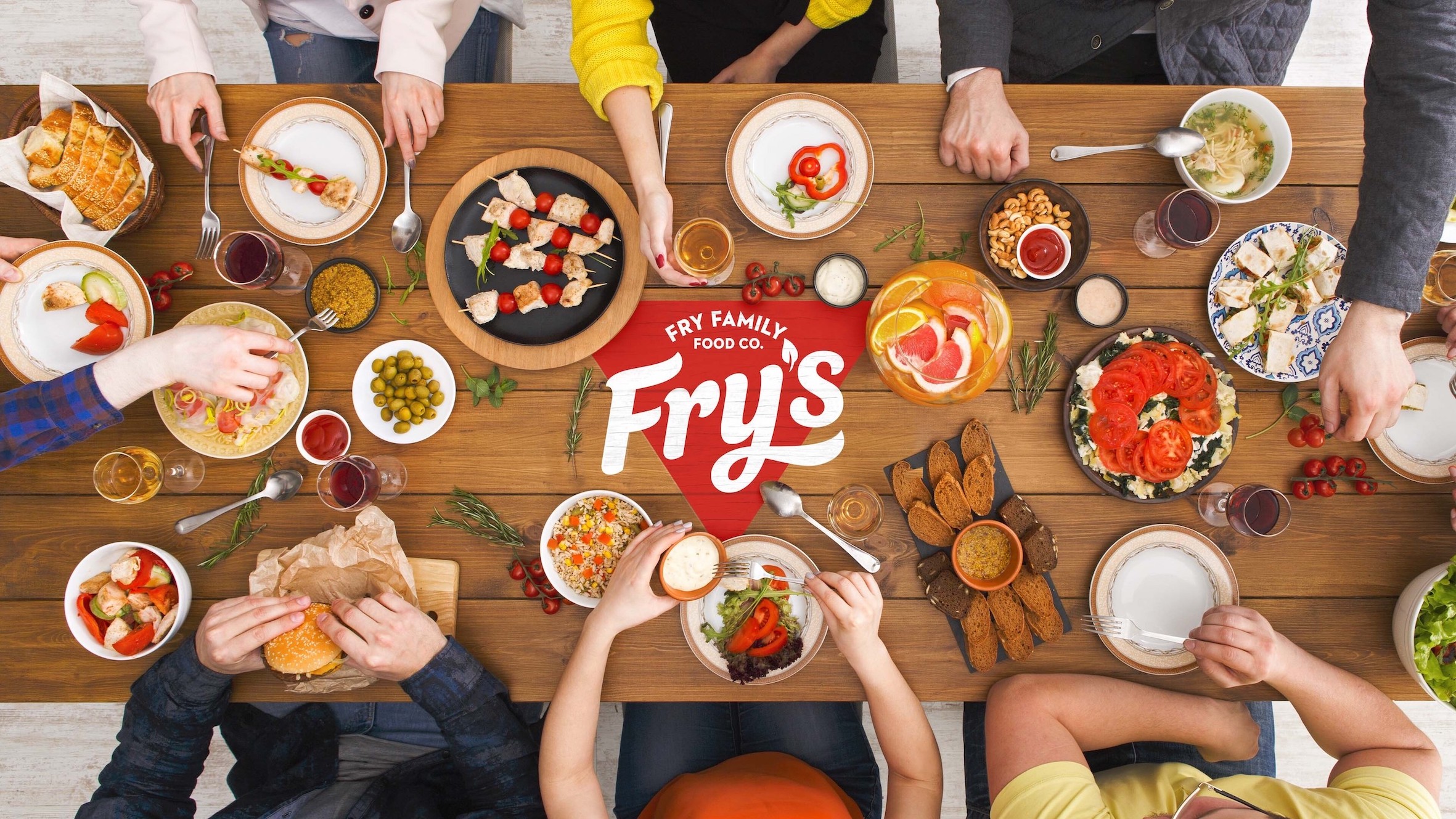
The new identity brings fresh relevance to the brand, embodying the family values to restore Fry’s to the forefront of the plant-based movement. The brand’s red triangle has been repurposed to symbolise the love and passion that goes into every delicious, nutritious plant-based meal within the portfolio. With earthy tonality, the colour palette reflects the brand’s wholesome personality whilst crafted, hand-stamped illustrations add an element of wit to engage Fry’s wide-ranging audience of vegans, vegetarians and flexitarians. The new photographic style is candid and natural, featuring real moments with engaging warmth and positivity.
New packaging uses a ticker tape device that anchors the Fry’s brandmark, sending the ‘Made with Love and Plants’ message with impact at shelf. Varianting is supported by colour and reinforced with illustrations, which also help to unify the brand across all product ranges. With updated photography, the packaging now delivers high on premium quality, taste appeal and brand purpose.
“Fry’s is no ordinary brand,” comments Tammy Fry, Global Brand Lead and co-founder at Fry’s. “We’re on a mission to make it easier for everyone to improve their health, reduce their environmental footprint and live more ethically by providing a range of great tasting, plant-based foods. Sunhouse’s new identity brings our family’s story to life with the confidence, character and compassion we need to become the leader in plant-based vegan foods worldwide.”
CREDIT
- Agency/Creative: Sunhouse
- Article Title: Fry’s Family Foods Shows the Love with New Identity by Sunhouse
- Organisation/Entity: Agency
- Project Type: Identity
- Project Status: Published
- Agency/Creative Country: United Kingdom
- Agency/Creative City: Bath
- Market Region: Global
- Project Deliverables: Brand Design, Brand Guidelines, Brand Mark, Brand Redesign, Identity System, Packaging Design, Packaging Guidelines
- Industry: Food/Beverage
- Keywords: plant-based
-
Credits:
Creative Team: Sunhouse


