


“Frudoza” is a niche brand of a large ice cream producer “Morozproduct” based in Minsk, Belarus.
It made appearance almost a decade ago with an aim to appeal to young people in search of extraordinary ice cream and unusual tastes. The product is plombier with pieces of fruit and berries, and it looks bright, too – the glaze is made of frozen juice.
Looking and tasting unlike any other ice cream, “Frudoza” was a great success and has become a love mark among those aged 16-24. And when first admirers grew up, their place was taken by a different generation, with their own values and views. Time for the brand change has come.
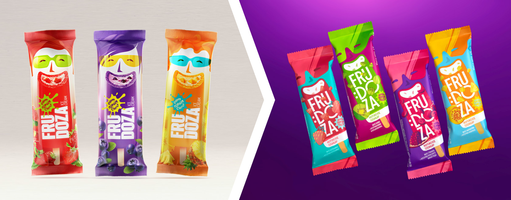
The style and all graphic elements required updating. For example, detailing and stylization of the characters seemed excessive, against the background of current visual codes. On the other hand, the technique of dividing the brand name into syllables anticipated the trend.
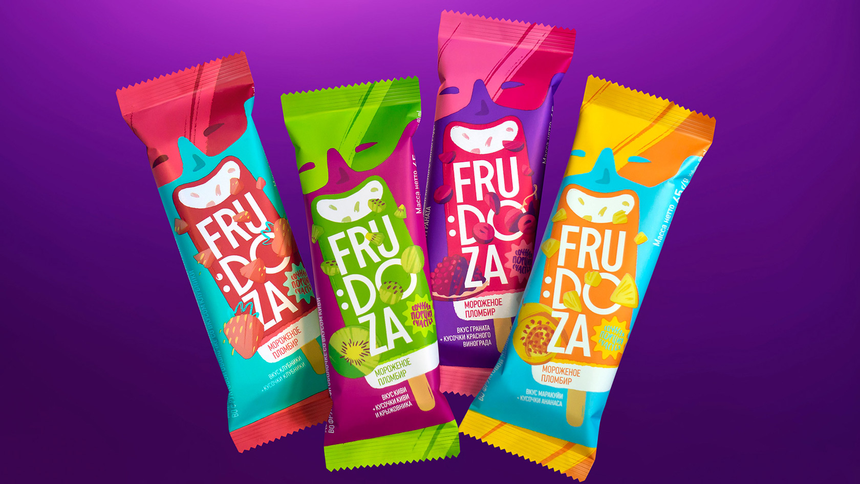
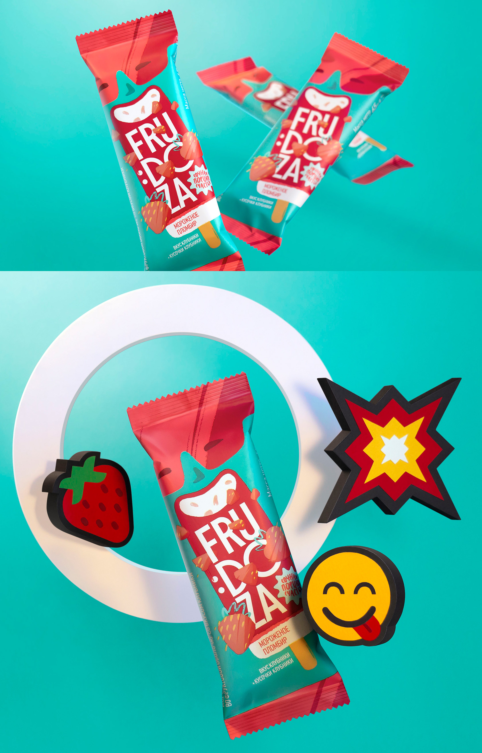
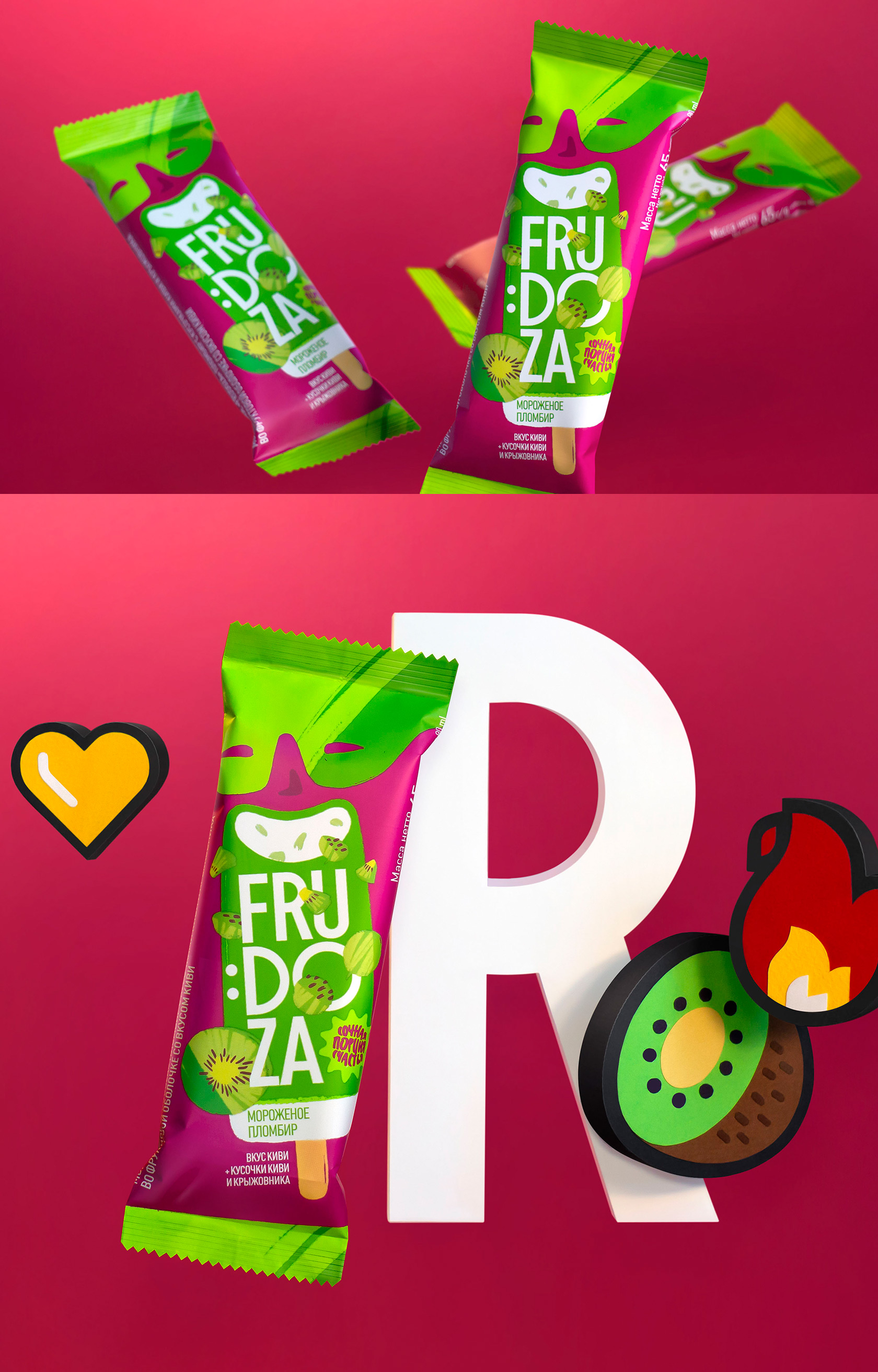
Staying true to the brand idea “The juicy dose of happiness”, the new design solution shifts off any unnecessary detail and focuses on visual anchors: bite & smile, colored sunglasses and the syllabic logo.
Elements of the image go through long-desired simplification, growing into symbolic stains of color. The composition gets energy and turns at an angle.
The typeface drops off some weight and looks lighter and neater, and on the way, a colon turns a letter into a smiley, echoing the brand idea.
Depictions of fruit and berries are entwined into the logo area. A friendly and seemingly careless illustration technique supports the general theme of color spots.
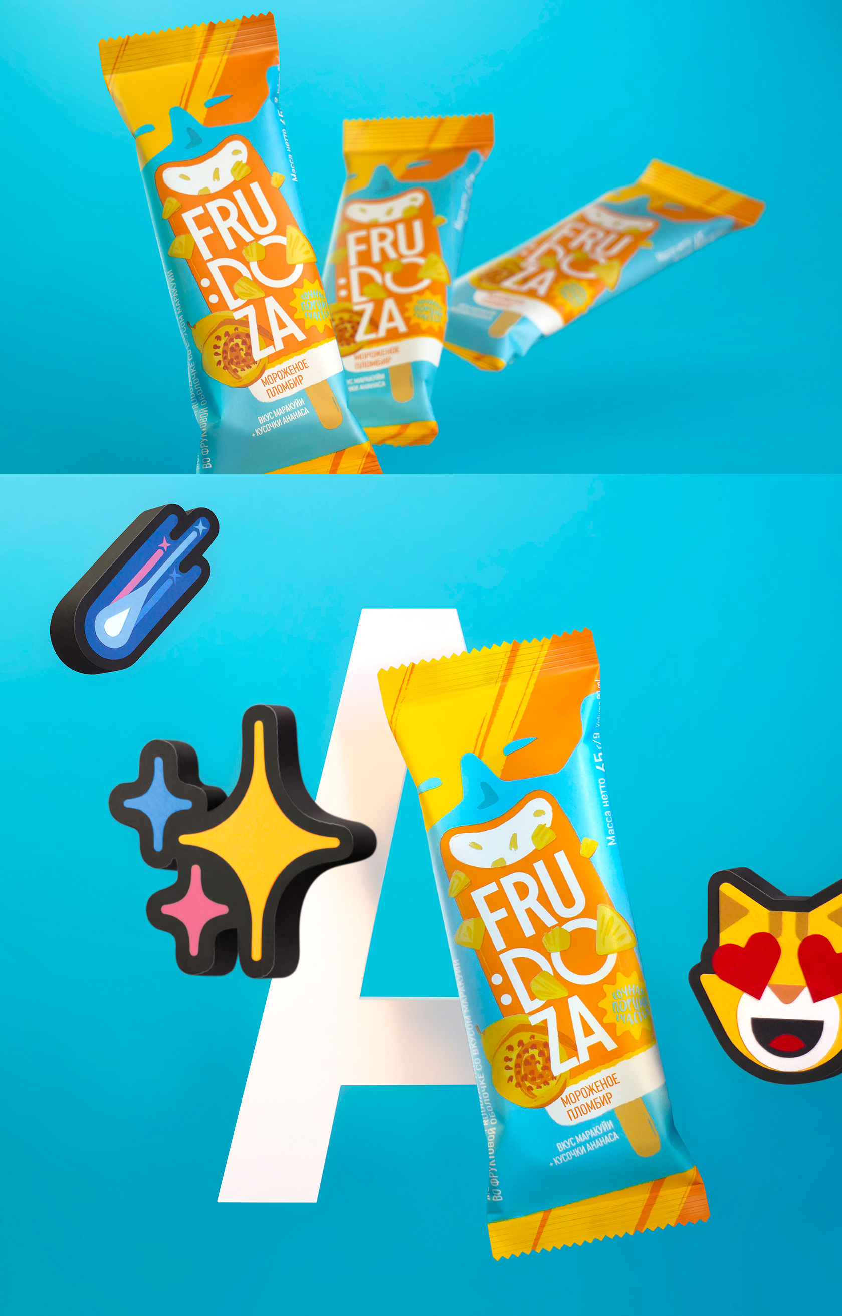
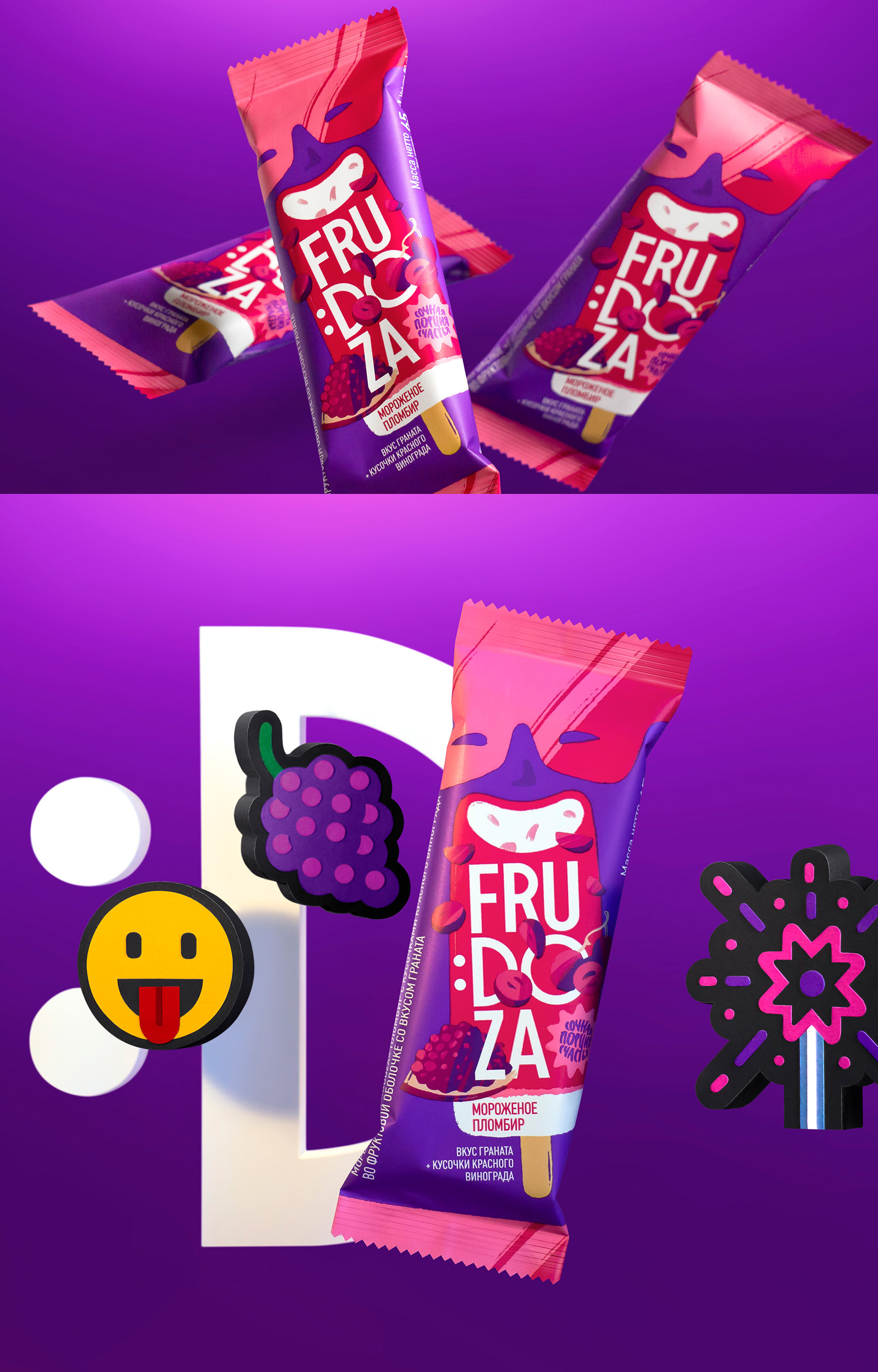
To bring out the “fruity” essence, the color saturation is at its fullest. Bright and straightforward, the colors sing in a contrasting combination. Vibrant palette makes it easy to spot the ice cream in the supermarket fridge – and right this moment the anticipation of pleasure begins.
The visual language of bold colors and simple yet expressive forms serves the brand well: concentrating attention on key elements increases clarity and awareness.
CREDIT
- Agency/Creative: Brama Branding
- Article Title: Frudoza Fruit Ice Cream Packaging Redesign by Brama Branding
- Organisation/Entity: Agency, Published Commercial Design
- Project Type: Packaging
- Project Status: Published
- Agency/Creative Country: Belarus
- Market Region: Europe
- Project Deliverables: Brand Identity, Brand Redesign, Brand Rejuvenation, Graphic Design, Illustration, Packaging Design, Tone of Voice
- Format: Flow-Pack
- Substrate: Plastic


