The Project: Velis Vineyards is a young winery walking an interesting path from grapes to bottle. The vineyards are located in Bulgaria while the wines are crafted in Germany. Since 2019 Velis Vineyards have own winery in Bulgaria where most of their wines are about to be made in.
The Challenge: I always love to speak about the challenges I meet on my way to every new wine label design. These challenges are mostly related with the creative process of the label or the packaging itself. When I started working with Velis it was kind of different. Different like no other way in my career. I think it was 2014 when I was first contacted by them and then I was commissioned to design their winery logo. Great! I did my best and really gave everything without even meeting the people behind the winery. Their new logo was something I was really very proud of. Then in 2016 when I was at Prowein I met a young lady who was one of the owners of the winery – Mrs. Zehe. Later on I received a phone call from her and we decided to create a new wine brand called Heaven’s Door.
I started working on this brand and then, to my greatest surprise, shortly after that, I had another conversation with Mrs. Zehe and she kindly hinted me that she is actually not very happy with the logo I did for her, though I was convinced that it was nearly piece of art.
Ok, then. I did not say anything, but i remember this very well – it was one Saturday in my office. I had an inspiration (I love that moments!) and within minutes I designed Velis’ new logo. It was one-breath job. Done almost instantly I sent it quickly to Mrs. Zehe. Shortly after that we had conversation #3 and I was really happy to know that my work was accepted and I was able to use it wherever I want to in my designs.
It is really challenging to redesign your own work and change it completely and even use it as a foundation of a premium wine label design.
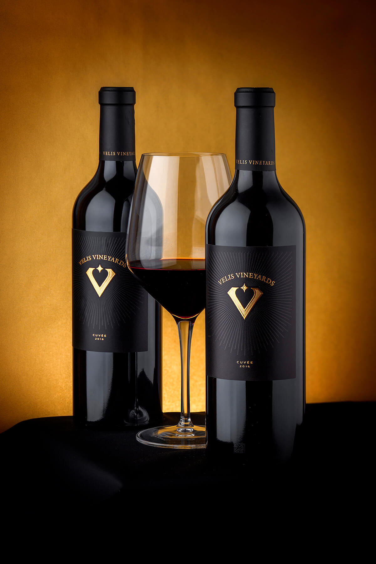
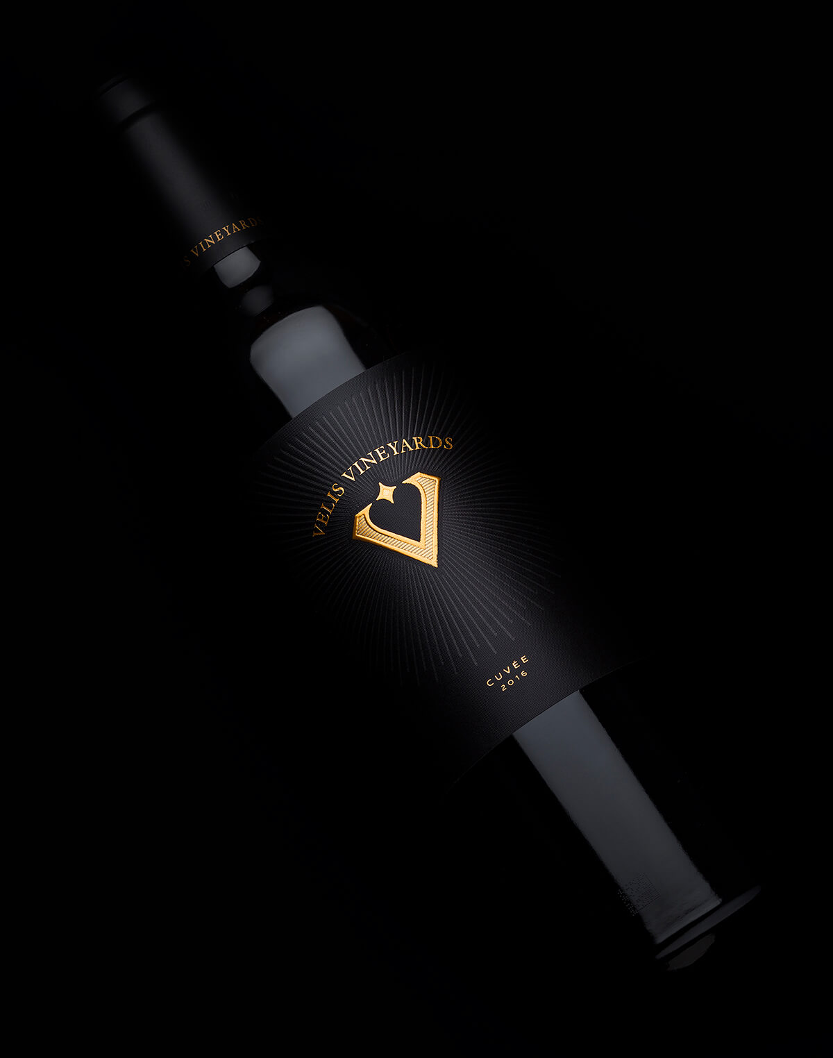
The new logo fit perfectly in my new all-black label. It enhanced the premium feeling I was looking for and really shined with own light and character on the shelf.
This is the story and the challenge behind the Velis wine label and their logo transformation. The rest could be seen on my photos which I tried to show the best of my work, lots of details and different materials.
The Execution
Bottle – We took the heavy Aparat bottle by Saverglass. Solid and serious masculine one with strong presence on the shelf, this bottle really attracts customer’s attention.
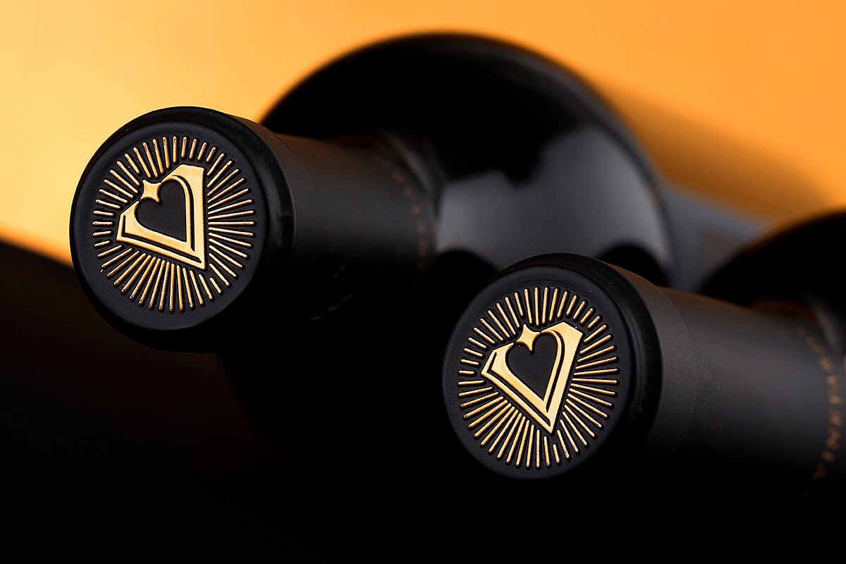
Sealing – We used classic cork sealing with tin capsules branded with the Velis’ new logo on the top. The logo was stamped with gold hot foil and then embossed.
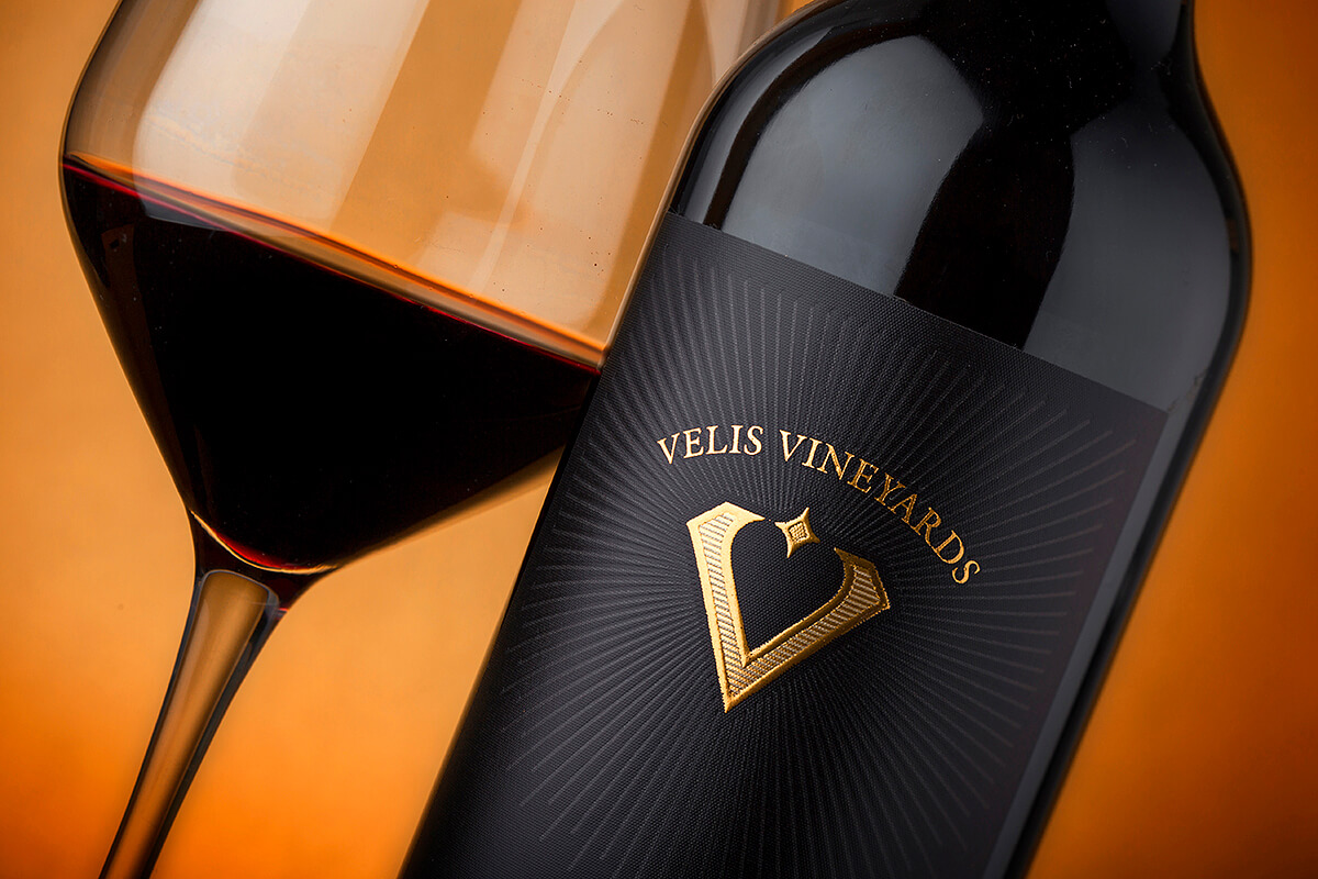
Paper – Like in many other projects I did, I was looking for artistic paper with own character. Arconvert’s Jade Raster was the choice I made because I liked the grainy structure of the surface and the way it looks when overprinted with solid background color.
Print – Jade Raster is one of my all-time top choices so I could say I nearly have no secrets with this paper. I had very unique approach this time because I wanted to print the background with two layers of black ink to get the best black possible from this grainy surface with very specific ink coverage.
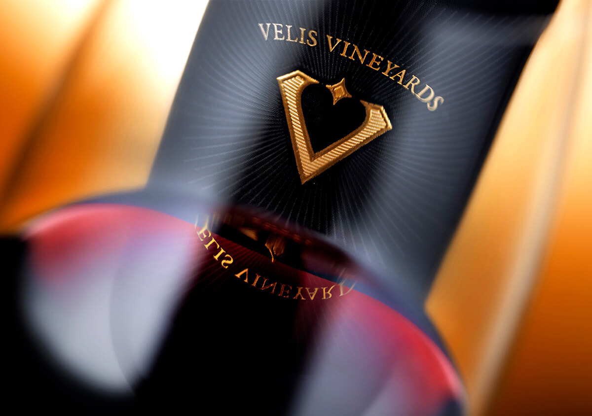
The ‘rays’ around the logo are made with strong debossing effect. The logo in the center is a combination of gold bronze ink, gold hot foil and gold silk foil. In short – double black for the background and triple gold for the logo.
The Result: I find the result very inspiring, classy and even compelling for the end customers. I used strong combination between glass bottle and wine label design using one of the most interesting print techniques to make the whole wine packaging stand out. The details produced by the blend of triple gold on the logo were so many that most of the people literally grab the bottle to touch the Velis’ logo and see for themselves how it was made.
I forgot to mention in the beginning that this project was made for Velis’ top wines and I was really motivated to do my best and create a premium wine packaging design.
CREDIT
- Agency/Creative: the Labelmaker
- Article Title: From Logo Redesign to a Sophisticated Wine Label
- Organisation/Entity: Agency, Published Commercial Design
- Project Type: Packaging
- Agency/Creative Country: United States
- Market Region: Europe
- Project Deliverables: Brand Strategy, Brand World, Branding, Graphic Design, Packaging Design, Photography, Retail Brand Design
- Format: Bottle
- Substrate: Glass Bottle


