


Doctor Paul is a British pharmaceutical brand that specializes in making medicals for children. As they recently entered the Uzbek market, Brand needed a mascot and packaging design, in order to find their auditory and form a positive reputation.
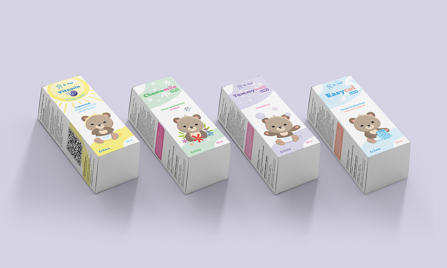
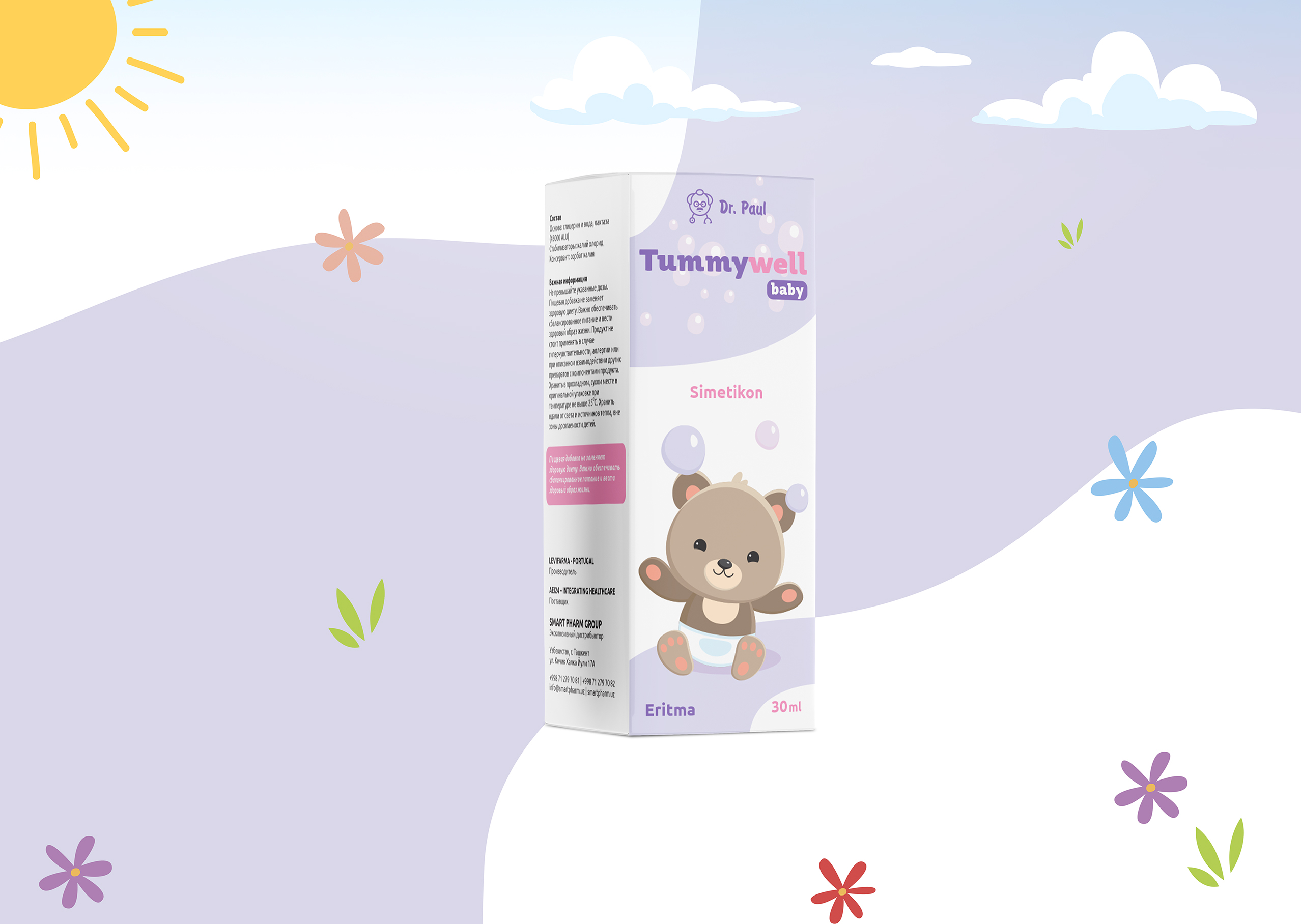
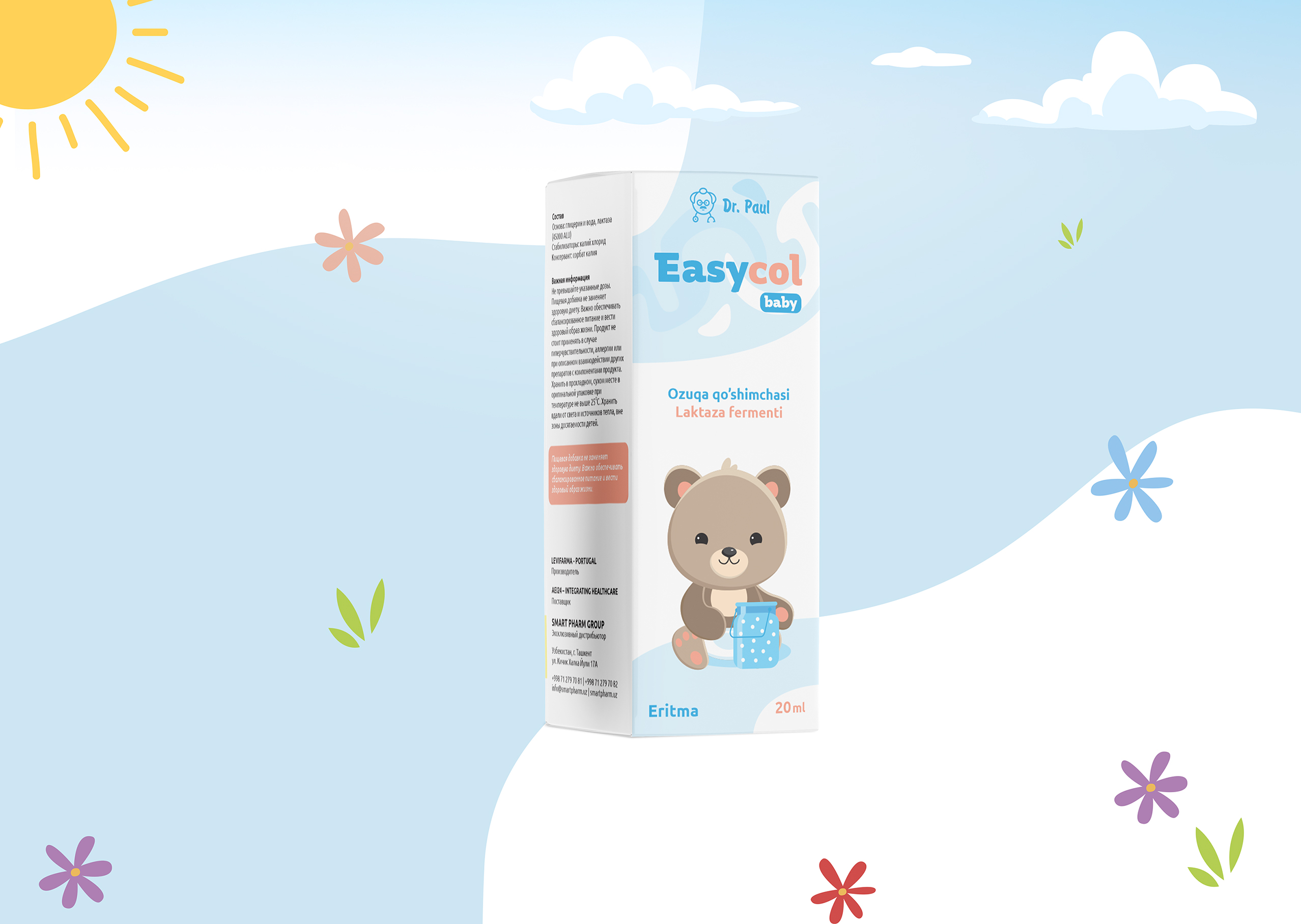
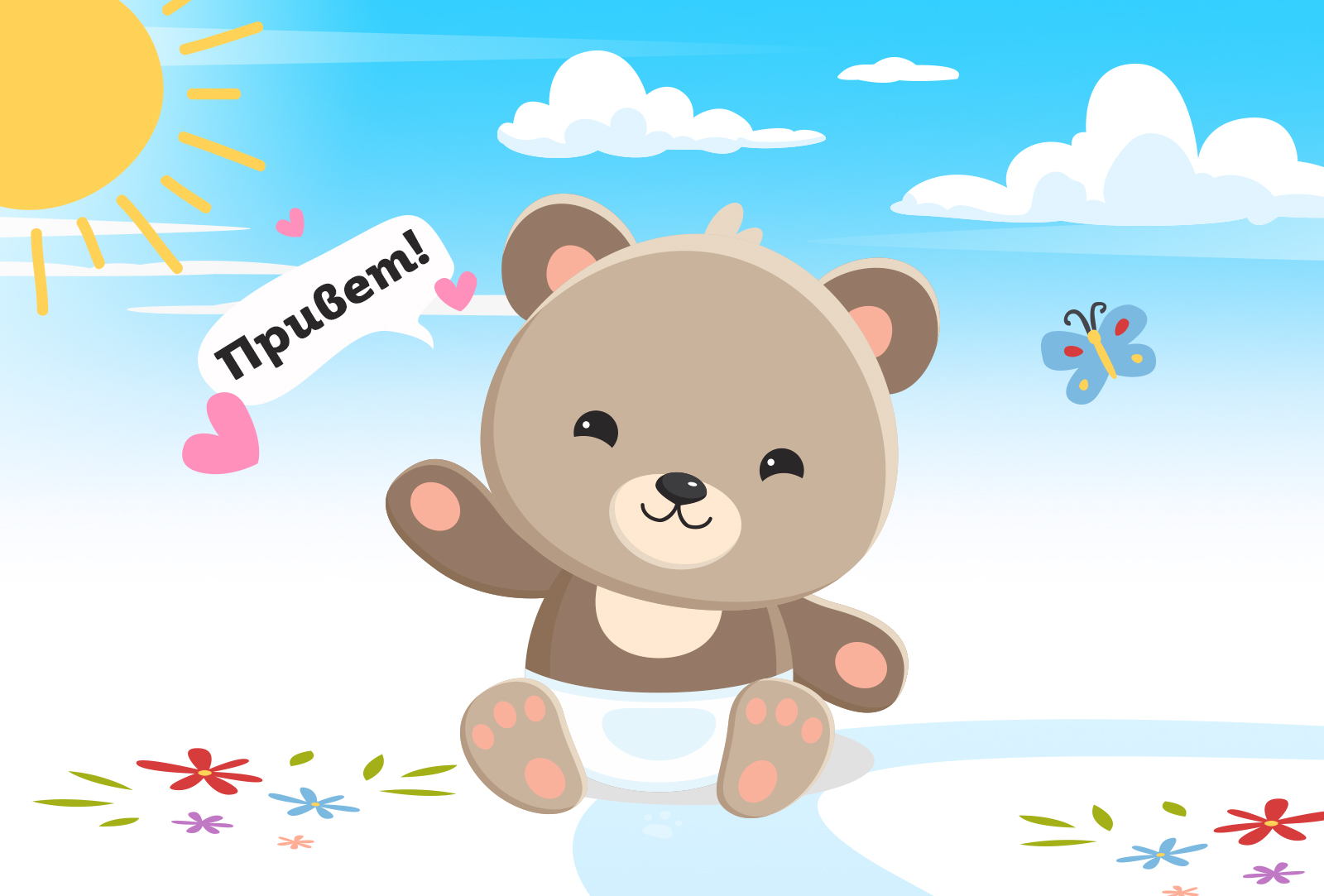
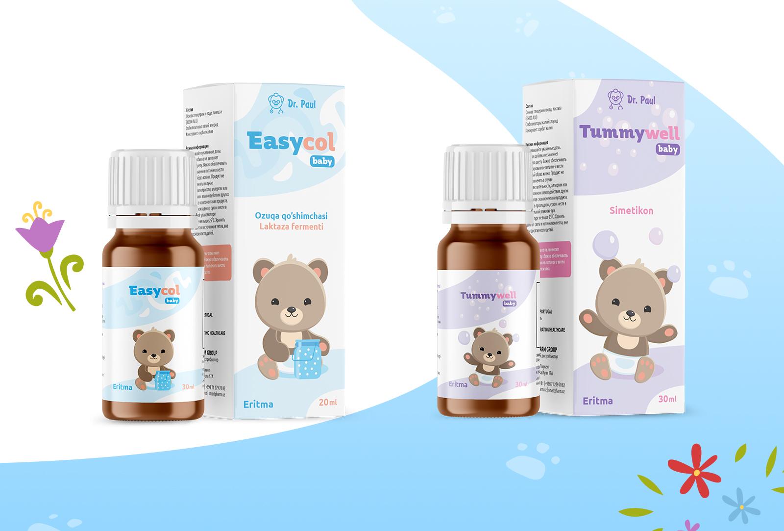
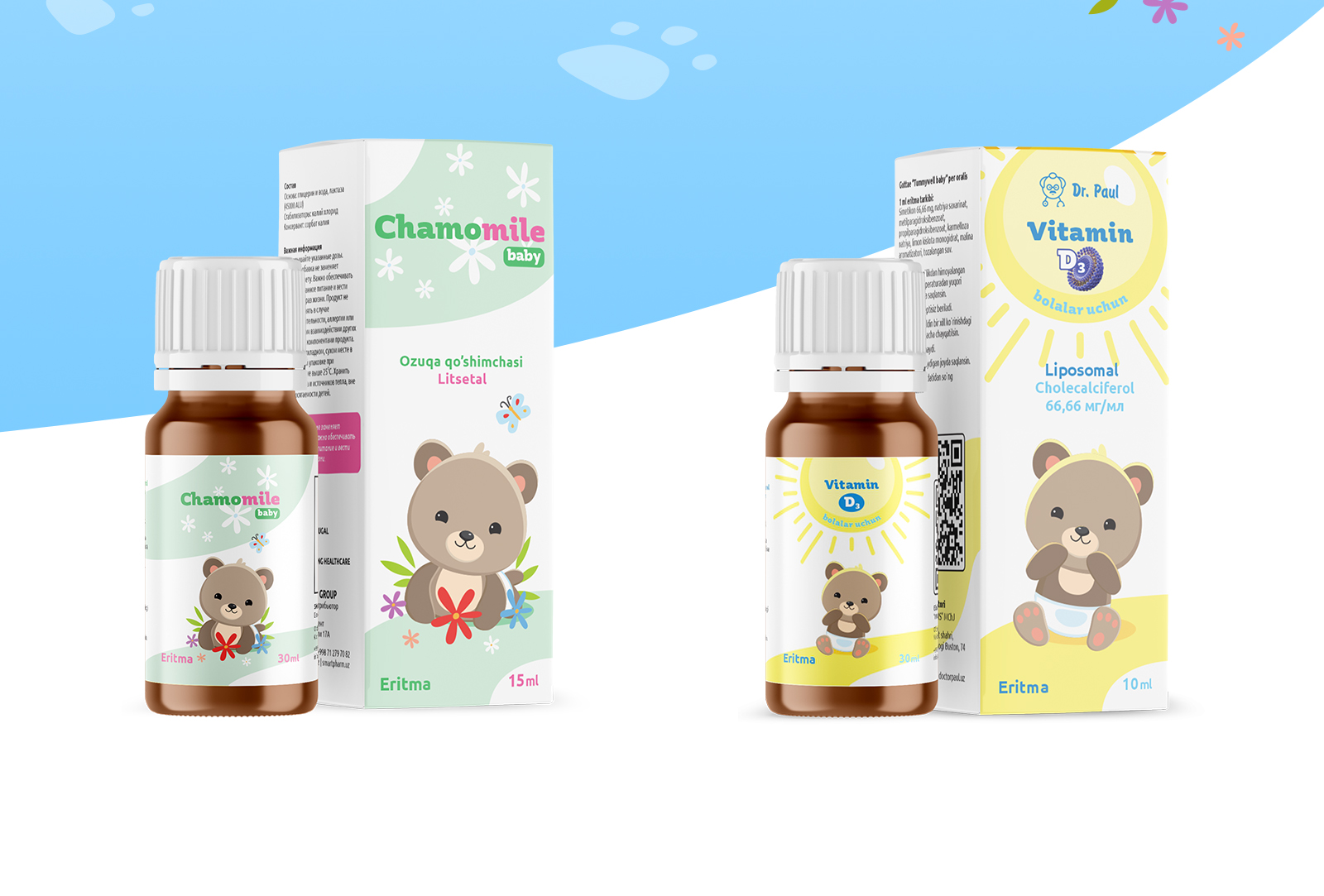
The main task that Brand gave us was making packaging that would be as friendly as possible so that kids did not feel uncomfortable or scared by the medical at first sight. That is why we made the mascot — it helped children to associate the product with a character: a teddy bear, Doctor Paul’s assistant.
The bear wears diapers, never stops smiling, and looks straight at your eyes when you take the packaging. A unique character helped the Brand to stand out among competitors. It showed a child-friendly attitude, that is focused not at parents, but their kids. Another big advantage of having a mascot was a perspective of numerous marketing activities, that one could perform with a teddy bear — cartoon, toys, merchandise and many others.
After finalizing the mascot design, we started making the packaging. Choice of colors was tough — usually, we use bright colors for anything that is made for kids, but this time we had a feeling that it would not be a very good decision. After all, we took the pastel tones, a bit more light, more calm, colors that are not exciting, but cool.
Our job was not done just by creating a packaging design — we also had to form a style of the Brand, that is later used in making instruction lists, booklets, flyers, and others.
As a result, we took three key colors for Dr. Paul: blue, yellow, and violet, all in pastel tones. The main color was blue, as it is associated with something safe, trustworthy, and accessible. Almost all packages of Dr. Paul now are built around this color.
Yellow and violet were used in highlighting some key moments or for a background. Yellow was also used in Detrivel’s packaging as the main color — it is Dr. Paul’s single product for adults in Uzbekistan.
In the end, the Dr. Paul’s case can be a nice example of how one can use mascots and calm tones in the pharmaceutical sphere.
CREDIT
- Agency/Creative: Minim
- Article Title: Friendly Design For British Pharmaceutical Company
- Organisation/Entity: Agency
- Project Type: Packaging
- Project Status: Published
- Agency/Creative Country: Uzbekistan
- Agency/Creative City: Tashkent
- Market Region: Middle East
- Project Deliverables: Packaging Design
- Format: Box
- Substrate: Pulp Carton
- Industry: Health Care
- Keywords: Minim, Uzbekistan, Doctor Paul, Packaging design
-
Credits:
Project Manager: Lazizkhuja Sharipov
Designer: Tokhir Tuygunov
Designer: Alexander Iskandersky
Designer: Mirabbos Zufarov
Copywriter: Said Nazrillayev
Client: Doctor Paul's Medicine LP
Manufacturers: Medio Farm Print LLC


