


El Torrejón is a Spanish family business founded in 1988 that has passed on its efforts and passion for dairy products from generation to generation.
What in its beginnings was a livestock farm with just over twenty animals and the basics to start producing, is today a company recognised for the high quality of its products and its traditional values.
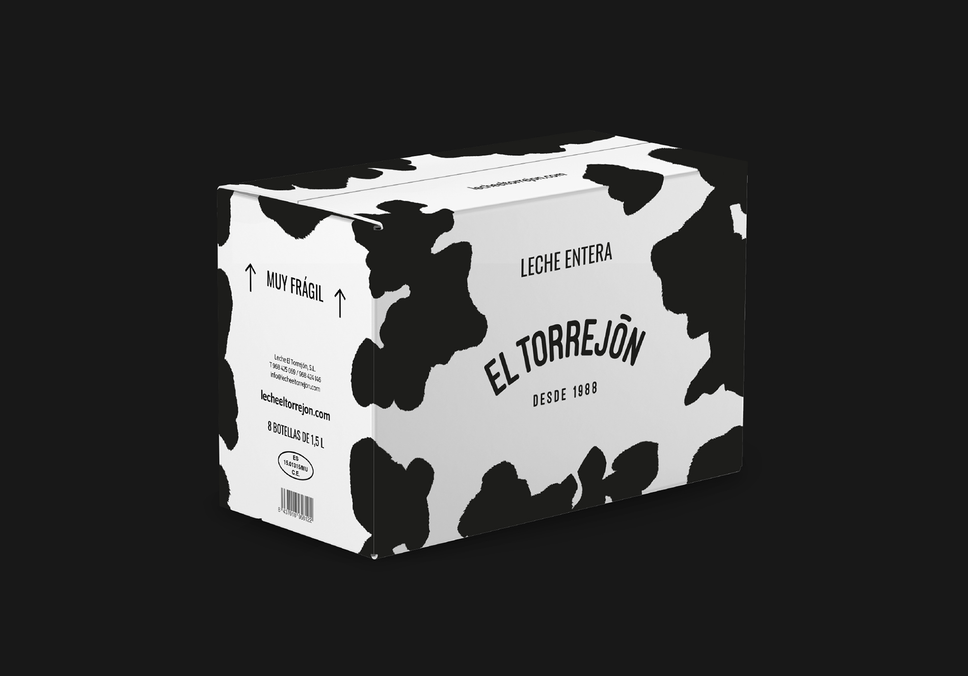
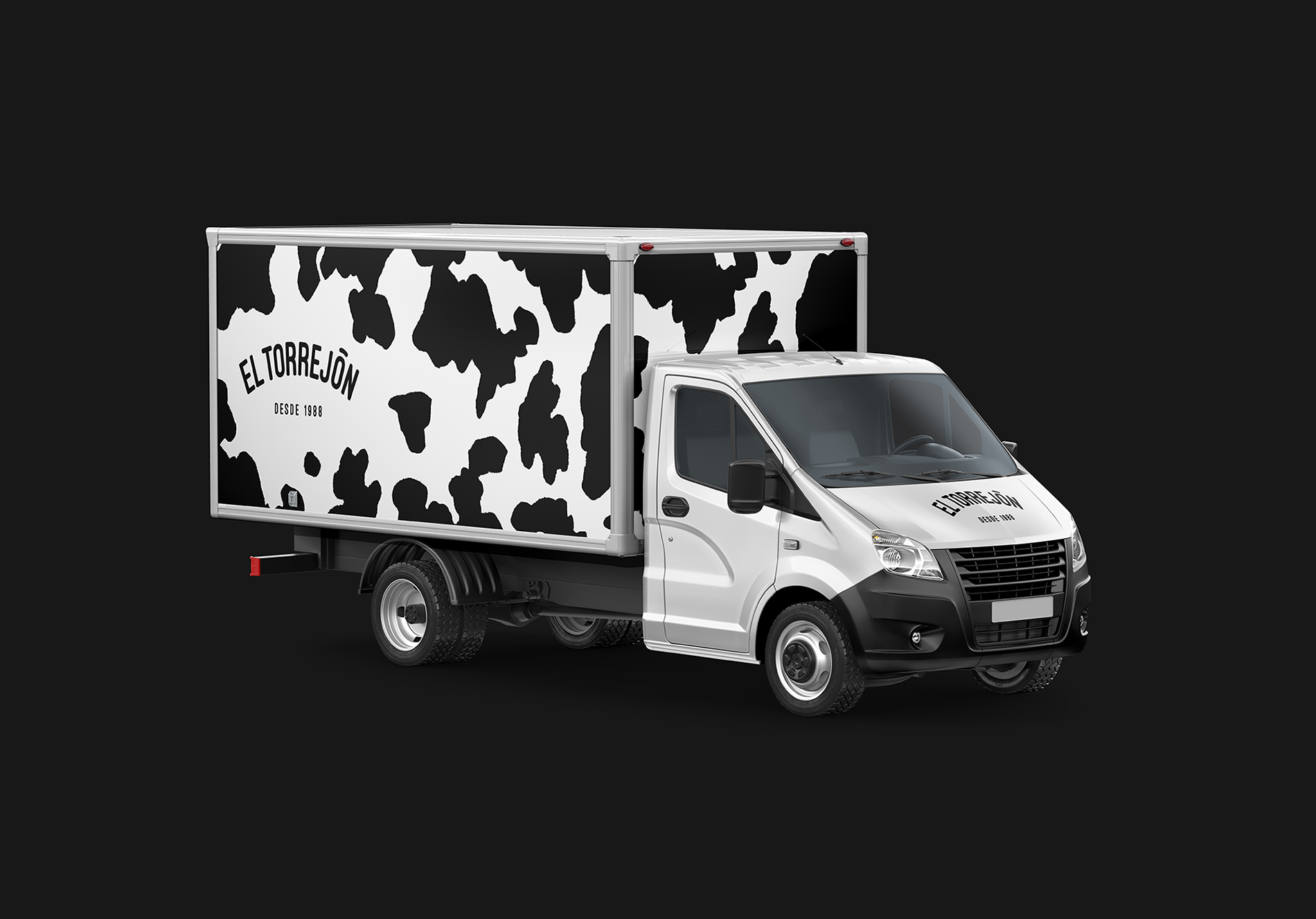
With the aim of positioning the El Torrejón brand on a national level, at bbrand we developed a new branding project and a complete line of packaging (glass bottle, PET bottle, tetrabrik, cardboard pack, box of different sizes) and various applications such as vehicles, work clothes, corporate fences, etc., as well as the design and development of the website.
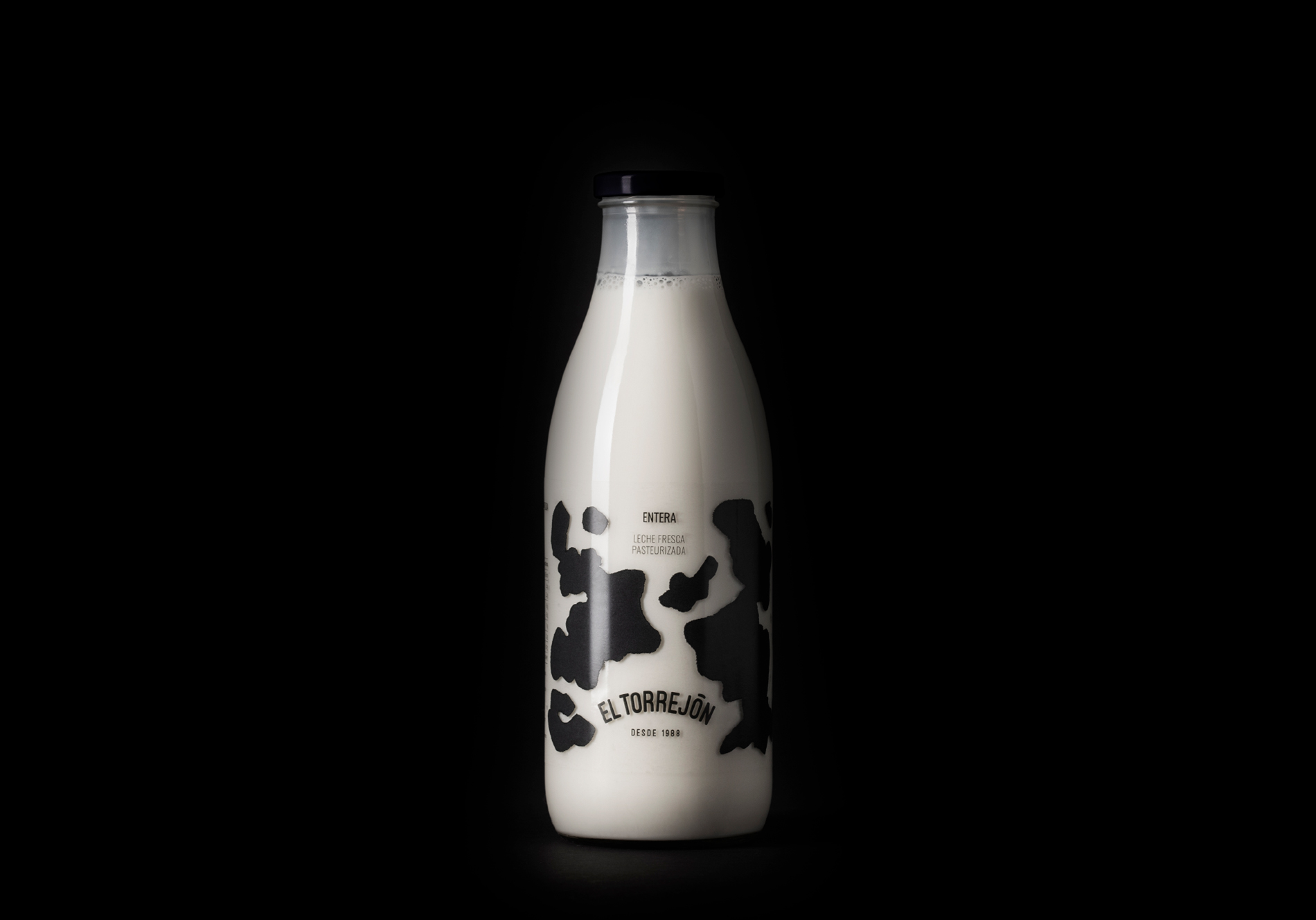
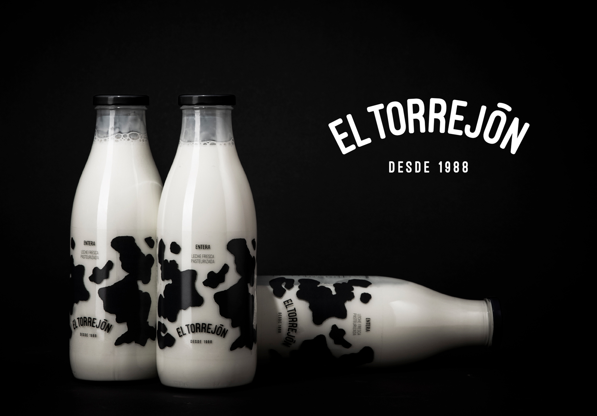
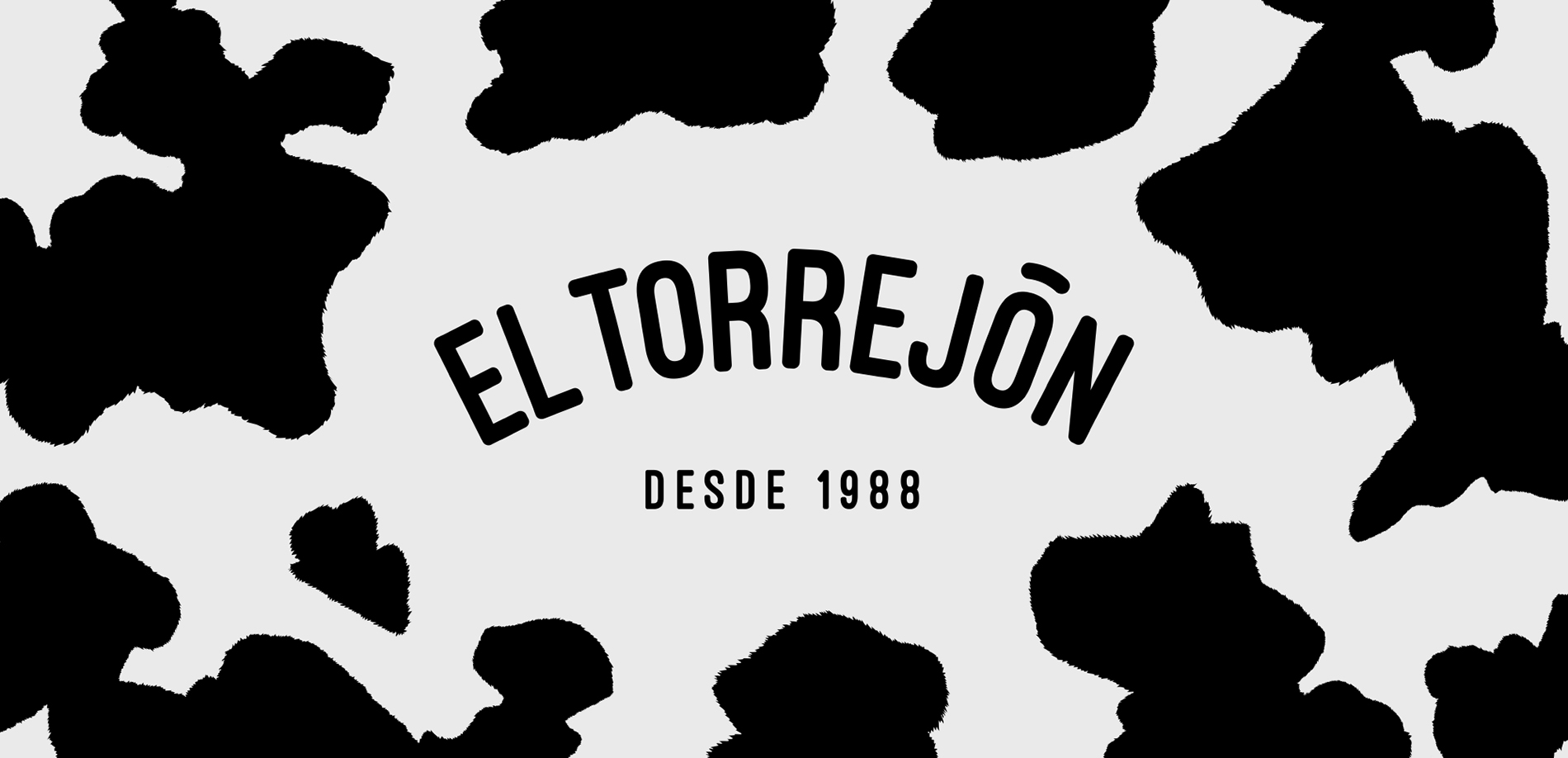
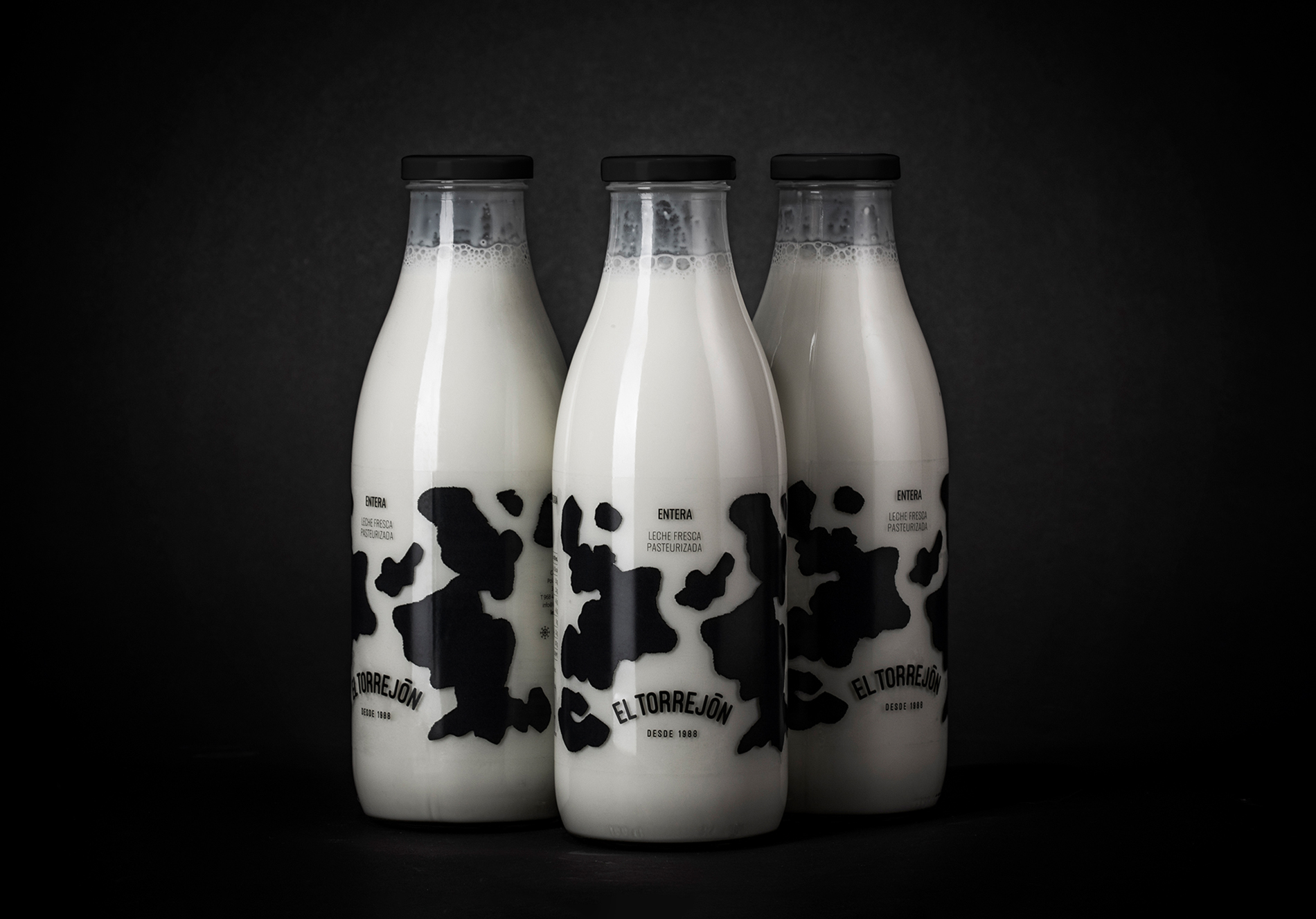
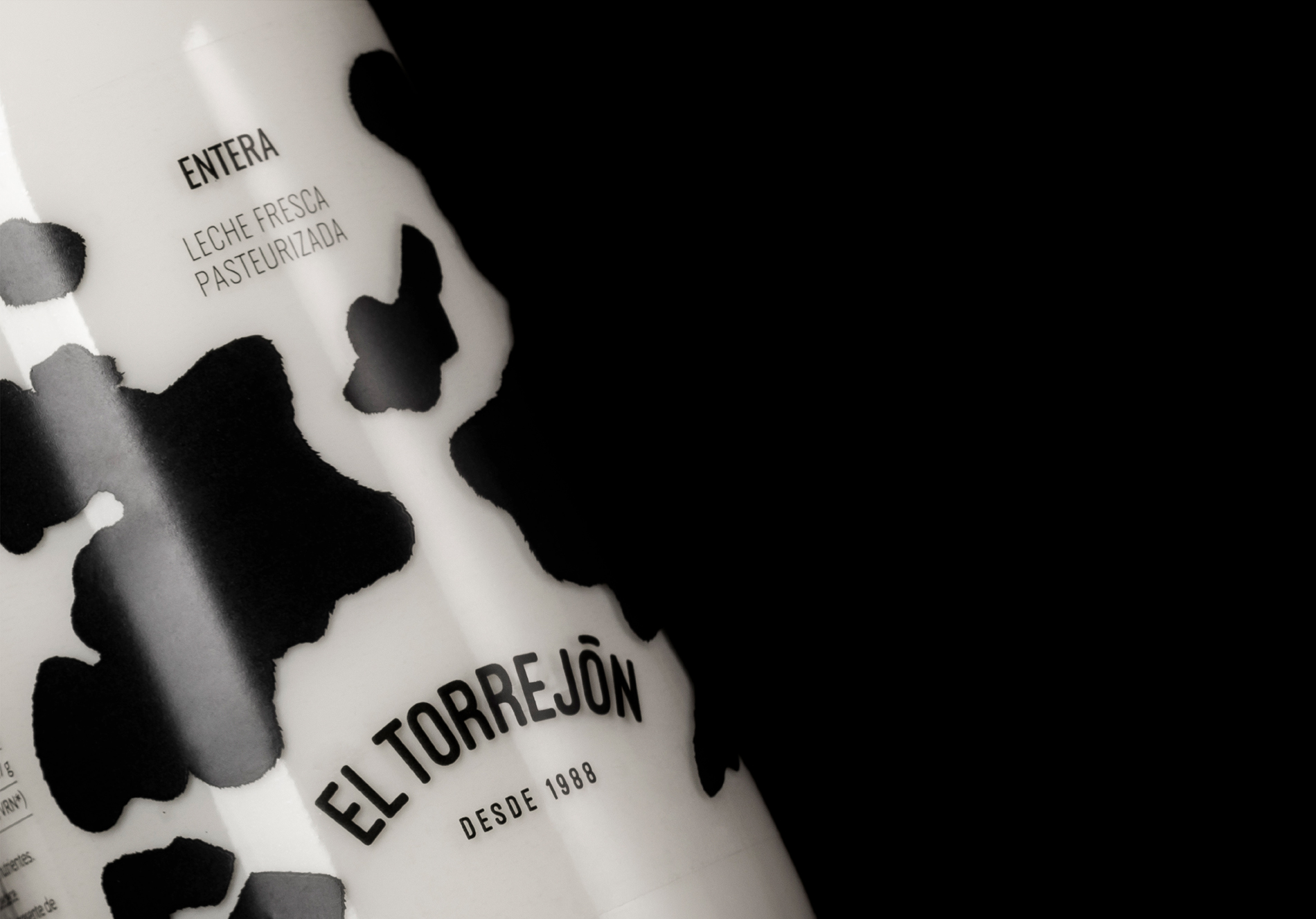
To reinforce the values in the basic elements of the new brand we created the new logo with the “since 1988” tagline, and the “tradition flavour” claim that come along with the logo in different communication media. But the most exciting part of this whole redesigning process was of course the packaging, where the brand is finally visible at the fridges of the supermarket in between its competitors and the only one thing that the consumers bring to their homes.
In order to achieve that ultimate objective, we put all the effort into transfer the company values to the product, and to reach the goal of making a brand-worthy packaging, to match the quality of the product. Using a transparent bottle with the milk itself as canvas, we have resolved the packaging with the characteristic shapes of cowhide. In addition to the basic black design that is the key visual, as appears in the principal media of communication and the gourmet glass bottle, we also design the regular colour code for different varieties of milk such as blue for whole milk, green for semi-skimmed and pink for skimmed milk, since the consumer is strongly used to this codes in the Spanish market.
A simple graphic solution – and yet never seen before – that reminds us of the natural, traditional, quality origin of milk, with the product as the main protagonist. A clean and effective result with high visibility on the shelf among its competitors.
CREDIT
- Agency/Creative: bbrand
- Article Title: Fresh Milk Packaging and Brand Design for El Torrejón by bbrand
- Organisation/Entity: Agency, Published Commercial Design
- Project Type: Identity
- Project Status: Published
- Agency/Creative Country: Spain
- Market Region: Europe
- Project Deliverables: Brand Architecture, Brand Rejuvenation, Brand World, Branding, Packaging Design, Product Architecture, Research / Insight
- Keywords: Milk, Packaging, Torrejon, Cow, Dairy, Glass, Black&White


