


London, 13th September 2021: Creative agency Free The Birds reveals its latest project for global life sciences company Bayer: revitalising its effervescent drink and vitamin tablets Berocca to strengthen its market position.
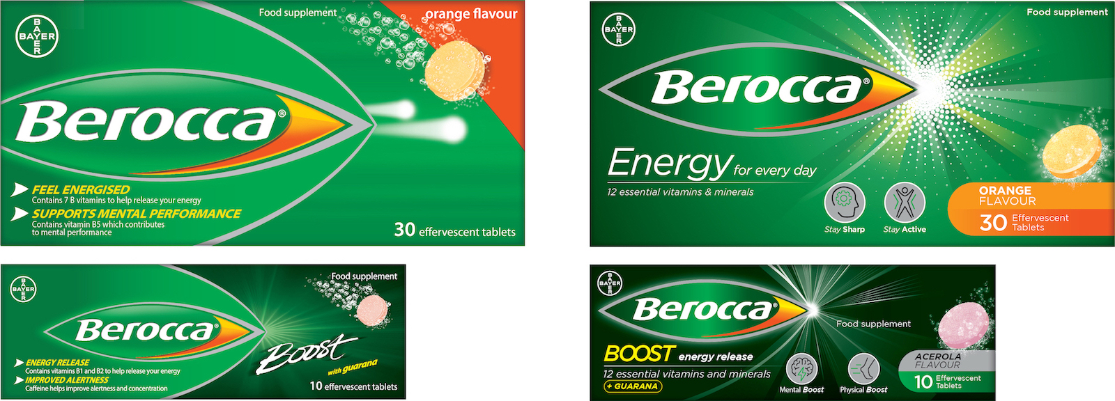
Established in 1969, Berroca has become one of the most popular vitamin brands, but the previous packaging design did not clearly communicate the product’s level of efficacy. Free The Birds, therefore, took the challenge of refreshing the brand identity for the consumer health market and elevating its new brand purpose globally. The design agency updated and created a cohesive global packaging design to reiterate the brand messaging “The Spark to Positive Energy” across the full Berocca portfolio.
The new branding, typography, iconography and improved colour palette aligns the full portfolio under a consistent communications umbrella that further reflects the brand’s new positioning. The newly introduced dual benefit icons and “What is Berocca For” section resolves previous ambiguity around the product’s health purposes and aid consumer navigation on the shelf. By redesigning the back of the pack and adding a specific layout for the ingredients, Free The Birds made the scientific aspects of Berocca more accessible and promoted the solid clinical evidence that the product works.
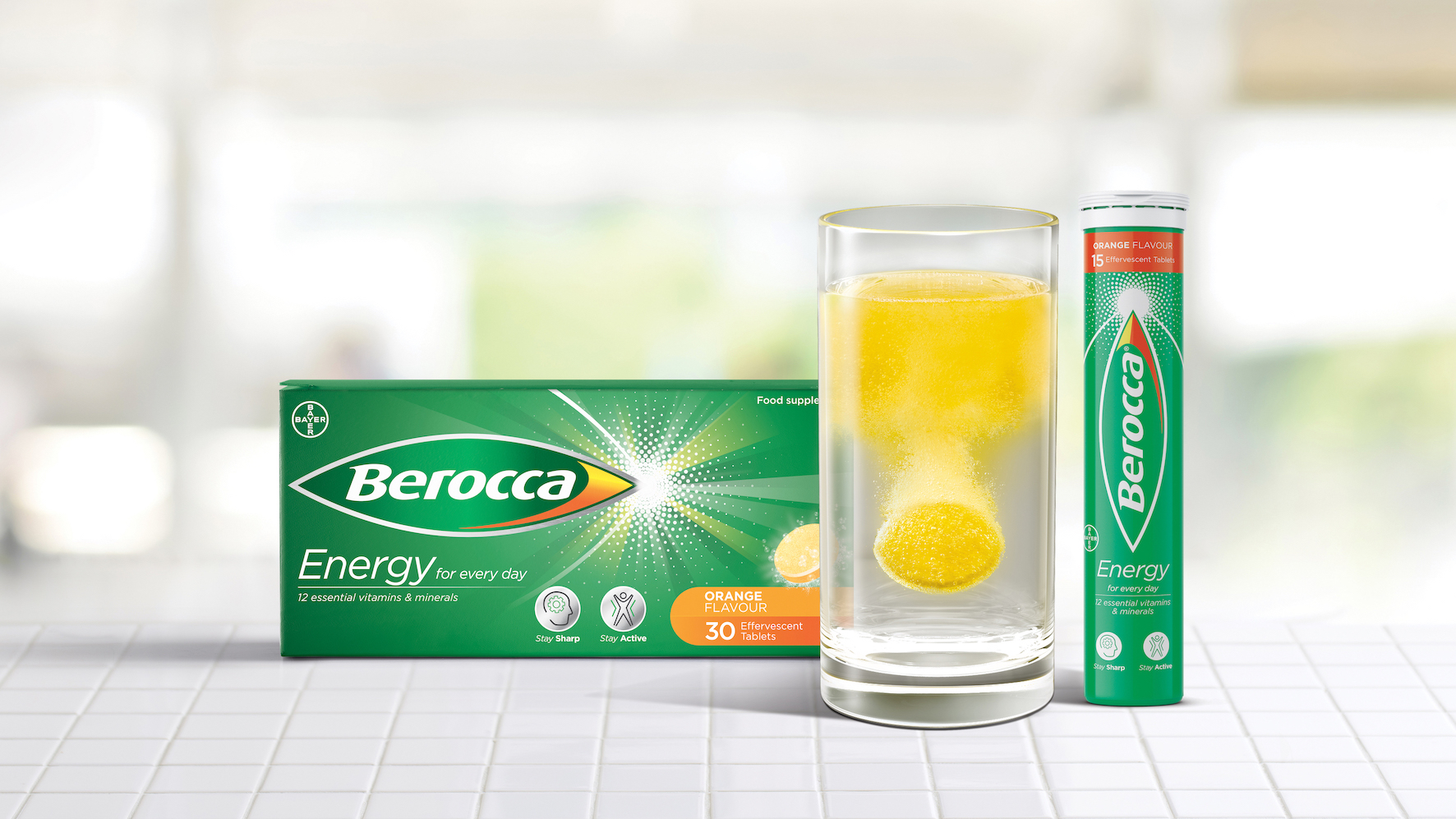
The brand identity has been re-energised to fully embrace and bring to life the brand purpose and character. The original Berocca bullet has evolved into a more modern, confident device that holds the brand name on the pack and has a stronger authority and brand presence on the shelf. An energy burst symbol has been added alongside the logo to resemble the product’s health efficacy.
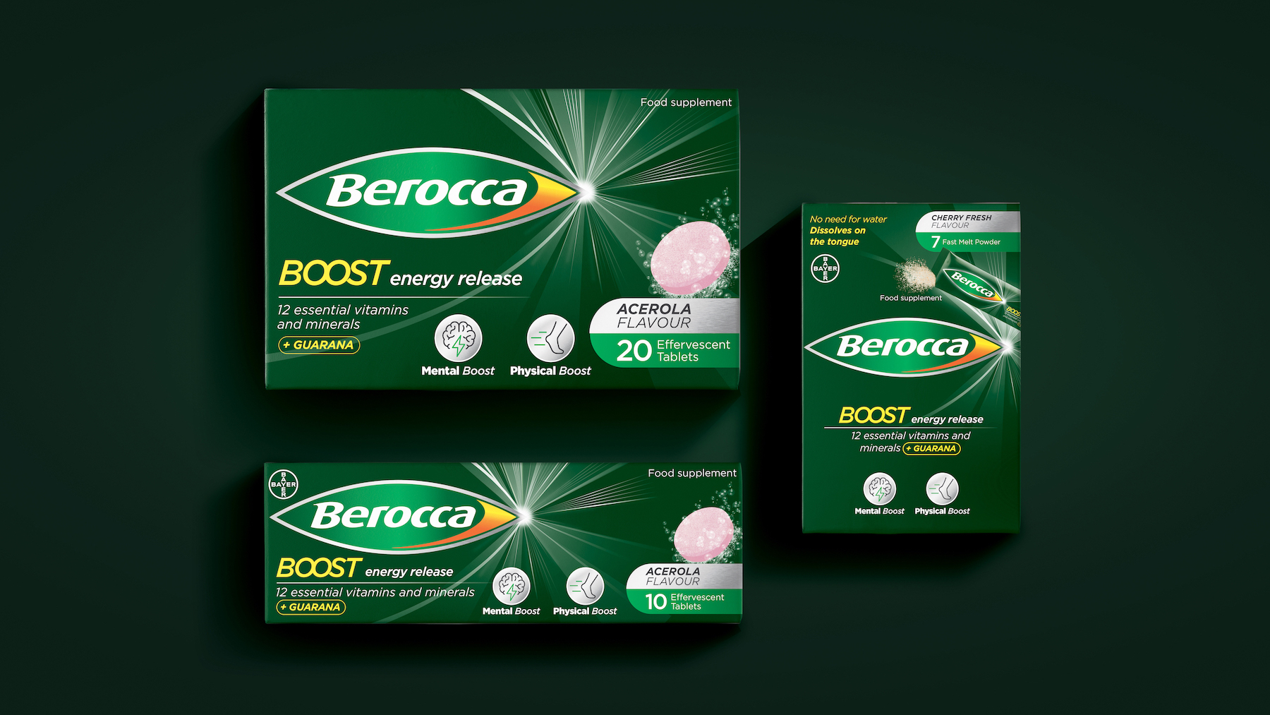
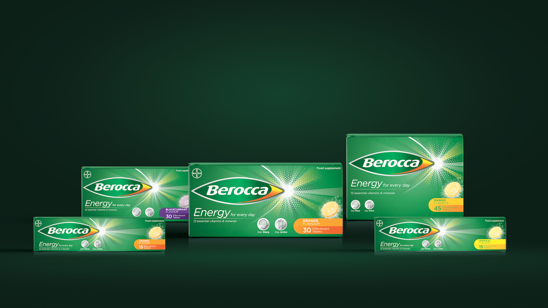
The colour palette was improved across the portfolio to ease navigation: primary Berocca colours (yellow, orange, light and dark green, silver, black) define the Energy and Boost ranges whereas the flavour colour palette differentiates the lozenges across the portfolio.
Free The Birds also created bespoke galenic illustrations on packs to clearly communicate the benefit of each product and the iconic Berocca fizz moment, which is a key asset for the brand.
All of the new brand assets are also used on the brand’s website and social media, keeping the branding consistent across all platforms.
Nick Vaus, Partner and Creative Director from Free The Birds commented: “Berocca is a heritage brand that you can spot in almost every household. As such, the new brand identity had to retain the existing brandmark, but elevate its positioning on the consumer health market. The new global cohesive design framework stands out on the shelf and emphasizes the brand’s key messaging around positive energy.”
Chris Padain, VP Head of Design & Packaging from Berocca added: “Our brand needed a refresh in order to further engage the consumers, who are putting self-care and wellbeing at the forefront of their shopping experience. Free The Birds has been an excellent partner to our brand journey and has reinforced our product benefits on the pack, whilst remaining consistent with our legacy.”
The new branding and packaging for Berocca has been rolled out in the UK and France as key regions and will be available across 70 markets in the coming years.
CREDIT
- Agency/Creative: Free The Birds
- Article Title: Free The Birds Refreshes Berocca’s Identity to Spark Positivity
- Organisation/Entity: Agency
- Project Type: Packaging
- Project Status: Published
- Agency/Creative Country: United Kingdom
- Agency/Creative City: London
- Market Region: Europe
- Project Deliverables: Brand Redesign, Brand Rejuvenation, Packaging Design
- Format: Box, Tube
- Substrate: Plastic
- Industry: Health Care
- Keywords: Free The Birds, Bayer, Berocca
-
Credits:
Partner and Creative Director: Nick Vaus


