


Founded in 2010, r insights research agency offers a full-cycle of market and social research services based on international quality standards.
Building on traditional research methodologies, they simultaneously harness innovative approaches to provide solutions that meet their clients’ needs.
They rely on quantitative methodology to assess incidence of patterns, and apply qualitative methods to deep dive into unique cases, human stories and lifeworlds.
They strive to have a meaningful impact on institutions and the lives of citizens by providing valuable research findings and actionable recommendations.
The company approached us to create a brand identity that reflect their values.
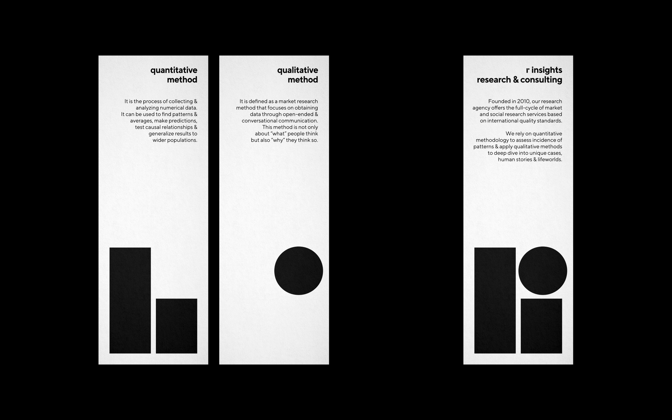
Quantitative methodology is a data collection method that gathers and analyzes information from large numbers of respondents, while qualitative methodology study seeks to convey individuals’ thoughts and feelings that might affect the way they behave.
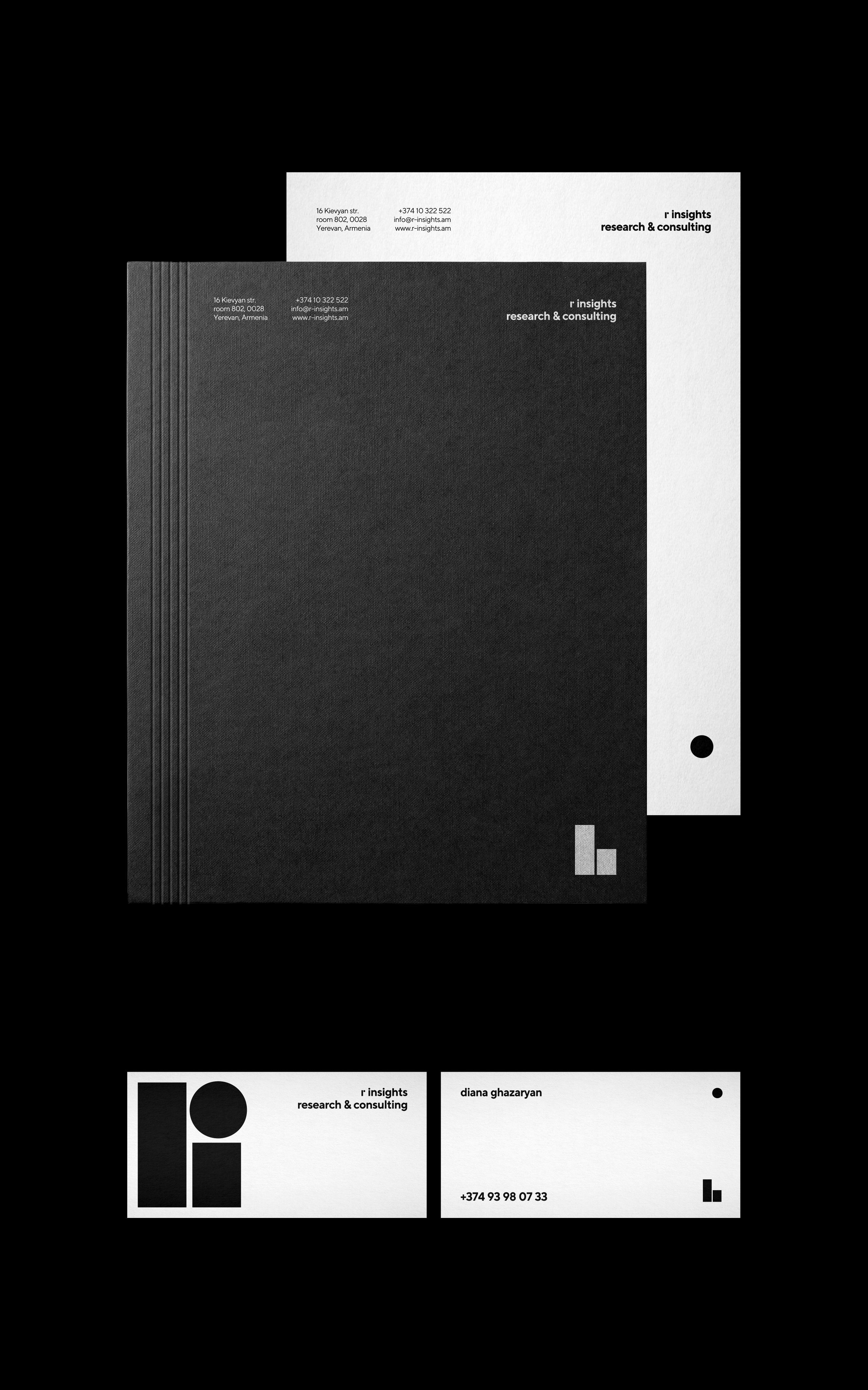
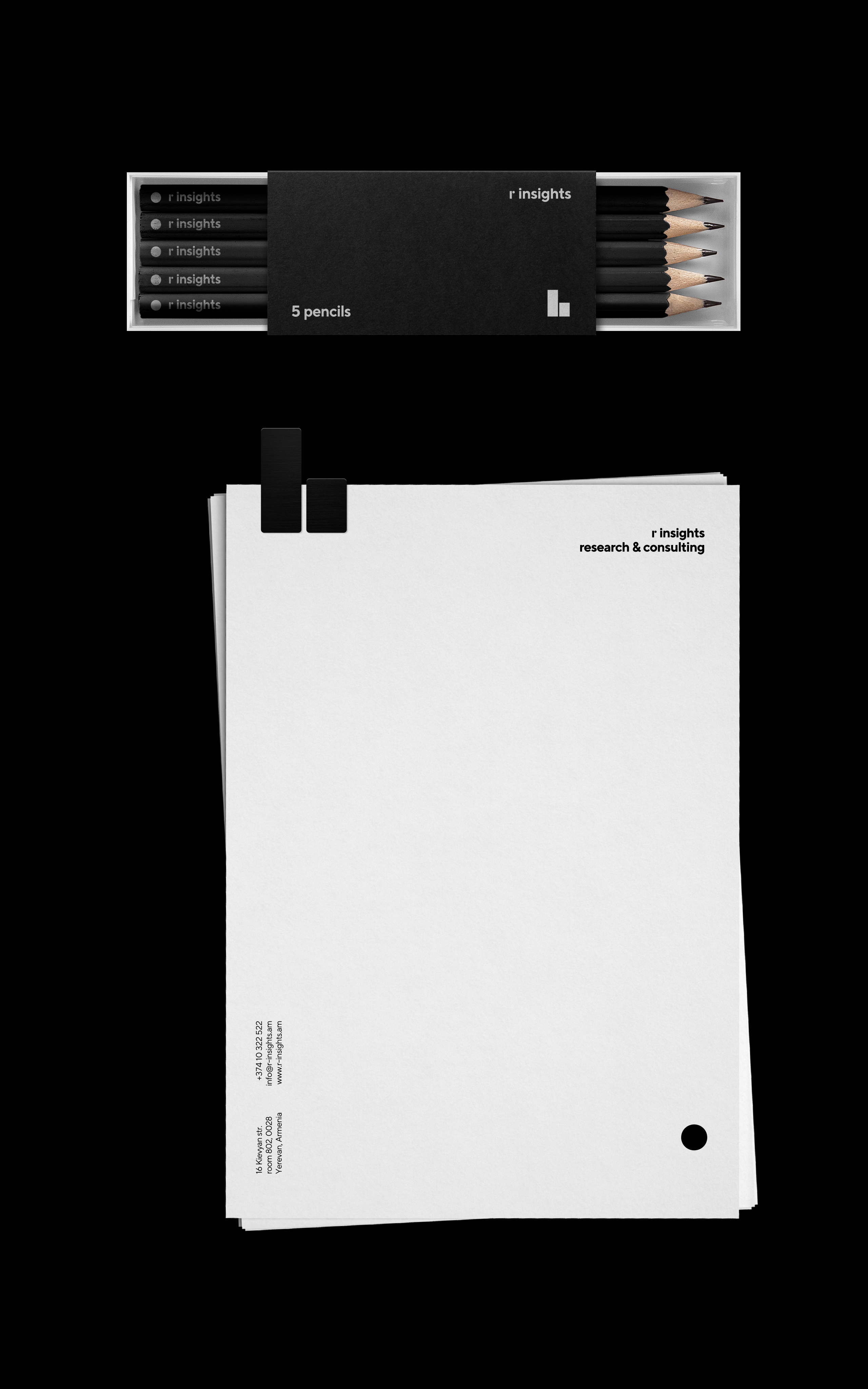
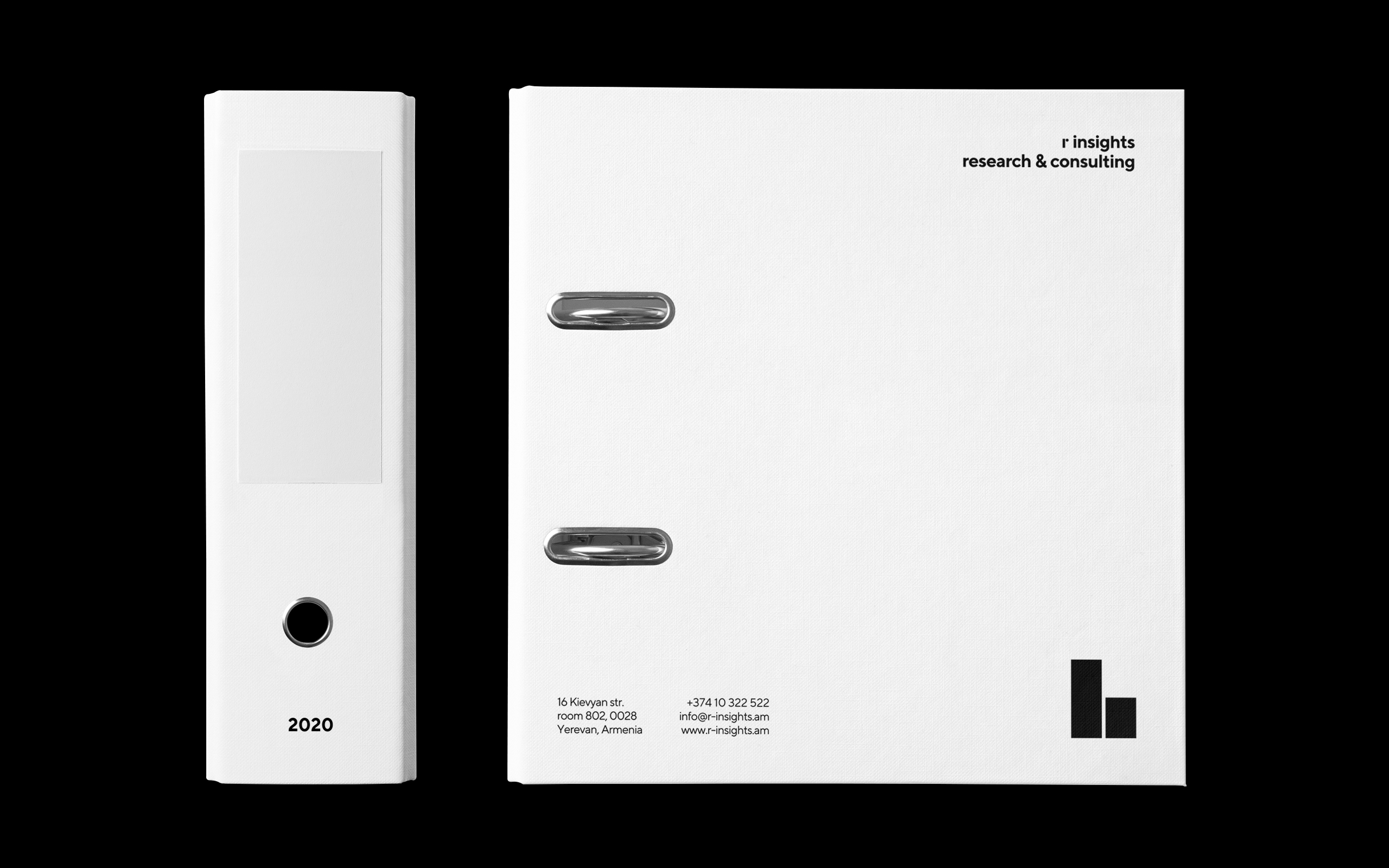
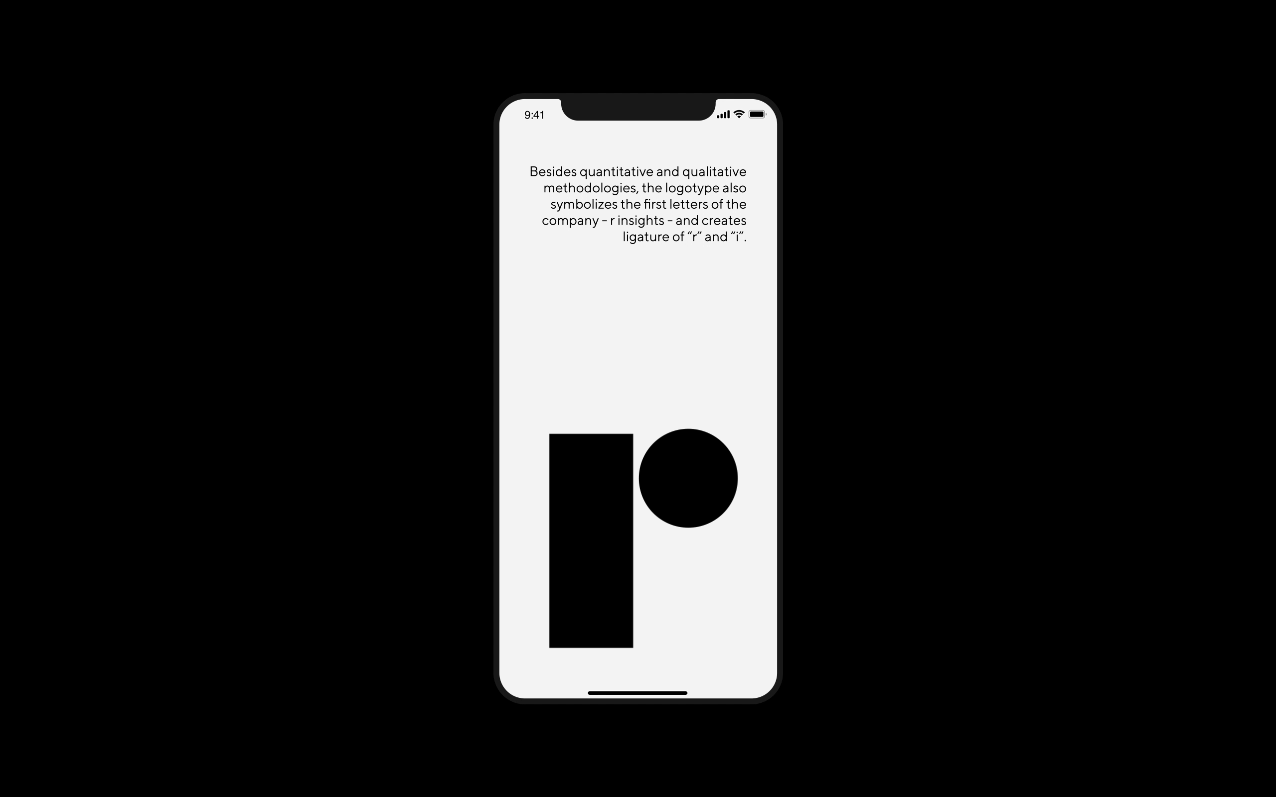
These methods on their turn become core elements in our identity and logotype. The logo consists of two lines and a circle, where two lines stand for quantity and circle stands for quality. Depending on the stationary, the logo can be divided into two parts.
For example, on a business card, a circle stands next to the name, because name is qualitative and two lines accompany a phone number, because it is quantitative. The concept is reflected in other stationery as well.
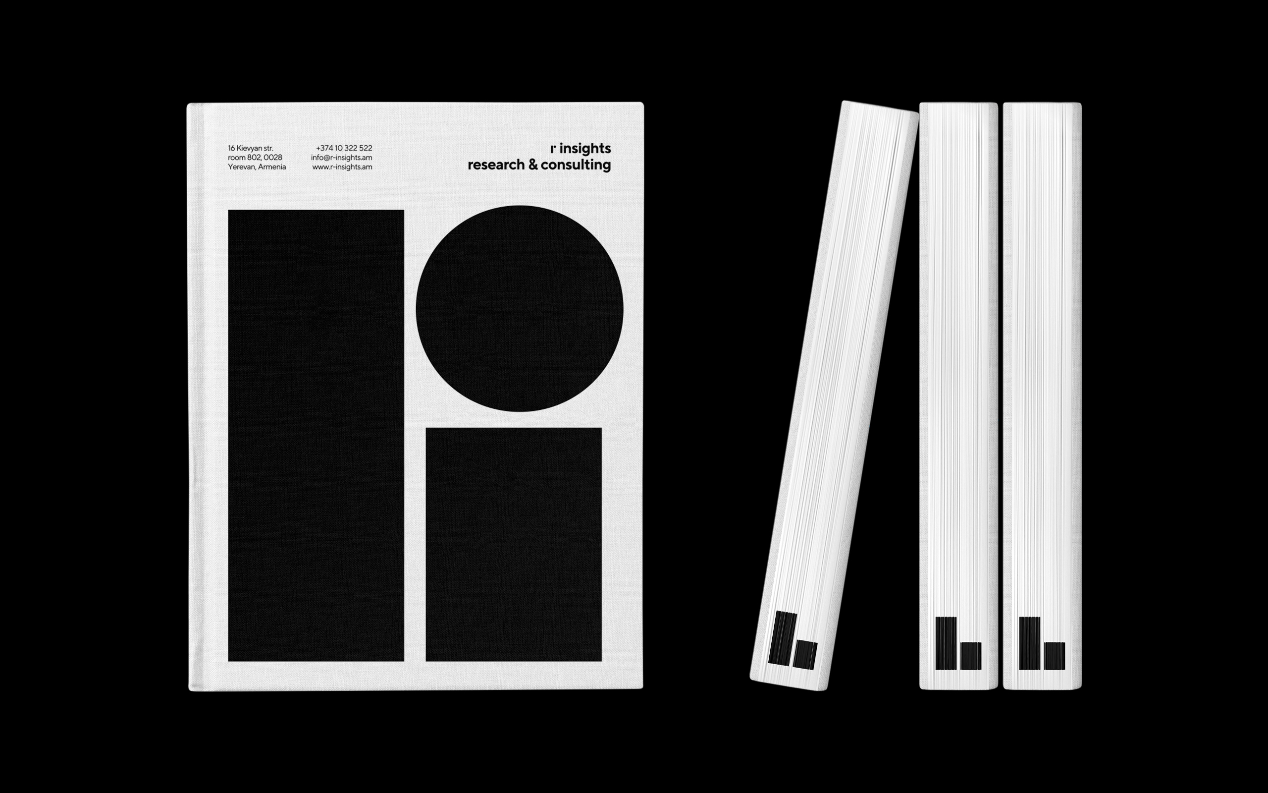
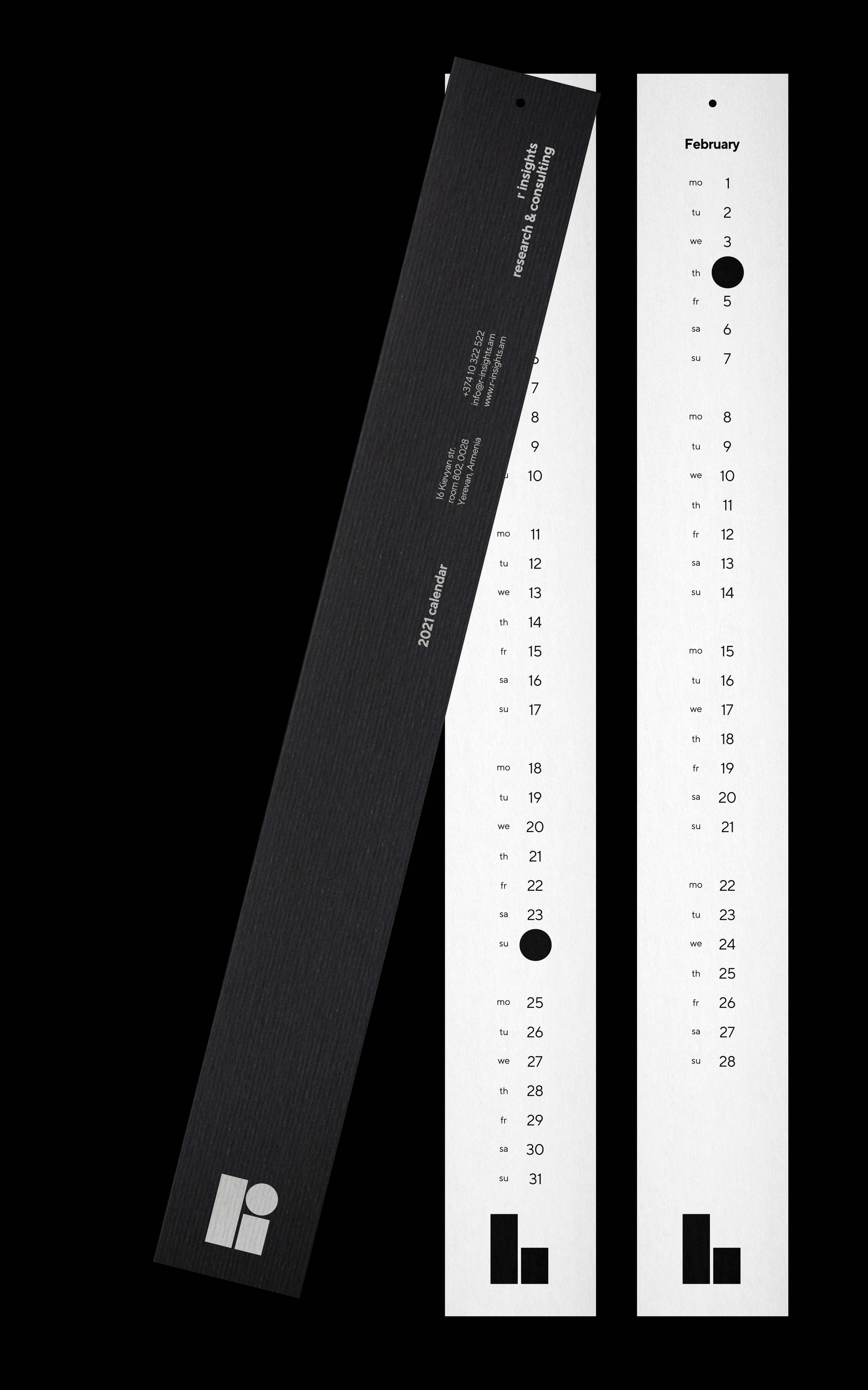
For example, the same logic has a notebook. It is made of pages, which people use as a canvas to express their ideas and thoughts, that’s why each page features a circle on its corners, but together they are all quantitative, hence the lines on the cover.
Besides quantitative and qualitative methodologies, the logo also represents the first letters of the company — r insights — binding them together and creating an environment in which they can coexist perfectly, merging to finally reveal the symbol of the company.
CREDIT
- Agency/Creative: formascope design
- Article Title: Formascope Design Help Research Agency Communicate Methodologies As a Core of Their Brand Platform
- Organisation/Entity: Agency, Published Commercial Design
- Project Type: Identity
- Project Status: Published
- Agency/Creative Country: Armenia
- Market Region: Europe
- Project Deliverables: Brand Guidelines, Brand Identity, Brand Redesign, Branding, Graphic Design, Identity System, Photography, Rebranding, Research, Tone of Voice
- Industry: Information
- Keywords: WBDS Agency Design Awards 2022/23


