


Client: Finhay is the leading smart application in Vietnam for small and medium investment – accumulation. With diversified and breakthrough personal financial products on digital platform, financial transparency and strong technology platform, Finhay helps users to accumulate and invest flexibly from small capital to build assets and protect the future.
Starting from a completely new model in Vietnam, after nearly 4 years of continuous efforts, Finhay has now received the trust of millions of users. Following that success, Finhay believes that, with the determination of Finhay members and the trust of users, together making finance simple and easy, anyone has the opportunity to invest and accumulate with Finhay.
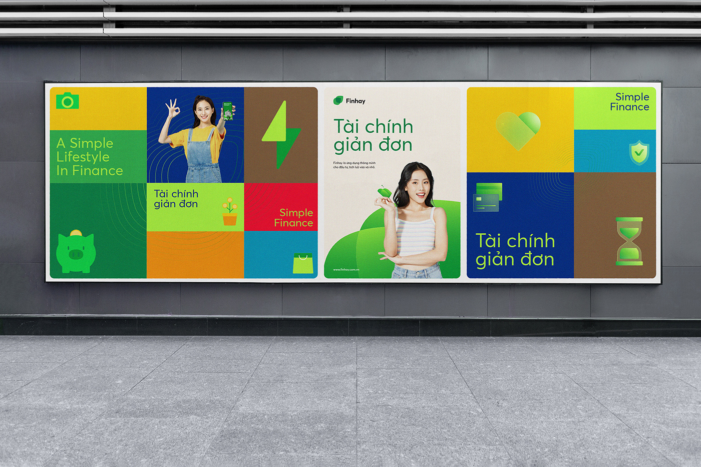
Finhay represents a simple, positive and optimistic lifestyle. Appreciate sustainable values for users and help them have a stable financial health.
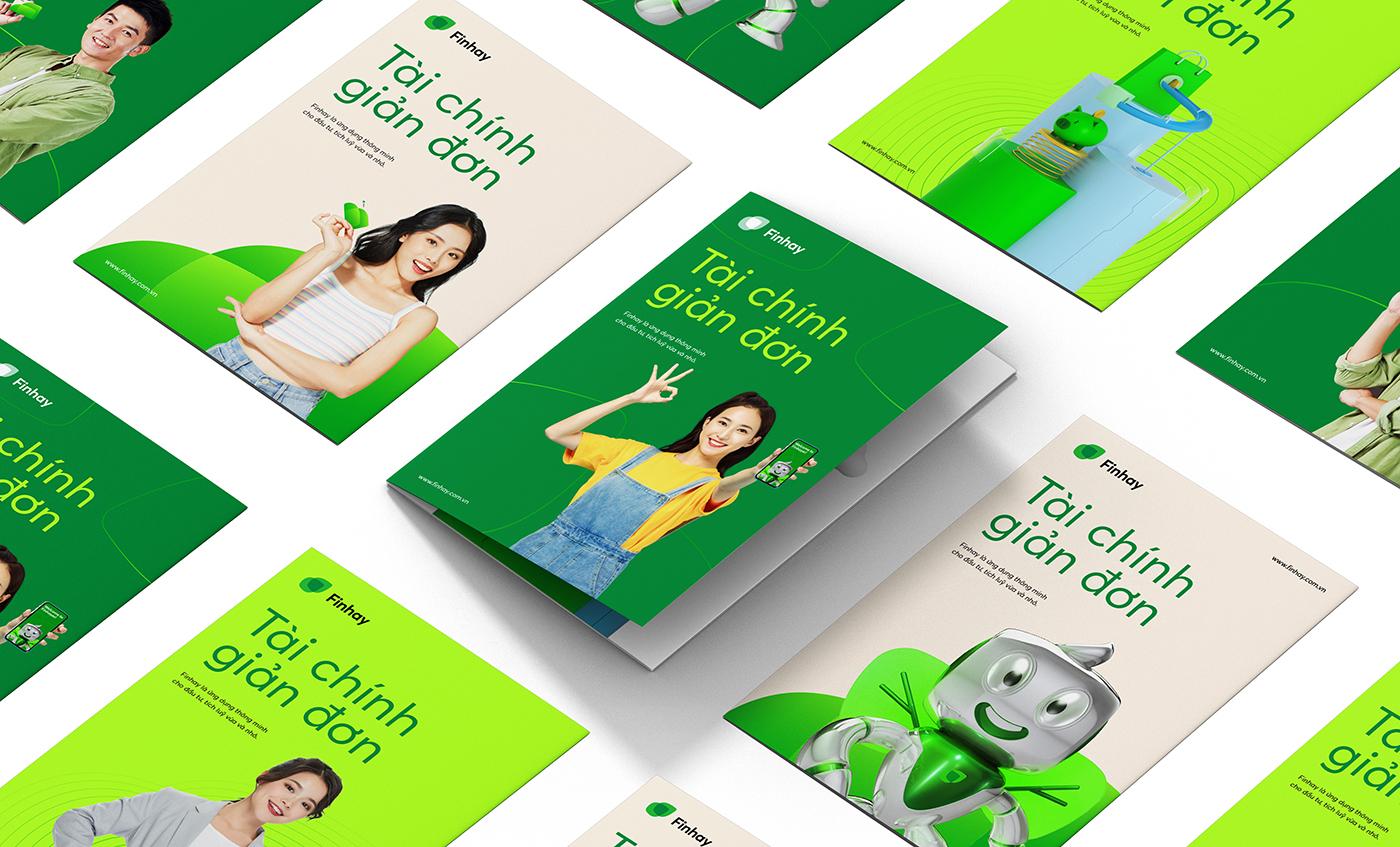
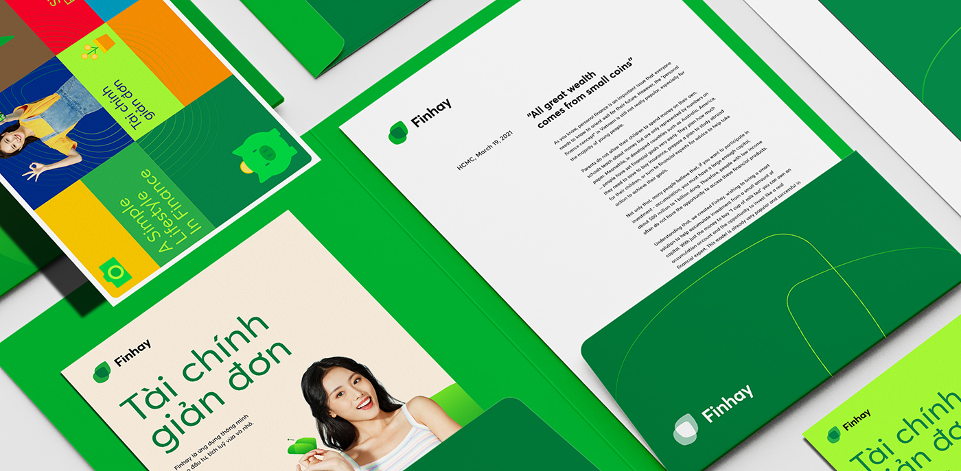
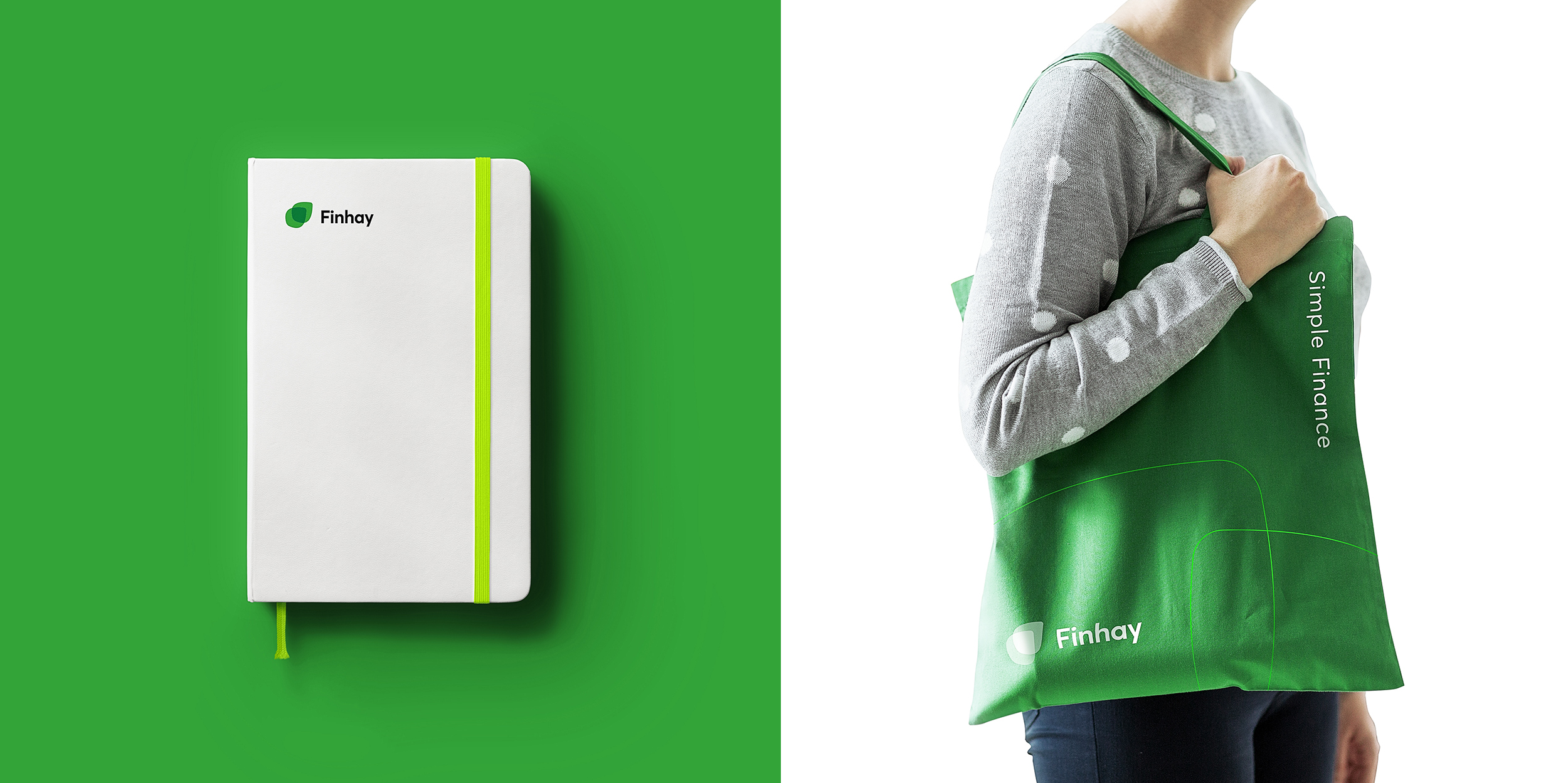
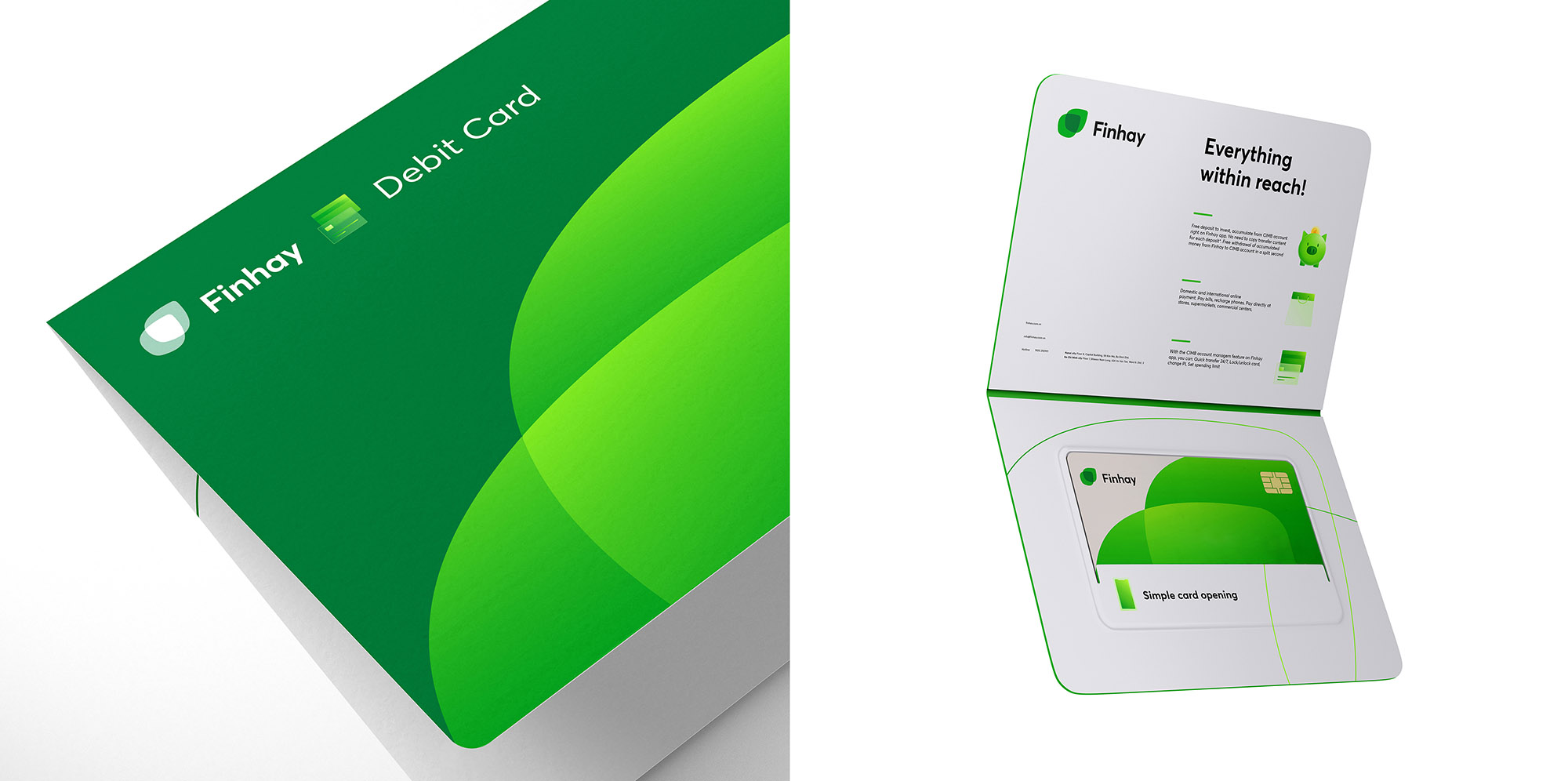
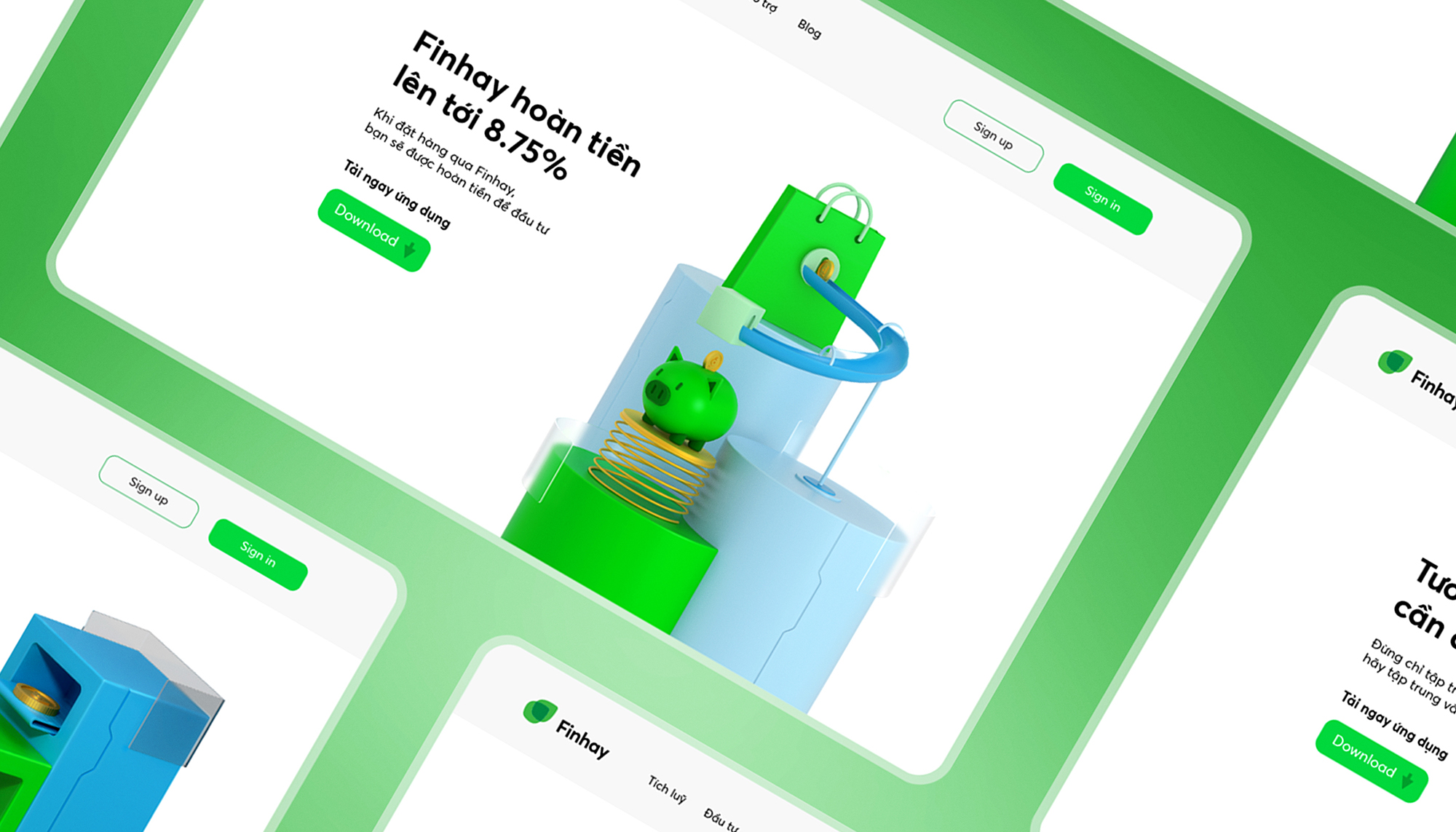
Objective: From the Big Idea “Simple Finance” to build a new visual identity system based on Finhay’s existing identity elements. The visual identity system must be linked, simple, flexible, transformative and impress users with many application cases, especially on the Digital platform.
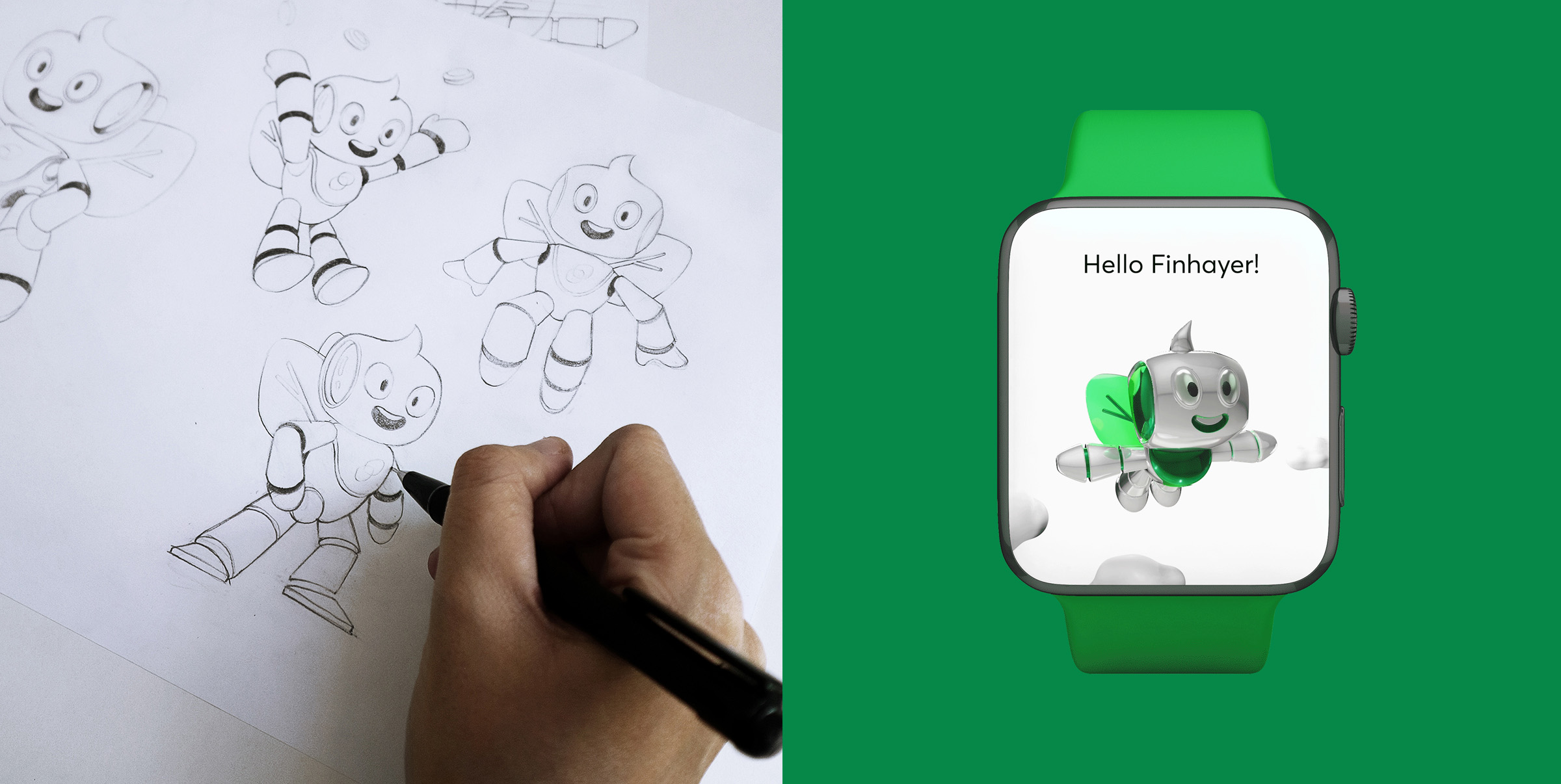
Visual Concept: In the context that Finhay’s target audience is the young generation, almost all of them are very vague in a variety of information and financial services. When you are aware of your financial problems and have a need to accumulate or invest, you do not seem to know how to start and who to trust? Because of that, Finhay will be likened to a light that opens the way for young people who are confused in their financial problems to follow. The green light that brings hope and luck will create confidence and optimism in the minds of young people, all questions about financial issues and services will be answered by Finhay.
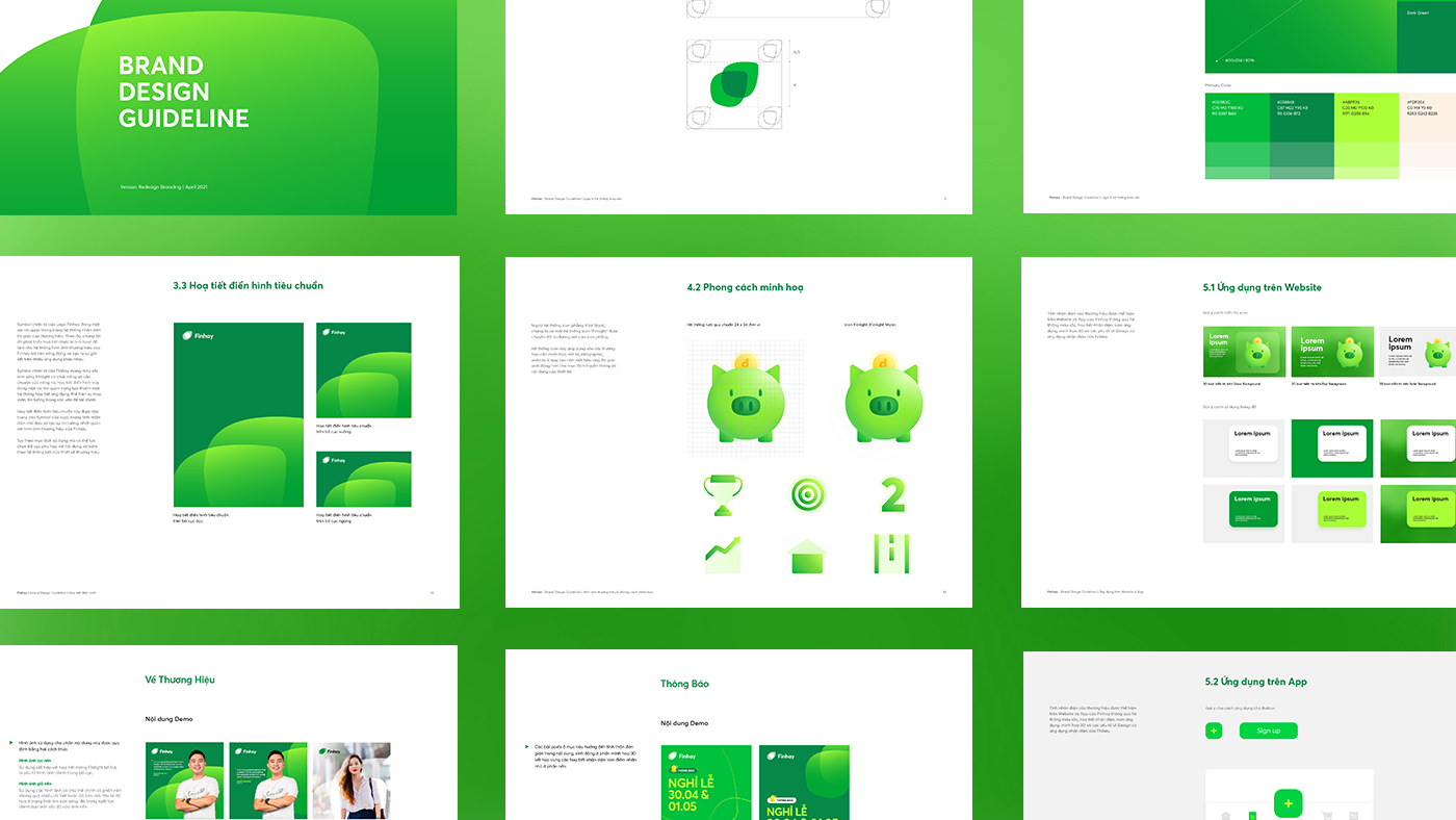
Solution: From Finlight concept, we create a transformative brand visual system based on 4 elements: Standard, Connective, Converging and Spread. These elements are illustrated through the visual system based on Finhay’s logo has been refreshed with a gradient green color system, giving the brand visual a new look, simple, flexible but still impressive.


CREDIT
- Agency/Creative: InSpace Creative
- Article Title: Finhay Visual Identity Designed by InSpace Creative
- Organisation/Entity: Agency
- Project Type: Identity
- Project Status: Published
- Agency/Creative Country: Vietnam
- Agency/Creative City: Ho Chi Minh city
- Market Region: Asia
- Project Deliverables: 2D Design, 3D Design, Icon Design, Identity System, Rebranding, User Interaction
- Industry: Financial
- Keywords: inspace, Vietnam, Identity, Redesign, Rebranding, Visual
-
Credits:
Creative Director: Sanh Nguyen


