


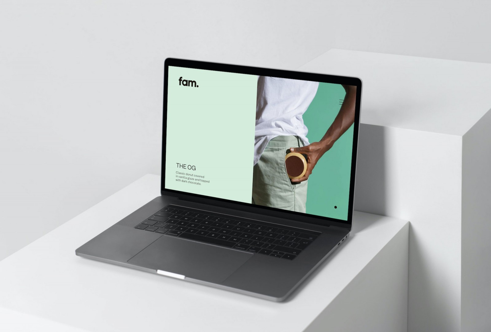
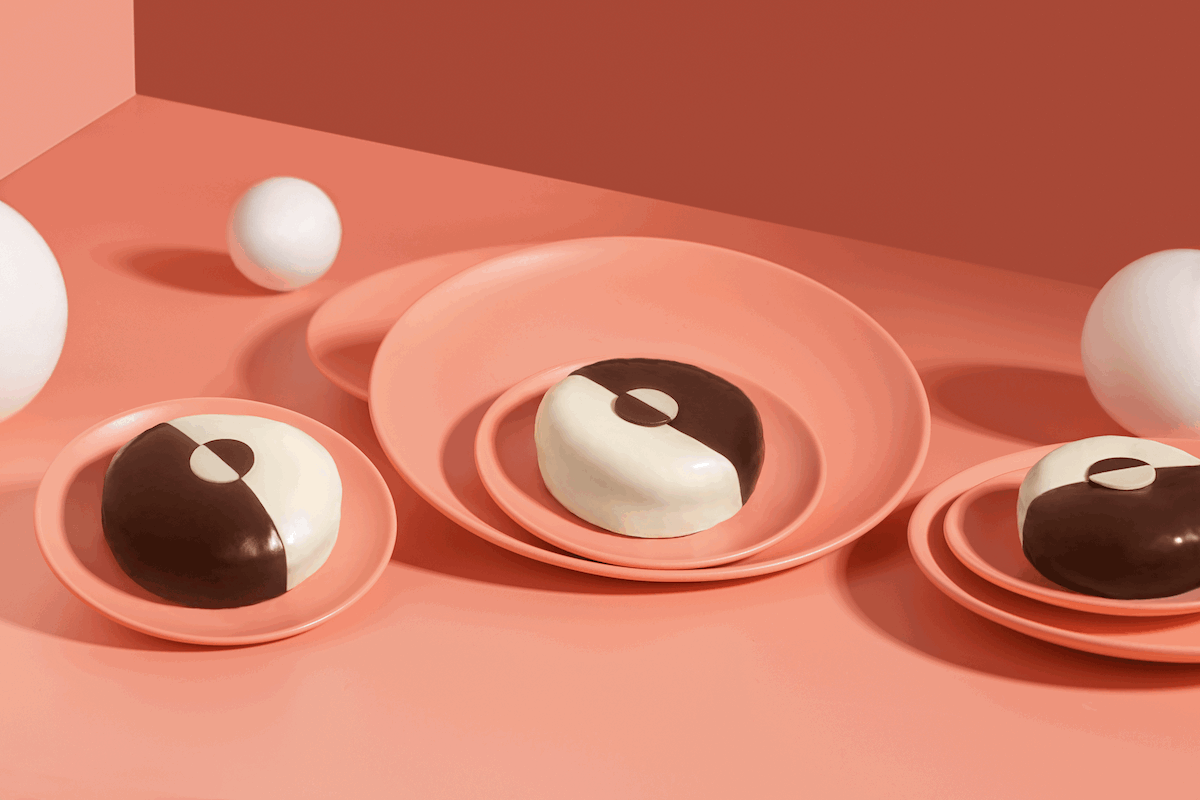
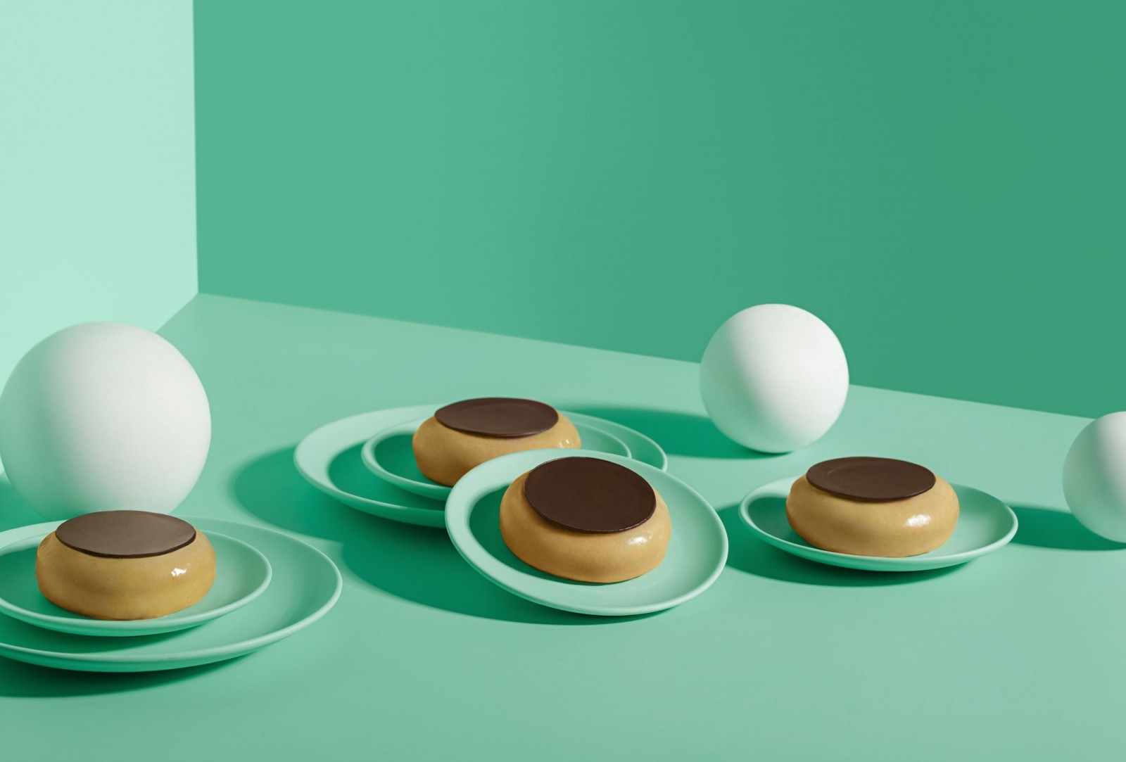
Fam is a new company from Kuwait that offers premium creative donuts with the aim of bringing a totally new donut concept to the GCC countries, offering new flavors, premium ingredients and exceptional product design.
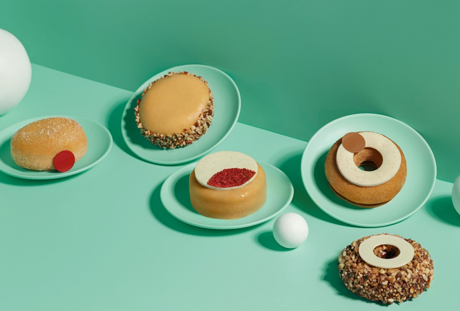
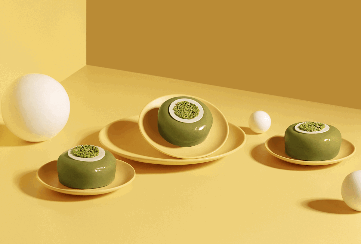
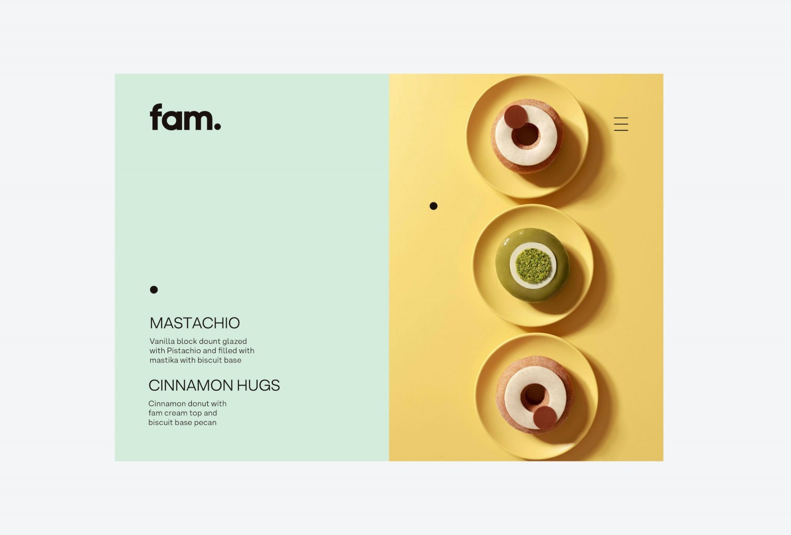
Their recipes are based on a structure of soft cake, doh, and a milky flavored filling, all covered by a hard layer of the best Swiss chocolate. Fam donuts have been developed to take the donut experience to the next level, creating unique flavors such as Chocolate Therapy, Cinnamon Hugs, Mastachio, Pecan Pancake, Say Cheese!, The OG, Fam Jam, Dark Mode and Grenade.
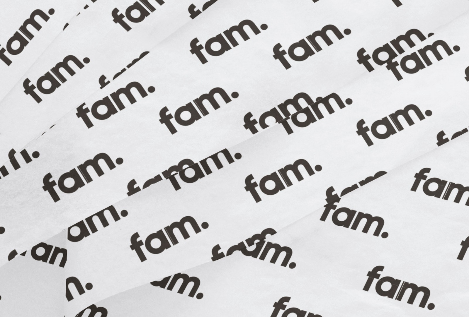
The name ‘Fam’ is an abbreviation of the word ‘family’, understanding this concept not only as biological relatives, but as all the people with whom a person has a close and affectionate relationship.
Fam commissioned us to develop the brand strategy, visual identity and packaging design for their new brand, because they wanted to convey to consumers the passion and dedication that the company puts into its product, through a fun, positive and energetic brand, all based on the values of minimalism and simplicity.
The logo seeks to generate a direct connection with the product, through the use of a bold typeface in its lowercase version, but at the same time it wants to differentiate itself from the rounded-edge typefaces, so overused in this category, adding a touch of elegance and a more premium look.
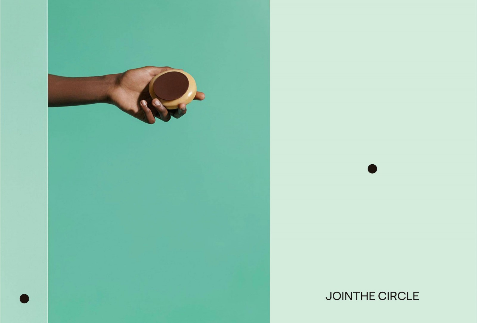
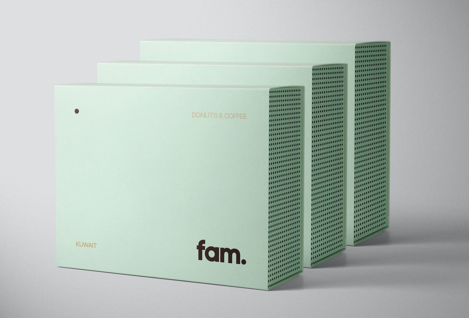
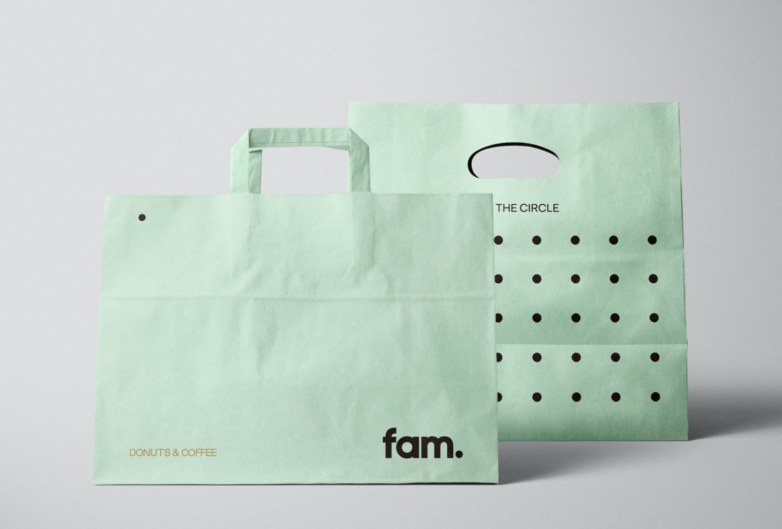
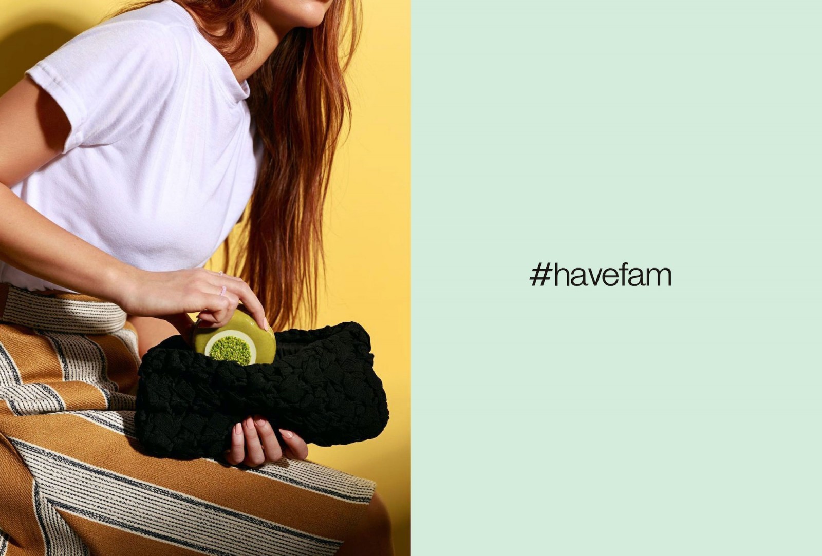
A simple dot is the central element that articulates the entire visual identity of Fam, which is found in the counter-shape of the ‘a’, creating a letter whose shape resembles that of a donut; also at the end of the word to reinforce the family concept through the abbreviation of this word; or as a pattern in the boxes representing the idea of a large community. In addition, the dot is present in a verbal way in the brand’s tagline, inviting consumers to try the donuts and join ‘the circle’.
The brand’s main colour is complemented by mint green and a vivid and bright colour palette to evoke the values of fun and energy, creating a positive visual identity full of good vibes.


CREDIT
- Agency/Creative: fagerström
- Article Title: Fagerström Create Visual Identity and Packaging for Fam – A Premium Donut Brand From Kuwait
- Organisation/Entity: Agency, Published Commercial Design
- Project Type: Identity
- Agency/Creative Country: Spain
- Market Region: Middle East
- Project Deliverables: Brand Creation, Brand Design, Brand Guidelines, Brand Identity, Brand Naming, Brand Strategy, Branding, Graphic Design, Identity System, Packaging Design, Tone of Voice
- Industry: Food/Beverage
- Keywords: brand identity, brand, design, identity design, logo, branding, corporate identity, logotype, graphic design, packaging, packaging design, typography, logo design, identity, minimalism, graphic design, donut, donuts, bakery, fam, fagerström, jointhecircle, havefam, Kuwait, GCC


