


” Task: design development of the flour packaging for ” Real Housewife” trademark
Solution:
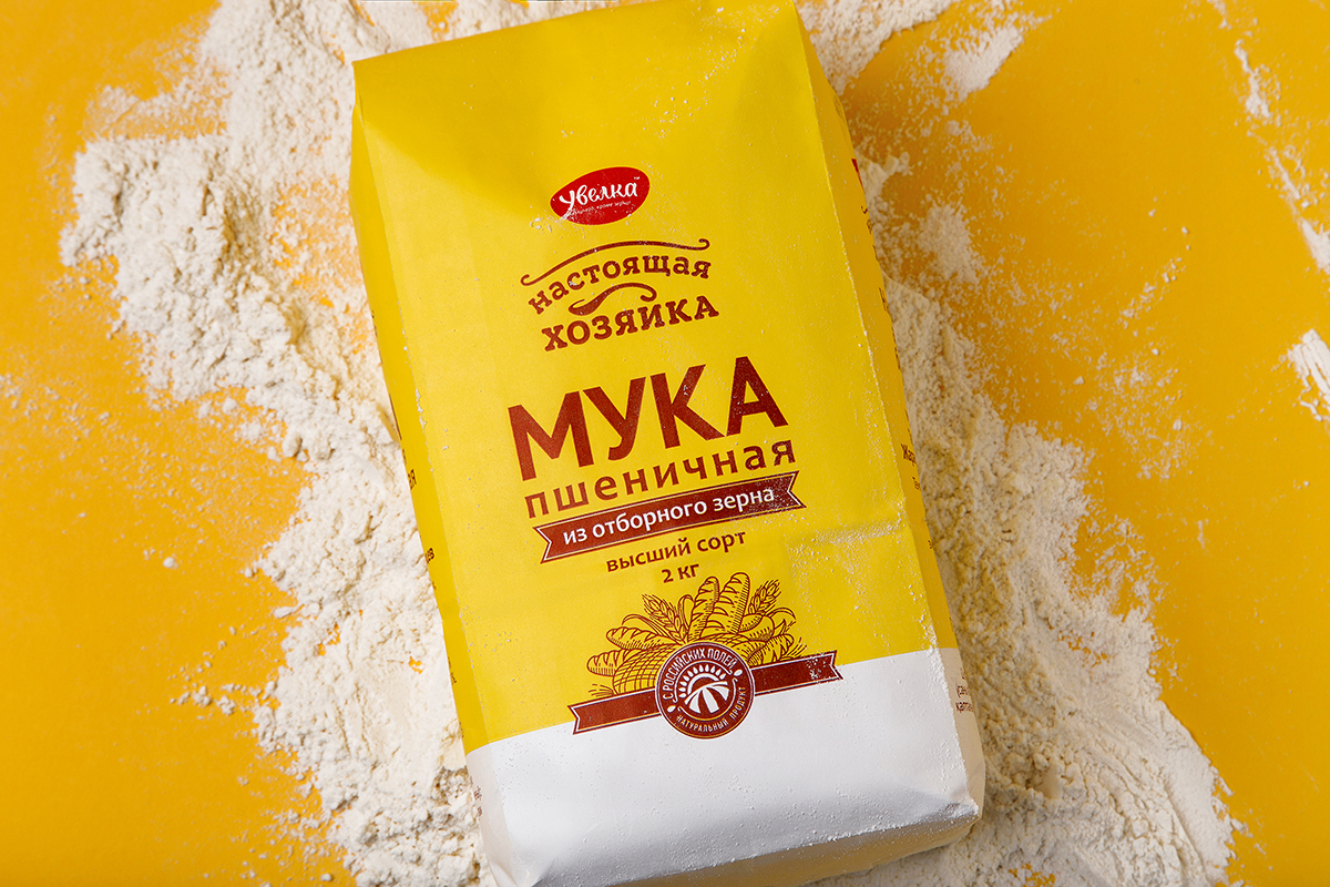
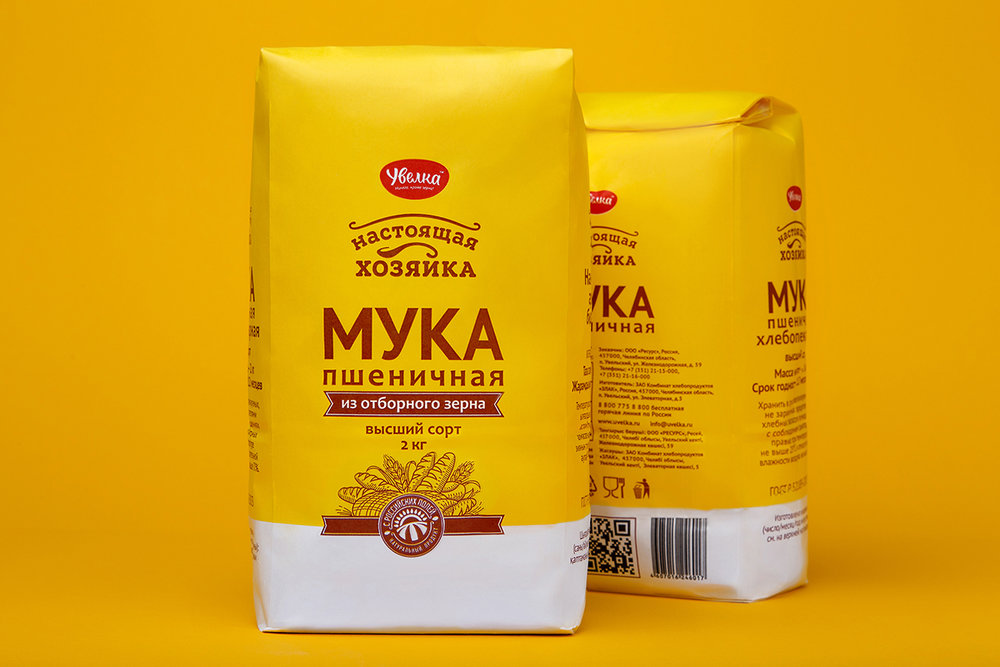
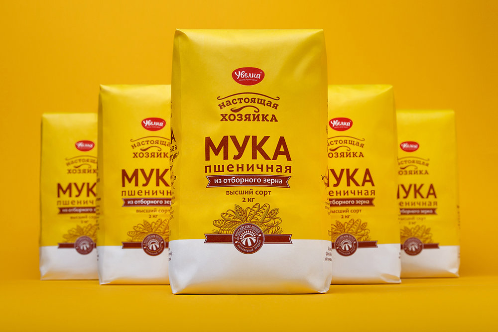
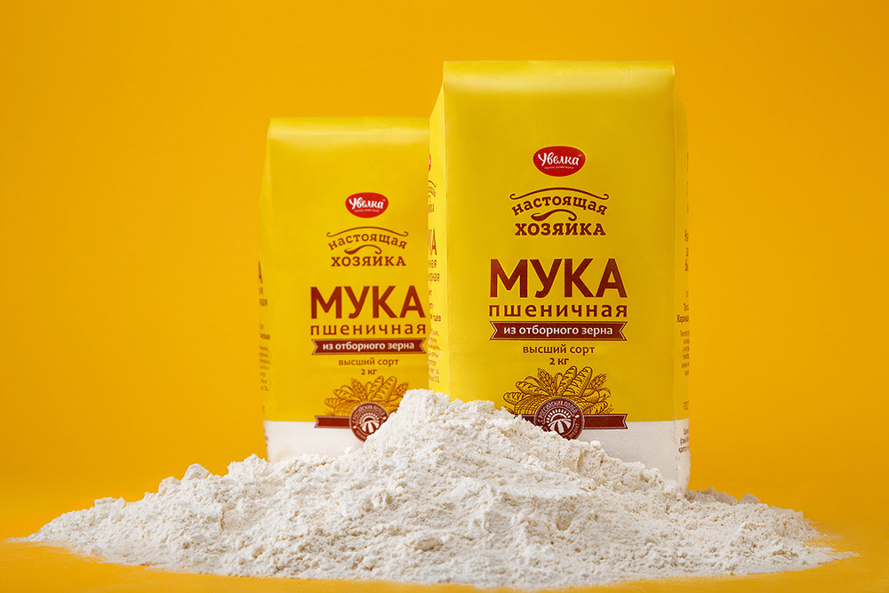
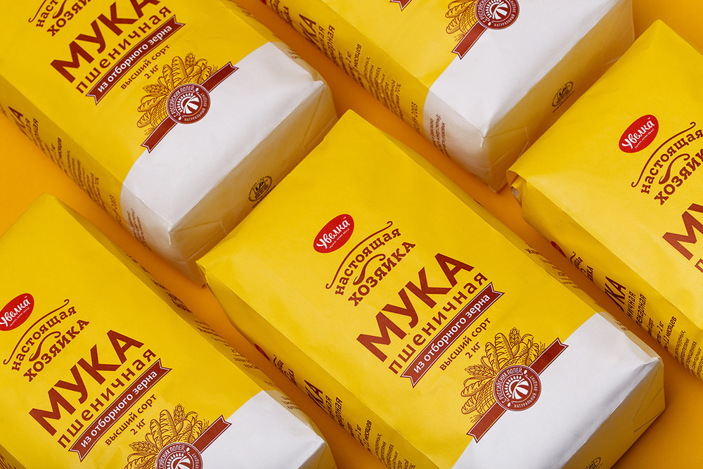
The “Real Housewife” flour is a new product category in the groceries brand line. The packaging design preserves consistency with already existing positions. So, the corporate yellow was chosen as the dominant design color. To draw attention to the new product offering, this color was used as a background filling.
Despite the brightness and visibility, the packaging solution remains traditional for its category. For example, the arrangement of informational cues is common to bring attention to product category. The engraving, as another characteristic, is also used in the design. This makes the package understandable, creates an effect of familiarity and generates audience’s confidence in the new brand appearing on the shelf.”
CREDIT
- Agency/Creative: Fabula Branding
- Article Title: Fabula Branding – “Real Housewife” flour
- Project Type: Packaging
- Format: Bag
- Substrate: Pulp Paper


