


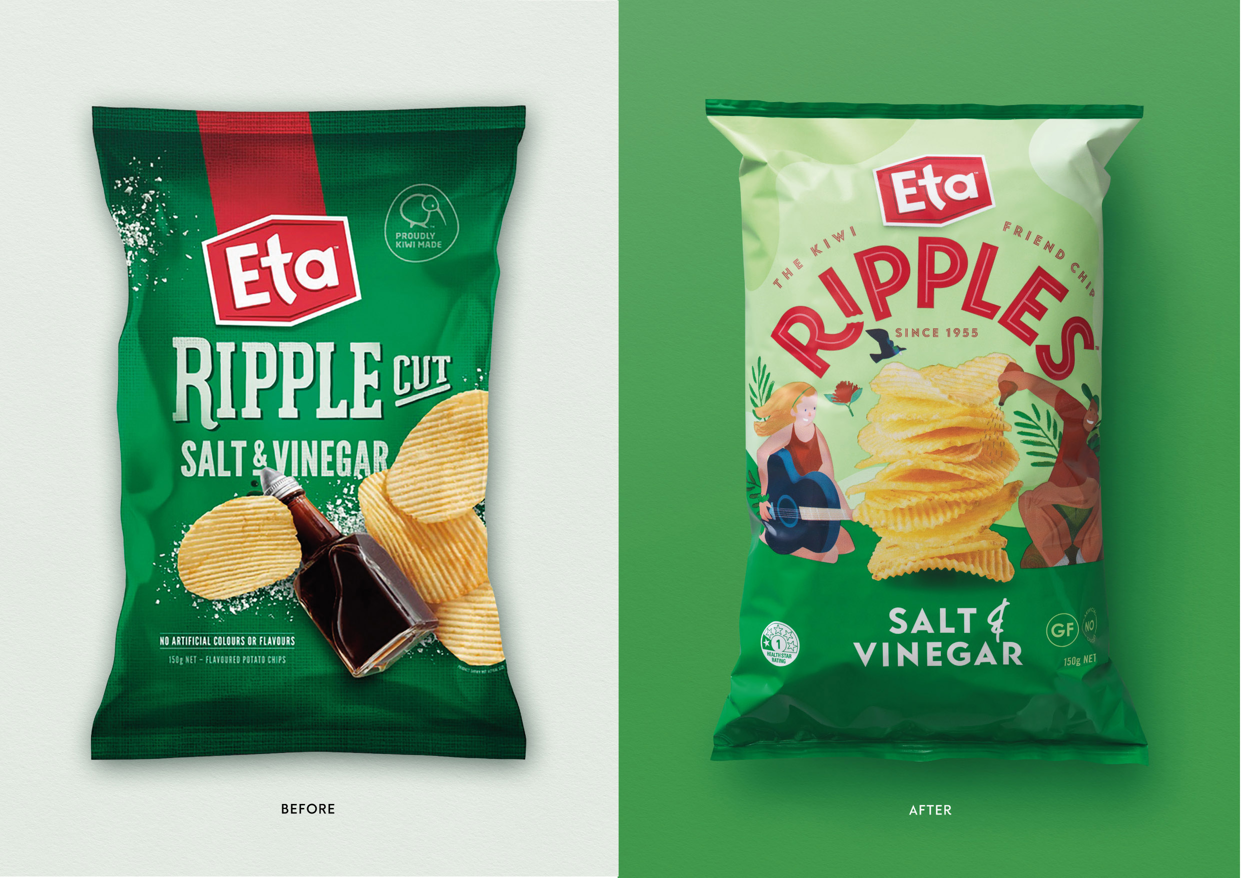
The Eta brand was becoming forgettable. It was the chip brand people grew up with but it had lost relevance with New Zealand’s younger consumers, and was no longer the brand of choice in the chip aisle. It didn’t have a clear position in the market; sitting in the shadow of Bluebird and getting pushed to the side by house brands.
We needed to bring life back into Eta’s iconic Ripples chips and make the brand popular once again.
Working to a newly formed brand essence of ‘Feed the Friendship’ we developed four distinct design ideas and took these through consumer validation to understand what and how the ideas were connecting, in order to take the brand forward in a meaningful way. Our final design had broad appeal across different consumer groups, most effectively delivered back to the proposition and importantly elevated Eta away from house brands.
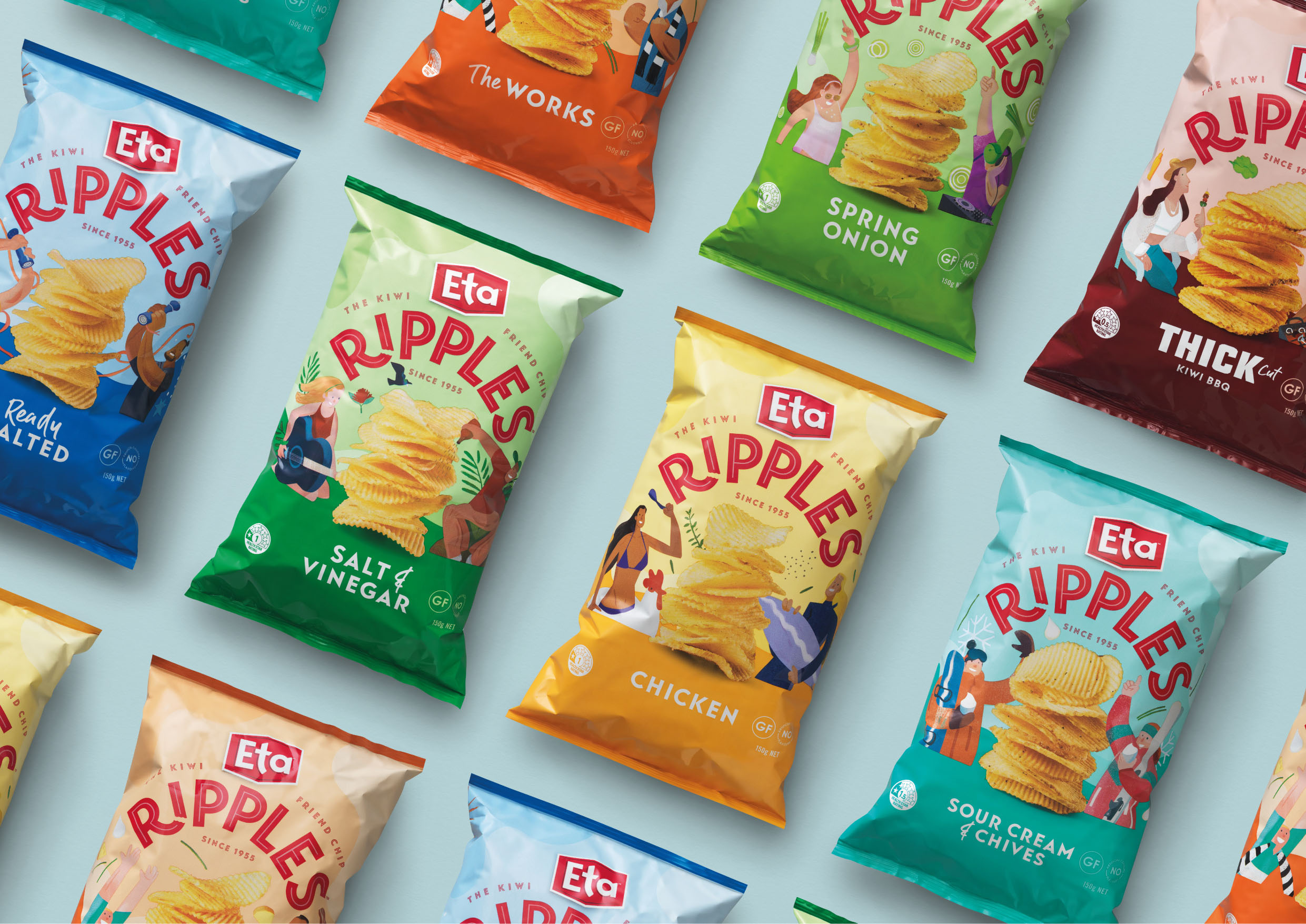
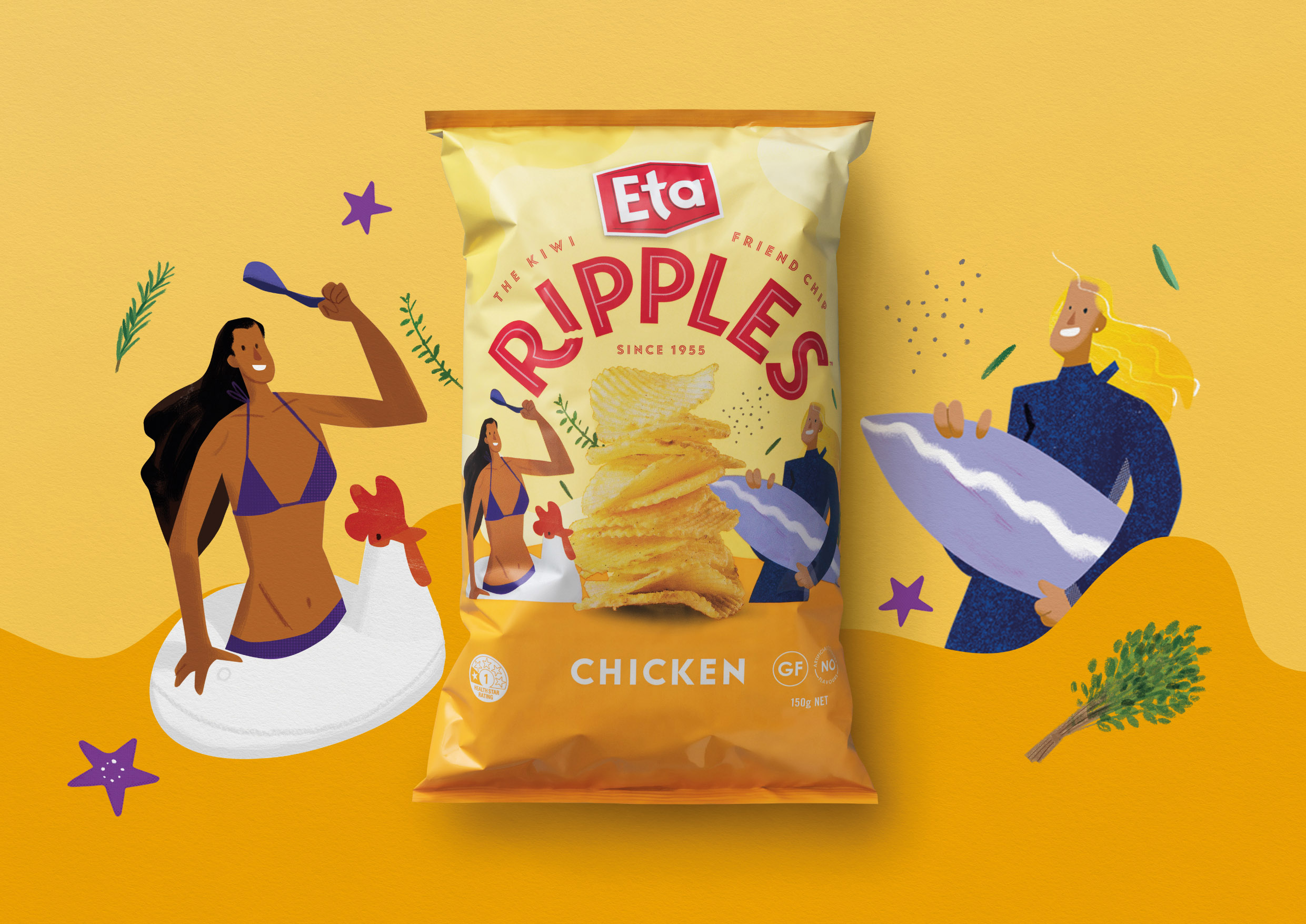
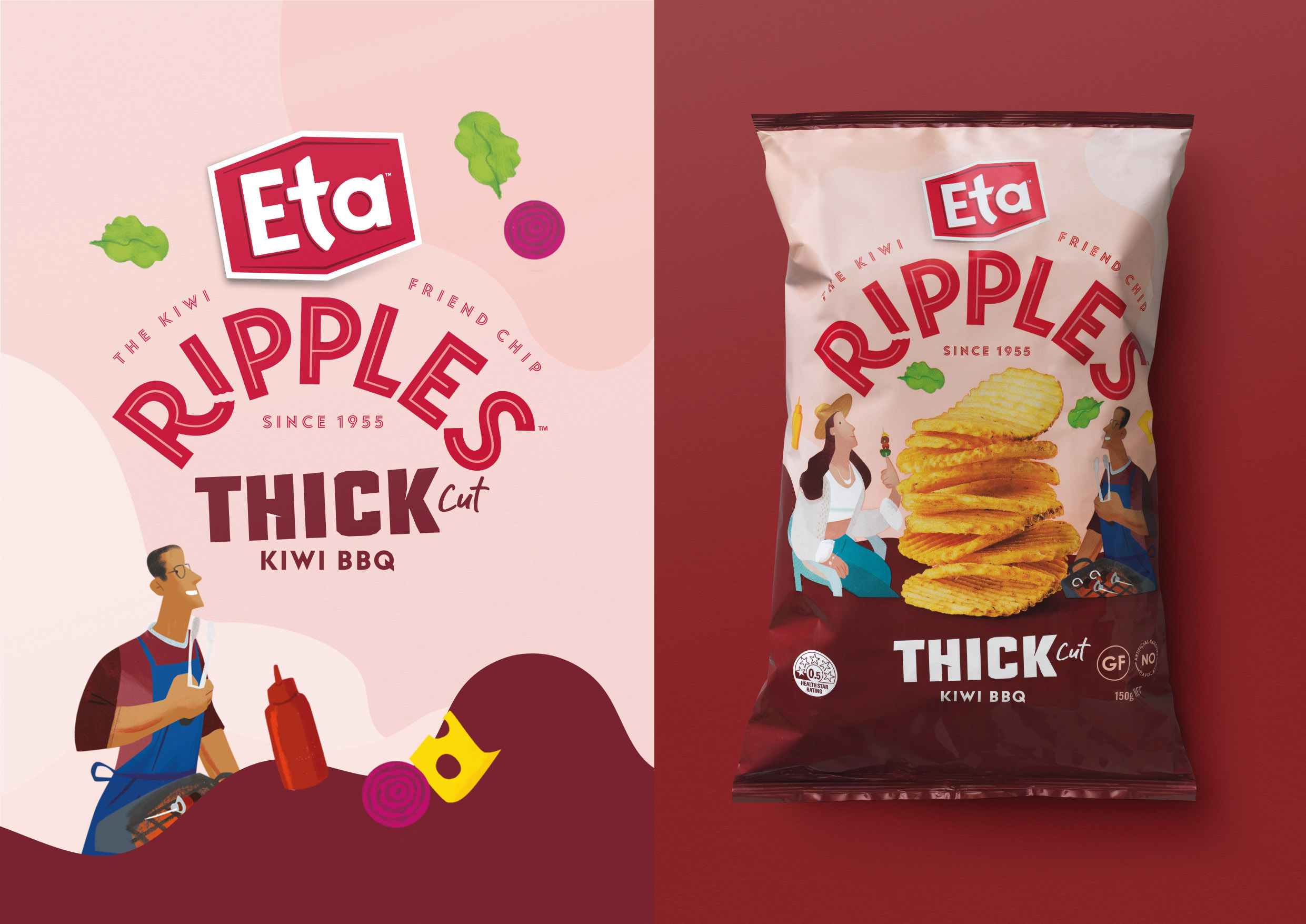
Creating a story for the brand to tell through our design, we developed continuously connected social scenarios that brought kiwis together. We aimed to capture the positive memories of fun times our consumers have enjoyed with family and friends – summer barbies, birthday parties and other simple get-togethers. The design was able to elicit an emotional connection, which had been missing from the brand for some time.
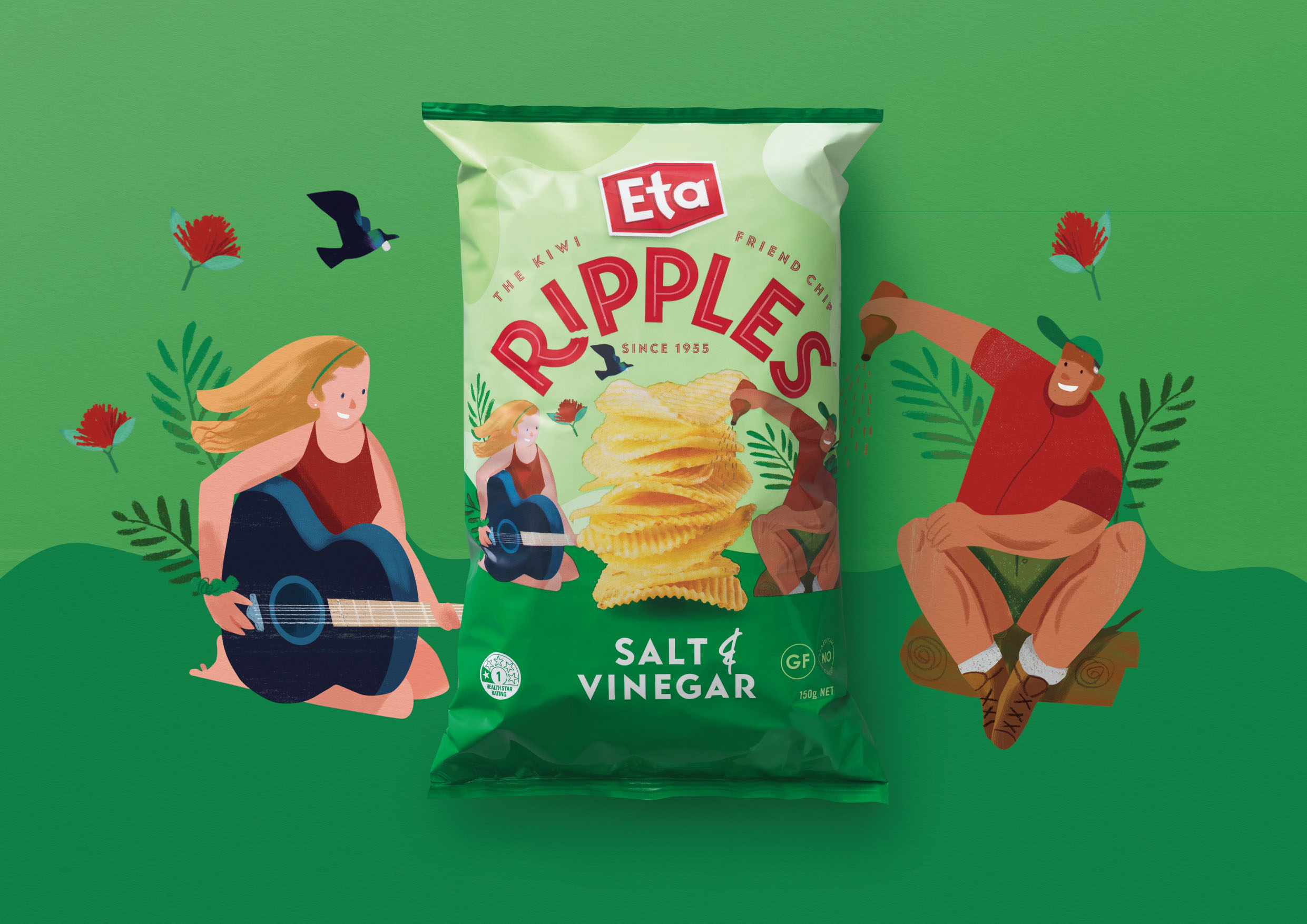
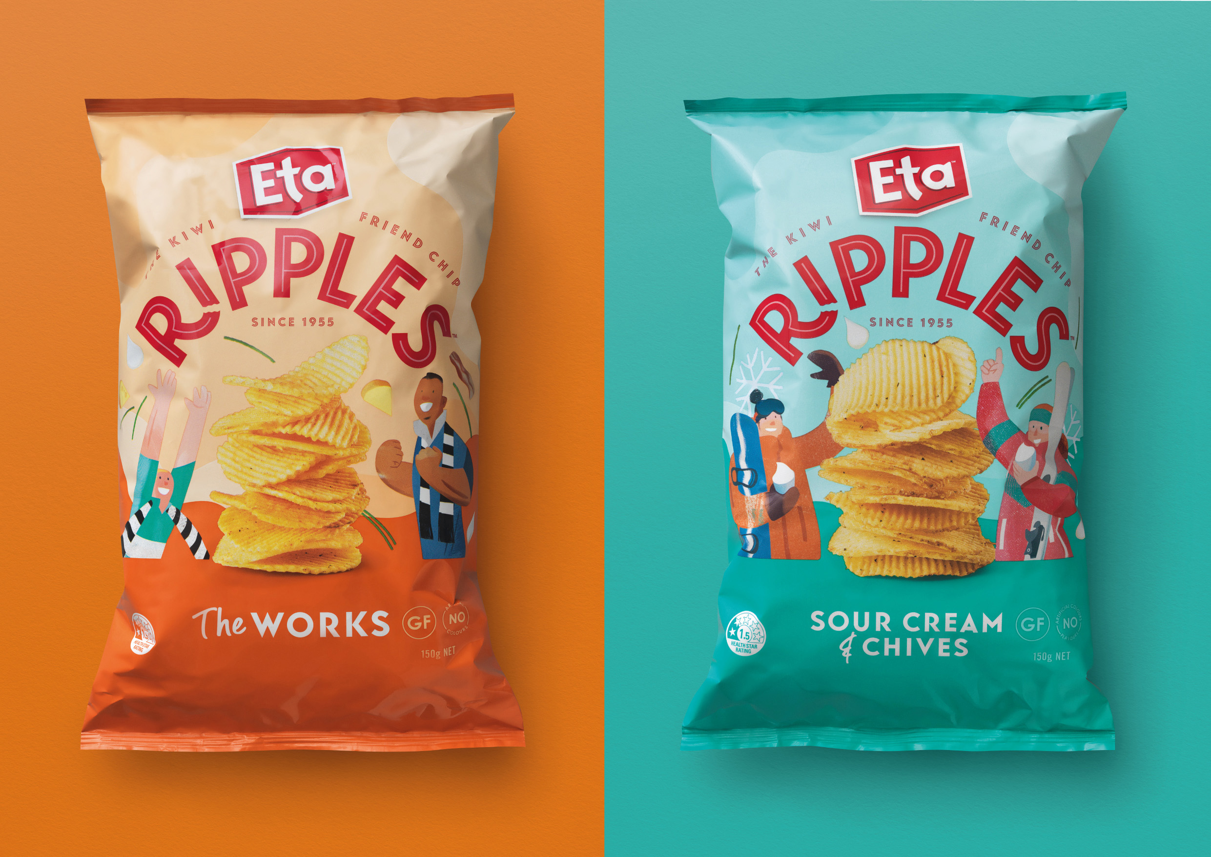
We worked with illustrator Daron Parton, to create bespoke characters and scenes for each variant. Each of the packs captured a different social occasion and helped us bring to life the different flavour profiles across the range. Daron’s stylised characters and their slightly exaggerated features combined with his modern yet natural illustration style worked in synergy with our bold graphic branding.
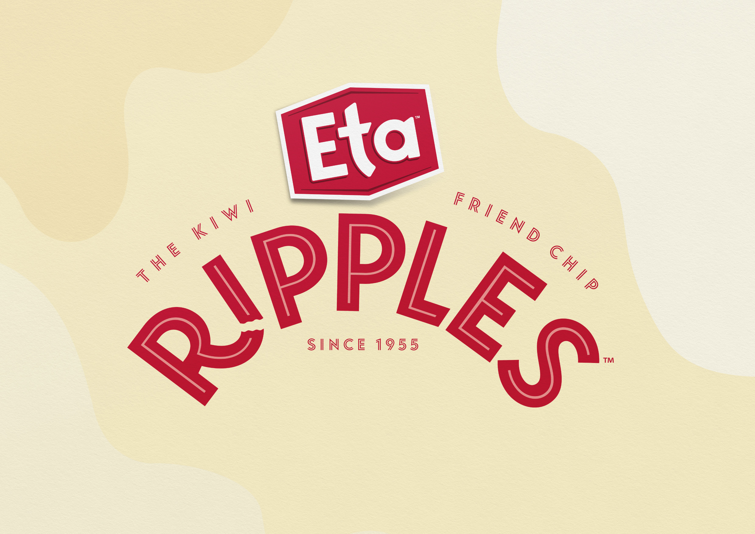
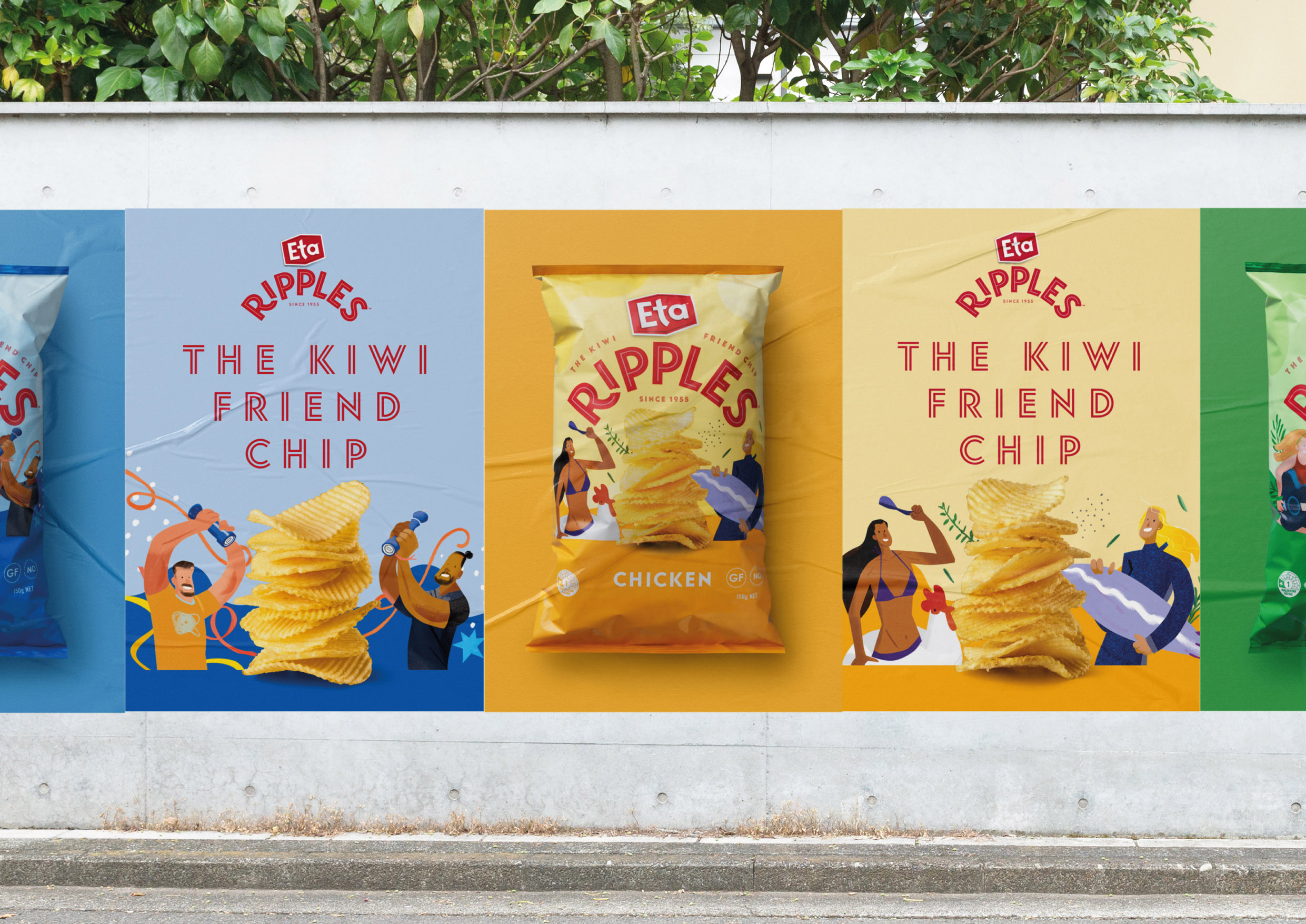
In the attention-demanding snacking aisle often swarmed with images of flying 3D chips and snacks, we’ve gone for a look that would stand-out for its freshness and modernity. Pastel colours became backdrops for our illustrations while the bold variant colour palette introduced a bit of fun and vibrancy into the range. Clean geometric typography helped us create a clear navigation. Connecting all the dots together, we introduced a new ‘The Kiwi Friend Chip’ tagline that reflected the playfulness of our illustrated characters and linked back to the brand’s new ‘Feeding Friendship’ essence.
The result is a highly successful relaunch of Eta Ripples, with a bold new look which has allowed the brand to reconnect with New Zealand consumers.
CREDIT
- Agency/Creative: Unified Brands
- Article Title: Eta Ripples Become Unforgettable With a Packaging Design Makeover
- Organisation/Entity: Agency
- Project Type: Packaging
- Project Status: Published
- Agency/Creative Country: New Zealand
- Agency/Creative City: Auckland
- Market Region: Oceania
- Project Deliverables: Brand Architecture, Brand Redesign, Brand Rejuvenation, Illustration, Packaging Design
- Format: Flow-Pack
- Substrate: Metal
- Industry: Food/Beverage
- Keywords: Eta, Ripples, New Zealand, Kiwi, Friend, Chip, NZ, Chips, Crisps
-
Credits:
Creative Director: Alex Butenko
Illustration: Daron Parton
Product Photography: Shaun Cato
Pack Photography: Nick Tresidder


