


Label 21 is a Digital Marketing company, focused on customer communication solutions with its audience. Although new in the market, it seeks to be a solid company, recognized in the national market and with a broad vision to act directly or indirectly with current technologies, offering services of digital marketing, communication, creation of digital and printed arts, management of social networks and advertising picture.
the purpose of the brand is to offer solutions that generate customer satisfaction. Developing customer communication solutions with your audience; Seeking to constantly study the market in search of the best ways and helping entrepreneurs who aim for the success of their company.
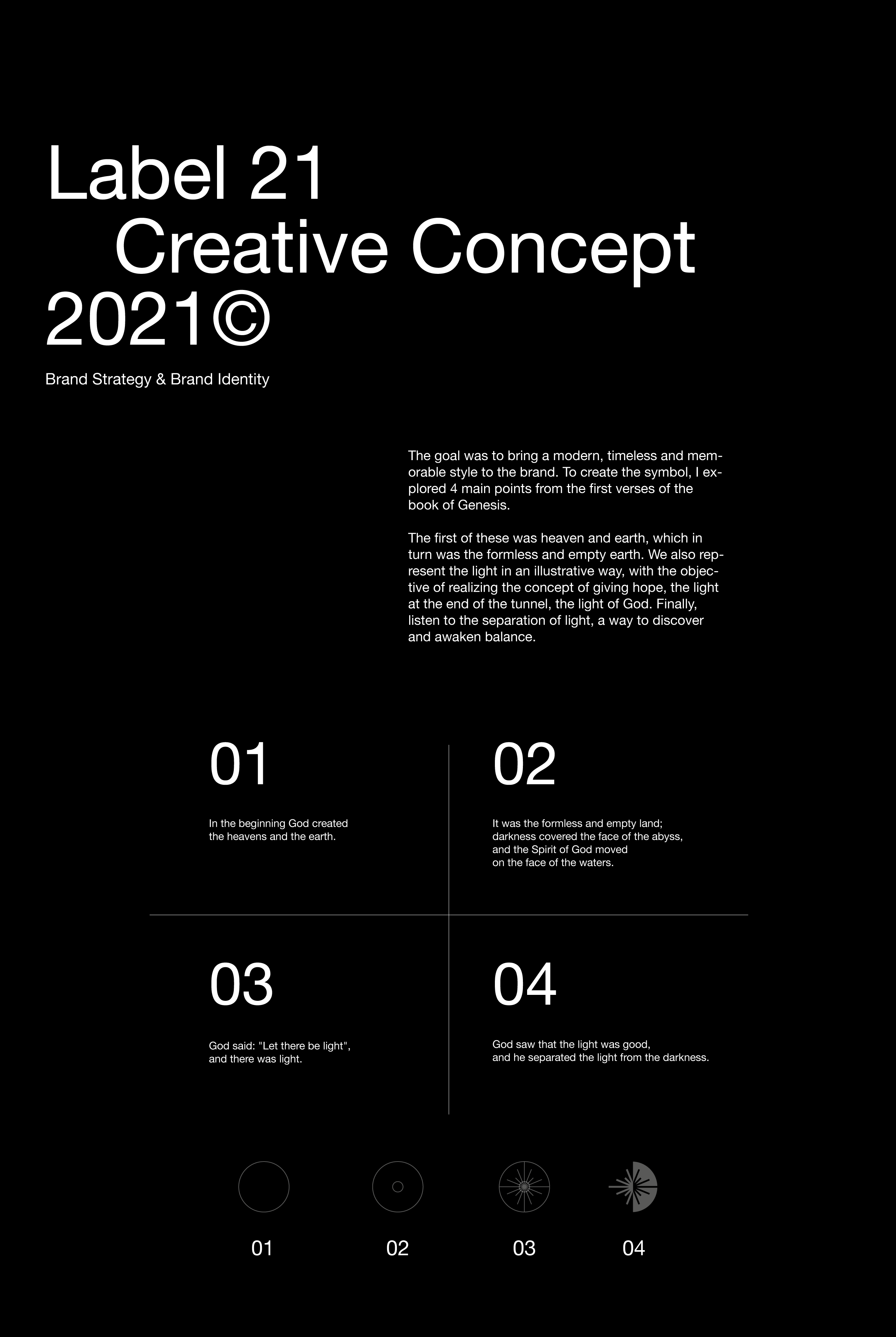
The challenge was to create a strong, contrasted and dynamic brand, which will refer to the strength of God, linked to the creation of the creator based on Genesis 1 and through its form, will communicate a new and renewed digital marketing company.
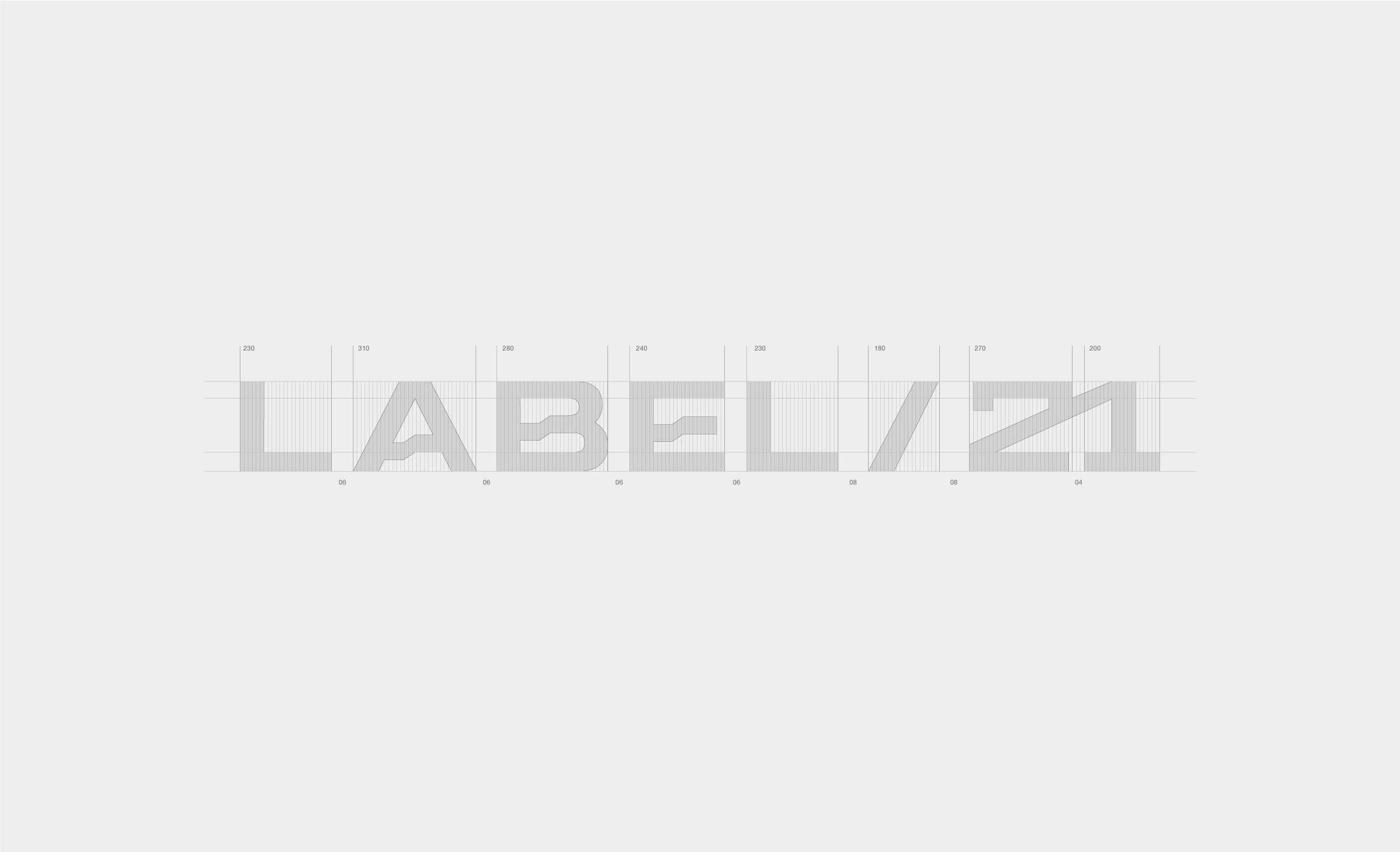
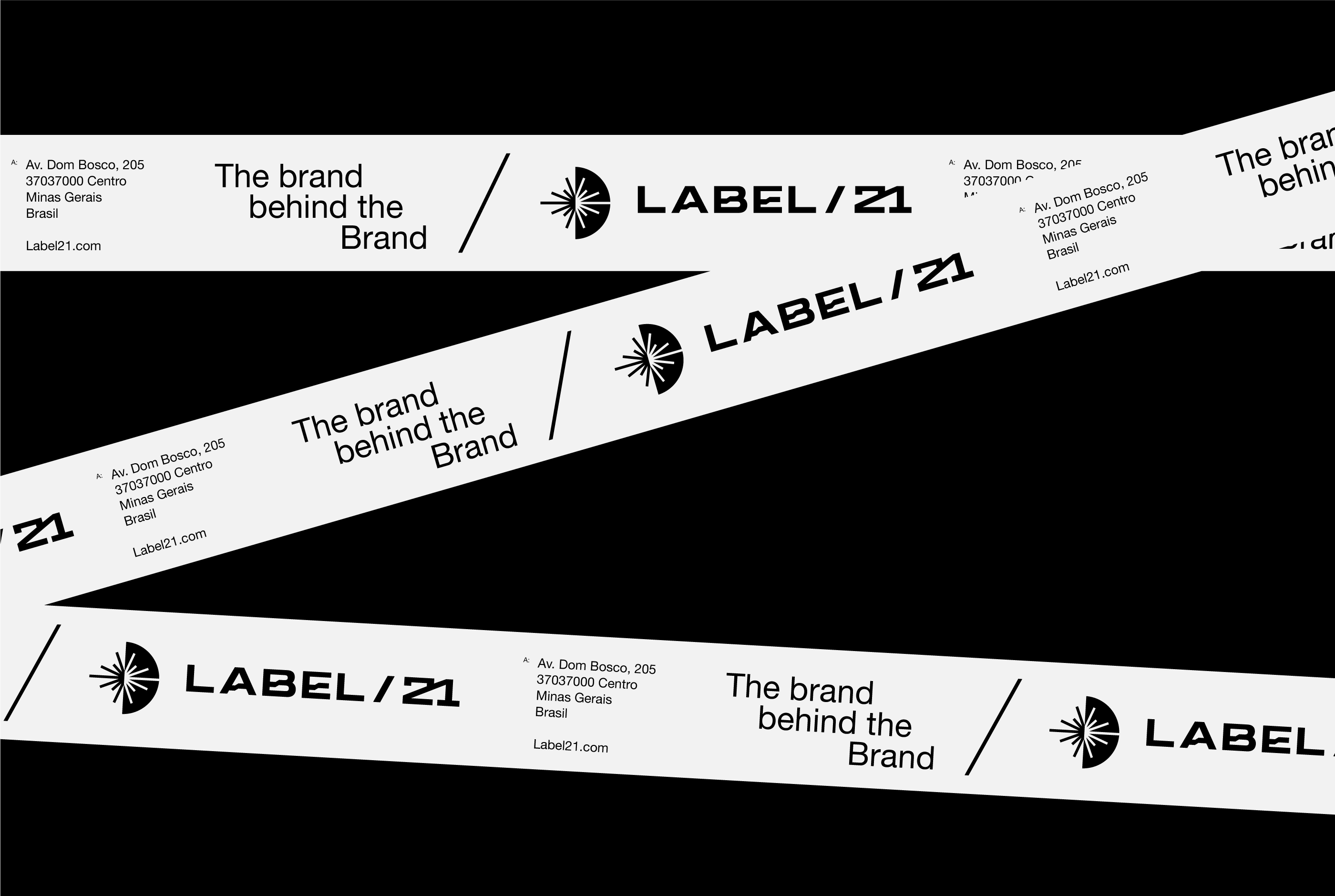
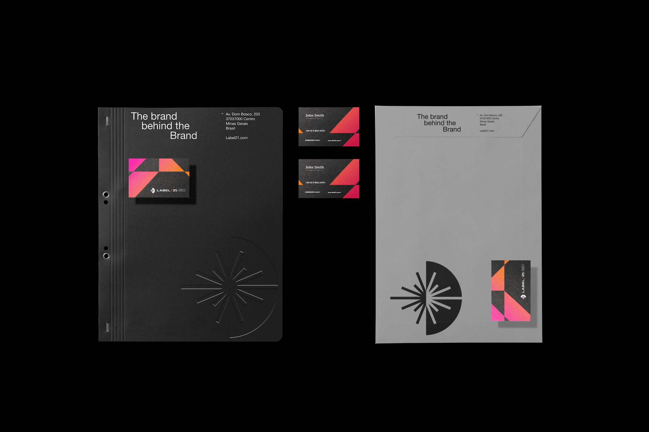
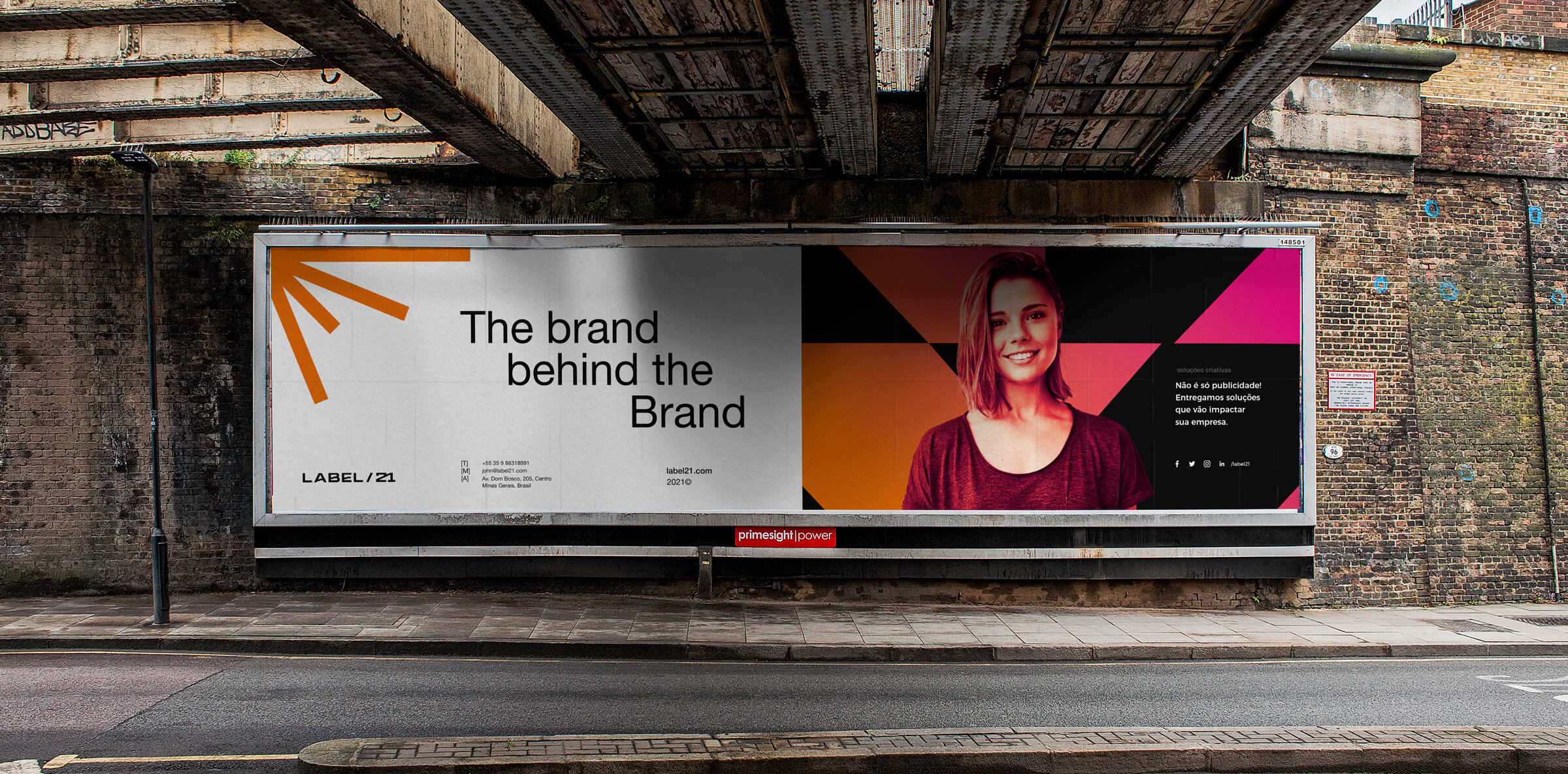
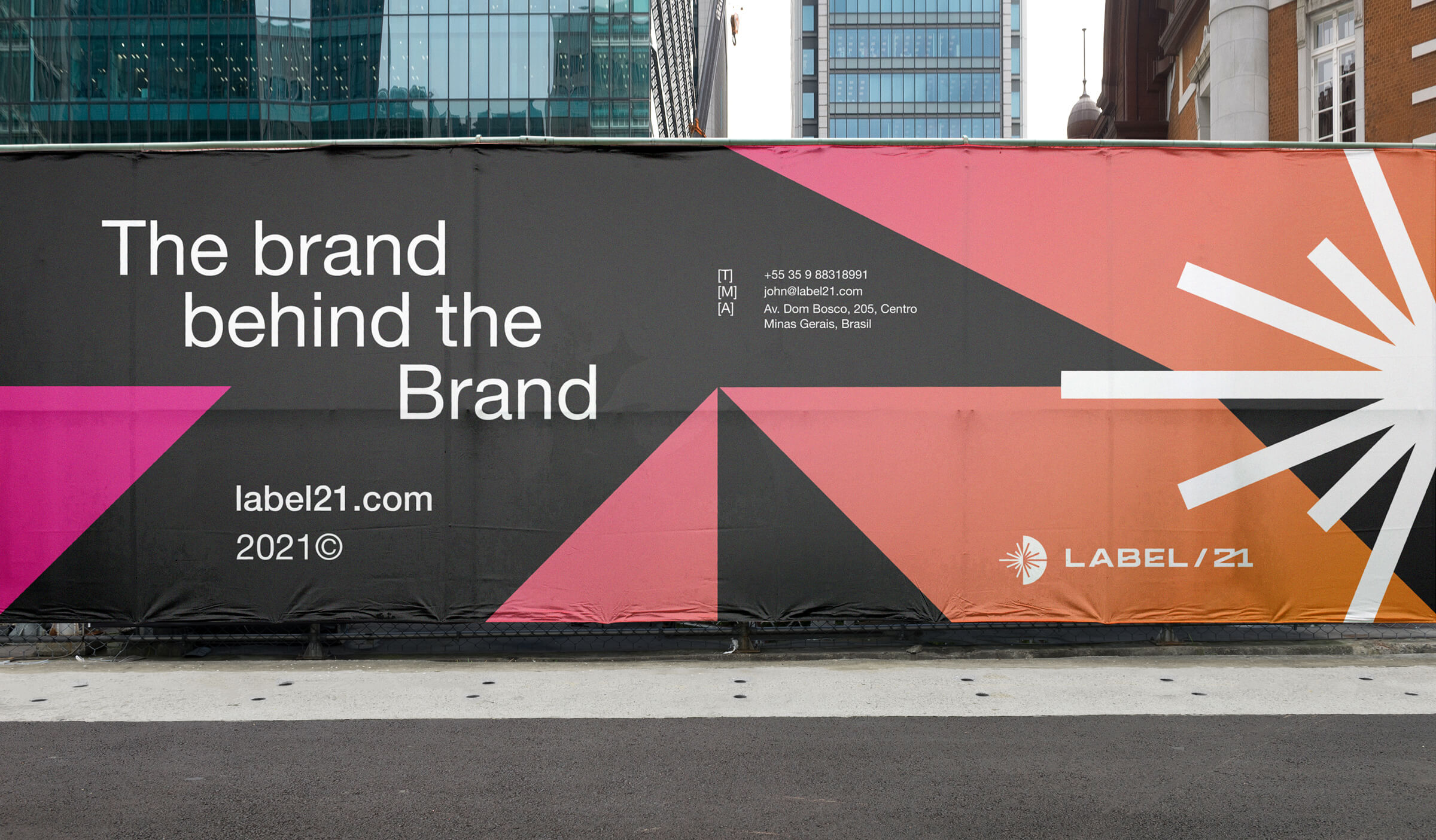
Considering the importance of the typographic voice to convey corporate messages, we created a personalized logo, inspired by a typeface without a geometric serif, Its linear nature suggests a modern style, with a technical and functional appeal. Suitable for any design environment, the combination of these qualities makes the logo highly legible and very distinguishable.
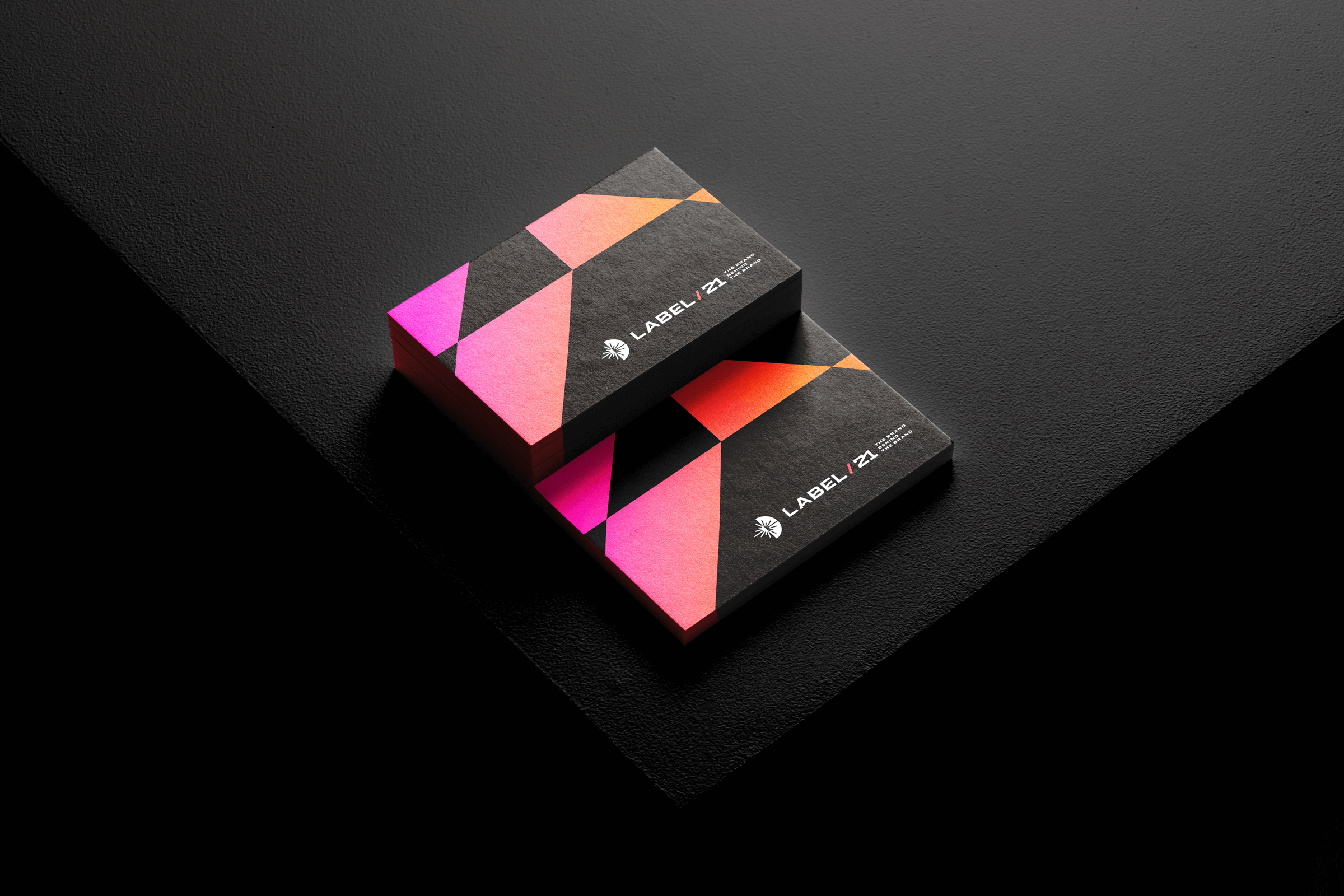
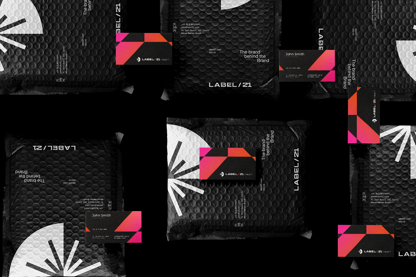
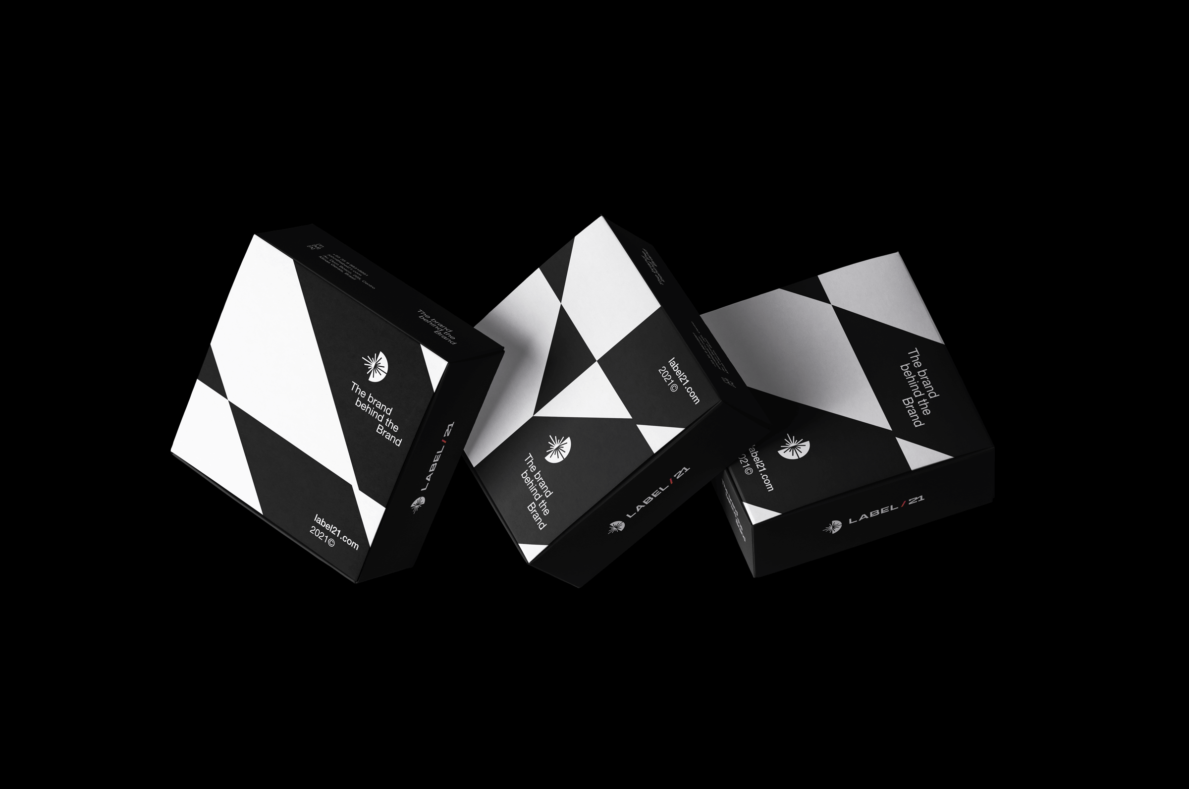
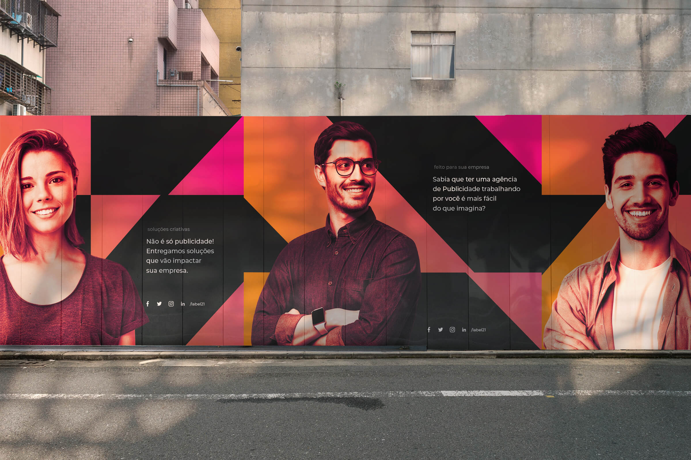
Determined to create contrast, the flourishing colors gain more prominence on a black background. Made to work with each other, in different combinations.
With this color approach, we were able to make the content stand out more and keep it simple, but memorable.
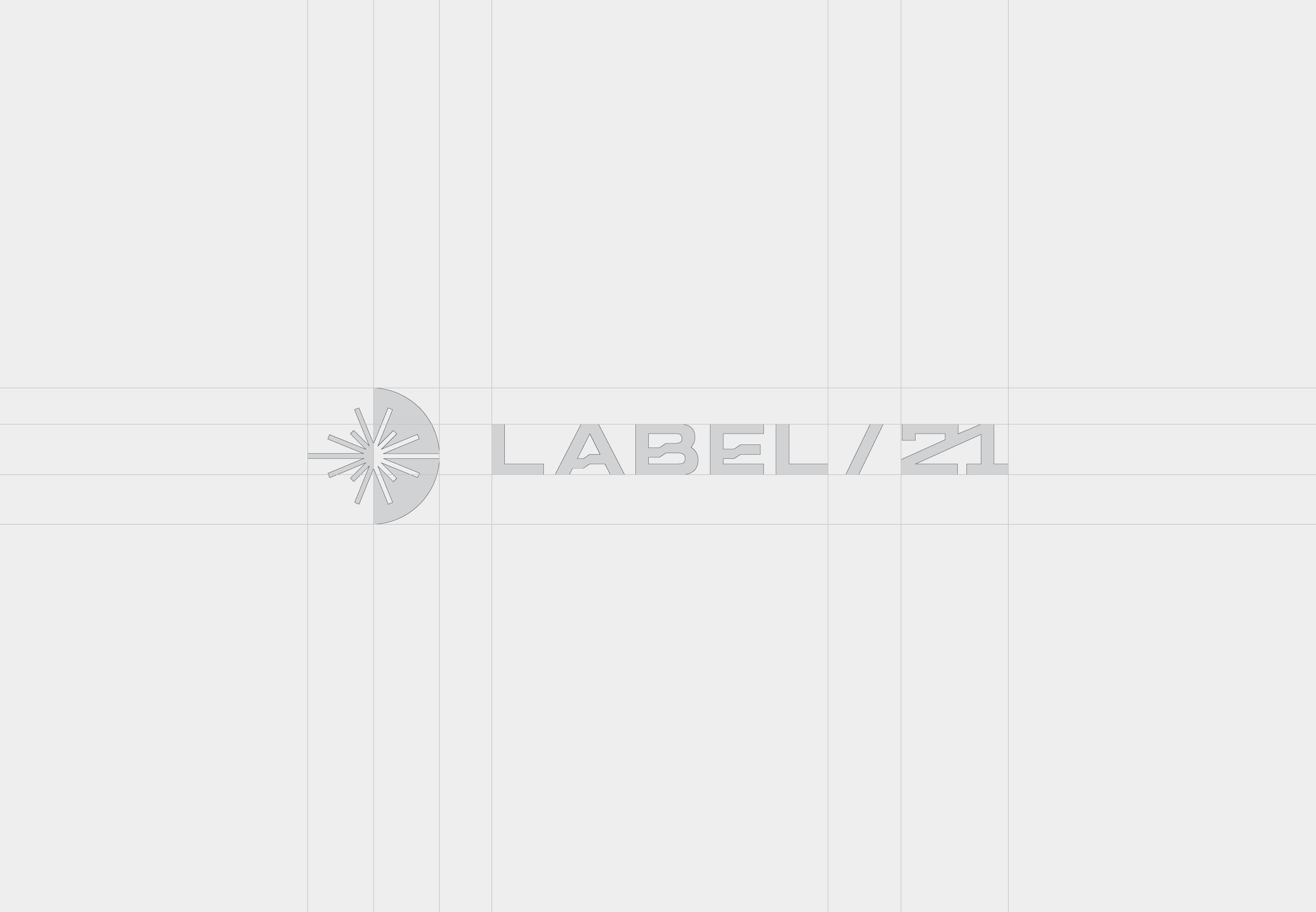
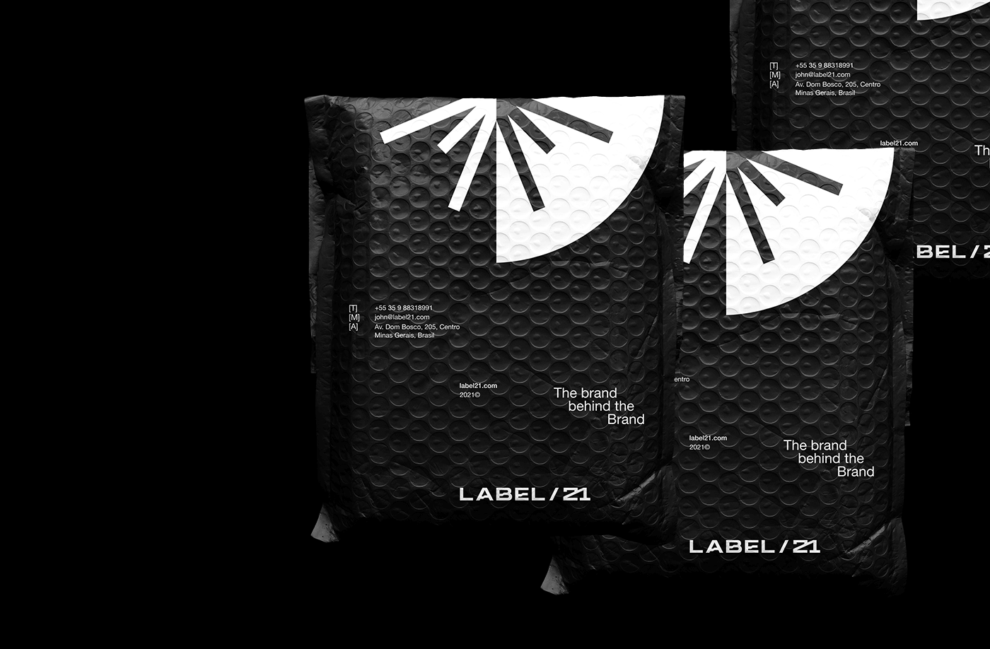
To develop the visual system and compose the elements that are part of the visual line, it was explored through the symbol and typography of the logo, shapes that reflect the unique and modern concept of the brand.
The result is a professional typography, which conveys the modernity of the brand, without losing its technological and audacious personality.
The solution was to develop a symbol based on the first four verses of Genesis 1. The forms and counter-forms of the symbol and the logo are used as a graphic support for the visual identity. A dynamic, modern and audacious brand, which can be used both online and offline.
CREDIT
- Agency/Creative: Estúdio Kuumba
- Article Title: Estúdio Kuumba Creates Visual Identity Project for Label 21
- Organisation/Entity: Freelance, Published Commercial Design
- Project Type: Identity
- Agency/Creative Country: Brazil
- Market Region: South America
- Project Deliverables: Brand Creation, Brand Identity, Brand Strategy, Branding, Identity System
- Industry: Technology
- Keywords: Brand Identity, Visual Identity, Brand Strategy


