


“La Estación” is a pharmacy located in a small town in Spain. This year with the change of owners they decided that it was a good time for a rebranding. The pharmacy lacked a strong visual identity. They had an old-fashioned logo that referred to the train station that is very close and to which its naming refers.
The pharmacy has a consolidated audience over time, mostly middle-aged and elder people who live in the area. The objective is to broaden this target to a younger audience who is interested in skin care and who consume quality products.
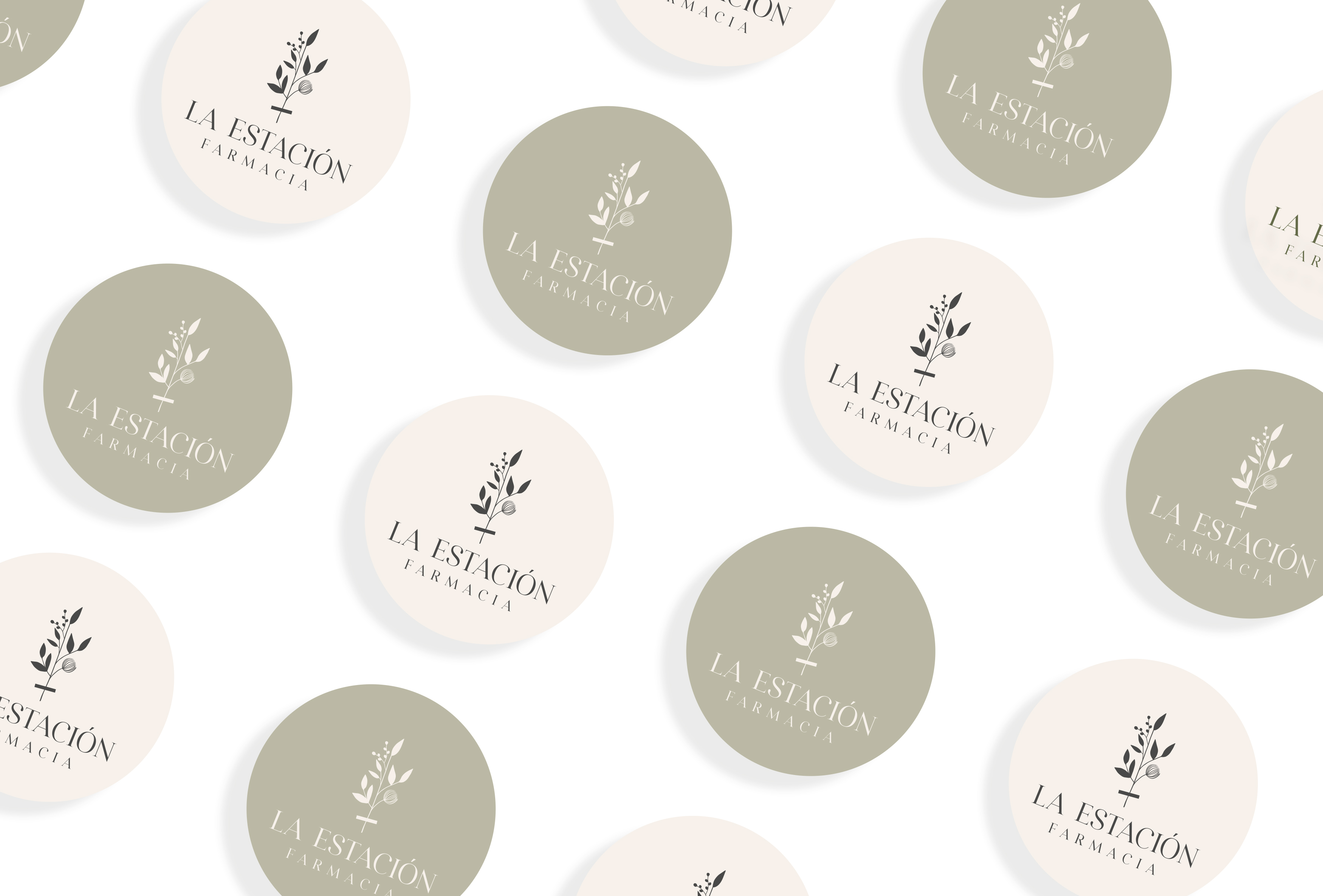
Many of these new customers will make purchases through the new ecommerce of the pharmacy, so the design of a shipping packaging together with tissue paper was essential, to this we add high quality paper cards that work as thank you cards and as cards for instructions of treatments, and also some stickers in different colors with the main logo of the brand.
We found it interesting to design an organic cotton tote bag to give to the customers who make larger purchases. It promotes the use of reusable shopping bags and to reduce plastic waste. Which is related to the philosophy that the pharmacy wants to convey.
The completely redesigned visual identity is inspired by two poles: science and nature with a clean and minimalist aesthetic. The logo font was carefully chosen, a serif typeface with a modern look. We want to convey seriousness and avant-garde. The color palette evokes tranquility and freshness that combines perfectly with the Eco friendly packaging design.


CREDIT
- Agency/Creative: Estudio del Mar
- Article Title: Estudio del Mar Creates Rebranding for a La Estación Pharmacy in Spain
- Organisation/Entity: Freelance
- Project Type: Identity
- Project Status: Published
- Agency/Creative Country: Spain
- Agency/Creative City: Madrid
- Market Region: Europe
- Project Deliverables: Rebranding
- Industry: Pharmaceutical
- Keywords: Pharmacy, graphic design, logo, Rebranding, nature, floral
-
Credits:
Art direction: Mar Cerdeira


